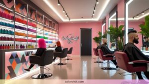
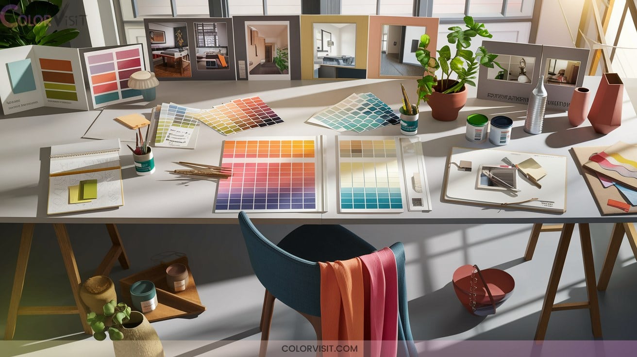
20 Versatile Color Palette Ideas for Any Design Project
When you’re searching for versatile color palette ideas, blend technical precision with historical context: neutrals like greige and taupe offer timeless flexibility, while high-contrast black and white invokes modernist clarity.
Earth tones—clay, terracotta, ochre—connect designs to ancient pigments and natural serenity. Experiment with professional navy and cream, playful dusty pastels, or bold neon gradients.
Carefully balanced triadic or complementary schemes boost visual impact. Explore seasonal palettes and muted pastels for adaptability across branding, digital, and print projects—more insights await.

1. Neutral Foundations for Timeless Appeal
A neutral color palette forms the backbone of timeless interior design, offering both flexibility and enduring sophistication.
Neutral palettes are the foundation of timeless interiors, delivering versatility and lasting elegance to any space.
Historically, creamy whites, soft tans, and sandy browns established balanced, adaptable spaces.
Today, you can innovate by layering muted greens—such as olive or sage—and rustic terracotta for subtle organic warmth.
Integrate honeyed oak, textured linens, and stone-inspired grays to provide tactile depth without visual clutter.
Employ greige, taupe gradients, and pale slate tones for seamless blends between modern and classic aesthetics.
Accentuate with brushed metallics or blackened hardware to harmonize tradition and modernity, ensuring your design remains relevant and resilient to trend cycles.
2. Black and White High-Contrast Palette
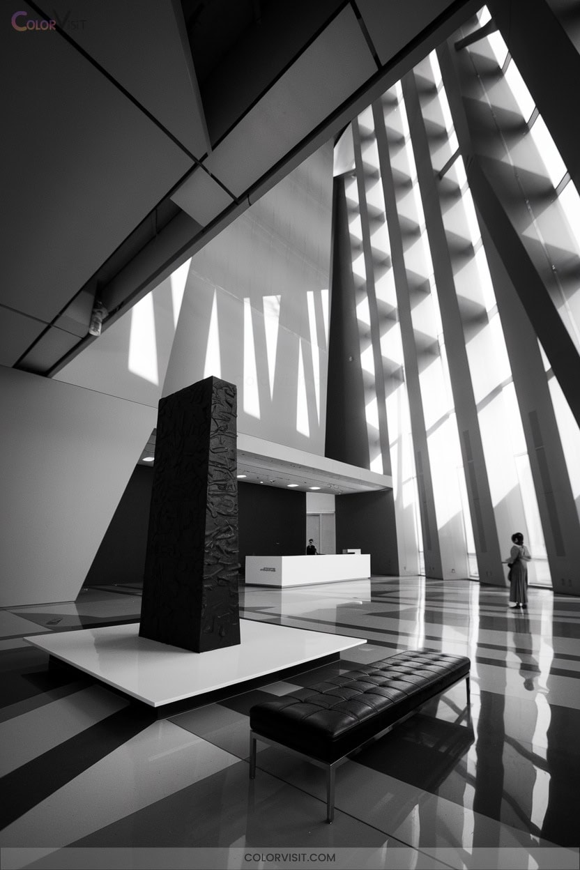
While neutrals offer enduring subtlety, high-contrast black and white palettes introduce a bold visual language rooted in early printmaking and modernist design movements.
You gain classic elegance, heightened readability, and accessibility—crucial for inclusive design.
Integrate gray tones like #E0E0E0 and #757575 to modulate intensity, create depth, and balance the stark interplay of black and white.
For innovative impact, introduce pop colors such as #FF5722 or #FFC107, establishing visual hierarchy and emotional engagement.
Consult WCAG guidelines and utilize contrast ratio tools to guarantee compliance and user inclusivity.
This versatile palette adapts seamlessly from editorial layouts to digital interfaces.
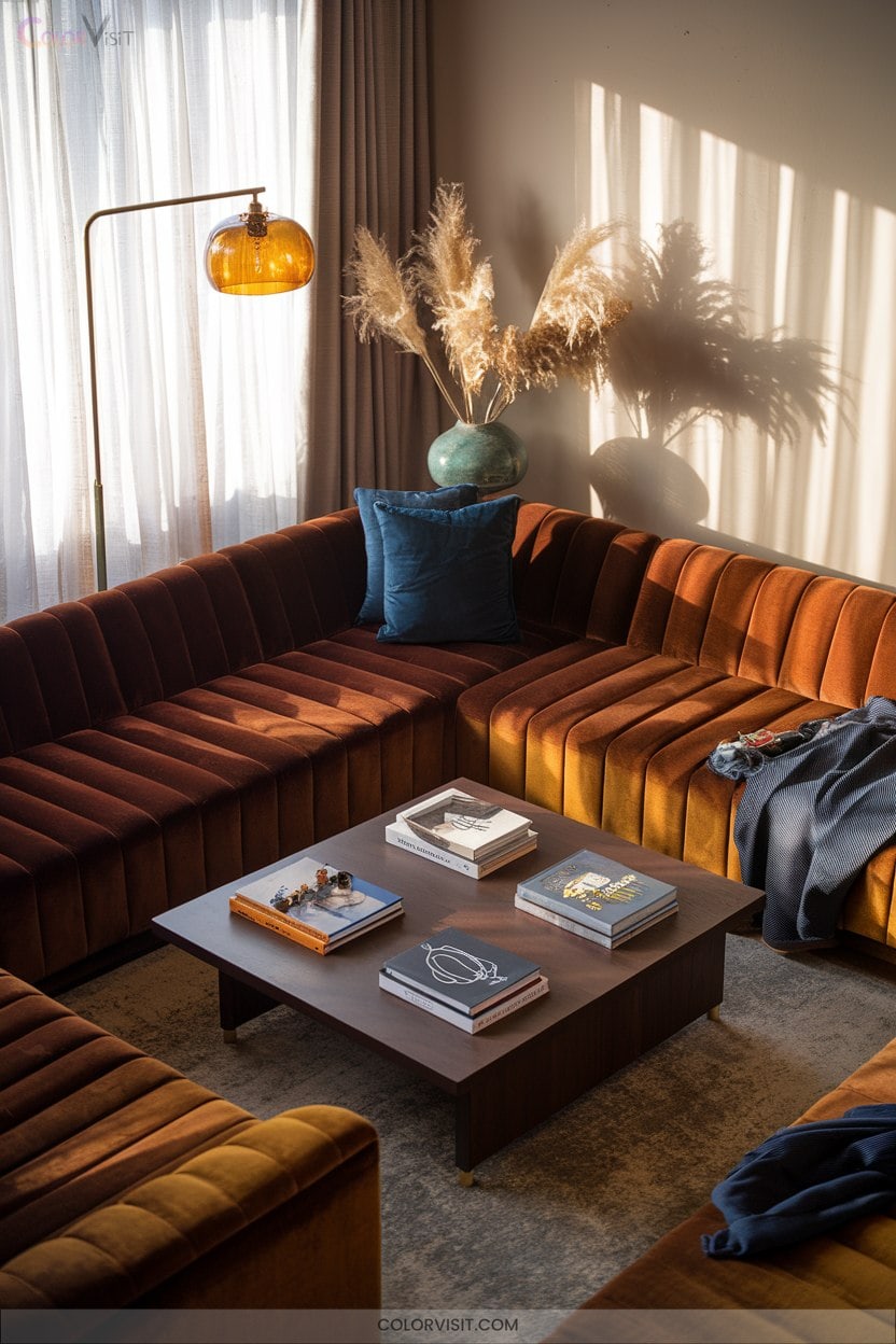
3. Earth Tones for Natural Serenity
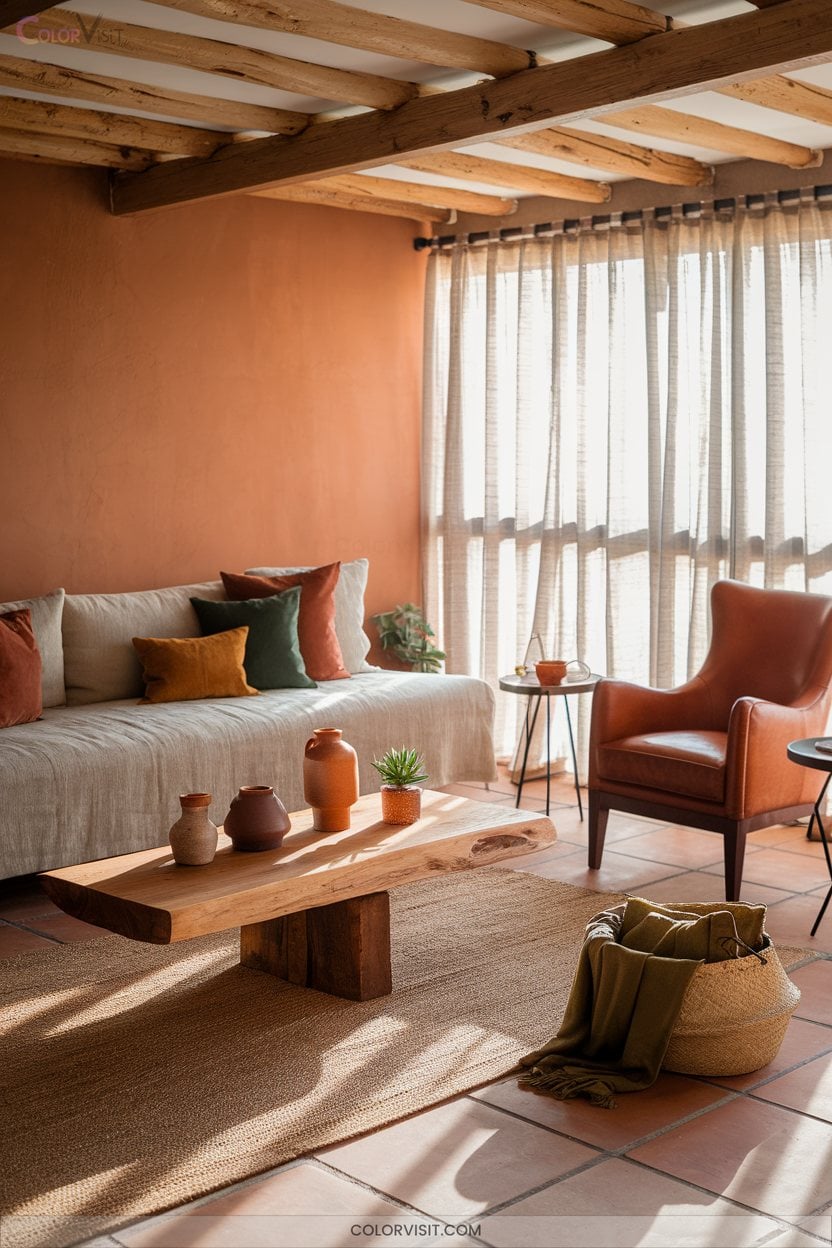
Earth tones anchor design in the organic world, drawing from clay, terracotta, ochre, and sienna to evoke natural serenity and groundedness.
Leveraging these hues, you tap into a chromatic lineage rooted in ancient pigments—ochre and sienna have adorned human habitats for millennia, symbolizing warmth and stability.
Integrate walnut, evergreen, or burnt orange with textural materials like wood, stone, and linen to reinforce tactile authenticity.
In digital contexts, curated earth tone palettes from tools like Figma or Pinterest enable adaptable, emotionally resonant interfaces.
Earth-inspired patterns and metallic accents add depth, ensuring your designs remain timeless, versatile, and culturally significant.
4. Monochromatic Elegance
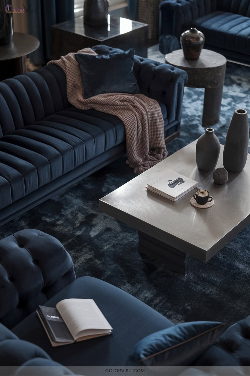
Monochromatic palettes distill visual design to its purest form by leveraging a single hue and manipulating its tints, shades, and tones to achieve both unity and depth.
You’ll discover that this approach, rooted in early 20th-century art movements, creates a cohesive and sophisticated visual identity—ideal for branding and consistent messaging.
Monochromatic design, inspired by early 20th-century art, offers unity and sophistication—perfect for building a memorable, consistent brand identity.
By adjusting luminance and saturation, you can evoke nuanced emotional responses, simplify composition, and maintain accessibility.
Digital tools like Coolors streamline palette generation, letting you experiment efficiently.
Whether you’re designing web interfaces, digital art, or interior spaces, monochromatic color schemes deliver harmony and adaptability without compromising on visual impact.
5. Navy and Cream for Professionalism
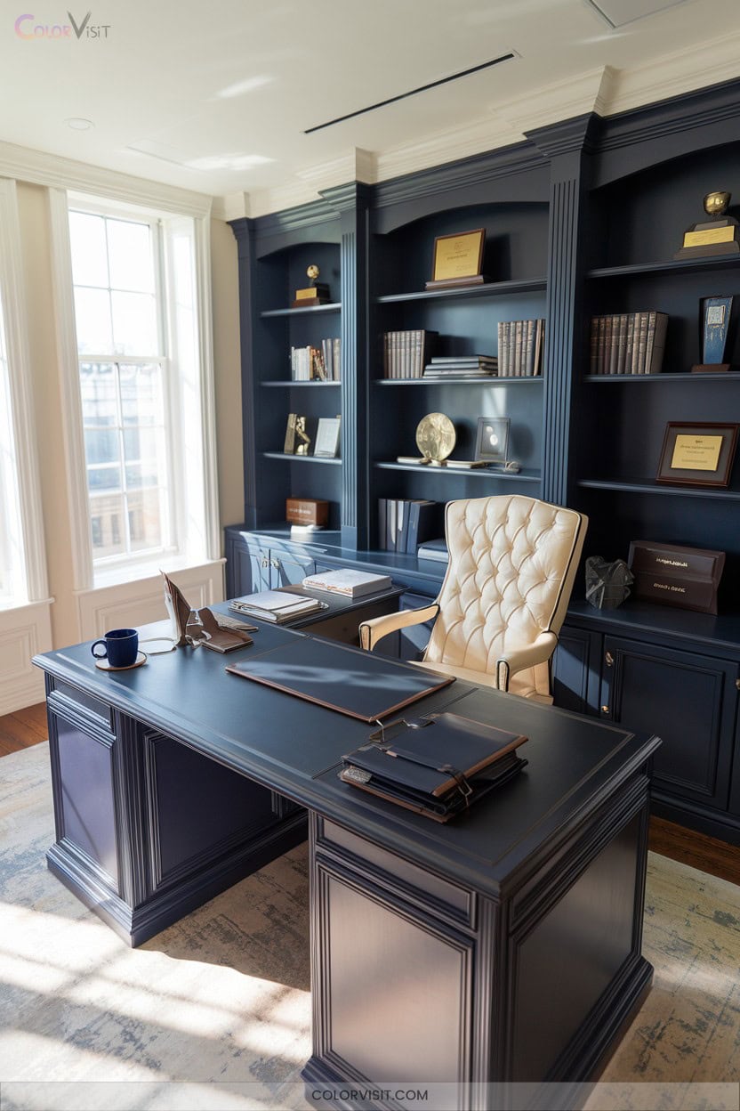
A timeless palette rooted in early 20th-century design, navy and cream commands a reputation for professionalism through precise color theory and psychological nuance.
By harnessing navy’s cool authority and cream’s inherent warmth, you achieve both visual hierarchy and harmonious balance.
Navy’s deep saturation signals trust and stability, while cream introduces approachability and comfort.
This chromatic duality excels in corporate branding, web design, and print materials, delivering clarity through contrast and guiding viewer attention.
Employ deep navy tones for dimension, integrate soft cream shades to soften rigidity, and leverage gradients for dynamic shifts—ensuring your designs remain sophisticated, flexible, and compelling across all platforms.
6. Sunny Orange and Yellow Combinations
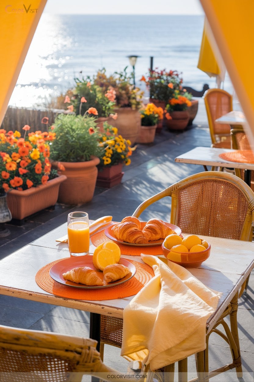
Radiant orange and yellow combinations inject dynamic energy into design, leveraging a high-chroma palette rooted in both Bauhaus experimentation and mid-century modernism.
You’ll find these hues effective in evoking positivity and creativity, making them ideal for spaces or graphics requiring vibrancy and warmth.
Technically, their high reflectivity enhances perceived brightness, especially in environments with limited natural light.
Historically, these colors symbolize optimism and ingenuity across cultures, adding nuanced depth to your palette choices.
Engage your audience emotionally with:
- Invigorating visual impact
- Uplifting mood enhancement
- Versatile shade harmonization
- Cultural symbolism of joy and creativity
- Dynamic contrast for spatial innovation
7. Amber With Complementary Accents
Amber’s intrinsic warmth and luminosity make it a strategic choice for designers seeking to energize visual compositions while maintaining emotional resonance.
Historically grounded in optimism and confidence, amber’s HEX of #FFBF00 offers versatility in both digital and print design.
To amplify its vibrancy, integrate complementary accents—navy or royal blue introduces cooling contrast, while lime or olive green injects freshness.
For a tactile, grounded effect, brown or beige can temper amber’s radiance.
When deploying amber in UI elements, always evaluate color contrast for accessibility.
Leveraging modern tools like Figma guarantees compliance with accessibility standards while sustaining innovative, visually compelling color harmony.
8. Tropical Reds and Purples
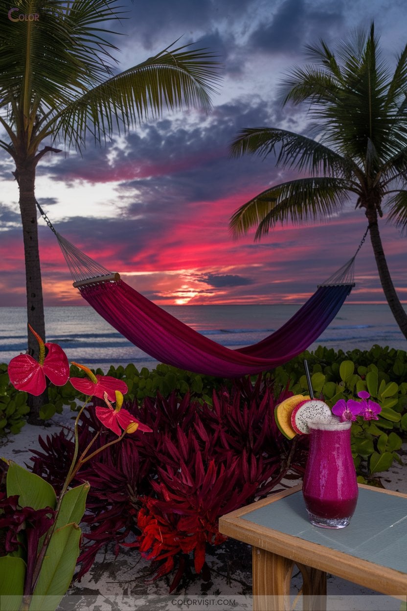
Tropical reds and purples deliver an electrifying chromatic synergy rooted in the vivid landscapes of equatorial regions.
Historically, these hues reference ceremonial textiles and botanical rarities, signaling vigor and opulence.
In contemporary design, you can harness their psychological intensity and visual dynamism for innovative results.
Utilize nuanced gradients, fruit-inspired saturation, and volcanic undertones to craft a decisive palette.
Consider the following emotional triggers:
- Lush blossoms inspire confidence and vibrancy
- Sunset gradients evoke tranquility and warmth
- Nighttime palettes introduce intrigue and sophistication
- Exotic fruit tones trigger curiosity and delight
- Volcanic reds suggest power and transformation
9. Electric Blue and Glowing Yellow
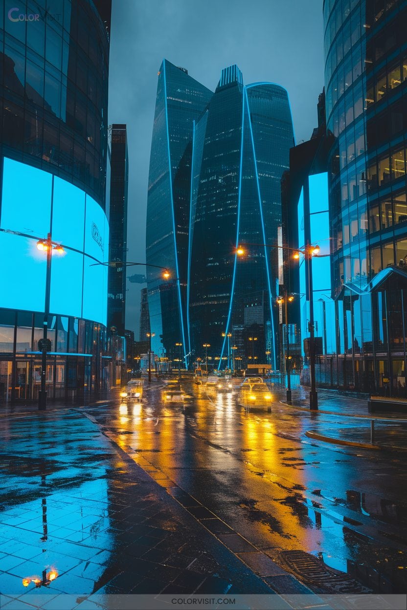
A synergy of electric blue and glowing yellow defines a contemporary approach to color palettes rooted in both scientific and cultural contexts.
You’ll find electric blue (#03A9F4) serves as a high-energy base, often associated with technological advancement and innovative branding.
Glowing yellow (#FFFF33), when used as an accent, establishes visual hierarchy and injects optimism, leveraging color psychology to maximize engagement.
Historically, this pairing channels modernity and dynamic contrast, making it ideal for digital interfaces, event design, and youth-focused products.
Enhance functionality with silver or charcoal gray to neutralize intensity, ensuring technical precision and aesthetic coherence across diverse design applications.
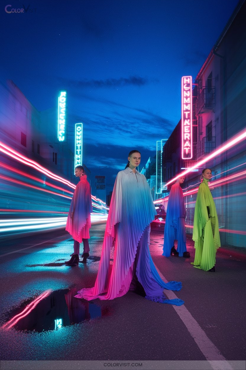
10. Neon Pops With Muted Bases
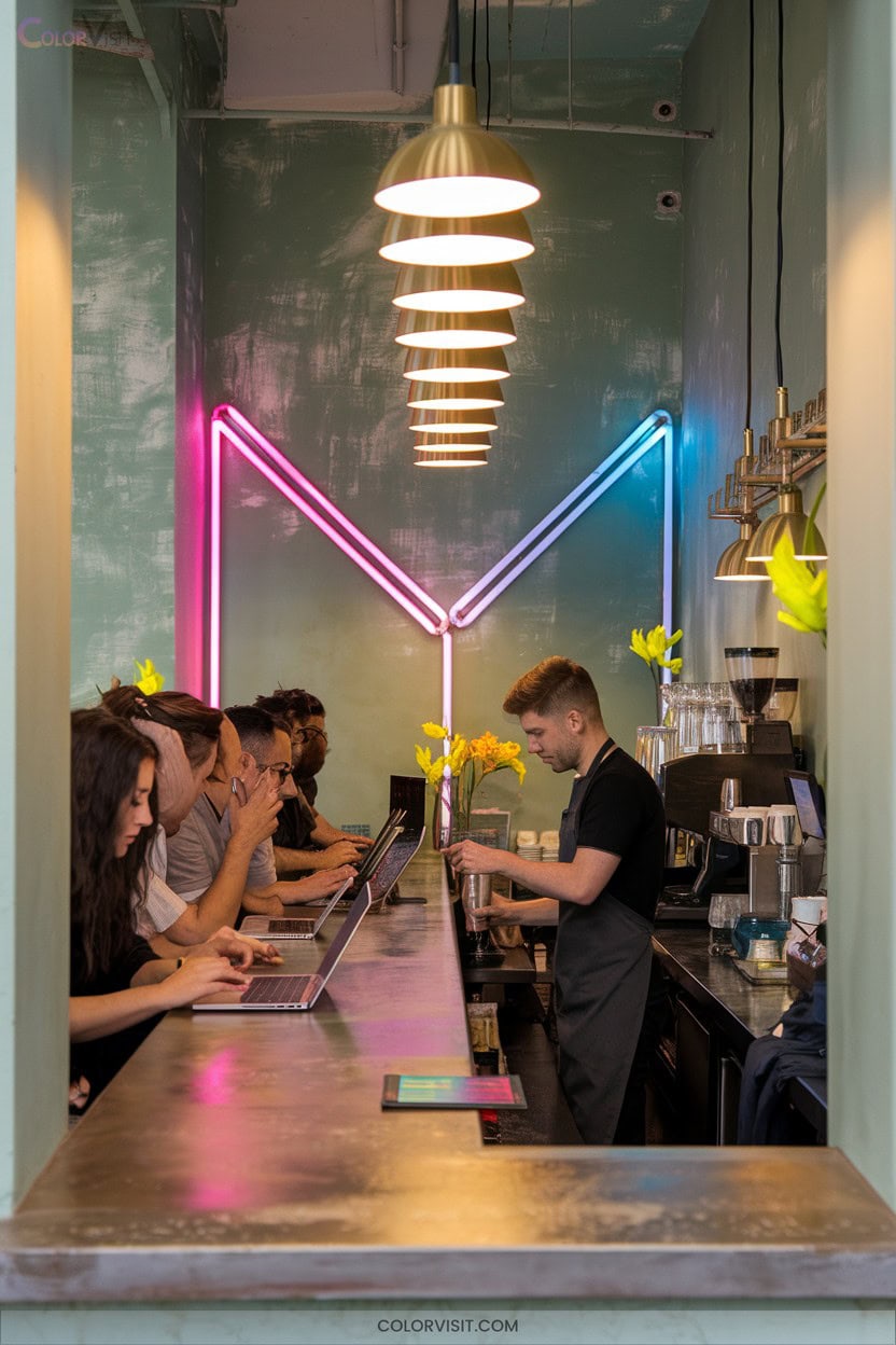
Vibrancy defines the interplay between neon pops and muted bases, a technique rooted in late-20th-century graphic design and contemporary digital aesthetics.
You’ll leverage neon’s chromatic intensity, balancing it with subdued tones to maximize legibility and visual hierarchy.
This approach channels nostalgia from vintage nightclub posters, yet feels distinctly modern in digital branding.
Muted backgrounds—grays, beiges, or soft pastels—let neon accents command attention without overwhelming users.
- Ignite excitement with electric magenta on deep blue.
- Achieve clarity using muted lilac with neon highlights.
- Evoke nostalgia through midnight palettes.
- Signal innovation with bold contrasts.
- Inspire confidence via balanced composition.
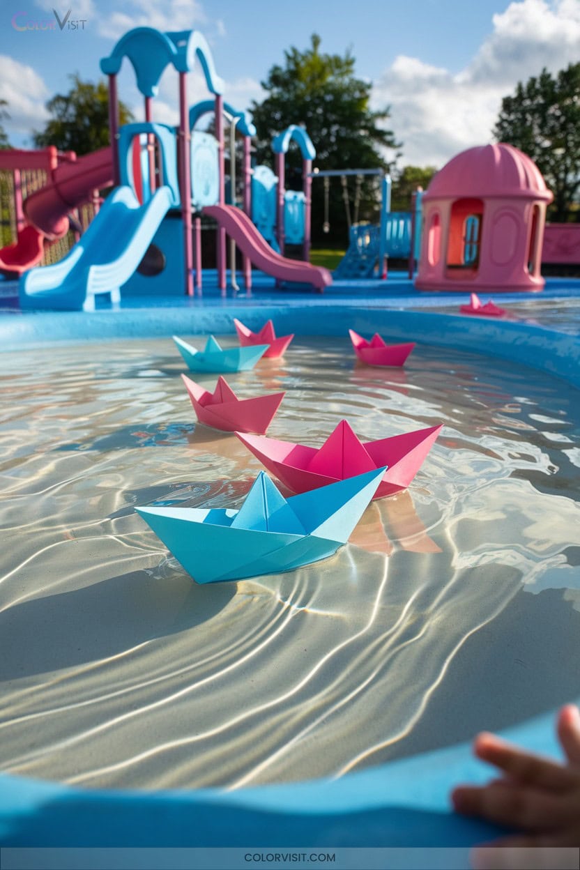
11. Playful Sky Blue, Rose, and Fuchsia Mix
Building on the energetic interplay of neon and muted tones, the palette of playful sky blue, rose, and fuchsia introduces a nuanced exploration of chromatic relationships rooted in both modern digital design and mid-century pop art.
You’ll leverage high chroma contrasts—sky blue’s tranquil energy against fuchsia’s vibrancy—while rose mediates, ensuring harmonic visual flow.
Historically, this trio echoes pop art’s defiance of convention, yet today’s digital interfaces refine it for youthful, innovative brand identities.
Integrate gradients for seamless blends or employ white and silver as stabilizing accents.
This palette maximizes emotional resonance and user engagement, ideal for experimental, visually driven projects.
12. Triadic Blue, Green, and Orange Energy
How does a triadic palette of blue, green, and orange generate such dynamic visual impact?
You leverage color theory, balancing high chromatic contrast with psychological resonance.
Historically, designers use triadic schemes for their structural harmony—blue for trust, green for growth, orange for stimulation.
Triadic palettes unite structural harmony with psychology—blue inspires trust, green signals growth, and orange sparks dynamic stimulation.
When you apply equal color ratios, digital visualization, and strategic lighting, you create vibrancy and depth.
This palette’s innovation lies in bridging calm, energy, and nature—ideal for forward-thinking brands and interactive interfaces.
- Ignite creativity with vivid contrasts
- Project reliability through blue’s stability
- Evoke freshness via green’s natural cues
- Energize audiences using orange’s vibrance
- Achieve modern, harmonious balance
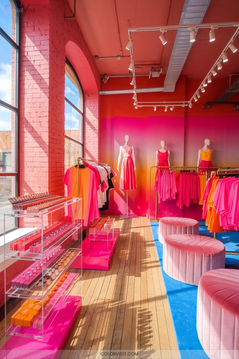
13. Bright Pinks and Oranges for Youthful Brands
Why do bright pinks and oranges dominate youthful branding in contemporary design?
These hues activate the visual cortex, eliciting immediate attention and emotional resonance—pink signals playfulness and creativity, while orange projects sociability and optimism.
Historically, such palettes emerged with youth-centric movements, leveraging color psychology to disrupt traditional branding codes.
You’ll find their dynamic contrast boosts memorability and market differentiation, especially when integrated as gradients or strategic accents.
Combine them with neutrals for balance or manipulate saturation for nuanced messaging.
This approach adapts seamlessly across digital interfaces and physical products, reinforcing a brand’s boldness, inclusivity, and relevance in evolving consumer landscapes.
14. Lime, Disco Purple, and Hot Pink Boldness
Palette synergy defines the impact of lime, disco purple, and hot pink—a trio rooted in late-1970s disco culture yet revived for contemporary design’s most energetic expressions.
Harness the psychological boldness, high-contrast vibrancy, and nostalgic edge these hues offer.
When you utilize this palette, you channel the electric glamour of disco while embracing the innovation of modern aesthetics.
Channel the electric glamour of disco and the inventive edge of modern design with this striking, high-energy color palette.
Their neon qualities and high-saturation amplify visual interest, making them invaluable for youth-centric branding, entertainment, or fashion.
- Evokes kinetic glamour and playful nostalgia
- Maximizes visual contrast for instant recognition
- Pairs flawlessly with metallic silver for sophistication
- Energizes branding with youthful vibrancy
- Embraces creative freedom and futuristic appeal
15. Pastel Primary Colors for Soft Playfulness

Softness defines the impact of pastel primary colors, which originated from the practice of adding white pigment to traditional primaries to reduce saturation and create visually soothing hues.
You’ll notice pastel palettes—such as Peach Crayola, Lemon Chiffon, and Light Blue—offer vibrant yet gentle chromatic balance, ideal for playful digital interfaces or contemporary branding.
Historically, Impressionist painters leveraged pastels for light-infused expression.
Today, you can integrate pastel hex codes like #ffc09f or #eac4d5 using RGB models in design software, ensuring accessibility and harmony.
Pastel primaries evoke modernity, sophistication, and approachability, making them indispensable for innovative, user-centered design projects.
16. Soft Gray and Muted Blue Minimalism
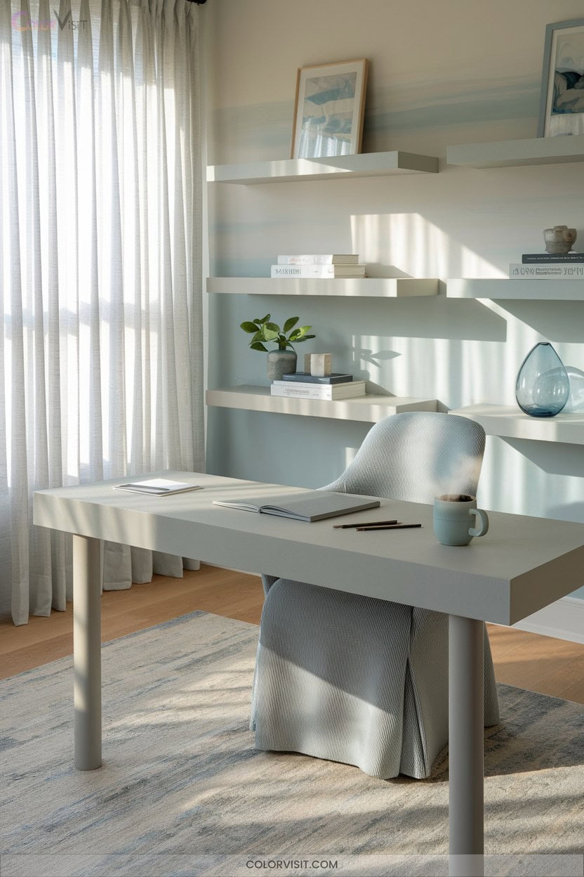
A refined blend of soft gray and muted blue exemplifies minimalist color theory, where neutral bases anchor a design, and controlled chromatic accents introduce subtle visual hierarchy.
Historically, this palette traces its roots to Bauhaus modernism, favoring utility and clarity.
Embrace its innovative versatility in tech interfaces, branding, and serene interiors by leveraging its inherent calm and adaptability.
Employ monochromatic gradations and tactile materials for dimensionality.
Integrate muted blue, sage green, and pale wood for a sophisticated, harmonious result.
- Spark innovation through serene minimalism
- Foster relaxation in high-stress spaces
- Achieve timeless brand identity
- Elevate digital product clarity
- Inspire subtle emotional resonance
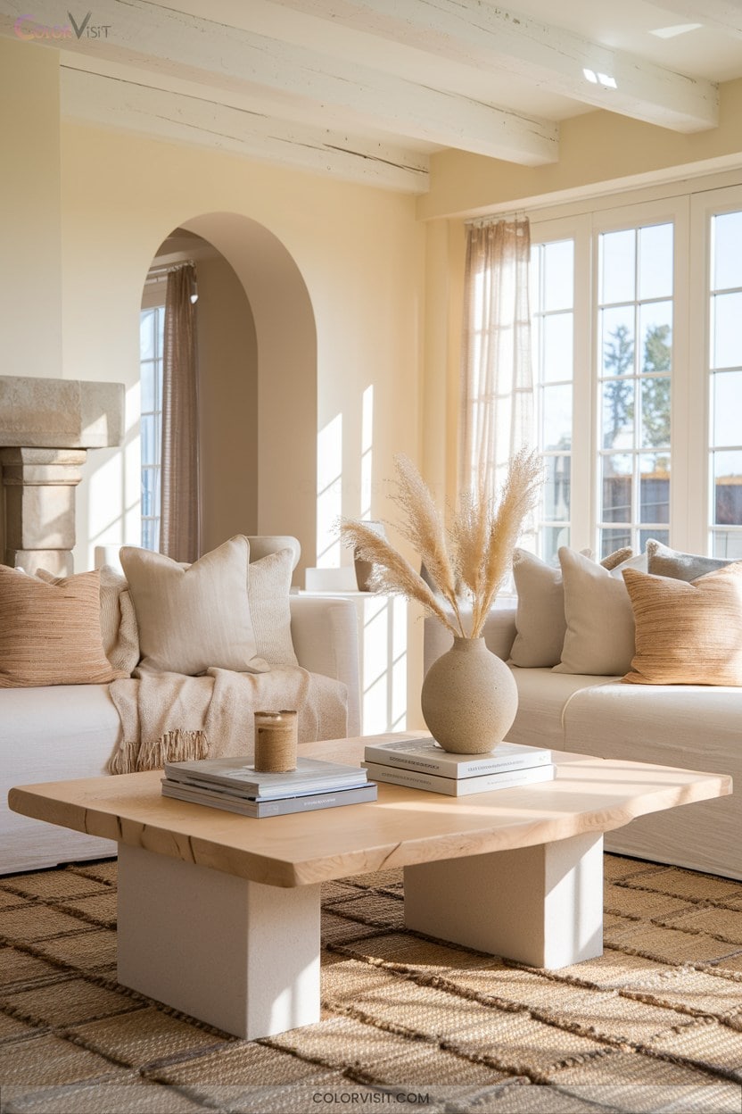
17. Warm Beige and Gentle White
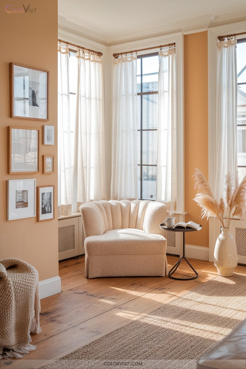
Designers consistently turn to warm beige and gentle white for their remarkable versatility and capacity to establish harmonious, balanced compositions.
Historically, these neutrals anchor both modernist and classic design movements, providing a consistent chromatic foundation across disciplines.
Beige’s flexible undertones work alongside the luminosity of white to generate a clean, minimalist aesthetic while inviting calm and warmth.
When you layer subtle beige variations—like taupe or sand—with crisp white, you introduce depth without visual clutter.
This palette’s timeless appeal supports creative freedom, ensuring compatibility with natural accents or bold contrasts, making it indispensable for innovative branding, interiors, and digital experiences.
18. Dusty Pastel Calmness
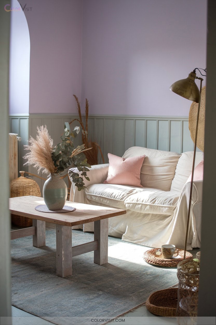
Muted sophistication defines the essence of Dusty Pastel Calmness—a palette where subdued, gray-infused hues like Silver Pink (#CEA2B1), Rhythm (#807C94), and Pewter Blue (#8EAEAF) converge to establish a tranquil, understated atmosphere.
Leveraging these chromatic elements introduces minimal visual noise, channeling serenity and balance through low-saturation tones.
Historically, dusty pastels reference vintage aesthetics, yet their adaptability suits both modern minimalism and classic elegance.
Technically, their desaturated nature reduces overstimulation, optimizing user experience and emotional response.
You’ll find these palettes indispensable for innovative design seeking timeless appeal and psychological comfort. By incorporating harmonious color palettes for living rooms, you can create spaces that foster relaxation and inspire creativity. These thoughtfully curated combinations not only elevate the aesthetic but also enhance the emotional connection to the environment. Embracing these principles allows for a seamless blend of style and comfort in any modern living space.
- Elicit gentle nostalgia
- Promote relaxation
- Cultivate harmony
- Encourage focus
- Suggest refined sophistication
19. Seasonal Palettes for Every Occasion
While dusty pastels evoke timeless calm, the strategic use of seasonal color palettes enables you to synchronize visual identity with the cyclical rhythms of nature and cultural moments.
Winter’s cool tones and metallic accents conjure sophistication rooted in centuries of solstice celebrations.
Spring’s botanical pastels and watercolor gradients reflect historical associations with renewal and growth.
Summer leverages vibrant primaries and ombré blends, recalling modernist experimentation with color theory.
Fall’s earthy tones and natural textures provide warmth and depth, echoing harvest traditions.
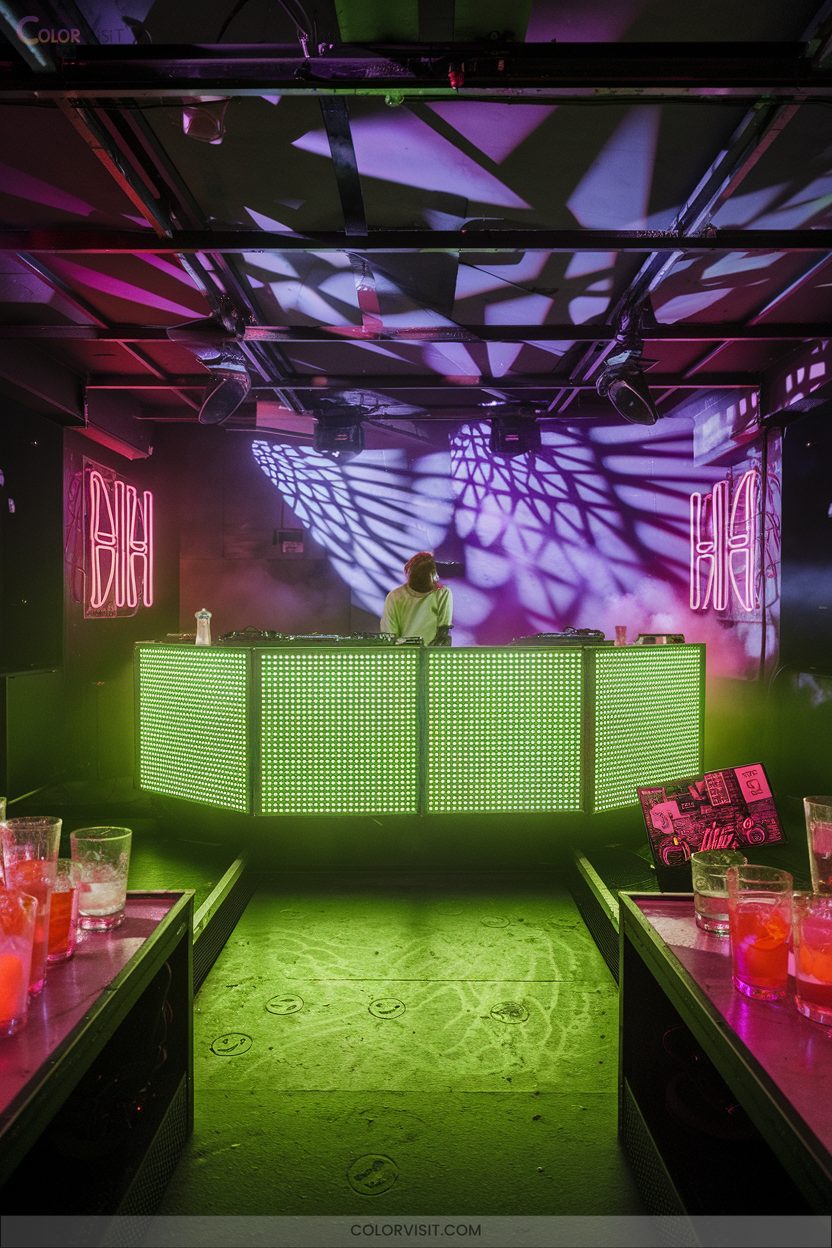
20. Trend-Driven Neon and Gradient Experiments
As digital aesthetics continue to evolve, neon and gradient color experiments have surged in popularity, reflecting a fusion of 1980s visual nostalgia and cutting-edge digital design.
You’ll find that integrating neon hues like hyper pink or neon green instantly signals innovation, energy, and a forward-thinking attitude.
Combining vibrant gradients with deep, moody backgrounds amplifies depth and modernity.
Leverage these techniques to develop immersive and emotionally engaging visual identities.
- Neon pink evokes youthful exuberance
- Gradient blends add dimensionality
- Deep backgrounds intensify neon impact
- Neon green provides rebellious accents
- Layered gradients deliver textured, futuristic depth
Frequently Asked Questions
How Do I Choose a Palette for Accessibility and Color Blindness?
You should analyze color contrast ratios per WCAG standards, leverage automated accessibility tools, and avoid red-green pairings. Prioritize complementary hues and test your palette for various impairments, ensuring innovative, historically informed, and inclusive visual communication aligns with evolving accessibility requirements.
What Tools Help Generate Cohesive Color Palettes Quickly?
Did you know 65% of designers use automated tools for palette creation? You’ll leverage advanced algorithms in platforms like Adobe Color and Coolors, harnessing color theory principles and real-time previews to generate harmonious palettes in seconds, driving innovative workflows.
How Can I Test a Palette Across Different Screen Types?
To test a palette across different screen types, you should employ device labs, simulate color profiles, and calibrate displays. Historically, cross-platform color accuracy drove innovations like ICC profiles, pushing designers to prioritize consistent, accessible visual experiences.
What’S the Best Way to Incorporate Brand Colors Into a New Palette?
Don’t worry about losing your brand’s essence—when you integrate brand colors, anchor them as primaries, then use analogous or complementary hues for accents. Historically, this method balances recognition with innovation, ensuring your palette evolves without sacrificing identity.
How Many Colors Should an Effective Palette Typically Include?
You should typically include 3 to 5 colors in an effective palette, leveraging color theory for cohesion. Historically, minimalist palettes enhanced recognition, but innovative brands often expand beyond five, balancing complexity with harmony for adaptive, future-focused applications. In addition, considering the psychological impacts of colors can further enhance the effectiveness of the palette. Artists can explore creative drawing ideas for artists by experimenting with various shades and tones within their selections. This exploration not only fosters artistic expression but also allows for a deeper connection with the intended audience.
Conclusion
Think of color palettes as the navigational stars of your design voyage. Just as ancient mariners relied on constellations for direction, you’ll use these versatile palettes—rooted in classic theory, enriched by technological advances, and shaped by evolving trends—to chart your course.
Whether you anchor in the timeless harbor of neutrals or ride the waves of innovation with neons, every hue is a beacon. Trust your palette; let it guide your project safely to its creative destination.