20 Creative Drawing Ideas With Color for Artists of All Levels
Unleash your creativity by drawing vibrant fruit studies, bunches of grapes, or whimsical nature scenes that let you experiment with color layering and harmony. Try monochromatic sketches to refine pressure control, or design abstract color wheels for palette mastery.
Crushed beverage cans, juicy citrus slices, vintage glass, and shiny mechanical parts challenge your observation and technique with gradients, texture, and shine. Every subject is an opportunity to sharpen your color skills—explore these techniques to expand your artistic range further.

1. Fruit Studies for Vibrant Layering
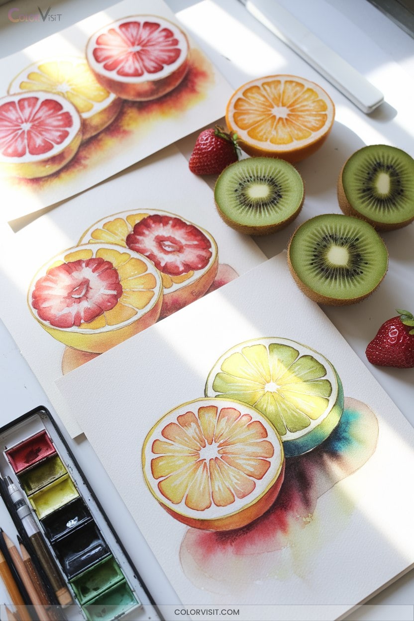
Fruit studies offer an ideal canvas for exploring vibrant color layering and dynamic artistic techniques.
Begin by applying color theory—use yellow, magenta, and cyan to mix luminous fruit shades.
Layer gouache to build striking contrasts between highlights and shadows, intensifying realism and depth.
Capture texture by carefully mimicking the skin’s surface, drawing inspiration from nature’s marvels like the marble berry’s pointillist effect.
Balance colors and textures for harmonious compositions; let each element support the overall vibrancy.
Stay innovative—experiment with saturation, play with color harmony, and push the expressive potential of your palette.
Approach each study as a fresh opportunity for creative breakthroughs.
2. Exploring Grapes in a Bunch
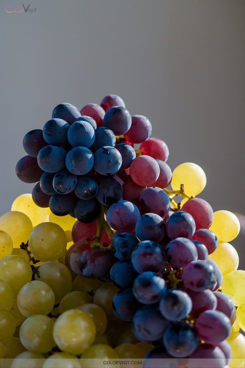
How can you capture the enchanting form and subtle complexity of a grape bunch?
Start by sketching guide lines to outline the bunch’s classic silhouette—wider in the middle, tapered at the ends.
Overlap grapes using varied shapes and sizes for authenticity; arrange front grapes fully visible, with others partially hidden to build depth.
Layer colored pencils on toned paper, selecting greens or purples to reflect realistic varieties.
Use light and shadow for dimensionality, emphasizing texture with careful shading.
Don’t hesitate to stylize or experiment with angles and negative space.
Include leaves and stems to unify your innovative composition.
3. Whimsical Nature Scenes With Color Play
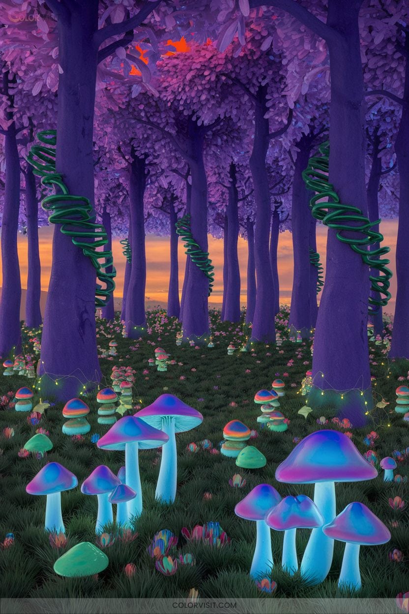
Color transforms ordinary landscapes into whimsical nature scenes brimming with imagination.
Color can turn everyday scenery into enchanting, imaginative worlds filled with whimsy and creative wonder.
Start by blending Dioxazine Purple, Sap Green, and Payne’s Grey for enchanting nighttime folk-art settings.
Use analogous color schemes—think blue to purple to green—for seamless atmospheric backgrounds.
Accent key elements with bright yellows like Diarylide to draw the eye.
Layer your washes, moving from light to dark, to evoke shifting light.
Experiment with texture using salt or plastic wrap, and add 3D interest through collage.
Metallic pens can highlight magical features.
4. Monochromatic Sketches for Pressure Control
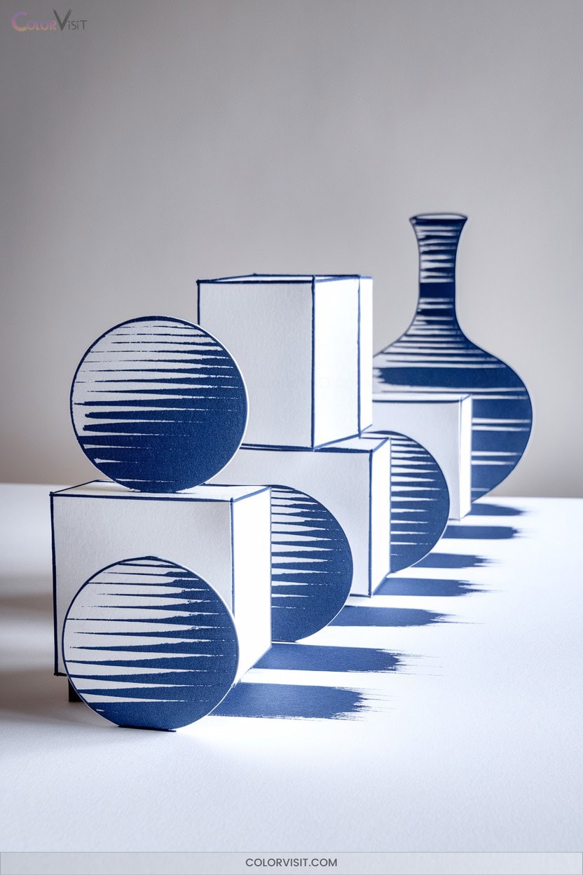
Mastering pressure control in monochromatic sketches reveals a surprising range of depth and form, even when you’re working with just a single hue.
By adjusting the pressure of your tool, you can manipulate value and texture, turning a simple color into a dynamic visual language.
To innovate with monochrome, try the following:
- Start with light, even strokes to create a subtle base layer—this preserves surface texture and allows for gradual buildup.
- Use increased pressure for focal accents, carving out bold, dimensional shapes.
- Experiment with layered applications, alternating pressure to generate smooth gradients and complex tonal shifts.
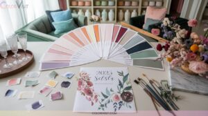
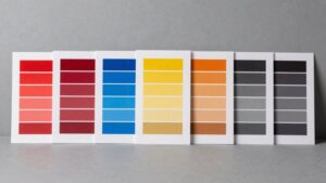
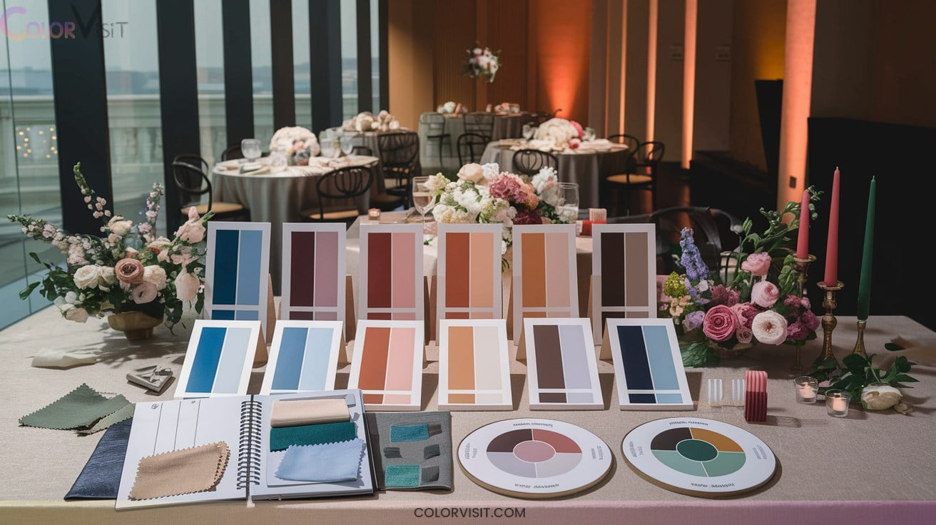
5. Abstract Color Wheels for Harmonious Palettes
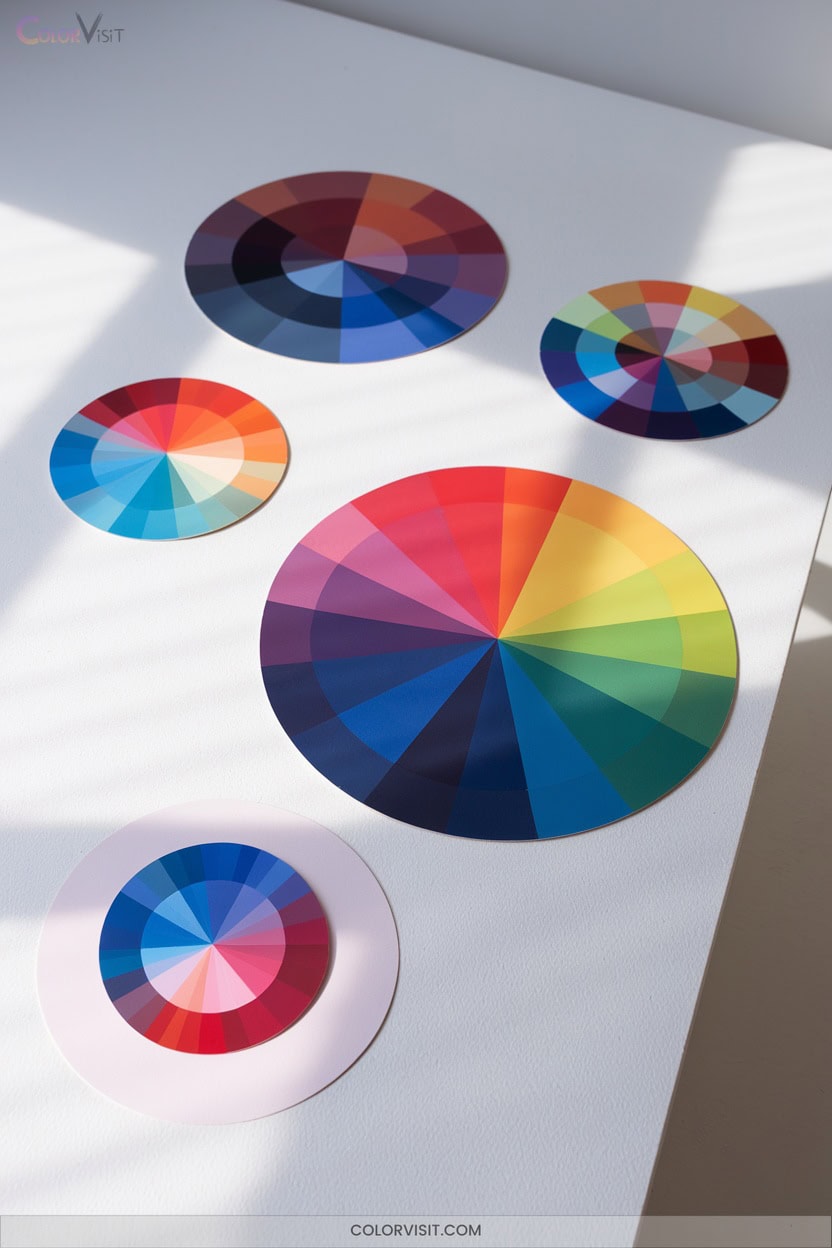
When you build an abstract color wheel, you reveal a practical framework for designing harmonious palettes that elevate your artwork.
Start by exploring analogous colors for serene harmony, then add complementary colors to introduce dynamic contrast.
Use neutrals—grays or whites—to balance bold hues and create resting points for the eye.
Experiment with monochromatic schemes by adjusting saturation and lightness to evoke emotion and depth.
Gradually blend colors for fluid gradations that guide the viewer.
Continuously evaluate your palette, making subtle adjustments for unity.
Leverage digital tools or physical models to innovate and refine your abstract color choices with confidence.
6. Still Life With Glass and Translucency
A single glass bottle on your studio table becomes a masterclass in observation and technique.
Glass demands careful attention to transparency, refraction, and light.
Begin by blocking in the background first—this establishes tonal contrast essential for defining the bottle’s contours.
Use acrylic glazes or watercolor washes for subtle gradations, and reserve titanium white for crisp highlights.
For maximum innovation and clarity, try:
- Layering phthalo blue and raw umber to build cool undertones.
- Mapping elliptical shapes with graphite for structural accuracy.
- Blending cast shadows and reflections with pastel sticks for atmospheric depth.
Let experimentation elevate your still life mastery.
7. Bird Illustrations With Lively Plumage

Vivid plumage transforms bird illustrations into dynamic showcases of color and texture, inviting viewers to appreciate each feather’s unique form.
Focus on accurate anatomy—observe beak shape, nostril placement, and the intricate structures of legs and feet.
Layer colored pencils or Copic markers to create rich depth and subtle gradations, then introduce texture through cross-hatching or stippling.
Capture iridescence by balancing highlights and shadows, paying close attention to your light source.
Use reference photos to master authentic patterns and hues.
Strategically include natural elements or negative space to emphasize movement and mood.
Push boundaries—let color innovation define your next avian masterpiece.
8. Rendering Metallic Surfaces With Color
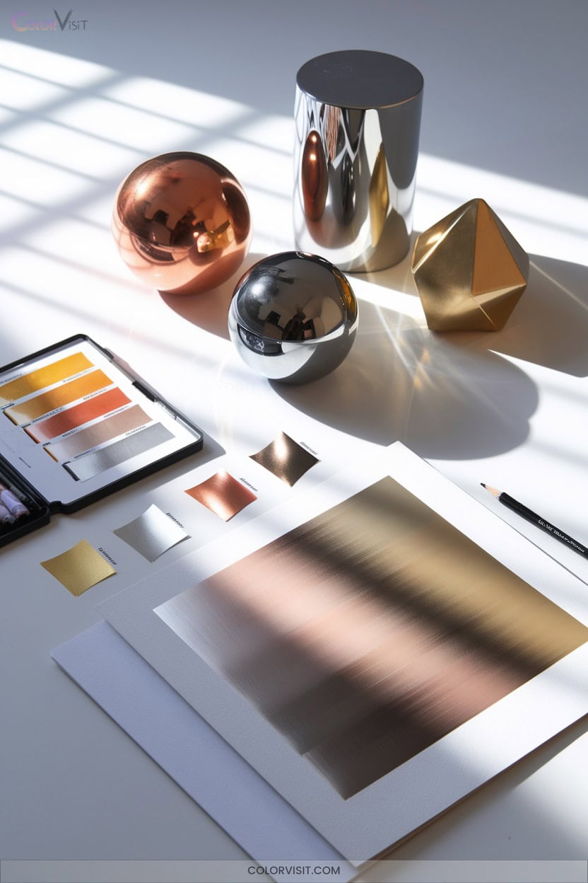
Mastering the vibrant intricacies of bird feathers lays a strong foundation for tackling the reflective world of metallic surfaces.
To render metals convincingly, you’ll need to balance contrast, color selection, and texture.
Achieving realistic metal effects requires skillfully blending contrast, thoughtful color choices, and carefully observed texture.
Use references to observe how light interacts with each metal’s unique properties.
For innovative results, focus on these essentials:
- Contrast Management: Push highlights and shadows distinctly, especially for chrome or steel, but avoid pure white on gold.
- Layering Colors: Build depth with grayscale underlays, then glaze metallic hues for realistic reflections.
- Anisotropic Techniques: Capture directional reflections in polished metals for dynamic, cutting-edge results.
9. Realistic Water Droplets in Colored Pencil
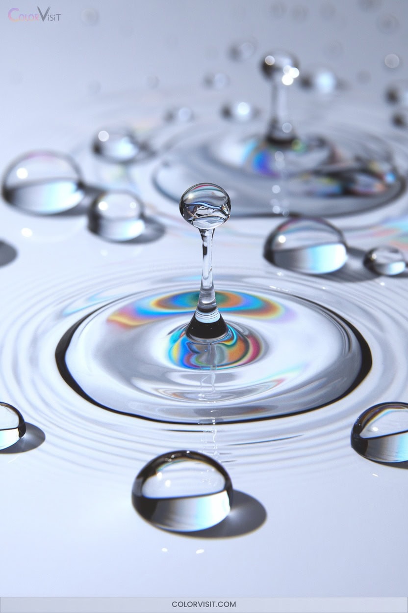
Capture the illusion of glistening water droplets by focusing on careful observation and deliberate layering with colored pencils.
Begin by sketching circles of various sizes on gray-toned paper—this boosts contrast and realistic reflections.
Shade the shadowed side with deep blues or grays, then layer lighter tones where light hits, blending gradations smoothly with a stump.
Place crisp white highlights with a gel pen for instant sparkle.
Study real droplets to accurately position shadows and reflections.
Avoid flatness by mixing colors and softening edges.
Experiment with background tones and subtle reflections to innovate.
Precision and patience will elevate your droplets’ realism.
10. Capturing Fabric Textures and Folds
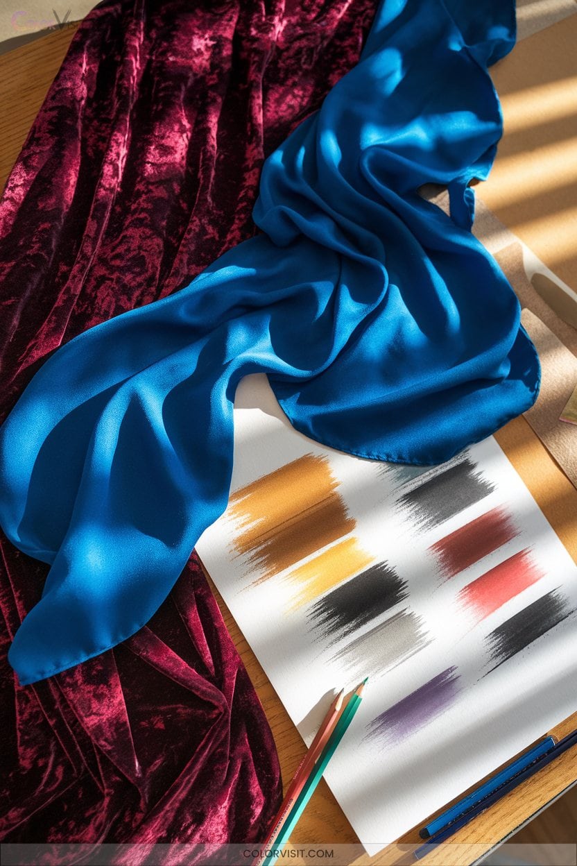
A nuanced understanding of fabric textures and folds transforms ordinary drawings into studies of tactile realism.
To capture these complexities, harness technical approaches that elevate your artwork:
- Use cross-hatching and stippling to build up tactile surfaces—cross-hatch for woven textiles, stipple for wool or sequins.
- Define folds by varying pencil grades (HB–6B), preserving highlights with a kneaded eraser for sheens like silk, and using directional shading to follow fabric tension.
- Enhance realism with color: layer indigo for denim, blend cool blues in silk’s shadows, and render lace with negative space.
Push boundaries—let each stroke innovate texture.
11. Photorealistic Marbles and Optical Effects
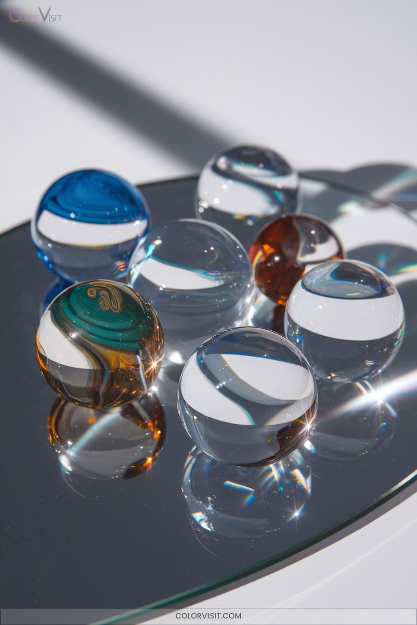
Once you’ve explored the tactile intricacies of fabric, turn your attention to the polished brilliance of marbles—objects that challenge your understanding of light, color, and form.
Begin with a precise graphite outline; symmetry is essential. Layer colored pencils with patience, blending for seamless color gradation and simulating transparency. Reference images help you capture authentic reflections, internal bubbles, and veins.
Start with a symmetrical graphite outline, then layer and blend colored pencils to reveal marbles’ luminous transparency and intricate reflections.
Use white charcoal or pastel to place crisp highlights, mimicking the marble’s signature shine. Balance values for convincing depth, and employ erasers or blending tools for soft gradations.
With careful observation and technique, your marbles will radiate optical realism and innovation.
12. Drawing Squished Aluminum Cans
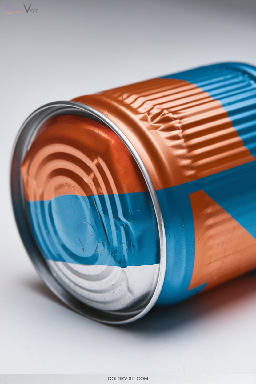
Few drawing exercises sharpen your observational skills like rendering a squished aluminum can.
To innovate, approach this subject with both technical precision and creative flair.
Begin by setting up a real crushed can under strong directional lighting—this emphasizes sharp creases, subtle folds, and metallic reflections.
Break the form into basic geometric shapes to map proportions accurately, then explore dynamic perspectives for visual interest.
Here’s how to maximize impact:
- Use colored pencils to layer cool blues in shadows and warm whites in highlights.
- Distort logos and text along curved surfaces for realism.
- Add final white gel pen accents for crisp metallic shine.
13. Animal Fur Studies With Layered Undertones
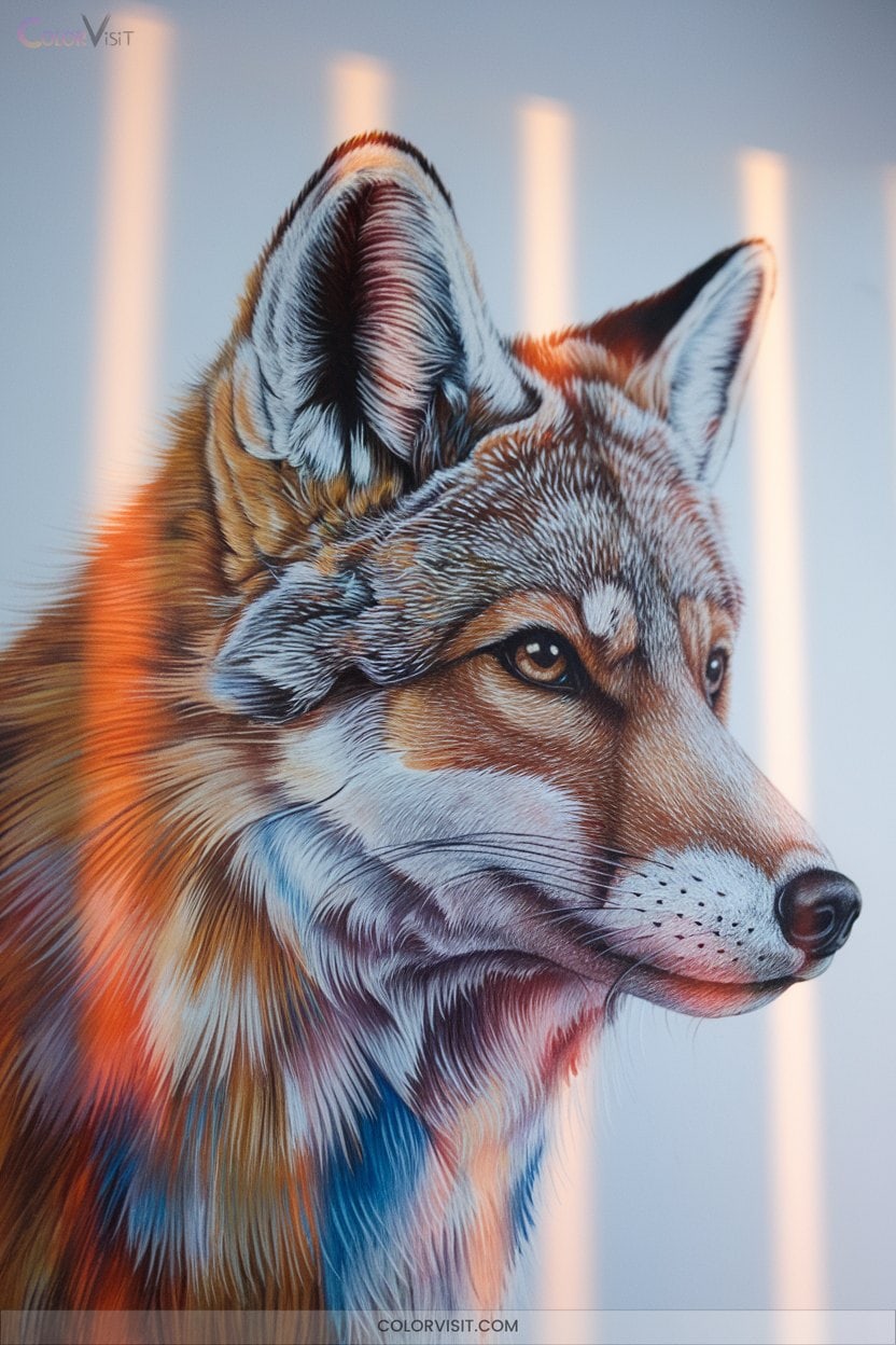
Mastering animal fur studies demands close observation and thoughtful layering of color to achieve convincing texture and depth. Start with high-quality reference photos and sketch the direction and length of hairs using light, dark undertones.
Use short, consistent strokes for short fur and longer lines for long fur, varying your pressure and color choices to mimic natural variation. Layer lighter colors over darker bases, building depth gradually.
Vary pressure and color in your strokes—short for short fur, long for longer coats—to create lifelike fur texture and depth.
Add stray hairs and shift shadow density to enhance realism. Experiment with mixed media—pastel pencils, digital brushes, or soft pastels—to innovate with texture.
Precision and patience will bring fur to vibrant, lifelike results.
14. Building Portrait Skin Tones With Color
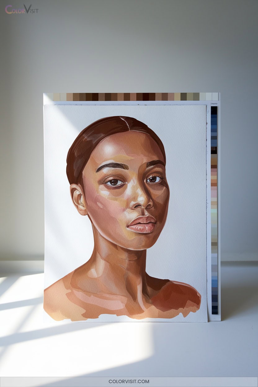
Achieving luminous, lifelike skin tones in portrait drawing requires more than simply mixing a “flesh” color—it’s about understanding how light, color, and layering interact on the surface of the skin.
Start by blocking in foundational tones using titanium white, burnt sienna, and organic red orange, then gradually layer to build depth.
Remember, innovation comes from observation and subtle adjustments.
Use the Zorn palette for versatility and experiment with color temperature shifts in shadows.
For technical precision:
- Gauge tones against white paper.
- Map facial zones for nuanced color.
- Adjust value and hue according to lighting conditions.
15. Floral Close-Ups and Translucent Petals
How can you capture the delicate translucency of a petal in your drawing?
Start by observing real petals—use magnifying tools or macro photos to study veins and gradients.
Observe actual petals up close, using magnifiers or macro images, to truly understand the intricate veins and subtle gradients.
Map how light passes through with tracing paper overlays, noting vibrant versus muted hues in hydrated and dried petals.
For realism, layer 3-5 watercolor glazes or use dry-brush acrylics with retarders for waxy effects.
On black paper, oil pastels offer dramatic contrast.
Underpaint with cool tones to boost vibrancy, then glaze transparent oxides for velvet textures.
Experiment with digital overlays at low opacity for innovation.
Always analyze petal structure, lighting, and density.
16. Weather-Worn Objects and Surface Narratives
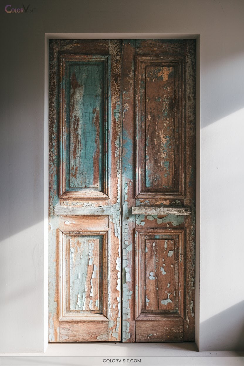
After exploring the softness and translucency of petals, turn your attention to the rugged beauty of weather-worn objects.
Now’s your chance to capture the compelling stories etched into surfaces by time and the elements.
Observe how rain, snow, and sun alter materials—each mark becomes a narrative.
To push your technical skills further, focus on:
- Texture mastery: Layer brushstrokes and experiment with blending to depict rust, frost, or fading paint.
- Surface storytelling: Use reflections, shadows, and color shifts to hint at weather history.
- Atmospheric context: Incorporate mist, clouds, or lighting for a sense of place and mood.
17. Crushed Beverage Cans as Colorful Subjects
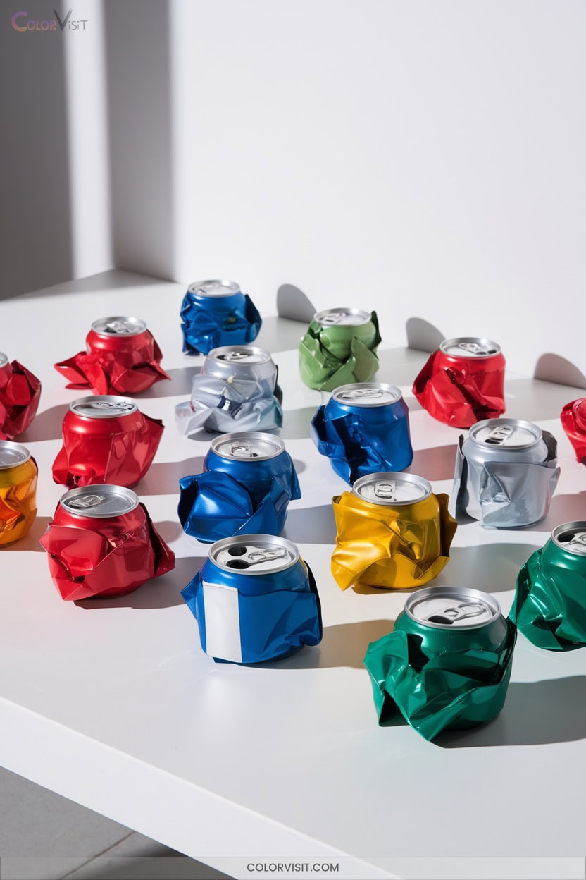
Why not let crushed beverage cans redefine your approach to color and form?
Their vibrant branding, dynamic reflections, and metallic sheens offer a palette that’s both bold and nuanced.
Study the interplay of gradients, logos, and text fragments—they provide narrative layers and rhythmic patterns.
Incorporate crushed cans into mixed media, collage, or three-dimensional works to explore kinetic shimmer and textural contrast.
Always plan for safety: clean, flatten, and handle aluminum carefully.
Use adhesives suited for metal when combining materials.
18. Cut Citrus Slices and Juicy Textures
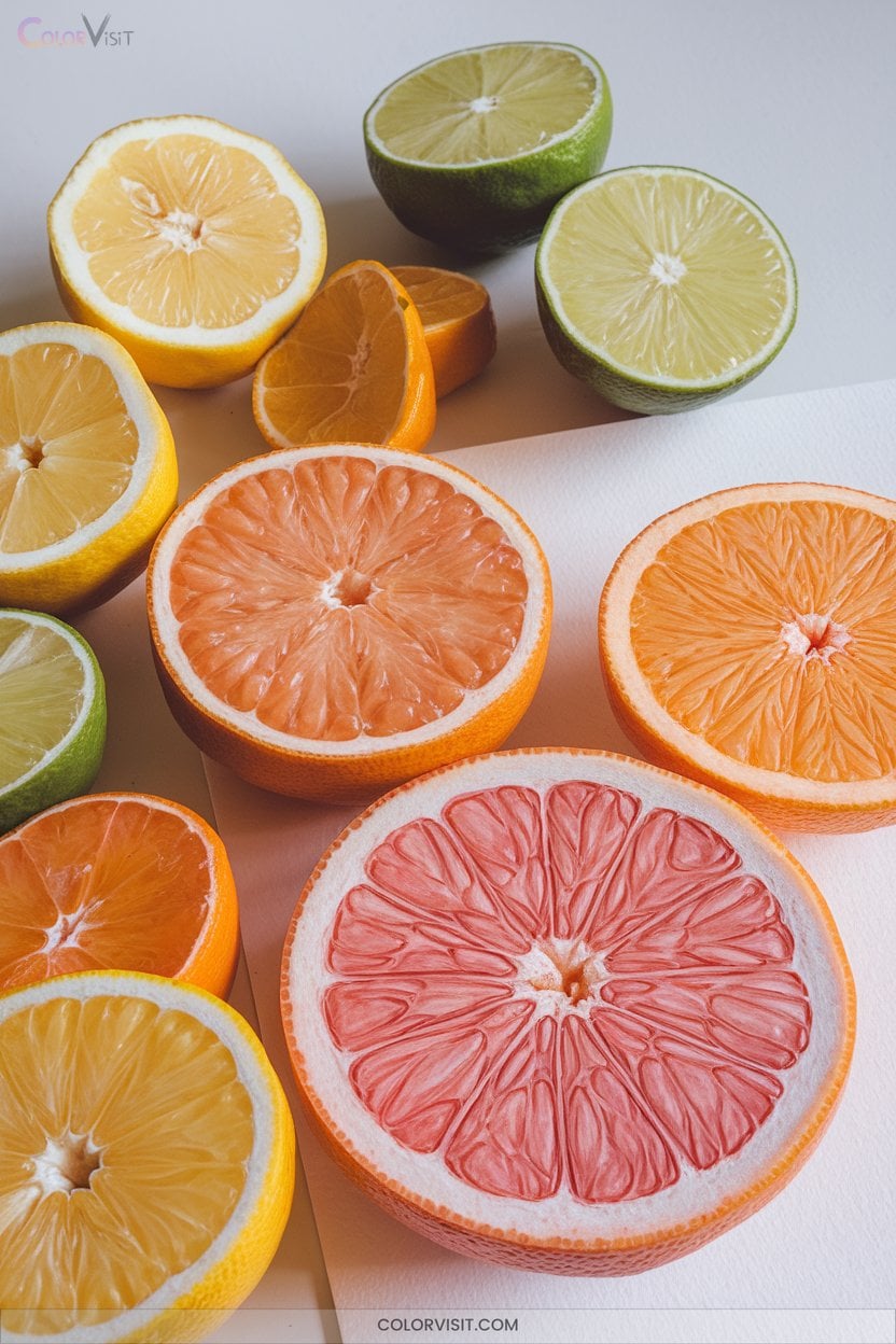
Illuminate your sketchbook with the vibrant energy of cut citrus slices—few subjects offer such a dynamic interplay of color, texture, and form.
Harness bold yellows, oranges, and greens, and experiment with layering to render juicy pulp and translucent flesh.
For inventive results, try these approaches:
- Arrange slices in geometric patterns, maximizing visual rhythm and repetition.
- Use oil pastels or liquid watercolors to blend and capture subtle gradients between rind and pulp.
- Highlight juice droplets and seeds with crisp highlights for heightened realism.
Observe real fruit closely, and let innovative mark-making techniques push your citrus drawings beyond traditional still life.
19. Vintage Glass Bottles and Aged Details
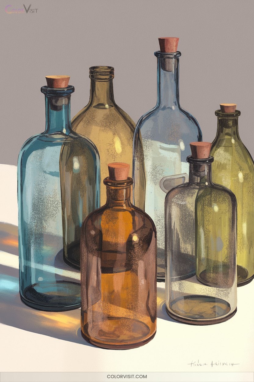
Once you’ve explored the lively colors and textures of citrus, shift your focus to the subtle elegance of vintage glass bottles.
Capture their historical character by studying shape variations—rectangular, cylindrical, or rounded—and select hues like green, blue, or amber to reflect their era.
Highlight decorative embossing and base marks with precise line work.
Don’t shy away from aging: use layered washes and texture brushes to evoke corrosion, crazing, and residue.
Subtle shading and dramatic lighting will reveal the glass’s transparency and patina.
Integrate these bottles into still life drawings to add depth, contrast, and a sense of timeless innovation.
20. Mechanical Parts With Matte and Shine Contrasts

Mechanical parts offer a unique challenge and reward for artists aiming to master contrasts between matte and shiny surfaces.
To innovate with color, explore metallic hues like silver, gold, and copper for reflective sections, while using deeper, muted shades for matte finishes.
Use lighting and texture strategically to elevate realism and drama.
Try this approach:
- Experiment with metallic paints to capture shine; highlight with crisp, white accents for maximum effect.
- Layer and blend matte shades for depth and tactile contrast.
- Use reference photos of engine parts or industrial design to inform your light sources and textures.
Frequently Asked Questions
Which Colored Pencil Brands Are Best for Blending and Layering Effects?
You’ll achieve exceptional blending and layering with Caran d’Ache Luminance, Derwent Lightfast, Faber-Castell Polychromos, and Prismacolor Premier. Their soft cores, rich pigmentation, and durability let you innovate boldly—don’t hesitate to experiment with unique color gradations.
How Can I Prevent Wax Bloom When Using Colored Pencils?
Ever wonder why your colored pencil art looks hazy over time? You can prevent wax bloom by layering lightly, choosing oil-based pencils, using high-quality paper, and sealing finished work with a fixative—don’t let wax dull your innovation!
What Paper Types Work Best for Colored Pencil Techniques?
You should experiment with Stonehenge, Canson Mi-Teintes, or smooth Bristol for colored pencil work. Each paper offers unique textures—test them to discover which supports your layering, blending, and innovative techniques for vibrant, lasting results.
How Do I Fix Mistakes or Lighten Areas in Colored Pencil Drawings?
When you accidentally turn a whisper of color into a thunderclap, don’t panic—grab an electric eraser for precision, use tape for gentle lifting, or layer inventive hues. You’re not just fixing mistakes; you’re inventing new possibilities!
Are There Tips for Organizing and Storing Colored Pencils Efficiently?
You’ll optimize your workflow by sorting colored pencils by color, brand, or project. Use labeled containers, vertical or rotating storage, and display cases. Don’t forget to leave space for current projects and keep everything easily accessible.
Conclusion
Think of your sketchbook as a garden, each drawing idea a unique seed you’ve planted. With every colorful stroke, you nurture growth—sometimes it’s a simple sprout, other times a rare blossom.
Don’t fear imperfect leaves or tangled vines; they’re proof you’re cultivating your artistic landscape. Keep exploring these creative ideas and tending your craft. Over time, your garden will flourish, reflecting both your technical skill and the vibrant spirit you bring to every page.