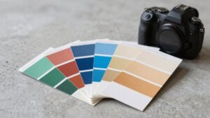
17 Sophisticated Drawing Room Color Ideas for an Elegant Home
Transform your drawing room with crisp white, airy ivory, and serene off-whites, then layer greige, taupe, or linen for tactile depth. Go bold with charcoal, Blue Muscari, or turquoise accents for contemporary clarity.
Infuse organic sophistication using warm wood, sage green, and earthy tones, while metallic golds or brass add modern opulence. Highlight with burnt orange, cognac, or lilac for statement warmth. Discover how each of these 17 palettes achieves timeless elegance and visual allure next.

1. White and Ivory Serenity
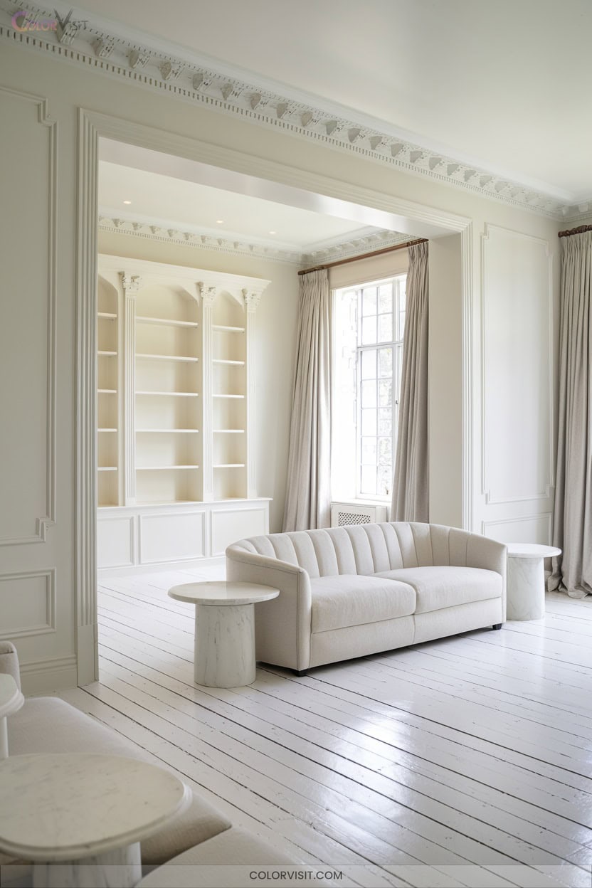
Serenity defines a white and ivory drawing room, where clean lines and subtle warmth create an expansive, inviting atmosphere.
You’ll leverage the versatility of white for spatial clarity, while layering ivory introduces tactile softness and nuanced depth.
Minimalist aesthetics benefit from these hues, emphasizing elegant restraint and contemporary luminosity.
Incorporate plush textiles, woven rugs, and sleek surfaces to amplify dimensionality.
Accent with black or metallic elements for modern sophistication, and ground the palette with organic materials.
Strategic lighting—natural and ambient—will enhance reflectivity and create sculptural focal points.
Add curated art and botanicals for a personalized, innovative visual statement.
2. Greige and Taupe Depth
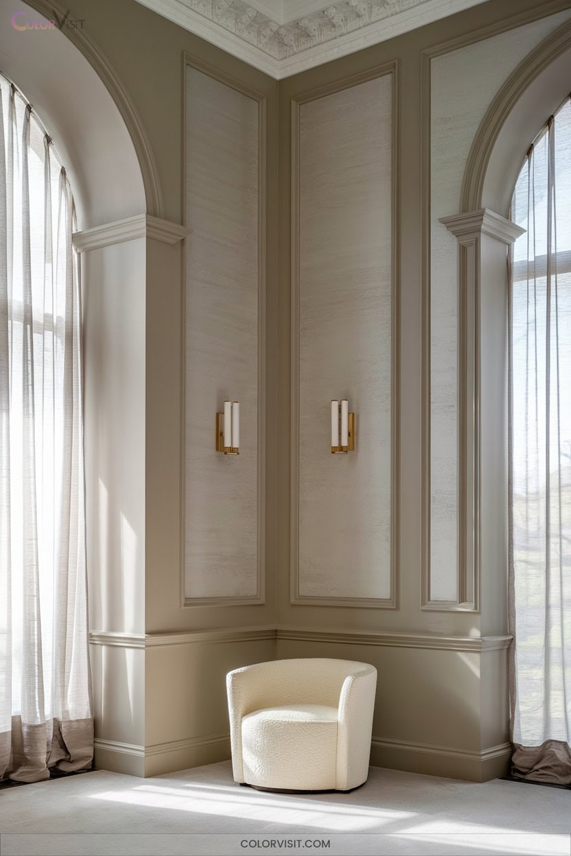
For those seeking more dimension than white and ivory offer, greige and taupe introduce nuanced warmth and depth to your drawing room.
These contemporary neutrals blend gray’s sophistication with beige’s inviting undertones, creating a balanced palette that’s both current and enduring.
Greige and taupe unite gray’s elegance with beige’s warmth, offering a timeless palette that feels fresh yet classic.
Leverage greige’s broad spectrum—think Benjamin Moore Pale Oak for light-infused subtlety or Sand Dune for wood-accented richness.
Taupe’s deeper tones, such as Sherwin Williams Modern Gray, ground the space elegantly.
Pair with tactile textures, sculptural wood furniture, and biophilic accents for a layered, innovative ambiance.
Warm lighting amplifies the effect, ensuring your drawing room feels refined and dynamic.
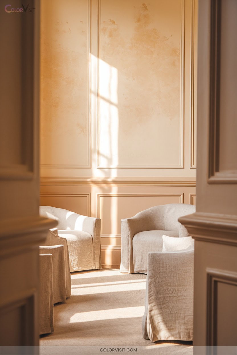
3. Off-White and Beige Calm

Invite tranquility into your drawing room with a foundation of off-white and beige, hues prized for their calming influence and sophisticated adaptability. To enhance the serene atmosphere, consider incorporating soft textiles in gentle pastel shades, adding layers of comfort and warmth. Complement these neutrals with natural wooden elements or subtle metallic accents, which can elevate the space while maintaining its peaceful essence. These choices reflect some of the best cozy sitting room color schemes, creating an inviting environment perfect for relaxation and conversation.
By layering soft off-white walls with light beige, you’ll amplify natural light, creating a spacious, luminous atmosphere.
Integrate tactile elements—jute rugs, sculptural lamps, pale oak accents—to infuse warmth and organic texture.
Subtle contrasts, like black window frames or slate gray accessories, introduce modernity without sacrificing serenity.
For a curated edge, add deep blue or burnt orange accents; these enrich the neutral base with visual intrigue.
Embrace this palette for a refined aesthetic that balances innovation and timeless comfort.
4. Cream and Linen Harmony
A duo as timeless as it’s chic, cream and linen form the backbone of an effortlessly harmonious drawing room.
Start with a cream sofa as your anchor, then layer in linen-upholstered chairs and ottomans for tactile depth.
Elevate the scheme with airy cotton throws, wool rugs, and natural wood accents—each amplifies the serene, organic vibe.
Integrate subtle earth tones, like muted greens or beiges, through cushions or sculptural vases to enhance the palette’s sophistication.
Opt for soft, diffused lighting via linen-shaded lamps and dimmers; this will accentuate the interplay of textures, ensuring a future-forward yet tranquil aesthetic.
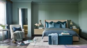
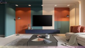
5. Gray and Charcoal Contrast
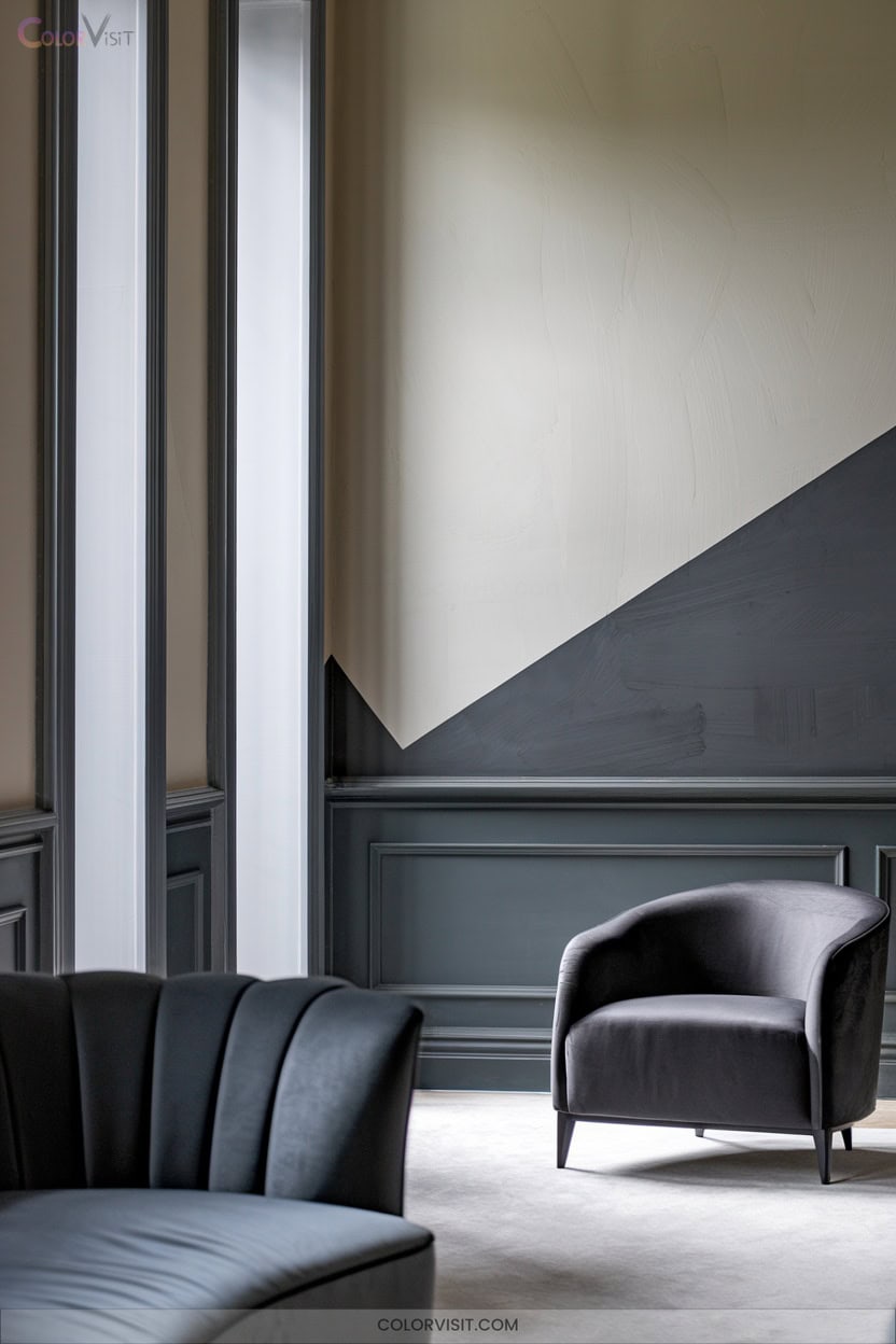
Sophistication defines the interplay of gray and charcoal in today’s most refined drawing rooms.
You’ll find charcoal—a deep, nuanced neutral—delivers drama without the starkness of black, especially when you layer light and dark grays for architectural depth.
Harness this palette to achieve cutting-edge elegance:
- Contrast and Balance: Offset charcoal gray with crisp whites or muted greens for dimensional harmony.
- Pattern Play: Integrate stripes, herringbone, or geometric motifs to inject energy and tactile interest.
- Lighting Innovation: Employ layered lighting—natural, LED, and dimmable fixtures—to highlight texture and maintain inviting ambiance throughout your space.
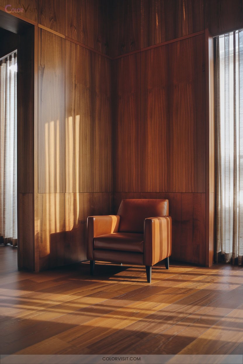
6. Walnut Brown Sophistication
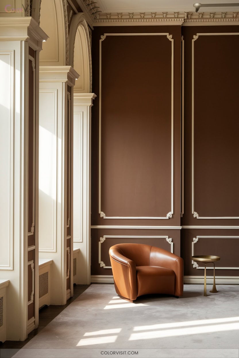
Nothing grounds a drawing room in timeless elegance quite like walnut brown—a rich, deep hue with subtle reddish undertones that instantly conveys depth and warmth. Harness walnut’s sophisticated neutrality as a foundation for both traditional and avant-garde interiors.
Pair it with creamy neutrals to offset its intensity, or echo its palette using refined shades like Farrow & Ball’s Salon Drab for a moody, enveloping effect. Walnut’s slightly glossy surfaces reflect light, subtly animating the space.
Integrate velvet upholstery, brass accents, or jewel-tone rugs for tactile intrigue. Maximize walnut’s versatility by drenching walls, trims, and ceilings, achieving cohesive, innovative luxury.
7. Cognac Leather Warmth
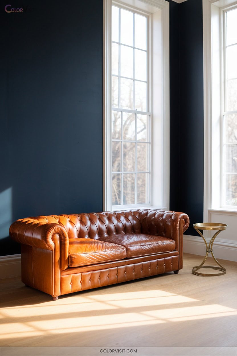
If walnut brown lays the groundwork for elegance, cognac leather infuses the drawing room with unmistakable warmth and tactile allure.
Its rich color profile—amber-tinged, with reddish-brown depth—evokes both heritage luxury and contemporary boldness.
You’ll appreciate how the patina matures, developing unique character over time.
For those seeking a forward-thinking yet timeless palette, consider these expert pairings and applications:
- Pair cognac leather seating with navy blue or emerald green for dramatic, gallery-worthy contrast.
- Integrate brass lighting to accentuate golden undertones and amplify ambient richness.
- Use leather-clad wall panels for a multisensory, high-impact design signature.
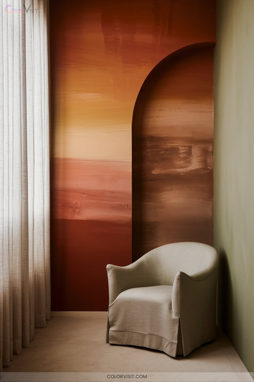
8. Burnt Orange Accents
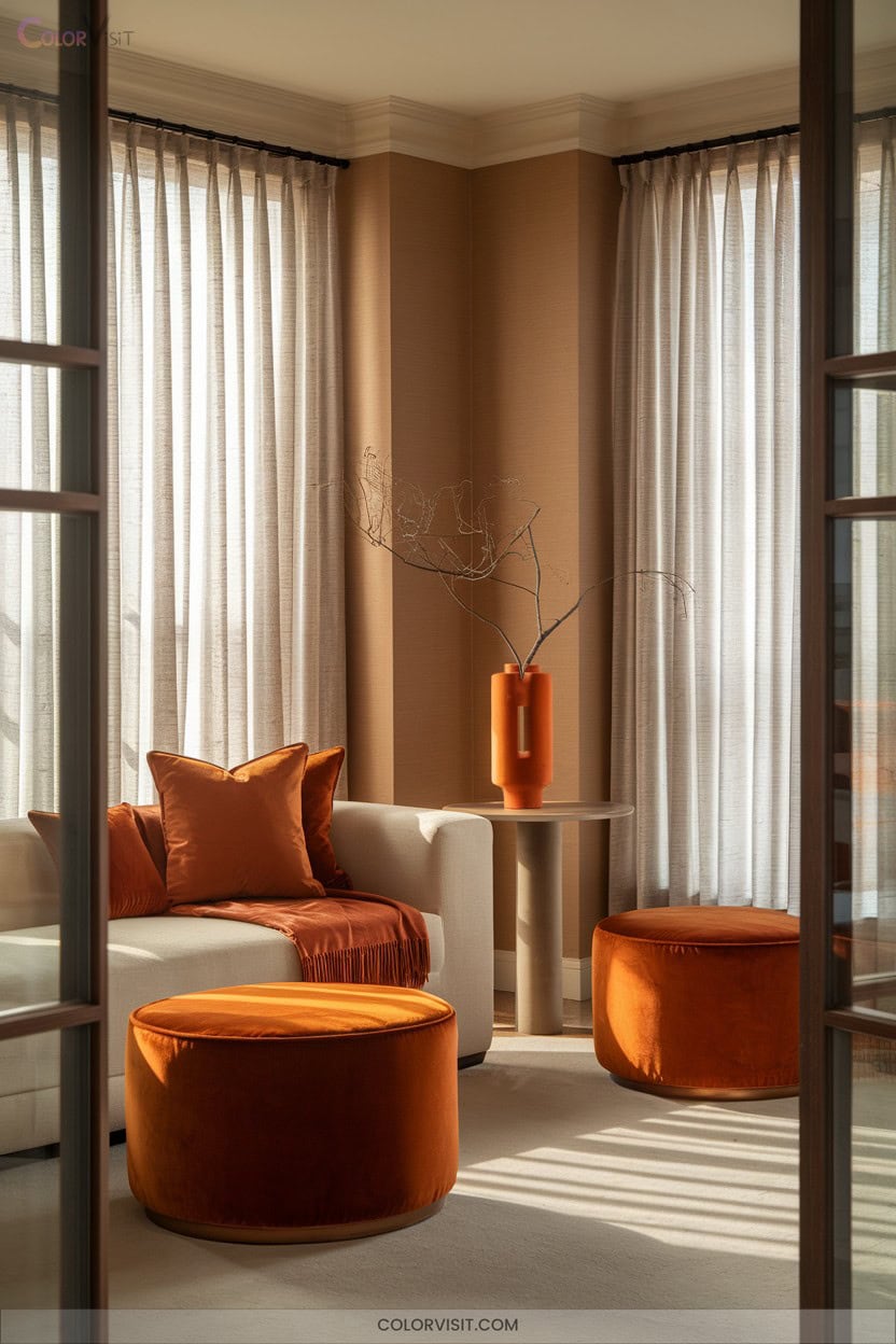
A burst of burnt orange instantly transforms a drawing room, anchoring the space with bold warmth and undeniable visual interest.
Opt for a burnt orange accent wall to create a dramatic focal point, especially when set against neutral backgrounds—think creamy beiges or subtle greys.
Integrate statement furniture like a velvet burnt orange chair, or introduce this hue through accent pillows and throws for textural intrigue.
For open-concept layouts, repeat burnt orange in key elements—rugs, art, or placemats—to unify zones.
Elevate sophistication further by pairing burnt orange with metallic accents or deep charcoals, embracing both modernity and timeless elegance.
9. Warm Wood Tones
Natural sophistication emerges when you incorporate warm wood tones in your drawing room.
Harness the inherent coziness of red or yellow undertones found in White Oak, Cherry, or Hickory for a trend-forward aesthetic.
Achieve visual dynamism by pairing contrasting light and dark woods unified by matching undertones.
This refined approach cultivates a welcoming, innovative atmosphere while embracing current design movements toward warmth and organic harmony.
- Anchor with a dominant wood tone—let your largest furniture piece set the palette.
- Mix contrasting shades—maintain undertone unity for cohesion.
- Layer with curated decor accents—add depth without overwhelming the space.
10. Sage Green Tranquility
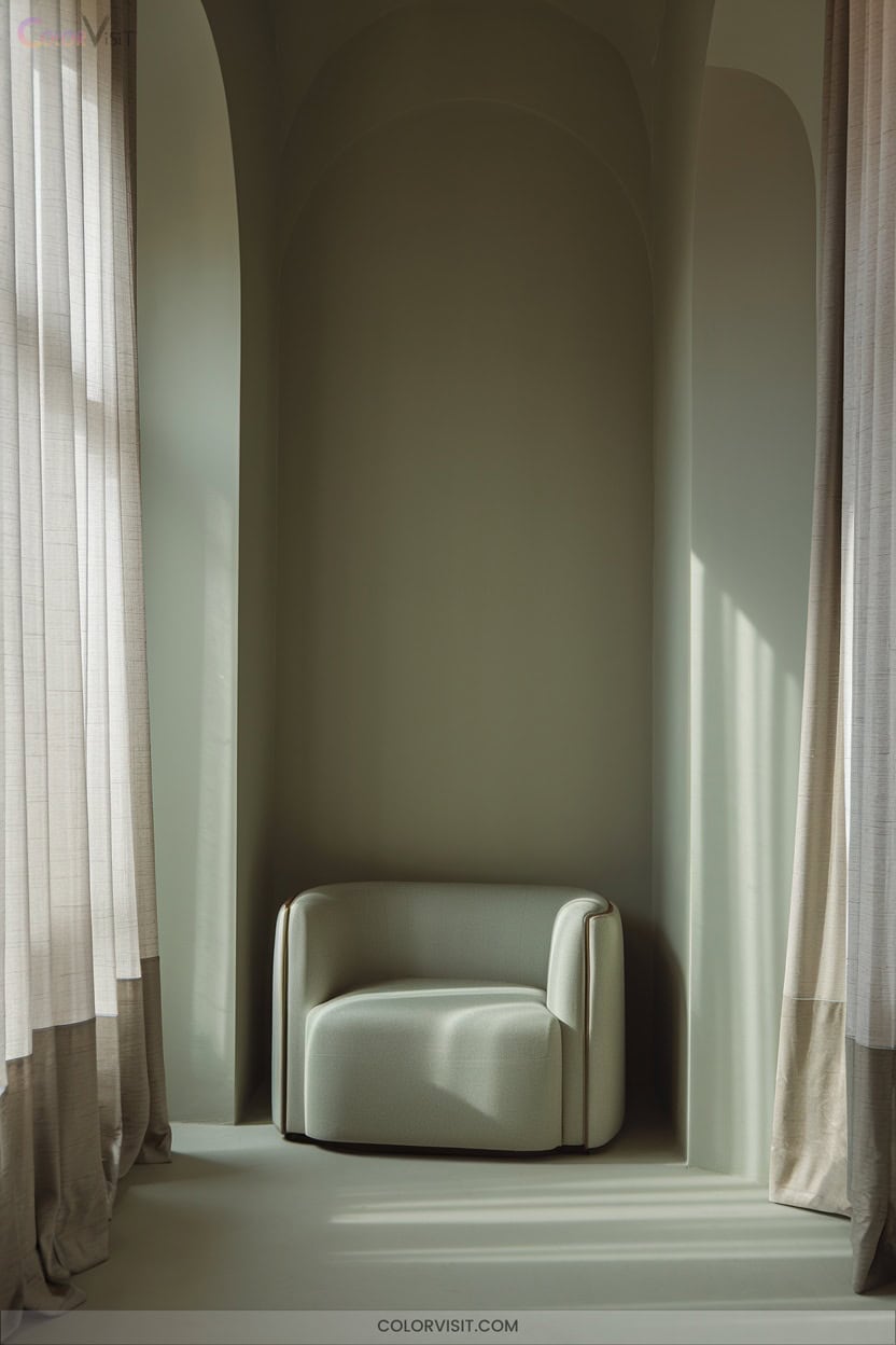
Building on the inviting warmth of wood tones, sage green introduces a refined layer of tranquility to your drawing room.
This nature-inspired hue, with its subtle gray undertones, embodies serenity and visual balance—exactly what’s trending in innovative interiors.
Use sage green as a wall color or in luxurious textiles and upholstery for a harmonious, versatile foundation.
Pair it with creams, taupes, or metallic finishes for a sophisticated, layered effect.
Sage green’s muted, earthy palette fosters calm, stability, and a seamless connection to the outdoors, providing the perfect backdrop for modern design elements and cutting-edge furniture profiles.
11. Lilac Purple Charm

Why not embrace the understated allure lilac purple brings to your drawing room?
This mid-tone hue, rooted in rich historical context, balances warmth and coolness with effortless sophistication.
Lilac’s adaptability lets you curate a space that resonates with grace and subtle modernity.
Use expert layering and innovative pairings for maximum impact:
- Contrast deep purples and metallic golds for a regal, contemporary palette.
- Anchor with neutral or wooden furniture and introduce velvety textures to amplify luxury.
- Incorporate mirrors and light accents to visually expand, while energizing with bold color pops and geometric decor.
Invite understated magic into your space.
12. Paradise Green Vibrance
Verdant energy transforms your drawing room into a sanctuary of Paradise Green vibrance, where every shade evokes balance, harmony, and an invigorating connection to nature.
Opt for layered botanical motifs, large leafy prints, and lush living walls to channel biophilic design.
Pair green’s restorative hues with organic textures—think reclaimed wood, marble, or glass—for a sophisticated, tactile interplay.
Integrate metallic accents in brass or gold for contemporary opulence.
Enhance the ambiance with natural light, which intensifies green’s rejuvenating qualities.
Prioritize eco-friendly materials and recycled elements, ensuring sustainability is integral to your aesthetic.
Paradise Green delivers serenity with an innovative, tropical edge.
13. Sunshine Yellow Radiance
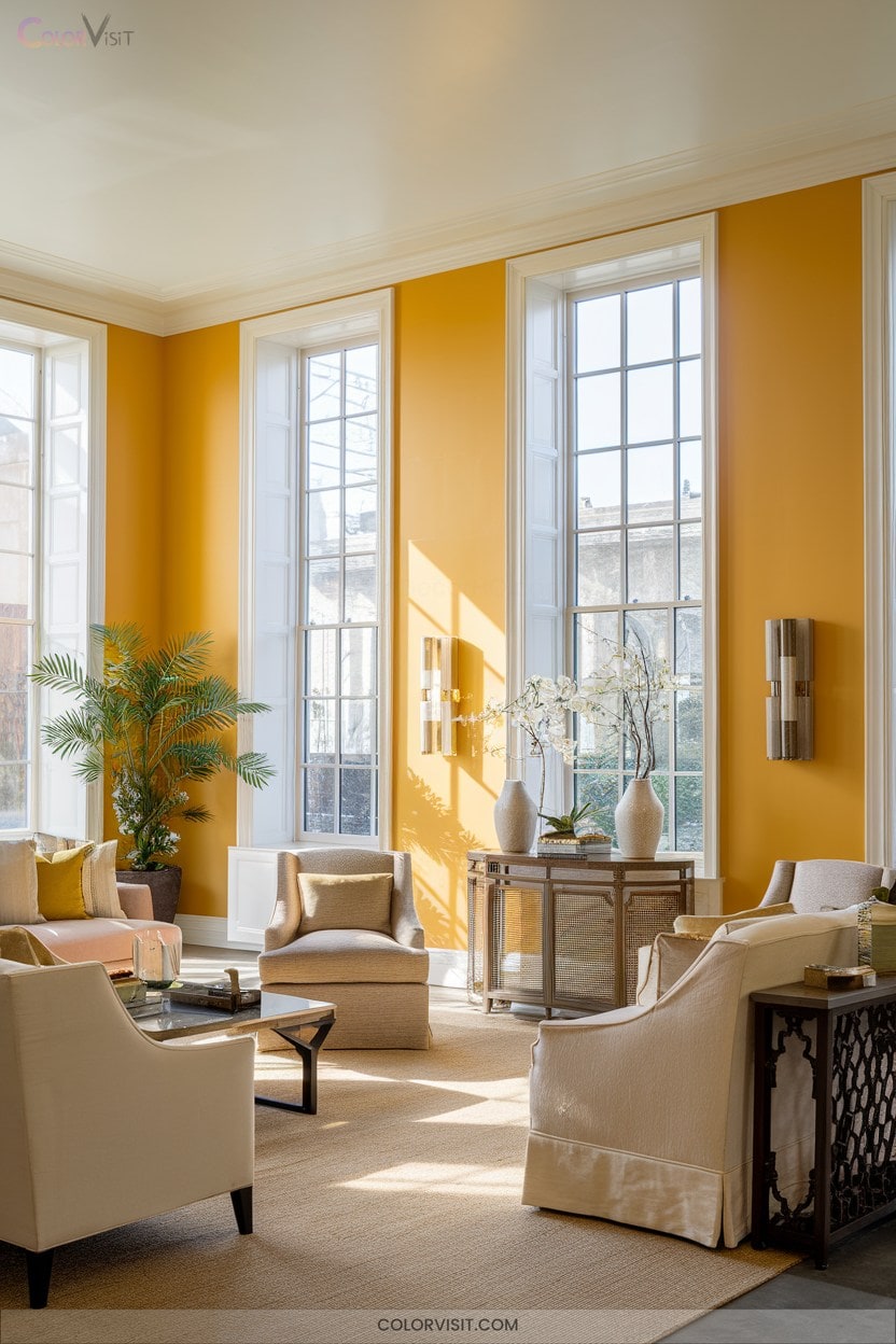
Infusing your drawing room with sunshine yellow radiance instantly elevates the atmosphere, channeling optimism, energy, and timeless appeal.
This vibrant hue acts as a visual stimulant, enhancing spatial perception and fostering positive emotional connections.
Leverage yellow’s versatility by integrating it with contemporary or classic schemes.
Use expert layering for dynamic results.
- Curate focal points with yellow accent walls or upholstery, ensuring a luminous, expansive feel.
- Balance warmth and harmony by pairing yellow with neutrals like beige or gray, preventing sensory overload.
- Integrate natural textures—wood elements or botanicals emphasize yellow’s vibrancy and reinforce trend-forward, biophilic aesthetics.
14. Blue Muscari Modernity
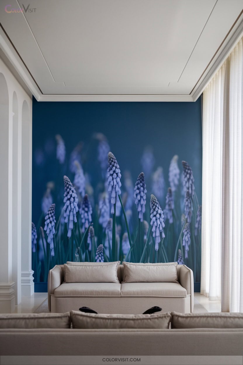
Blue Muscari radiance delivers an invigorating, contemporary statement in drawing room design, blending botanical inspiration with modern sensibility. You’ll appreciate its vibrant blue, nuanced with violet undertones and crisp white accents, as it injects freshness into your space.
Use Blue Muscari on accent walls, upholstery, or curated art pieces to foster clarity and calmness—key tenets of biophilic interiors. Pair it with minimalist furnishings, metallic finishes, and organic textures like wood or stone for a sophisticated balance. Integrate patterned textiles or floral motifs to reinforce the color’s presence.
Blue Muscari’s serene energy invites creativity, conversation, and unmistakable elegance.
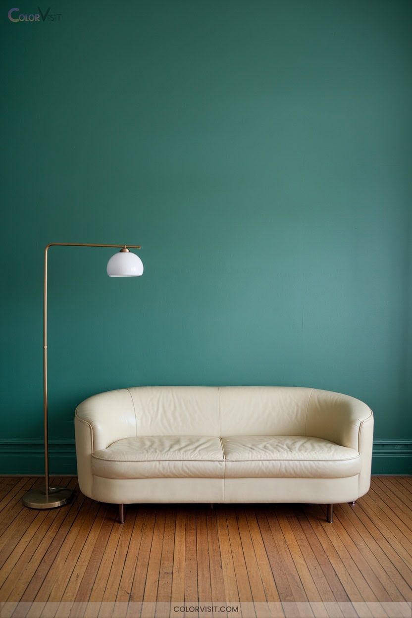
15. Turquoise Highlights
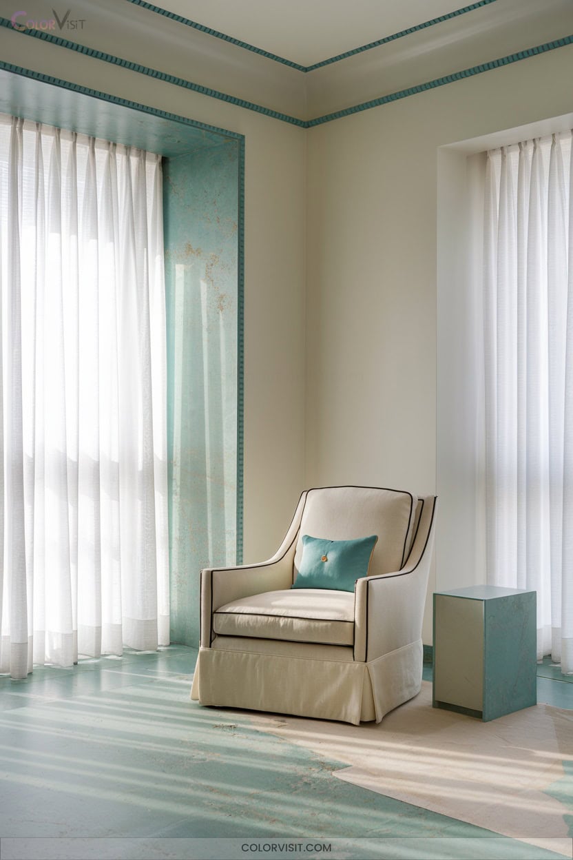
For a drawing room that feels both energizing and refined, turquoise offers a striking alternative to the cool serenity of Blue Muscari.
This versatile hue radiates contemporary appeal, especially when layered with beige or natural textiles for a sophisticated, nature-inspired palette.
Turquoise exudes modern charm, coming alive when combined with beige or organic textures for a chic, earthy ambiance.
Turquoise’s multidimensionality thrives in both bohemian and minimalist interiors, acting as a visual anchor or accent.
Pairing turquoise with neutral backgrounds or wooden accents elevates its vibrancy.
Harness trend-forward styling by integrating turquoise in these innovative ways:
- Accent walls or jewel-toned sofas for dramatic depth
- Artful turquoise vases and textured rugs for tactile intrigue
- Soft, warm lighting to amplify richness
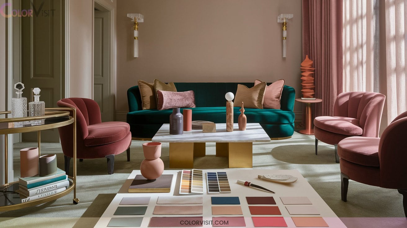
16. Metallic Accents for Luxury

Elevate your drawing room’s ambiance by weaving in metallic accents that instantly convey luxury and sophistication.
Opt for brass coffee tables or rose gold side tables as functional focal points, layering depth without visual clutter.
Metallic-finished lighting—think chrome chandeliers or copper pendants—reflects light, amplifying spatial vibrancy.
Integrate metallic wallpapers with subtle patterns or fabrics threaded with shimmer to add dimension and tactile intrigue.
Precision in metallic hardware selection guarantees cohesion, while mirrored or metal-framed furnishings expand perceived space.
Balance shiny elements with matte or natural textures for harmony.
Embrace mixed metals to evoke both contemporary glamour and timeless elegance.
17. Earthy Tones Inspired by Nature
A curated palette of earthy tones instantly infuses your drawing room with organic sophistication, grounding the space in nature’s enduring beauty.
Embrace rich terracottas, deep umbers, and taupes to evoke both contemporary allure and timeless comfort.
These hues—popular in 2025 palettes—offer tranquility and depth, especially when layered with matte finishes and tactile textures.
For a cutting-edge, harmonious aesthetic, consider these innovative approaches:
- Pair moss green accents with dark brown walls for a sophisticated, biophilic vibe.
- Incorporate handmade clay décor and wood furnishings to reinforce authenticity.
- Balance bold sienna or ochre with creamy neutrals for visual equilibrium.
Frequently Asked Questions
How Can Lighting Affect Sophisticated Color Choices in a Drawing Room?
You’ll find lighting transforms color perception—warm bulbs amplify reds and golds, cool LEDs sharpen blues and grays. Prioritize high CRI fixtures and layered lighting to curate dynamic, elegant palettes that respond innovatively to evolving trends and natural light.
What Color Schemes Work Best With Patterned or Textured Wallpapers?
You’ll achieve visual harmony by pairing monochromatic shades or nuanced neutrals with textured wallpapers. Opt for bold contrasts to energize geometric patterns, or embrace earthy hues and soft pastels to amplify natural or tactile surfaces—trend-forward, innovative, and visually compelling.
Are There Elegant Color Options Suitable for Small Drawing Rooms?
You could always embrace the “shoebox chic” aesthetic, but you’d rather deploy ecru, warm ivory, or pearlescent gray. Harness reflective finishes and tonal layering—let spatial constraints inspire avant-garde elegance, not compromise. Maximize luminosity, minimize monotony.
How Do I Incorporate Artwork Without Clashing With Sophisticated Colors?
Curate artwork that leverages color coherence—opt for pieces with tones that complement or artfully contrast your palette. Integrate mixed media or textured frames for dimension. Embrace thematic unity and strategic placement to guarantee your gallery feels deliberately innovative.
What Are the Best Ways to Transition Drawing Room Colors to Adjoining Spaces?
To master color blends between spaces, leverage analogous or monochromatic palettes, maintain trim consistency, and layer textures. Integrate cohesive accents—like curated rugs or art—while embracing the 60-30-10 rule for visually seamless, on-trend spatial flow.
Conclusion
As you curate your drawing room’s palette, think of it as composing a symphony—each hue an essential note. A recent Houzz survey found 68% of homeowners believe color directly impacts mood, so your choices aren’t just visual—they’re emotional architecture. Consider how different shades can evoke feelings of calm, energy, or creativity, guiding the atmosphere of your space. Explore transformative wall color ideas that can elevate your drawing room from ordinary to extraordinary, inviting warmth or serenity at every glance. By thoughtfully selecting your palette, you can create a harmonious environment that resonates with both style and emotional well-being.
Whether you embrace metallic accents or serene neutrals, you’re orchestrating elegance and comfort. Let your space become a timeless backdrop, where every shade tells a story and every visitor feels both inspired and welcomed.