22 Stunning House Color Ideas for Interior and Exterior in 2025
Transform your home in 2025 with vibrant convivial yellows for cheerful spaces, serene sage greens and delft blues for sophisticated calm, and creamy whites like Snowbound that maximize natural light. Embrace layered neutrals, earthy taupes, and bold jewel-tone blues or deep chocolate browns for dramatic accents.
Go modern with dual-tone or monochromatic exteriors, pairing soft oyster whites with driftwood grays for elegance. Discover how to combine these hues with trending textures, woods, and metallics for truly next-level style.


1. Convivial Yellow for Inviting Living Spaces
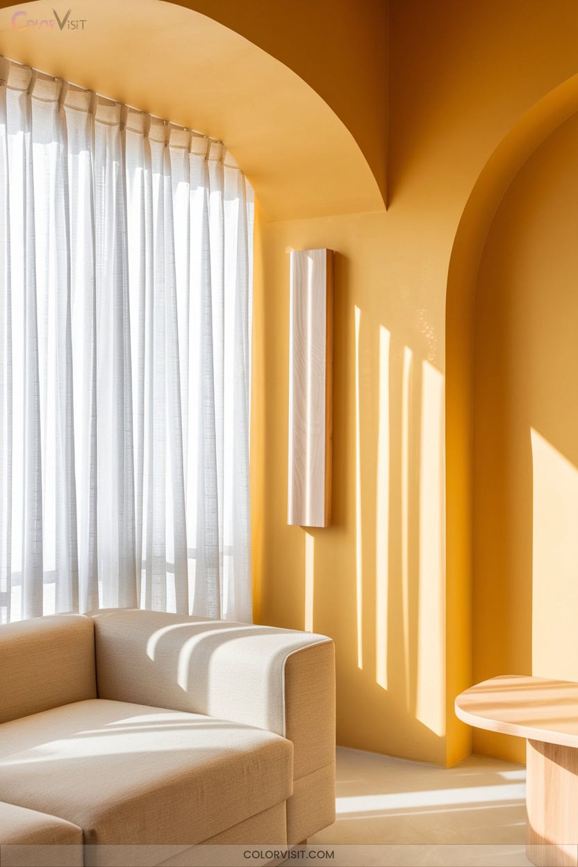
Why not let convivial yellow breathe new life into your living spaces this year?
Embrace the resurgence of butter yellow—a shade that’s both nostalgic and forward-thinking.
Butter yellow returns, infusing spaces with a retro allure that feels refreshingly contemporary and endlessly inviting.
Pair it with lime cream for a fresh, dynamic balance or let it shine against natural woods and textured linens.
You’ll notice how yellow’s warmth instantly lifts the mood, blending retro 1970s influences with sharp, modern aesthetics.
Use it as a subtle neutral across plush throws or make a bold statement with an accent wall.
Under warm lighting, convivial yellow radiates comfort and optimism, mirroring the innovative spirit seen in high-fashion interiors.
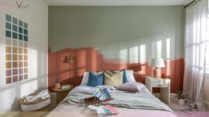
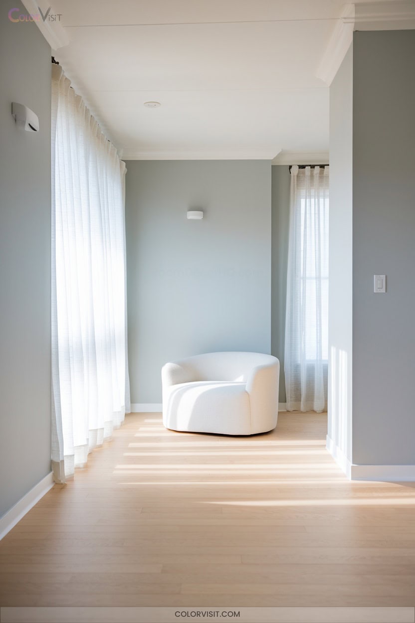
2. Quietude: A Serene Bedroom Choice
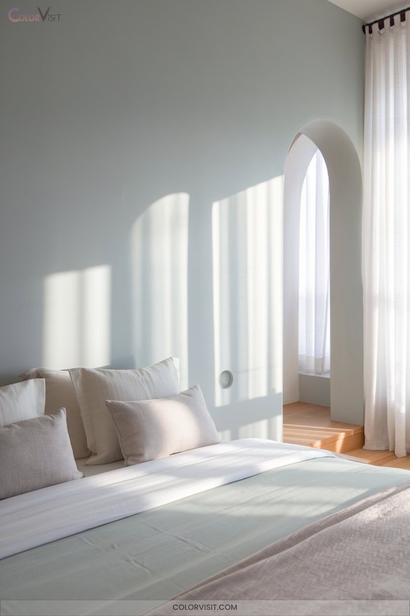
Serenity settles into your bedroom when you choose Quietude—a soft sage green kissed with subtle blue undertones.
This cool, modern-traditional hue instantly calms, blending green’s restorative energy with blue’s tranquil embrace.
Quietude’s earthy refinement grounds you, nurturing restful sleep and a sense of sanctuary.
Pair it with organic linens, rattan accents, or brushed gold details for elevated texture.
Layering this shade across walls and trim brings cohesive sophistication, whether your style leans minimalist or maximalist.
Quietude harmonizes with ivory, oatmeal, slate blue, and muted lavender, adapting to every season.
For 2025, it’s the innovative path to a restorative, timeless retreat.
3. Delft Blue’s Touch of Elegance
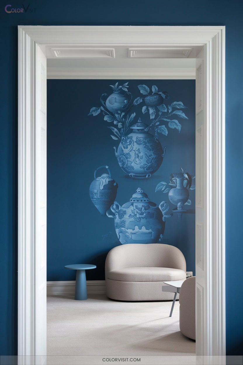
While Quietude invites restful tranquility, Delft Blue introduces a refined vibrancy that instantly elevates any space. In 2025, this sea-blue with green undertones channels Dutch artistry, blending computational design with artisanal glazing for tactile, visually dynamic surfaces.
Delft Blue infuses interiors with refined vibrancy, merging Dutch artistry and tactile design for visually dynamic spaces in 2025.
Use Delft Blue on kitchen walls, paired with Rocky River islands or Sequin gold accents for a layered, modern aesthetic. Nature-inspired ceramic tiles and matte-glazed finishes contrast beautifully with metallic hardware or warm wood.
Outdoors, Delft Blue endures as ceramic cladding, gates, or window frames, harmonizing with greenery.
Embrace this hue for sophisticated interiors and exteriors that balance innovation and timeless elegance.
4. Snowbound for a Modern Minimalist Look
Minimalism finds its perfect canvas in Snowbound (SW 7004), a cool white with subtle gray undertones that defines modern sophistication.
You’ll appreciate how it enhances natural light, making rooms feel expansive and uncluttered.
Snowbound’s versatility lets you create seamless flows between spaces, elevating both interiors and exteriors.
For a truly innovative touch, consider these modern applications:
- Use as a neutral backdrop to showcase bold furniture and curated decor.
- Pair with gray-influenced accents for a harmonious palette.
- Enhance kitchens and bathrooms with differing sheens for depth.
- Contrast with dark exteriors for a crisp, contemporary façade.
5. Spiced Cider for Cozy Interiors
Warmth radiates from Spiced Cider (SW 7702), a rich reddish-orange that instantly transforms interiors into inviting retreats.
This hue’s earthy brown undertones evoke the comfort of a fireside evening, making any space feel snug and sophisticated.
Use it for bold feature walls, cabinetry, or built-ins—its high intensity never reads flat.
Pair with textured linen, wool, or bouclé, plus brass or copper accents for a luxuriously tactile vibe.
Spiced Cider harmonizes with checkered floors or patterned upholstery, and it shines alongside Snowbound trim.
In kitchens, bedrooms, or dens, you’ll create memorable, innovative spaces brimming with convivial, on-trend energy.
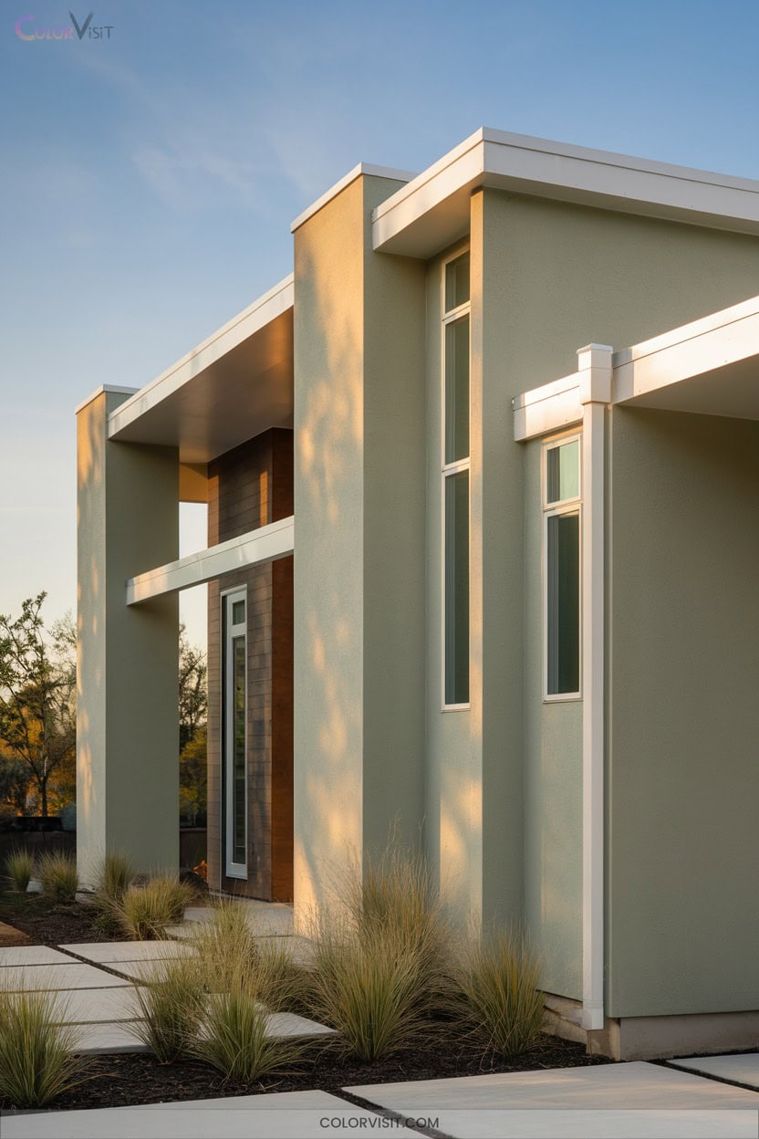
6. Earthy Sage Green for Calming Exteriors
After embracing the inviting energy of Spiced Cider indoors, it’s time to let your home’s exterior reflect a sense of calm and connection to nature.
Earthy sage green is 2025’s innovative “new neutral,” radiating tranquility while blending seamlessly with natural landscapes.
Its subtle blue and earthy undertones pair beautifully with bold accents and modern materials.
For a truly innovative, harmonious exterior, consider these dynamic combinations:
- Crisp white trim for architectural clarity
- Warm wood accents to add cozy sophistication
- Deep forest green or navy shutters for striking contrast
- Natural stonework to enhance organic elegance
Let your home’s exterior evoke balance and forward-thinking design.
7. Soft Orange to Energize Your Home’s Facade
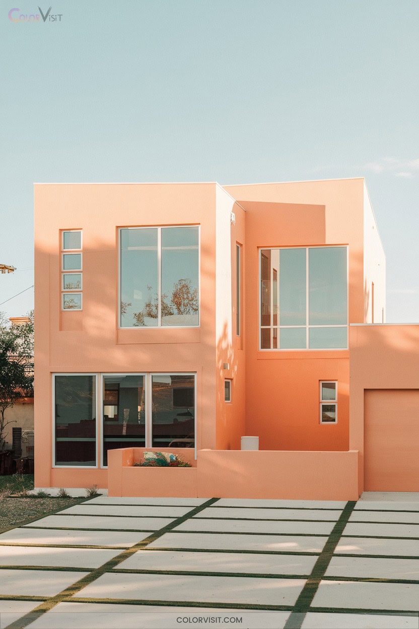
A fresh take on curb appeal, soft orange transforms your home’s exterior into a beacon of warmth and vibrancy.
This trending 2025 hue radiates energy without overwhelming, especially on modern facades with clean lines.
Soft orange radiates uplifting energy, bringing modern exteriors to life while keeping the look fresh, inviting, and effortlessly balanced.
Pair creamy orange, reminiscent of tomato bisque, with earthy grays or deep greens like Forest Green for a balanced, sophisticated palette.
Metallic bronze or copper highlights elevate architectural details, while natural materials—wood or brick—become richer against this inviting backdrop.
Use soft orange to accentuate doors or window frames, ensuring your home feels both innovative and welcoming.
In sunlight, this shade truly shines, amplifying curb appeal instantly.
8. Warm Neutrals for Timeless Curb Appeal
Step into a world where your home’s exterior radiates timeless elegance with warm neutrals.
This year, innovative homeowners are embracing taupe and beige hues like Sherwin-Williams’ Accessible Beige, blending classic appeal with a fresh, airy twist.
These shades don’t just look stylish—they harmonize effortlessly with natural landscapes and a variety of architectural styles.
Warm neutrals deliver comfort and sophistication, ensuring your curb appeal endures every season.
- Blend seamlessly with stone, wood, or stucco for textural depth
- Elevate modern and traditional exteriors alike
- Pair easily with bold doors or trim for visual interest
- Create curb appeal that’s welcoming and enduring
9. Dark Charcoal: Sophistication at the Doorstep
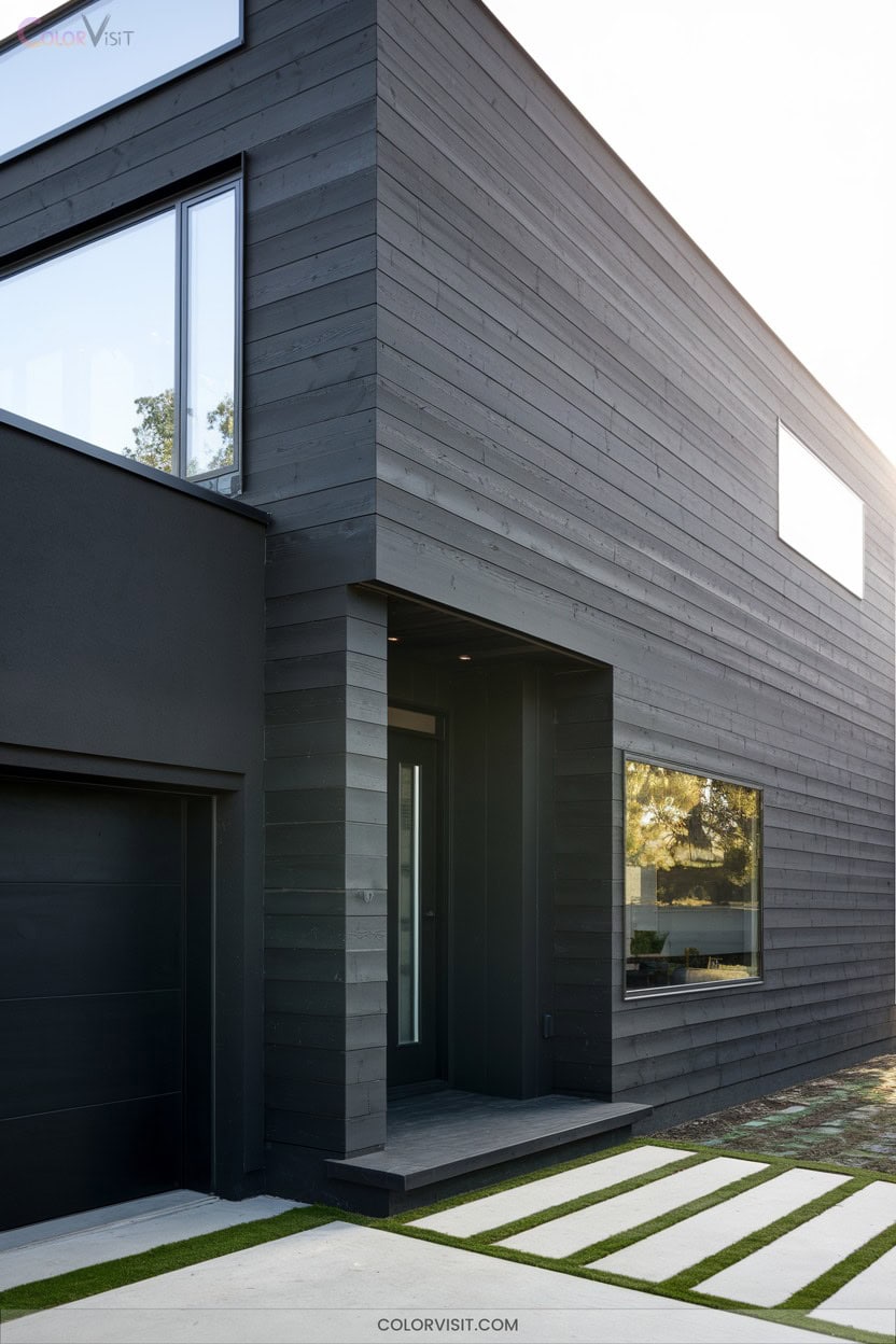
While warm neutrals invite timeless charm, dark charcoal introduces a striking level of sophistication right at your doorstep.
Dark charcoal elevates your entryway, adding instant sophistication and modern allure to any home’s exterior.
Embrace the trend with shades like Iron Ore by Sherwin-Williams or Kendall Charcoal by Benjamin Moore for a modern, polished exterior.
This deep hue amplifies contrast, making wood, stone, and brick details pop, while crisp white accents or stormy grays create a harmonious palette.
Charcoal’s versatility suits contemporary, farmhouse, industrial, and even coastal styles.
Apply it as a dominant color or accent for depth and visual balance.
Prioritize high-quality paint for durability, and consider your surroundings to achieve bold, innovative curb appeal.
10. Deep Blue for Dramatic Exterior Contrast
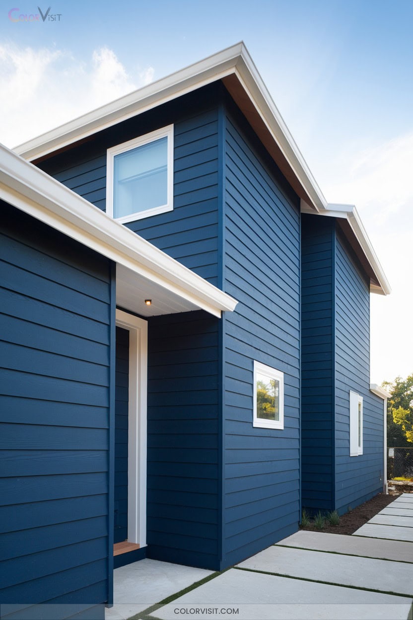
Sapphire-inspired exteriors instantly elevate curb appeal, delivering a level of drama that’s both current and timeless.
In 2025, deep blue palettes—ranging from classic navy to oceanic teal—offer you innovative ways to accentuate your home’s architecture.
Pairing these hues with crisp white trim or metallic fixtures creates striking contrast and undeniable sophistication.
Deep blue’s versatility means it harmonizes beautifully with brick, stucco, or wood, ensuring year-round appeal.
- Highlights architectural lines with bold contrast
- Integrates seamlessly with natural surroundings
- Adapts to diverse styles, from coastal to urban
- Amplifies sustainability through serene, nature-inspired tones
11. Accessible Beige for Versatile Interiors

After embracing the striking impact of deep blue exteriors, interiors in 2025 are gravitating toward warmer, more inviting palettes—none more versatile than Accessible Beige.
This nuanced greige, with its gentle green undertones and taupe warmth, instantly elevates your space.
You’ll find it sophisticated and adaptable, perfect for kitchen walls, living rooms, and airy hallways.
Pair it with bold jewel tones, soft pastels, or luxe metallics for a curated, on-trend look.
Accessible Beige supports both minimalist and maximalist visions, bridging comfort and innovation.
It’s the modern neutral designers recommend for timeless, layered interiors that feel fresh and deeply inviting.
12. Revere Pewter: The Sophisticated Gray
Revere Pewter stands as a benchmark for sophisticated, lived-in elegance—a warm gray that instantly grounds any interior in subtle refinement.
With its greige nuance and understated green undertones, you’ll find it effortlessly bridges modern innovation and classic appeal.
Its balanced LRV of 55.05 guarantees versatility, especially in spaces filled with natural or thoughtfully curated artificial light.
If you’re seeking a timeless backdrop that adapts to evolving design trends, consider:
- Pairing with warm stone or natural wood for organic warmth
- Using as a foundational color for cohesive, neutral schemes
- Accentuating kitchen cabinets against white subway tiles
- Avoiding violet-toned grays to keep undertones harmonious
13. Shorebird for Light and Airy Rooms
While sophisticated grays like Revere Pewter offer timeless elegance, you might crave a space that feels brighter and more effortlessly relaxed.
Shorebird’s coastal-inspired palette lets you flood your rooms with light—think soft oyster whites on walls, haze blue accents, and driftwood grays grounding cabinetry and floors.
Layered textures—linen, bleached wood, and woven seagrass—keep things tactile yet uncluttered.
Full-height sheers and high-gloss trim bounce natural light deeper into your space, while minimalist furniture with floating shelves maintains airy sightlines.
Organic details—ceramic lamps, nautical stripes, and curated coastal artifacts—add innovative, biophilic character without weighing down your contemporary vision.
14. Warm Cream for a Cozy Home Atmosphere
How can you instantly create a sense of comfort and warmth in your home? Embrace warm cream as your foundation.
This trending hue in 2025 offers a soft, inviting canvas that elevates cozy living while staying on the cutting edge of design.
Warm cream harmonizes beautifully with innovative styles and tactile materials, giving your space both depth and tranquility.
- Layer with textured fabrics like velvet or wool for tactile richness
- Pair with natural wood or stone to amplify organic warmth
- Highlight with soft gold or bronze accents for subtle glamour
- Integrate with minimalist or Japandi-inspired décor for serene, modern comfort
15. Taupe’s Natural and Earthy Appeal
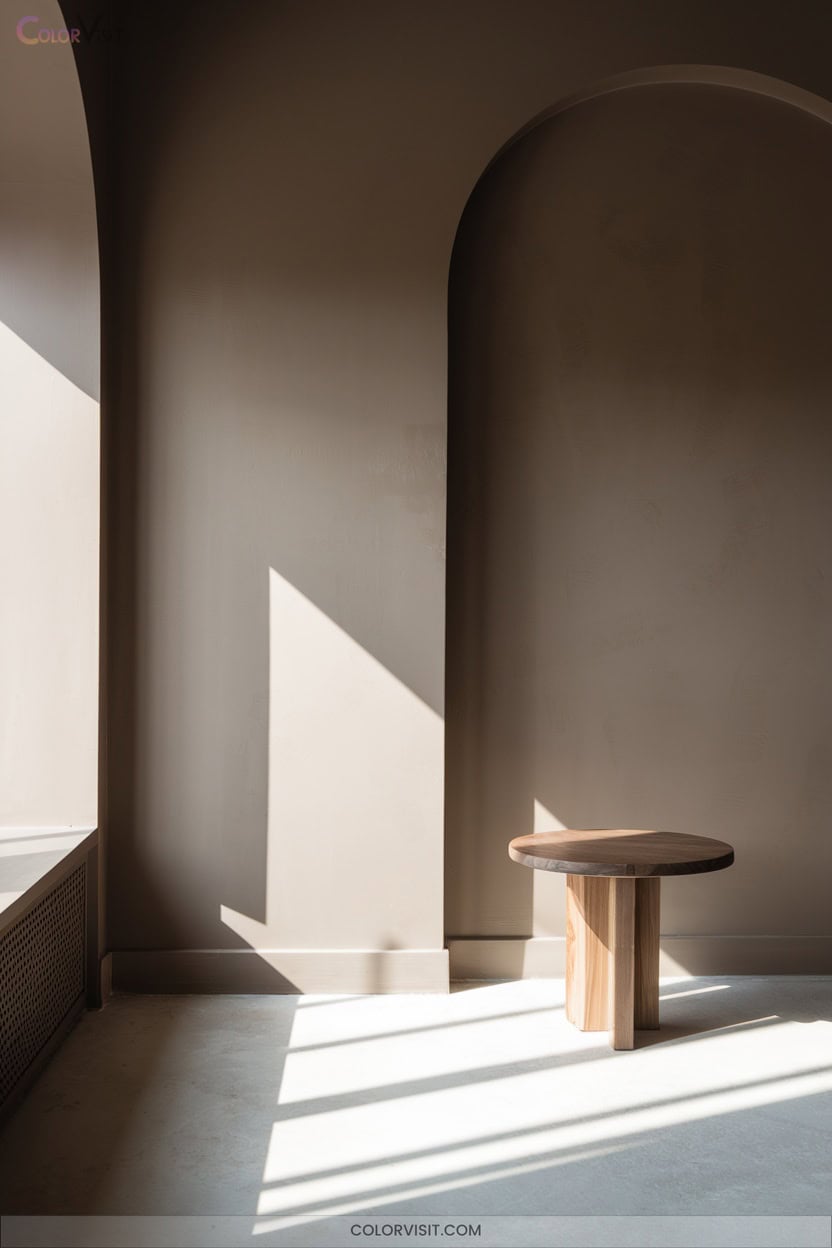
Although trends continually evolve, taupe stands out as a timeless choice for both interiors and exteriors thanks to its natural, earthy character.
You’ll appreciate taupe’s refined blend of brown and gray, which creates a serene backdrop for contemporary living.
In 2025, taupe anchors warm neutral palettes—think ivory and cream—while pairing beautifully with chartreuse, dusty blue, or chocolate brown.
Use taupe for siding or accent walls to unify diverse architectural elements or accentuate organic shapes.
Layer it with rich wood or metallics for a sophisticated twist.
Greenery and textured finishes will further amplify taupe’s connection to the natural world.
16. Stucco for Subtle Warmth Indoors
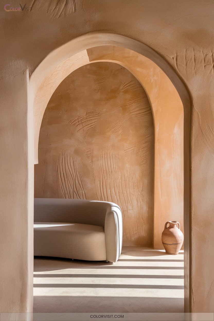
If you’re seeking an interior finish that quietly radiates warmth, stucco stands out with its tactile allure and enduring charm. This material’s adaptability lets you create sleek, contemporary walls or textured, rustic surfaces that feel both curated and timeless.
Stucco isn’t just beautiful—it’s practical, offering durability, moisture resistance, and energy efficiency. You can personalize color and texture for a bespoke feel that elevates your space.
- Minimal upkeep and long-lasting resilience
- Seamless blend with wood, stone, or metal accents
- Energy savings through enhanced insulation
- Customizable finishes to match any aesthetic vision
Stucco truly transforms interiors with innovative subtlety.
17. Nomadic Desert for Bohemian Inspiration
Ever wondered how to channel wanderlust into your home’s color story?
Embrace the Nomadic Desert palette—earthy neutrals like sand, terracotta, and khaki set a sun-washed base on walls and furniture, while jewel tones in textiles ignite bold, global energy.
Earthy neutrals lay a sun-washed foundation, while vibrant jewel-toned textiles spark wanderlust and global inspiration throughout your space.
Layer burnt orange and sky blue for warmth and contrast, then ground the look with muted browns and khaki green.
Mix in handwoven kilim rugs, unfinished wood, and Moroccan wedding blankets for texture and authenticity.
Elevate with matte black fixtures, dark wood accents, and geometric-patterned tiles.
Showcase Mediterranean ceramics, brass lighting, and eclectic art for curated, bohemian sophistication.
18. Rocky River: Adding Depth With Earthy Tones
Rocky River-inspired color schemes infuse interiors and exteriors with grounded sophistication, blending deep, earthy tones that instantly evoke the tranquility of nature.
You’ll notice how these hues add warmth, depth, and balance, especially when paired with natural materials and textures.
In 2025, Rocky River tones stand at the forefront of sustainable design, bringing a luxurious, eco-conscious edge to your spaces.
For innovative, cohesive results, consider:
- Painting an accent wall or kitchen island in Rocky River tones
- Layering wood, stone, and fabric textures for organic harmony
- Integrating dim lighting to enhance cozy ambiance
- Balancing bold colors with soft neutrals
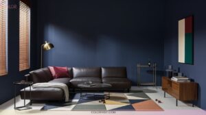
19. Jewel-Tone Blues for Luxurious Accents
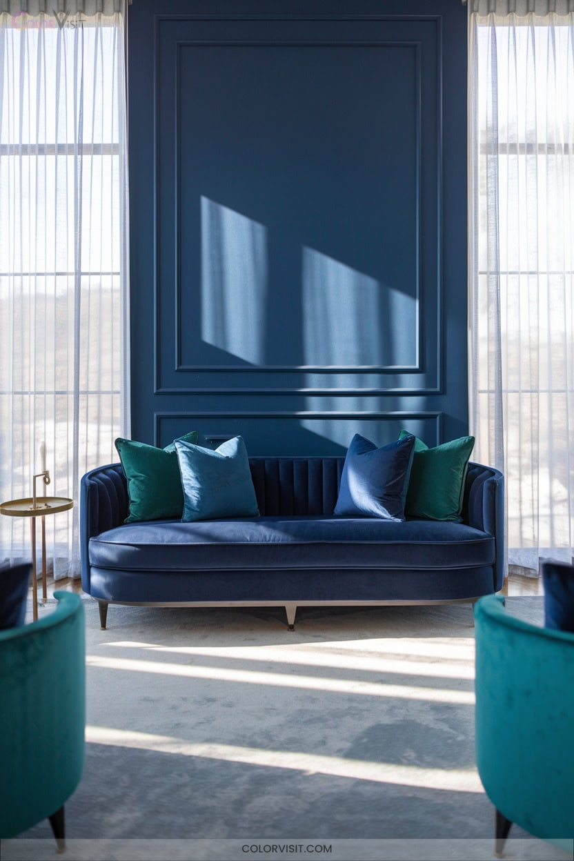
Infuse your living spaces with a sense of refined opulence by embracing jewel-tone blues—sapphire, deep royal, and indigo—for striking accents in both interiors and exteriors.
In 2025, these saturated hues transform rooms and façades into showcases of sophisticated energy.
Paint an accent wall in deep blue for instant drama, or choose velvet furnishings and metallic light fixtures with blue undertones for tactile luxury.
Balance these bold blues with creamy neutrals or sleek metallics to avoid visual overload.
Jewel-tone blue doors or shutters offer unique curb appeal, while accessories and textiles let you experiment without committing to permanent changes.
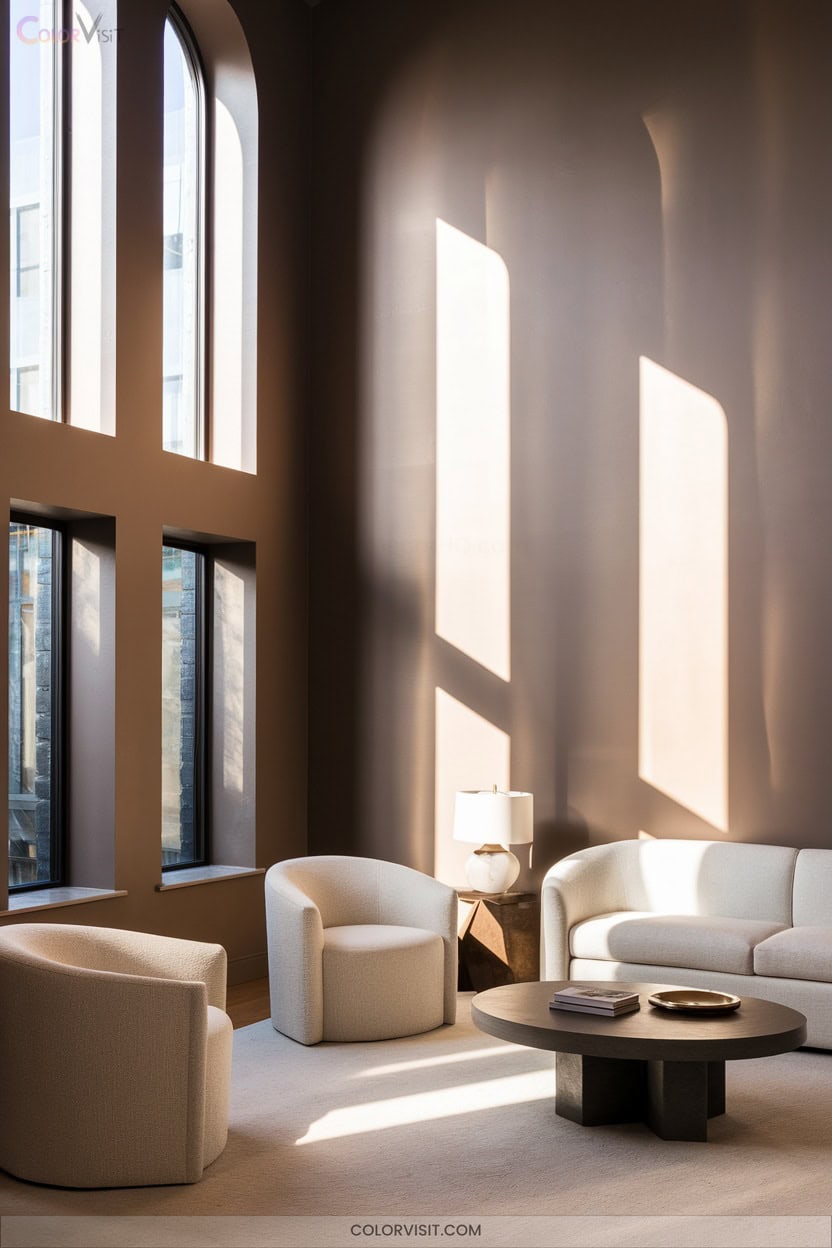
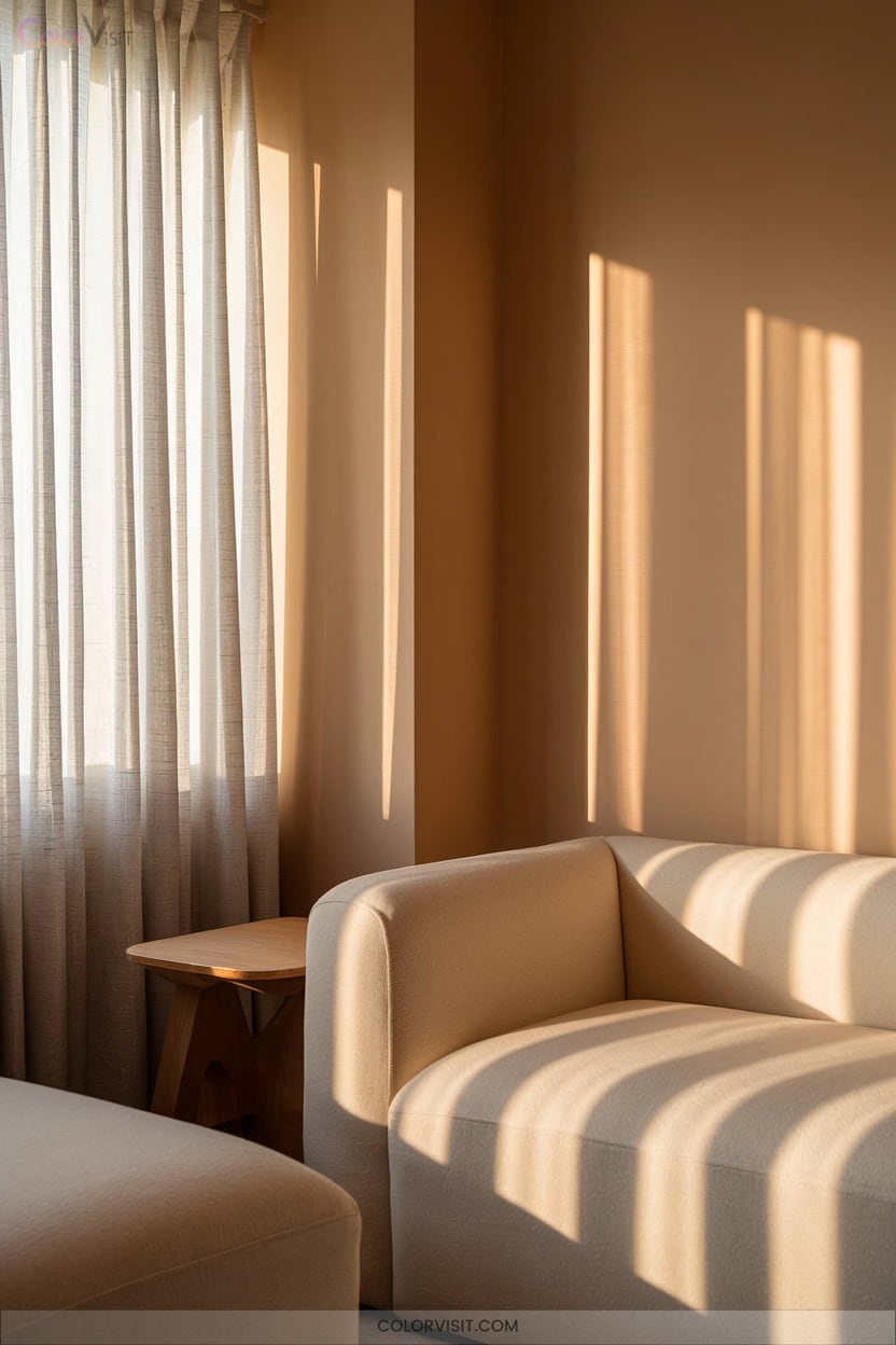
20. Deep Chocolate Brown for Ultimate Comfort
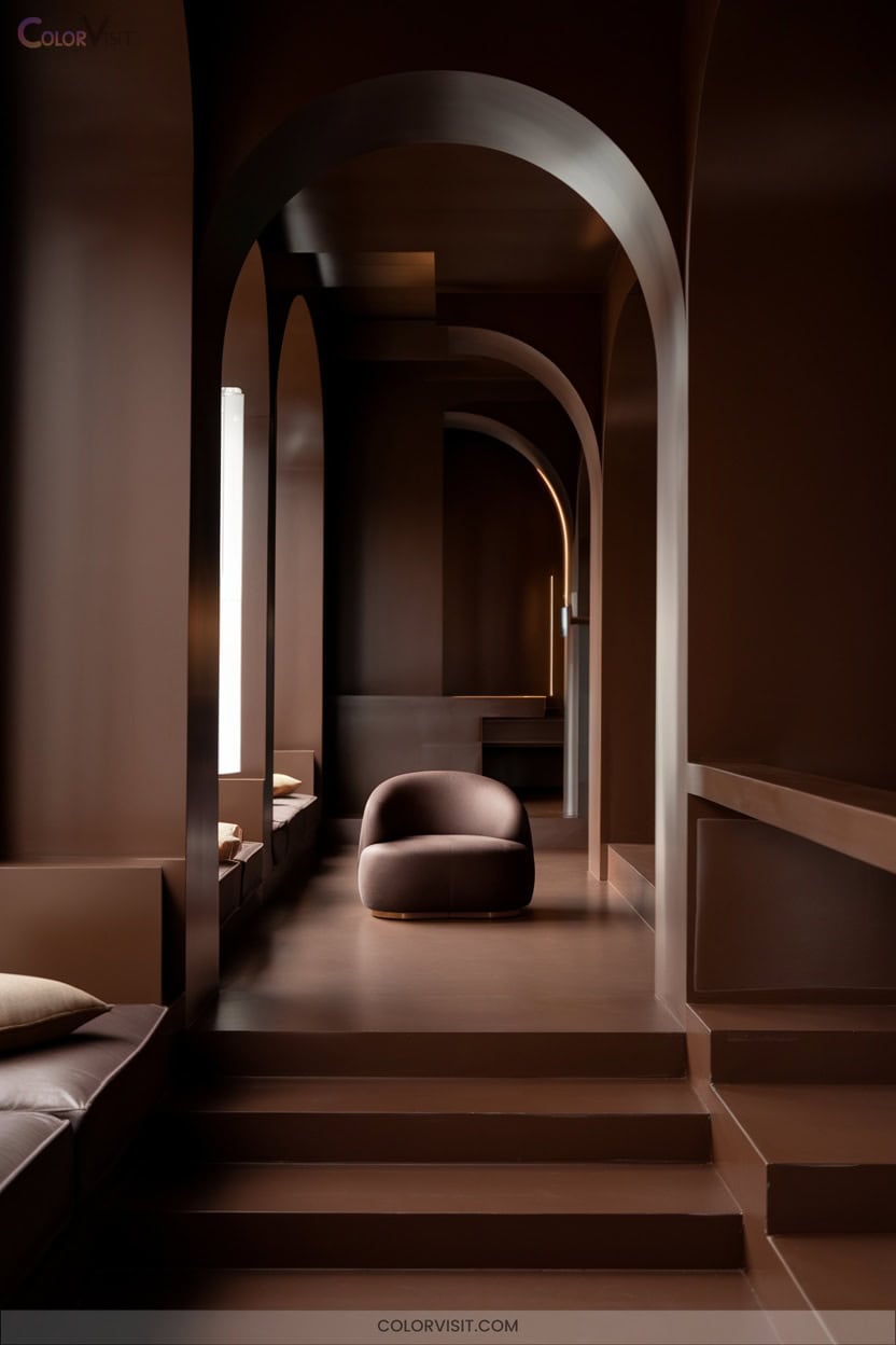
A palette anchored by deep chocolate brown instantly envelops your home in warmth and comfort, setting the tone for a space that feels both grounded and luxurious.
You’ll notice how this rich hue, trending in 2025, elevates interiors with its earthy sophistication and inviting depth.
Deep chocolate brown pairs beautifully with natural materials, harnessing authenticity and sustainability for a modern yet timeless look.
Integrate the shade with innovative intent:
- Enhance cabinetry or accent walls for dramatic coziness
- Pair with warm reds or soft blues for nuanced harmony
- Layer linen, wool, or reclaimed wood for tactile interest
- Use thoughtful lighting to maintain vibrancy
21. Monochromatic Neutrals for Seamless Design
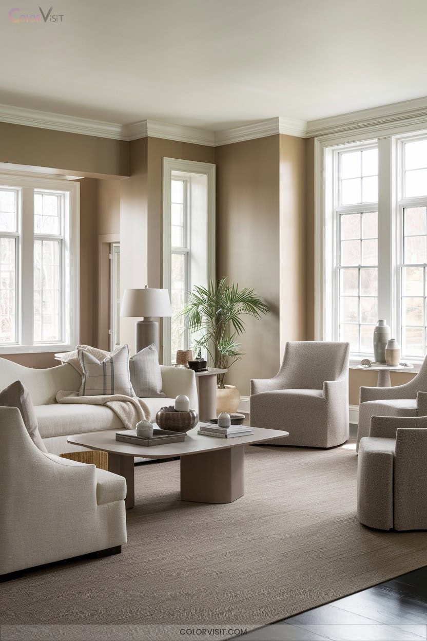
After exploring the comforting depth of deep chocolate brown, you’ll find that monochromatic neutrals offer a seamless, modern approach to color.
Embrace warm beiges and earthy tones for interiors that radiate comfort and quiet sophistication.
Layering subtle variations—think tone-on-tone walls, textiles, and sculptural furniture—creates depth while maintaining visual unity.
Mixing textures and integrating patterns enhances the ambiance, making spaces feel both inviting and innovative.
Outside, monochromatic facades harmonize beautifully with nature, delivering a clean visual flow.
Let lighting amplify the mood, and select materials that mirror your interior palette for a cohesive, forward-thinking design that soothes and inspires.
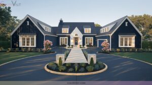
22. Dual-Tone Exteriors for a Modern Statement
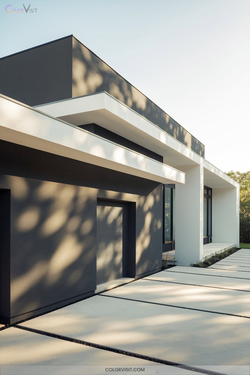
Elevate your home’s curb appeal with the visual intrigue of dual-tone exteriors—a trend that artfully blends two complementary hues for striking, contemporary results.
By pairing earthy sage green with soft orange accents or layering fresh spring green against an earthy gray backdrop, you’ll achieve a facade that feels both grounded and innovative.
Dual-tones allow you to spotlight architectural features and respond thoughtfully to your home’s environment.
- Highlight windows and doors with off-white or taupe trim for subtle contrast
- Integrate terracotta or blush shutters for warmth and sophistication
- Pair olive green with beige for seamless landscape harmony
- Use airy blue accents for a coastal-inspired twist
Frequently Asked Questions
How Do I Choose Trim Colors That Match Bold Wall Colors?
When choosing trim colors for bold walls, you’ll want to amplify contrast or embrace harmony. Opt for crisp white, rich black, or jewel tones. Don’t shy away from unexpected pairings—they’ll make your space feel fresh and innovative.
What Paint Finishes Work Best for High-Traffic Areas?
Want a finish that stands up to daily life while looking sharp? You’ll love satin for its washable, subtle sheen in busy spaces, or semi-gloss for maximum durability—and both stay on trend for innovative, modern homes.
Are There Eco-Friendly Paint Options for Interiors and Exteriors?
You’ll find plenty of eco-friendly paint options for both interiors and exteriors. Choose zero-VOC brands like Clare, Benjamin Moore Natura, or ECOS Paints—they’re trend-forward, offer sophisticated finishes, and support your commitment to sustainable, innovative design.
How Can Lighting Affect the Appearance of Paint Colors?
You’ll notice paint colors shift dramatically under different lighting. Natural light, bulb temperatures, and fixture styles all influence tones and depth. Test swatches throughout the day, mix lighting sources, and embrace innovative fixtures to achieve your perfect, on-trend palette.
What Preparation Is Needed Before Painting Over Dark Colors?
Did you know 80% of color inconsistencies stem from poor prep? You’ll need to patch, sand, and use a high-coverage tinted primer, applying thin coats for a flawless, on-trend finish that truly transforms your space.
Conclusion
Choosing your home’s colors is like curating an art gallery—each shade tells its own stylish story. In 2025, let bold jewel tones, serene neutrals, and warm inviting hues set the mood in every room and on every facade. Incorporating these color themes can transform your space into a reflection of your personal taste and style. For those planning events, consider how these palettes can serve as wedding color ideas for 2025, adding elegance and vibrancy to your celebration. Embrace the potential of these hues to create memorable atmospheres that resonate with joy and warmth.
With these 22 stunning ideas, you can transform your space into a trendsetting sanctuary that feels both personal and fresh. Embrace the palette that speaks to you, and watch your home come alive with effortless, aesthetic charm.