14 Statement-Making Room Door Color Ideas for Interior Transitions
Transform your space by choosing statement-making room door colors like Silver Song’s silvery gray, Chelsea Gray for warm contrast, or bold Black Satin for dramatic impact.
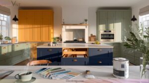
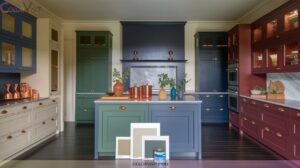
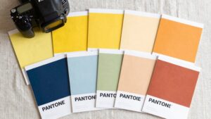
Try powder blue Alice White or calm Agate Green for serene flow, while Blush Pink or Burnt Orange infuse playful energy and warmth.
Monochrome gradients or vibrant color-blocking make each threshold pop. From stained oak Urban Grey to vibrant Galápagos Turquoise, discover how every threshold can feel unique—there’s much more inspiration ahead.

1. Silver Song: Subtle Silver-Gray Elegance
A gentle touch of sophistication, Silver Song by Benjamin Moore introduces a refined, light silver-gray tone that subtly elevates any room’s aesthetic.
You’ll find its neutrality amplifies brightness while seamlessly blending with diverse decor styles.
Pair it with crisp white or understated neutral trims for a cohesive look, or let it set the stage for bold furnishings and art.
Silver Song’s understated drama thrives in minimalist spaces, adapting effortlessly to modern textures and patterned textiles.
Its timeless appeal resists fleeting trends, delivering elegance in bedrooms, living areas, or entryways.
Embrace this innovative gray for a balanced, harmonious interior flow.
2. Alice White: Powder Blue Neutral Versatility
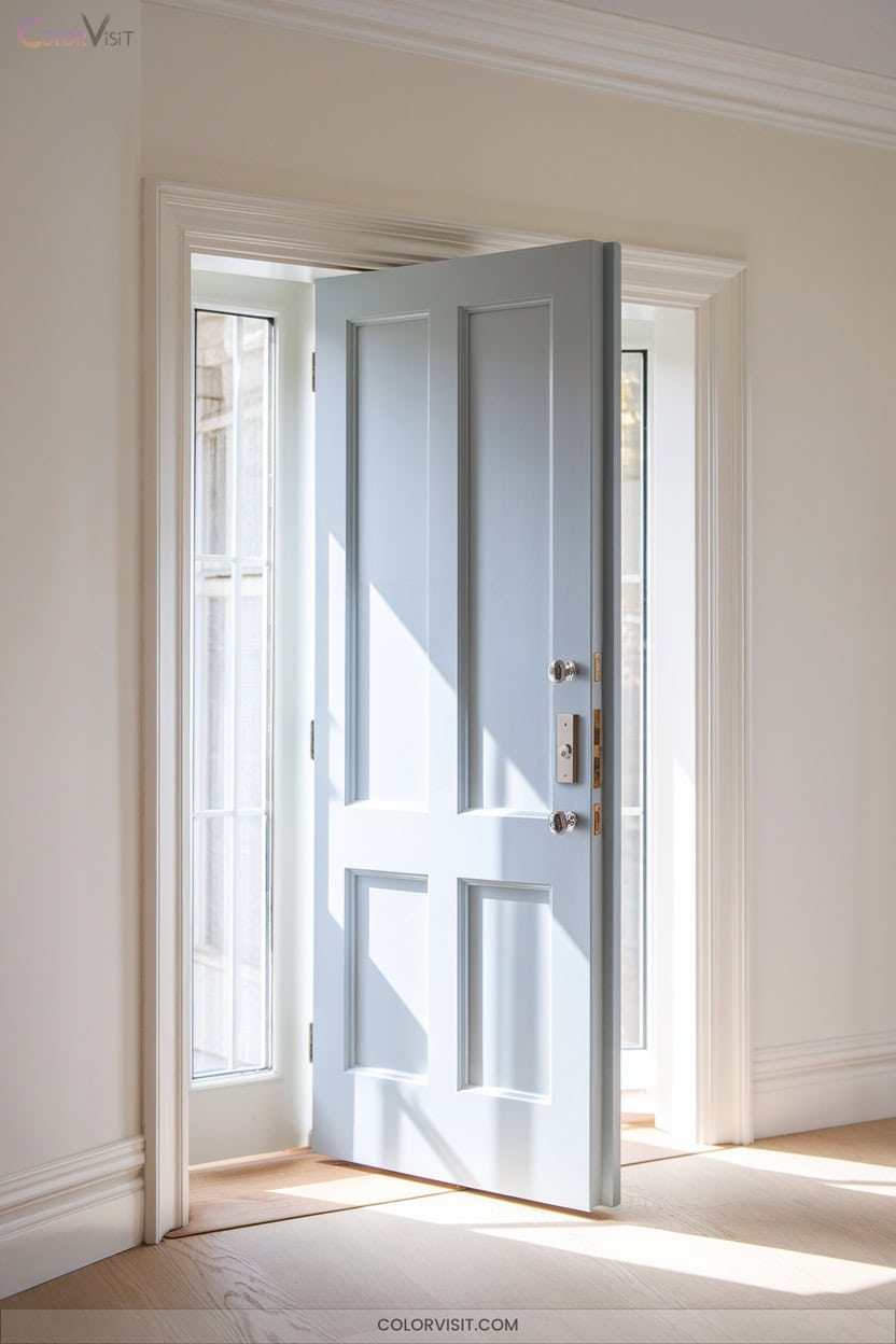
Moving from the refined subtlety of silver-gray, consider the effortless charm of pairing powder blue doors with Alice White for a fresh, contemporary statement.
Powder blue’s muted gray undertones offer neutral versatility, seamlessly bridging modern and classic interiors.
When framed by Alice White trim, doors evoke clarity and crispness, enhancing light and spatial flow.
This pairing brings calm and cohesion to spaces, unifying diverse palettes with understated color.
Complement the look with light oak finishes, rattan accents, and brushed nickel hardware for tactile depth.
Opt for matte or eggshell finishes to maintain a sophisticated, muted effect without overwhelming the ambiance.
3. Chelsea Gray: Warm Gray for Transitional Contrast
Sophistication meets versatility with Chelsea Gray—a warm, mid-depth shade that delivers refined contrast without overwhelming a room.
Chelsea Gray brings sophisticated warmth and versatile contrast, elevating interiors with a refined touch that never feels overpowering.
Use it on doors to subtly define divisions in open floor plans, letting its balanced light reflectivity and nuanced green or violet undertones respond dynamically to your space’s orientation.
Pair Chelsea Gray with crisp Chantilly Lace trim for a tailored, contemporary edge.
This hue harmonizes beautifully with wood, matte black, or brushed brass hardware, enhancing architectural details.
Its warm depth avoids flatness, performing elegantly even in tricky north-facing rooms.
For a modern, statement-making shift, Chelsea Gray elevates your doors with understated, on-trend distinction.
4. Kendall Charcoal: Defining Deep Gray
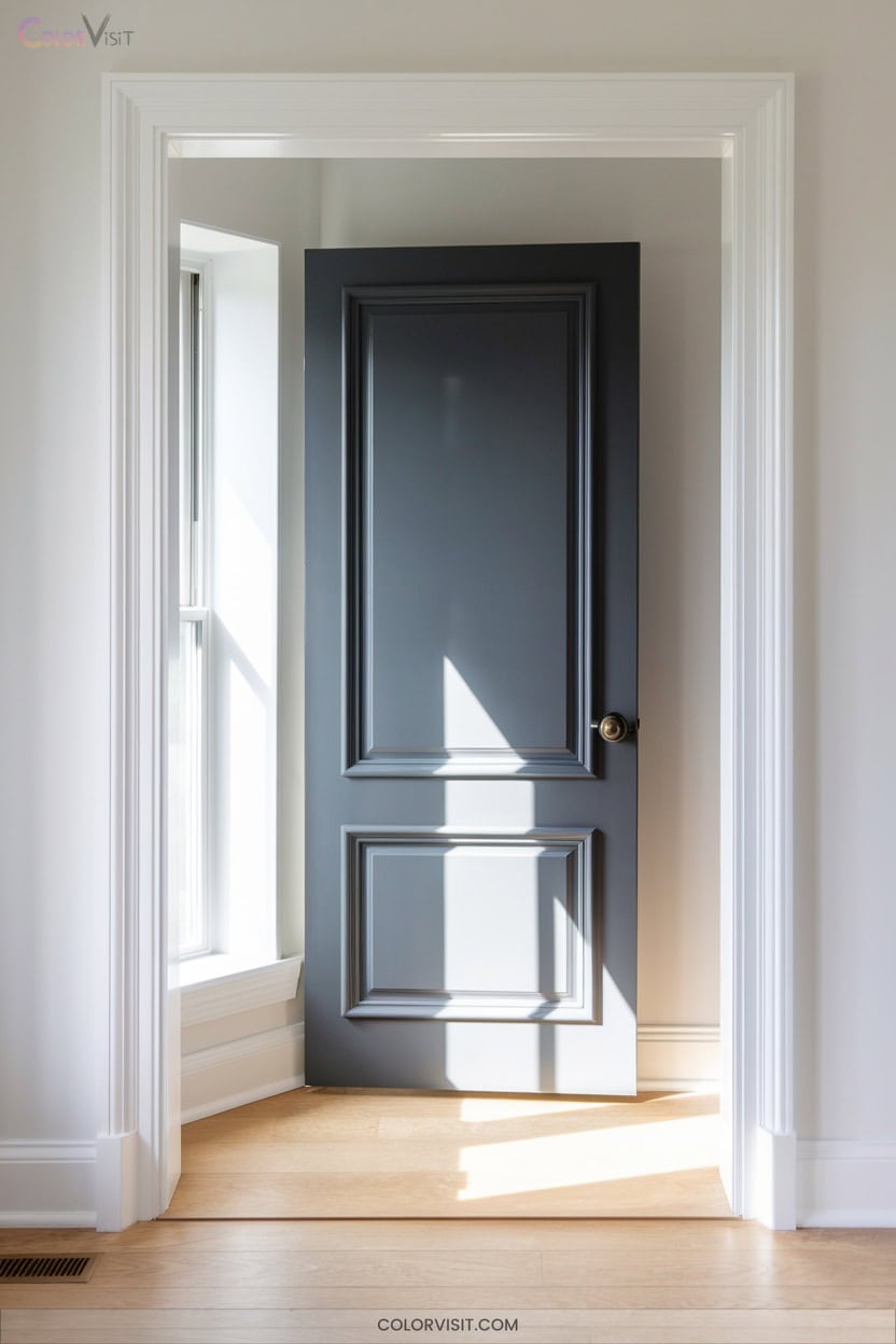
For those craving a bolder counterpoint to the warmth of Chelsea Gray, Kendall Charcoal offers striking definition with its deep, multidimensional gray base and subtle green undertone.
This saturated shade transforms doors into architectural centerpieces, its LRV below 15 creating dramatic shadow and visual weight.
Satin or pearl finishes keep surfaces refined and tactile.
Pair with crisp Chantilly Lace trim to sharpen profiles, or introduce warm woods and deep navies for layered sophistication.
Kendall Charcoal thrives in varied lighting—north-facing rooms maximize its moody intensity, while warm bulbs highlight its organic nuance.
It’s a fearless, versatile choice for innovative interiors.
5. Urban Grey: Modern Stained Oak Texture
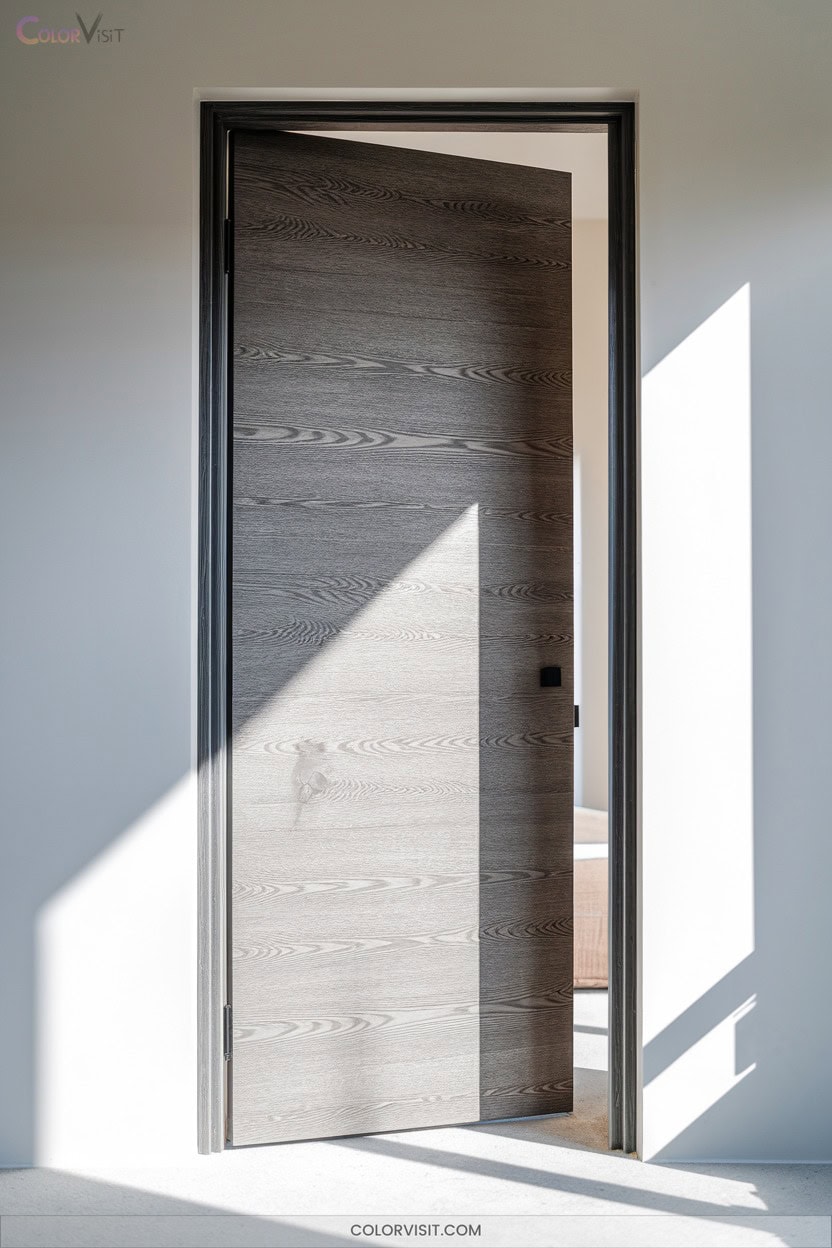
An Urban Grey stained oak door instantly anchors a room with its refined balance of natural grain and contemporary color.
You’ll notice how the sophisticated grey—ranging from cool light to deep, rich tones—elevates the oak’s texture while keeping your space rooted in modernity.
Sophisticated grey tones enhance the oak’s natural texture, bringing depth and a modern edge to any interior space.
This finish pairs seamlessly with minimalist hardware, metallic accents, and both light and dark interior palettes.
Use it for main entrances to establish a statement or as a sleek room divider that doesn’t block light.
Urban Grey’s versatility means it enhances thematic consistency, harmonizes with natural materials, and requires minimal upkeep—perfect for future-focused, design-driven interiors.
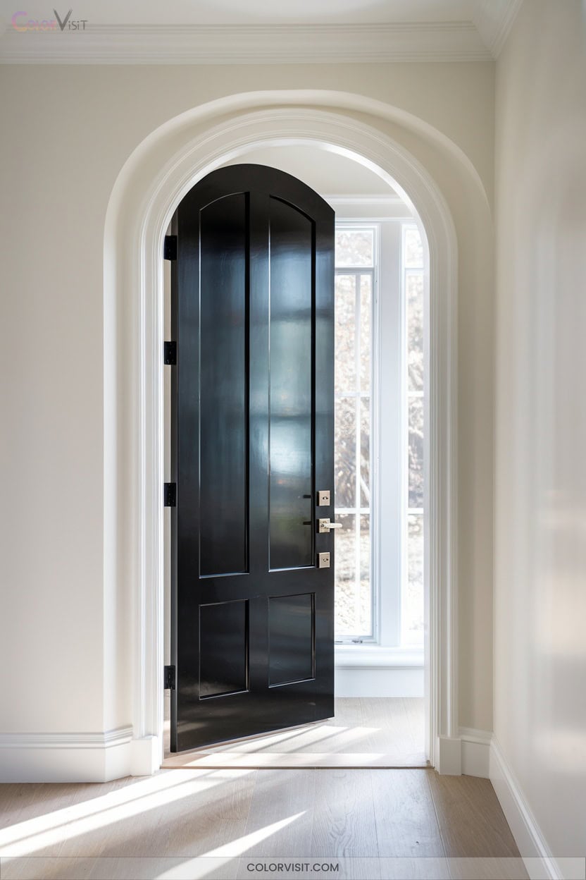
6. Black Satin: Luxe Matte Black Drama
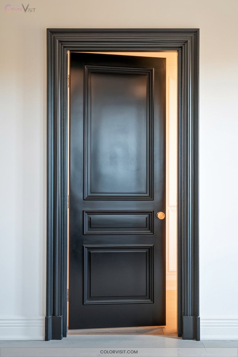
Drama enters with a black satin door, instantly commanding attention and anchoring your space with a luxe, modern edge.
The matte finish softens reflections, letting the rich color depth create striking contrast against light walls or neutral accents.
Black satin’s versatility means it adapts effortlessly—enhancing moody, trend-forward interiors or elevating farmhouse chic and traditional spaces.
Pair with creams, bold hues, wood tones, or metallics for a tailored, sophisticated look. You’ll appreciate its durability, easy maintenance, and timeless appeal.
As a bold design move, a black satin door delivers elegance and visual intrigue, transforming any room threshold into an unforgettable statement.
7. Onyx: Sophisticated Black Accents
Sophistication defines Onyx—a pure, neutral black that transforms a simple door into a statement of enduring elegance.
Choose Onyx to ground your interiors with a color that’s universally chic yet visually impactful.
Its deep, consistent tone creates stunning contrast, making architectural details and trim pop without overpowering your decor.
Opt for a satin or pearl finish to soften its intensity, mask imperfections, and keep maintenance effortless.
Onyx complements both modern and classic aesthetics, pairing beautifully with wood, brick, or vibrant accents.
Let it anchor open spaces, unify connections, and serve as a striking canvas for your most artistic design moments.
8. High-Gloss Black: Reflective Modern Impact
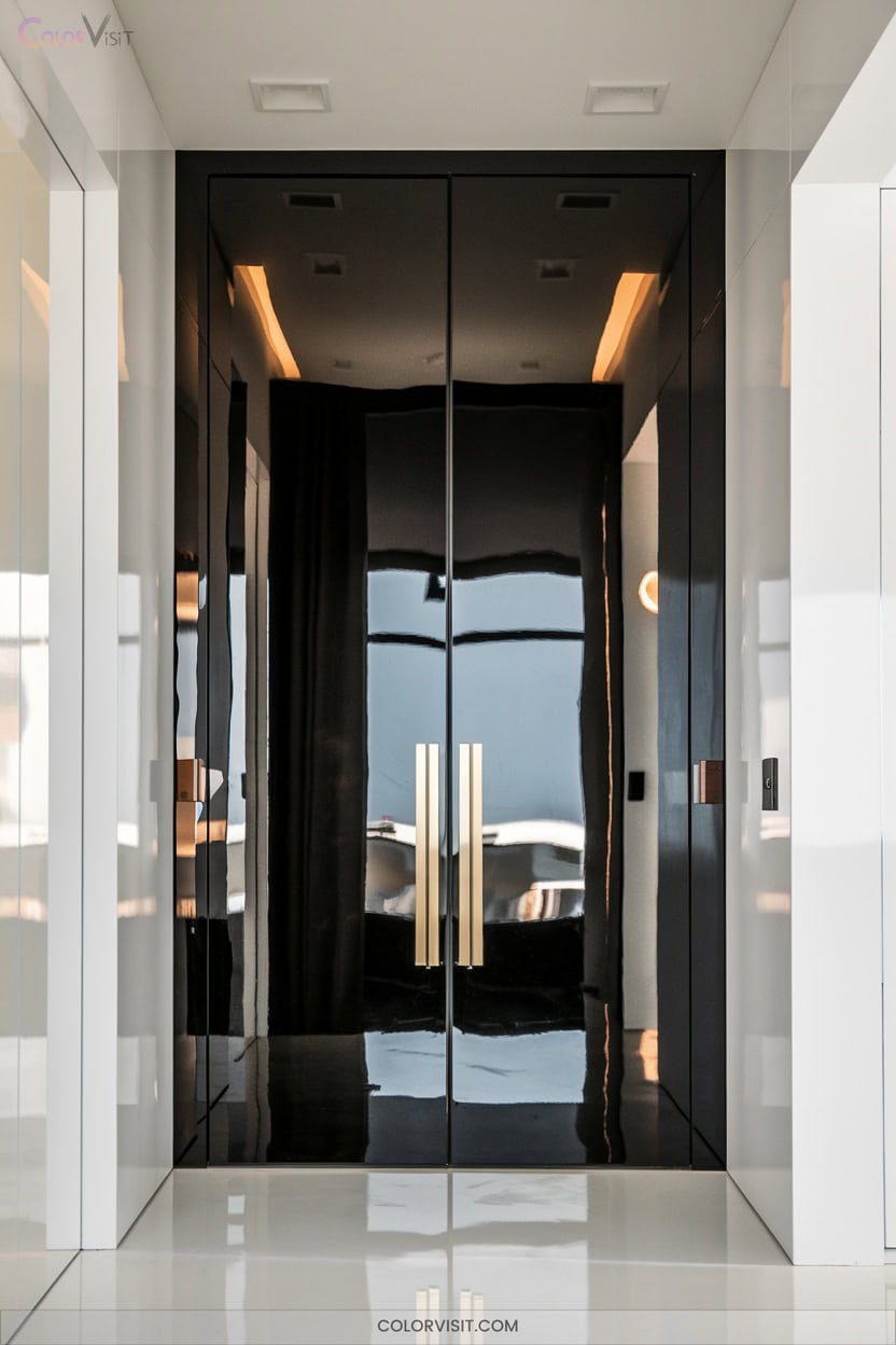
Lustrous allure defines high-gloss black doors, instantly setting a dramatic tone within any modern space.
You’ll love how the reflective surface amplifies light, creating a striking focal point that elevates minimalist or contemporary interiors.
Opt for MDF slabs with aluminum banding or high-density wood substrates—these materials guarantee durability and a flawless finish.
High-gloss black pairs effortlessly with white trim, metallic hardware, or stained glass details, balancing boldness with elegance.
While fingerprints and imperfections show more readily, the visual payoff is undeniable.
Embrace this trend in urban lofts or eclectic homes, where innovation thrives and statement shifts truly matter.
9. Charcoal Gray: Soft Farmhouse-Modern Blend
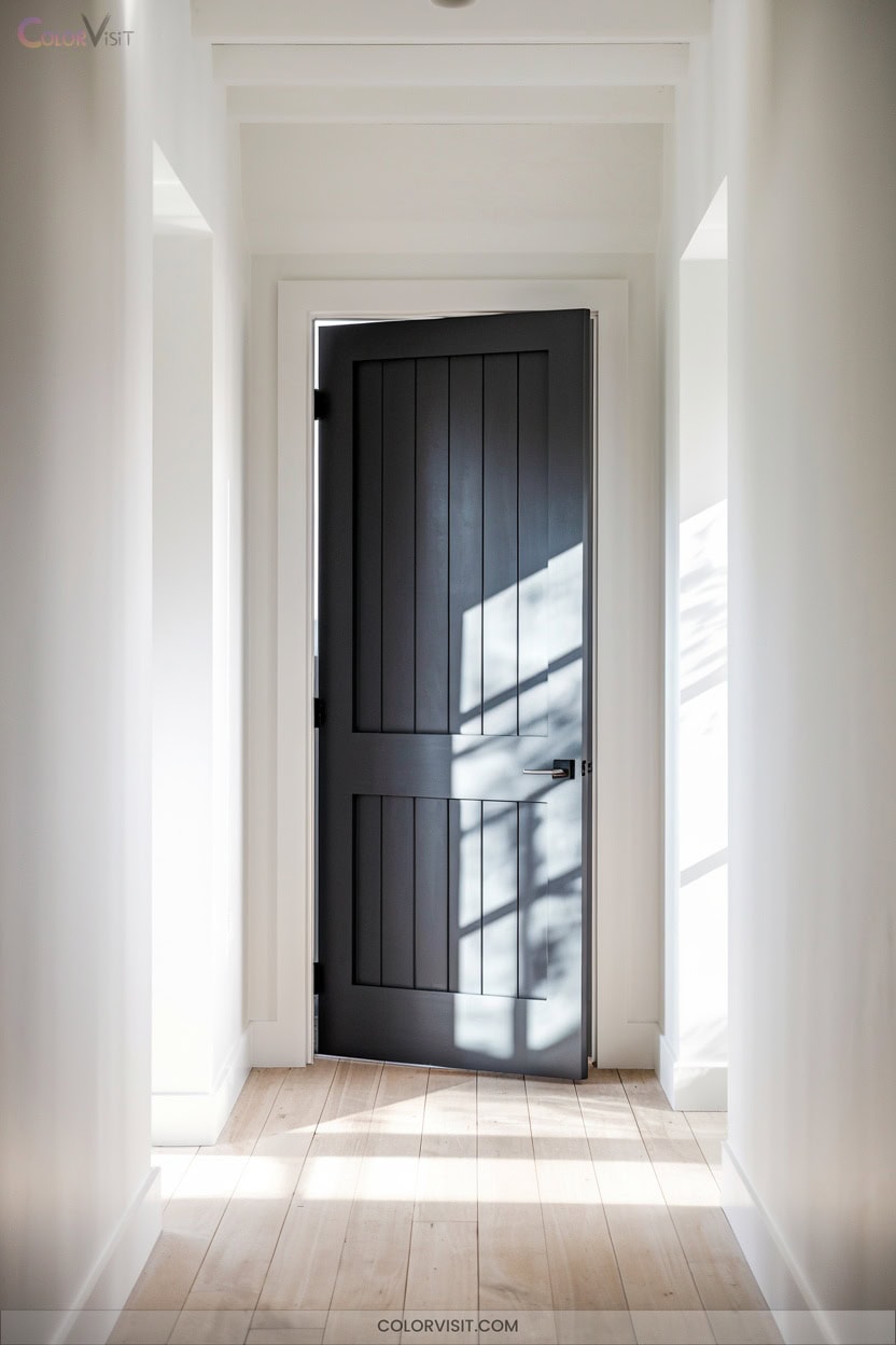
While high-gloss black doors command attention with their bold sheen, charcoal gray offers a subtler approach that melds seamlessly with farmhouse-modern interiors.
This hue—think Kendall Charcoal—serves as a sophisticated neutral, providing depth without overpowering your space.
Pair it with crisp whites to highlight architectural details or blend it with rustic wood tones for a cozy, updated farmhouse feel.
Charcoal gray’s versatility shines with both cool and warm palettes, adapting to evolving trends.
Add bronze or copper hardware for a modern edge, and let natural textiles amplify the tactile appeal.
Test shades in your lighting for a perfectly tailored look.
10. Galápagos Turquoise: Vibrant Teal Focal Point
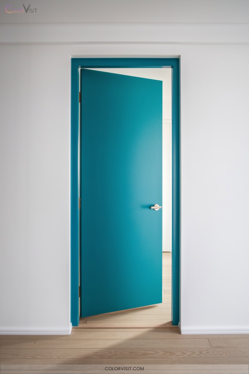
A splash of Galápagos Turquoise transforms any room door into a striking focal point, infusing your space with the rich vibrancy of deep ocean waters.
This Benjamin Moore shade (2057-20) boasts a low LRV of 9.45, delivering saturated color that feels both modern and intimate—especially in expansive spaces.
Use it on doors to bridge rooms with bold innovation, pairing seamlessly with clean-lined furniture and natural textures like wood or stone.
Experiment with contrasting hues such as Honeymoon for a fresh pop, or layer Silver Marlin for sophisticated color blocking.
Opt for a semi-gloss finish to maintain durability and easy upkeep.
11. Agate Green: Calming Spring Green Choice
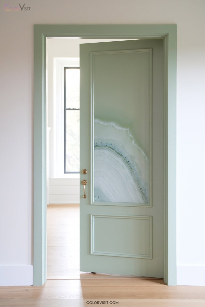
If you’re seeking a room door color that’s both soothing and stylish, Agate Green (Sherwin-Williams SW 7742) offers a refined alternative to bold teals like Galápagos Turquoise.
This calming, earthy shade instantly elevates thresholds, infusing your space with serene vibes and understated luxury.
A calming, earthy shade that elevates any entryway, bringing serene vibes and a touch of understated luxury to your home.
Its versatility complements modern, bohemian, or nature-inspired interiors, pairing effortlessly with neutrals, earthy hues, or soft pastels.
Agate Green’s moderate light reflectance reduces glare, while its durability guarantees long-lasting color.
Use it on doors for a subtle statement, or extend it to trim and hallways for a cohesive, innovative look that channels contemporary tranquility.
12. Blush Pink: Playful Contemporary Contrast
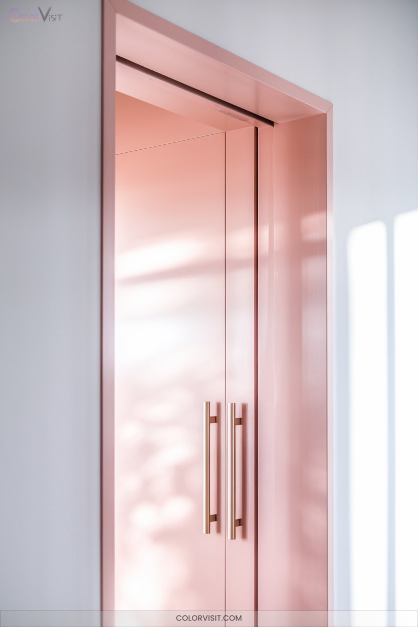
Blush pink introduces a gentle burst of personality to any interior, offering a playful yet refined contrast that feels effortlessly current.
Use it on doors to bridge modern minimalism with warmth, letting soft pink tones enliven neutral halls or crisp white walls.
Enhance its elegance with silver or brass hardware, or apply a dry-brushed accent for subtle dimension.
Blush pink pairs seamlessly with light greens and blues, infusing spaces with a fresh, nature-inspired energy.
Millennials love its sophisticated vibrancy, making it a go-to for bedrooms, dressing areas, or powder rooms where comfort and contemporary style harmoniously blend.
13. Burnt Orange: Bold Warmth for Cool Spaces
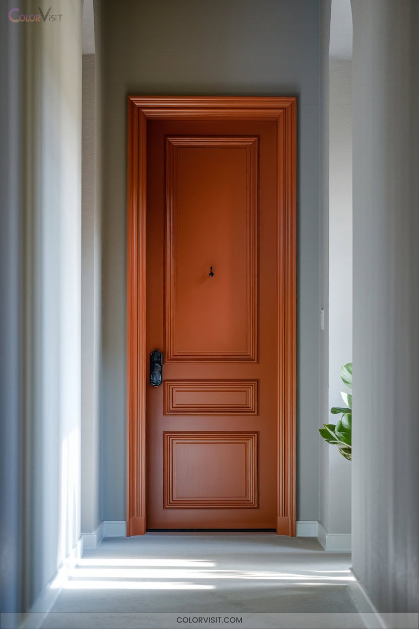
Burnt orange radiates bold warmth, instantly transforming cool or neutral spaces into inviting, energetic environments.
This earth-toned hue—think Earths Core or Copper Blush—strikes a balance between vibrancy and rustic charm, making your doors a sophisticated, approachable focal point.
Pair burnt orange with teal, navy, or cool grays for contrast, or blend with sage and warm neutrals for harmony.
In modern, rustic, or blended interiors, burnt orange doors bring creativity and visual comfort.
Highlight with brass or matte black hardware for extra dimension.
Let burnt orange delineate zones, disguise wear, and elevate your interiors with a trend-forward, memorable statement.
14_Monochrome & Color-Blocked Door Statements

A thoughtfully chosen monochrome or color-blocked door instantly elevates the style of any room, turning a simple entryway into a statement feature.
Elevate any room’s style by transforming a simple entryway into a striking statement with a monochrome or color-blocked door.
Embrace monochromatic palettes by painting your door and trim in graduated shades—think soft blues or clay tones—for seamless visual flow and understated elegance.
This approach offers harmony while letting your decor shine.
Prefer boldness? Color-blocking with contrasting hues transforms doors into focal points, especially in neutral settings. Highlight flows with a pop of leather yellow or deep green.
Both styles speak to trendsetters who crave design innovation, delivering sophisticated, customizable options to redefine your home’s interior flows.
Frequently Asked Questions
How Do I Choose the Best Finish (Matte, Satin, Gloss) for Interior Doors?
When choosing a door finish, assess your space’s light, traffic, and mood. Matte absorbs light for subtle elegance, satin balances sheen and durability for trends, while gloss pops with innovation—perfect if you crave bold, high-impact style.
What Prep Work Is Needed Before Painting or Staining an Interior Door?
Before painting or staining, you’ll remove hardware, deep-clean, sand, and repair imperfections. Prime if needed, then set up a stylish, organized workspace. Use quality tools, mask edges, and prioritize safety for flawless, on-trend results.
Can You Repaint Over Stained Wood Doors Without Sanding?
Yes, you can repaint over stained wood doors without sanding if you use a quality deglosser and the right primer. You’ll streamline the process, protect modern finishes, and maintain that fresh, innovative edge in your interior aesthetic.
How Do Door Colors Affect Perceived Room Size and Light?
You’ll notice door colors instantly shift a room’s vibe—light, seamless hues visually expand and brighten, while bold or dark tones absorb light, creating cozy intimacy. High-contrast doors define boundaries, subtly shrinking space, but add daring, on-trend appeal.
Are Certain Door Paint Colors More Durable or Easy to Clean?
Imagine your door as a chic designer handbag—dark, glossy finishes reveal every fingerprint, while soft grays or satin blues disguise daily smudges. If you crave longevity and effortless upkeep, opt for semi-gloss, urethane enamel paints.
Conclusion
As you choose a door color, remember that 52% of designers say a bold door instantly elevates a room’s style.
Whether you’re drawn to soft silver, deep charcoals, or playful blush, your door becomes a curated element—a detail that pulls the eye and sets the mood.
Don’t be afraid to make a statement; after all, in a well-designed home, every surface tells your story, and the right color is your perfect signature.