Are Blue and Orange Complementary Colors: Explained!
In the world of color theory, understanding the relationship between blue and orange as complementary colors is crucial for anyone involved in design, art, or visual communication.
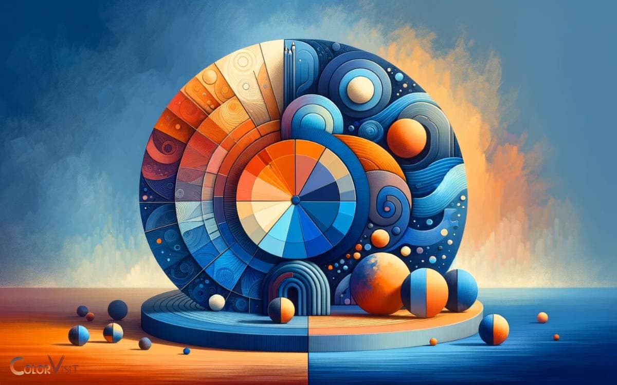
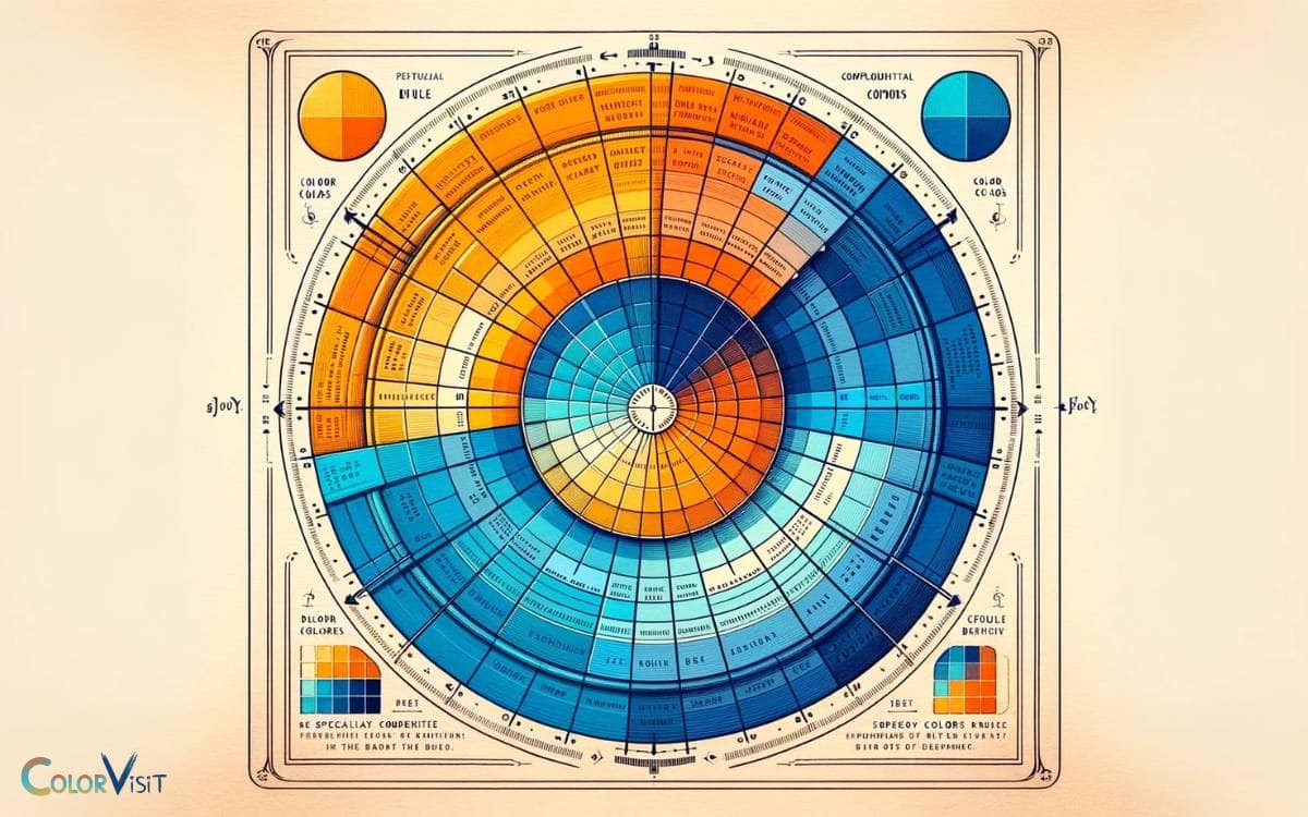
These two colors sit directly opposite each other on the color wheel, a positioning that signifies their complementary nature.
This dynamic pairing is more than just a striking visual contrast; it has significant implications for design aesthetics, psychological influence, and practical applications across a variety of disciplines.
However, the interaction between blue and orange goes beyond simple opposition, demanding a deeper exploration of how they can be used together to create visually appealing and effective designs.
Why Blue and Orange Are Complementary Colors:
Consider a website designed with a deep blue background and vibrant orange buttons. This use of complementary colors not only makes the buttons stand out but also creates a visually appealing and easy-to-navigate interface.
Utilizing blue and orange effectively in design requires an understanding of their complementary nature and the ability to balance their visual impact for the desired outcome.
Key Takeaway
Understanding Color Theory
At the core of visual arts and design, color theory provides a foundational understanding of how colors interact, influence, and complement each other within a spectrum.
This theoretical framework is essential for creators who aim to evoke specific emotions, convey messages, or achieve aesthetic harmony in their work.
By delving into the psychological and cultural implications of color, designers can craft visuals that resonate deeply with their intended audiences.
Furthermore, understanding color theory enables the innovative application of color in ways that can enhance usability and accessibility in digital interfaces.
This analytical approach to color selection and combination is not just about aesthetics but also about creating meaningful and effective design solutions that stand out in a competitive landscape.
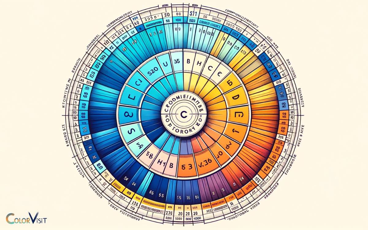
The Color Wheel Explained
Building on the foundational principles of color theory, the color wheel presents a structured visual representation of colors and their relationships.
This circular diagram serves as a crucial tool in various fields, enabling professionals to harness the power of color combinations effectively.
To understand its significance, consider the following:
- Primary Colors: Red, yellow, and blue form the wheel’s base, incapable of being created through the mixing of other colors.
- Secondary Colors: Green, orange, and purple are derived from combinations of primary colors, illustrating the wheel’s interconnected nature.
- Tertiary Colors: Mixing primary and secondary colors yields these hues, expanding the palette for nuanced design exploration.
This systematic arrangement facilitates a deeper comprehension of color harmony, guiding innovative applications in design, art, and marketing.
Blue and Orange in Design
Harnessing the dynamic interplay between blue and orange, designers effectively create visually compelling and balanced compositions across various mediums.
This color combination, when utilized with precision, evokes a sense of vibrancy and harmony, essential for innovative design solutions.
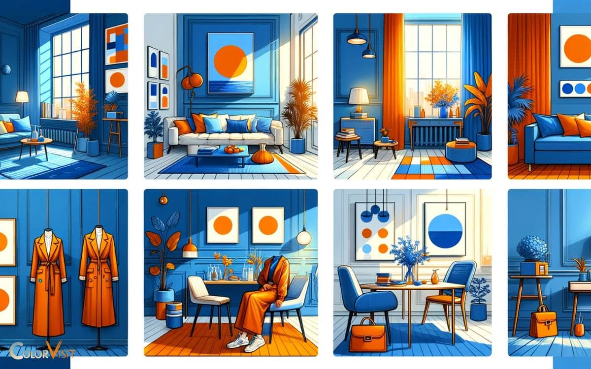
The application of these colors spans digital interfaces, branding, and interior design, showcasing their versatility and impact.
| Medium | Blue Application | Orange Application |
|---|---|---|
| Digital | Backgrounds, Icons | CTA Buttons, Highlights |
| Branding | Corporate Identity, Logos | Accent Colors, Packaging |
| Interiors | Walls, Furnishings | Decorative Accents, Art |
Psychological Impact
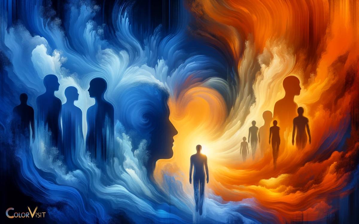
The psychological impact of the blue and orange color combination is profound, influencing perceptions and emotions in ways that are significant for both designers and viewers.
This dynamic duo evokes a range of psychological responses due to their high contrast and visibility.
To further elucidate:
- Stimulation of Creativity: The stark contrast between blue’s calmness and orange’s energy can stimulate the mind, fostering innovative thinking and creativity.
- Enhanced Attention: This color combination grabs attention more efficiently than monochromatic schemes, making it ideal for conveying important information.
- Emotional Balance: Blue’s association with stability and calmness, juxtaposed with orange’s vibrancy and enthusiasm, can create a balanced emotional response, making content engaging yet comforting.
Understanding these psychological effects is crucial for harnessing the full potential of this color combination in design and communication strategies.
Practical Applications
Recognizing the psychological impact of blue and orange as complementary colors, it becomes essential to explore their practical applications in various fields.
In marketing and branding, these colors are strategically utilized to evoke specific emotions, enhance brand recognition, and influence consumer behavior.
The dichotomy between blue’s tranquility and orange’s energy can be harnessed to create visually compelling and psychologically balanced compositions.
In UI/UX design, this color pairing improves user engagement by optimizing readability and highlighting key actions.
Additionally, in interior design, blue and orange are employed to cultivate environments that stimulate creativity while maintaining a sense of calm.
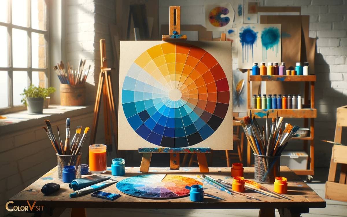
Blue and Orange Color Wheel
Creating a blue and orange color wheel involves combining these two colors, which are complementary on the color wheel, meaning they are opposite each other.
This contrast creates a vibrant and dynamic visual effect because complementary colors enhance each other’s brightness and intensity.
The blue and orange color wheel will include a range of shades from blue to orange, transitioning through intermediate colors such as purples and greens, which are mixtures of the primary colors (blue and red) and secondary colors (green and orange) involved.
To visualize this, imagine starting with pure blue on one side and pure orange on the other. As you move clockwise or counterclockwise around the wheel, the colors will blend through various shades.
Directly between blue and orange, you would find colors that are mixtures of the two, such as warm greens and cool purples, since green is a mixture of blue and yellow, and when you mix orange (which contains red and yellow) with blue, you get shades of purple and brown depending on the proportion of each color.
This blend showcases how colors can transition smoothly from one to the other, creating a wide spectrum of hues that can be used for color harmony in art, design, and aesthetics.
The use of complementary colors like blue and orange is a popular choice for creating visual interest and vibrancy in various forms of visual media.
Orange and Blue Color Theory
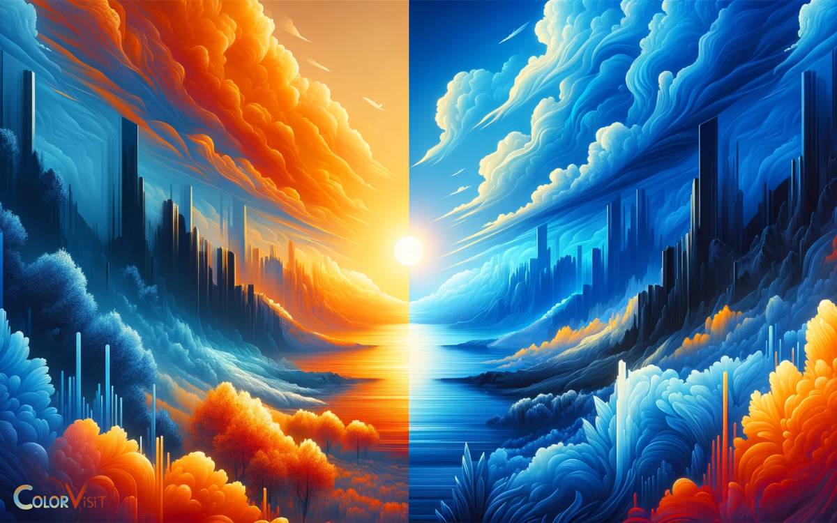
Orange and blue are complementary colors on the color wheel, meaning they are positioned directly opposite each other.
This relationship is a fundamental aspect of color theory, which explores how different colors interact and the visual effects of those interactions.
Here’s a closer look at how the orange and blue color theory is applied in various fields and its impact:
Visual Contrast and Harmony
- Complementary Contrast: Orange and blue create a high contrast when used together. This contrast is visually striking and can draw attention to specific elements within a composition.
- Harmony: Despite their contrast, complementary colors like orange and blue can achieve a harmonious look when used in the right proportions, offering a balanced and pleasing aesthetic.
Psychological Impact
- Orange: Often associated with warmth, enthusiasm, creativity, and energy, orange can evoke feelings of excitement and vibrancy.
- Blue: Typically associated with calmness, stability, trust, and serenity, blue can induce a sense of peace and tranquility.
- The juxtaposition of orange and blue can create a dynamic balance, stimulating the viewer while also providing a sense of stability.
Use in Art and Design
- Art: Artists use orange and blue to create depth and focus in their work. The contrast between warm orange and cool blue can add dimension and direct the viewer’s attention to specific areas of the artwork.
- Design: In graphic and interior design, orange and blue are used to create vibrant and energetic spaces that also feel balanced and inviting. This color combination is popular in branding and advertising to grab attention and convey specific brand values.
Film and Photography
- Color Grading: Many filmmakers and photographers use an orange and blue color palette to enhance their visuals. This technique helps to separate the subject from the background, improve skin tones, and create a visually appealing contrast that is pleasing to the eye.
Cultural and Contextual Variations
The meanings and associations of orange and blue can vary depending on cultural and contextual factors. However, the visual impact of their complementary nature is universally recognized.
Application Tips
- Balance: Use orange and blue in balanced proportions to avoid overwhelming the viewer. A dominant color can anchor the composition, while its complementary color can serve as an accent.
- Variations: Explore different shades and tints of orange and blue to achieve different moods and effects. Lighter shades can offer a more subtle and soft look, while brighter, more saturated shades can be more dynamic and energetic.
- Textures and Materials: Incorporating various textures and materials can enhance the visual interest of the orange and blue color scheme, adding depth and complexity to the design.
Understanding and applying the principles of orange and blue color theory allows creators to craft visually compelling and emotionally engaging works across different mediums and industries.
Conclusion
The exploration of color theory and the detailed examination of the color wheel illuminate the compelling relationship between blue and orange as complementary colors.
This dynamic pairing, when employed in design, leverages profound psychological effects, enhancing visual appeal and communication effectiveness.
The practical applications of this color harmony span various fields, underscoring its versatility and potency.
Thus, the strategic use of blue and orange not only captivates the visual senses but also enriches the intended message, affirming their intrinsic complementary nature.
