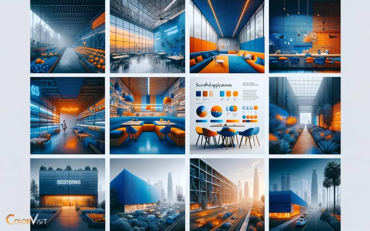
Blue and Orange Color Palette: Harmonizing Opposites!
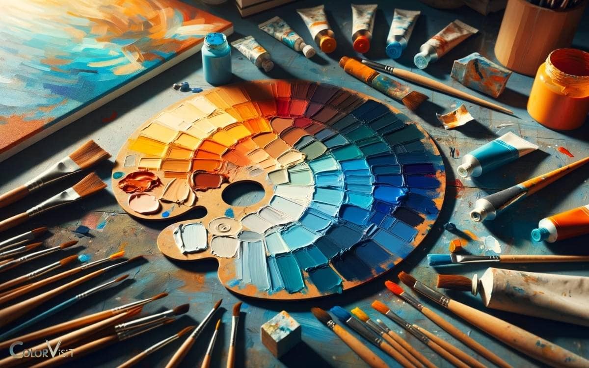
The blue and orange color palette, a striking and harmonious combination, is deeply rooted in color theory principles, offering more than just aesthetic pleasure. This palette creates a sense of balance and energy, engaging viewers on both emotional and psychological levels. Artists and designers often explore the blue orange purple color palette to evoke creativity and excitement while maintaining visual stability. Such combinations can transform spaces and resonate with audiences, elevating the overall impact of a work. This dynamic pairing evokes feelings of warmth and tranquility, making it a popular choice in various design disciplines. Burnt orange and blue aesthetics not only enhance visual appeal but also create a captivating contrast that draws attention and evokes emotional responses. As a result, these colors are frequently utilized in branding, interior design, and artwork to create memorable impressions.
These complementary colors create a dynamic contrast that has fascinated artists and designers for centuries.
The appeal of blue and orange extends from the natural serenity and vibrancy found in landscapes to their powerful use in visual media, capturing attention and evoking a wide range of emotions. This combination can create striking contrasts, enhancing the visual experience in both art and design. The blue gray orange color palette exemplifies this balance, where the calmness of blue and gray complements the energetic punch of orange, resulting in a harmonious yet dynamic aesthetic. Such palettes can be particularly effective in branding, interior design, and fashion, drawing viewers in while maintaining an aura of sophistication.
This exploration delves into the scientific foundations, historical significance, and contemporary applications of this color scheme, revealing an intriguing blend of art and psychology.
Exploring the Blue and Orange Color Palette:
In the movie industry, the blue and orange palette is often used in posters to create a visually appealing contrast that stands out, making it a favorite choice for blockbuster films.
The blue and orange palette transcends mere color choice, embodying a perfect blend of visual appeal and psychological impact that continues to enchant and engage audiences worldwide.
Key Takeaway
The Science Behind Complementary Colors
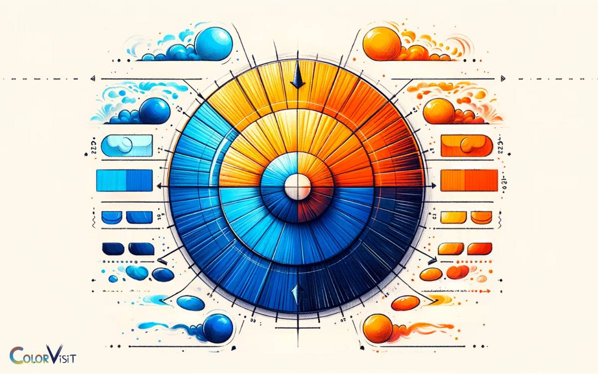
Delving into the realm of color theory, the concept of complementary colors stands out as a fundamental principle, particularly illuminating why the blue and orange color palette resonates so profoundly in visual aesthetics.
This pairing capitalizes on the high contrast and vibrancy inherent in complementary relationships, where colors directly opposite each other on the color wheel significantly enhance each other’s visual impact.
The blue and orange combination exploits this contrast to evoke a dynamic, yet harmonious feeling, making it a go-to choice for designers aiming to capture attention while maintaining balance.
This sophisticated understanding of color interaction not only enriches the visual experience but also pushes the boundaries of design innovation, encouraging a trend-conscious approach that values the power of detail in crafting memorable and impactful visual narratives.
Historical Uses in Art and Design
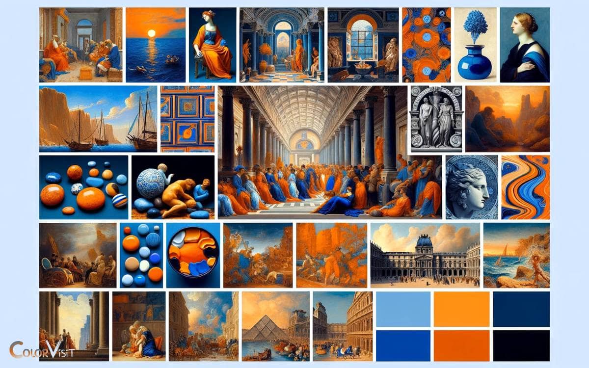
The historical tapestry of art and design vividly showcases the blue and orange color palette, a testament to its timeless appeal and dynamic visual impact across ages.
This juxtaposition of colors has been celebrated for its ability to evoke depth, contrast, and visual harmony, enriching artworks and architectural elements with a vibrant yet balanced aesthetic.
| Era | Example | Impact on Design |
|---|---|---|
| Renaissance | The Birth of Venus | Enhanced naturalism and depth |
| 17th Century | Dutch Golden Age | Emphasized lighting and mood |
| 20th Century | Art Deco | Symbolized energy and luxury |
Modern Applications and Trends
In contemporary design landscapes, the blue and orange color palette continues to influence trends, shaping spaces with its vibrant contrast and aesthetic appeal.
This dynamic duo has been skillfully utilized across various mediums, offering a fresh perspective on design elements that captivate and inspire.
- Digital Media: From website designs to social media graphics, creating eye-catching visuals.
- Interior Design: Accent walls and decor that energize living spaces.
- Fashion Industry: Bold, statement-making apparel and accessories.
- Branding and Marketing: Memorable logos and campaigns that stand out.
- Art Installations: Innovative use in public spaces, evoking emotion and conversation.
This palette’s adaptability and striking impact keep it at the forefront of modern design, continually evolving to meet the desires of an audience that craves innovation and distinction.
Tips for Creating Striking Combinations
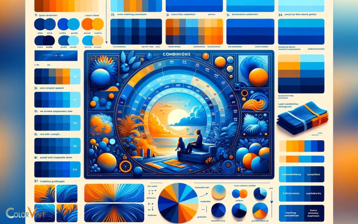
Mastering the art of combining blue and orange hues requires a keen eye for detail, an understanding of color theory, and a flair for creativity to achieve visually compelling and trend-forward designs.
To create striking combinations, begin by selecting shades that complement rather than clash.
For a harmonious blend, use a soft, pastel blue with a muted orange; for a bolder statement, opt for a vibrant cobalt paired with a fiery terracotta.
Consider the context and application—whether for fashion, interior design, or branding—to ensure the palette aligns with the desired mood and message. Incorporating neutrals can balance the intensity, while experimenting with textures adds depth.
Always remember, the key to innovation lies in daring to mix, match, and juxtapose unexpected hues for a truly distinctive result.
Case Studies: Blue and Orange in Action
Exploring real-world applications, several case studies vividly illustrate the dynamic impact of blue and orange color palettes across various design disciplines.
These combinations not only captivate the viewer but also evoke a range of emotions, from energetic vibrance to serene calmness.
- Interior Design: A living room makeover featuring blue walls with orange accents, creating a space that’s both inviting and energizing.
- Branding: A tech startup’s logo utilizing blue and orange to convey innovation and reliability.
- Fashion Design: A runway collection that pairs bold orange pieces with subtle blue accessories for a striking contrast.
- Web Design: A user interface design that uses blue and orange to guide the user’s eye and emphasize call-to-action buttons.
- Art: A modern art piece where blue and orange swirls evoke a sense of dynamic motion and balance.
Conclusion
In the realm of visual aesthetics, the juxtaposition of blue and orange not only captivates the observer’s gaze but also harmonizes the visual experience through their complementary nature.
This color palette, deeply rooted in both historical significance and modern relevance, continues to influence art, design, and trends with its striking combinations.
By meticulously selecting hues and understanding their interactions, one can craft compositions that speak volumes, demonstrating that in the world of design, opposites do indeed attract, creating a symphony of colors that resonates with timeless appeal.
