Blue Orange Movie Color Scheme: Cinematic Brilliance!
The blue-orange color scheme, widely utilized in the movie industry, transcends mere aesthetics, delving deep into the realm of color psychology and its profound impact on audience perception.
This juxtaposition of blue’s coolness against orange’s warmth does more than please the eye; it strategically manipulates the viewer’s emotional landscape.
Historically, filmmakers have leveraged this color scheme to accentuate contrasts, trigger specific emotions, and denote character attributes.
This analysis delves into the technical intricacies and memorable cinematic instances where this palette has not only enriched the visual narrative but also subtly shaped the audience’s experience in multifaceted ways.
Understanding the Blue-Orange Color Scheme in Films:
In the critically acclaimed movie ‘Mad Max: Fury Road,’ the extensive use of the blue-orange palette not only visually stuns the audience but also deepens the narrative by contrasting the desolate, hostile desert (orange) with the hopeful, clear skies (blue), mirroring the film’s underlying themes of survival and hope.
The strategic application of the blue-orange color scheme serves as a visual storytelling tool, ingeniously weaving color psychology into the fabric of cinematic narratives, thereby elevating the film-watching experience to new emotional heights.
Key Takeaway
The Psychology Behind Colors
The psychology behind colors is a complex field that investigates how hues influence human behavior, emotions, and perceptions, providing crucial insights into their application in visual media.
Blue and orange, as a pair, stand out for their intrinsic properties and the psychological impact they have on viewers.
Blue is typically associated with tranquility, depth, and stability, evoking a sense of calm and serenity. It can also symbolize trust, loyalty, and wisdom.
Conversely, orange is perceived as vibrant and energetic, often associated with enthusiasm, creativity, and warmth.
This juxtaposition creates a dynamic visual contrast that is not only aesthetically pleasing but also stimulates cognitive engagement.
Understanding these psychological effects allows filmmakers and designers to strategically employ the blue-orange color scheme to evoke specific emotions and responses from their audience, fostering an innovative visual storytelling approach.
Historical Use in Cinema
Understanding the psychological impact of colors on human emotions and perceptions paves the way for exploring their historical application in cinema. The blue-orange color scheme has played a pivotal role in visual storytelling.
This dichotomy, rooted in complementary colors, leverages the warm and cool tones to create a visually striking contrast that enhances narrative depth and emotional resonance.
Historically, filmmakers have employed this scheme to guide audience emotions, signify character development, and underscore thematic elements.
Its evolution from the early days of Technicolor to today’s digital age illustrates a sophisticated understanding of color theory and its psychological implications.
This application not only enriches the cinematic experience but also demonstrates a meticulous approach to film-making, where every hue contributes to the storytelling process.
Iconic Films and Scenes
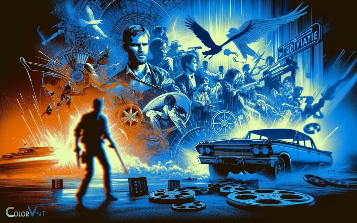
Several iconic films and scenes have masterfully utilized the blue-orange color scheme, showcasing its ability to evoke deep emotional responses and highlight critical narrative elements.
This color contrast not only enriches the visual palette but also imbues scenes with a deeper symbolic meaning, enhancing the storytelling process.
- Mad Max: Fury Road – The film’s desert landscapes and high-octane sequences are accentuated by the stark contrast between the scorching orange hues of the daytime and the cool blue tones of night scenes, amplifying the dystopian atmosphere.
- Drive – Its use of neon-lit nights and the juxtaposition of warm interiors against the cold urban exterior crafts a visually stunning narrative landscape, reflecting the protagonist’s isolation and inner turmoil.
- Moonlight – This film employs the scheme to articulate the protagonist’s journey, using the warmth of orange to depict moments of tenderness and the coolness of blue to convey isolation and introspection, thereby enriching the emotional depth of the story.
Technical Aspects and Lighting
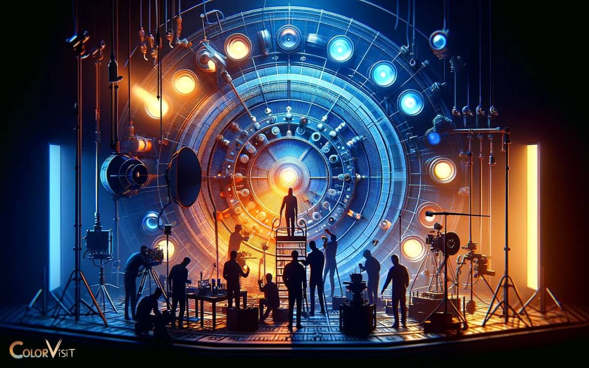
Exploring the technical aspects and lighting techniques, it becomes evident how filmmakers meticulously craft the blue-orange color scheme to enhance cinematic storytelling and emotional impact.
This technique leverages the color wheel’s complementary colors to create visually striking scenes.
Directors and cinematographers often employ advanced digital grading tools and carefully positioned lighting to achieve the desired hue balance.
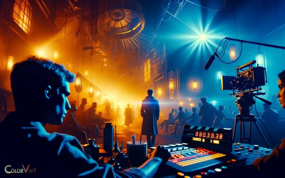
The orange tones, usually achieved through practical lighting or color grading, evoke warmth and are often used to highlight characters, creating a sense of intimacy and focus.
Conversely, blue tones are crafted through a combination of natural light manipulation and digital effects, setting a cooler, often more detached or tense atmosphere.
This deliberate manipulation of color and light not only defines the visual aesthetic but also subtly influences the narrative’s emotional texture.
Impact on Audience Perception
The manipulation of the blue-orange color scheme profoundly shapes audience perception, enhancing emotional engagement and narrative understanding through visual cues.
This color palette, when skillfully applied, can:
- Evoke Specific Emotions: Blue can instill a sense of calm, isolation, or sadness, whereas orange can evoke warmth, passion, or tension. The juxtaposition of these colors manipulates viewers’ emotional responses, aligning them more closely with the film’s thematic intentions.
- Highlight Contrast and Focus: By placing these colors in contrast, filmmakers can direct audience attention to specific characters, objects, or scenes, enhancing storytelling through visual emphasis.
- Symbolize Themes and Motifs: The use of blue and orange can symbolize opposing concepts such as ice and fire, water and desert, or technology and nature, enriching the narrative with deeper symbolic layers.
This strategic use of color not only captivates but also communicates on a subliminal level, deeply influencing audience reception and interpretation of the film.
Conclusion
In the tapestry of cinema, the blue and orange color scheme emerges as a profound narrative tool, weaving psychological depths into visual storytelling.
This dichotomy bathes the silver screen in a dance of contrast and harmony, manipulating audience perception with its spectral embrace.
Through the meticulous application of lighting and technical artistry, filmmakers craft scenes that resonate on a visceral level, embedding iconic imagery into the collective consciousness.
Thus, the blue-orange palette transcends mere aesthetic, becoming a pivotal character in the cinematic lexicon.
