Brands That Use the Color Orange: Iconic Appeal!
The color orange, synonymous with vibrancy, creativity, and energy, plays a pivotal role in the brand identity of many influential companies across diverse sectors.
From the refreshing appeal of Fanta in the beverage industry to the prestigious elegance of Hermès in luxury goods, orange not only sets these brands apart visually but also establishes a profound psychological connection with their audience.
This article delves into the strategic incorporation of orange in branding, examining its impact on consumer perception and brand loyalty, and highlights notable brands that have effectively utilized this dynamic color to carve out a distinctive space in the competitive market landscape.
Strategic Importance of Orange in Branding:
Examples of Brands Utilizing Orange:
In essence, the use of orange in branding is a testament to the color’s versatility and psychological impact.
Whether it’s the refreshing zest of Fanta, the luxurious allure of Hermès, or the playful vibrancy of Nickelodeon, orange continues to be a powerful tool in creating memorable and effective brand identities.
Orange not only captures the eye but also the imagination, making it a cornerstone for brands aiming to inspire and engage.
Key Takeaway
The Psychology of Orange
The color orange, often associated with creativity, enthusiasm, and warmth, plays a pivotal role in influencing consumer perceptions and emotions.
Its vibrancy commands attention without the aggression often attributed to red, making it an ideal choice for brands aiming to stand out in a saturated market.
By leveraging orange in their visual identity, companies can evoke feelings of accessibility and comfort, encouraging engagement and fostering a sense of community among their audience.
Furthermore, orange’s association with innovation and affordability can enhance brand perception, positioning products as both cutting-edge and accessible.
Employing orange strategically within branding and marketing efforts can therefore significantly impact consumer behavior, driving both attraction and retention in a competitive landscape.
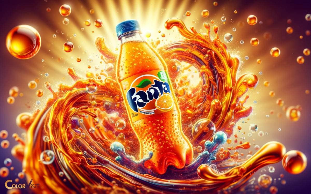
Fanta’s Fizzy Dominance
Embodying the essence of vibrancy and refreshment, Fanta has solidified its position as a global leader in the soft drink industry through its clever utilization of the color orange.
This strategic choice goes beyond mere aesthetics; it taps into the psychological association of orange with energy, fun, and youthfulness, making Fanta not just a drink, but a symbol of dynamic joy.
The brand has adeptly harnessed the power of this color to differentiate itself in a saturated market, creating a visual identity that resonates deeply with consumers seeking innovation and excitement in their beverage choices.
Fanta’s commitment to maintaining this vibrant image underscores the brand’s understanding of the integral role color plays in consumer perception and market dominance.
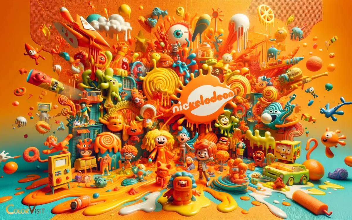
Nickelodeon’s Playful Palette
Nickelodeon’s incorporation of vibrant orange hues, coupled with its iconic slime imagery, immediately conveys a sense of youthful energy and playfulness that is unmistakably associated with the brand.
This strategic use of color not only distinguishes Nickelodeon in a crowded media landscape but also resonates deeply with its target audience, cultivating a unique and lasting brand identity.
The playful palette serves as a visual representation of the network’s commitment to fun, creativity, and the spirit of childhood, making it a powerful tool in its branding arsenal.
Iconic Slime Imagery
Drenching its brand identity in vibrant hues, Nickelodeon distinguishes itself with the iconic use of playful, green slime imagery, a symbol of its unique approach to children’s entertainment.
This choice of branding does more than simply stand out; it encapsulates the essence of Nickelodeon’s innovative and boundary-pushing ethos.
- Memorable Branding: Instant recognition among audiences globally.
- Engagement: Encourages interactive viewer participation.
- Differentiation: Sets Nickelodeon apart in a competitive market.
- Cultural Impact: Becomes a symbol of youth and fun.
Through the strategic use of slime imagery, Nickelodeon has not only solidified its position in the entertainment industry but also cultivated a brand that resonates deeply with its youthful audience, demonstrating the power of thoughtful, creative branding in establishing an enduring connection with consumers.
Youthful Energy Expression
Building on its iconic green slime imagery, Nickelodeon further distinguishes its brand identity through a playful palette that exudes youthful energy and creativity.
This strategic choice in coloration is not merely a visual choice but a psychological one, tapping into the vibrant, dynamic essence of childhood and imagination.
By integrating the color orange, Nickelodeon not only aligns itself with the attributes of joy and enthusiasm but also stimulates a sense of adventure and exploration among its audience.
This color strategy fosters a unique connection with viewers, positioning the brand as a beacon of fun and creativity in a crowded media landscape.
Nickelodeon’s adept use of orange in its branding palette reiterates its commitment to being a harbinger of innovative, engaging content that resonates with the spiritedness of youth.
Harley-Davidson’s Bold Statement
Transitioning from Nickelodeon’s playful use of orange, Harley-Davidson presents a stark contrast with its iconic orange logo, symbolizing a bold statement in the motorcycle industry.
This choice of color not only distinguishes Harley-Davidson from its competitors but also plays a crucial role in the evolution of its brand identity, reflecting a legacy of strength and freedom.
Analyzing the impact of this vibrant hue, we can appreciate how Harley-Davidson leverages orange to reinforce its position as a symbol of rebellion and adventure.
Iconic Orange Logo
Harley-Davidson’s unmistakable orange logo stands as a bold testament to the brand’s enduring legacy and distinctive identity within the motorcycle industry.
The vibrant hue not only captures attention but also symbolizes the spirit of adventure and freedom that Harley-Davidson motorcycles embody.
This strategic use of color demonstrates a deep understanding of visual branding’s power to evoke emotion and create lasting connections with consumers.
- Symbolism of Adventure: The orange color echoes the thrill of the open road.
- Brand Recognition: Instantly identifiable, setting Harley-Davidson apart from competitors.
- Emotional Connection: Engages consumers on a visceral level, fostering brand loyalty.
- Marketing Strategy: A cornerstone of Harley-Davidson’s visual identity, integral to its marketing efforts.
In leveraging this iconic orange logo, Harley-Davidson crafts a compelling narrative of independence, innovation, and authenticity.
Brand Identity Evolution
Over the years, the evolution of Harley-Davidson’s brand identity has made a bold statement, reflecting its commitment to innovation while honoring its rich heritage.
This iconic brand has adeptly navigated the delicate balance between tradition and modernity, employing the color orange not just as an aesthetic choice but as a symbol of its vibrant spirit and relentless drive.
The strategic use of orange in its branding radiates energy, exuding a sense of freedom and adventure that resonates with its audience.
Harley-Davidson’s ability to adapt its visual identity, while staying true to its roots, showcases a forward-thinking mindset that captivates and inspires.
This evolution is a testament to the brand’s enduring appeal and its unwavering focus on paving the way forward in the motorcycle industry.
Amazon’s Subtle Touch
Amazon subtly incorporates the color orange into its branding, employing it in a manner that enhances user experience and brand recognition.
This strategic use of color demonstrates Amazon’s understanding of the psychological impact of hues in marketing.
Orange, often associated with creativity, enthusiasm, and energy, aligns perfectly with Amazon’s mission to innovate and excite.
- Highlighting Special Offers: Orange draws attention to deals and promotions, guiding users toward savings.
- CTA Buttons: Makes call-to-action buttons stand out, increasing conversion rates.
- Progress Indicators: Used in loading bars, providing a visually engaging way to wait.
- Rating Stars: The color enhances the visual appeal of customer ratings, making feedback more noticeable.
Amazon’s strategic use of orange underlines its commitment to a user-centric approach, leveraging color psychology to foster a more engaging and intuitive shopping experience.
Home Depot’s DIY Appeal
Moving from the digital marketplace to the tangible world of home improvement, Home Depot stands out as a brand that effectively utilizes the color orange to embody its DIY ethos and appeal to the hands-on consumer.
The vibrant hue not only captures attention but also resonates with the energy and enthusiasm inherent in do-it-yourself projects.
This strategic use of orange in Home Depot’s branding communicates a message of accessibility and encouragement, inviting both novice and seasoned DIYers into a world where creativity meets functionality.
By aligning the color with the spirit of innovation and self-reliance, Home Depot has crafted a unique identity that not only differentiates it from competitors but also fosters a community of empowered individuals eager to take on their next project.
TNT’s Explosive Shade
Transitioning from Home Depot’s iconic orange to the vibrant hue of TNT’s logo, we observe how color profoundly influences brand identity and consumer perception.
TNT harnesses the dynamic and energetic essence of orange to communicate its rapid, explosive entertainment value, setting a bold standard in the media industry.
This strategic color choice not only distinguishes TNT visually but also embeds a powerful psychological impact, making its brand unforgettable in the competitive landscape.
TNT’s Brand Identity
TNT’s brand identity leverages a vibrant shade of orange that symbolizes the dynamism and energy intrinsic to its global logistics and delivery services.
This choice is not arbitrary but a calculated decision to communicate its core values and operational ethos.
The color orange, in this context, serves as more than just an aesthetic choice; it is a strategic tool wielded to distinguish TNT in a competitive marketplace.
- Visibility: Orange ensures TNT stands out, fostering instant recognition.
- Energy: Reflects the company’s relentless drive and swift service delivery.
- Innovation: Signals a forward-thinking, innovative approach to logistics.
- Warmth: Invokes feelings of friendliness and approachability, crucial for customer service.
Through this distinctive use of orange, TNT crafts a compelling narrative around its brand, highlighting its commitment to efficiency, innovation, and customer satisfaction.
Impact of Color Choice
Exploring the impact of TNT’s choice of an explosive shade of orange reveals the profound influence color has on brand perception and consumer behavior.
This vibrant hue is not just a visual marker; it’s a strategic emblem that embodies energy, excitement, and a bold willingness to stand out.
In the competitive landscape of media, TNT’s orange is a statement of innovation and audacity. It communicates a promise of dynamic content, compelling viewers to expect the unexpected.
This deliberate selection taps into the psychological associations of orange with enthusiasm and creativity, fostering a unique connection with audiences seeking vibrance in their viewing experience.
Through this lens, TNT’s color choice is not merely aesthetic—it’s a powerful tool in crafting a distinctive identity and influencing viewer engagement.
Firefox’s Fiery Tail
Embodying the essence of speed and agility, the Firefox logo captivates attention with its vibrant orange tail, symbolizing the browser’s rapid performance and innovative spirit.
This clever use of color not only sets Firefox apart in the competitive browser market but also communicates its core values without a word.
The fiery tail is more than just an aesthetic choice; it’s a visual promise of efficiency, adaptability, and cutting-edge technology.
- Visual Appeal: The orange tail attracts and retains user interest.
- Brand Identity: Establishes a unique and memorable presence.
- Symbolism: Conveys speed, innovation, and reliability.
- Marketing Strategy: Differentiates Firefox in a saturated market, appealing to users who prioritize performance and innovation.
Through strategic color use, Firefox effectively positions itself as a leader in web browsing technology.
SoundCloud’s Creative Wave
Transitioning from Firefox’s vibrant emblem to SoundCloud’s creative zenith, the use of orange in SoundCloud’s branding is a strategic choice that significantly elevates its visual identity and reinforces its position in the digital music landscape.
The color not only imbues the brand with energy and innovation but also markedly enhances brand recognition among its diverse and global audience.
This adept integration of orange into SoundCloud’s identity demonstrates how color can be a powerful tool in distinguishing a brand in a crowded marketplace, fostering an immediate and lasting connection with its users.
Visual Identity Impact
The innovative use of orange in SoundCloud’s visual identity significantly enhances its brand recognition, setting a vibrant tone that resonates with its creative user base.
This choice of color not only distinguishes SoundCloud from its competitors but also embodies the energy and dynamism inherent to the platform’s community of artists, podcasters, and music enthusiasts.
The impact of this visual strategy is multifaceted:
- Encourages Engagement: Draws users into an immersive audio experience.
- Stimulates Creativity: Inspires users to produce and share original content.
- Fosters Community: Builds a sense of belonging among a diverse user base.
- Enhances User Experience: Makes navigation intuitive and visually appealing.
Through these effects, SoundCloud’s visual identity powerfully contributes to its position as a leading platform for audio distribution and discovery.
Brand Recognition Boost
Leveraging its distinctive orange visual identity, SoundCloud has successfully amplified its brand recognition, riding a creative wave that sets it apart in the crowded digital audio market.
This strategic use of a vibrant color not only captures attention but also imbues the platform with a sense of energy and innovation, resonating deeply with its core audience of creators and music enthusiasts.
ING’s Financial Warmth
ING’s strategic adoption of orange in its branding palette evokes a sense of financial warmth and approachability, setting it apart in the banking sector.
This choice reflects not just a visual preference but a deep understanding of color psychology and its impact on customer perception.
By embracing orange, ING communicates:
- Innovation: Suggesting a forward-thinking approach to banking services.
- Friendliness: Making financial discussions feel more accessible and less intimidating.
- Energy: Reflecting the dynamic nature of the financial world and ING’s active role within it.
- Confidence: Demonstrating a bold stance in a competitive industry, reassuring customers of their decision to trust ING.
This strategic use of color underscores ING’s commitment to standing out in the crowded financial marketplace, prioritizing user experience and emotional connection.
Hermès’ Luxury Glow
Much like ING’s innovative use of orange, Hermès elevates this vibrant hue to symbolize luxury and exclusivity within the fashion industry.
The French luxury brand has masterfully woven orange into its identity, transforming what could be seen as a common color into a trademark of high-end sophistication.
This strategic color choice not only distinguishes Hermès in a market flooded with traditional black and brown luxury goods but also communicates the brand’s commitment to creativity and boldness.
By adopting orange, Hermès invites its clientele into a world where luxury is not just experienced but felt through the warmth and vitality the color exudes.
This deliberate use of orange challenges the norms, encouraging a reevaluation of luxury symbols and proving that innovation can indeed redefine elegance.
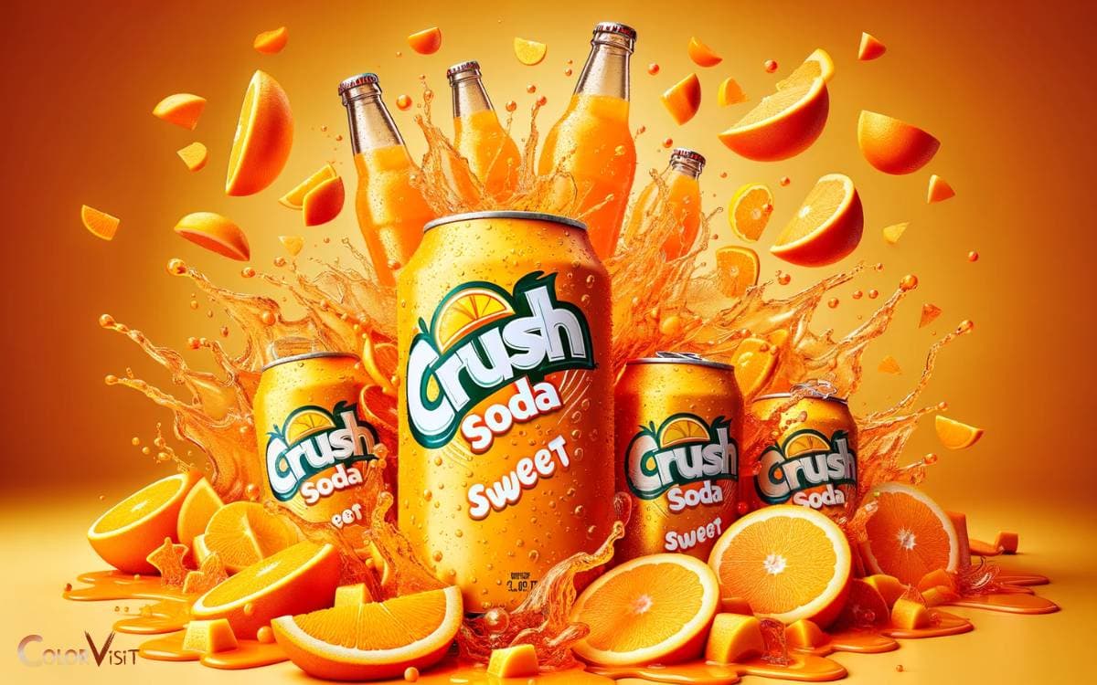
Crush Soda’s Sweet Spot
In the realm of soft drinks, Crush Soda distinguishes itself through its vibrant use of orange, encapsulating a blend of nostalgia and excitement that appeals to a broad consumer base.
The brand’s strategic deployment of this color accomplishes several key objectives:
- Brand Recognition: Its unique orange color instantly sets it apart on crowded shelves, enhancing brand recall.
- Emotional Connection: The color orange evokes feelings of warmth, happiness, and energy, aligning with the fun and youthful image of Crush Soda.
- Market Positioning: This distinctive color choice signifies innovation, helping Crush to carve out a unique spot in a competitive market.
- Visual Appeal: The bright, inviting hue attracts the eye, making the product more appealing to consumers seeking a refreshing beverage experience.
Gulf Oil’s Iconic Look
Shifting focus from the effervescent world of soft drinks to the dynamic realm of automotive services, Gulf Oil’s iconic use of orange in its branding strategy stands as a testament to the power of color in creating an unmistakable corporate identity.
This vibrant hue not only captures the essence of energy and movement but also sets Gulf Oil apart in the competitive landscape of fuel providers and automotive services.
The strategic use of orange communicates a message of innovation, reliability, and forward-thinking, resonating deeply with an audience that values both tradition and progress.
| Aspect | Description | Impact |
|---|---|---|
| Visibility | High contrast against blue | Enhances brand recognition |
| Psychology | Evokes excitement, warmth | Stimulates consumer interest |
| Differentiation | Distinct from typical corporate colors | Solidifies unique identity |
| Application | Signage, uniforms, marketing materials | Creates cohesive brand experience |
| Legacy | Long history of use in branding | Builds trust and nostalgia |
EasyJet’s Sky-High Color
Soaring through the skies, EasyJet’s bold embrace of the color orange not only revolutionizes its visual identity but also firmly establishes its presence in the highly competitive airline industry.
By choosing a color that symbolizes energy and affordability, EasyJet communicates its brand ethos effectively, appealing to a broad demographic seeking innovative travel solutions.
- Visibility: The vibrant hue ensures EasyJet planes stand out against the blue sky, enhancing brand recognition.
- Emotional Connection: Orange evokes feelings of warmth and accessibility, aligning with EasyJet’s friendly service.
- Differentiation: In a sea of traditionally colored airlines, EasyJet’s orange sets it apart as a forward-thinking company.
- Brand Consistency: From the aircraft to the crew uniforms, the consistent use of orange reinforces brand identity, creating a memorable customer experience.
Conclusion
The strategic use of the color orange by brands across various industries showcases its dynamic appeal and psychological impact.
From Fanta’s market dominance, with over 130 million consumers daily, to Hermès’ embodiment of luxury, orange proves to be a versatile tool in branding.
This color not only enhances brand recognition but also evokes emotions of excitement and enthusiasm, compelling consumers towards the brand.
Thus, the careful integration of orange into a brand’s palette can significantly contribute to its identity and success in the competitive market landscape.


