Burnt Orange and Green Color Palette: Earthy Vibrance!
Delving into the burnt orange and green color palette reveals a fascinating blend of warmth and coolness, a duality that captures both the eye and the imagination.
This combination, rich in historical context and prevalent in the natural world, offers a compelling look at how colors influence our mood and perception.
In the realm of fashion, bold and vibrant burnt orange pieces contrast with the calming hues of green, making a statement that is both striking and harmonious.
Interior design takes this palette to a level of subtle elegance, utilizing these colors to create spaces that feel both energized and serene. In landscaping, the natural occurrence of these colors together underscores their innate beauty and appeal.
The cultural significance of burnt orange and green spans various traditions and societies, highlighting their versatility and enduring popularity.
As we explore this color palette’s potential in shaping future trends, it’s clear that the possibilities are as vast as they are intriguing.
Key Highlights of the Burnt Orange and Green Color Palette:
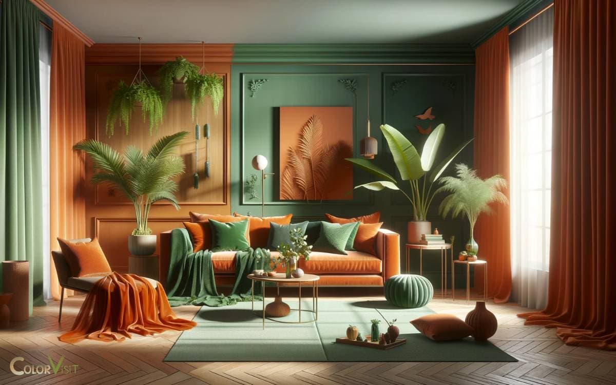
In an interior design setting, a living room featuring burnt orange sofas against a backdrop of soft green walls exemplifies how this color palette can invigorate a space while maintaining a soothing atmosphere.
The burnt orange and green color palette is a testament to nature’s inherent beauty, showcasing how opposite colors can coexist in perfect harmony.
Key Takeaway
The Color Psychology
In the realm of color psychology, the burnt orange and green palette evokes a complex synergy of warmth, renewal, and stability, embodying both the vibrancy of autumn’s embrace and the rejuvenation of spring’s promise.
This juxtaposition crafts a narrative of perpetual growth and grounded energy, appealing to those who seek a balance between innovation and tradition.
The burnt orange, with its deep, fiery undertones, ignites a sense of dynamic creativity, while the green, in its myriad shades, anchors this fervor in the natural world’s calm and resilience.
Together, they create a visual experience that is both comforting and stimulating, making this palette a favorite among forward-thinking designers and brands aiming to convey a message of sophisticated vitality and enduring progress.
Historical Significance
Tracing back through the annals of history, the burnt orange and green color palette has consistently symbolized a harmonious blend of vitality and renewal across various cultures and epochs.
This vibrant duo has adorned the tapestries of ancient empires, signaling prosperity and fertility.
In the Renaissance, it graced the canvases of masters, embodying the era’s quest for knowledge and the intertwining of the natural world with human achievement.
Moving into the modern age, these hues have been reimagined in fashion and design, embodying a retro yet futuristic appeal that captivates the contemporary eye.
Their historical depth adds layers of meaning to their aesthetic appeal, making them a timeless choice for those seeking to infuse their creations with both nostalgia and a forward-thinking ethos.
In Nature’s Design
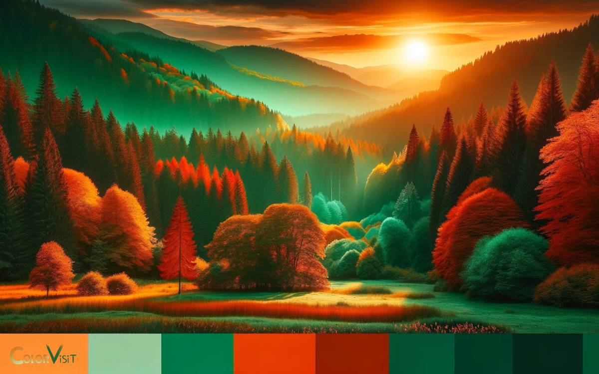
Reflecting on the historical richness of the burnt orange and green palette, it becomes evident that nature itself has been the grand designer, meticulously weaving these colors into the fabric of the natural world.
This palette is a testament to nature’s innate ability to harmonize contrasts, creating visuals that are both soothing and vibrant.
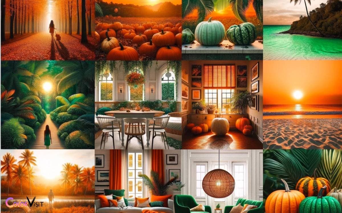
In the golden hour light, the landscape transforms, highlighting the burnt orange hues in autumn leaves against the evergreen backdrop, crafting scenes of unparalleled beauty.
These colors are not just a feast for the eyes but also serve as a source of inspiration, pushing the boundaries of creativity.
Nature’s design, with its sophisticated blend of burnt orange and green, invites us to explore and innovate, reminding us that the greatest muse is the world around us.
Fashion Forward Ideas
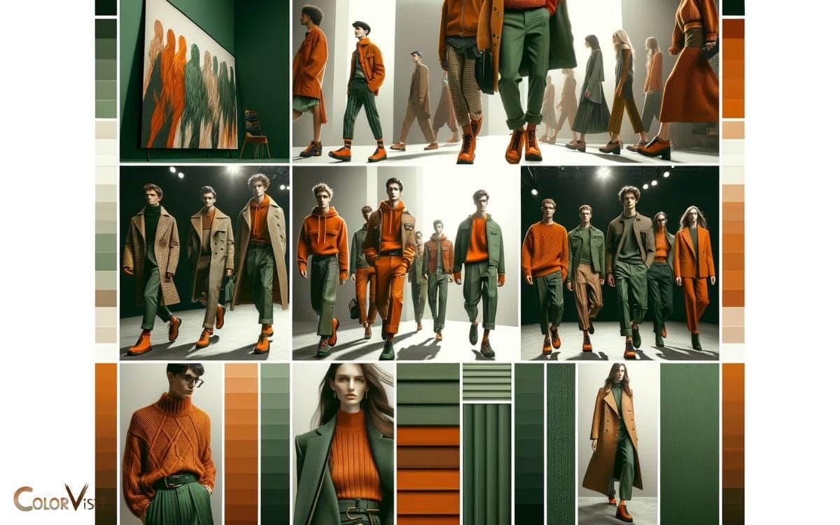
Drawing upon the dynamic interplay of burnt orange and green, fashion designers are pioneering bold ensembles that pay homage to nature’s quintessential palette.
This season, the fashion world is captivated by the rich, earthy hues of burnt orange juxtaposed with the vibrant, life-affirming tones of green.
The combination evokes a sense of balance and creativity, inspiring a fresh wave of innovative designs.
| Trend | Description |
|---|---|
| Layered Textures | Combining silk burnt orange tops with green wool coats. |
| Accessory Accents | Emerald green belts and amber orange bags for a pop of color. |
| Nature-Inspired Prints | Floral patterns where burnt orange blooms against a green backdrop. |
| Statement Footwear | Olive green boots paired with burnt orange midi dresses. |
| Eco-Friendly Fabrics | Organic cotton and recycled materials in bold, nature-inspired hues. |
This palette is not just a trend; it’s a movement towards more thoughtful, inspired fashion.
Interior Design Magic
Embracing the vibrant interplay of burnt orange and green, interior designers are transforming spaces into enchanting havens that mirror the richness and vitality found in nature’s palette.
This innovative approach breathes life into every corner, creating atmospheres that are both invigorating and soothing.
- Utilizing burnt orange for statement walls or furniture pieces to inject warmth and depth.
- Incorporating green through plants or textiles to add freshness and a sense of tranquility.
- Playing with textures and materials to enhance the tactile experience, combining velvet with organic linens.
- Integrating metallic accents or glass elements to introduce a touch of elegance and reflect light, enhancing the overall ambiance.
These elements collectively forge a harmonious space that is not only visually stunning but also emotionally resonant, epitomizing the very essence of contemporary interior design magic.
Artistic Expressions
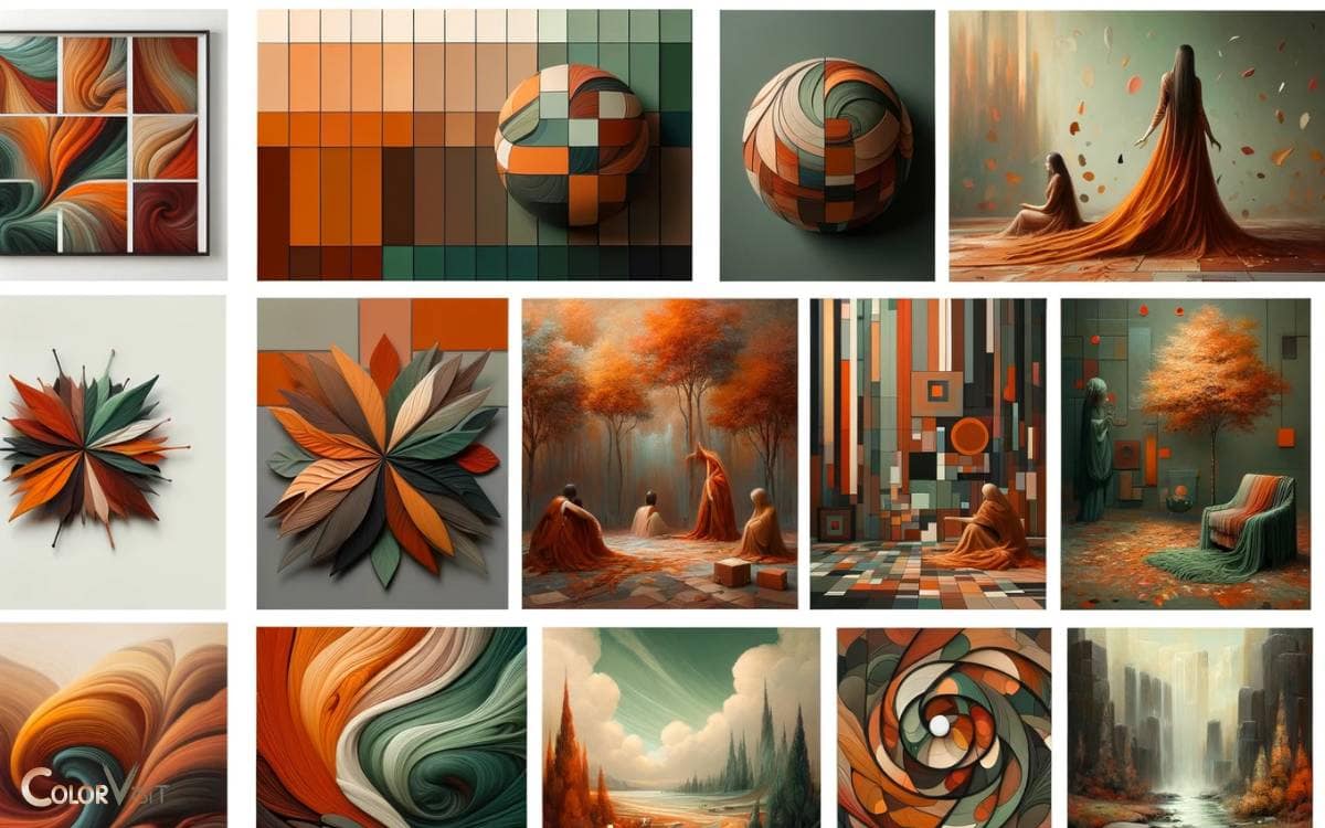
The burnt orange and green color palette transcends traditional boundaries, inspiring artists to create bold, visually captivating works that echo the dynamism and depth of these hues.
This vibrant combination harnesses the warmth of autumnal sunsets alongside the rejuvenating essence of natural foliage, offering a canvas ripe for exploration.
Contemporary creators harness these colors to craft pieces that resonate with emotional depth and raw energy.
Whether through abstract expressionism, where these colors clash and dance in an unending tango, or in more figurative works that breathe life into earthly narratives, the burnt orange and green palette is a testament to the boundless creativity it fosters.
Artists are not just using color; they are redefining it, pushing the envelope of visual storytelling in a manner that is both avant-garde and deeply human.
Seasonal Inspirations
Seasonal shifts serve as a muse for artists, who find in the transition from summer’s zenith to autumn’s embrace a rich palette of burnt orange and green, mirroring the Earth’s own artistic transformation.
This duo evokes a sense of warmth and earthiness, ideal for capturing the essence of change and renewal.
To deepen the connection, consider:
- The golden hues of late summer sunsets blending into the crisp, verdant tones of early fall leaves.
- Harvest festivals, where the bounty of the earth is celebrated in a spectacle of oranges and greens.
- The rustic charm of countryside landscapes transitioning under autumn’s spell.
- The vibrant contrast of these colors against the soft, fading light of shorter days, providing a dramatic backdrop for creative endeavors.
Wedding Themes
Drawing inspiration from nature’s palette, a wedding theme centered around burnt orange and green hues offers a unique blend of warmth and vibrancy, setting a picturesque and trendy ambiance for the celebration of love.
This theme speaks to couples who desire a modern yet timeless setting, allowing for an array of innovative decor ideas.
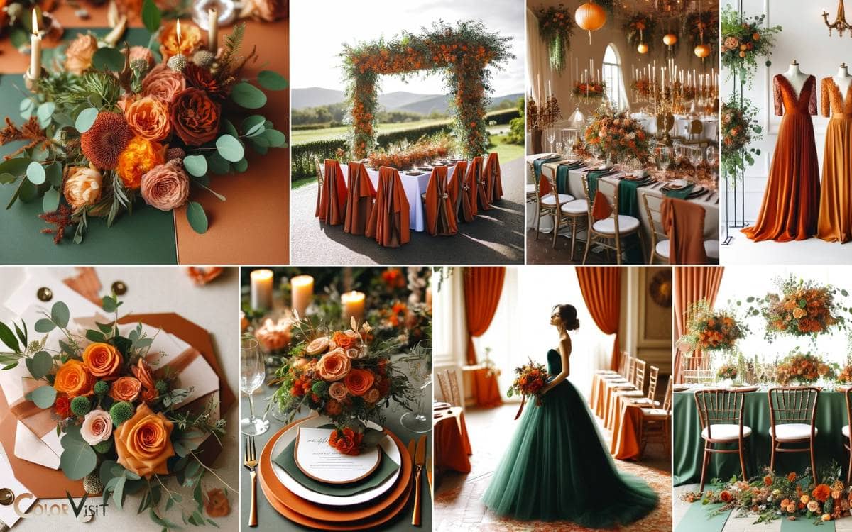
Imagine tables adorned with burnt orange linens contrasted by lush green floral arrangements, creating an immersive experience that transports guests to an enchanted forest at sunset.
The colors also allow for creative flexibility in bridesmaids’ dresses and groomsmen’s accessories, encouraging a harmonious yet dynamic visual story.
This theme not only captivates the eye but also evokes a sense of warmth, making every moment of the wedding feel intimate and meticulously curated.
Graphic Design Tips
Leveraging the vibrant contrast of burnt orange and green in graphic design can significantly enhance the visual appeal of any project.
This dynamic duo can transform mundane designs into captivating visuals that demand a second look, offering a fresh and modern aesthetic that captures attention.
Here are some tips to effectively incorporate this color scheme:
- Use burnt orange as a bold background to make green elements pop.
- Apply green in typography or icons to inject vitality into designs.
- Experiment with gradients blending burnt orange and green for a trendy, energetic vibe.
- Incorporate textures in these colors to add depth and intrigue.
Landscaping With Colors
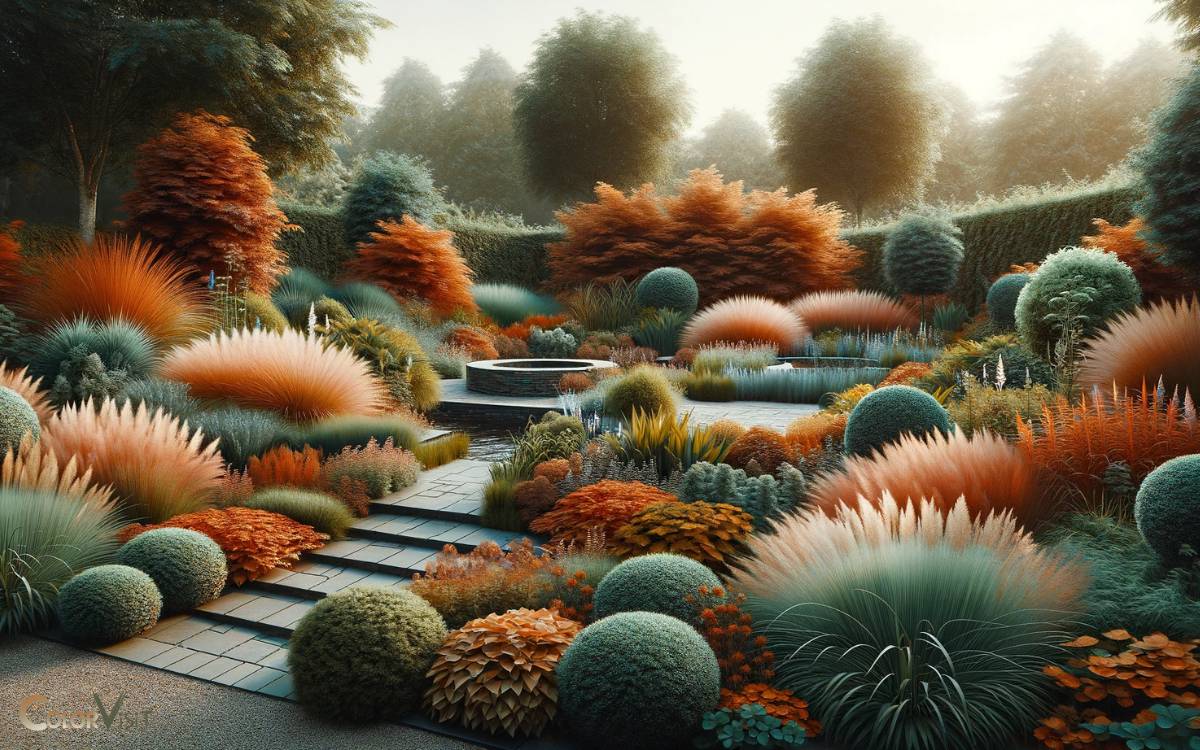
Transitioning from the realm of graphic design to the natural canvas of the outdoors, the art of landscaping with a burnt orange and green color palette requires a keen understanding of color harmony basics and the strategic selection of plants.
This approach not only ensures that your garden becomes a visually striking space but also that it resonates with the trendy, yet timeless appeal of these two colors.
Mastering these principles transforms ordinary spaces into breathtaking landscapes, where every hue and texture plays a pivotal role in creating an enchanting outdoor experience.
Color Harmony Basics
In the realm of landscaping, mastering the principles of color harmony—particularly with a palette of burnt orange and green—can transform an ordinary garden into a visually stunning oasis.
These colors, when used thoughtfully, can create an environment that is both vibrant and soothing, embodying the essence of nature’s own artistry.
To captivate and inspire, consider these aspects:
- Contrast and Balance: Achieving a delicate balance between the warm, invigorating burnt orange and the cool, calming green.
- Texture Variation: Incorporating a variety of textures to complement the color scheme and add depth.
- Seasonal Consideration: Planning for changing seasons to ensure year-round appeal.
- Lighting Effects: Utilizing natural and artificial lighting to enhance the colors and create dynamic shadows.
Embracing these principles will ensure a garden that is not only visually appealing but also a reflection of innovative design.
Selecting Plants Wisely
A carefully curated selection of plants is paramount when aiming to achieve a harmonious blend of burnt orange and green in your landscape design.
Opting for foliage and flowers that mirror this palette not only enhances the aesthetic appeal but also creates a vibrant, dynamic garden space.
Consider incorporating plants like Heuchera, which offers splendid burnt orange leaves, alongside lush, green ferns that provide a textured backdrop.
Succulents with green tones and seasonal blooms in deep orange hues can add a contemporary twist.
This thoughtful approach to plant selection elevates the garden, transforming it into a modern sanctuary of color and style.
Cultural Representations
Exploring the vibrant interplay between burnt orange and green, one uncovers a tapestry of cultural significance, where these hues are deeply embedded in traditions, celebrations, and artistic expressions worldwide.
This color duo evokes a myriad of emotions and meanings, transcending mere aesthetic appeal to embody rich, cultural narratives.
- Ireland’s National Colors: Symbolizing the lush landscapes and revolutionary history.
- Hindu Festivals: Burnt orange represents fire and spirituality, while green signifies life and harmony.
- Autumnal Celebrations: These colors encapsulate the essence of fall, from harvest festivals to Thanksgiving.
- African Textiles: Intricately woven with these colors to narrate stories of heritage, identity, and community.
This palette not only enriches the visual spectrum but also invites us to delve into the stories and traditions it represents, making it a perennial favorite in design and cultural expressions.
DIY Project Ideas
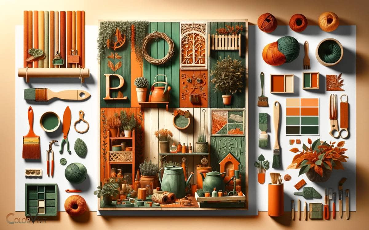
Harnessing the dynamic interplay between burnt orange and green, this section presents innovative DIY project ideas that invite enthusiasts to infuse their spaces with the warmth and vitality of these colors.
Imagine transforming a bland room into a vibrant sanctuary by creating an accent wall featuring a geometric pattern of burnt orange and lush green.
Envision hand-painting terracotta pots in these hues to hold your thriving indoor plants, adding a burst of color and life to any corner.
Consider crafting unique, textured throw pillows that blend these shades seamlessly, offering both comfort and a visual feast for the eyes.
Each project not only elevates the aesthetic of a space but also serves as a testament to the power of color in shaping our surroundings.
Future Trends
As we peer into the horizon of home decor and fashion, the burnt orange and green color palette is poised to redefine aesthetics with its warm, earthy tones and vibrant energy. This captivating combination invites a sense of comfort and vibrancy, making it perfect for both modern and rustic spaces. The burnt orange and sage green harmony creates an inviting atmosphere that encourages creativity and warmth, making it an ideal choice for living rooms and bedrooms alike. As designers embrace these colors, we can expect to see innovative patterns and textures that elevate any interior setting.
Emerging palette predictions suggest a harmonious blend that speaks to both comfort and boldness, setting a trend that invites innovation and creativity.
Through a thorough design impact analysis, these colors are expected to influence a wide range of products, from interior design elements to wearable fashion, marking a distinct shift towards embracing nature-inspired hues in our everyday lives.
Emerging Palette Predictions
In the realm of color trends, the fusion of burnt orange and green is anticipated to redefine contemporary aesthetics, blending warmth with vitality in an innovative palette.
This combination is not just a fleeting trend but a forward-thinking vision that is expected to captivate the design world.
To understand the depth of this emerging trend, consider the following predictions:
- A surge in eco-conscious designs, where these colors symbolize the earth’s raw beauty and sustainability.
- The rise of digital and virtual design spaces embracing this palette for its dynamic and immersive qualities.
- An increased application in fashion, where the contrasting colors create bold statements.
- Home decor trends favoring these hues for their ability to evoke a sense of comfort and energy simultaneously.
Design Impact Analysis
The fusion of burnt orange and green is poised to revolutionize design aesthetics across various industries, laying the groundwork for a future where color not only defines space but also embodies the ethos of sustainability and innovation.
This color combination, rich in depth and versatility, promises to infuse spaces with warmth and nature-inspired tranquility, encouraging eco-friendly design solutions.
| Industry | Impact | Trend Prediction |
|---|---|---|
| Fashion | Bold | Rise of eco-conscious apparel |
| Interior | Warmth | Emphasis on biophilic design |
| Tech | Fresh | Sustainable product design |
| Art | Vibrant | Eco-centric art movements |
As we navigate towards this vibrant future, the burnt orange and green palette stands as a beacon of creativity, urging designers to explore the untapped potential of color in crafting spaces and products that are not only visually stunning but also environmentally responsible.
Color Palette with Burnt Orange
A burnt orange rust color dress evokes warmth, earthiness, and a touch of vintage charm. Creating a color palette around this shade can bring out its richness and versatility.
Here’s a color palette that complements a burnt orange rust dress beautifully, enhancing its warmth and depth:
- Deep Teal: This color offers a striking contrast to burnt orange, bringing out its warmth while adding sophistication and depth to the palette.
- Cream or Ivory: A light, neutral color like cream or ivory softens the overall look and provides a calm balance to the intensity of burnt orange.
- Sage Green: Sage green adds a natural, earthy element to the palette. It’s subtle and complements the warmth of burnt orange without overpowering it.
- Mustard Yellow: A touch of mustard yellow can brighten the palette and add vibrancy. It harmonizes with burnt orange and adds to the autumnal vibe.
- Chocolate Brown: Deep brown shades work well with burnt orange, enhancing the rustic, earthy quality of the palette. It’s perfect for grounding the other colors and adding sophistication.
- Gold Accents: Gold adds a touch of luxury and warmth, echoing the underlying golden tones in burnt orange. It’s ideal for accessories or decorative elements.
This palette combines warmth with a balance of light and dark, vibrant and subdued colors, making it versatile for various applications, including fashion, interior design, and art projects.
The combination of these colors can create a cozy, inviting atmosphere or a vibrant, energetic look, depending on how they’re used together.
Conclusion
The juxtaposition of burnt orange and green within various spheres, from fashion to interior design, echoes a harmonious balance between warmth and vitality, tradition and innovation.
These colors, deeply rooted in historical significance and natural beauty, have transcended time, permeating contemporary culture and design.
Embracing this color palette not only revitalizes spaces and ensembles but also carries forward a rich cultural legacy, promising a future where color continues to influence and inspire across diverse creative landscapes.
