16 Engaging Classroom Color Scheme Ideas to Stimulate Learning
You can stimulate learning with classroom color schemes by blending calming neutrals, pastel accents, and natural wood for focus and serenity, then layering in bright yellow, red, or orange zones to spark creativity.
Soothing blues or greens anchor study areas, while multicolored rugs and high-contrast accents define spaces and boost accessibility.
Rotate colors with the seasons or use your school’s mascot hues to build community. There’s much more to discover about using color for motivation and inclusion.

1. Calming Neutrals With Accents
A calming neutral palette, accented with subtle pops of color, transforms your classroom into a focused and serene environment.
A neutral palette with gentle color accents creates a serene, focused classroom atmosphere that nurtures calm and concentration.
By choosing muted grays, creams, and earth tones, you’ll reduce overstimulation and foster emotional regulation.
Layering natural textures and abstract patterns adds gentle visual interest without sacrificing calm.
Incorporate printable resources and customizable banners in neutral hues to create a cohesive, tranquil space.
Use soft accent colors strategically—think dusty pastels or muted greens—for visual cues that support engagement.
Neutral-themed organizational tools and schedule cards promote order, helping students concentrate and feel secure. This approach elevates both mood and learning outcomes.
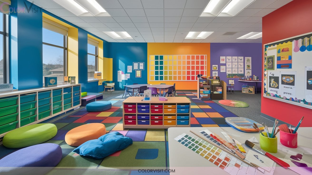
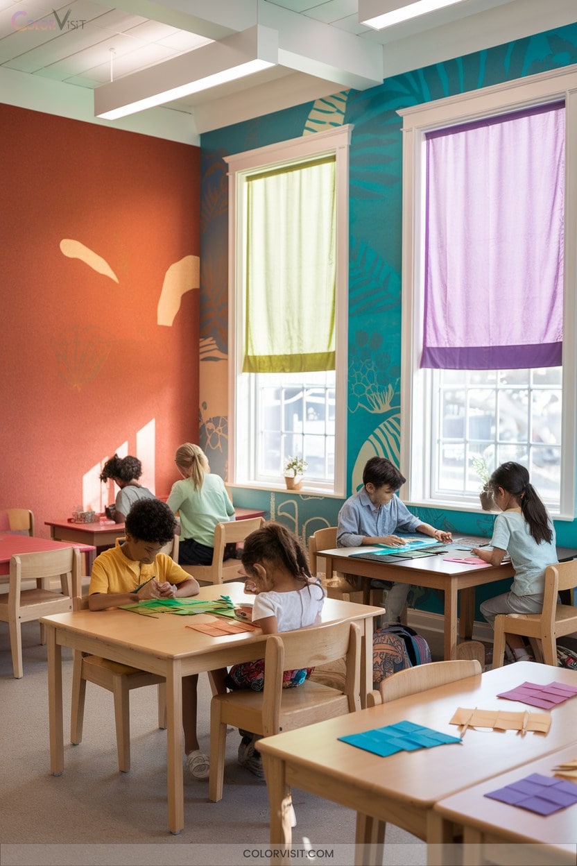
2. Bright, Energetic Zones for Young Learners
Three vibrant colors—red, yellow, and orange—can transform your classroom into an energetic hub that sparks curiosity and active learning in young students.
Use red accents, like chairs or posters, to energize hands-on stations and motivate participation, but keep it limited to avoid overstimulation.
Integrate yellow on glass boards or soft seating to capture attention and foster optimism in creative zones, pairing it with neutrals for visual balance.
Orange, applied to collaborative furniture or decor, encourages communication and enthusiasm without overwhelming the space.
Combine these hues on mobile elements and highlight activity zones, always testing placement and monitoring student responses.
3. Focus-Enhancing Schemes

Color transforms classroom focus zones into havens of concentration and calm.
Color turns learning spaces into sanctuaries of focus, helping students find calm and clarity in every lesson.
Harness blue for its proven ability to lower stress and sharpen attention in reading corners or study areas.
Integrate green in makerspaces to reduce visual fatigue and balance energy, extending focus during group projects.
Add controlled yellow accents to spark alertness where quick recall matters.
For innovation-driven classrooms, blend neutral backdrops with cool tones to eliminate distraction and let focus-enhancing hues shine.
- Calm blue quiets anxiety, letting students immerse in learning.
- Restful green sustains engagement through challenging lessons.
- Strategic yellow accents enliven attention without overwhelming.
4. Mood-Boosting Palettes

Why settle for a dull classroom when you can use color to uplift mood and spark engagement?
Integrate red accents to energize collaborative spaces and fuel creativity; balance with neutrals so vibrancy doesn’t overwhelm.
Use soft yellows to capture attention and inspire optimism on boards or charts, but avoid excess to prevent fatigue.
Opt for blue hues in study zones—light blues relax, while darker shades foster focus and professionalism.
Orange accents boost creativity and engagement, especially in interactive areas when paired with cool tones.
Finally, green offers renewal and calm, making it ideal for restful, wellness-focused learning environments.
5. Activity-Specific Color Coding
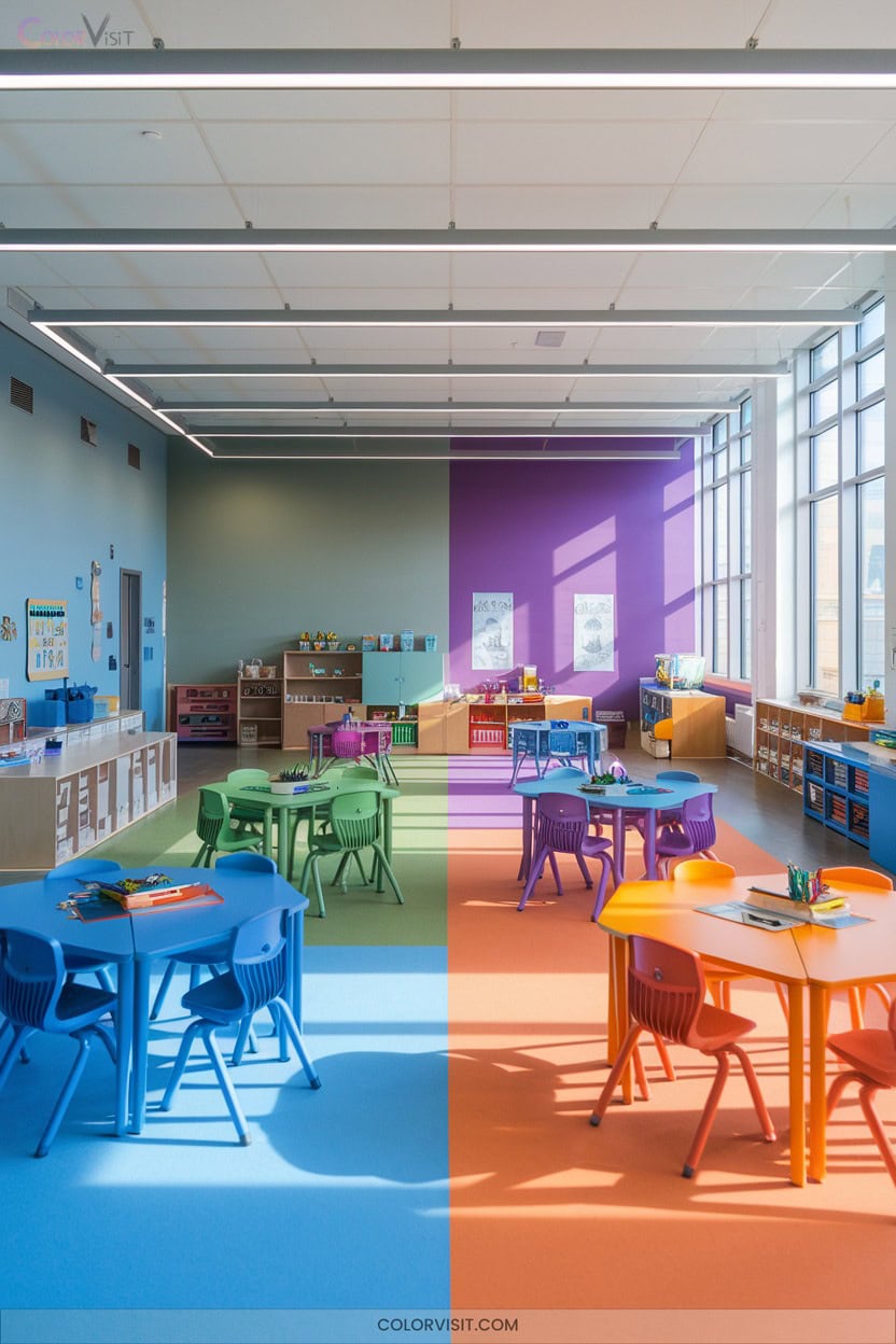
A well-designed color coding system transforms classroom routines, making activities instantly recognizable and changes smoother for every student.
Imagine students reaching for blue folders knowing it’s math time, or confidently highlighting main ideas in yellow and details in pink.
You’ll see less confusion and more independence as learners navigate centers and materials by color.
Visual consistency not only boosts memory retention but also encourages engagement.
Here’s how you can spark clarity and excitement in your classroom:
- Assign specific colors to subjects and activities.
- Organize group areas and resources with matching colors.
- Incorporate color-coded interactive games and assessments.
6. Cultural & Contextual Adaptations
Building on the clarity brought by activity-specific color coding, you can enrich your classroom’s atmosphere by thoughtfully adapting color schemes to reflect cultural and contextual nuances.
Thoughtful color choices, attuned to cultural and contextual nuances, can transform your classroom into a more welcoming, meaningful environment.
Integrate heritage hues and symbolic patterns—like kente cloth motifs or Indigenous earth tones—to affirm student identities. Invite families to co-select colors, ensuring shared cultural narratives.
Display multilingual signage using culturally resonant palettes, and align accent colors with local traditions.
Prioritize color choices that foster emotional safety; avoid traumatic associations. Use lighting that harmonizes with your palette to enhance psychological impact.
This approach not only personalizes learning spaces but also strengthens community connection and student belonging.
7. Soft Blues and Greens for Concentration
Harness the power of soft blues and greens to create a classroom that supports both concentration and calm.
When you introduce these hues, you offer students a visually soothing environment that reduces anxiety and enhances focus.
Soft blues are ideal for reading corners or study zones, while gentle greens inspire creativity and collaboration.
This color pairing not only elevates mood but also fosters mental clarity and cognitive engagement.
- Imagine students feeling instantly at ease as they enter your classroom.
- Watch focus sharpen during quiet, detailed tasks.
- See creative collaboration flourish in spaces accented with restorative green.
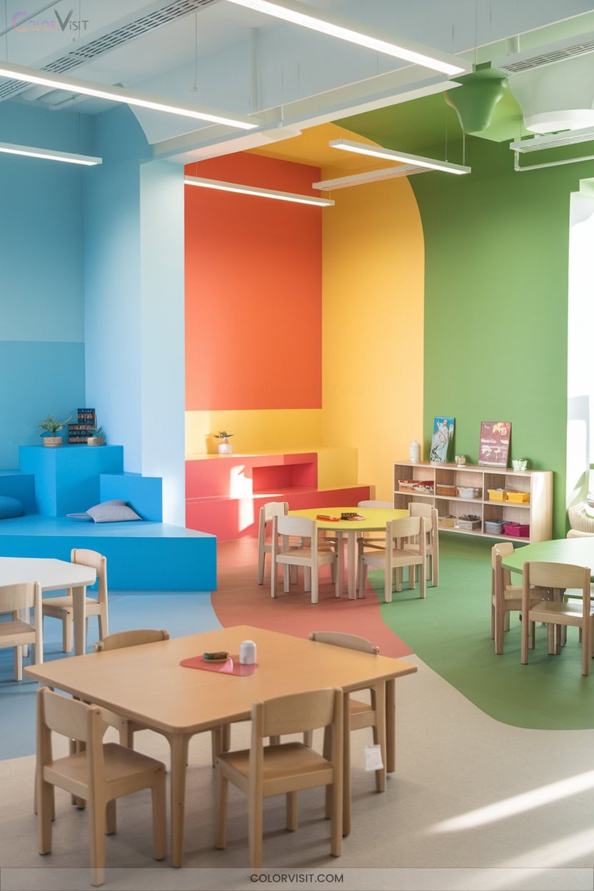
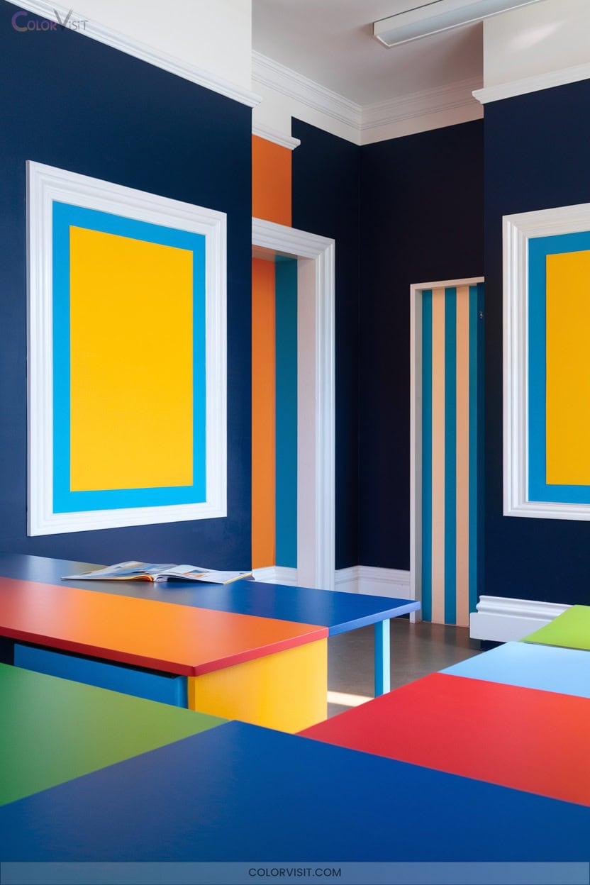
8. Primary Color Play Areas
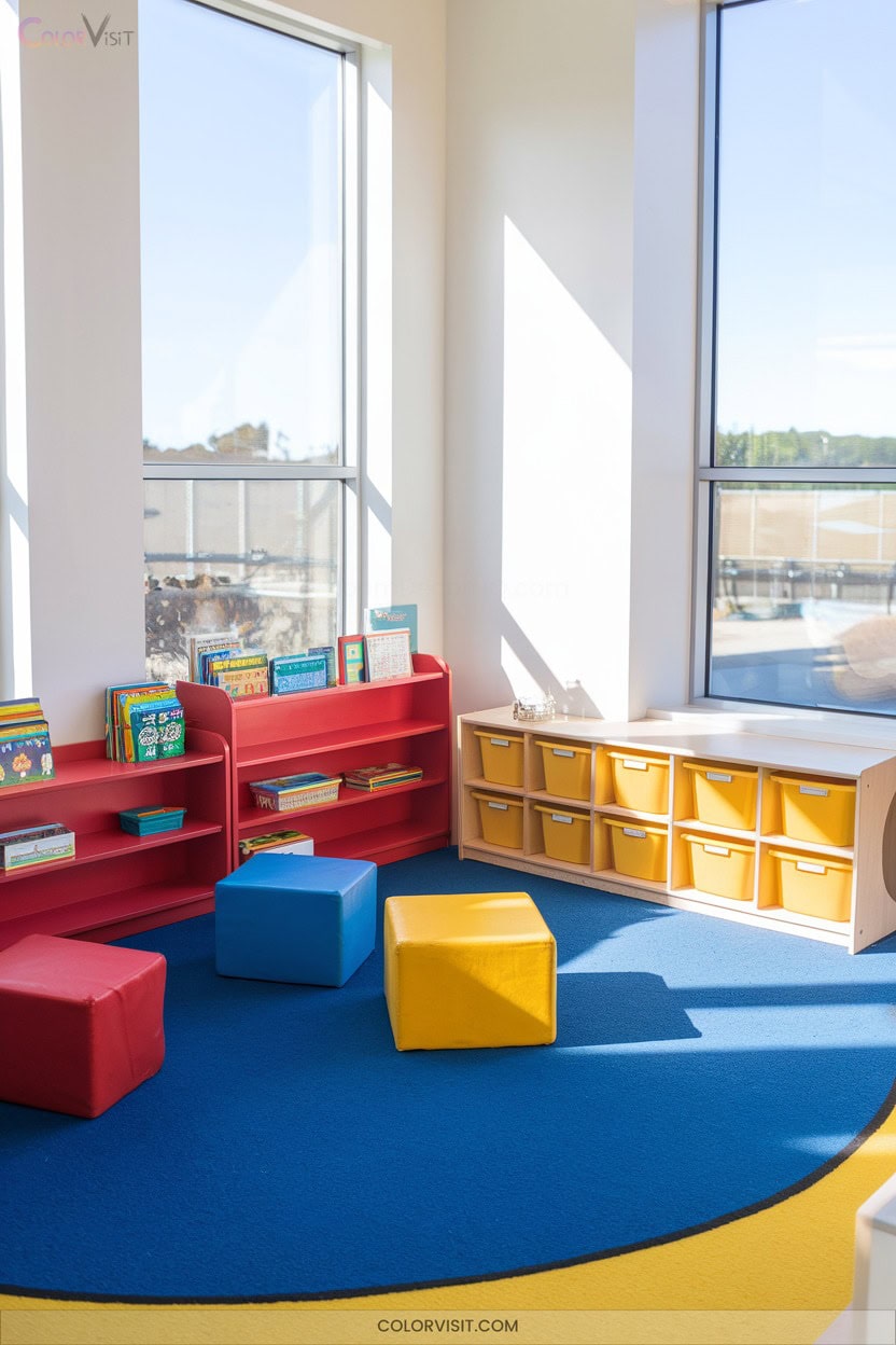
Color bursts bring life and structure to play areas, especially when you use primary colors—red, blue, and yellow—to define energetic, engaging spaces.
Layering these vivid hues in play equipment, wall accents, and sensory corners fuels children’s excitement and supports learning through active exploration.
Assigning each color to specific zones creates intuitive wayfinding and helps kids distinguish between activity areas. Use red to energize group games, yellow to inspire creativity, and blue to calm.
Consistent use of these colors sharpens visual perception, while balancing them with neutrals prevents overstimulation.
Leverage Pinterest for innovative layouts that keep your space dynamic and purposeful.
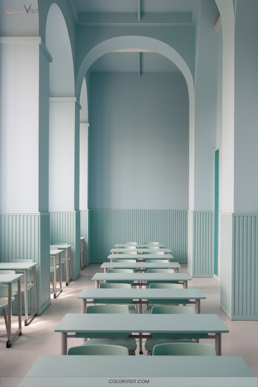
9. Monochromatic Palettes for Minimal Distraction
When you want to minimize distractions and boost focus, a monochromatic palette delivers a clean, unified look that keeps students’ attention on learning materials instead of competing colors.
A monochromatic palette creates a unified classroom environment, helping students focus on learning without the distraction of competing colors.
By harnessing varying shades of a single hue—like soft blues or muted greens—you create a harmonious environment that reduces visual noise and anxiety.
This approach highlights educational tools and technology, making them stand out against a calm backdrop.
Embrace innovation with these emotional benefits:
- Calm—students feel less overwhelmed, more centered.
- Clarity—learning tools become visually prominent.
- Consistency—routine and stability foster a safe, inviting learning space.
10. Lime Green Feature Walls
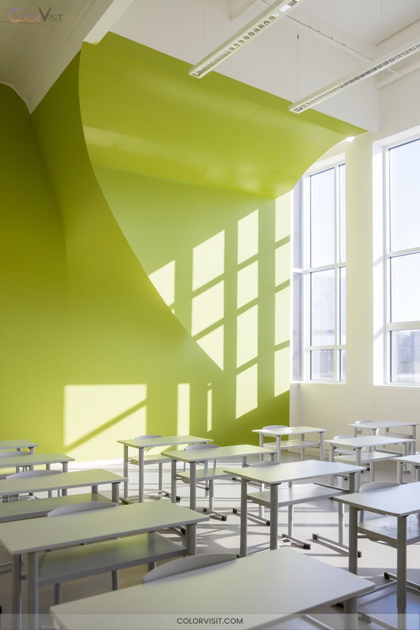
After establishing calm with a monochromatic palette, you can energize your classroom by introducing a lime green feature wall.
This vibrant shade instantly draws attention, invigorating the space and creating a modern focal point.
Lime green contrasts beautifully with neutrals, making displays and learning materials pop without overwhelming the senses.
Psychologically, it boosts concentration, supports calmness, and stimulates alertness—key for student engagement.
Feature walls in this hue also encourage creativity and fresh thinking.
For maximum effect, place your lime green wall near active learning zones, and pair it with durable, washable paint for easy upkeep in dynamic classroom environments.
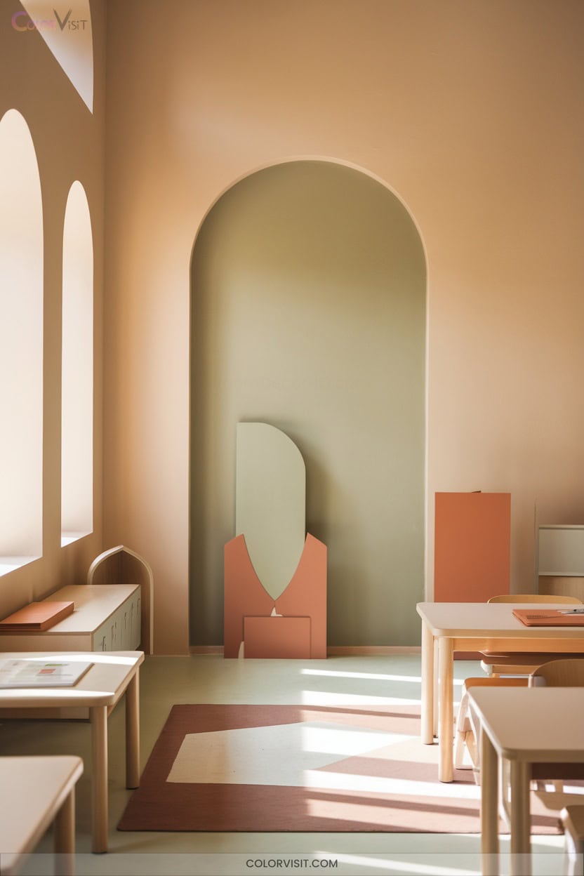
11. Pastel Shades in Counseling Spaces
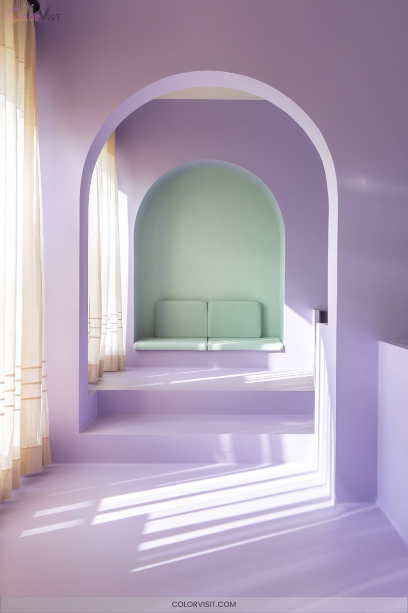
A well-chosen palette of pastel shades transforms counseling spaces into safe, inviting environments where students feel at ease.
You’ll notice how pale aqua, soft peach, and gentle yellow foster calm, clarity, and emotional safety, making each session more effective.
Pale aqua, soft peach, and gentle yellow inspire calm and clarity, nurturing emotional safety for more effective counseling sessions.
Pastels reduce visual overstimulation, creating a harmonious backdrop that’s both flexible and cohesive for innovative therapy settings.
Use them on walls, furnishings, or as thoughtful accents to maintain visual balance and enhance comfort.
- Soft hues diminish anxiety and promote serenity.
- Balanced pastels support emotional openness.
- Gentle colors encourage trust and foster positive student engagement.
12. Natural Wood Tones for Warmth
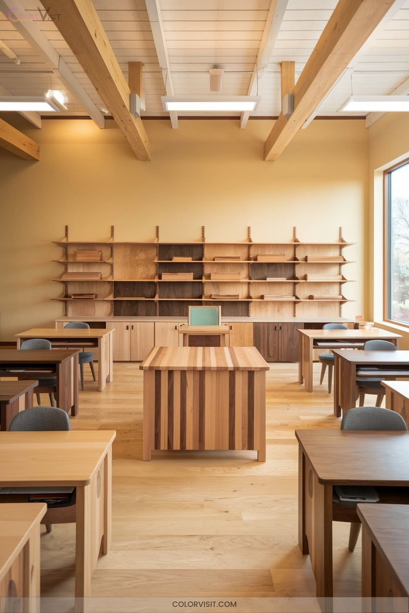
Natural wood tones instantly invite warmth and balance into your classroom, grounding the space with earthy textures and calming hues.
By selecting real or wood-effect surfaces—think shelving, display frames, and modular storage—you’ll tap into biophilic design principles that boost student well-being and focus.
Layer in jute rugs, woven baskets, and bamboo elements for tactile diversity and visual interest.
Neutral palettes and uncluttered wood-themed bulletin boards reduce overstimulation, supporting neurodiverse learners and information retention.
Use printable wood-grain accents or reclaimed materials for cost-effective updates.
With matte finishes and natural fibers, you’ll guarantee durability and lasting style across curriculum changes.
13. High-Contrast Accents for Accessibility
Contrast transforms classroom accessibility, ensuring every student can easily locate materials, navigate spaces, and engage with content.
When you implement high-contrast accents, you make your environment visually inclusive and cognitively supportive.
High-contrast accents transform classrooms into visually inclusive, cognitively supportive spaces where every student can confidently engage and succeed.
Bold outlines on shelves, technology stations, and even power cables help learners with contrast sensitivity thrive.
Choose saturated markers for your whiteboard, and use dark blotter paper to reduce glare beneath worksheets.
These intentional choices foster clarity and independence.
- Empower independence—students easily find their personal space and materials.
- Reduce anxiety—clear visual cues alleviate confusion and hesitation.
- Spark engagement—contrasting diagrams and labels invite participation.
14. Seasonal Color Rotations
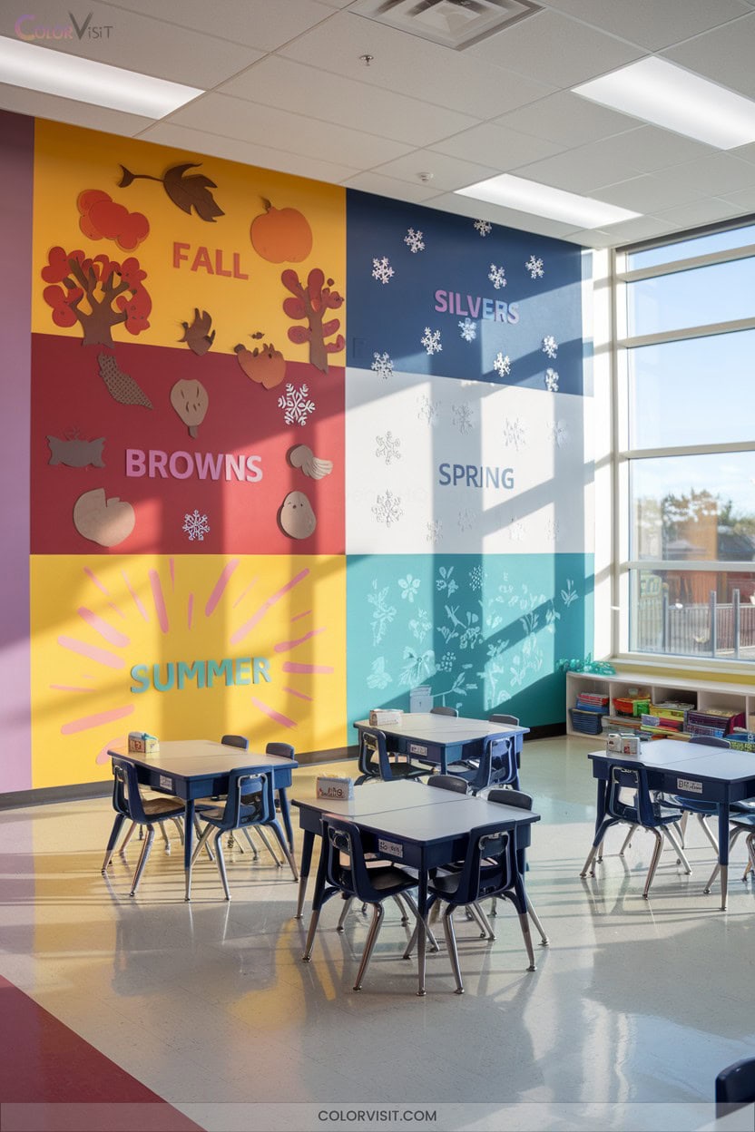
Seasonal color rotations energize your classroom, offering a dynamic way to refresh spaces and maintain student interest throughout the year.
Start by weaving seasonal hues into calendars, learning centers, and educational resources—this keeps content visually fresh and relevant.
Balance vibrant color bursts with neutral tones to avoid overstimulation, and use warm tones for winter or cool shades for summer to influence mood.
Let students help select seasonal palettes; their input increases engagement. Incorporate visual cues for changes and update decorations on a budget.
Consistency and cultural relevance in your color choices foster a sense of anticipation and innovation for every season.
15. School Mascot-Inspired Hues
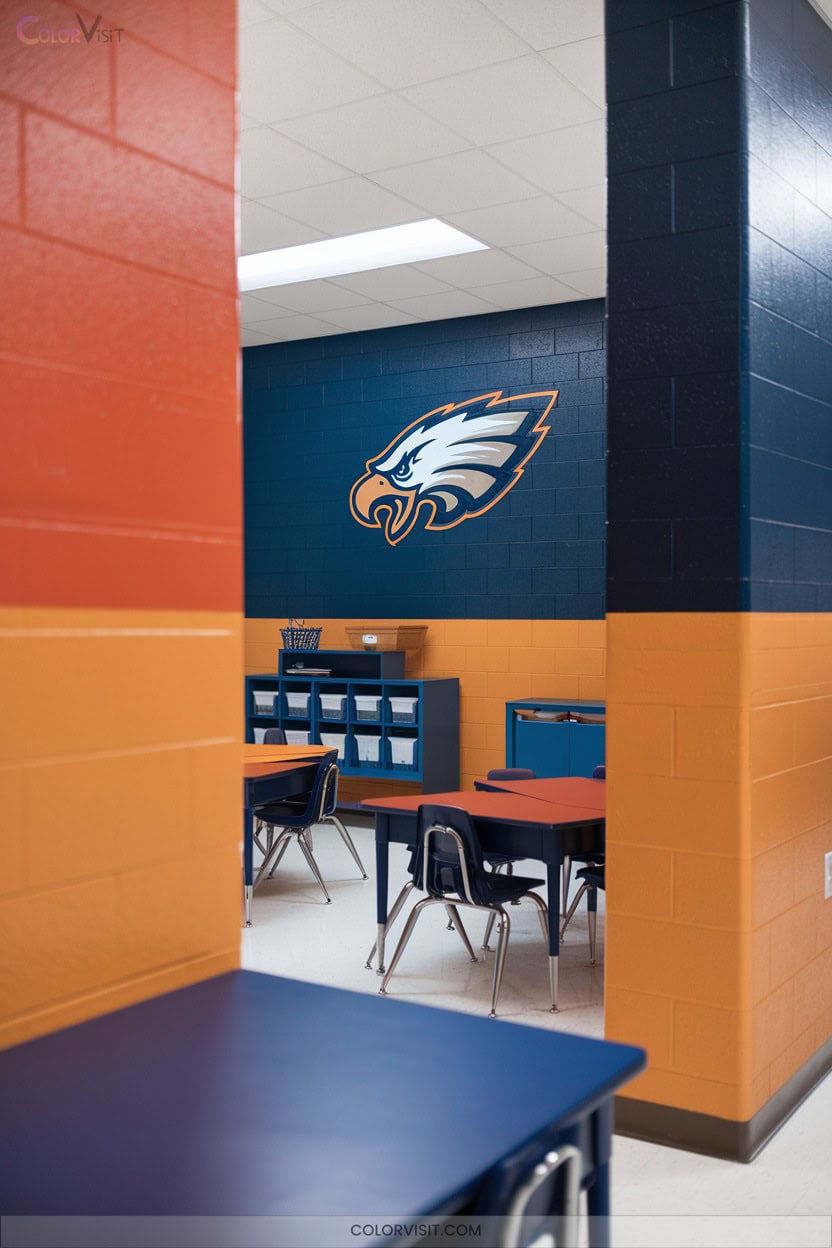
School pride comes alive when you infuse your classroom with mascot-inspired colors.
These hues don’t just brighten the space—they strengthen your school’s identity and foster genuine unity.
By integrating your mascot’s color palette into decor, furniture, and displays, you create a visually cohesive environment that energizes students and cultivates engagement.
Leverage color psychology to balance spirited tones with calming neutrals for ideal focus and mood.
- Ignite belonging: Use mascot colors to foster emotional connection and school spirit.
- Boost motivation: Vibrant tones elevate morale and participation.
- Promote teamwork: Unified color schemes encourage collaboration and group identity.
16. Multicolored Rugs to Define Activity Spaces
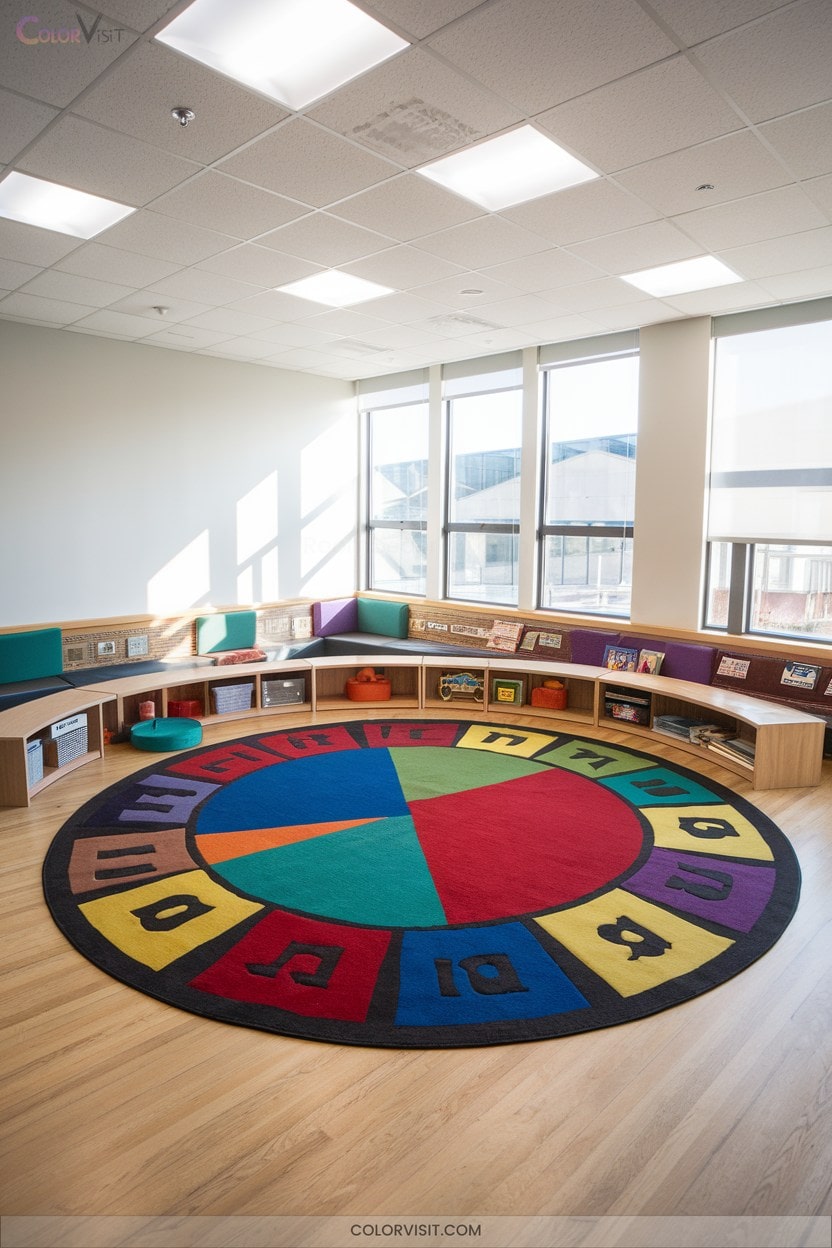
Transform your classroom’s layout and learning dynamics with multicolored rugs that clearly define activity spaces.
Choose grid-based layouts to set visual boundaries and minimize distractions—ideal for structured group work or independent reading.
Alphabet borders and music-themed designs integrate curriculum content directly into your floor plan, actively reinforcing literacy and thematic engagement.
Vibrant blocks stimulate alertness and foster creativity, while soft, antimicrobial, stain-resistant materials guarantee safe and comfortable learning.
Select from multiple sizes or shapes to fit any classroom, and prioritize non-slip, eco-friendly options for sustainability and safety.
Multicolored rugs don’t just organize—they invigorate your innovative, learner-focused environment.
Frequently Asked Questions
How Do I Involve Students in Selecting Classroom Color Schemes?
You invite students to survey color preferences, lead mood board sessions, and vote on curated palettes. Guide them to research color psychology, discuss visual impact, and test samples, ensuring inclusive, innovative choices that reflect everyone’s learning needs.
Are There Cost-Effective Ways to Update Classroom Colors?
You might think updating classroom colors drains your budget, but it doesn’t have to. Start with neutral walls, add bursts of color through student work and DIY decor, then strategically use lighting and second-hand finds for maximum impact.
Can Color Schemes Impact Students With Sensory Processing Disorders?
You can absolutely impact students with sensory processing disorders by choosing your color schemes wisely. Opt for soft, muted, or neutral tones, and avoid bright reds and yellows—this reduces sensory overload, enhances comfort, and supports focused, innovative learning.
What Are Best Practices for Repainting Classrooms During the School Year?
When repainting classrooms mid-year, you’ll assess traffic patterns, prioritize high-use areas, schedule work during breaks, use low-VOC paints, and test colors in real light. Always engage stakeholders and gather feedback to maximize educational impact.
How Can Lighting Affect the Perception of Classroom Colors?
You’ll notice lighting dramatically changes how you and your students perceive classroom colors. Adjust brightness and temperature to reveal true tones, boost focus, and create a dynamic mood. Experiment with colored filters to energize or calm your learning space.
Conclusion
If you think classroom color doesn’t matter, think again—it’s practically the secret superpower of effective teaching!
When you use the right color schemes, you’re not just decorating; you’re sculpting attention, focus, and joy.
Whether you want to calm a stormy classroom or ignite wild creativity, color is your tool.
So, don’t settle for boring beige—unleash a palette that’ll make your students’ brains practically do cartwheels with excitement and engagement every single day.