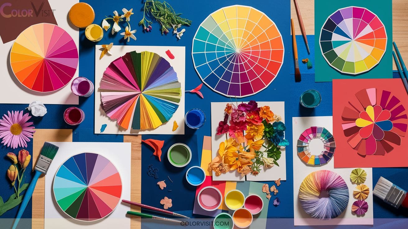
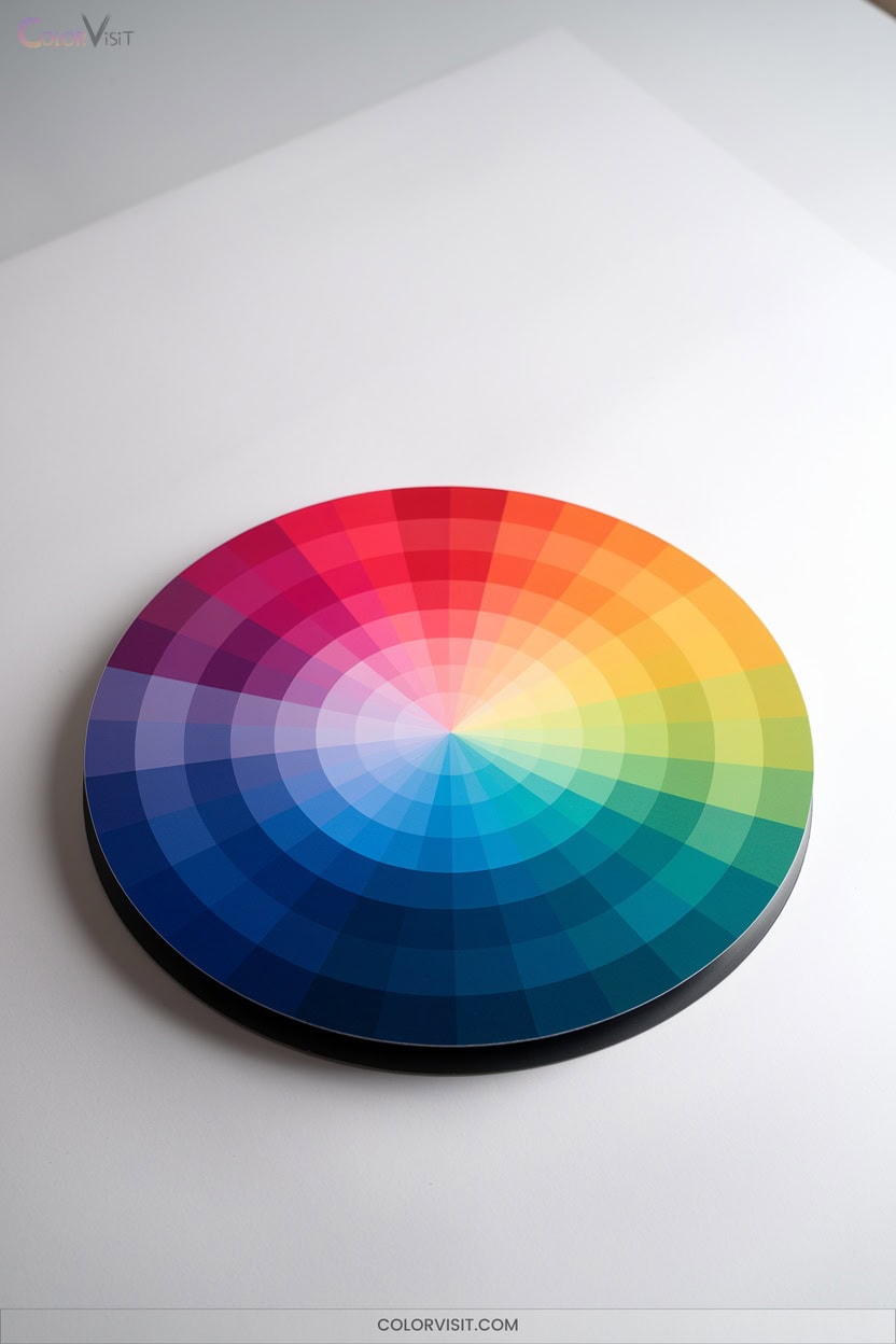
15 Creative Color Wheel Ideas Unique Artists Will Love
You’ll invigorate your color theory practice with 15 creative color wheel ideas tailored for boundary-pushing artists. Explore collage art wheels using torn magazine clippings and fabric for tactile depth, or construct mandala-inspired and 3D folded paper wheels to master radial symmetry and gradation.
Synthesize chakra-mapped palettes, engineer mixed media compositions, and apply advanced harmonies in photographic layouts. Collaborative murals and ombre-painted furniture further expand chromatic strategy. There’s more to discover for artists aiming to master dynamic color interplay. Exploring innovative techniques such as layering translucent materials or integrating digital elements can enhance visual storytelling. These approaches not only diversify artistic expression but also spark new creative drawing ideas for artists. Embracing experimentation in color usage can lead to unique outcomes that push the boundaries of traditional artwork.

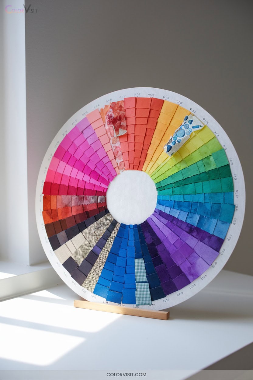
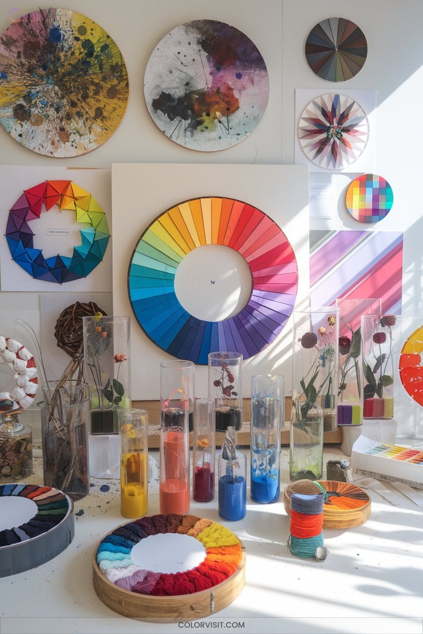
1. Collage Art Color Wheels
A collage art color wheel leverages magazine clippings, recycled paper, and mixed-media sources to construct a visually dynamic, texturally rich representation of color theory principles.
You’ll organize hand-cut or torn elements into 12 radial segments, accurately mapping primary, secondary, and tertiary hues.
Modular assembly allows group collaboration, while tonal layering within each segment develops nuanced value gradations.
Integrate unconventional materials—fabric, photos, found objects—for enhanced tactile depth and negative space manipulation.
Employ adhesive techniques to achieve a smooth, wrinkle-free finish.
Incorporate labeling systems, protective coatings, and strategic lighting to optimize both educational impact and exhibition durability.
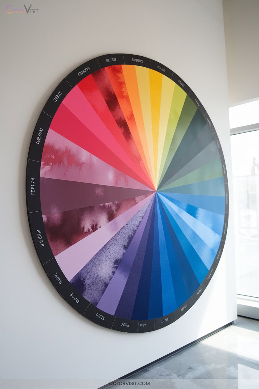
2. Mandala-Inspired Color Wheels
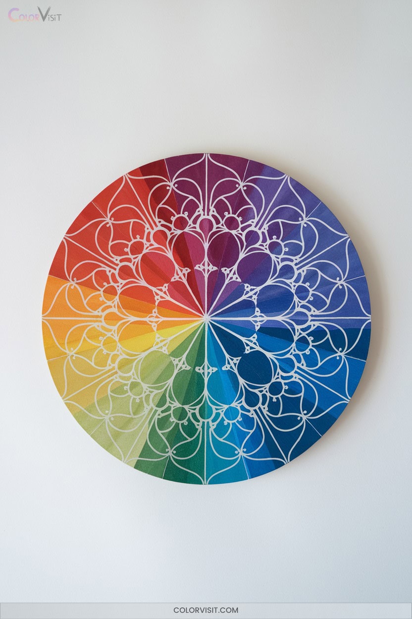
Drawing from the intricate symmetry and symbolic resonance of traditional mandalas, mandala-inspired color wheels synthesize geometric precision with advanced color theory.
You’ll leverage radial symmetry to organize primary and secondary hues, employing protractors or freehand techniques to construct precise or organic motifs.
Integrate tints, shades, and color gradations to achieve dynamic visual depth, while geometric patterns—triangles, circles, and squares—structure harmonious chromatic arrangements.
Experiment with watercolors or mixed media to exploit unique pigment interactions.
3. Chakra-Inspired Color Explorations
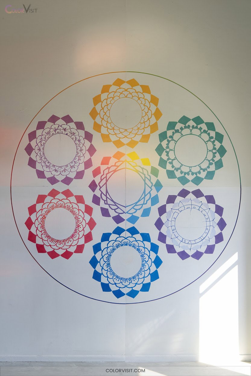
How might you harness the vibrational resonance of chakra colors as a strategic framework for color exploration?
By leveraging the sequenced chromatic spectrum of the chakras, you’ll align your palette with both energetic symbolism and visual harmony.
Each hue—red through violet—carries distinct emotional and spiritual connotations, empowering you to engineer expressive, balanced compositions.
Integrate chakra color theory for advanced color dynamics and conceptual depth:
- Construct color wheels mapping chakra progression for energy flow visualization.
- Synthesize gradients or muted blends for nuanced palettes.
- Apply complementary chakra pairs for dynamic contrast.
- Integrate therapeutic color symbolism for targeted emotional impact.
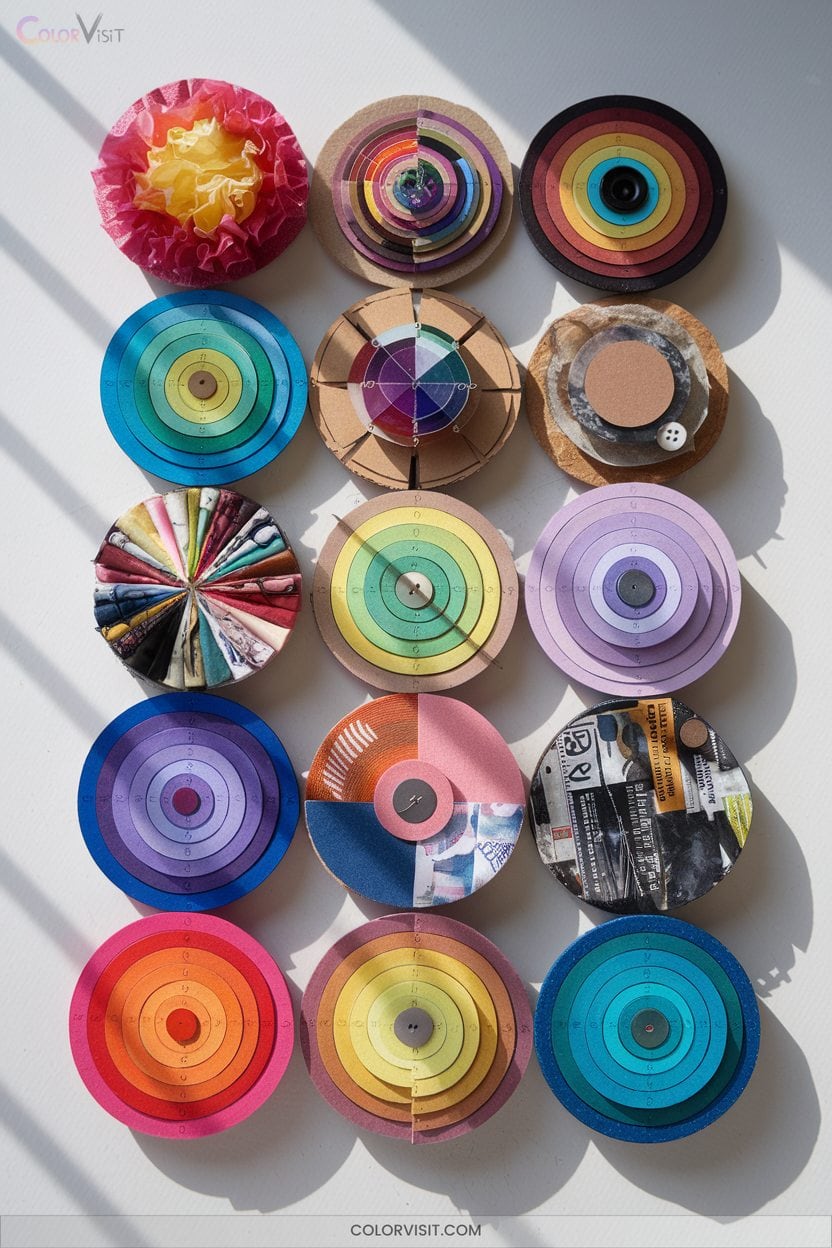
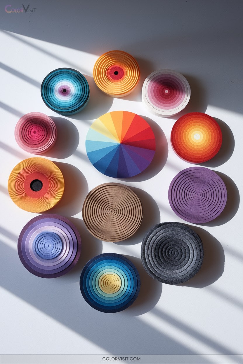
4. Folded Paper 3D Wheels
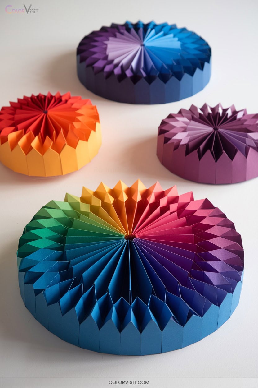
Origami engineering transforms the traditional color wheel into a dynamic, three-dimensional construct, merging geometric rigor with chromatic strategy.
Select dual-sided, square paper for ideal vibrancy and structural integrity.
Use precise fold patterns—concentric, spiral, or modular—to achieve symmetry and dimensional depth.
Employ the two-color principle or expand with primary and secondary hues, ensuring clean color boundaries for visual harmony.
Layer and stack components to enhance the 3D effect, leveraging shadow creation and light interactions for heightened visual impact.
This approach not only demonstrates advanced color theory but also pushes the boundaries of spatial design and tactile engagement in artistic practice.
5. Mixed Media Color Wheel Creations
While three-dimensional paper constructions offer a tactile exploration of spatial color theory, mixed media color wheel creations push chromatic experimentation further by integrating diverse materials and techniques.
You’ll manipulate pigment selection, chroma, and tonal variation using acrylics, inks, and natural pigments for vibrant, lightfast results.
Precision in layering, blending, and chromatic manipulation amplifies contrast and harmony.
Advanced artists optimize material-specific wheels, leveraging color theory for visual dynamism.
- Experiment with complementary and analogous schemes for contrast and cohesion.
- Integrate recycled or natural materials for unique textural outcomes.
- Use art journaling to pre-visualize mixed media palettes.
- Explore pigment mixing to expand chromatic range.
6. Digital Interactive Color Wheels
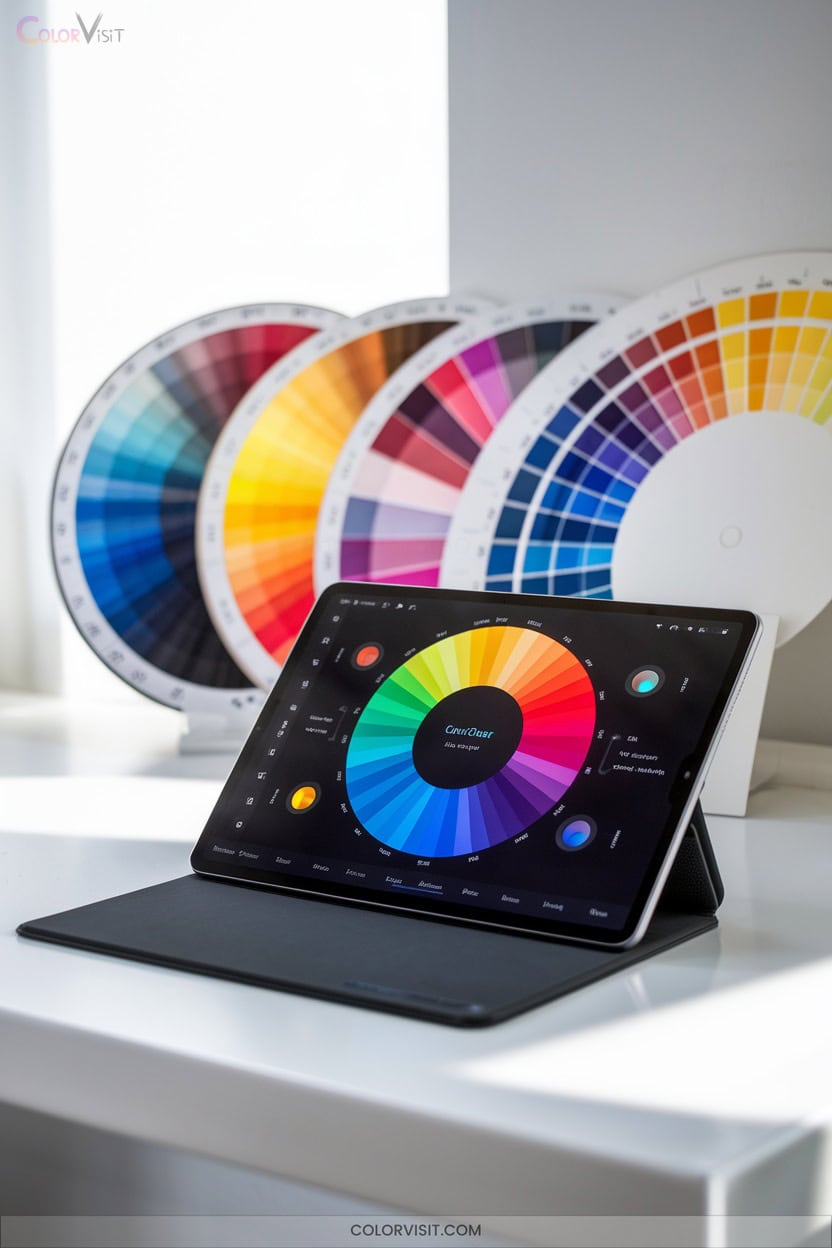
A digital interactive color wheel transforms traditional color theory exploration into an intuitive, data-driven process by leveraging real-time manipulation and precise parameter control.
You can access these tools instantly via web platforms, utilizing interfaces that support direct color code input and dynamic adjustment of hue, saturation, and brightness.
Interactive segments, sliders, and overlays facilitate granular control while providing immediate visual feedback on palette changes.
Advanced algorithms automate harmonious palette generation and allow you to compare multiple color schemes side-by-side.
Seamless integration with design software, export capabilities, and community-driven resources streamline your workflow and foster efficient, informed color decisions for innovative projects.
7. Analogous Color Palette Art
Building on the precision and versatility offered by digital interactive color wheels, analogous color palette art leverages adjacent hues to generate visually harmonious compositions.
Analogous color palettes harness the harmony of neighboring hues, creating balanced and visually engaging digital art compositions.
You’ll select a primary anchor hue, then incorporate neighboring colors—typically three to five—for a unified, balanced effect.
Mastering this technique demands a nuanced understanding of chromatic relationships, temperature interplay, and palette dominance.
To elevate innovation, try these approaches:
- Experiment with tints, shades, and tones for depth.
- Use gradient blends for seamless chromatic flow.
- Employ contrasting underpainting to enhance vibrancy.
- Integrate monochromatic elements for complexity and visual intrigue.
8. Complementary Color Design Projects
Curious how artists achieve striking visual energy in their compositions? Harness complementary color design.
By strategically pairing hues opposite on the color wheel—think red-green, blue-orange, yellow-purple—you’ll leverage simultaneous contrast, intensifying each color’s vibrancy.
Employ value manipulation: blend tints and shades within pairs for dimensionality and nuanced gradations.
Experiment with saturation and temperature shifts to create visual hierarchy and kinetic flow.
Integrate guided drawing and nine-plus color variations for textural richness.
Whether using oil pastels or gouache, these techniques transform classroom exercises and advanced designs, producing dynamic, balanced compositions that captivate viewers and push the boundaries of color innovation.
9. Branding With Color Theory
Why do certain brands command instant recognition and trust?
Color theory is your secret weapon.
With 90% of first impressions driven by color, your palette isn’t just decorative—it’s strategic.
Harnessing color psychology, competitor analysis, and technical execution drives brand equity and consumer loyalty.
To innovate with color in branding, pursue these analytical strategies:
- Leverage industry benchmarking to avoid overused palettes and enhance differentiation.
- Use unused competitor colors to boost memorability and market presence.
- Test color accessibility and document HEX/RGB/Pantone codes for cross-platform consistency.
- Subvert expectations with bold, category-disrupting hues or accent-driven monochromatic schemes.
10. Gradation and Ombre Color Art
Gradation and ombre techniques form the backbone of sophisticated color manipulation in art, enabling you to orchestrate seamless blends and controlled chromatic shifts across surfaces.
Master blending—whether through wet-on-wet, layering, or the introduction of intermediate hues—allows you to achieve nuanced shifts that heighten visual complexity.
Employ dry brushes and strategic palette setups for textured ombre effects, adding dimensionality and contrast.
Explore hatching or crosshatching in drawing to emulate painterly gradation.
Analyze color harmony and select pigments that reinforce your conceptual intent, transforming gradients into focal points.
Let gradation articulate mood, atmosphere, and movement, energizing both portraits and abstract compositions.
11. Complementary Color Scenes in Photography
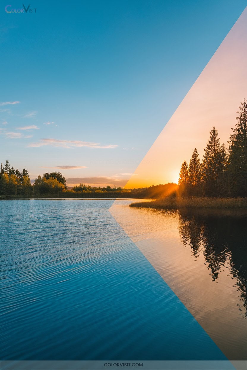
A mastery of complementary color scenes in photography hinges on a rigorous understanding of color theory, specifically the dynamic interplay between hues positioned directly opposite each other on the color wheel.
When you leverage these chromatic pairs—red and green, blue and orange, yellow and purple—you amplify image vibrancy and visual contrast, creating compelling focal points.
To innovate effectively, consider these technical strategies:
- Identify complementary pairs in your environment using a color wheel.
- Prioritize one color as dominant, using its complement as an accent.
- Manipulate saturation and luminance for nuanced intensity.
- Integrate color contrast via props, backgrounds, or lighting for balanced compositions.
12. Color Harmony in Photographic Composition
Building on the dynamic energy of complementary color scenes, mastering color harmony in photographic composition requires a sophisticated orchestration of hues and relationships mapped on the color wheel.
You’ll leverage monochromatic, analogous, triadic, and tetradic harmonies to construct visually compelling images.
Analyze color wheel placement to select harmonies that optimize emotional resonance and guide visual flow.
Manipulate contrast, lighting, and negative space to balance dominant and subordinate colors, ensuring compositional clarity.
Employ split-complementary and rectangular schemes for dynamic tension.
Through mindful framing and targeted color adjustment in post-processing, you refine chromatic interactions, elevating mood, focus, and narrative integrity within each photograph.
13. Color Mixing and Secondary Color Activities
Mastering color mixing with technical accuracy enables sophisticated secondary color activities that deepen your understanding of chromatic relationships.
By manipulating primary hues—red, blue, and yellow—you’ll generate secondary colors (green, orange, purple) with precise control over hue, saturation, and value.
Advanced color theory empowers you to engineer tints, shades, and nuanced gradations for innovative palettes.
Employ these activities for technical refinement:
- Construct interactive color wheels to visualize secondary color genesis.
- Execute controlled color mixing exercises to calibrate chromatic accuracy.
- Solve color puzzles to analyze relational logic.
- Design painting projects emphasizing secondary color dominance and complementary interactions.
14. Collaborative Color Wheel Projects
Elevate your color theory practice by engaging in collaborative color wheel projects that synthesize collective creativity with technical rigor.
Coordinate a color mural, assigning segments to participants to demonstrate chromatic harmony and unity.
Launch school-wide color wheels to foster communal engagement while reinforcing concepts like analogous, complementary, and triadic relationships.
Integrate color psychology posters and symbolism guides, leveraging cross-disciplinary research for deeper meaning.
Facilitate patterned animal color wheels to analyze natural palettes and color relationships.
Innovate with community color time capsules, encapsulating chromatic artifacts to capture temporal palettes.
Through these structured collaborations, you’ll expand both technical expertise and creative synergy.
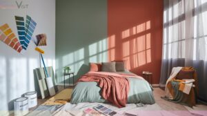
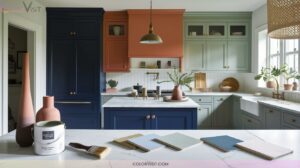
15. Painted Furniture and Decor Using Color Wheels
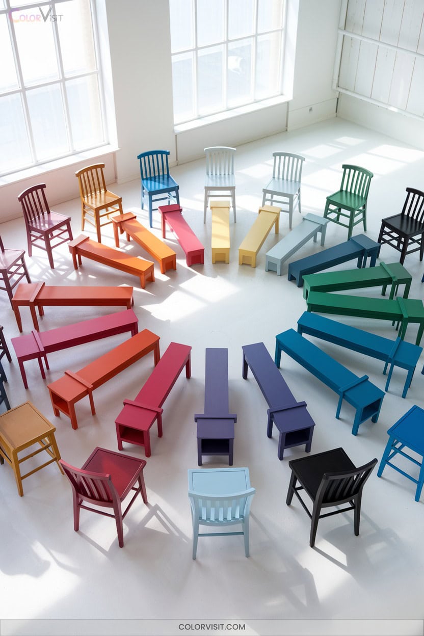
Furniture transforms into functional art when you strategically apply color wheel theory to its surfaces.
Harness primary, secondary, or tertiary hues to engineer bold stenciling, dynamic ombre gradients, or crisp geometric motifs.
Emphasize structure using complementary contrasts or opt for monochromatic harmony for cohesive visual flow.
Incorporate nature-inspired palettes or abstract influences for innovative results.
- Select a color harmony—complementary, analogous, or triadic—for your design.
- Apply stenciling with contrasting colors to accentuate form and detail.
- Blend shades for a technical ombre effect, enhancing dimensionality.
- Integrate geometric patterns using harmonious hues for a contemporary, innovative finish.
Frequently Asked Questions
How Can I Use the Color Wheel to Improve My Textile Designs?
You can strategically leverage the color wheel to engineer harmonious palettes, optimize color contrasts, and apply advanced schemes like triadic or tetradic relationships, ensuring your textile compositions achieve visual impact, color accuracy, and innovative, market-driven differentiation.
What Are the Best Apps for Creating Digital Color Wheel Art?
You’ll revolutionize your workflow with apps like Color Wheel, Pocket Color Wheel, Color Gear, Canva Color Wheel, and Colorfly. Leverage features like AR integration, contrast ratio calculators, and dynamic palette generators for boundary-pushing digital color wheel art.
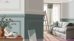
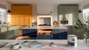
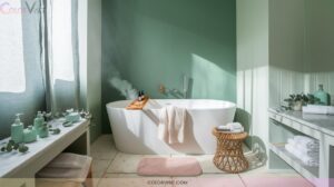
How Does Color Theory Influence Mood in Home Decor?
You leverage color theory to strategically orchestrate mood in home decor, employing hue, saturation, and value to evoke emotional responses. Calibrating warm and cool palettes, you optimize psychological impact, enhancing functionality, aesthetic harmony, and spatial experience.
Can Color Wheel Principles Be Applied to 3D Modeling Projects?
Colorful composition, contrast, and cohesion converge when you apply color wheel principles in 3D modeling. Manipulate hue harmony, saturation shifts, and strategic shader setups to craft compelling, chromatically-consistent scenes that showcase sophisticated visual storytelling and innovative material mastery.
How Do I Generate Custom Palettes With a Color Wheel Generator?
You select a base hue, adjust parameters like saturation and brightness, then explore schemes—analogous, triadic, tetradic—within the generator. Fine-tune with sliders, extract from images, and leverage accessibility tools to guarantee your palette’s functional and innovative.
Conclusion
Delve into these color wheel ideas and you’ll spark a chromatic revolution in your studio. You’ll orchestrate pigment symphonies, engineer harmonious gradients, and architect color narratives that defy convention.
With techniques ranging from mixed-media layering to tridimensional paper engineering, your palette will transcend the ordinary and morph into a kaleidoscopic powerhouse.
These projects aren’t just exercises—they’re catalysts for artistic metamorphosis. Take command of hue, value, and saturation, and watch your creative output reach stratospheric visual impact.