16 Elegant Dining Room Paint Color Ideas to Impress Your Guests
Elevate your dining room with crisp whites like Extra White or White Dove to create a luminous, timeless canvas. Try sophisticated grays, balanced greige, or warm beiges such as Manchester Tan to set a welcoming mood.
Make a statement with serene Aleutian blue-green, navy blue, jewel-toned greens, or rich plums for bold elegance. Refined charcoals and sleek steel-blues add modern depth and drama. Ready for more inspired, expert-approved dining room palettes that wow?

1. Crisp White for a Timeless Foundation
A crisp white paint sets a timeless foundation in any dining room, delivering both versatility and sophistication.
A crisp white paint brings enduring elegance and unmatched versatility to the heart of your home: the dining room.
Opt for Sherwin-Williams Extra White for modern clarity—its cool undertones and high LRV maximize light and pair effortlessly with warm accents.
Benjamin Moore’s Simply White or White Dove guarantees brightness with nuanced warmth, ideal for south-facing or open layouts.
Cloud White avoids yellowing in luminous spaces, while Alabaster’s soft touch flatters formal settings.
Use satin or eggshell finishes on walls, semi-gloss on trim for depth.
Always test undertones against flooring and furnishings to prevent clashing, and select premium formulas to resist yellowing.
2. Sophisticated Gray for Dining Elegance
While crisp white offers a classic backdrop, sophisticated gray takes dining room elegance to a new level with its refined neutrality and unmatched versatility.
Choose a pale gray for an airy, serene ambiance that expands your space and pairs effortlessly with any decor.
Opt for dramatic dark gray to foster intimacy, set off statement artwork, and provide a striking contrast with lighter furnishings.
Explore grays with unique undertones—cool for calm, warm for subtle coziness, or balanced for universal appeal.
Leading brands like Farrow & Ball and Sherwin-Williams offer curated tones, ensuring your dining room always feels contemporary and expertly composed.
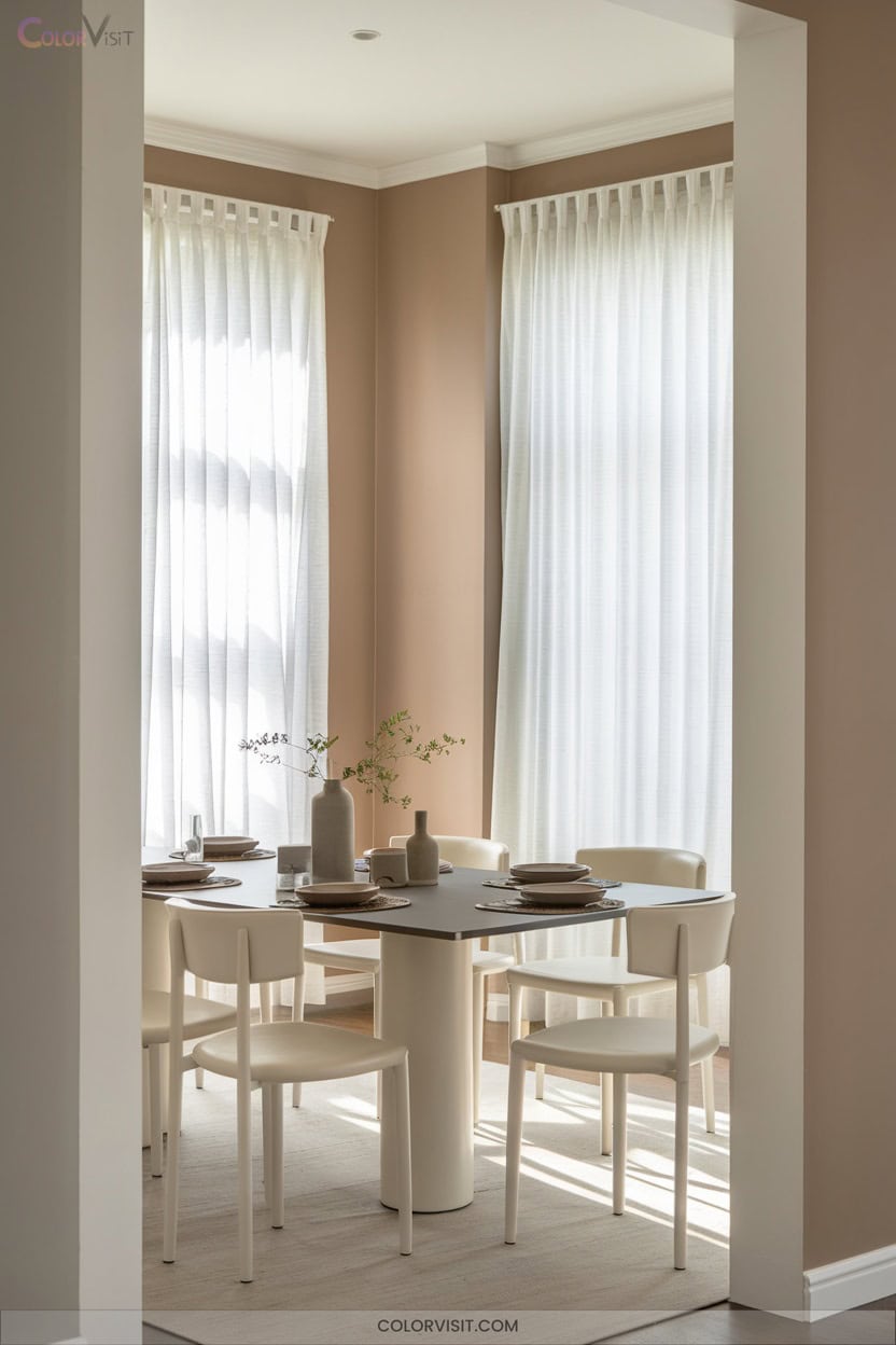
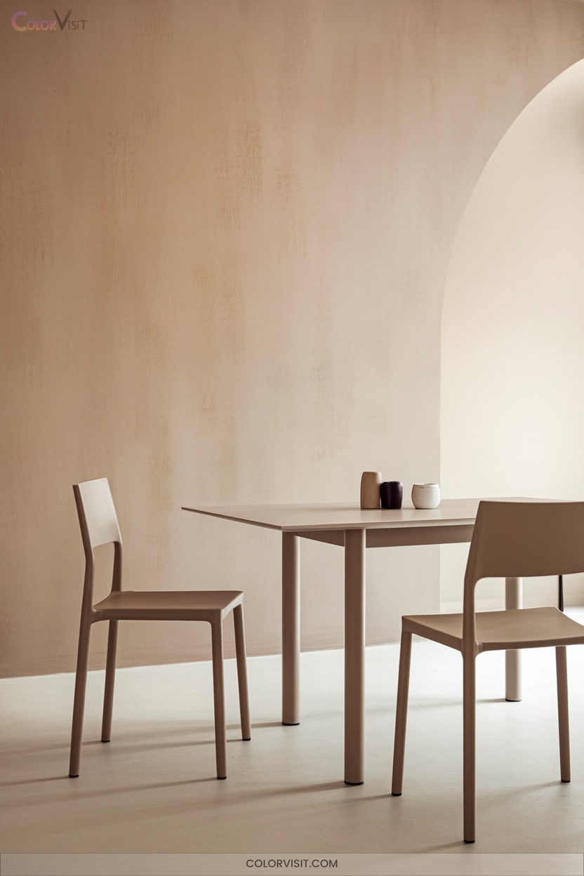
3. Warm Beige for Inviting Gatherings

Warmth defines the most welcoming dining rooms, and nothing delivers that effect quite like a thoughtfully chosen beige.
Opt for Sherwin-Williams Creamy to infuse northern spaces with light, or embrace Benjamin Moore Manchester Tan for a sandy, organic backdrop that pairs seamlessly with wood accents.
If you crave nuanced depth, Benjamin Moore Pashmina’s subtle gray notes provide muted sophistication without veering traditional.
Maximize visual interest by layering natural textures—consider earthenware, marble, or blackened steel against mid-tone beiges like Accessible Beige.
Always test large swatches under varied lighting to guarantee your beige supports both intimate gatherings and dynamic design statements.
4. Balanced Greige for Modern Versatility
Balanced greige delivers a sophisticated foundation for dining rooms that demand both modern edge and timeless adaptability.
Its fusion of gray and beige provides flexibility in any lighting condition, never skewing too warm or cold.
This neutral backdrop adapts seamlessly, enhancing art and furnishings while supporting bold design moves.
For innovative, style-forward results, consider these strategies:
- Test swatches like Revere Pewter and White Duck across various lighting.
- Pair greige walls with metallic accents or rich wood tones for visual interest.
- Use mid-range LRVs to balance brightness and depth.
- Rely on greige’s subtlety to unify eclectic décor.
5. Serene Aleutian SW 6241 From Sherwin-Williams
For those seeking a dining room color that infuses tranquility without sacrificing sophistication, Sherwin-Williams Aleutian SW 6241 stands out as a compelling option.
Sherwin-Williams Aleutian SW 6241 brings tranquil sophistication, making it a standout choice for a serene yet refined dining room atmosphere.
This blue-green hue, with its refined blue undertones and HEX #98A9B7, delivers a modern, serene ambiance ideal for innovative design.
Pair Aleutian with crisp white trim for freshness or introduce dramatic contrast using Tricorn Black.
Incorporate natural textures and curated lighting to amplify the color’s dynamic character in various lighting conditions.
Opt for light-toned furniture and blue-green textiles to enhance the space’s visual harmony.
Aleutian SW 6241 transforms the dining experience with understated elegance.
6. Earthy Taiga SW 9654 for Cozy Ambiance
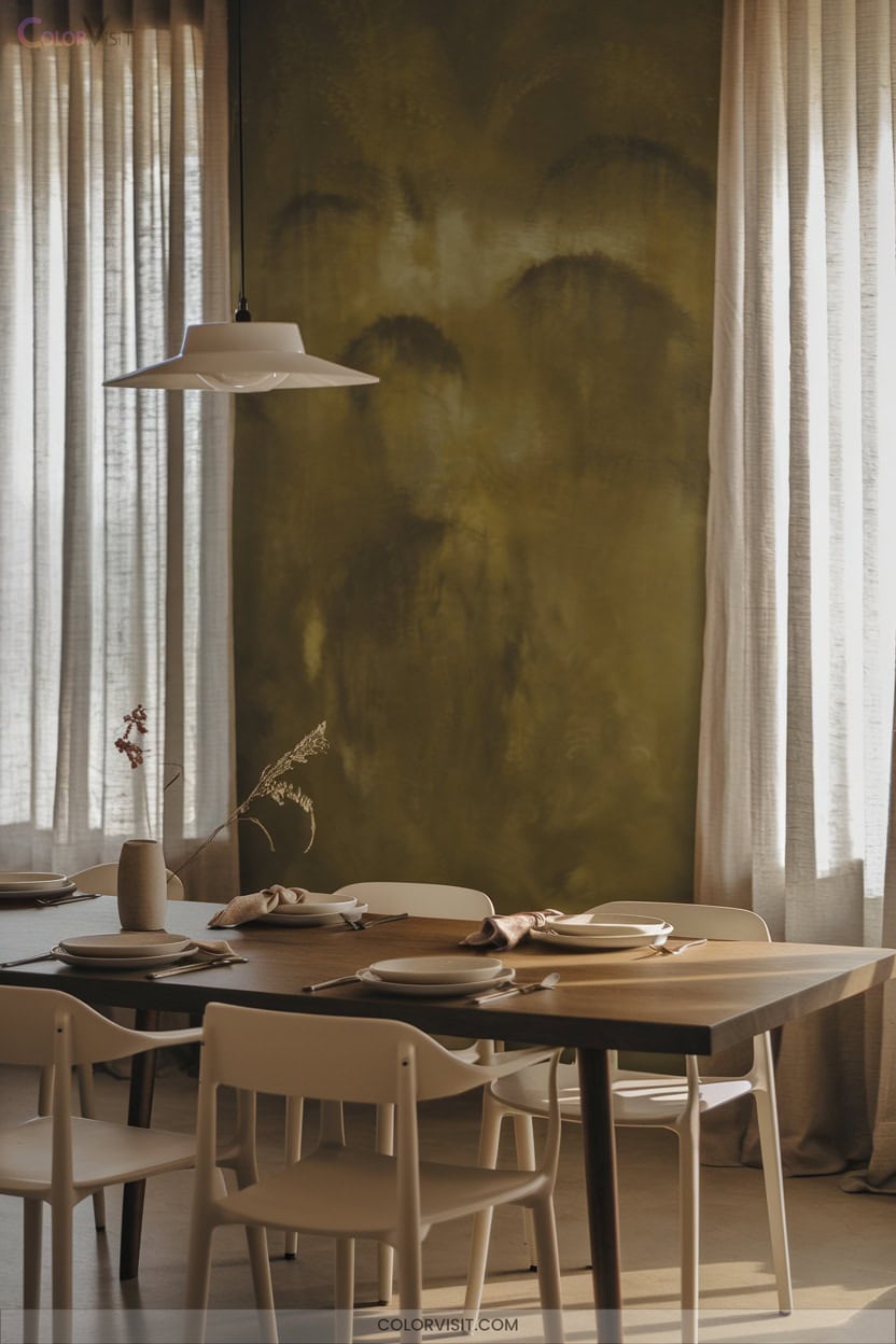
Inviting sophistication defines Taiga SW 9654, a Sherwin-Williams neutral that brings grounded warmth to dining spaces without overpowering the palette.
With an LRV of 22.41, it creates an intimate, cocooning ambiance—ideal for modern entertaining.
You’ll appreciate its nuanced earthy green undertones that harmonize with natural textures and innovative design pairings.
For elevated results, consider:
- Accent walls for a subtle yet compelling focal point.
- Crisp white trim (SW Extra White 7006) to enhance architectural definition.
- Warm metallic fixtures—think antique brass for tactile interest.
- Layered natural fabrics and botanical accents to reinforce organic luxury.
7. Natural Saguaro SW 6419 to Bring the Outdoors In
While Taiga SW 9654 infuses dining rooms with earthy sophistication, opting for Natural Saguaro SW 6419 instantly channels a connection to the outdoors.
This yellow paint, defined by warm olive undertones and a yellow-brown base, delivers an organic, grounded ambiance with an LRV of 11.85—ideal for intimate, modern settings.
Amplify its earthy aesthetic by pairing with oak or walnut furnishings and introducing brass or gold accents for refined depth.
Layer in natural textiles like jute, greenery, and nature-inspired art.
Use dimmable warm lighting or linen-shaded lamps to highlight Saguaro’s nuanced hues and create a dynamic, inviting dining experience.
8. Rustic Charm With Burnt Almond 280F-4
A dining room painted in Burnt Almond 280F-4 instantly radiates rustic sophistication, thanks to its warm, earthy tone and subtle depth.
This color’s RGB composition (179, 147, 117) and HEX #B39375 create a nuanced backdrop that pairs seamlessly with innovative rustic design.
Elevate your space by considering:
- Oak or pine wood accents for authentic warmth.
- Metallic touches—think copper or brass—for refined contrast.
- Layering earthy textiles, such as linen or cotton, for tactile interest.
- Warm, dimmable lighting to enhance the inviting ambiance.
Burnt Almond’s GREENGUARD Gold certification guarantees your dining room remains both stylish and health-conscious.
9. Contemporary Vibes With Almond Latte N260-2
Sophistication meets comfort with Almond Latte N260-2, a warm, espresso-inspired hue that brings contemporary energy to your dining room.
This GREENGUARD Gold certified paint merges style with sustainability, ensuring superior indoor air quality. Its moderate LRV of 59.14 reflects just enough light to create an inviting yet modern ambiance, ideal for entertaining.
Acting as both paint and primer, Almond Latte simplifies your process and delivers stain-blocking performance.
Pair it with minimalist or ornate furniture to highlight your innovative taste.
With one-coat hide options and versatile finishes, you’ll achieve a flawless, cozy statement wall that’s both functional and fashion-forward.
10. Opulent Cellini Gold HDC-CL-18 Accents
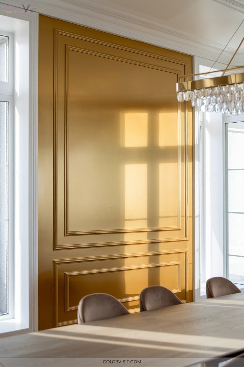
Timeless luxury defines Cellini Gold HDC-CL-18, an antique-inspired hue that instantly elevates your dining space with rich, opulent undertones.
Harness its design versatility by integrating this shade for contemporary yet classic sophistication.
Cellini Gold’s advanced stain repellency and one-coat hide guarantee your walls remain pristine through countless gatherings.
Pair this paint with innovative lighting and lush textiles for dramatic ambiance.
For a refined, solution-oriented approach, consider:
- Accent one wall with Cellini Gold for focal intrigue.
- Pair with dark wood furniture for depth.
- Coordinate with Urban Raincoat or Ceylon Cream.
- Select from matte or semi-gloss finishes.
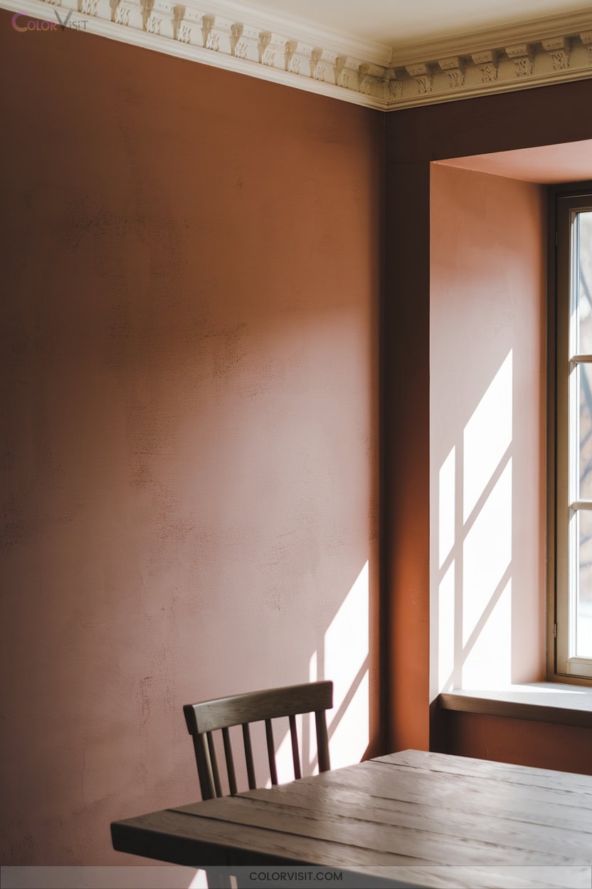
11. Bold Red for Dramatic Flair
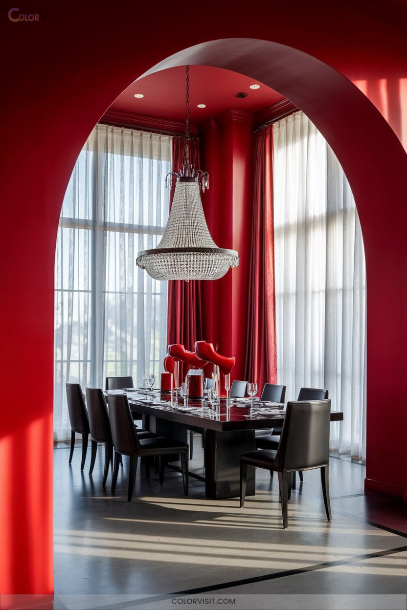
While Cellini Gold delivers subtle opulence, bold red takes your dining room in a distinctly dramatic direction. Opt for Heritage Red or Red Bay to balance warmth and vibrancy, or choose Fireweed and Clay Ridge for earthy, intimate sophistication.
South-facing rooms intensify these shades; north exposures yield grounded, muted red. Use matte finishes to minimize glare, and crisp white or muted gray trim for modern definition.
Highlight architectural details and create visual contrast with gold accents, hardwood furniture, and neutral linens.
Test samples in varied lighting, and consider a feature wall for focal impact—bold red transforms your space into an unforgettable dining experience.
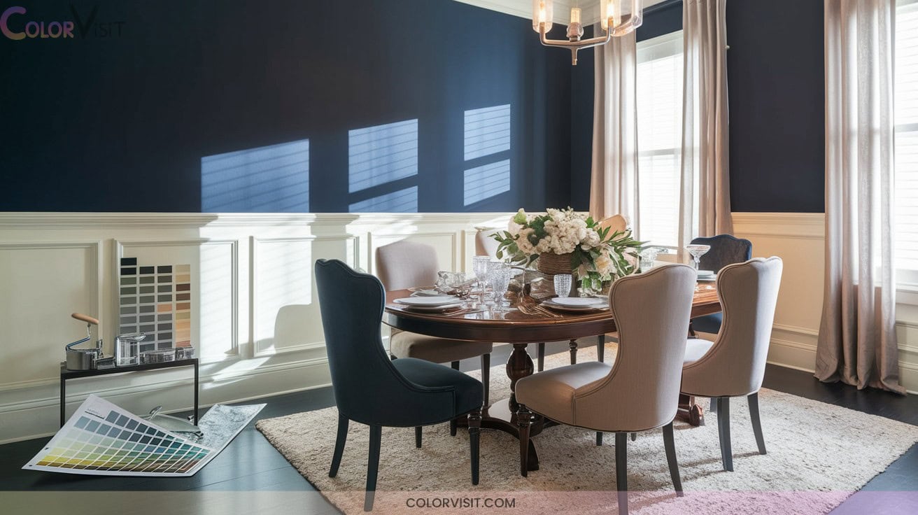
12. Classic Navy Blue for Timeless Style
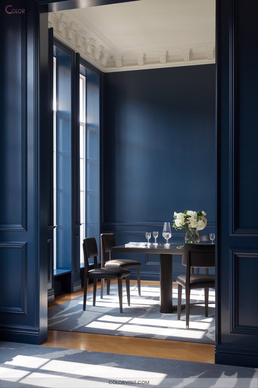
When you want to evoke a sense of enduring elegance in your dining room, classic navy blue stands out as a refined, versatile choice.
Classic navy blue brings refined sophistication and timeless versatility to any dining room, creating an elegant and inviting atmosphere.
This hue—think Farrow & Ball’s Wine Dark or Benjamin Moore’s Polo Blue—delivers depth and adaptability that complements both contemporary and historic settings.
Elevate your space with these expert strategies:
- Pair navy blue walls with dark wood accents for a sophisticated foundation.
- Use metallic elements, such as gold or silver, to introduce a touch of luxury.
- Contrast navy with neutral furnishings for dynamic visual balance.
- Layer velvet drapes in deeper blues to enhance a moody, immersive ambiance.
13. Deep Plums for a Luxurious Atmosphere
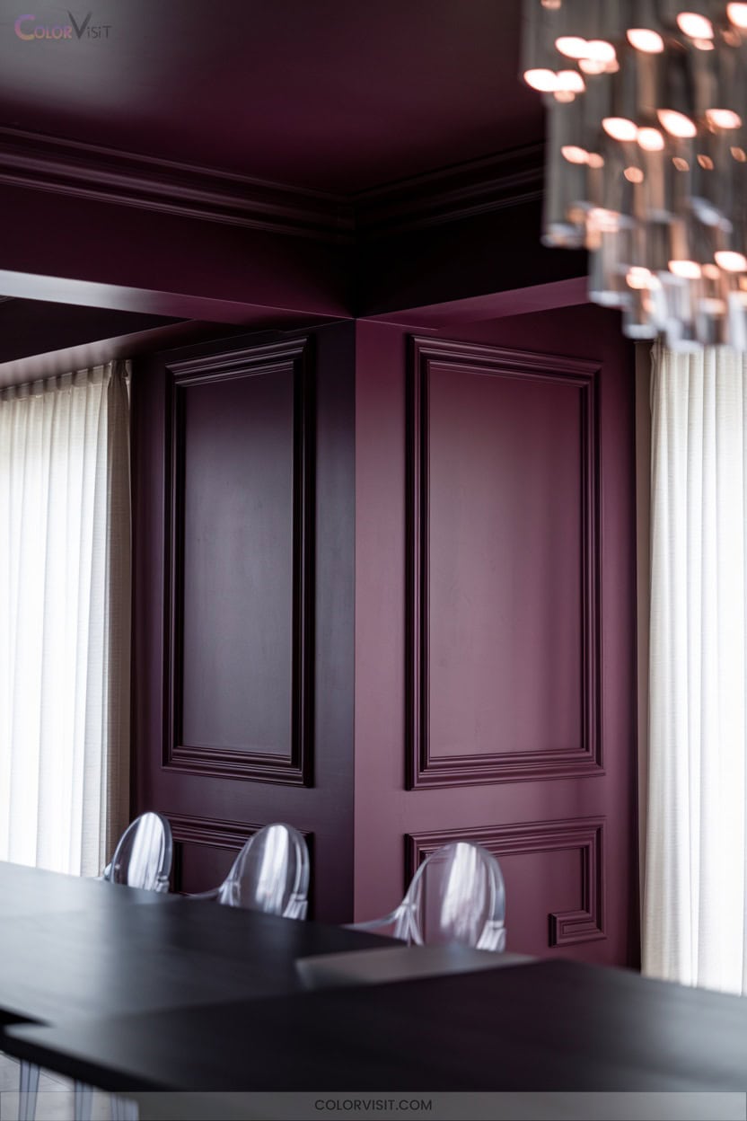
Opulence takes center stage in the dining room with the introduction of deep plum hues.
Harness bold statements with Magnolia Home’s Plum Suede on feature walls, or select Frosted Lilac for a sophisticated balance with glass or metal furnishings.
Pair classic deep plum with pink-toned whites and greys for multidimensional elegance, then amplify with gold or brass accents for a contemporary edge.
Strategic placement is essential—utilize deep plum where natural light prevails and integrate reflective elements like mirrors or pendant lights.
14. Jewel-Toned Greens for Vibrant Gatherings
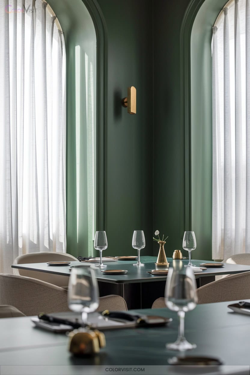
For those seeking a dining room that feels as lively as it’s refined, jewel-toned greens offer an unforgettable palette.
Jewel-toned greens bring vibrance and refinement to dining spaces, creating a palette that’s both memorable and sophisticated.
Opt for saturated hues like emerald, hunter, or forest green to create a vibrant yet sophisticated ambiance.
Elevate your design with these expert-approved combinations:
- Pair deep greens with natural wood accents for warmth and organic contrast.
- Add brass or gold metallics—think lighting or decor—for a luxurious finish.
- Use black accents to inject a sharp, contemporary edge.
- Incorporate soft pink highlights or lush greenery to balance intensity and infuse elegance.
These choices guarantee a dynamic, innovative dining experience.
15. Refined Kendall Charcoal HC-166 for Depth
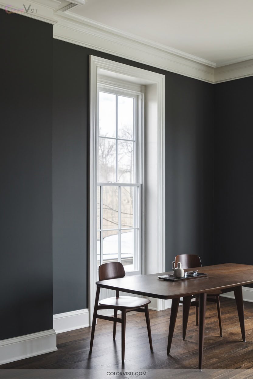
Curious how to achieve depth and sophistication in your dining room?
Kendall Charcoal HC-166 offers a rich, dark neutral with an LRV of 14.61, delivering luxurious depth while remaining versatile.
Its nuanced green undertones and superior light absorption create a dramatic, structural anchor that elevates both modern and traditional design elements.
Pair it with crisp white trims like Chantilly Lace for striking contrast, or layer earthy hues for a balanced palette.
The premium, stain-resistant finish guarantees color integrity and durability, even in high-traffic areas.
Choose Kendall Charcoal to create an intimate, innovative dining space defined by refined ambiance.
16. Modern Blueprint S470-5 for Sleek Appeal
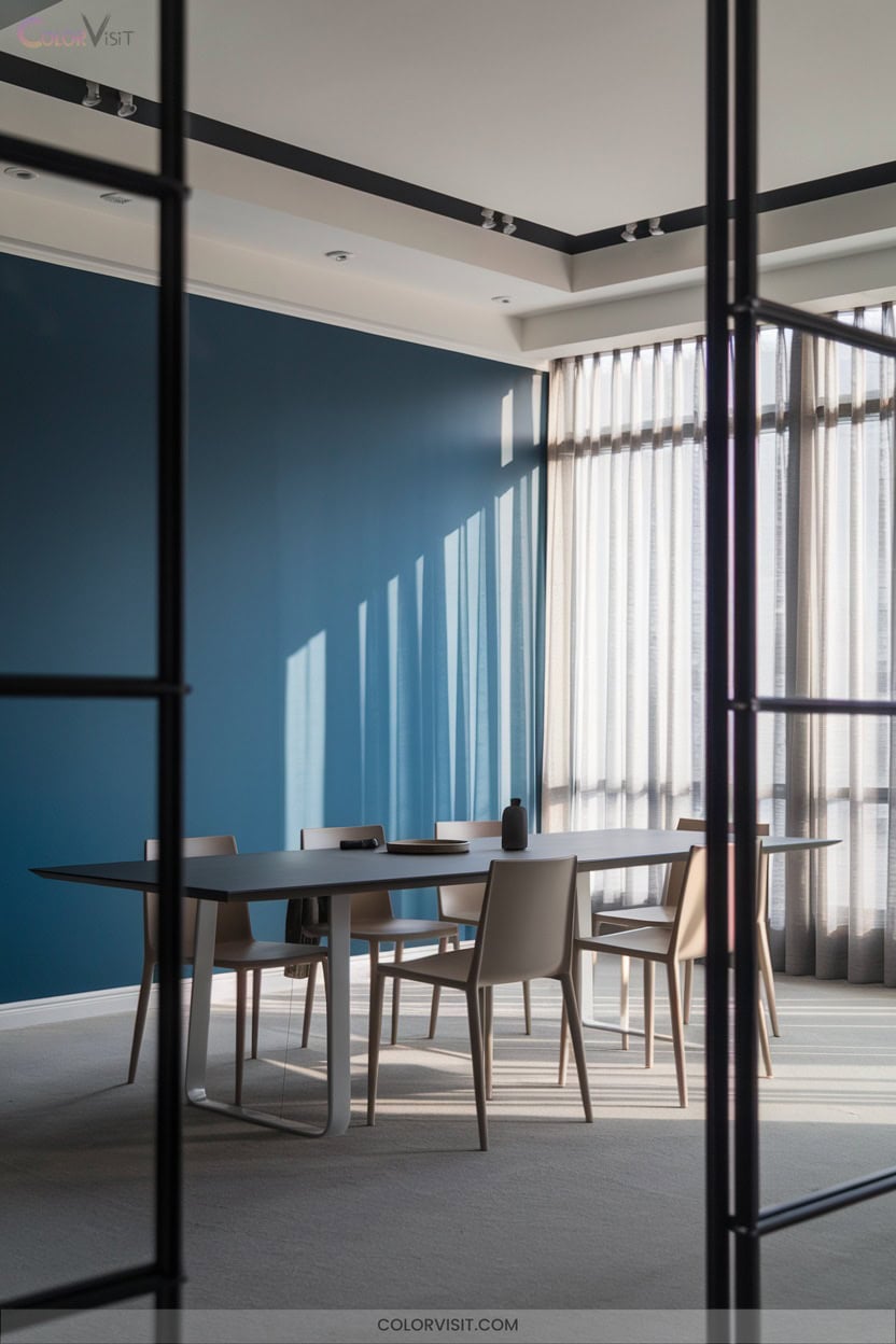
A dynamic choice for the modern dining room, Blueprint S470-5 by Behr introduces a cool, steel-blue sophistication that instantly elevates your space.
This dusky blue-gray shade bridges navy and denim, offering versatility across walls, trim, and cabinetry.
To achieve a sleek, innovative dining environment, consider these expert strategies:
- Use satin enamel for a pearl-like, durable finish on trim or walls.
- Pair with metallic accents—gold or silver—for refined contrast.
- Layer with warm lighting to enhance comfort and vibrancy.
- Contrast with whites or creams to highlight the blue’s modern edge.
Elevate your dining room with Blueprint’s contemporary allure.
Frequently Asked Questions
Which Paint Finish Is Best for Dining Room Walls: Matte, Satin, or Semi-Gloss?
You should opt for a satin finish—it strikes the perfect balance between sophistication and practicality. Satin resists stains, cleans easily, and subtly reflects light, enhancing modern ambiance while maintaining resilience for innovative, style-forward dining room environments.
How Do I Choose Complementary Accent Colors for My Dining Room?
Start by analyzing your base color’s undertones, then select accent hues from the opposite side of the color wheel for dynamic contrast. Incorporate metallics or jewel tones to elevate sophistication, ensuring your palette feels intentional and visually compelling.
Are There Eco-Friendly or Low-Voc Paint Options for Dining Rooms?
You’ll find innovative eco-friendly and zero-VOC paints like ECOS, Healthier Homes, and Benjamin Moore Eco Spec. They deliver aesthetic versatility, durable performance, and certified sustainability. Prioritize Green Seal or asthma-friendly certifications to guarantee ideal indoor air quality.
What Colors Make a Small Dining Room Appear Larger and Brighter?
Imagine you transform a cramped dining nook with Chantilly Lace—a crisp, luminous white. You’ll harness light reflectivity and visual expansion, leveraging sleek monochromatic furnishings and vertical elements to craft an innovative, spatially dynamic atmosphere that feels strikingly open.
Can I Paint the Ceiling a Different Color Than the Walls for Added Interest?
Absolutely, you can paint the ceiling a contrasting or complementary color for visual intrigue. Opt for a saturated ceiling if your space has ample light, or a lighter hue to maintain airiness—always coordinate undertones for seamless, innovative cohesion.
Conclusion
It’s often said that color sets the mood, but studies actually confirm its profound impact on perceptions and interactions. When you choose a sophisticated palette—whether crisp white, elegant greige, or daring blueprint—you’re not just decorating, you’re curating experiences.
Your dining room becomes more than a backdrop; it’s a stage for memorable gatherings. So, embrace expert color theory and let your space impress. The right shade doesn’t just beautify—it truly elevates every meal you host.