16 Elegant Dining Room Paint Color Ideas to Impress Your Guests
Elevate your dining room with crisp whites like Extra White or White Dove to create a luminous, timeless canvas. Try sophisticated grays, balanced greige, or warm beiges such as Manchester Tan to set a welcoming mood.
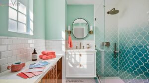
Make a statement with serene Aleutian blue-green, navy blue, jewel-toned greens, or rich plums for bold elegance. Refined charcoals and sleek steel-blues add modern depth and drama. Ready for more inspired, expert-approved dining room palettes that wow?

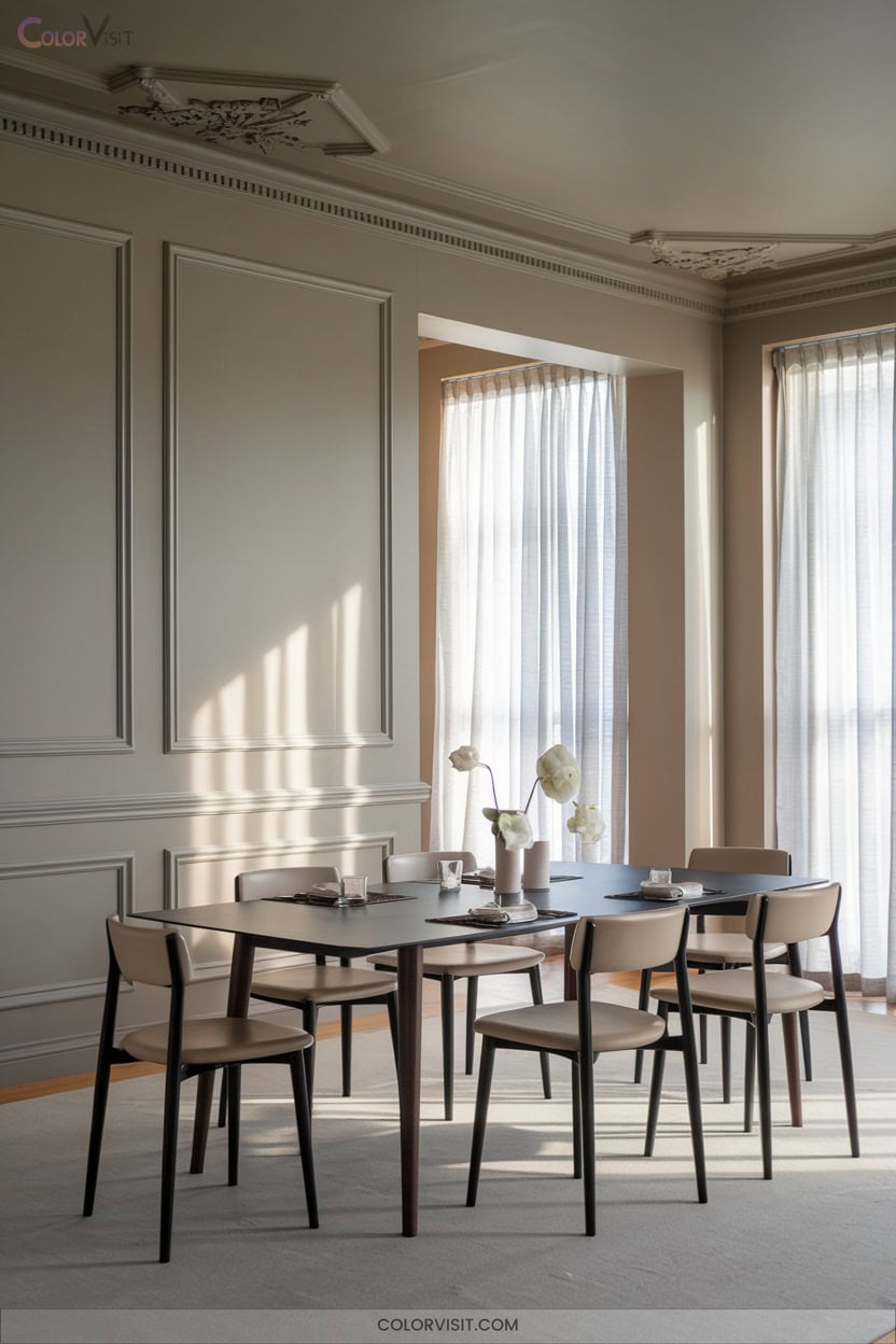
1. Crisp White for a Timeless Foundation
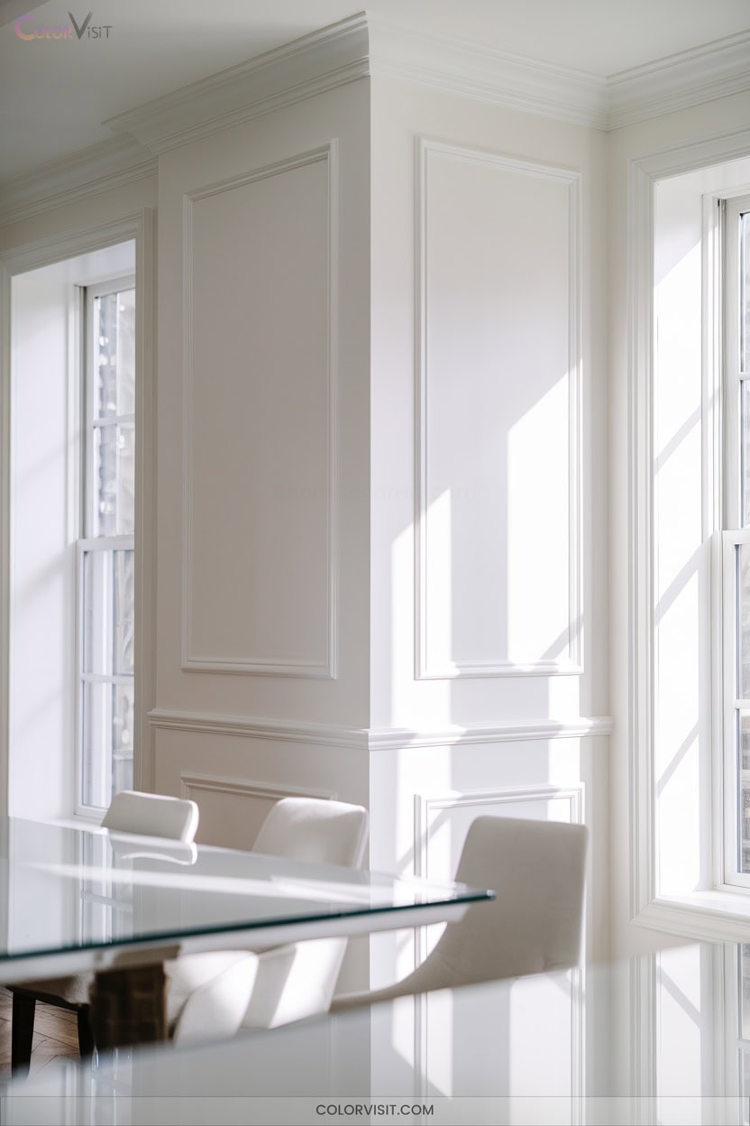
A crisp white paint sets a timeless foundation in any dining room, delivering both versatility and sophistication.
A crisp white paint brings enduring elegance and unmatched versatility to the heart of your home: the dining room.
Opt for Sherwin-Williams Extra White for modern clarity—its cool undertones and high LRV maximize light and pair effortlessly with warm accents.
Benjamin Moore’s Simply White or White Dove guarantees brightness with nuanced warmth, ideal for south-facing or open layouts.
Cloud White avoids yellowing in luminous spaces, while Alabaster’s soft touch flatters formal settings.
Use satin or eggshell finishes on walls, semi-gloss on trim for depth.
Always test undertones against flooring and furnishings to prevent clashing, and select premium formulas to resist yellowing.
| FolkArt Home Decor Chalk Acrylic Paint 8oz Grotto |  | Best Matte Finish | Paint Type / Product Form: Water-based acrylic chalk furniture & craft paint | Finish Type: Matte (chalk paint finish) | Color / Color Name: Grotto (blueish green shade) | VIEW LATEST PRICE | Read Our Analysis |
| Jungarian Furniture Paint Kit 16oz Retro Mint |  | No-Sanding Convenience | Paint Type / Product Form: Water-based acrylic furniture paint | Finish Type: Matte | Color / Color Name: Retro Mint (greenish mint) | VIEW LATEST PRICE | Read Our Analysis |
| Heirloom Traditions ALL-IN-ONE Paint Mediterranean Blue Teal |  | All-In-One Durability | Paint Type / Product Form: Water-based acrylic all-in-one cabinet and furniture paint | Finish Type: Matte / Low Luster Velvet Sheen | Color / Color Name: Mediterranean Blue Teal | VIEW LATEST PRICE | Read Our Analysis |
| Country Chic All-in-One Chalk Paint Fancy Frock |  | Eco-Friendly Choice | Paint Type / Product Form: Chalk paint (liquid, chalk formula) | Finish Type: Matte (chalky matte finish) | Color / Color Name: Fancy Frock (light blue) | VIEW LATEST PRICE | Read Our Analysis |
| DWIL Matte Finish Furniture Paint 5oz Blue Grey |  | Complete Starter Kit | Paint Type / Product Form: Water-based matte furniture paint (liquid) | Finish Type: Matte | Color / Color Name: Blue Grey | VIEW LATEST PRICE | Read Our Analysis |
| PRESTIGE Interior Paint and Primer in One Mint Frost Semi-Gloss 1 Gallon |  | High-Coverage Interior | Paint Type / Product Form: Acrylic latex interior paint and primer in one | Finish Type: Semi-Gloss | Color / Color Name: Mint Frost (#bce4d6, light mint green) | VIEW LATEST PRICE | Read Our Analysis |
| Rust-Oleum Color Spark Interior Paint Sample Pack |  | Color Sampling Pack | Paint Type / Product Form: Acrylic interior paint and primer (sample chips) | Finish Type: Swatch color sample pack (finish not specified) | Color / Color Name: Dark Blues (various shades: Peace of Mind, Capri, etc.) | VIEW LATEST PRICE | Read Our Analysis |
| Magnolia Home Chalk Style Interior Paint Wooded Acres |  | Designer-Inspired Palette | Paint Type / Product Form: Water-based acrylic chalk style interior paint | Finish Type: Ultra-Matte (chalk style) | Color / Color Name: Wooded Acres (woodsy brown with green undertones) | VIEW LATEST PRICE | Read Our Analysis |
| Modern Kitchen Decor Humorous Food Canvas Poster |  | Humorous Kitchen Art | Paint Type / Product Form: Canvas poster (not paint) | Finish Type: Canvas print (no paint finish) | Color / Color Name: N/A (poster with humorous food art) | VIEW LATEST PRICE | Read Our Analysis |
| MUDECOR Extra Large Neutral Abstract Canvas Wall Art |  | Large Neutral Artwork | Paint Type / Product Form: Framed canvas print (not paint) | Finish Type: Canvas print (no paint finish) | Color / Color Name: N/A (neutral abstract canvas art) | VIEW LATEST PRICE | Read Our Analysis |
| Purple White Vintage Farmhouse Window Curtains 2 Panels |  | Farmhouse Window Panels | Paint Type / Product Form: Polyester fabric curtains (not paint) | Finish Type: Fabric curtains (no paint finish) | Color / Color Name: Purple and White (fabric curtain colors) | VIEW LATEST PRICE | Read Our Analysis |
| jejeloiu Cherry Blossom Chinese Ink Wall Art Set |  | Vibrant Wall Set | Paint Type / Product Form: Canvas wall art set (not paint) | Finish Type: Canvas print (no paint finish) | Color / Color Name: N/A (Chinese ink painting set with cherry blossom red sun theme) | VIEW LATEST PRICE | Read Our Analysis |
2. Sophisticated Gray for Dining Elegance
While crisp white offers a classic backdrop, sophisticated gray takes dining room elegance to a new level with its refined neutrality and unmatched versatility.
Choose a pale gray for an airy, serene ambiance that expands your space and pairs effortlessly with any decor.
Opt for dramatic dark gray to foster intimacy, set off statement artwork, and provide a striking contrast with lighter furnishings.
Explore grays with unique undertones—cool for calm, warm for subtle coziness, or balanced for universal appeal.
Leading brands like Farrow & Ball and Sherwin-Williams offer curated tones, ensuring your dining room always feels contemporary and expertly composed.
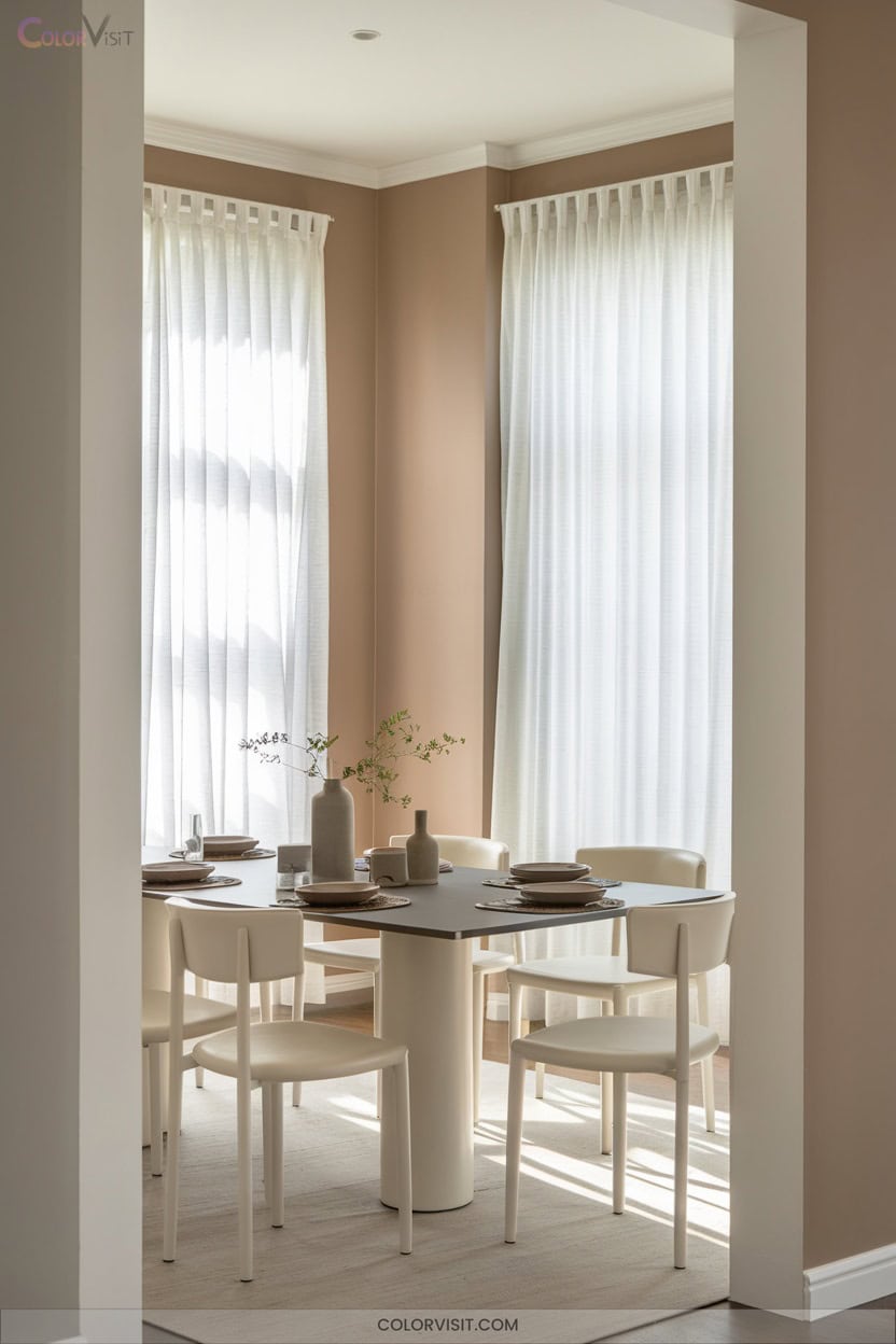
3. Warm Beige for Inviting Gatherings

Warmth defines the most welcoming dining rooms, and nothing delivers that effect quite like a thoughtfully chosen beige.
Opt for Sherwin-Williams Creamy to infuse northern spaces with light, or embrace Benjamin Moore Manchester Tan for a sandy, organic backdrop that pairs seamlessly with wood accents.
If you crave nuanced depth, Benjamin Moore Pashmina’s subtle gray notes provide muted sophistication without veering traditional.
Maximize visual interest by layering natural textures—consider earthenware, marble, or blackened steel against mid-tone beiges like Accessible Beige.
Always test large swatches under varied lighting to guarantee your beige supports both intimate gatherings and dynamic design statements.
4. Balanced Greige for Modern Versatility
Balanced greige delivers a sophisticated foundation for dining rooms that demand both modern edge and timeless adaptability.
Its fusion of gray and beige provides flexibility in any lighting condition, never skewing too warm or cold.
This neutral backdrop adapts seamlessly, enhancing art and furnishings while supporting bold design moves.
For innovative, style-forward results, consider these strategies:
- Test swatches like Revere Pewter and White Duck across various lighting.
- Pair greige walls with metallic accents or rich wood tones for visual interest.
- Use mid-range LRVs to balance brightness and depth.
- Rely on greige’s subtlety to unify eclectic décor.
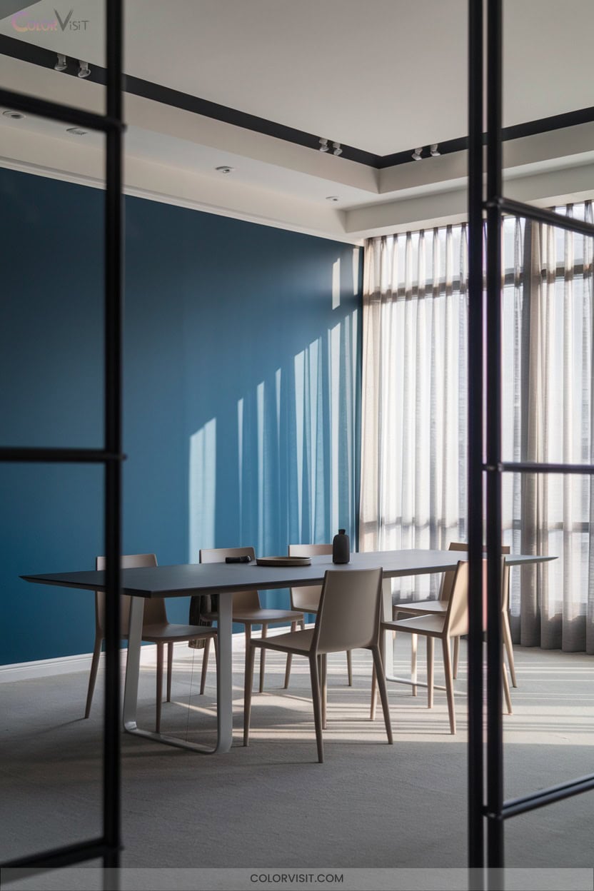
5. Serene Aleutian SW 6241 From Sherwin-Williams
For those seeking a dining room color that infuses tranquility without sacrificing sophistication, Sherwin-Williams Aleutian SW 6241 stands out as a compelling option.
Sherwin-Williams Aleutian SW 6241 brings tranquil sophistication, making it a standout choice for a serene yet refined dining room atmosphere.
This blue-green hue, with its refined blue undertones and HEX #98A9B7, delivers a modern, serene ambiance ideal for innovative design.
Pair Aleutian with crisp white trim for freshness or introduce dramatic contrast using Tricorn Black.
Incorporate natural textures and curated lighting to amplify the color’s dynamic character in various lighting conditions.
Opt for light-toned furniture and blue-green textiles to enhance the space’s visual harmony.
Aleutian SW 6241 transforms the dining experience with understated elegance.
6. Earthy Taiga SW 9654 for Cozy Ambiance
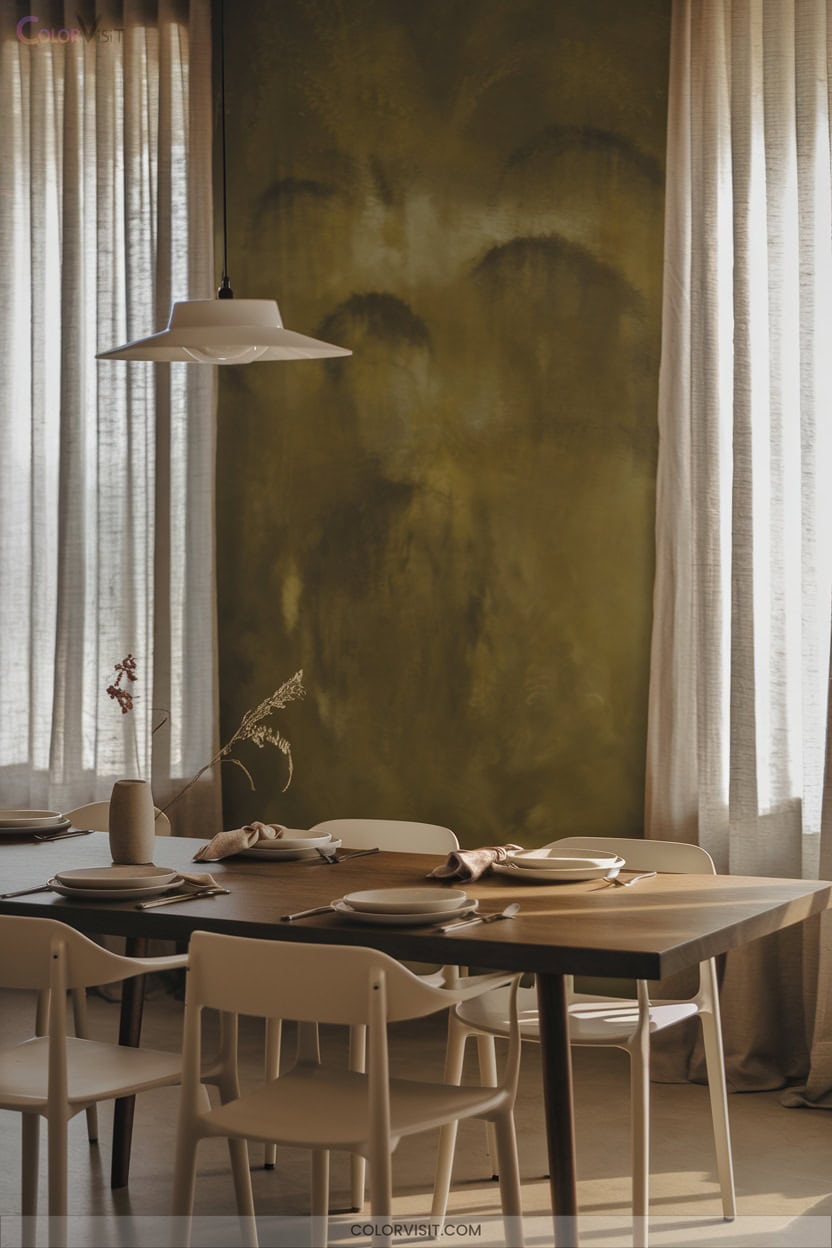
Inviting sophistication defines Taiga SW 9654, a Sherwin-Williams neutral that brings grounded warmth to dining spaces without overpowering the palette.
With an LRV of 22.41, it creates an intimate, cocooning ambiance—ideal for modern entertaining.
You’ll appreciate its nuanced earthy green undertones that harmonize with natural textures and innovative design pairings.
For elevated results, consider:
- Accent walls for a subtle yet compelling focal point.
- Crisp white trim (SW Extra White 7006) to enhance architectural definition.
- Warm metallic fixtures—think antique brass for tactile interest.
- Layered natural fabrics and botanical accents to reinforce organic luxury.
7. Natural Saguaro SW 6419 to Bring the Outdoors In
While Taiga SW 9654 infuses dining rooms with earthy sophistication, opting for Natural Saguaro SW 6419 instantly channels a connection to the outdoors.
This yellow paint, defined by warm olive undertones and a yellow-brown base, delivers an organic, grounded ambiance with an LRV of 11.85—ideal for intimate, modern settings.
Amplify its earthy aesthetic by pairing with oak or walnut furnishings and introducing brass or gold accents for refined depth.
Layer in natural textiles like jute, greenery, and nature-inspired art.
Use dimmable warm lighting or linen-shaded lamps to highlight Saguaro’s nuanced hues and create a dynamic, inviting dining experience.
8. Rustic Charm With Burnt Almond 280F-4
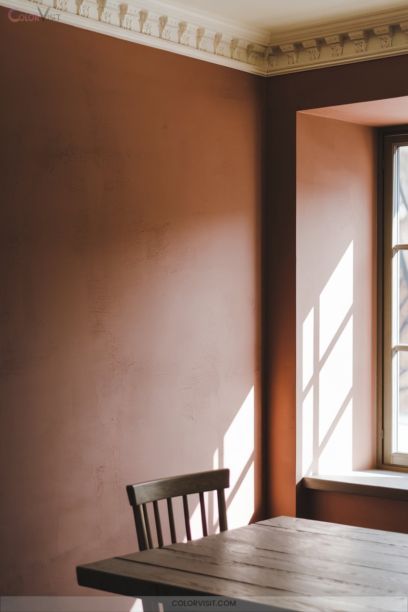
A dining room painted in Burnt Almond 280F-4 instantly radiates rustic sophistication, thanks to its warm, earthy tone and subtle depth.
This color’s RGB composition (179, 147, 117) and HEX #B39375 create a nuanced backdrop that pairs seamlessly with innovative rustic design.
Elevate your space by considering:
- Oak or pine wood accents for authentic warmth.
- Metallic touches—think copper or brass—for refined contrast.
- Layering earthy textiles, such as linen or cotton, for tactile interest.
- Warm, dimmable lighting to enhance the inviting ambiance.
Burnt Almond’s GREENGUARD Gold certification guarantees your dining room remains both stylish and health-conscious.
9. Contemporary Vibes With Almond Latte N260-2
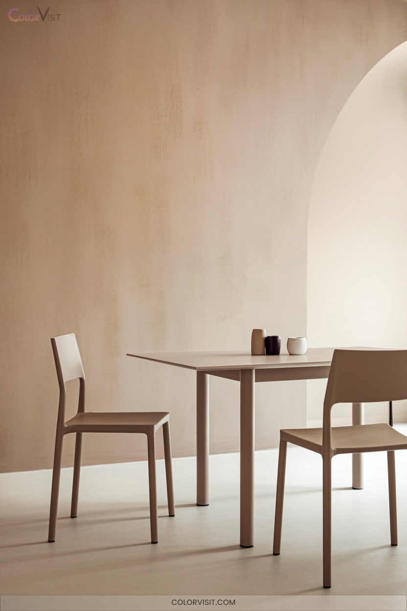
Sophistication meets comfort with Almond Latte N260-2, a warm, espresso-inspired hue that brings contemporary energy to your dining room.
This GREENGUARD Gold certified paint merges style with sustainability, ensuring superior indoor air quality. Its moderate LRV of 59.14 reflects just enough light to create an inviting yet modern ambiance, ideal for entertaining.
Acting as both paint and primer, Almond Latte simplifies your process and delivers stain-blocking performance.
Pair it with minimalist or ornate furniture to highlight your innovative taste.
With one-coat hide options and versatile finishes, you’ll achieve a flawless, cozy statement wall that’s both functional and fashion-forward.
10. Opulent Cellini Gold HDC-CL-18 Accents
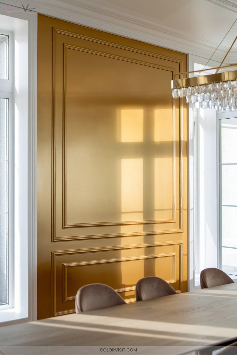
Timeless luxury defines Cellini Gold HDC-CL-18, an antique-inspired hue that instantly elevates your dining space with rich, opulent undertones.
Harness its design versatility by integrating this shade for contemporary yet classic sophistication.
Cellini Gold’s advanced stain repellency and one-coat hide guarantee your walls remain pristine through countless gatherings.
Pair this paint with innovative lighting and lush textiles for dramatic ambiance.
For a refined, solution-oriented approach, consider:
- Accent one wall with Cellini Gold for focal intrigue.
- Pair with dark wood furniture for depth.
- Coordinate with Urban Raincoat or Ceylon Cream.
- Select from matte or semi-gloss finishes.
11. Bold Red for Dramatic Flair
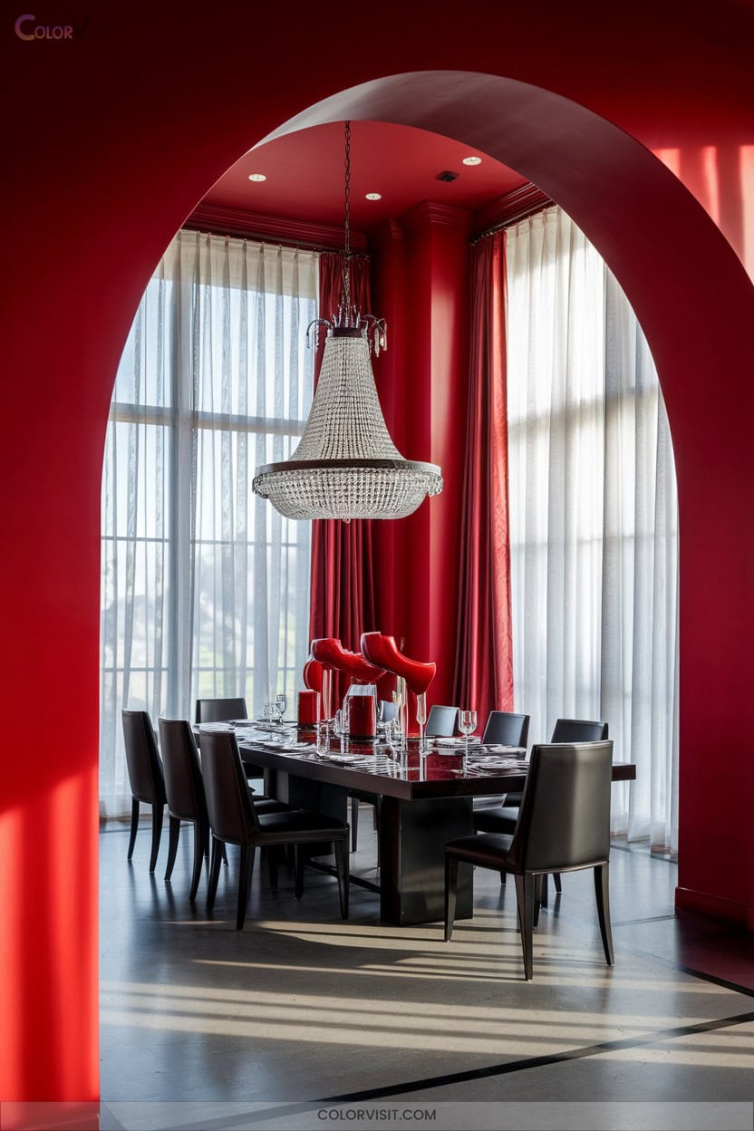
While Cellini Gold delivers subtle opulence, bold red takes your dining room in a distinctly dramatic direction. Opt for Heritage Red or Red Bay to balance warmth and vibrancy, or choose Fireweed and Clay Ridge for earthy, intimate sophistication.
South-facing rooms intensify these shades; north exposures yield grounded, muted red. Use matte finishes to minimize glare, and crisp white or muted gray trim for modern definition.
Highlight architectural details and create visual contrast with gold accents, hardwood furniture, and neutral linens.
Test samples in varied lighting, and consider a feature wall for focal impact—bold red transforms your space into an unforgettable dining experience.
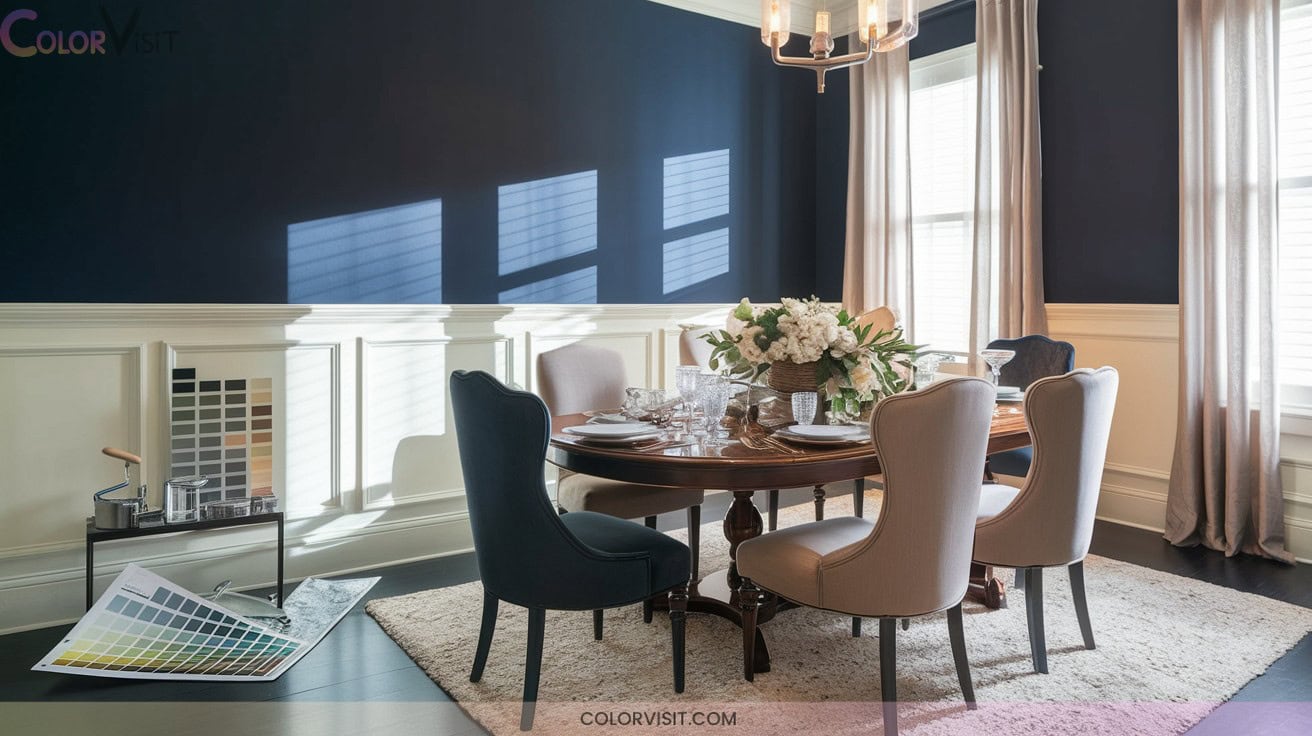
12. Classic Navy Blue for Timeless Style
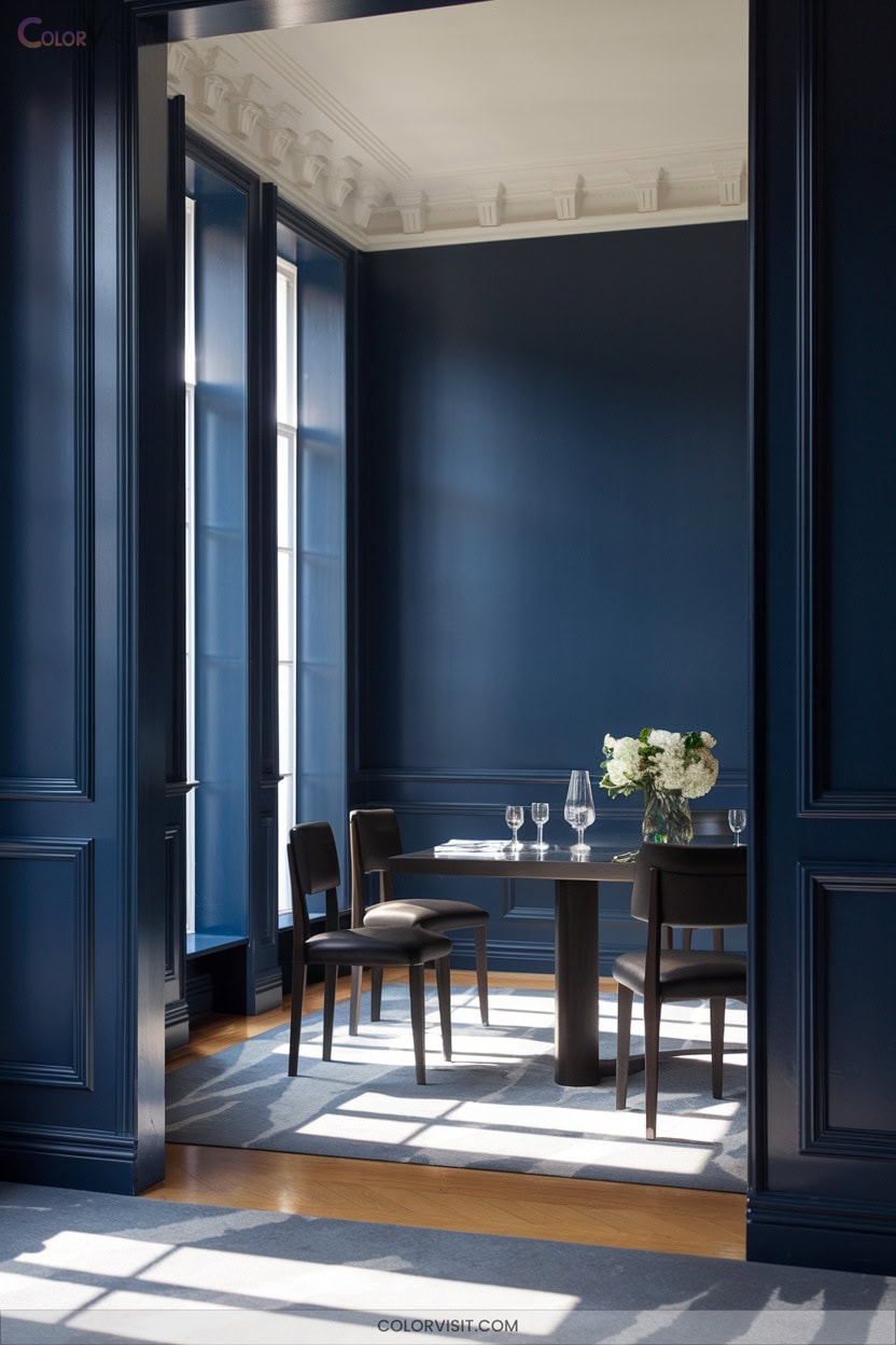
When you want to evoke a sense of enduring elegance in your dining room, classic navy blue stands out as a refined, versatile choice.
Classic navy blue brings refined sophistication and timeless versatility to any dining room, creating an elegant and inviting atmosphere.
This hue—think Farrow & Ball’s Wine Dark or Benjamin Moore’s Polo Blue—delivers depth and adaptability that complements both contemporary and historic settings.
Elevate your space with these expert strategies:
- Pair navy blue walls with dark wood accents for a sophisticated foundation.
- Use metallic elements, such as gold or silver, to introduce a touch of luxury.
- Contrast navy with neutral furnishings for dynamic visual balance.
- Layer velvet drapes in deeper blues to enhance a moody, immersive ambiance.
13. Deep Plums for a Luxurious Atmosphere
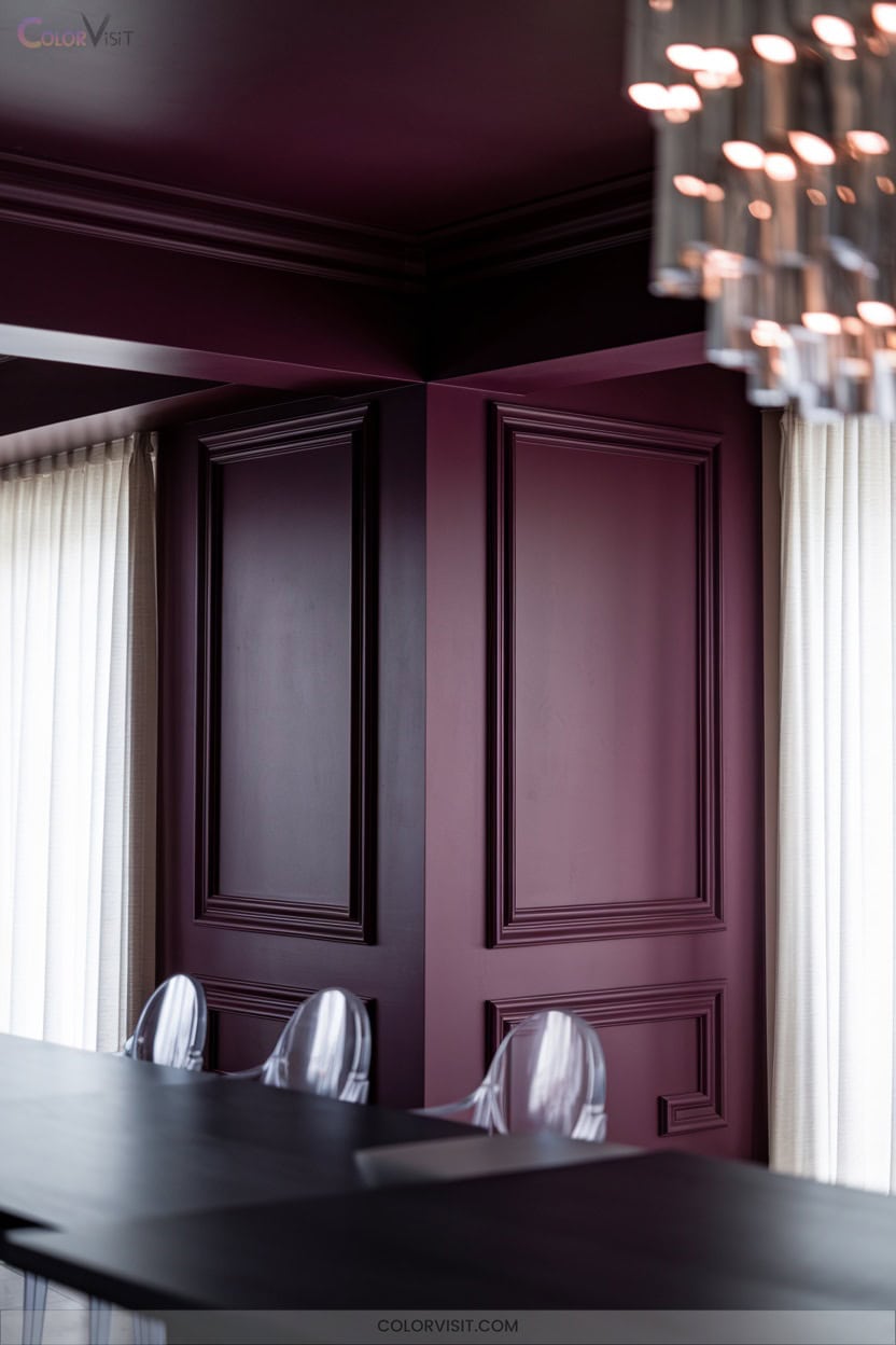
Opulence takes center stage in the dining room with the introduction of deep plum hues.
Harness bold statements with Magnolia Home’s Plum Suede on feature walls, or select Frosted Lilac for a sophisticated balance with glass or metal furnishings.
Pair classic deep plum with pink-toned whites and greys for multidimensional elegance, then amplify with gold or brass accents for a contemporary edge.
Strategic placement is essential—utilize deep plum where natural light prevails and integrate reflective elements like mirrors or pendant lights.
14. Jewel-Toned Greens for Vibrant Gatherings
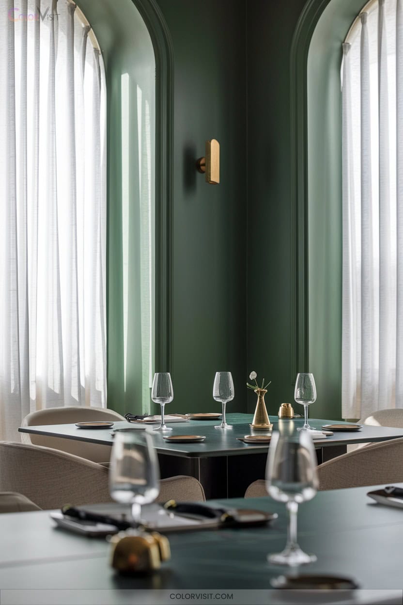
For those seeking a dining room that feels as lively as it’s refined, jewel-toned greens offer an unforgettable palette.
Jewel-toned greens bring vibrance and refinement to dining spaces, creating a palette that’s both memorable and sophisticated.
Opt for saturated hues like emerald, hunter, or forest green to create a vibrant yet sophisticated ambiance.
Elevate your design with these expert-approved combinations:
- Pair deep greens with natural wood accents for warmth and organic contrast.
- Add brass or gold metallics—think lighting or decor—for a luxurious finish.
- Use black accents to inject a sharp, contemporary edge.
- Incorporate soft pink highlights or lush greenery to balance intensity and infuse elegance.
These choices guarantee a dynamic, innovative dining experience.
15. Refined Kendall Charcoal HC-166 for Depth
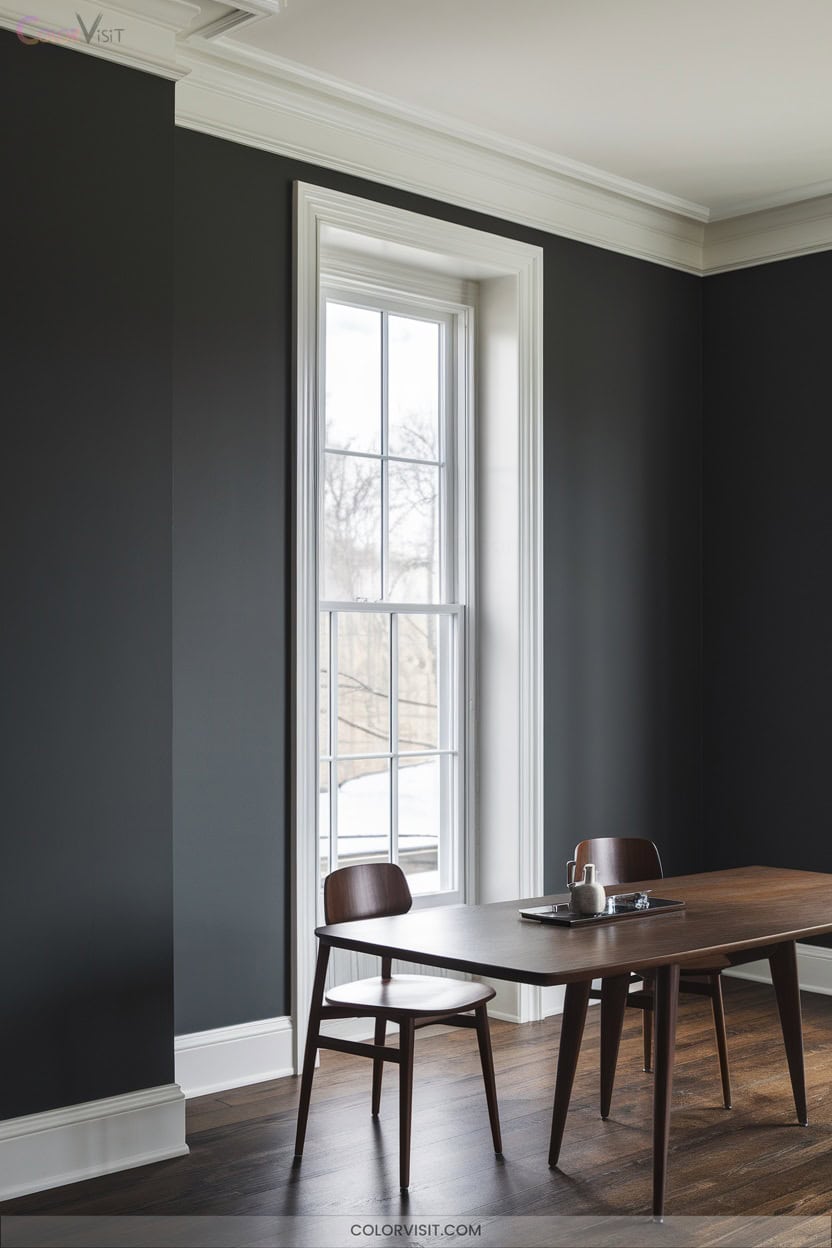
Curious how to achieve depth and sophistication in your dining room?
Kendall Charcoal HC-166 offers a rich, dark neutral with an LRV of 14.61, delivering luxurious depth while remaining versatile.
Its nuanced green undertones and superior light absorption create a dramatic, structural anchor that elevates both modern and traditional design elements.
Pair it with crisp white trims like Chantilly Lace for striking contrast, or layer earthy hues for a balanced palette.
The premium, stain-resistant finish guarantees color integrity and durability, even in high-traffic areas.
Choose Kendall Charcoal to create an intimate, innovative dining space defined by refined ambiance.
16. Modern Blueprint S470-5 for Sleek Appeal
A dynamic choice for the modern dining room, Blueprint S470-5 by Behr introduces a cool, steel-blue sophistication that instantly elevates your space.
This dusky blue-gray shade bridges navy and denim, offering versatility across walls, trim, and cabinetry.
To achieve a sleek, innovative dining environment, consider these expert strategies:
- Use satin enamel for a pearl-like, durable finish on trim or walls.
- Pair with metallic accents—gold or silver—for refined contrast.
- Layer with warm lighting to enhance comfort and vibrancy.
- Contrast with whites or creams to highlight the blue’s modern edge.
Elevate your dining room with Blueprint’s contemporary allure.
More Details on Our Top Picks
FolkArt Home Decor Chalk Acrylic Paint 8oz Grotto
Looking to refresh your dining room with a rich, matte finish? FolkArt Home Decor Chalk Acrylic Paint in Grotto offers a highly pigmented, creamy formula that’s easy to blend and distress. This water-based, non-toxic paint dries quickly and works well on wood, metal, glass, and more.
You can layer and sand it for an aged look; clean up is simple with soap and water while it’s still wet. Made in the USA, it’s a favorite among crafters for durable color and coverage. Seal your project with FolkArt Wax to protect your beautiful finish.
- Paint Type / Product Form:Water-based acrylic chalk furniture & craft paint
- Finish Type:Matte (chalk paint finish)
- Color / Color Name:Grotto (blueish green shade)
- Size / Volume:8 oz (237 ml)
- Indoor/Outdoor Use:Indoor only
- Application Ease / Prep Required:Minimal surface prep; easy distressing; water cleanup
- Additional Feature:Ultra-matte finish
- Additional Feature:Water-based, non-toxic
- Additional Feature:Easy distressing and layering
Jungarian Furniture Paint Kit 16oz Retro Mint
If you want a hassle-free way to refresh your dining room furniture, the Jungarian Furniture Paint Kit 16oz Retro Mint is a perfect choice. This water-based, low-odor paint requires no sanding or primer; just stir and apply.
Its matte finish brightens wood surfaces like tables, cabinets, and chairs with a trendy retro mint hue. You’ll appreciate its fast drying time and washable, wear-resistant film that extends your furniture’s life. The kit includes applicators and brushes, making it beginner-friendly.
Plus, it works indoors or outdoors, ensuring versatile use. With 4.6 stars from over 400 reviews, it’s a reliable pick for 2026.
- Paint Type / Product Form:Water-based acrylic furniture paint
- Finish Type:Matte
- Color / Color Name:Retro Mint (greenish mint)
- Size / Volume:16 oz (473 ml)
- Indoor/Outdoor Use:Indoor/Outdoor (weather resistant)
- Application Ease / Prep Required:No sanding or priming needed; ready to use; fast drying
- Additional Feature:No sanding or primer
- Additional Feature:Fast drying, low odor
- Additional Feature:Weather resistant, washable
Heirloom Traditions ALL-IN-ONE Paint Mediterranean Blue Teal
Who wants a paint that simplifies the entire process without compromising durability? Heirloom Traditions ALL-IN-ONE Paint in Mediterranean Blue Teal has you covered. This water-based acrylic combines primer, paint, and topcoat; so you skip sanding and extra coats. Its low-luster, matte finish adds a smooth, elegant touch to your dining room.
You can confidently use it on cabinets, walls, furniture, even glass or metal. With about 140 sq ft coverage per quart, two coats usually suffice. Just grab the recommended Tool Trio, and you’re set for a vibrant, lasting Mediterranean vibe that fits indoor and outdoor spaces alike.
- Paint Type / Product Form:Water-based acrylic all-in-one cabinet and furniture paint
- Finish Type:Matte / Low Luster Velvet Sheen
- Color / Color Name:Mediterranean Blue Teal
- Size / Volume:32 oz (1 quart / 946 ml)
- Indoor/Outdoor Use:Indoor/Outdoor
- Application Ease / Prep Required:No sanding, no priming, no top coat needed; all-in-one
- Additional Feature:Built-in primer and top coat
- Additional Feature:Suitable for smooth fabrics
- Additional Feature:Waterproof and durable
Country Chic All-in-One Chalk Paint Fancy Frock
Wondering which paint can effortlessly transform your dining room furniture with minimal prep? Country Chic All-in-One Chalk Paint in Fancy Frock is your answer. This light blue chalk paint features a built-in primer and top coat; it allows you to paint wood, metal, or laminate with a smooth, matte finish in just 30 minutes.
It’s eco-friendly, ultra-low VOC, and safe for kids and pregnant women. Whether you want a shabby chic or contemporary look, this durable paint offers excellent adhesion and vibrant coverage. Perfect for both beginners and pros, it’s a top pick for stylish, hassle-free dining room updates.
- Paint Type / Product Form:Chalk paint (liquid, chalk formula)
- Finish Type:Matte (chalky matte finish)
- Color / Color Name:Fancy Frock (light blue)
- Size / Volume:8 oz (237 ml)
- Indoor/Outdoor Use:Indoor/Outdoor
- Application Ease / Prep Required:Built-in primer and top coat; quick dry; minimal prep
- Additional Feature:Eco-friendly, ultra-low VOC
- Additional Feature:Built-in primer and top coat
- Additional Feature:Complies with toy safety standards
DWIL Matte Finish Furniture Paint 5oz Blue Grey
You’ll appreciate the DWIL Matte Finish Furniture Paint 5oz Blue Grey if you want a quick, no-fuss way to refresh your dining room furniture. This water-based, non-toxic paint offers a smooth matte finish in a trendy blue-grey hue. You won’t need primer or sanding on wood surfaces; this saves time and effort.
The kit includes gloves, masking tape, and a brush, making application straightforward. It dries fast, allowing multiple coats in a day. It works well on wood, plywood, MDF, and wicker. Ideal for indoor use, it’s low odor and water-resistant; this makes it perfect for updating tables, chairs, and cabinets with style and durability.
- Paint Type / Product Form:Water-based matte furniture paint (liquid)
- Finish Type:Matte
- Color / Color Name:Blue Grey
- Size / Volume:5 oz (148 ml)
- Indoor/Outdoor Use:Indoor only
- Application Ease / Prep Required:No sanding or primer needed on wood; water-based; quick drying
- Additional Feature:Primer & paint in one
- Additional Feature:Includes complete tool set
- Additional Feature:Low odor, water-based
PRESTIGE Interior Paint and Primer in One Mint Frost Semi-Gloss 1 Gallon
Looking for a dining room paint that combines ease and elegance? PRESTIGE Interior Paint and Primer in One, Mint Frost, offers just that. This semi-gloss acrylic latex paint brightens your dining space with its fresh, soothing mint hue (#bce4d6) while being washable and low in VOCs.
It self-primes on properly prepared surfaces, saving you time without sacrificing quality. With one gallon covering 250-400 sq ft, it dries in an hour and fully cures after four. Plus, its lifetime warranty ensures lasting satisfaction.
Perfect for your dining room, Mint Frost balances style, durability, and easy maintenance effortlessly.
- Paint Type / Product Form:Acrylic latex interior paint and primer in one
- Finish Type:Semi-Gloss
- Color / Color Name:Mint Frost (#bce4d6, light mint green)
- Size / Volume:1 gallon (126 fl oz / 3785 ml)
- Indoor/Outdoor Use:Interior only
- Application Ease / Prep Required:Requires surface prep; self-primes on prepared surfaces; stir before use
- Additional Feature:Semi-gloss washable finish
- Additional Feature:Lifetime warranty on application
- Additional Feature:Covers 250-400 sq ft
Rust-Oleum Color Spark Interior Paint Sample Pack
Choosing the perfect dining room paint color just got easier with the Rust-Oleum Color Spark Interior Paint Sample Pack. You get multiple dark blue options like Peace of Mind, Capri, Denim, Riverwalk, and Oxford Tie, all in one handy chip card.
This pack helps you visualize colors before committing; it eliminates guesswork. Its advanced acrylic formula resists scuffs and hides imperfections, ensuring a flawless finish. For best results, pair it with Zinsser Bulls Eye 1-2-3 primer on tricky surfaces.
With coverage up to 400 square feet and easy Amazon returns, this sample pack is smart for your dining room makeover.
- Paint Type / Product Form:Acrylic interior paint and primer (sample chips)
- Finish Type:Swatch color sample pack (finish not specified)
- Color / Color Name:Dark Blues (various shades: Peace of Mind, Capri, etc.)
- Size / Volume:Sample pack (1 unit, chip size)
- Indoor/Outdoor Use:Interior only
- Application Ease / Prep Required:Sample chips for color selection; no application
- Additional Feature:Multiple color swatches included
- Additional Feature:Paint and primer in one
- Additional Feature:Resists scuffs and marks
Magnolia Home Chalk Style Interior Paint Wooded Acres
Who loves a cozy, nature-inspired vibe in their dining space? Magnolia Home Chalk Style Interior Paint in Wooded Acres might be your perfect pick. This woodsy brown with a hint of green delivers a timeless, ultra-matte finish; it is ideal for furniture and cabinets.
You’ll appreciate its rich, concentrated formula that dries fast with low odor and VOCs. Easy to apply with a brush or foam roller, it covers up to 100 sq. ft. per quart. Plus, protect your work with Magnolia’s finishing wax. Wooded Acres transforms your dining area into a warm, inviting retreat that feels effortlessly natural.
- Paint Type / Product Form:Water-based acrylic chalk style interior paint
- Finish Type:Ultra-Matte (chalk style)
- Color / Color Name:Wooded Acres (woodsy brown with green undertones)
- Size / Volume:32 oz (1 quart)
- Indoor/Outdoor Use:Interior only
- Application Ease / Prep Required:Easy application; wipe dust; no sanding; use finishing wax for protection
- Additional Feature:Ultra-matte vintage finish
- Additional Feature:Low VOC, low odor
- Additional Feature:Covers up to 100 sq ft
Modern Kitchen Decor Humorous Food Canvas Poster
If you want to add a playful touch to your dining space, the Modern Kitchen Decor Humorous Food Canvas Poster fits perfectly. Measuring 12 by 18 inches, this framed canvas offers durability against humidity, unlike paper posters. Its witty food theme brightens any room, making it ideal for your dining area or as a charming housewarming gift for couples and friends.
With a 0.6-inch white margin reserved for framing, it fits standard photo frames effortlessly. Plus, the poster comes with warranty support and customer feedback options. This art piece lets you enjoy a fun, modern vibe while enhancing your home’s character.
- Paint Type / Product Form:Canvas poster (not paint)
- Finish Type:Canvas print (no paint finish)
- Color / Color Name:N/A (poster with humorous food art)
- Size / Volume:12 x 18 inches (canvas poster)
- Indoor/Outdoor Use:Indoor use (decor)
- Application Ease / Prep Required:Ready to hang; no prep (poster)
- Additional Feature:Durable humidity-resistant canvas
- Additional Feature:Framed, ready to hang
- Additional Feature:Great gift idea
MUDECOR Extra Large Neutral Abstract Canvas Wall Art
Looking to complement your dining room’s new paint colors with a striking centerpiece? The MUDECOR Extra Large Neutral Abstract Canvas Wall Art offers a soft, minimal landscape that blends seamlessly with various color palettes. Measuring 60×30 inches, this framed print arrives ready to hang with a full kit included, making setup straightforward. Just get a friend to help for balanced support.
Crafted in the U.S. by H5Print, it boasts high-quality, shrink-resistant canvas and a professional finish. Perfect for your dining room or any space, it’s a stylish, durable choice that enhances your room’s ambiance effortlessly.
- Paint Type / Product Form:Framed canvas print (not paint)
- Finish Type:Canvas print (no paint finish)
- Color / Color Name:N/A (neutral abstract canvas art)
- Size / Volume:60 x 30 inches (canvas print)
- Indoor/Outdoor Use:Indoor use (decor)
- Application Ease / Prep Required:Ready to hang; no prep (canvas art)
- Additional Feature:Framed with hanging kit
- Additional Feature:Multiple size options
- Additional Feature:High quality prints
Purple White Vintage Farmhouse Window Curtains 2 Panels
Purple White Vintage Farmhouse Window Curtains 2 Panels offer a perfect blend of rustic charm and modern functionality for your dining room. Measuring 52″W by 90″L each, these 100% polyester panels feature durable, breathable fabric with silver grommets that slide easily on most rods. They block sunlight effectively while letting in natural light; this enhances your space’s ambiance.
Their vintage farmhouse design in purple and white complements various decor styles, from rustic to minimalist. Easy to care for with machine washing and wrinkle-free hems, these curtains add both style and practicality. This makes them an excellent choice for your dining room windows.
- Paint Type / Product Form:Polyester fabric curtains (not paint)
- Finish Type:Fabric curtains (no paint finish)
- Color / Color Name:Purple and White (fabric curtain colors)
- Size / Volume:2 panels, each 52″ x 90″
- Indoor/Outdoor Use:Indoor use (curtains)
- Application Ease / Prep Required:Easy installation; machine washable curtains; no paint application
- Additional Feature:Durable, wrinkle-free polyester
- Additional Feature:Stainless steel grommets
- Additional Feature:Blocks sunlight, breathable
jejeloiu Cherry Blossom Chinese Ink Wall Art Set
For those who want to add a touch of elegance and vibrant color to their dining room, the jejeloiu Cherry Blossom Chinese Ink Wall Art Set offers a stunning solution. This 3-piece set features 12″x16″ canvas panels framed in wood. It showcases vivid cherry blossom designs printed in HD ink. The waterproof, odorless canvases are ready to hang, making installation simple.
Its bright, lively patterns create a cozy, cheerful atmosphere perfect for dining spaces. Durable and versatile, this artwork complements various decor styles, from modern to farmhouse. It enhances your room’s ambiance while igniting enthusiasm for life and gatherings.
- Paint Type / Product Form:Canvas wall art set (not paint)
- Finish Type:Canvas print (no paint finish)
- Color / Color Name:N/A (Chinese ink painting set with cherry blossom red sun theme)
- Size / Volume:3 pieces, each 12″ x 16″ canvas
- Indoor/Outdoor Use:Indoor use (decor)
- Application Ease / Prep Required:Ready to hang; no prep (canvas art)
- Additional Feature:HD ink printing
- Additional Feature:Indoor waterproof canvas
- Additional Feature:Ready to hang set
Factors to Consider When Choosing Dining Room Paint Color Ideas
When choosing dining room paint colors, you’ll want to think about how lighting affects the space and how colors work with your furniture. Consider the mood you want to create; whether it’s cozy or vibrant, and how wall texture might change the look.
Don’t forget to pick the right paint finish to match your style and maintenance needs.
Room Lighting Impact
Because lighting can dramatically alter how paint colors appear, you’ll want to contemplate the temperature and intensity of both natural and artificial light in your dining room. Natural light brightens colors, making rooms with large windows feel lighter and more vibrant. North-facing rooms often benefit from warmer tones to avoid a dreary vibe.
Artificial light temperature matters too; cool whites may look stark in daylight, but warmer under incandescent bulbs. Remember, paint finishes interact with light: matte softens colors by absorbing light, whereas semi-gloss or gloss reflect more, changing hue and brightness.
Also, consider seasonal shifts and time of day, as colors can deepen or dull. Finally, nearby walls and furnishings can cast subtle undertones, altering how your chosen paint reads in the space.
Furniture Color Coordination
How can you ensure your dining room feels cohesive and inviting? Start by coordinating your furniture colors with your wall paint. Choose furniture hues that either contrast or harmonize with the walls to create focal points without overwhelming the space.
Match furniture finishes, whether matte, velvet, chalk-style, or semi-gloss, with the room’s paint sheen to avoid clashing textures. If your walls sport bold colors, opt for neutral or muted furniture tones to maintain balance. For smaller rooms, lighter furniture shades can visually expand the area. In contrast, darker tones help ground larger spaces.
Don’t forget to consider the undertones—warm or cool—of your furniture to complement natural light and the overall color temperature. This consideration ensures a harmonious and welcoming dining environment.
Desired Mood Effects
What mood do you want your dining room to evoke? Light, cool tones like pale blues or sage greens create a calming, upscale atmosphere. Warm tones such as creamy yellows or soft terracottas foster coziness and social warmth.
Consider how finishes affect mood: matte or low-sheen paints reduce glare and encourage intimate conversations. Semi-gloss or satin finishes reflect more light, energizing the space. Rich, deep hues add formality and drama; whereas lighter shades keep the room airy and versatile.
Pay attention to saturation—subdued colors feel relaxing. Highly saturated ones can boost appetite and conversation; however, they might overwhelm smaller rooms. Lastly, color temperature matters: cooler hues make small spaces feel larger. Warmer hues create a snug, inviting environment.
Choose accordingly to set your ideal dining mood.
Wall Texture Considerations
When selecting a paint color for your dining room, keep in mind that wall texture plays a significant role in how the color appears. Rough textures like popcorn or heavy stucco can make colors look lighter and more diffuse. Smooth walls reflect color evenly. Because textured surfaces scatter light differently, the same paint shade might read differently than you expect.
Test swatches on your actual walls to see how texture and lighting interact throughout the day. Also, textured walls often need more coats or a rolling technique for consistent coverage. Keep in mind that matte finishes highlight texture and imperfections; you might lean toward satin or eggshell to soften the look. Considering these factors ensures your chosen color looks just right in your dining space.
Paint Finish Options
Why does paint finish matter as much as color in your dining room? Because the finish affects the room’s mood, maintenance, and how imperfections appear. Matte finishes give your walls a velvety, non-reflective look that softens harsh light and hides minor flaws. This makes them perfect if your walls aren’t flawless.
Semi-gloss finishes reflect more light, brightening the space and making cleanup easier; however, they can highlight surface imperfections. For a vintage vibe, chalky finishes add a soft, powdery texture that is often favored for furniture or cabinetry. Velvet or low-luster finishes balance sheen and depth, offering sophistication with moderate durability.
If you want simplicity, all-in-one paints streamline the process but might limit color richness and need longer curing. Choose a finish that fits your style and lifestyle for the best dining room look.
Space Size Influence
Room size plays a pivotal role in selecting the right paint color for your dining area. If you have a larger dining room, lighter colors work best to create an airy, open feeling. On the other hand, smaller spaces benefit from deeper, saturated tones that add warmth and coziness.
Just be careful with intense hues in compact rooms; they can make the space feel too small if applied to all walls. Ceiling height also matters: high ceilings pair well with mid-tone colors, while low ceilings look taller with lighter shades that draw the eye upward.
Finally, consider how much wall surface you’re painting and how your dining room connects to adjacent rooms. Using similar light colors in open-plan layouts helps maintain a cohesive, spacious feel throughout.
Seasonal Color Trends
Beyond size and layout, seasonal color trends can greatly influence your dining room’s ambiance throughout the year. In spring, fresh pastels and greens bring a lively, airy feel. While summer favors brighter blues and sunny yellows that energize the space. As autumn arrives, warm terracotta and olive tones create a cozy, inviting atmosphere.
Winter calls for deep blues, charcoal, and metallic accents to add sophistication and warmth. You can rely on Pantone’s annual palettes to guide harmonious choices that complement your furniture and décor. Warm neutrals like creamy beiges and greiges remain popular as versatile backdrops. They let you easily swap in seasonal textiles and accents.
To keep things flexible, consider using accent colors such as mustard or sage in curtains or tableware. This reflects the season without repainting.
Accent Wall Ideas
How can you make your dining area stand out without overwhelming the space? An accent wall is your answer. Choose a bolder or warmer hue than your other walls to create a striking focal point.
Think about colors that complement your existing furniture; deep navy or charcoal pairs beautifully with lighter woods. Opt for matte or eggshell finishes to minimize glare and showcase texture subtly.
Consider color psychology too: soft blues and greens promote calm meals, while rich reds or ochres spark warmth and lively conversation. Before committing, test large swatches on your wall and view them at different times to see how natural and artificial light affect the color.
This careful approach ensures your accent wall enhances your dining room perfectly.
Frequently Asked Questions
Which Paint Finish Is Best for Dining Room Walls: Matte, Satin, or Semi-Gloss?
You should opt for a satin finish—it strikes the perfect balance between sophistication and practicality. Satin resists stains, cleans easily, and subtly reflects light, enhancing modern ambiance while maintaining resilience for innovative, style-forward dining room environments.
How Do I Choose Complementary Accent Colors for My Dining Room?
Start by analyzing your base color’s undertones, then select accent hues from the opposite side of the color wheel for dynamic contrast. Incorporate metallics or jewel tones to elevate sophistication, ensuring your palette feels intentional and visually compelling.
Are There Eco-Friendly or Low-Voc Paint Options for Dining Rooms?
You’ll find innovative eco-friendly and zero-VOC paints like ECOS, Healthier Homes, and Benjamin Moore Eco Spec. They deliver aesthetic versatility, durable performance, and certified sustainability. Prioritize Green Seal or asthma-friendly certifications to guarantee ideal indoor air quality.
What Colors Make a Small Dining Room Appear Larger and Brighter?
Imagine you transform a cramped dining nook with Chantilly Lace—a crisp, luminous white. You’ll harness light reflectivity and visual expansion, leveraging sleek monochromatic furnishings and vertical elements to craft an innovative, spatially dynamic atmosphere that feels strikingly open.
Can I Paint the Ceiling a Different Color Than the Walls for Added Interest?
Absolutely, you can paint the ceiling a contrasting or complementary color for visual intrigue. Opt for a saturated ceiling if your space has ample light, or a lighter hue to maintain airiness—always coordinate undertones for seamless, innovative cohesion.
Conclusion
It’s often said that color sets the mood, but studies actually confirm its profound impact on perceptions and interactions. When you choose a sophisticated palette—whether crisp white, elegant greige, or daring blueprint—you’re not just decorating, you’re curating experiences.
Your dining room becomes more than a backdrop; it’s a stage for memorable gatherings. So, embrace expert color theory and let your space impress. The right shade doesn’t just beautify—it truly elevates every meal you host.