14 Welcoming Entryway Color Ideas Paint Suggestions for First Impressions
Make your entryway unforgettable with expertly chosen colors like soft gray for airiness, crisp white to boost light, or pale blue for calm. Try blush pink, mint green, or bold hot pink for personality, and explore two-tone walls or multicolored patterns for depth.
Accentuate features with navy or forest green, or anchor warmth with taupe and terracotta. Mix finishes and lighting for dynamic effects. Discover strategic pairings and paint suggestions that’ll enhance your home’s very first impression just ahead.

1. Soft Gray for an Airy Entry
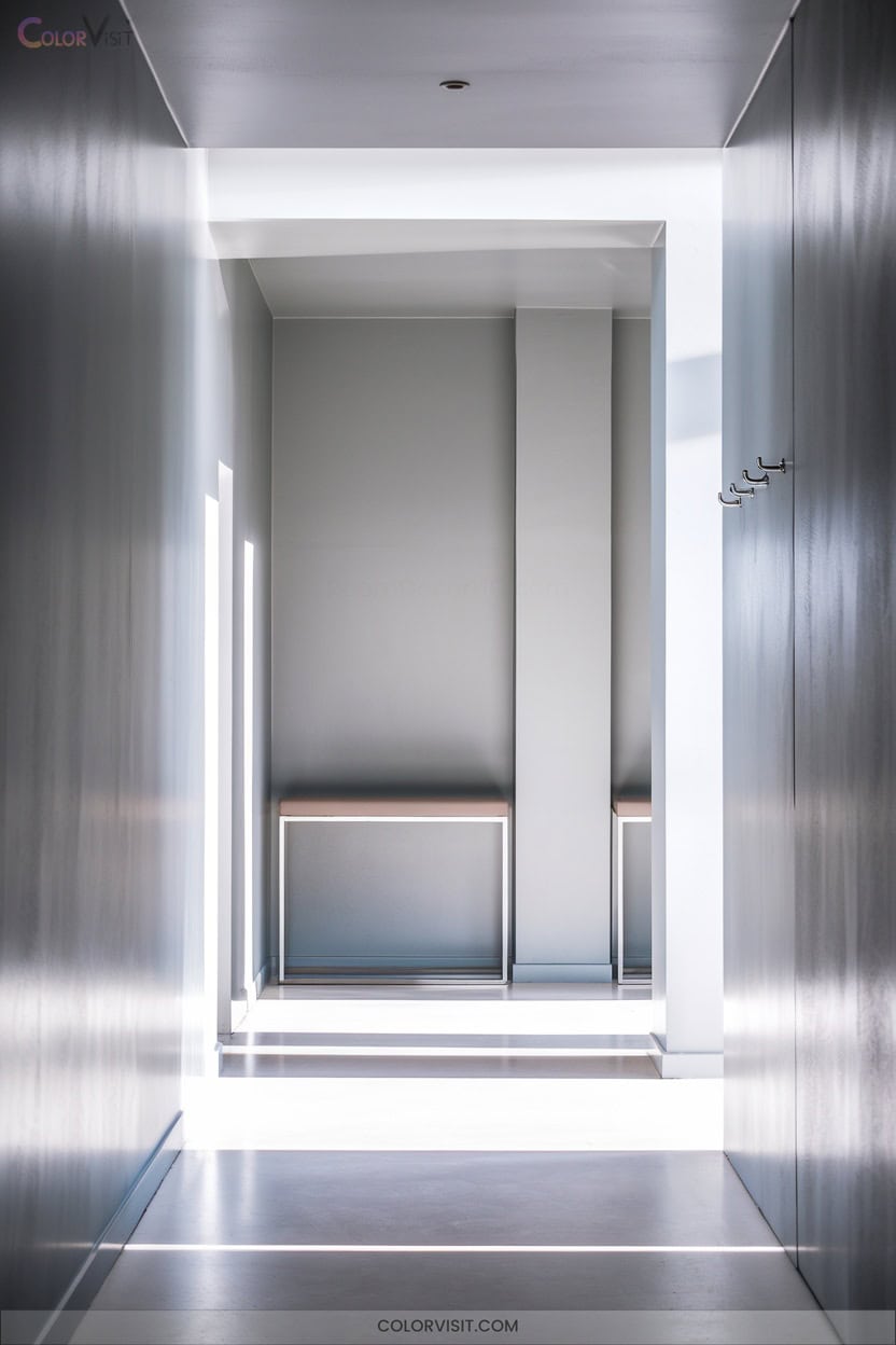
A soft gray entryway instantly creates an airy, sophisticated welcome that sets a serene tone for your home.
Soft gray in the entryway brings effortless sophistication and a calming, welcoming atmosphere to your home from the moment you step inside.
You’ll find that cool undertones in shades like Benjamin Moore’s Classic Gray or Revere Pewter expand spatial perception, balancing lightness and depth without overwhelming.
Soft gray acts as a versatile, neutral canvas—supporting bold accents or natural materials, yet never clashing.
Its consistency across varied lighting conditions means your entry stays calming and polished.
Choose a semi-gloss or satin finish for durability and a subtle sheen.
With soft gray, you unify flooring types and décor styles, ensuring a fluid, innovative flow indoors.
2. Crisp White to Brighten Small Spaces
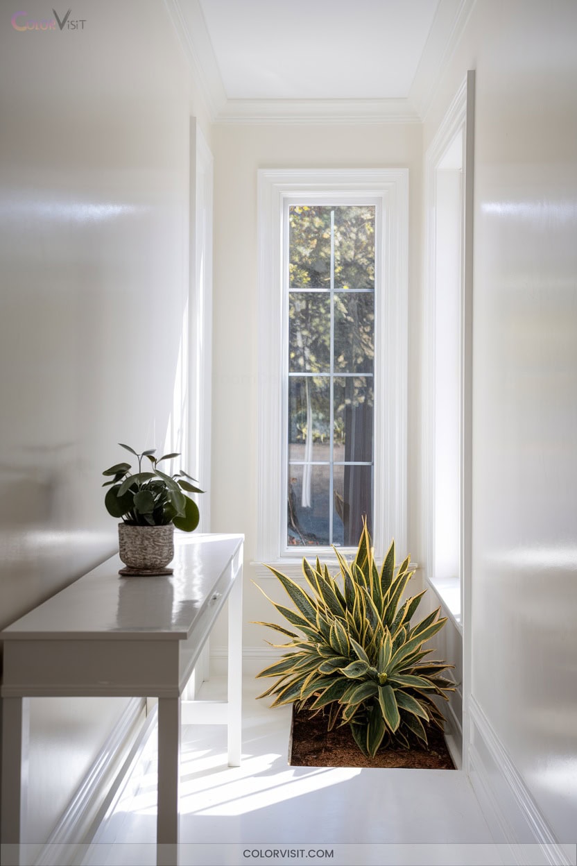
Transform your compact entry by harnessing the power of crisp white paint to amplify light and open up even the smallest vestibule.
Choose whites with blue or green undertones to neutralize golden sunlight, or opt for Pure White SW7005 for east-facing entries.
Satin or eggshell finishes, paired with mold-resistant, high-traffic formulations, guarantee durability and easy maintenance.
Define architectural lines using gloss white trim and layer a second, subtly different white on the ceiling.
Integrate metallic accents and textured rugs to prevent sterility.
Always test swatches at various heights—lighting shifts matter.
Mirrors opposite windows maximize brightness, further expanding spatial perception.
3. Pale Blue for Tranquil Transitions
While crisp white reflects every ray of light to expand a compact entry, pale blue introduces a layer of serenity that immediately sets a calm, welcoming tone.
Opt for nuanced blue hues—like Farrow & Ball’s light blue paints—to evoke tranquility reminiscent of clear skies or calm waters. Integrate minimalist furniture and textured accessories for sensory depth.
Pair baby blue with white for a fresh, airy palette, or combine powder blue with neutral accents for balance. Maximize natural light to amplify the restful vibe.
This approach leverages color psychology, ensuring your entryway functions as a peaceful, innovative gateway from the outside world.
4. Blush Pink for Subtle Warmth
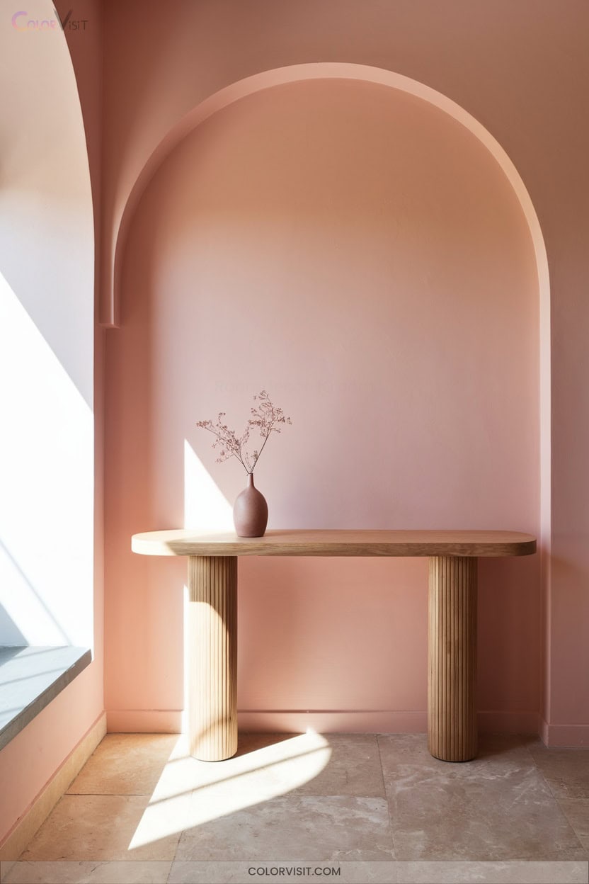
Blush pink delivers a refined warmth that instantly softens your entryway, setting an inviting tone the moment you step inside.
This innovative hue bridges sophistication and comfort, promoting peace and visual harmony.
Pairing blush pink with sleek metallics or light wood tones creates a space that feels both contemporary and welcoming.
To elevate your entry experience, consider these expert strategies:
- Incorporate plush rugs or woven textures for tactile depth and added comfort.
- Use statement art in plum or black for visual intrigue and contrast.
- Add mirrored accents to enhance spaciousness and light reflection.
- Layer with elegant lighting for a serene, welcoming ambiance.
5. Refreshing Mint Green Accents
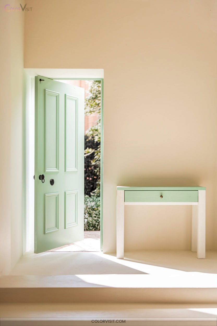
A mint green accent wall instantly injects your entryway with a sense of calm and revitalization, channeling both retro charm and modern freshness. Leverage mint’s versatility by pairing it with crisp white for a bright, airy welcome or with deep forest green for a sophisticated, nature-inspired palette.
Incorporate mint green through accent furniture, geometric rugs, or sculptural lighting for subtle impact. For a bold statement, contrast mint with black or energetic orange hues.
Layering different shades of mint creates depth without visual clutter. Integrate organic materials or vintage decor to further heighten mint’s timeless, innovative appeal in your entryway.
6. Classic Beige for a Cozy Welcome
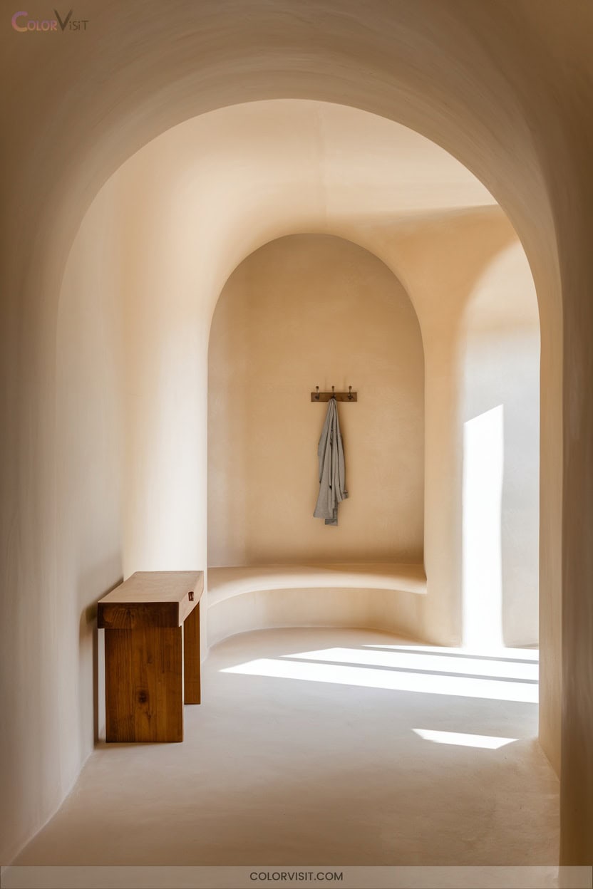
After exploring the fresh vibrancy of mint green, consider the subtle sophistication that classic beige brings to your entryway.
This timeless hue radiates warmth, instantly creating a cozy atmosphere that welcomes guests with understated elegance.
Beige’s adaptability lets you layer textures and materials, ensuring your entryway feels both curated and inviting.
Opt for paint shades that avoid strong undertones for maximum versatility and effortless coordination.
- Elevate with Sherwin Williams Accessible Beige or Benjamin Moore Shaker Beige for balanced, warm neutrality
- Pair with metallic or wood accents for tactile depth
- Use as a seamless backdrop for bold artwork
- Enhance resale appeal with broad compatibility
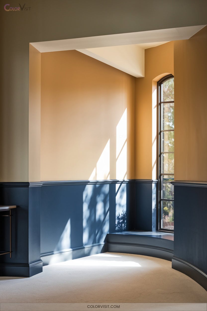
7. Warm Taupe for Timeless Appeal
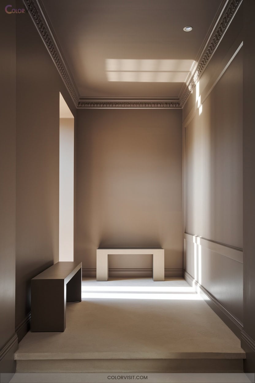
Warm taupe anchors your entryway with an understated elegance that transcends fleeting trends. This sophisticated neutral adapts seamlessly to both modern and classic furnishings, delivering a fresh foundation for innovative design.
Its brown undertones generate inviting warmth, while its versatility guarantees compatibility with myriad color palettes and finishes.
Whether your entryway basks in southern light or craves a cozier feel, taupe’s depth responds expertly to different lighting conditions. Employ lighter taupe to expand smaller spaces, or opt for deeper shades to create intimacy in larger foyers.
Warm taupe’s timeless appeal guarantees a welcoming, contemporary statement that leaves lasting first impressions.
8. Earthy Terracotta for Natural Charm
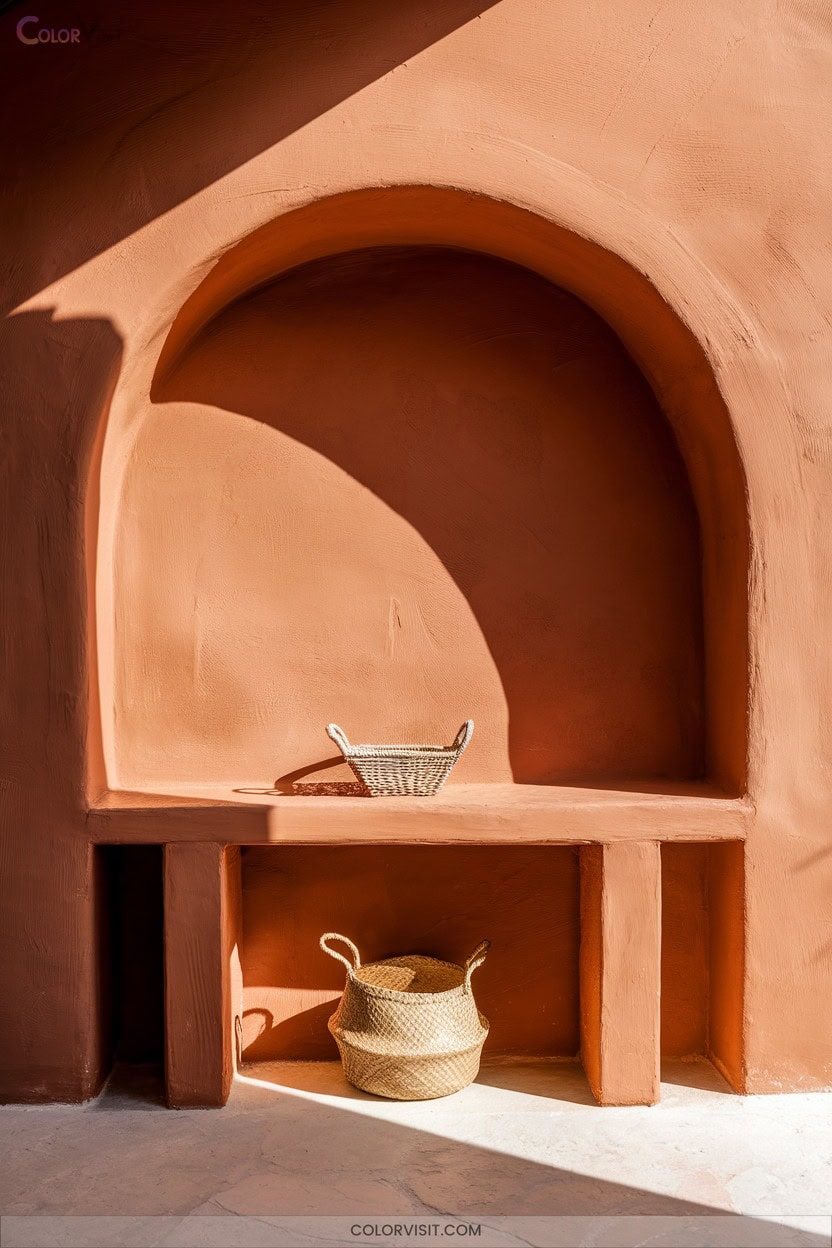
Step into a space grounded in authenticity with earthy terracotta—a hue that instantly infuses your entryway with natural charm and tactile warmth.
Terracotta’s moderate Light Reflectance Value (LRV) delivers a balanced backdrop that feels both welcoming and sophisticated.
Harness its versatility by pairing deep, dramatic shades like Behr Deep Terra Cotta with lighter neutrals or natural fibers for layered dimension.
For a designer-driven entry, consider these techniques:
- Opt for matte or satin finishes to prevent visual heaviness.
- Highlight doors with spicy Behr Tandoori for bold focus.
- Integrate brass or copper hardware for modern warmth.
- Layer with rattan, jute, or raw textiles.
9. Sunny Yellow to Energize the Space
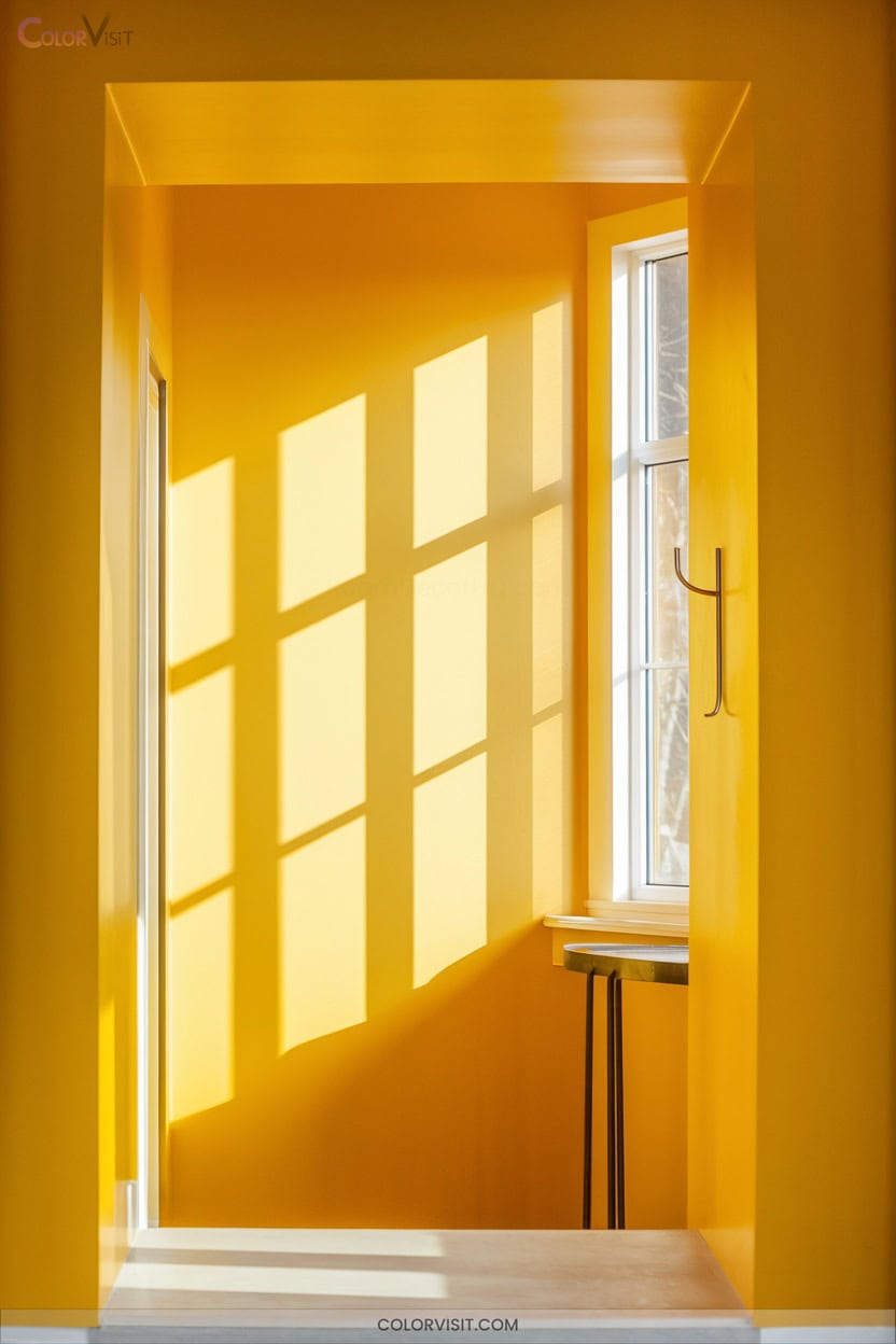
For those seeking to invigorate their entryway with a burst of positivity, sunny yellow offers a distinctly uplifting palette.
Opt for bold sunflower or citrus hues for maximum energy, or select mustard tones for sophisticated warmth.
Balance this vibrancy by pairing yellow walls with white benches or natural wood accents, ensuring the space feels harmonious.
Leverage strategic lighting to amplify yellow’s impact and highlight architectural features using contrasting trim.
Introduce yellow through accent walls, furniture, or textiles for versatility.
For a modern edge, combine yellow with chartreuse or hazel undertones, and enhance visual interest with plants or yellow-themed artwork.
10. Bold Navy for a Dramatic Entrance
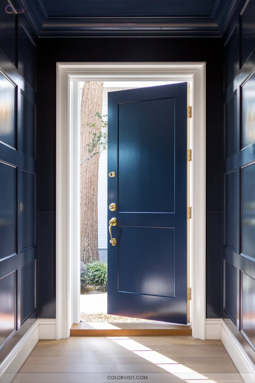
Command attention the moment you enter by enveloping your entryway in bold navy, a hue that instantly elevates connecting spaces into striking, intentionally designed statements.
Navy’s high-contrast interplay with crisp white trim yields a classic yet progressive focal point, especially effective in traditional or blended homes.
Use deep shades like Benjamin Moore Hale Navy or Sherwin-Williams Naval for saturated impact. Layer in tactile materials and strategic lighting to prevent visual heaviness.
- Pair with gold or brass hardware for warmth and luxe detail
- Integrate oak or walnut accents to balance coolness
- Install warm LED sconces to counteract gloom
- Add mirrored surfaces to amplify natural light
11. Hot Pink for an Adventurous Statement
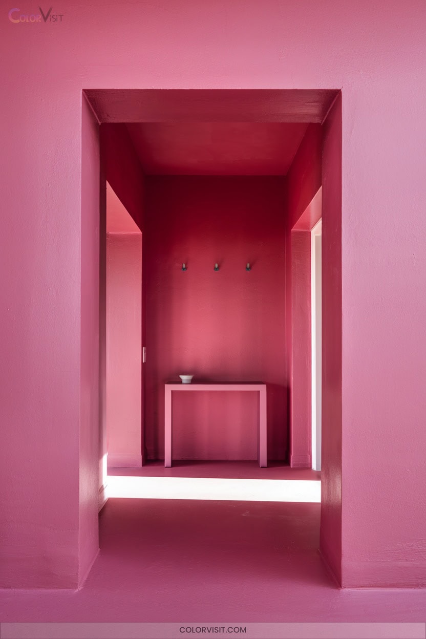
Energize your entryway with hot pink—a daring choice that instantly transforms connecting spaces into bold showcases of personality and vibrancy.
Revitalize your entryway with hot pink for a striking burst of personality and a vibrant, unforgettable first impression.
Harness this saturated hue’s psychological energy to invigorate high-traffic zones and spark playful creativity, especially where natural light is limited.
For balance, pair hot pink walls with black hardware or metallic gold accents, and introduce rattan textures or velvet seating to temper intensity.
Opt for Farrow & Ball’s Shallot in semi-gloss for light reflection, or Behr’s Hot Pink matte for modernity.
Test samples throughout the day, and implement indirect LED lighting to guarantee your statement remains refined and adaptable.
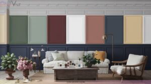
12. Two-Tone Walls for Visual Depth
Two-tone walls instantly elevate an entryway by introducing visual depth and dynamic contrast, making even compact spaces feel layered and intentional.
By leveraging innovative color pairings—think black and white for timeless drama or green and terracotta for earthy sophistication—you’ll create an entry that feels bespoke and architectural.
Employ advanced techniques like horizontal splits, vertical blocks, or ombre gradients to tailor the ambiance.
Two-tone applications excel at highlighting features and disguising flaws, delivering both style and function.
- Enhances architectural interest by accentuating doorways and columns
- Balances bold and neutral hues for harmonious impact
- Adapts easily to evolving interior trends
- Offers endless customization possibilities
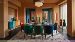
13. Multicolored Patterns for Playful Personality
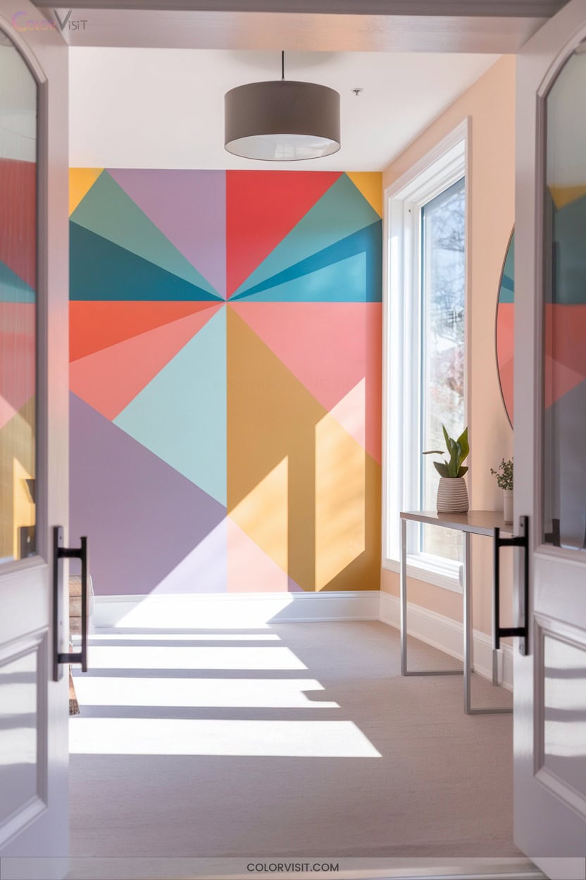
Why settle for a predictable entryway when multicolored patterns can infuse the space with playful personality and visual intrigue?
Experiment with vibrant tile mosaics, polished plaster, or custom wood-inlay designs to create a one-of-a-kind floor.
Combine bold color statements and mixed textures—think metallic accents with natural wood—for a dynamic, tactile experience.
Curate lighting to amplify hues and maximize natural light, elevating the visual impact.
Use Pinterest and before-and-after projects for inspiration, ensuring your color scheme aligns with your home’s palette for cohesion.
Add whimsical rugs or wall art for a curated, energetic entry that leaves a memorable first impression.
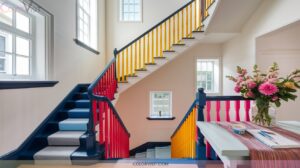
14. Highlighting Architectural Details With Accent Colors
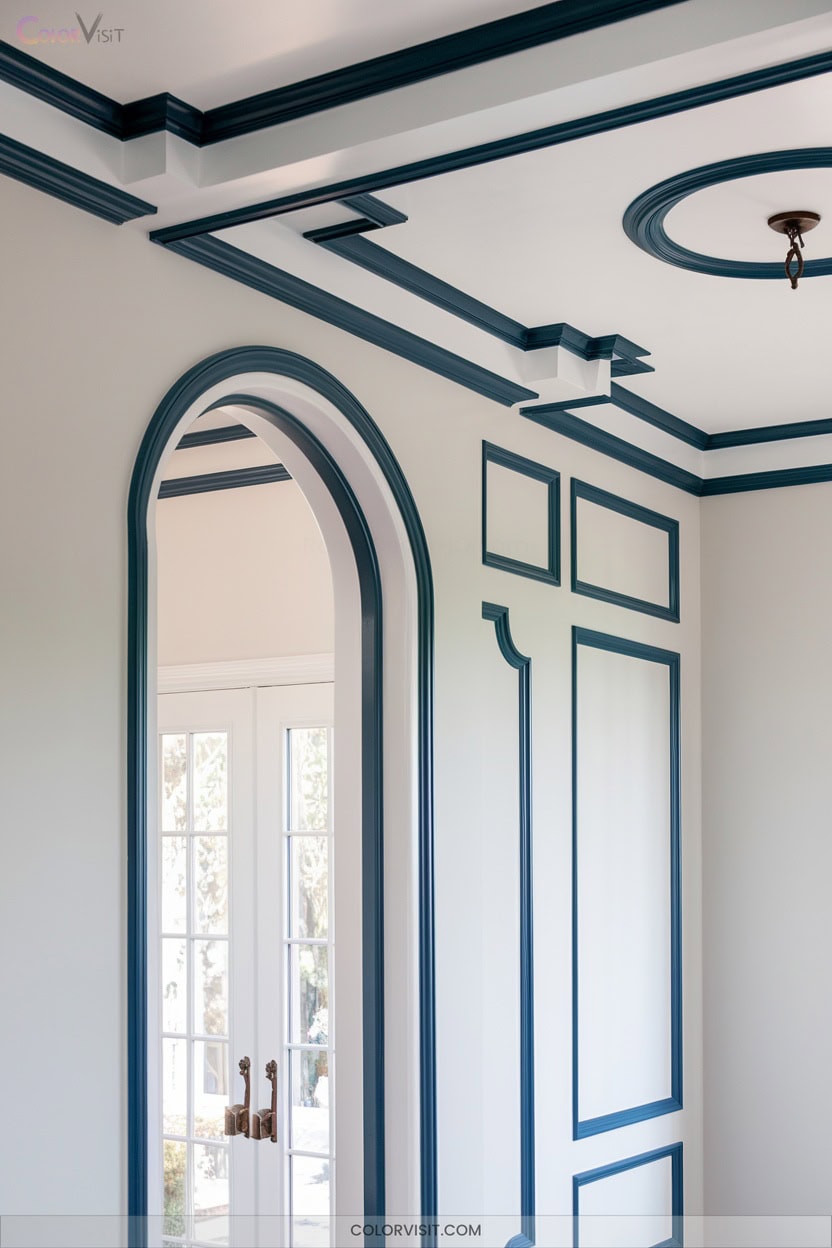
Bold multicolored patterns can certainly set a lively tone, but if you’re aiming to showcase the craftsmanship and unique character of your entryway, accent colors offer a sophisticated approach.
Accent colors provide a refined way to highlight your entryway’s craftsmanship and charm, moving beyond bold patterns for lasting sophistication.
Use vibrant hues like forest green or terracotta on trim, molding, or architectural niches to create a visual hierarchy and guide the eye.
Pair accent tones with a neutral background for maximum contrast, reflecting both heritage and contemporary innovation. Metallic finishes like bronze or gold add a luxurious dimension and emphasize detail.
- Highlight intricate trim or molding with bold, contrasting shades
- Use accent colors to unify diverse materials
- Integrate nature-inspired tones for authenticity
- Opt for metallics to elevate sophistication
Frequently Asked Questions
How Do I Choose Entryway Paint Colors That Match My Flooring?
Start by analyzing your floor’s undertone—cool, warm, or neutral. Select wall colors with contrasting undertones for dynamic balance. Don’t overlook depth; pair lighter floors with airy hues and dark floors with saturated or high-contrast shades for modern impact.
What Paint Finish Works Best for High-Traffic Entryways?
Think of your entryway as the red carpet of your home—choose satin or pearl finishes for that velvety resilience, or go semi-gloss for gallery-worthy cleanability. You’ll balance durability, modern aesthetics, and effortless upkeep with these innovative sheens.
How Can I Prevent Scuff Marks on Entryway Walls?
You’ll minimize entryway scuffs by installing kick plates, chair rails, or protective films, selecting scrubbable paint finishes, and positioning barrier furnishings. Proactively schedule touch-ups and educate users—adapting your strategy as wear patterns shift for long-term resilience.
Are There Eco-Friendly Paint Options for Entryways?
Did you know that zero-VOC paints can reduce indoor air pollution by up to 70%? You’ll find innovative options like milk paint and AFM Safecoat, which combine sustainability, advanced adhesion, and rich, trend-forward color palettes for entryways.
How Often Should I Repaint My Entryway for Best Results?
You should repaint your entryway every 2-3 years for ideal aesthetics and durability. Prioritize high-performance, scuff-resistant paints with moisture protection and advanced fade technology to extend intervals, ensuring your space consistently delivers a cutting-edge, polished impression.
Conclusion
Step into style with stunning shades that set a sophisticated scene from the moment you enter. Whether you pick pale pastels, moody mint, or bold blush, your entryway’s palette can perfectly personalize your passageway. Strategically select saturated or subtle tones to showcase architectural accents and craft a cohesive, mesmerizing first impression.
So, don’t delay—drench your doorway in delightful color and let your entryway’s expressive energy enchant every guest who crosses your threshold.