14 Bold Gate Paint Color Ideas to Enhance Your Property
Enhance your curb appeal by painting your gate in bold hues like timeless black, dramatic navy, or vibrant sunflower yellow. Opt for sleek slate blue, elegant Revere Pewter, or earthy moss and sage greens for a sophisticated touch.
Consider high-contrast combos like black with gold, rustic walnut wood finishes, or warm terracotta for personality. Pair with crisp whites or metallic hardware for extra charm. Explore more standout color options and expert pairing tips to truly transform your entryway.

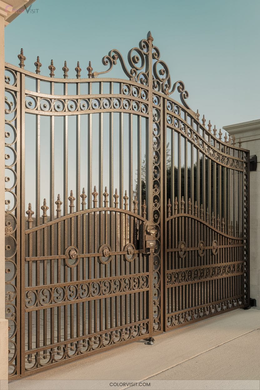
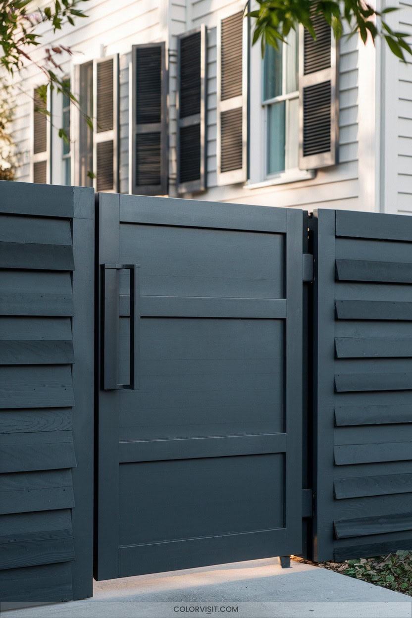
1. Black: Timeless Elegance for Any Property
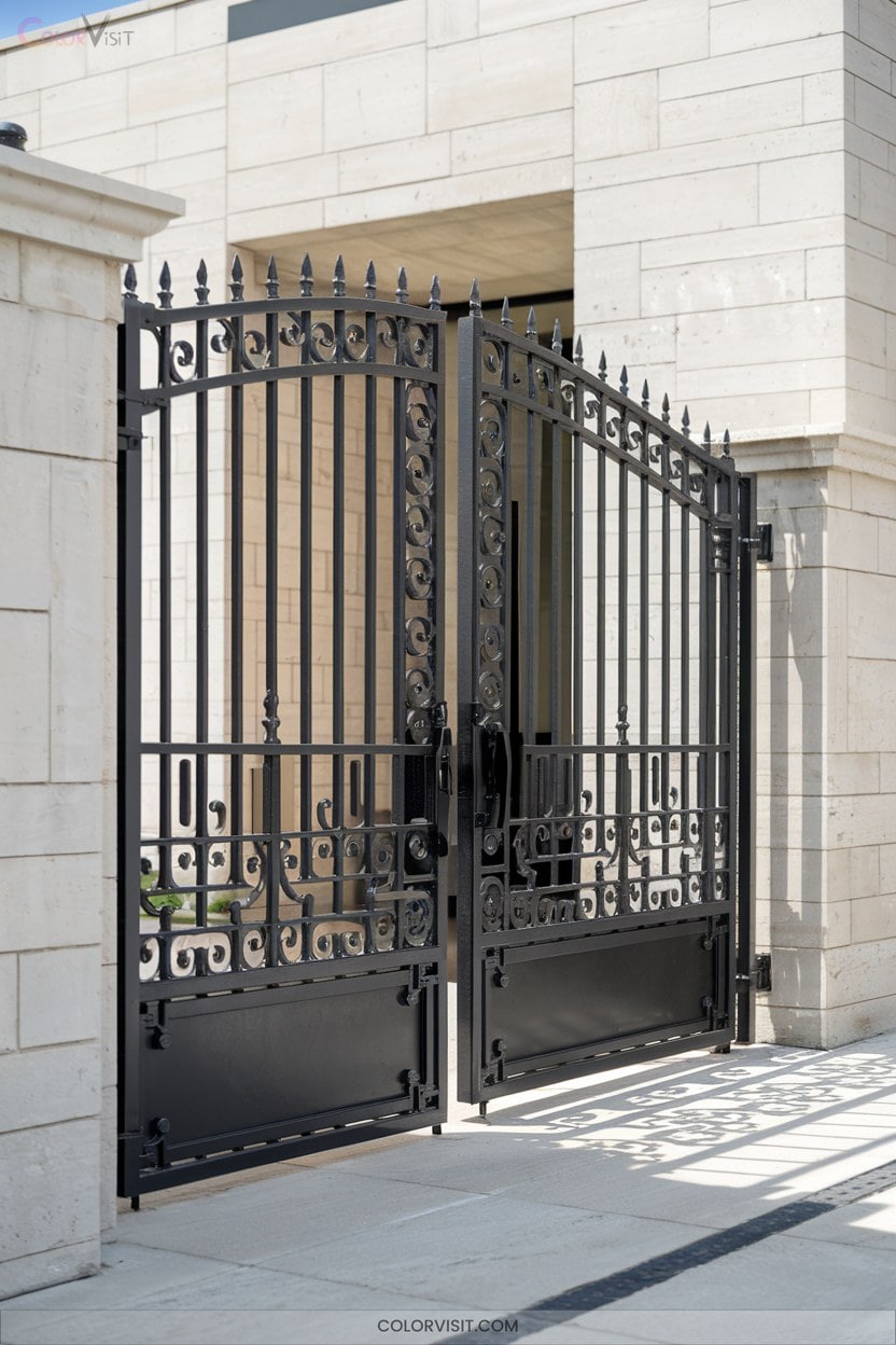
Black is a classic gate color that instantly elevates any property, offering both sophistication and versatility no matter your home’s style.
Choosing the right black means considering its Light Reflectance Value (LRV)—Onyx BM’s near-true black (LRV 2.9) creates striking presence, while Wrought Iron delivers a softer, nuanced contrast with subtle brown and blue undertones.
Test samples in natural and artificial light, as undertones and depth shift dramatically.
For modern impact, opt for high-gloss finishes or embrace matte for a minimalist look.
Pair black gates with warm whites like White Dove OC-17 to avoid harshness and achieve crisp visual appeal.
2. Revere Pewter HC-172: The Perfect Warm-Cool Neutral
Few gate colors blend sophistication and versatility quite like Revere Pewter HC-172.
This warm greige, with subtle green undertones, creates an innovative bridge between modern and classic aesthetics.
A warm greige with gentle green undertones, Revere Pewter effortlessly unites modern flair and timeless, classic appeal.
Its LRV of 55.05 guarantees your gate stands out without overwhelming your property’s facade.
Pair it with crisp White Dove trim for a harmonious look, or combine it with Chelsea Gray or Fog Mist for a layered, contemporary palette.
To maximize its calming effect and prevent gloominess, make sure your gate receives ample natural or warm artificial light.
Revere Pewter’s timeless appeal and ability to balance diverse elements make it a forward-thinking choice.
3. Black & Gold: High-Contrast Metallic Drama
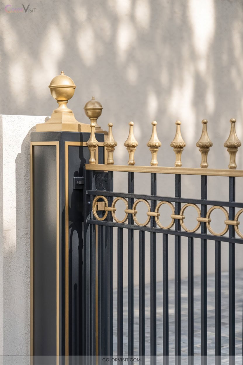
When you want your gate to make a statement, nothing delivers quite like the high-contrast pairing of deep black and radiant gold.
This combination’s visual impact is undeniable—black grounds the design, while gold infuses it with luxury and energy.
To innovate, choose matte black as your base and accentuate with glossy or rose gold hardware for a sophisticated edge.
Consider integrating cream or slate gray details for balance, or experiment with textural contrasts, such as metallic gold against smooth black.
With careful selection of finishes, you’ll craft a gate that’s both timeless and boldly contemporary, instantly enhancing your property’s allure.
4. Moss Green: Seamless Harmony With Nature
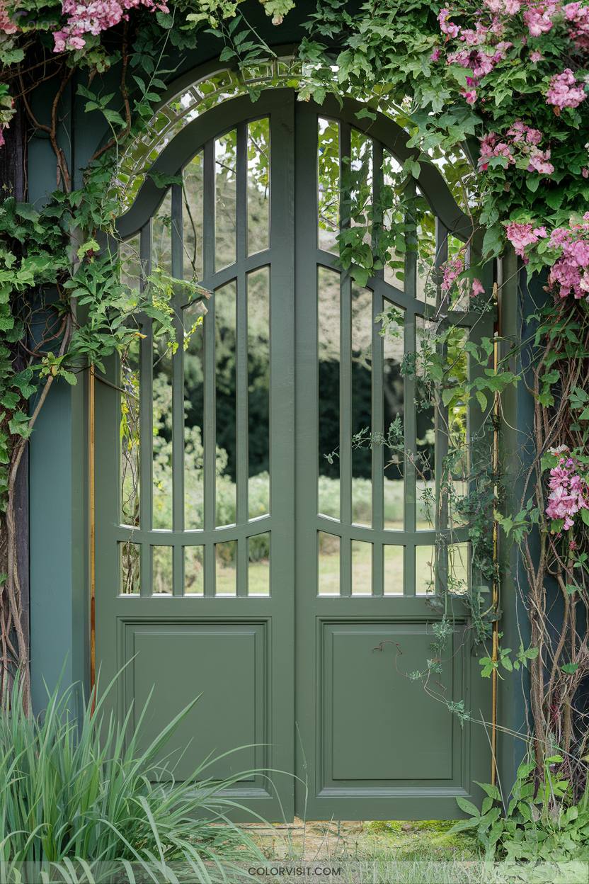
For homeowners seeking a gate color that blends effortlessly with natural surroundings, moss green offers a grounded, calming alternative to the bold energy of black and gold.
This shade, rich in yellow-gray undertones, evokes tranquility and biophilic harmony, reducing visual stress while adapting to both traditional and modern architecture.
Moss green’s yellow-gray undertones bring tranquility and biophilic calm, seamlessly complementing both classic and contemporary home designs.
Opt for durable, fade-resistant paints like BEHR Marquee or explore Sherwin-Williams Oakmoss for cheerful warmth.
Matte finishes discreetly hide imperfections, while high-gloss works well for high-touch gates.
Pair moss green with warm grays, cream trims, or natural wood accents for sophisticated contrast and seamless integration with seasonal foliage and existing landscaping.
5. Navy Blue: Classic Impact With Coastal Flair
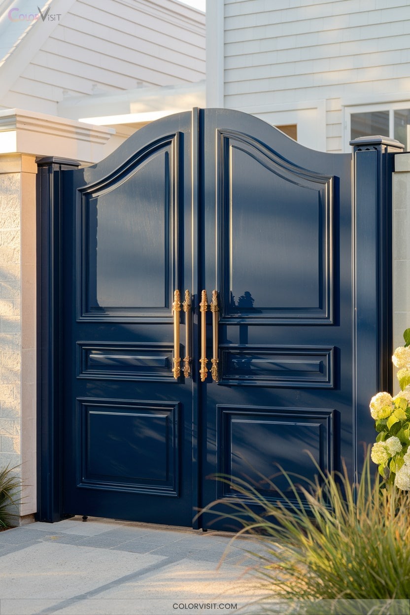
Timeless sophistication defines a navy blue gate, instantly elevating your home’s exterior while introducing a serene, coastal-inspired ambiance.
Navy blue delivers visual impact that’s both bold and calming, evoking the tranquility of seaside escapes.
Its versatility allows you to pair it effortlessly with white trim for crisp contrast, or natural wood for added warmth.
Deep navy shades like Hale Navy or Naval mask dirt and withstand seasonal changes, offering both beauty and practicality.
In colder climates, navy blue’s heat retention can aid energy efficiency.
For innovative curb appeal, let a navy blue gate command attention and unify diverse architectural elements.
6. Lucerne AF-530: Deep Teal for a Modern Edge
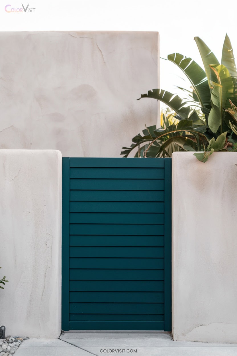
A rich, saturated hue like Lucerne AF-530 introduces a modern edge to your gate, blending deep teal sophistication with bold visual interest.
Its low LRV means you’ll achieve depth and drama—perfect for statement-making entrances.
Pair Lucerne effortlessly with crisp neutrals like Gray Horse or warm Jute for harmonious contrast, or accentuate with brushed nickel hardware for a sleek finish.
For lasting performance, choose Ultra Spec® 500 flat or eggshell in moderate-traffic areas, and always test a sample under natural lighting.
Avoid high-gloss finishes to preserve a contemporary aesthetic, and let Lucerne elevate your property with modern innovation.
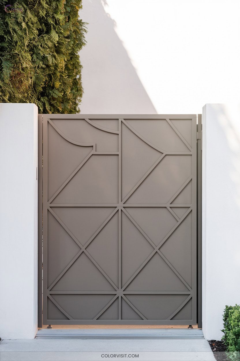
7. Light Gray & White: Sleek Monochrome Contrast
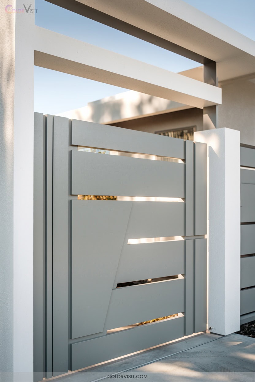
With light gray and white, you’ll achieve a sleek monochrome contrast that instantly modernizes any gate.
Pairing these tones creates visual balance and highlights architectural details—think crisp white trim outlining a contemporary light gray frame.
This sophisticated combination works equally well with modern minimalist or classic designs, offering timeless versatility.
In garden settings, gray and white blend seamlessly with greenery, while in urban contexts, they evoke chic, streamlined appeal.
Use high-quality, UV-resistant paints for lasting vibrancy.
Layer textures—smooth metal, rough stone—for added depth.
Accentuate features like handles in white for subtle pops and a truly innovative entrance.
8. Bronze: Warmth and Tradition for Wrought-Iron Gates
Bronze transforms wrought-iron gates by infusing warmth and heritage into your entryway.
Opting for antique or dark bronze finishes delivers depth and pairs seamlessly with masonry, stonework, or earthy palettes.
Bronze-black hybrids, like Urbane Bronze, offer a contemporary edge while preserving tradition.
Prioritize powder coating or hand-buffed patinas for durability and authentic character—these finishes develop a rich, low-maintenance texture over time.
Bronze excels in coastal climates and historic neighborhoods, often pre-approved by HOAs for both style and resilience.
Pair your bronze gate with cream, sage, or navy backdrops to highlight detail and create a striking, timeless focal point.
9. Terracotta: Mediterranean Warmth for a Welcoming Entrance
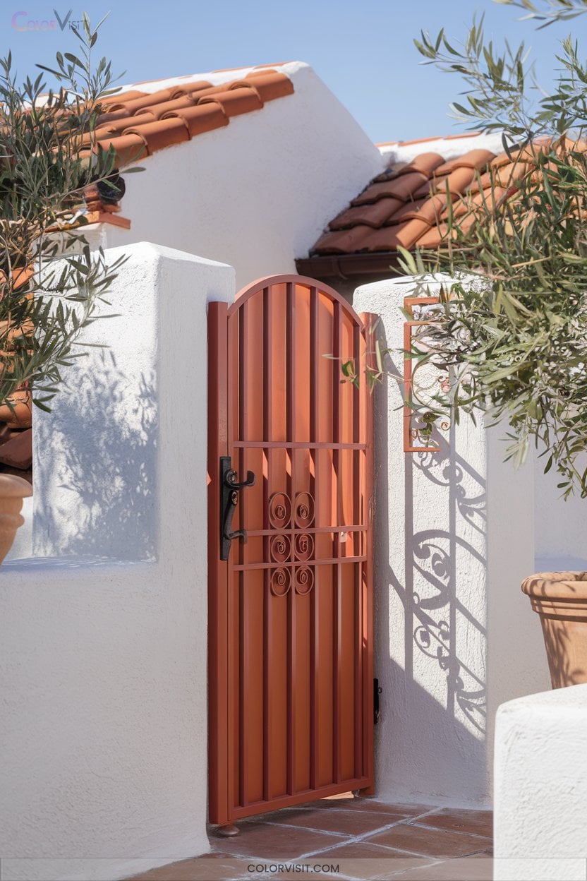
Shifting focus from the timeless elegance of bronze, terracotta offers a distinctly Mediterranean warmth that instantly makes your entrance feel inviting.
Embrace its earthy spectrum—from soft blush and peach to burnt orange and brick red—to evoke a sense of tradition and creativity.
Terracotta’s rich, mineral-influenced tones pair beautifully with gates of metal, wood, or stone, adding character and an emotional connection to your space.
For a modern edge, match terracotta with crisp whites or cool midnight blue.
This bold choice not only enhances curb appeal but also introduces balance, harmony, and a welcoming ambiance rooted in Mediterranean heritage.
10. Sage Green: Botanical Beauty for Cottage-Style Gates
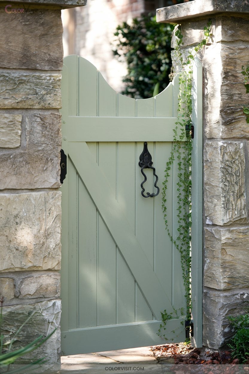
Serenity defines the appeal of sage green for cottage-style gates, offering a muted, botanical tone that blends seamlessly with garden landscapes.
Embrace this desaturated hue to evoke Victorian charm and timeless elegance, while supporting eco-friendly choices like water-based, zero-VOC paints.
Choose sage green for your gate to capture Victorian elegance and support sustainable living with eco-friendly, water-based paints.
Pair sage green with off-whites, muted taupes, or warm grays for a sophisticated palette.
Accentuate your gate with rustic hardware, woven baskets, or climbing vines to amplify its natural beauty.
Always test paint samples to guarantee true color in your setting.
Sage green’s versatility and classic character make it an innovative choice for enhancing your property’s cottage-inspired exterior.
11. Slate Blue: Cool Sophistication for Stone or Brick Exteriors
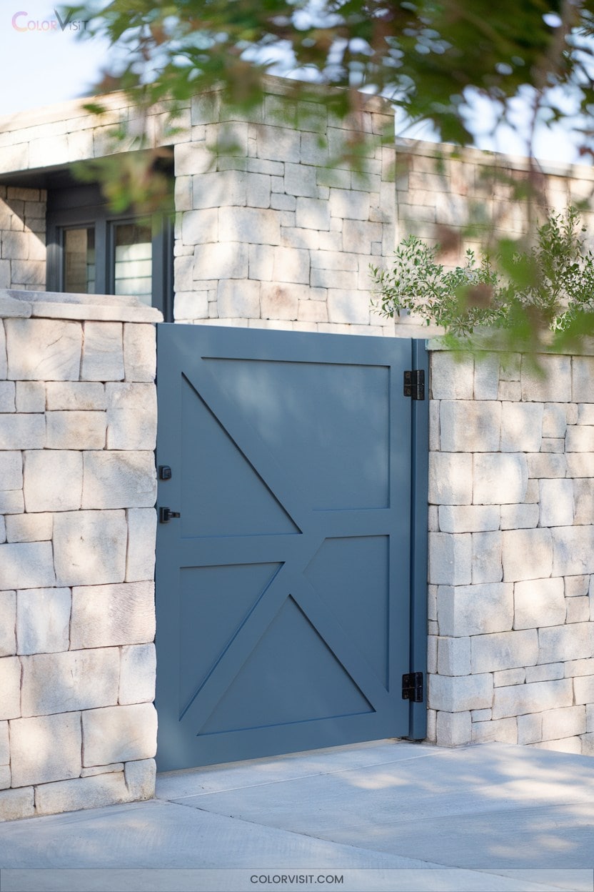
While sage green infuses cottage gates with natural softness, slate blue offers a refined, contemporary edge perfect for stone or brick exteriors.
This versatile blue-gray, with its subtle blue-green undertones and LRV of 43.21, strikes balanced contrast against rugged masonry without overpowering it.
Pair slate blue gates with crisp white trims like Cloud White for modern definition, or coordinate with taupe shutters for earthy harmony.
Test samples in varied lighting to gauge depth, and opt for an eggshell or satin sheen for durability.
For a progressive touch, combine with black metal hardware and accent colors like Navy Masterpiece or Marilyn’s Dress.
12. Castle Peak Gray 1561: Charcoal Door and Shutter Pairing
Castle Peak Gray 1561 offers a sophisticated blend of deep mossy green and warm gray undertones, making it a compelling choice for gates seeking both richness and versatility.
Pairing this color with charcoal doors and shutters innovates your exterior by introducing striking contrast.
Charcoal accents highlight architectural features, while the warmth in Castle Peak Gray softens the look for a refined finish.
This pairing is especially effective in settings with stone, brick, or abundant greenery, as it harmonizes with natural elements.
Opt for premium finishes to maximize depth, and let this color duo set a bold, contemporary tone for your property.
13. Sunflower Yellow: Vibrant Pop for Daytime Appeal
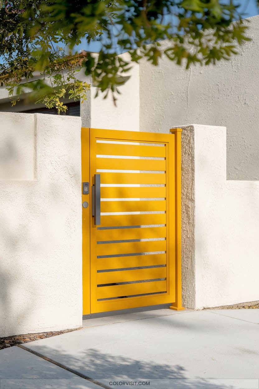
If you’re looking to bring energy and brightness to your gate, sunflower yellow offers an unmistakable pop that stands out, especially during daylight hours.
Its high optical brightness instantly enhances curb appeal while radiating warmth and happiness.
Sunflower yellow’s vibrant brightness boosts curb appeal, filling your entryway with an inviting sense of warmth and joy.
Brands like Sherwin-Williams and Behr offer durable exterior options, ensuring lasting vibrancy.
Balance sunflower yellow with crisp whites or cool grays for a modern look, or pair it with deep blues for striking contrast.
Always evaluate how the shade interacts with your landscape and test its appearance in different lighting.
For eco-conscious choices, opt for low-VOC or GREENGUARD Gold Certified paints.
14. Walnut Wood Finish: Rustic Charm With Wood-Look Paint
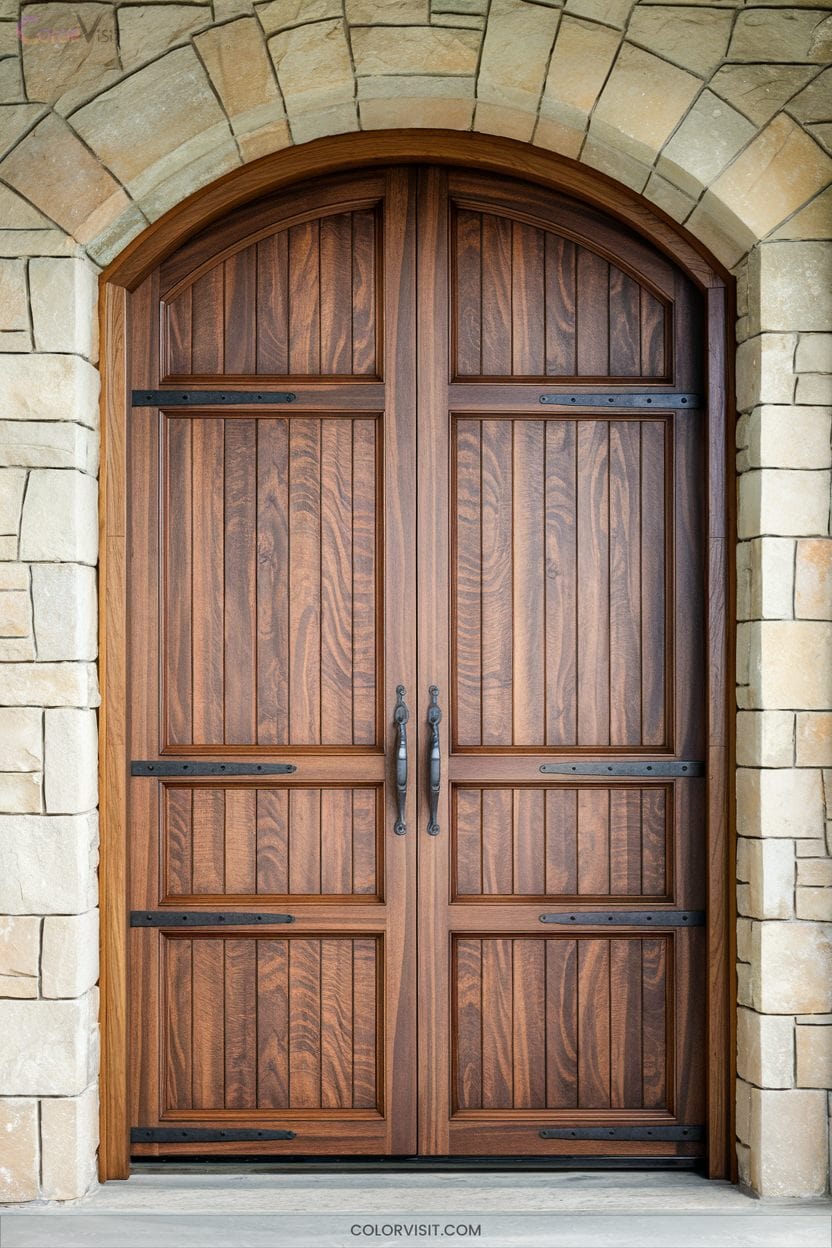
A walnut wood finish instantly brings rustic charm and timeless appeal to your gate, even when achieved with wood-look paint rather than real timber.
You can replicate walnut’s rich brown hues and distinctive grain using innovative techniques that deliver both authenticity and durability.
For an innovative, cohesive exterior, consider:
- Mimicking deep chocolate and light blonde tones for dynamic color variation.
- Using textured rollers or brushes to simulate walnut’s tight, straight grain.
- Layering oil-based and water-based stains for depth and resilience.
- Testing samples to verify the chosen finish complements your property’s lighting and style.
Elevate your gate’s character while guaranteeing low maintenance and lasting beauty.
Frequently Asked Questions
How Do I Prepare a Metal Gate Before Painting It?
Start by cleaning the gate thoroughly, remove rust and old paint with a wire brush or sander, then smooth the surface. Apply a rust-inhibiting primer, let it dry completely, and you’re ready for innovative color application.
What Finishes Are Best for Outdoor Gate Paint Durability?
For maximum outdoor gate paint durability, you should choose a semi-gloss or gloss finish. These reflect sunlight, resist fading, and repel moisture better than flat finishes. You’ll achieve a sleek, innovative look that’s easier to maintain.
Can I Paint Over Previously Painted Gates Without Sanding?
Sure, you could skip sanding—if you want your paint to peel faster than trends change. But if you crave innovation and longevity, lightly sand first; it guarantees your bold color truly adheres and endures outdoor realities.
How Often Should I Repaint My Exterior Gate?
You should repaint your exterior gate every 2–7 years, depending on material, climate, and maintenance. Inspect for peeling, fading, or cracking. Use high-quality paint and prep thoroughly to keep your gate looking fresh and innovative.
Are There Eco-Friendly Paint Options for Gates?
You’ve got great eco-friendly paint options for gates. Choose zero-VOC, water-based paints like ECOS or DuraSoy ONE for safe, durable results. Don’t overlook powder coating for aluminum gates—it’s innovative, sustainable, and offers excellent color choices.
Conclusion
With these gate paint color ideas, you’ll give your garden a gorgeous glow and your property a polished presence. Whether you’re craving classic contrasts or subtle sophistication, selecting shades that suit your style will set your space apart.
Don’t delay—dabble in daring hues or embrace earthy elegance to boost your home’s curb appeal. Remember, pairing personality with practicality guarantees your gate greets guests with grace and grandeur every single time they swing by.