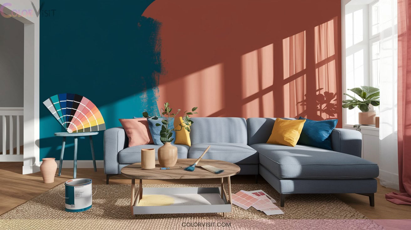
22 Fresh Home Interior Color Ideas for a Complete Makeover
Refresh your home with 2025’s trendiest colors—embrace Quietude’s soft sage, serene blue-grays, and mossy greens for biophilic calm. Ground your space with sandy beige and driftwood gray, layered for organic texture.
Accent with rich burgundy, Rookwood Red, and bold Chara Blue to channel vintage luxury or contemporary vibrancy. Pair with plush textiles, gold and brass metallics, or playful coral for a modern upgrade. Discover how these 22 hues can transform every room’s mood and style.

1. Embrace Serenity With Quietude
Serenity takes center stage with Quietude, a soft sage green infused with a subtle blue-gray undertone that instantly elevates your home’s atmosphere.
As Sherwin-Williams’ Color of the Year 2025, Quietude embodies transcendent tranquility and modern sophistication.
Quietude radiates calm and sophistication as Sherwin-Williams’ 2025 Color of the Year, redefining tranquility for modern interiors.
You’ll notice how its versatile hue adapts seamlessly to modern, blended, and traditional design language, exuding calm in bedrooms, living rooms, and even nurseries.
Pair it with white oak floors, dark accent furniture, or vintage elements for an innovative aesthetic.
Soft lighting accentuates its peaceful aura, while Quietude’s trend compatibility assures your space feels both on-point and timelessly curated.
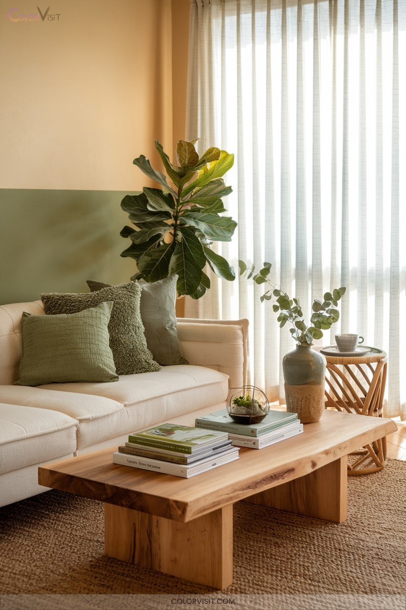
2. Bring Nature Indoors With Sage Green
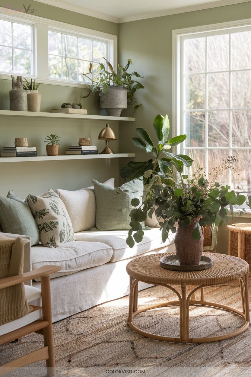
Step into a space where nature effortlessly flows indoors through the understated elegance of sage green.
This grayish, silvery-toned hue transcends trends, acting as a sophisticated neutral that seamlessly bridges modern minimalism and classic design.
Sage green’s versatility empowers you to envelop living rooms, bedrooms, or kitchens in tranquility, while its botanical inspiration fosters a biophilic connection.
Amplify visual interest with sage-hued wall paneling or upholstery, then layer with earth tones, crisp whites, or metallic gold accents for a curated, innovative palette.
Embrace the evolution—sage green remains a forward-thinking choice for those seeking serenity and refined, nature-centric aesthetics.
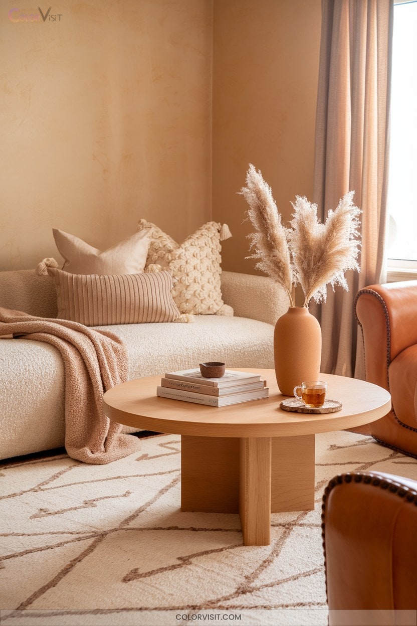
3. Cozy up With Sandy Beige
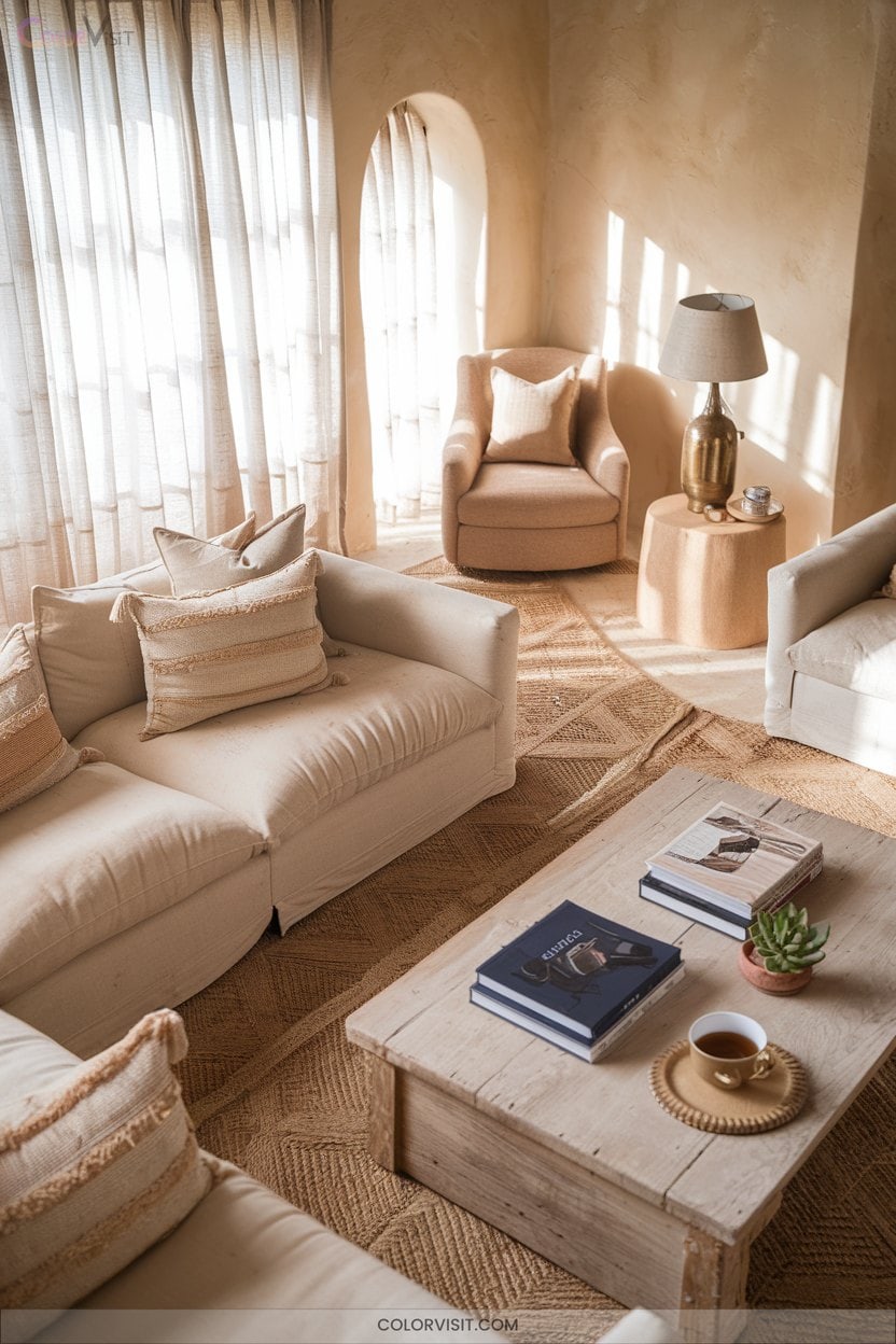
How can one instantly infuse warmth and sophistication into a space?
Embrace sandy beige—a color that’s dominating 2025’s interior trends for its visual impact and adaptability.
Its consistent neutrality acts as the perfect canvas, balancing bold patterns or sleek modern lines.
Layer it with tactile textures—think plush upholstery or matte ceramics—to create depth.
Pair sandy beige with dark blues for coastal energy, or blend with creams and terracotta for natural harmony.
In any room, this hue elevates focal points and keeps atmospheres airy yet grounded.
Opt for monochromatic sandy beige schemes to achieve an innovative, cohesive, and unmistakably inviting interior.
4. Go Organic With Mossy Green Accents
Lean into the organic allure of mossy green accents to bring 2025’s biophilic design movement directly into your home.
Integrate preserved moss living walls—eco-conscious and maintenance-free—for an authentic, tactile connection to nature.
Pair mossy green with industrial surfaces like concrete or stone to amplify visual contrast in minimalist spaces.
Curate your palette with moss-green drapery, painted accent walls, or statement furniture, anchoring rooms in tranquility.
For unexpected impact, introduce moss-filled terrariums, ceiling treatments, or kitchen cabinetry.
This earthy hue harmonizes with daylight, reduces visual stress, and flexibly complements Scandinavian, Bohemian, rustic, and blended interiors for a forward-thinking aesthetic.
5. Refresh Spaces With Driftwood Gray
Following mossy green’s organic vibrance, driftwood gray emerges as the next must-have neutral for interiors seeking timeless sophistication.
This nuanced hue, blending gray and brown undertones, channels the patina of weathered wood and adapts brilliantly to contemporary or rustic aesthetics.
You’ll notice how its chameleon-like quality—shifting subtly in different lighting—adds unexpected depth to bedrooms and living spaces.
Use driftwood gray on walls or furniture to ground accent colors, from soft blues to earthy greens, creating a striking yet cohesive palette.
Incorporate driftwood-finished pieces for a tactile, organic vibe that feels both cutting-edge and enduringly serene.
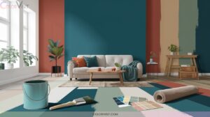
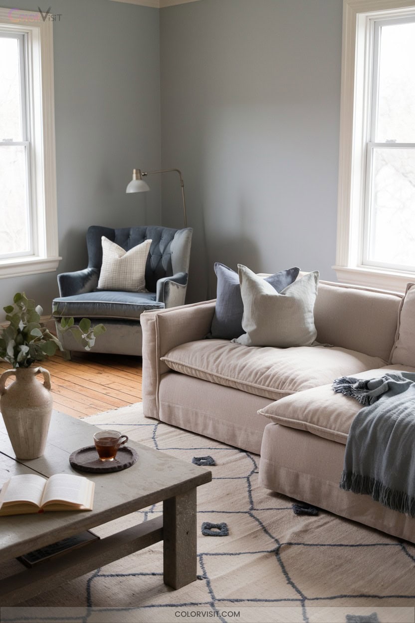
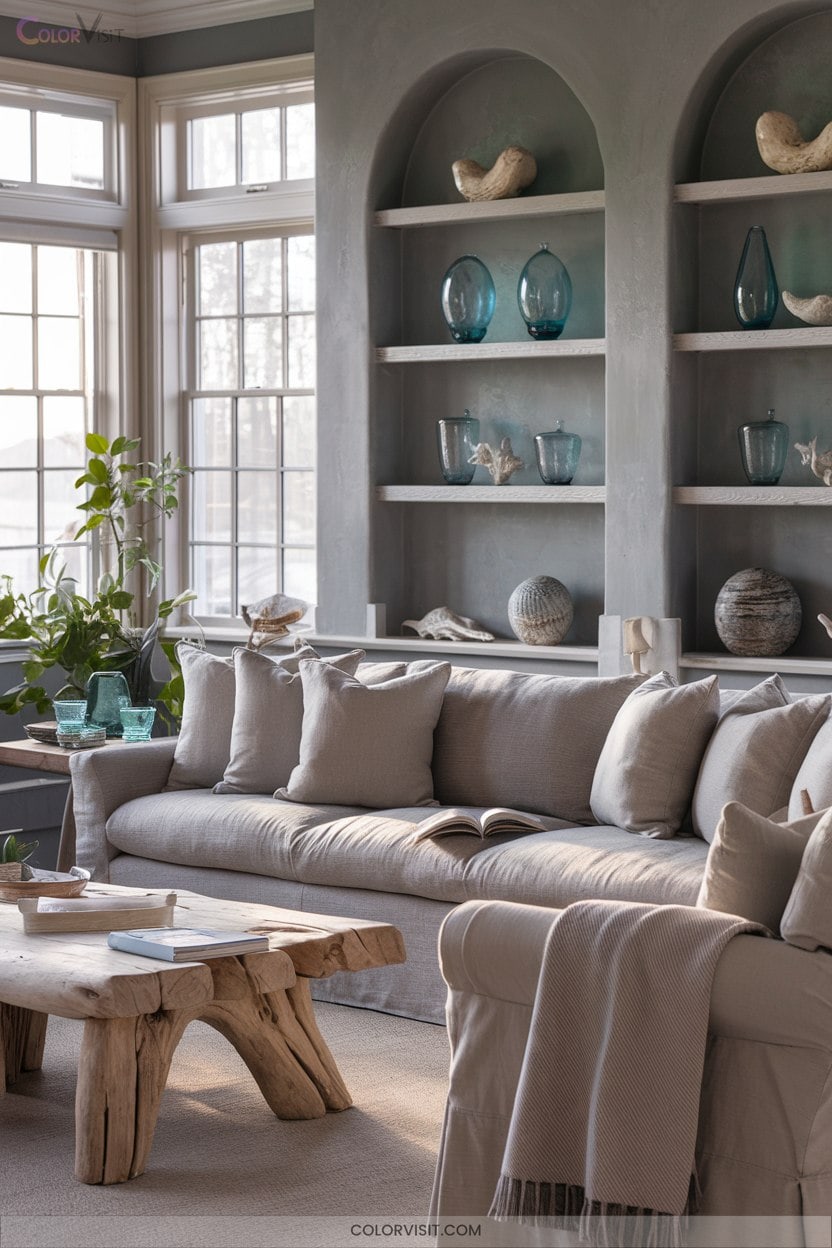
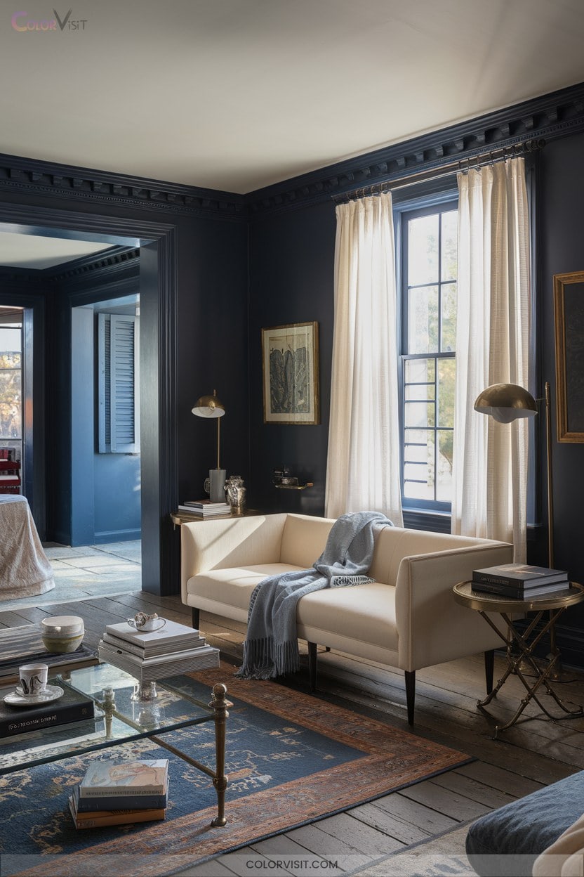
6. Create Calm With Blue-Grey Hues
A palette of blue-grey hues instantly infuses interiors with tranquility, merging the restorative qualities of blue and the subtle sophistication of grey.
You’ll find blue-grey walls visually expand rooms while reducing visual stress, perfect for crafting a serene, spa-like ambiance.
Pair powder blue-grey with metallic accents for understated drama, or introduce slate tones for a contemporary edge.
Incorporate textured fabrics—velvet or linen—in layered blue-grey shades to add tactile depth.
Balance the palette with natural wood and crisp white trim, or modernize with black accents.
Blue-grey’s versatility resonates across minimalist, Scandinavian, and coastal trends, ensuring timeless innovation and effortless calm.
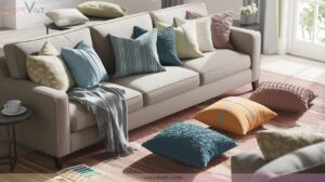
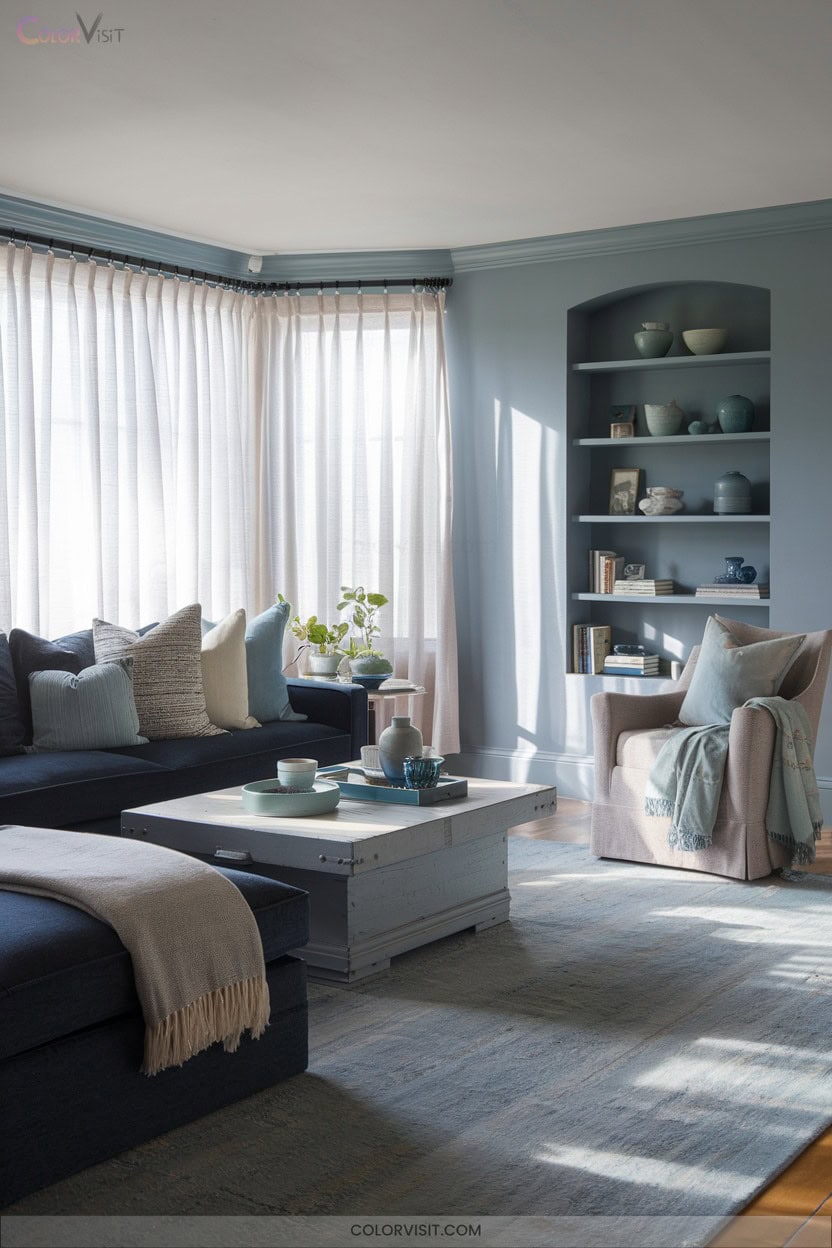
7. Add Soft Blues With Green Undertones
While blue-grey palettes evoke serenity, soft blues with green undertones offer a fresh, nature-inspired alternative that instantly lifts interiors.
These blue-green hues—think Farrow & Ball’s Inchyra Blue or Benjamin Moore’s Mexicali Turquoise—create a dynamic interplay of calm and revitalization.
Blue-green tones like Inchyra Blue or Mexicali Turquoise infuse spaces with both soothing calm and invigorating energy.
Use airy aqua in bedrooms or guest rooms to amplify tranquility, or opt for deeper teal in studies for a cocooning effect.
Pair with crisp white trim and rich wood for striking contrast.
Always test samples in your space, as lighting and orientation shift the shade’s character.
Embrace satin or semi-gloss finishes to highlight the color’s luminous, contemporary appeal.
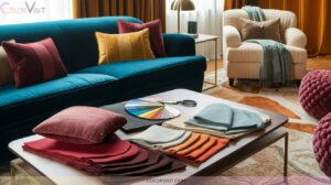
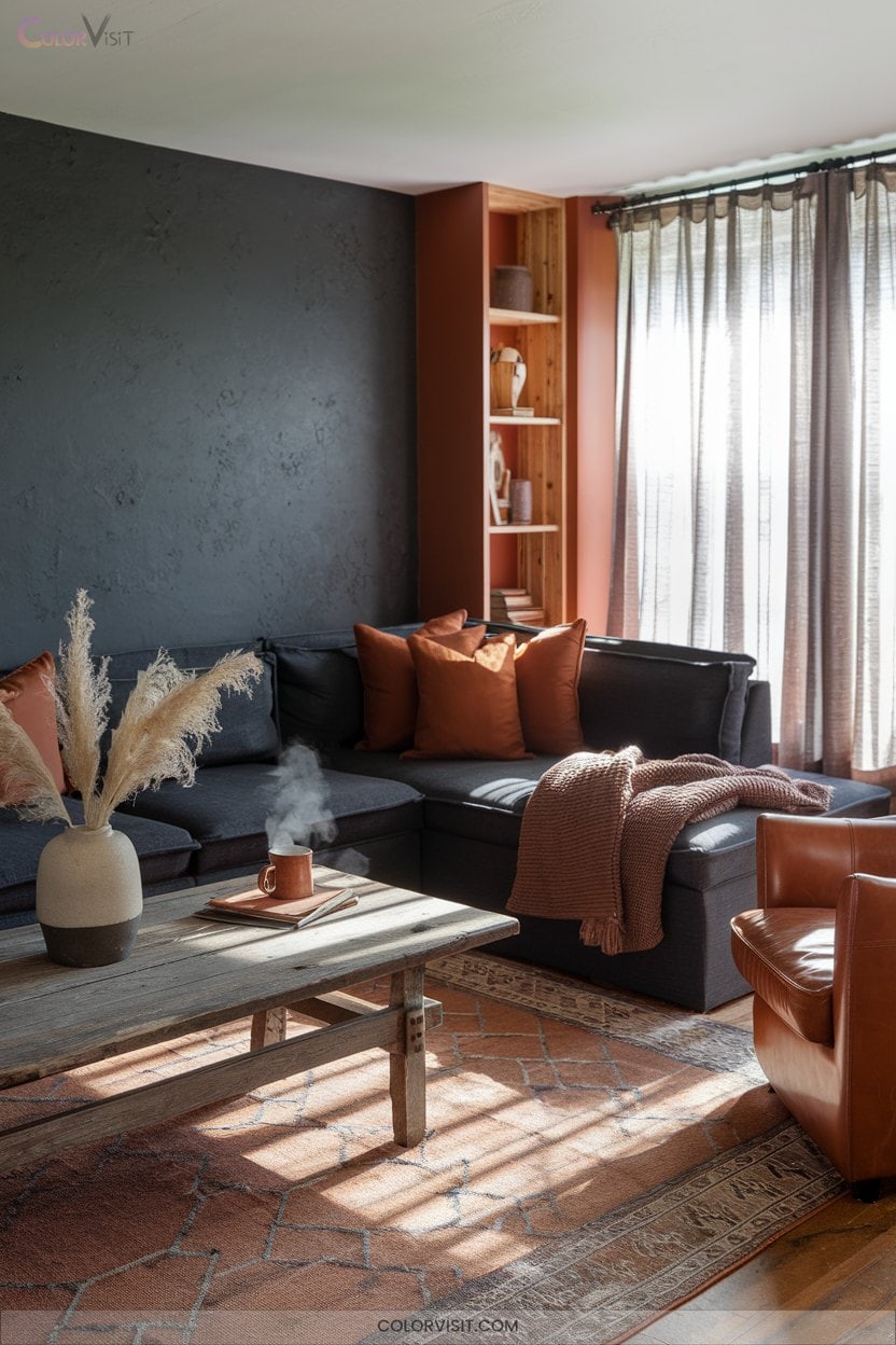
8. Invite Drama With Rich Burgundy
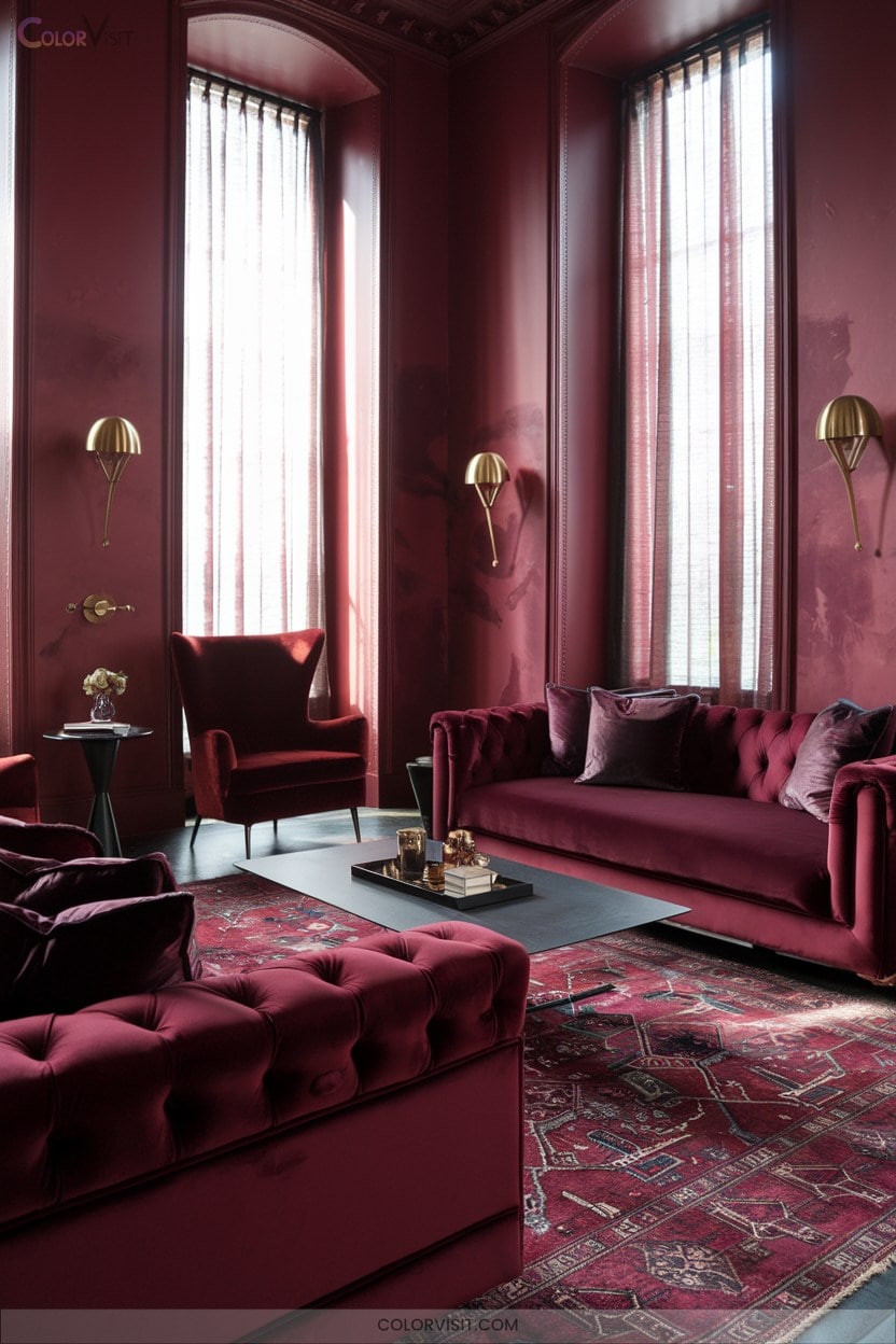
Infuse your interiors with instant sophistication by introducing rich burgundy—a hue that commands attention and envelops spaces in luxury.
This trend-forward color injects depth and drama, instantly amplifying the visual intrigue of any room.
Pair burgundy with tactile fabrics like velvet or wool for heightened opulence, or use it as a statement wall for a moody, immersive effect.
Balance its intensity with neutrals or juxtapose with saturated shades for maximum impact.
Burgundy’s psychological warmth and passion foster a comforting yet energizing atmosphere, making it ideal for spaces where you crave both escape and engagement.
Embrace this bold innovation confidently.
9. Vintage Charm With Rookwood Red
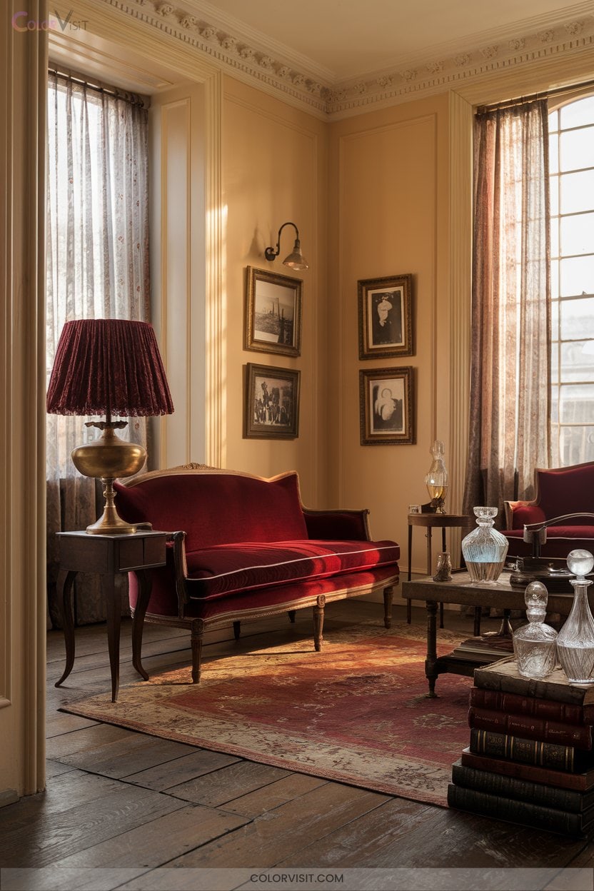
Heritage radiates from every brushstroke of Rookwood Red, a Sherwin-Williams classic that channels vintage allure into contemporary interiors.
This sophisticated hue, inspired by Victorian-era palettes, instantly elevates spaces with warmth and timeless elegance.
Pair Rookwood Red with crisp whites or luxe gold accents for a modern juxtaposition, or ground it with earthy terracotta for rustic authenticity.
Whether you’re updating walls, ceilings, or statement furniture, leverage Sherwin-Williams’ visualization tools to tailor the shade to your light conditions.
Integrate Rookwood Red into eclectic or traditional settings for a curated, trend-forward aesthetic that celebrates storied design while embracing innovative, personalized style.
10. Make a Statement With Chara Blue
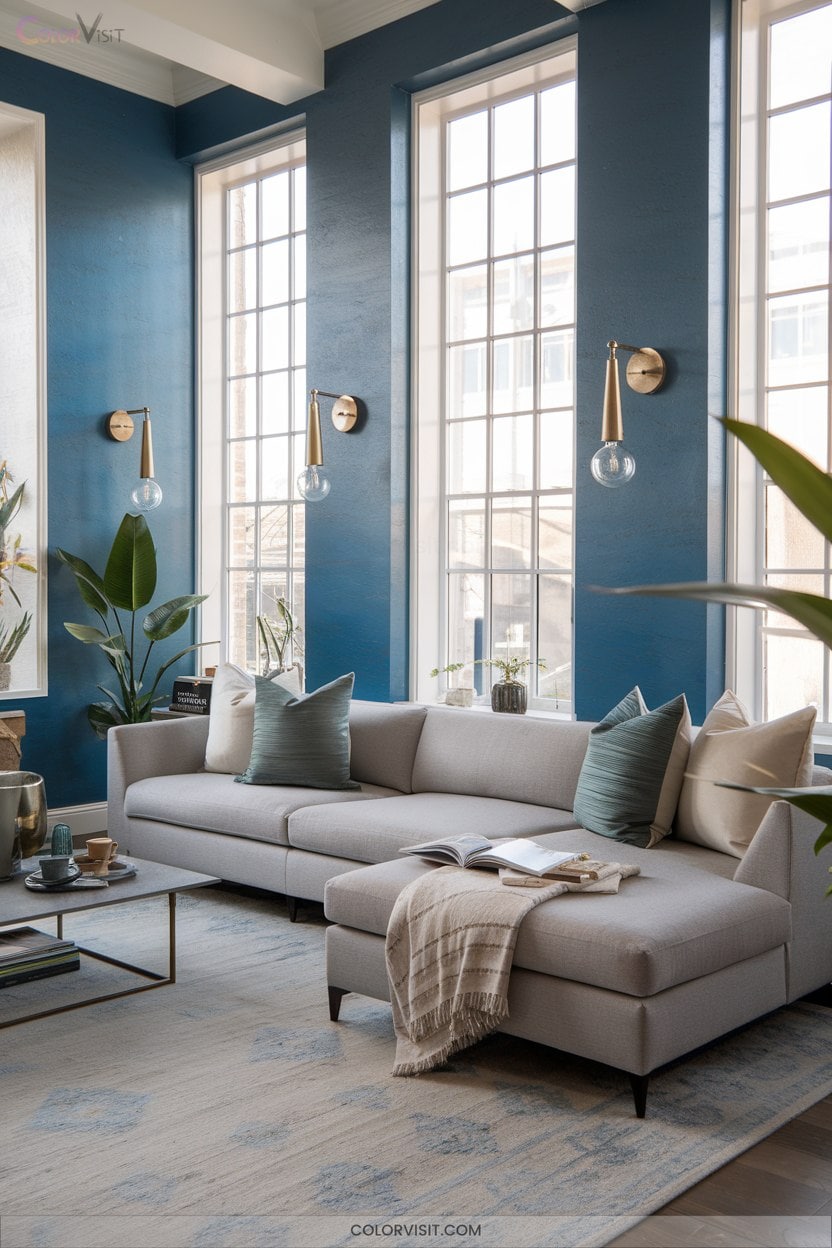
After embracing the rich sophistication of Rookwood Red, elevate your interiors with the bold character of Chara Blue—a shade that commands attention in any setting.
With its unparalleled versatility, Chara Blue adapts seamlessly to both contemporary and traditional aesthetics.
Leverage its calming psychological impact for bedrooms or living spaces, integrating statement furniture or dramatic accent walls.
Layer multiple blue tones and experiment with material contrasts—think blue against brass or warm wood—for dynamic depth.
For visual intrigue, combine solid and patterned blue elements or incorporate sculptural, rounded accents.
In 2024, Chara Blue’s trend-forward presence offers transformative, cohesive harmony throughout your home.
11. Energize Rooms With Bansa Forest Green
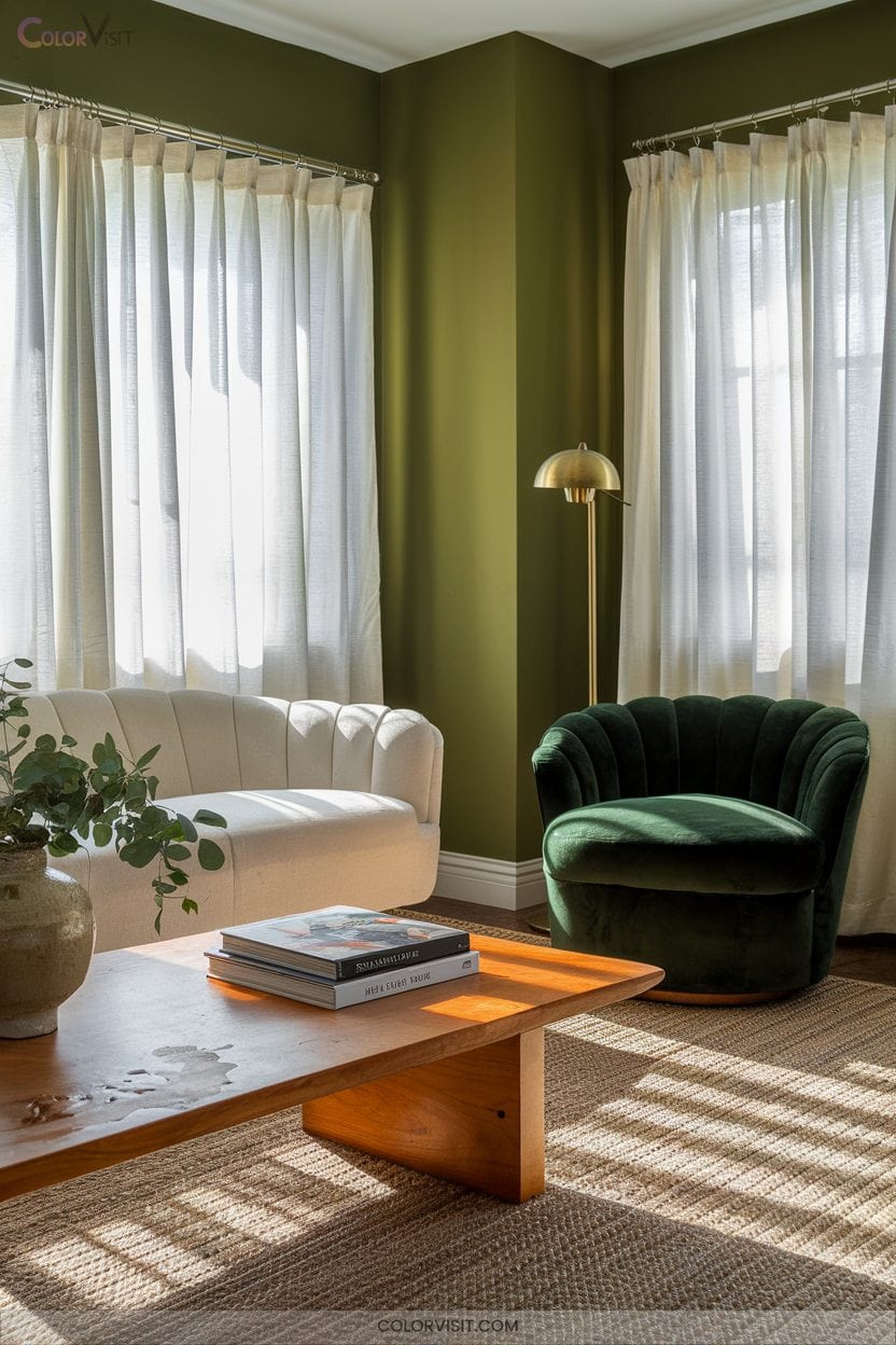
Anchor your space in the dynamic vibrance of Bansa Forest Green—a hue that instantly bridges the indoors with the tranquility of nature.
This sophisticated shade, inspired by Farrow & Ball’s Bancha, infuses interiors with both energy and serenity, tapping into the wellness-driven trend for nature-connected living.
Inspired by Farrow & Ball’s Bancha, this refined green brings both vibrancy and calm to interiors, echoing the latest nature-inspired trends.
Pair Bansa Forest Green with neutral backgrounds for balance, or layer it with earth tones and metallic accents to elevate visual depth.
Accent walls, velvet textures, and wood finishes create a tactile, immersive experience.
Integrate living plants and statement furnishings for a cohesive, invigorating environment that amplifies creativity and contemporary design sensibility.
12. Sophisticated Style With Hail Navy Blue
A statement in refined color, Hale Navy Blue delivers an instant sense of depth and sophistication to any interior.
This true navy, free from green or violet undertones, adapts seamlessly to modern innovation and classic grandeur.
Visualize bold accent walls or cabinetry, grounded by the soft glow of strategic lighting and the tactile richness of woven cane or rattan.
Elevate your environment by embracing:
- Dramatic contrast with crisp whites and subtle grays
- Layered textures using natural fibers and sleek metals
- Monochromatic depth with varying navy shades
- The rugged elegance of Fisherman Core blended with Castlecore luxury
13. Warm up With Cinnamon Slate
Embrace the modern allure of Cinnamon Slate—Benjamin Moore’s 2025 Color of the Year—with its heathered plum and velvety brown undertones that bring grounded sophistication to any interior.
This earth-toned violet amplifies design flexibility, elevating both accent walls and immersive, full-room treatments.
Pair it with warm woods and metallics for a curated, tactile experience, or layer velvet sofas and bouclé cushions to intensify depth and comfort.
Cinnamon Slate’s versatility extends beyond paint—integrate it through textured throws, rugs, and décor for a cohesive palette.
Innovators will love its ability to unify spaces and set a tranquil, contemporary mood throughout your home.
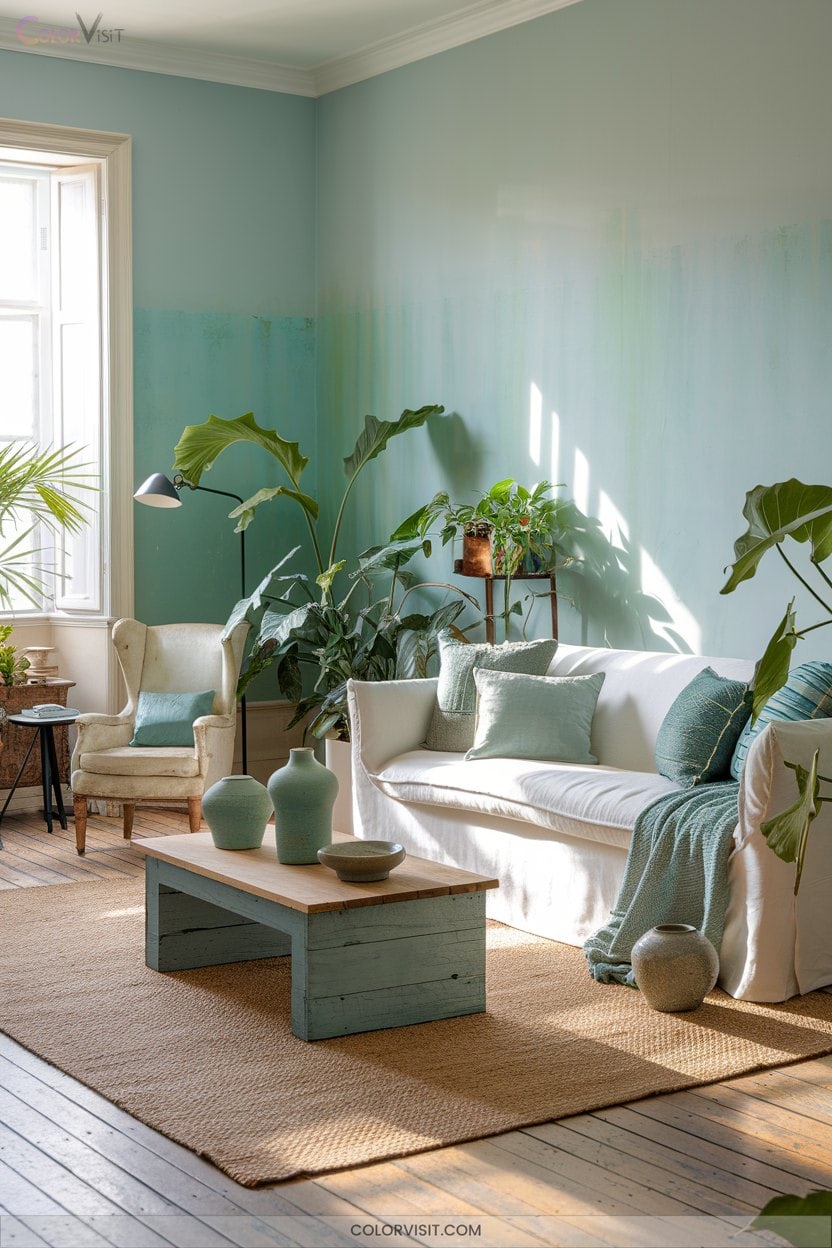
14. Relax With Sea Salt Tones
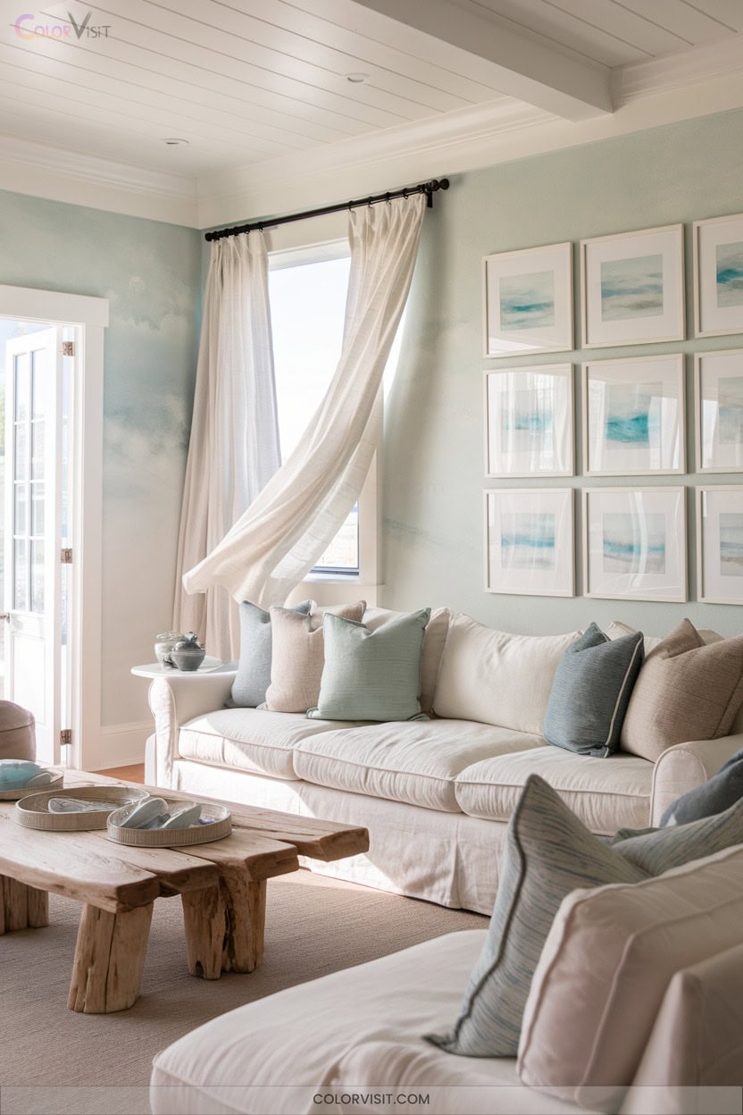
After exploring the rich, sophisticated depth of Cinnamon Slate, shift your focus to the airy tranquility of Sea Salt tones.
This blue-green chameleon elevates modern interiors with its calming, light-reflective quality and subtle undertone shifts.
Sea Salt infuses interiors with tranquil, luminous beauty, its shifting undertones bringing modern spaces an ever-evolving sense of calm.
Embrace Sea Salt for a trend-forward, innovative palette that adapts to every lighting nuance.
Imagine:
- Serene bedrooms bathed in calming hues, instantly reducing daily stress.
- Harmonious kitchens accented with wood and crisp whites for coastal vibrancy.
- Inviting, spacious bathrooms where light dances across green-gray walls.
- A unified, designer-driven whole-house scheme that feels effortlessly fresh and visually expansive.
Let Sea Salt transform your space.
15. Flexibility With Greige and Off-White
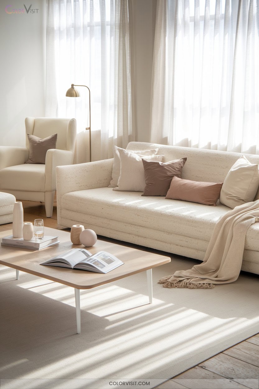
Step into the domain of greige and off-white for unparalleled flexibility in modern interiors.
These nuanced neutrals create a sophisticated, timeless canvas that adapts effortlessly to trend shifts and diverse aesthetics, from Scandinavian minimalism to classic chic.
Greige’s subtle undertones harmonize with natural materials—think wood grains and stone textures—while off-white amplifies light, enhancing spatial perception.
Employ off-white accents against greige walls for a balanced, visually dynamic look.
This pairing hides everyday wear on upholstery and invites colorful artwork or bold accessories to pop.
Curate layered textures and sleek furnishings to achieve a refined, innovative space that evolves with your vision.
16. Layer Warm Neutrals for Comfort
While greige and off-white set a refined backdrop, layering warm neutrals like taupe, ochre, and terracotta infuses interiors with inviting comfort.
Layering warm neutrals over a backdrop of greige and off-white brings cozy, inviting energy to any interior.
Harness the power of earthy tones and rich textures—linen, velvet, bouclé—to evoke depth and tactile intrigue.
Strategically balancing 80% warm neutrals with 20% cool accents prevents monotony and modernizes your palette.
Let visual warmth flow through natural light and organic materials.
To create an emotionally resonant environment:
- Surround yourself with honeyed beige and plush camel throws.
- Mix vintage and modern accents for curated character.
- Integrate wood and stone for authentic texture.
- Add subtle, nature-inspired patterns.
17. Modern Vibes With Light Grey
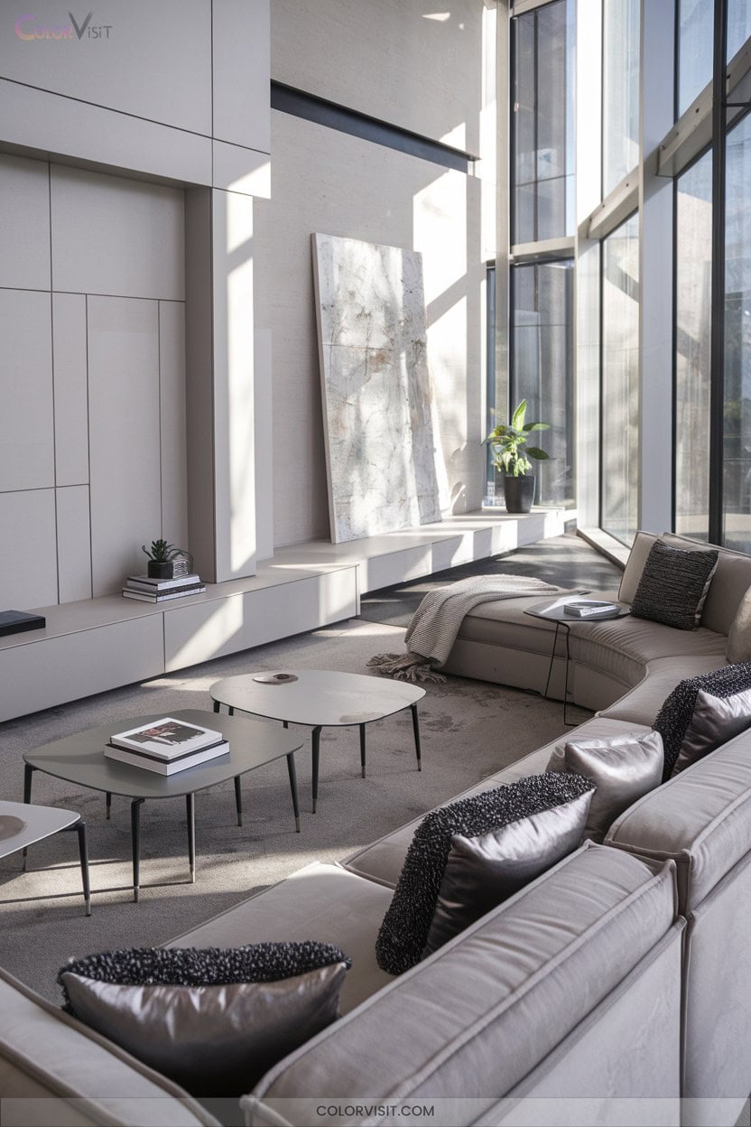
Why not elevate your space with the understated elegance of light grey?
This versatile shade instantly crafts a serene, sophisticated ambiance—perfect for expansive, modern interiors.
Pair light grey walls with crisp white trim for heightened luminosity, then layer in dramatic contrast using black or navy accents.
Anchor the room with textured grey rugs or geometric-patterned carpets to inject visual intrigue without overpowering the palette.
Industrial enthusiasts can integrate concrete finishes and metal furnishings, softened by warm woods.
For cohesion, choose upholstery in complementary hues, then strategically introduce abstract art or sculptural décor for a dynamic, innovative aesthetic that feels both fresh and timeless.
18. Infuse Joy With Sunshine Yellow
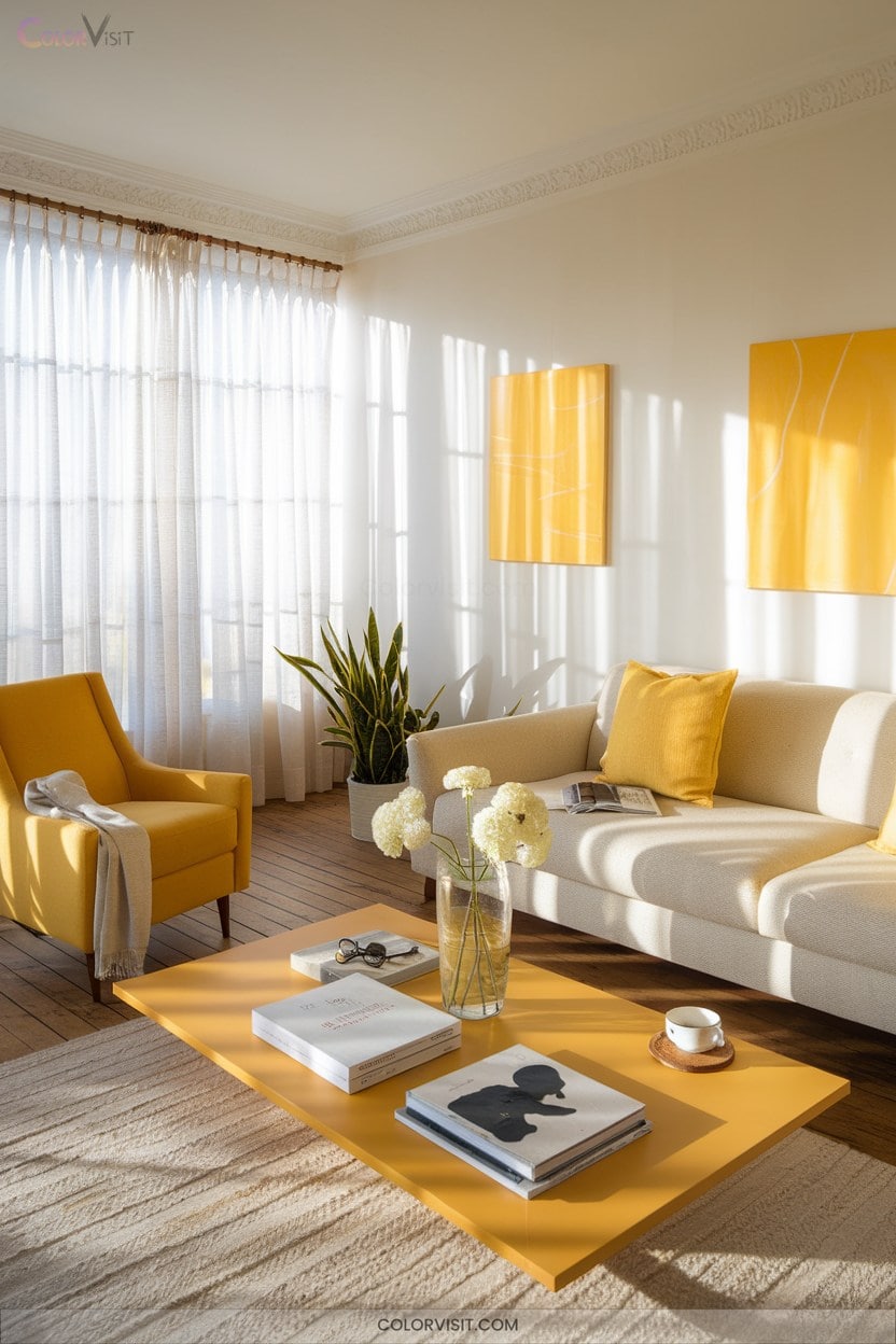
Radiate optimism throughout your home by incorporating sunshine yellow—an interior color trend celebrated for its mood-lifting vibrancy and energizing warmth.
This hue instantly brightens dim spaces, combats seasonal affective disorder, and invigorates creativity.
Sunshine yellow transforms dull interiors, uplifts moods, and sparks creative energy throughout your living space.
Pair buttery yellows with Pantone’s Ultimate Grey for balanced sophistication or opt for bold canary accents to energize monochrome schemes.
Maximize impact with layered materials and intentional placement:
- Drench connecting spaces in lemon chiffon to uplift daily routines.
- Highlight cabinetry with mustard yellow for retro flair.
- Pair matte yellow walls with jute or rattan for organic contrast.
- Integrate gold hardware for a luxe, innovative finish.
19. Playful Touches With Orange and Coral
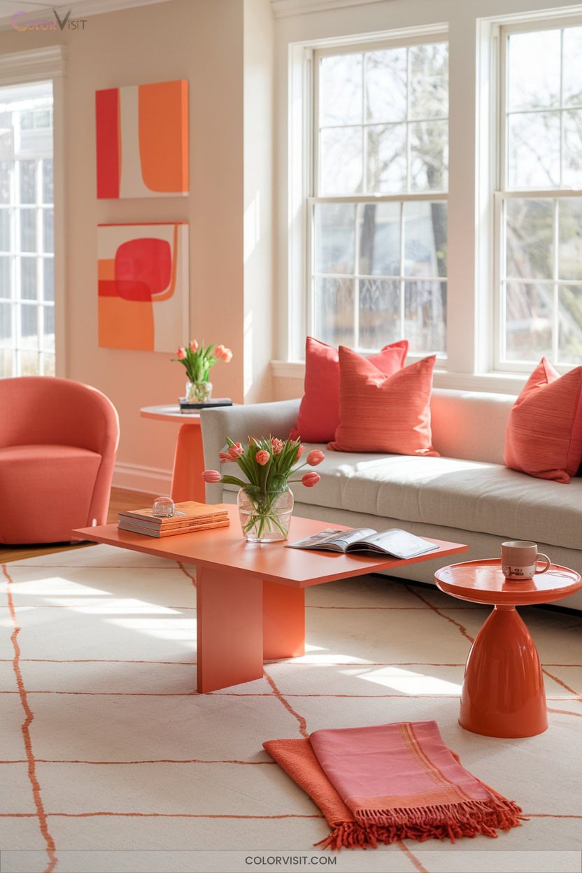
Infuse your interiors with a burst of playful energy by harnessing the vibrancy of orange and coral—two hues at the forefront of contemporary color trends.
These dynamic shades radiate warmth and comfort, ideal for cozy retreats and social zones.
Integrate coral feature walls or orange accents in textiles like velvet or linen to introduce depth and tactile appeal.
Pair these hues with neutral backdrops, eucalyptus greens, or rich wood tones for elevated balance.
Bold maximalists can experiment with saturated coral, while modernists may opt for subtle accents.
Embrace brass or marble accessories for a luxe finish—each element sparks inventive visual intrigue.
20. Elegant Lilac Purple for Living Areas
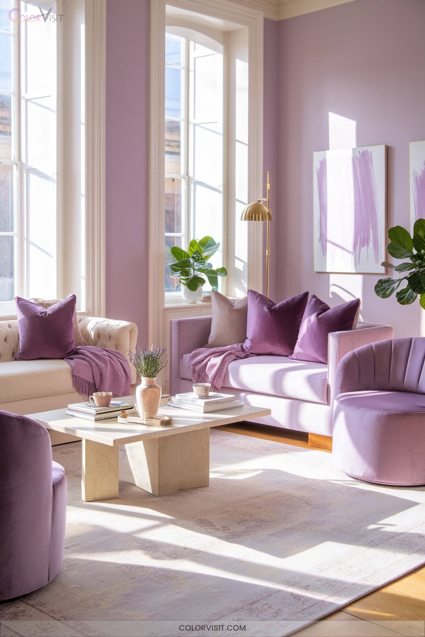
After embracing the energetic flair of orange and coral, introduce a refined sense of tranquility with lilac purple in your living areas.
Harness lilac’s versatility—this pastel shade sits elegantly between lavender and light purple, evoking sophistication and natural harmony.
Lilac’s soft undertone functions as a flexible neutral, seamlessly blending with contemporary or rustic aesthetics.
Activate visual interest and emotional resonance with these techniques:
- Paint an accent wall lilac for a serene focal point.
- Incorporate lilac statement furniture for modern elegance.
- Layer subtle lilac accessories to enrich the ambiance.
- Optimize ambient lighting with lilac-tinted bulbs for calming allure.
21. Go Bold With Deep Burgundy
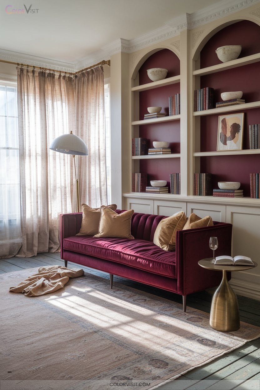
Step into a world of elevated sophistication when you introduce deep burgundy to your interiors—a hue that channels the richness of vintage red wine and the drama of contemporary design.
This moody shade is trending for its ability to infuse warmth and intrigue, ideal for curating cozy yet luxurious spaces.
Embrace a color-drench approach with layered materials—think bouclé, wool, and red velvet.
Paint a statement wall, upholster a bespoke ottoman in antique textiles, or add bold burgundy throw pillows.
Balance the intensity with neutral backdrops, wood elements, and crisp white accents.
Elevate your aesthetic and remain ahead of the design curve.
22. Add Luxury With Gold and Brass Metallics
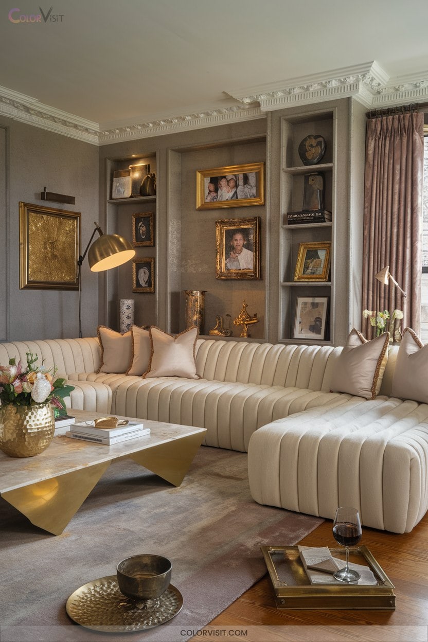
Lustrous metallics like gold and brass instantly elevate interiors, channeling both opulence and modern flair.
You’ll find these accents offer exceptional versatility—pairing seamlessly with warm neutrals or rich, moody hues for a curated, on-trend effect.
Metallic accents blend effortlessly with warm neutrals or deep, moody tones, creating a curated interior that feels both timeless and on-trend.
Their reflective properties amplify light and space, while statement pieces anchor the look in sophistication.
To evoke a sense of luxury and innovation:
- Introduce brass inlays on bespoke furniture.
- Opt for sculptural gold lighting fixtures.
- Layer metallic décor with tactile, contrasting fabrics.
- Use metallics as strategic focal points for maximum impact.
Balance is key: curate, don’t crowd, for enduring elegance.
Frequently Asked Questions
How Do I Choose the Right Paint Finish for Each Room?
You’ll want to analyze each room’s function, light levels, and traffic flow. Opt for matte in serene, low-traffic zones; satin or eggshell for versatile, luminous spaces; and glossy finishes to accentuate architectural details or high-impact, contemporary areas.
Are Dark Wall Colors Harder to Maintain or Clean?
Dark wall colors demand more maintenance—you’ll notice dust, fingerprints, and smudges immediately, especially with matte finishes. Prioritize gentle, innovative cleaning tools and products to preserve the dramatic impact. Opt for satin or semi-gloss for superior durability and ease.
What’S the Best Way to Test Paint Colors Before Committing?
To test paint colors innovatively, you’ll apply large peel-and-stick samples or painted boards, observe shades under variable lighting, and leverage digital visualization tools. Prioritize sheen diversity and live with samples to guarantee your selection’s immersive, on-trend impact.
How Can I Make Small Rooms Look Bigger With Color?
Maximize spatial perception by embracing light-reflective neutrals, monochromatic palettes, and seamless color flow. Integrate shaded gradients and minimize contrast for visual expansion. Experiment with airy ceiling tones and strategic accent walls to create dynamic, trend-forward illusions of openness.
What Are Eco-Friendly or Low-Voc Paint Options?
Want to transform your space sustainably? You’ll find zero-VOC paints like ECOS and Clare offer clean palettes, GREENGUARD certification, and vivid pigments. Embrace trend-setting, eco-friendly finishes that elevate indoor air quality and set a visionary standard.
Conclusion
So, isn’t it true that your home’s palette shapes your mood and mindset? By embracing trending hues—from tranquil sage green to opulent gold—you’ll curate spaces that feel both current and deeply personal. The theory holds: color truly transforms. Let your interiors become a canvas for self-expression and well-being.
Step boldly into the world of color psychology, and watch as your home radiates renewed energy, sophistication, and unmistakable style. Are you ready for your complete makeover?