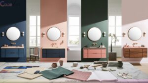
18 Stunning Home Wall Color Ideas to Personalize Your Space
Elevate your space with 18 stunning home wall color ideas, from biophilic cedar-inspired walls and caramelized hues that radiate warmth, to bold jewel-toned blues for a luxe statement. Ground your rooms using timeless stucco neutrals, incorporate dramatic dark green or matte black accents, and highlight natural textures with earthy palettes.
Pair versatile neutrals for cohesive style, or try unique combinations like spiced cider and brass. Explore the latest color trends—each idea transforms your home’s atmosphere, ensuring every room feels curated just for you.

1. Embrace Nature With Cedar-Inspired Walls
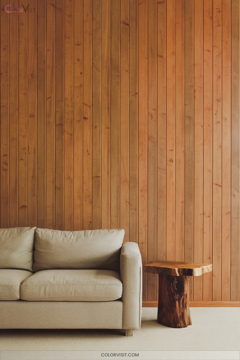
A cedar-inspired wall instantly grounds your space with natural warmth and timeless texture.
Bring natural warmth and enduring texture to your interiors with the grounding beauty of a cedar-inspired wall.
You’ll elevate your interiors by leveraging cedar’s biophilic design attributes, which promote well-being and an organic connection.
Select from Western Red Cedar for resilience, Eastern Red Cedar for aroma, or knotty and smooth finishes for tailored aesthetics.
Integrate reclaimed cedar for a sustainable, vintage edge.
Enhance visual interest with minimal décor and neutral palettes, letting cedar’s grain take center stage.
Use paneling or accent walls for targeted impact—extend to ceilings or add cedar shelves for cohesion.
Maximize daylight to amplify cedar’s rich, tactile presence in innovative spaces.
2. Warm up Your Space With Caramelized Hues
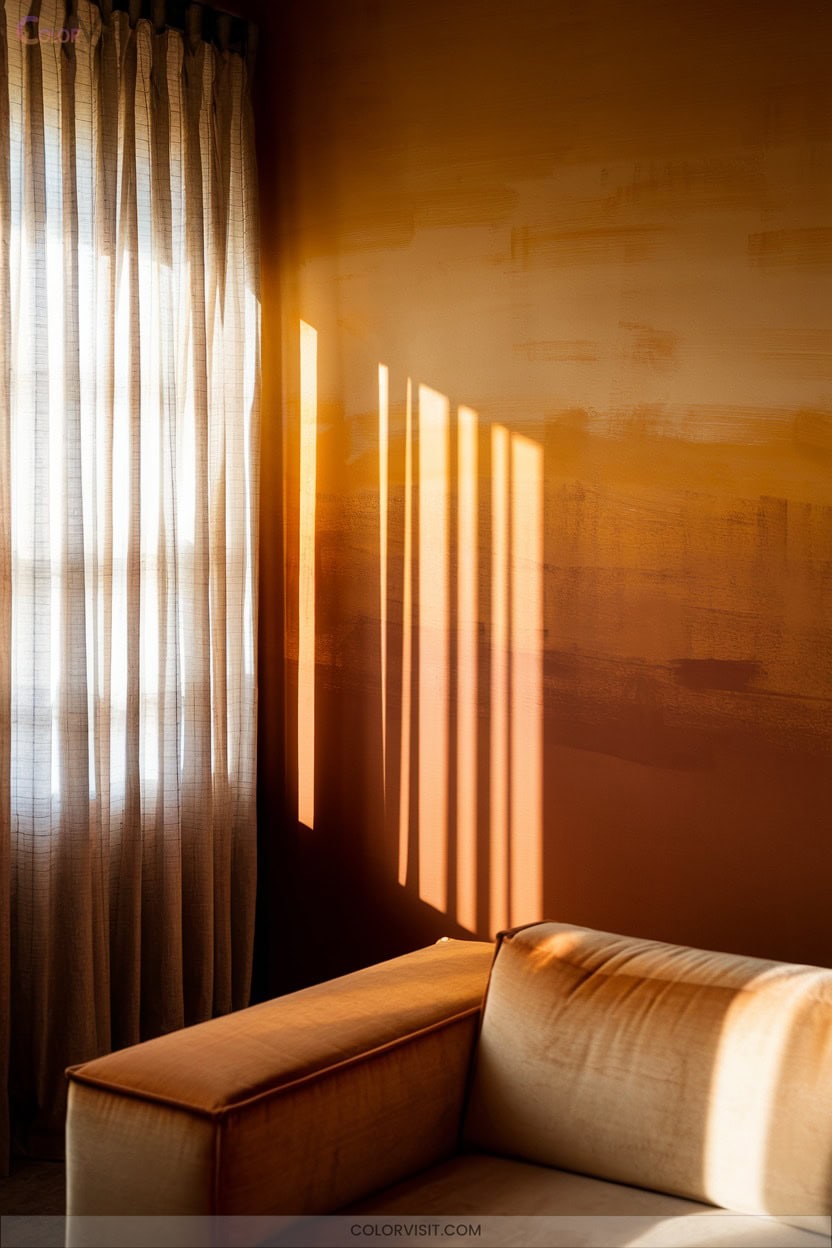
Lean into the rich, inviting allure of caramelized hues to instantly elevate your home’s ambiance.
These sophisticated tones transcend standard neutrals, infusing warmth and visual depth that adapts seamlessly across seasons.
Utilize caramel on feature walls or ceilings for a dynamic focal point, or integrate it through accent pieces and wooden furniture for tactile richness.
Pairing caramel with pure whites or ochre-based tans achieves a harmonious, Scandinavian-inspired tranquility, while blush and yellow accents introduce summer vibrancy.
Its soothing effect fosters emotional connection and comfort, creating an inviting, stylish environment that’s adaptable to both modern and vintage design aesthetics.
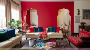
3. Create Drama With Bold Jewel-Toned Blues
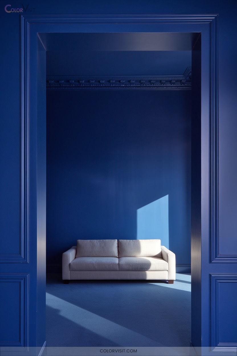
Command attention in your home with bold jewel-toned blues—rich, saturated hues that instantly infuse spaces with luxurious depth and modern sophistication.
Tap into the allure of sapphire, indigo, or turquoise-greens like Benjamin Moore’s Sonoma Skies 737 and Celadon 590 for a dramatic, on-trend statement.
Pair these hues with crisp whites or aged brass accents for curated contrast and luminous vibrancy.
Maximalist aficionados can amplify drama with large-scale patterned wallpaper or coordinate with other jewel tones.
In smaller spaces, a jewel-toned accent wall transforms powder rooms into glamorous retreats.
Prioritize lighting to accentuate the opulence and prevent the shade from feeling heavy.
4. Ground Your Home With Timeless Stucco Neutrals
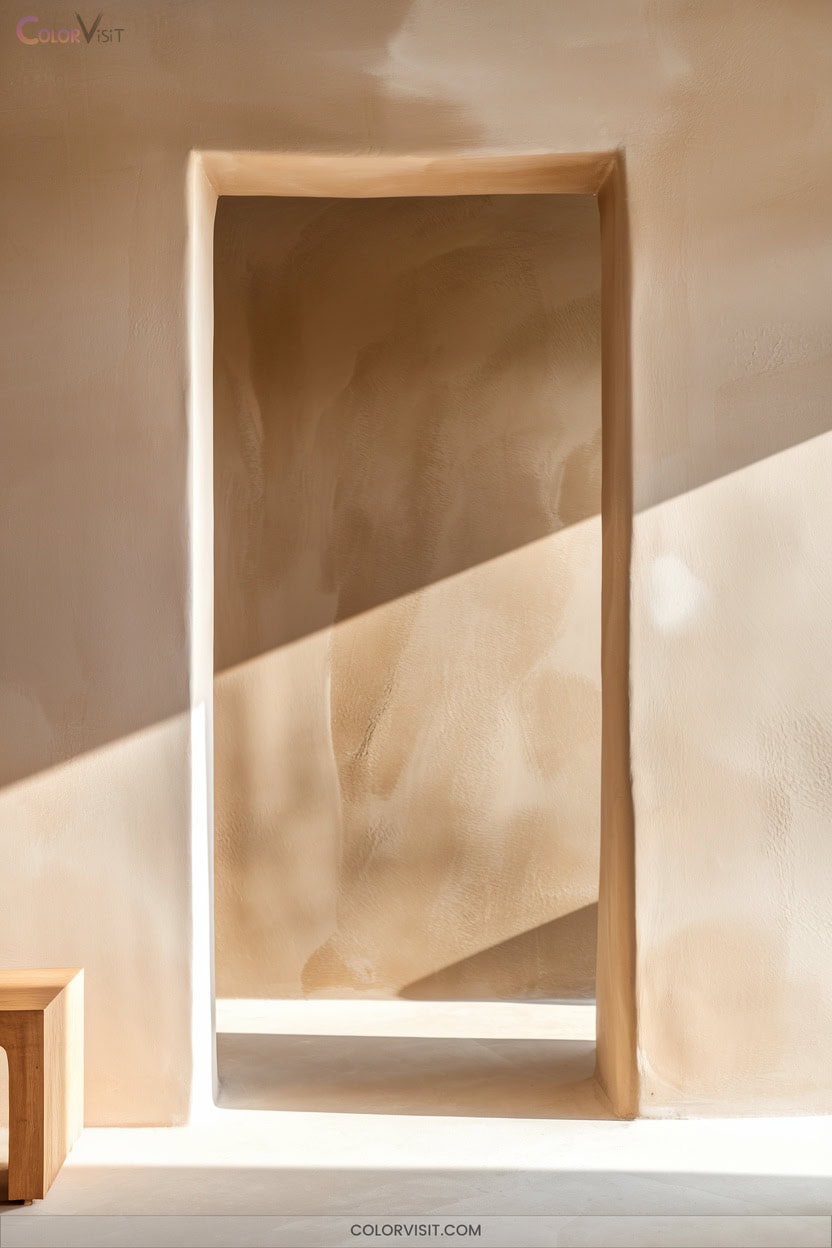
While bold jewel-toned blues create unforgettable drama, timeless stucco neutrals offer a grounded foundation that never goes out of style.
Timeless stucco neutrals ground a space with enduring elegance, while bold jewel-toned blues deliver unforgettable visual drama.
Opt for classic tan or desert beige to seamlessly blend your home with natural landscapes, or choose moderne white for a crisp, sun-reflective façade that elevates resale value.
Gray—ranging from dovetail to mountain—delivers a contemporary edge, especially when paired with stone or brick.
Taupe and warm beige provide versatility, bridging modern and traditional aesthetics.
Integrate these hues with wood accents or metallics for visual depth.
These enduring neutrals assure your space feels sophisticated, adaptable, and visually connected to its environment.
5. Add Richness With Cinnamon Slate Accents
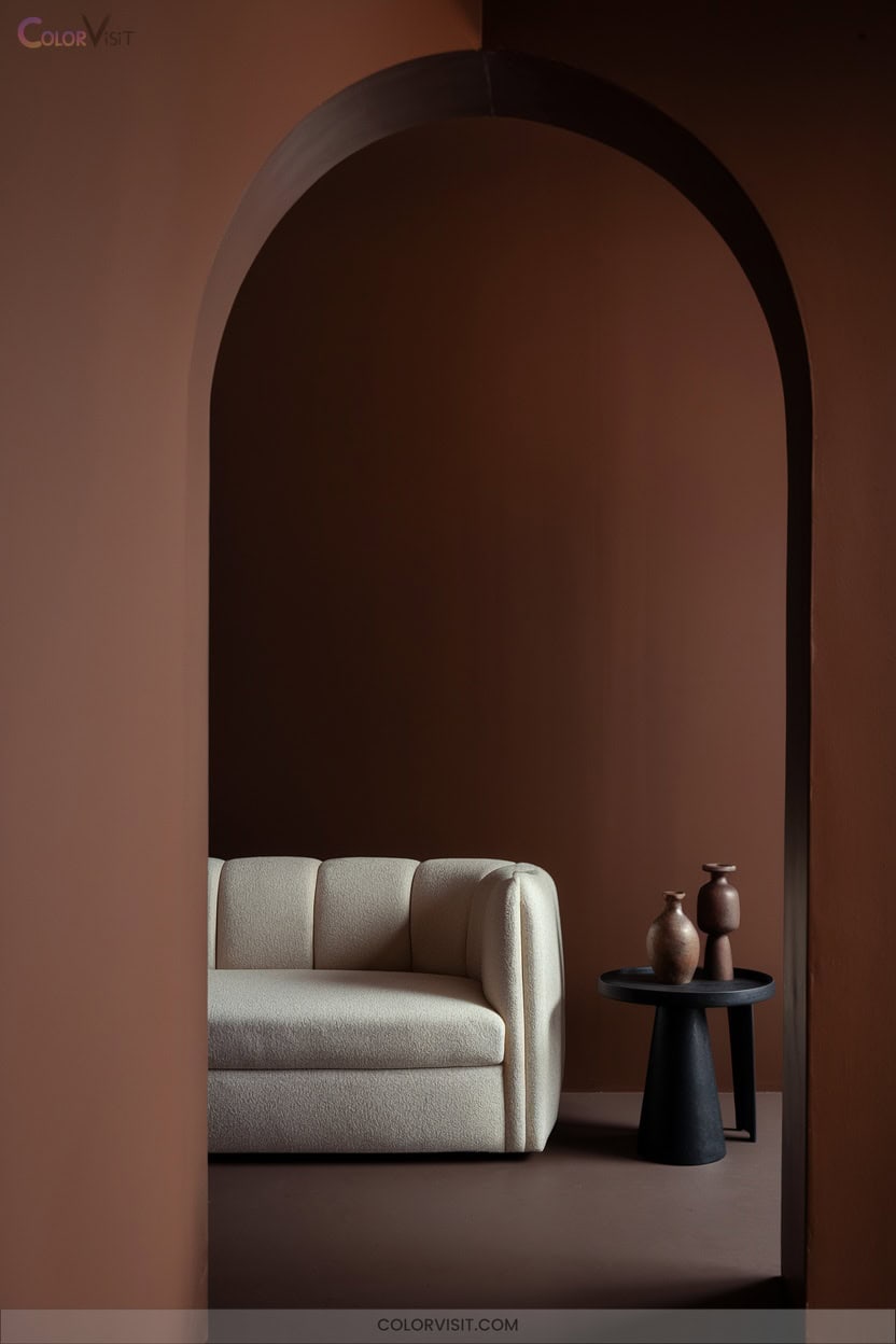
Elevate your home’s palette by introducing Cinnamon Slate accents—a rich, velvety plum with subtle brown undertones that instantly infuses spaces with warmth and sophistication.
This innovative hue, with a medium-depth LRV of 19.71, creates a refined ambiance while remaining versatile and visually impactful.
Here’s how you can harness its trend-forward charm:
- Paint an accent wall in your living room for a cozy yet chic statement.
- Pair Cinnamon Slate with natural stone or brick for tactile contrast.
- Use as a full-room color in kitchens seeking modern elegance.
- Integrate with 2025 Color Trends for harmonious, curated color stories.
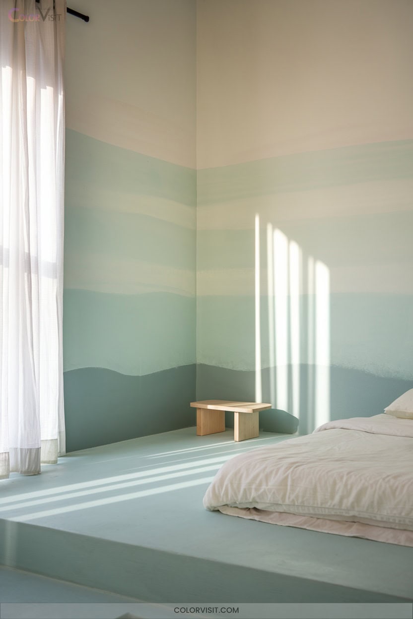
6. Soothe the Senses With Rocky River Blues
Steep your home in tranquility by choosing Rocky River SW 6215—a cool, saturated green with blue undertones that instantly conjures a calming, nature-inspired retreat.
Rocky River SW 6215 invites soothing calm with its cool, blue-green tones, transforming any space into a peaceful, nature-inspired haven.
This medium-dark hue (LRV 15, hex #5E706A) delivers sophisticated depth, making it ideal for bold accent walls, spa-inspired bathrooms, or modern kitchens.
Pair Rocky River with natural woods, soft whites, or gold accents to elevate visual interest and highlight its grounding influence.
Whether you’re updating a library, exterior door, or vanity, this color’s emotional balance and mood-enhancing properties make it a forward-thinking choice for innovative, restorative interiors that prioritize wellness and design harmony.
7. Brighten up With Convivial Yellow
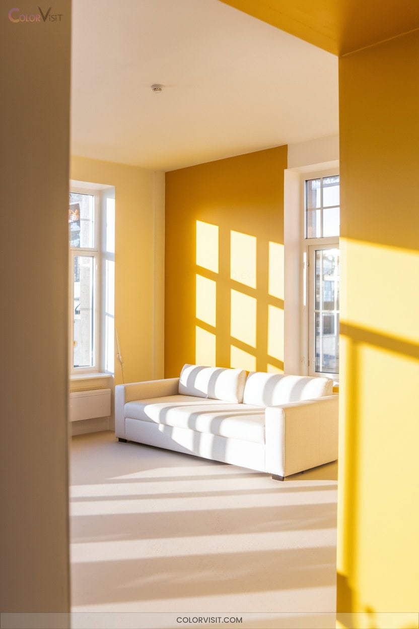
If you’re ready to shift from serene and grounded to lively and uplifting, yellow offers an instant infusion of light and optimism.
Harness its full spectrum—from acid neons to buttery creams—for visual impact and tailored ambiance.
Yellow’s energetic resonance transforms spaces, especially when paired with trend-forward color combinations and curated textures.
To innovate with yellow, consider:
- Test multiple shades in your space to assess lighting effects.
- Use bold yellow for strategic accent walls; opt for muted tones in larger areas.
- Pair yellow with navy or sage green for contemporary contrast.
- Integrate natural materials and graphic prints for modern dimension.
8. Achieve Serenity With Snowbound Whites
When you want to cultivate tranquility at home, Snowbound whites deliver a refined, serene backdrop with nuanced sophistication.
With an LRV of 83, Snowbound reflects light softly—never glaring, always inviting.
Its subtle undertones, shifting between creamy yellow, gray, or a whisper of purple, infuse depth and innovation into minimalist or Scandinavian-inspired settings.
Pair it with gray-influenced hues or cream textiles to maintain cohesion and visual calm.
Snowbound’s chroma value lends a gentle warmth without straying into starkness.
Always sample in your lighting, as undertones shift subtly.
Elevate serenity by integrating texture and natural elements, letting your space breathe.
9. Layer Calmness With Quietude Tones
Expanding on serene foundations, Quietude tones offer a sophisticated evolution of calm by layering blue-green hues with a gentle gray undertone.
As Sherwin-Williams’ 2025 Color of the Year, this low-chroma shade delivers trend-forward ambiance that mimics sea glass and weathered stone, perfect for spatial innovation.
Sherwin-Williams’ 2025 Color of the Year evokes sea glass tranquility and stone-inspired modernity, ushering in a new era of serene design.
To maximize its tranquil impact:
- Pair Quietude with warm neutrals like Pearly White for a balanced canvas.
- Contrast with crisp whites on trim to create visual depth.
- Introduce coastal blues for seamless gradient blends.
- Limit Quietude to select feature walls to prevent oversaturation and maintain subtlety.
Your space transforms into a sanctuary of modern serenity.
10. Invite Coziness With Deep Chocolate Browns
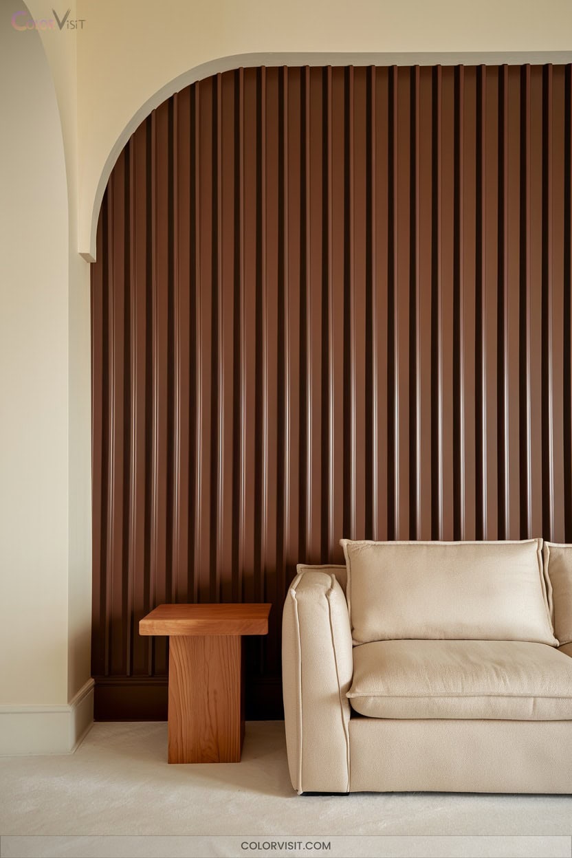
Lean into enveloping comfort by coating your walls in deep chocolate browns—a trend-forward choice that instantly elevates warmth and intimacy.
Harness the mood-enhancing embrace of Benjamin Moore’s Van Buren Brown or Farrow & Ball’s Salon Drab, both offering sophisticated depth.
To innovate, balance these rich hues with cream or beige accents, maximizing light reflectance and preventing visual heaviness.
Wooden furniture and earthy-toned rugs underscore the cozy aesthetic, while warm lighting amplifies the inviting mood.
For a curated, designer look, integrate muted browns in bedrooms or living spaces, pairing with tactile textiles and curated art for visual intrigue and modern comfort.
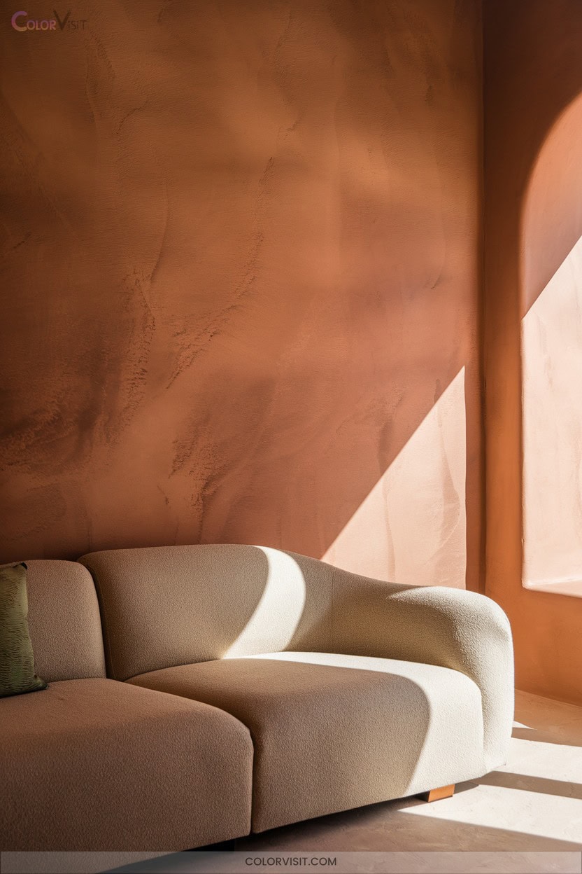
11. Infuse Autumnal Warmth With Spiced Cider
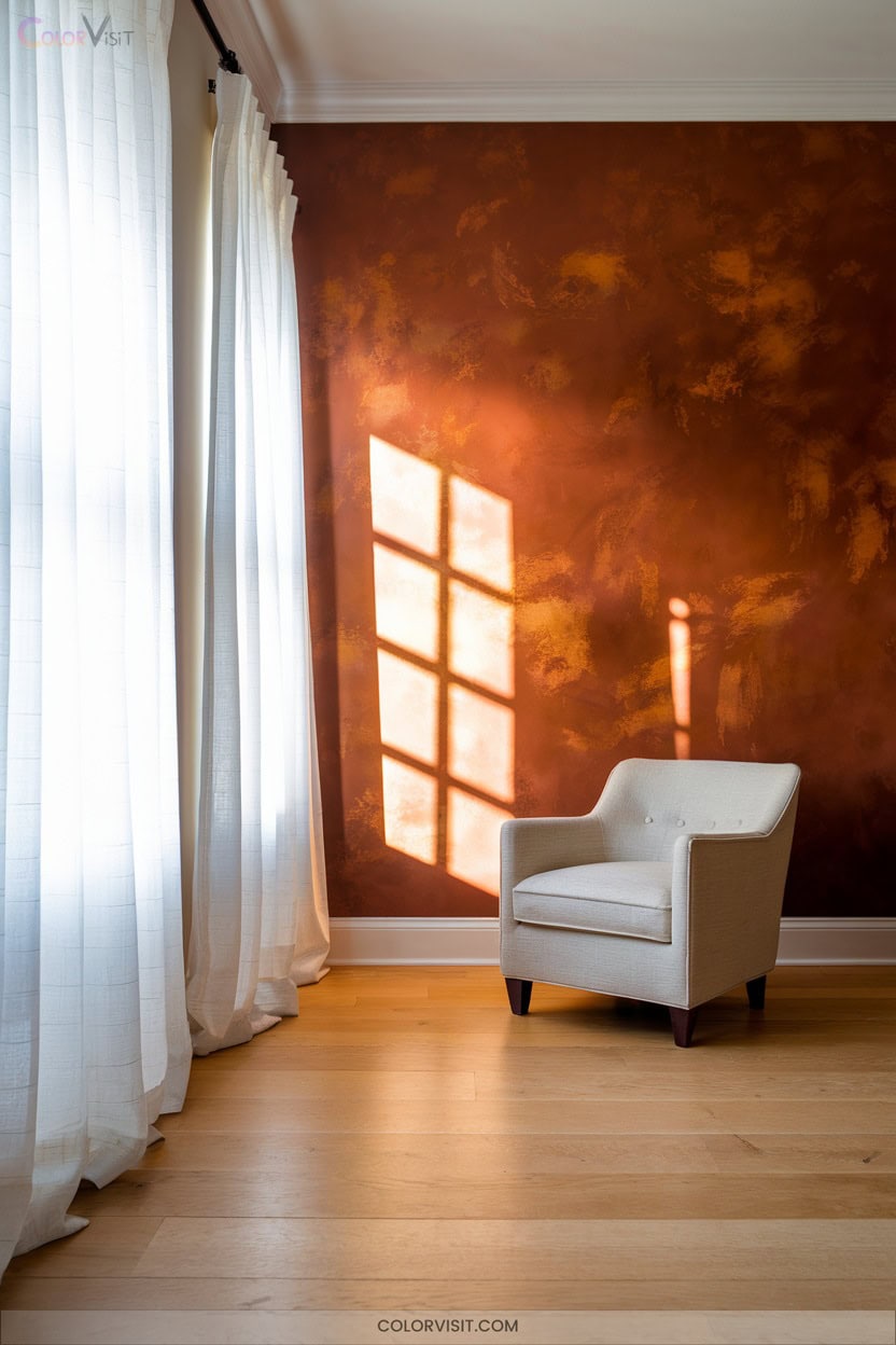
Energize your interiors with the radiant embrace of Spiced Cider—a warm, earthy hue that instantly channels autumnal sophistication.
This trending shade, with its blend of muted copper, spiced red, and deep orange undertones, transforms social spaces into vibrant havens.
For a truly innovative look:
- Paint an accent wall in your dining room, pairing with brass lighting for a luxe glow.
- Layer in jute rugs and rattan furniture to amplify organic texture.
- Contrast Spiced Cider walls with creamy trim or greige ceilings for modern balance.
- Use 2700K mood lighting to enhance the cozy, inviting ambiance year-round.
12. Channel Classic Elegance With Delft Blue
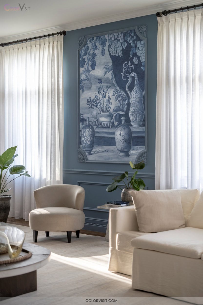
How does one evoke timeless sophistication while maintaining a calm, inviting ambiance?
Embrace Delft blue—a shade renowned for its slate gray and green undertones, delivering serene depth and subtle elegance.
This cool, tranquil hue transforms bedrooms and living spaces into refined sanctuaries.
For a modern twist, pair it with crisp white trim or layer it with cool neutrals.
In bathrooms, combine it with natural elements and white tiles for a spa-like retreat.
Delft blue’s versatility extends to kitchen cabinetry and dining areas, especially when contrasted with coral or yellow accessories, creating an innovative, balanced palette that feels both classic and fresh.
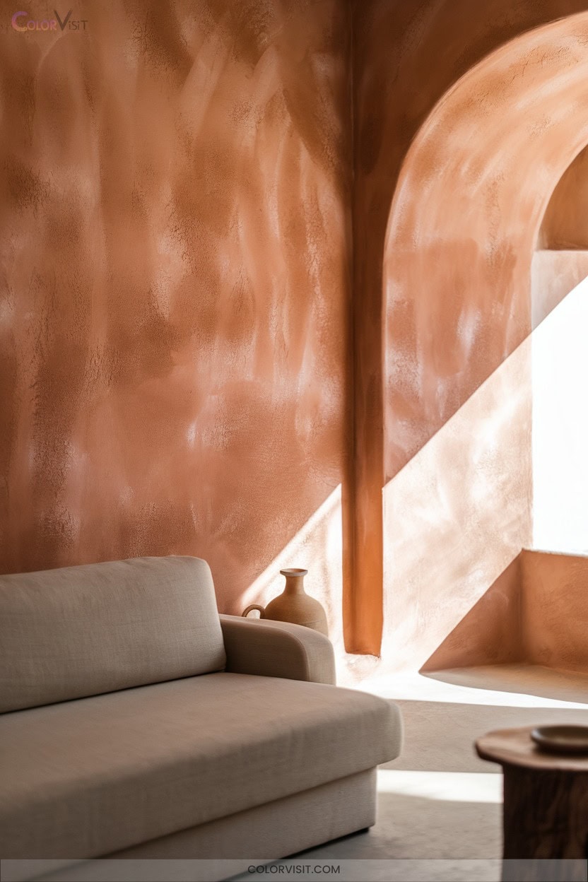
13. Capture Desert Vibes With Nomadic Desert
Sun-baked serenity defines spaces painted in Nomadic Desert (SW 6107), Sherwin-Williams’ inviting, orange-based mid-tone that channels the warmth and elegance of a golden desert sunset.
Activate a grounded, trend-forward ambiance by leveraging its earthy undertones and adaptable character.
Elevate your interior innovation by:
- Pairing with Extra White for crisp, modern contrast.
- Layering with Accessible Beige to amplify earth tone harmony.
- Introducing Tricorn Black accents for sophisticated depth.
- Integrating natural textures—think wood, clay, or woven details—to reinforce the desert aesthetic.
This versatile hue transforms bedrooms, halls, and living spaces into oases of contemporary comfort.
14. Bridge Style With Warm Grays
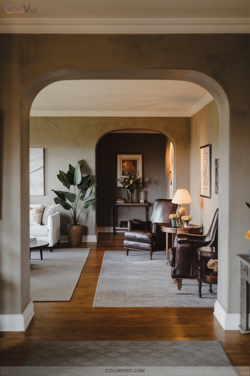
After embracing the earthy comfort of Nomadic Desert, set your sights on the sophisticated harmony of bridge style interiors anchored by warm grays.
This hybrid aesthetic unites clean architectural lines with inviting softness, leveraging warm gray’s nuanced brown or taupe undertones for a balanced, contemporary vibe.
Apply Hampshire Gray or Stonington Gray on primary walls to highlight structural features and play with light, while accenting with muted greens or subtle blues for dynamic contrast.
Pair matte finishes and natural wood elements to reinforce organic appeal.
Warm grays deliver versatility—effortlessly adapting to evolving trends and enabling striking, personalized spatial innovation.
15. Highlight Natural Textures for Earthy Charm
Imagine the impact when natural textures and earthy tones converge to create walls that exude organic charm and tactile depth.
You can innovate your space by integrating earthy palettes—think moss greens, mineral blues, and warm taupes—with tactile materials for a harmonious, nature-inspired look.
For maximum effect, consider:
- Pairing rattan, wicker, or cane with color palettes rooted in soil and stone.
- Painting walls with versatile whites to spotlight textural accents.
- Layering in sea grass rugs or wooden elements for multi-dimensional warmth.
- Introducing living plants and organic motifs to reinforce a dynamic, curated connection to the outdoors.
16. Enhance Depth Using Black Accents
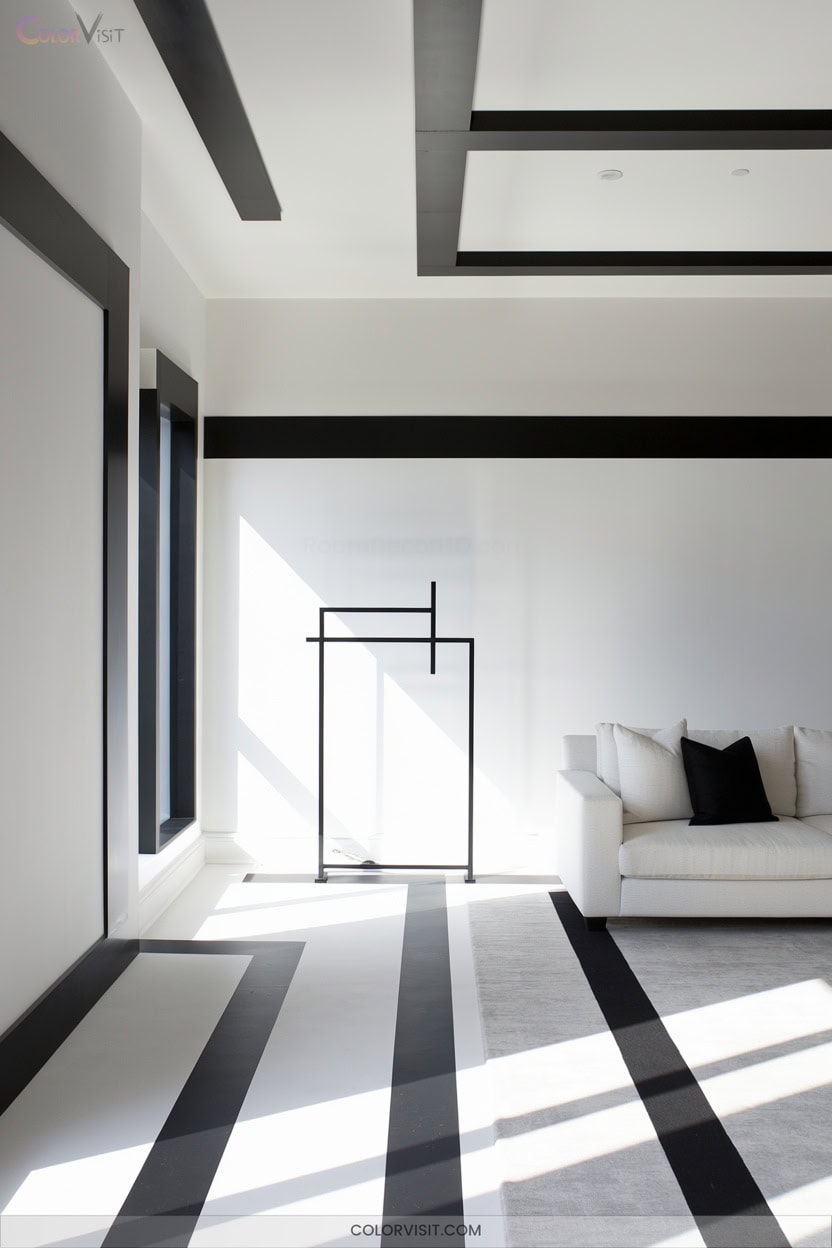
Why settle for flat, uninspired walls when strategic black accents can instantly elevate your home’s visual depth?
Integrate matte black on architectural features—think built-in bookshelves, wainscoting, or a statement fireplace—then offset the boldness with ivory or taupe for balance.
Layer in tactile richness by combining glossy finishes, velvet upholstery, and reclaimed wood.
Use minimalist lighting and mirrors to amplify and soften the drama of black, avoiding oppressive shadows.
Complete the look with metallic fixtures, vibrant artwork, or greenery for contemporary contrast.
This curated interplay of tone, texture, and light delivers a dynamic, trend-forward aesthetic that feels both luxurious and innovative.
17. Elevate Design With Dark Green Accents
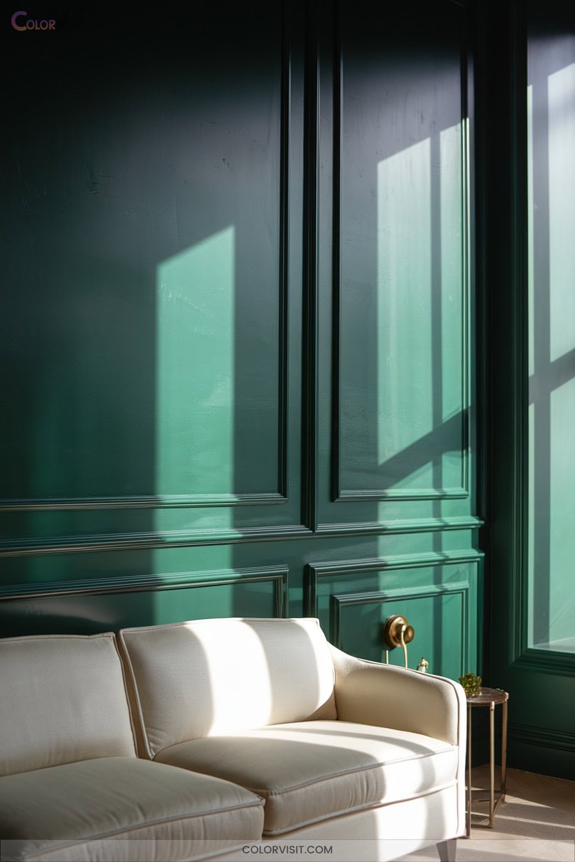
Channel sophistication and modernity by introducing dark green accents that instantly ground your space with organic depth.
This on-trend shade thrives in curated interiors, offering visual drama balanced by refined finishes and thoughtful pairings.
Elevate your design with these innovative strategies:
- Offset deep green walls with cream furnishings and brass hardware for luminous contrast.
- Anchor living zones using velvet or leather seating in jade or forest tones.
- Highlight architectural features with matte sheens, textured paneling, or biophilic touches.
- Illuminate moody spaces using warm pendants, mirrored surfaces, and layered LED lighting for dimensional brilliance.
Let green redefine your aesthetic.
18. Pair Versatile Neutrals for Effortless Style
A curated palette of versatile neutrals brings understated elegance and adaptability to any interior.
Harness the synergy of warm beiges and taupes with cool grays to craft a dynamic yet cohesive atmosphere. Choose Benjamin Moore’s Classic Gray or French Canvas for nuanced undertones that deliver organic sophistication.
Layer monochromatic neutrals—like Creamy Mushroom or Basswood—for seamless blends and increased textural depth. Integrate bold neutrals, such as rich taupe accent walls, to anchor your design.
Leverage ambient and accent lighting to amplify subtle contrasts and highlight architectural details. This approach guarantees your space remains innovative, inviting, and effortlessly adaptable to evolving trends.
Frequently Asked Questions
How Can I Choose the Right Finish for My Wall Paint?
When selecting a wall paint finish, assess your space’s lighting, traffic patterns, and desired maintenance ease. Opt for matte to mask flaws, or embrace satin and gloss for contemporary vibrancy, durability, and standout color retention in high-impact areas.
Are There Eco-Friendly Paint Options for Home Interiors?
Absolutely, you’ll find innovative eco-friendly paint options like zero-VOC formulas from ECOS Paints, Benjamin Moore, and Sherwin-Williams. These deliver high performance, vibrant color retention, and sustainability—perfect for trendsetters seeking healthier, visually stunning interior solutions.
How Do I Prevent Paint Colors From Fading Over Time?
To prevent paint colors from fading, you’ll choose premium fade-resistant paints with UV-stable pigments, embrace reflective finishes, prep surfaces meticulously, and leverage innovative UV-blocking window treatments. Prioritize routine gentle cleaning and strategic shading to maintain vibrant, lasting color impact.
What’S the Best Way to Test Paint Colors Before Committing?
To test paint colors innovatively, apply sample shades in large swatches or on movable boards, view them under varied lighting, and leverage augmented reality paint tools. Analyze undertones, texture interplay, and emerging color trends before finalizing your transformative choice.
How Often Should Interior Walls Be Repainted?
Think of repainting as revitalizing a canvas—most interior walls need it every 3-5 years, but high-traffic zones, moisture-prone spaces, and trend-driven updates may accelerate your timeline for a visually dynamic, on-trend home environment.
Conclusion
With these wall color ideas, you’ll transform your home into an absolute showstopper—a space so stylish, guests might never want to leave. Imagine cedar-inspired serenity, drama-laden jewel tones, and avant-garde neutrals, all colliding in a visual masterpiece.
Don’t settle for bland walls; your interiors deserve the sophistication and wow-factor found in designer showrooms. So grab that paint swatch, embrace bold trends, and watch your space become the envy of every Pinterest board on the planet.