20 Cohesive Instagram Theme Ideas Color Schemes to Grow Your Following
Boost your Instagram growth by curating a standout feed with cohesive color schemes like monochromatic pastels, harmonious triads, bold complementary pairs, or earthy nature-inspired palettes. You’ll build instant brand recognition, attract consistent engagement, and ride top design trends—from minimalist neutrals and black-and-white classics to playful, vintage-inspired pops.
Experiment with gradients, texture, and grid previews to guarantee every post aligns visually and emotionally. Stick around to discover fresh palette ideas and practical tips to sharpen your strategy even more.

1. Monochromatic Magic
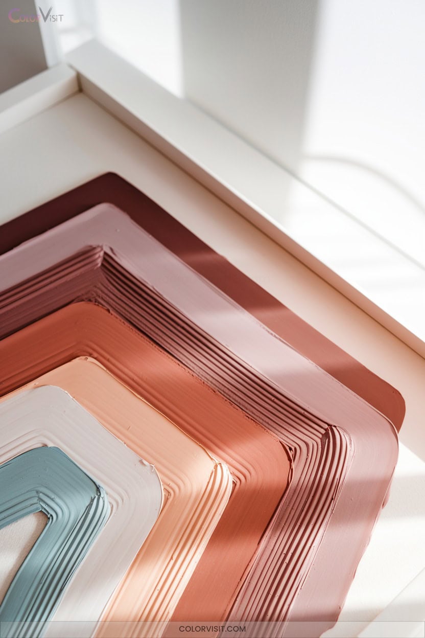
Monochromatic magic transforms your Instagram feed into a cohesive visual story, using tints, tones, and shades of a single base color to create instant brand recognition and professional polish.
A monochromatic palette weaves your Instagram posts into a seamless, branded narrative that captures attention and elevates your visual identity.
You’ll command attention by leveraging texture—think matte vs. glossy finishes—and layering opacity for subtle contrast.
Play with typographic weight and negative space to guide the eye and prevent monotony.
Incorporate gradients and repeated patterns for modern rhythm.
Neutral palettes evoke minimalism, while signature accent shades add luxury.
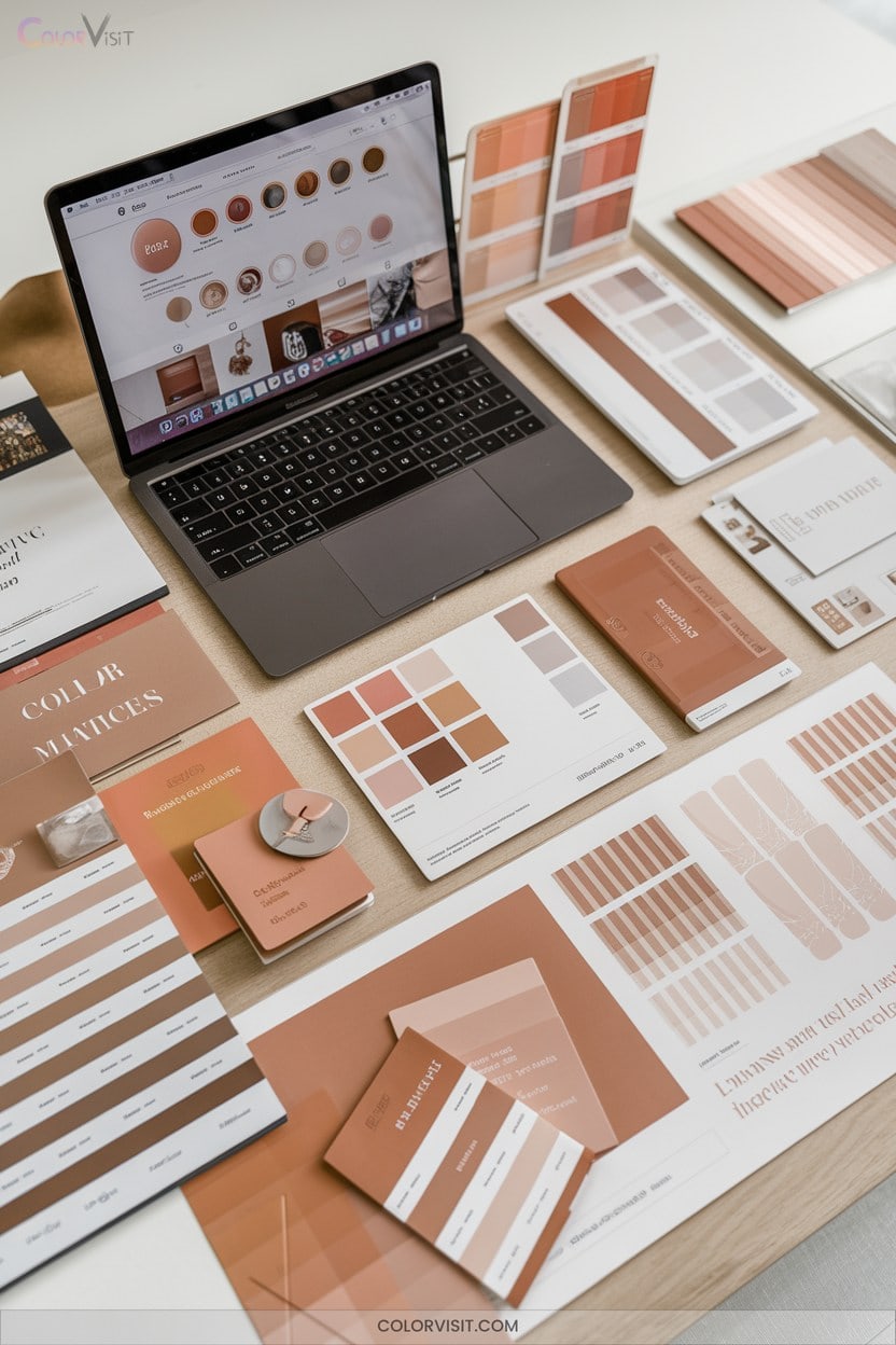
Use tools like Canva and the Adobe Color Wheel for effortless consistency.
Analytics prove: monochromatic feeds boost viewer retention, trust, and algorithmic reach.
2. Analogous Harmony

A carefully curated analogous color scheme instantly elevates your Instagram feed with visual unity and natural flow.
By selecting three or more colors adjacent on the color wheel—think blue, blue-green, and blue-violet—you echo harmony seen in nature and influential design.
Use one shade as dominant, letting others accent for balance.
This approach provides smooth shifts between posts, creating a consistent, on-trend aesthetic that’s proven to boost brand recognition and audience engagement.
Infuse black, white, or gray for contrast without losing cohesion.
For innovative creators, analogous harmony is a strategic move—visually soothing, emotionally resonant, and essential for modern Instagram growth.
3. Complementary Contrast
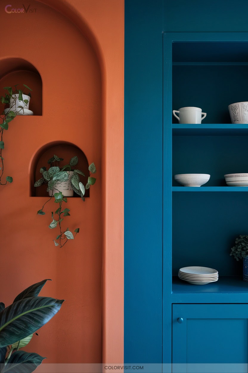
While analogous harmony delivers a seamless, soothing feed, complementary contrast takes your Instagram presence in a bold new direction.
By pairing colors opposite each other on the color wheel—like blue and orange or red and green—you instantly command attention and inject energy into your brand.
This approach isn’t just visually dynamic; it signals innovation and sets you apart in a saturated market.
Use complementary contrast to highlight key messages, amplify your brand identity, and drive engagement.
- Stand out with striking, high-impact visuals.
- Boost brand recognition through consistent color pairing.
- Engage followers by spotlighting important content with bold contrasts.
4. Earthy Nature-Inspired Tones
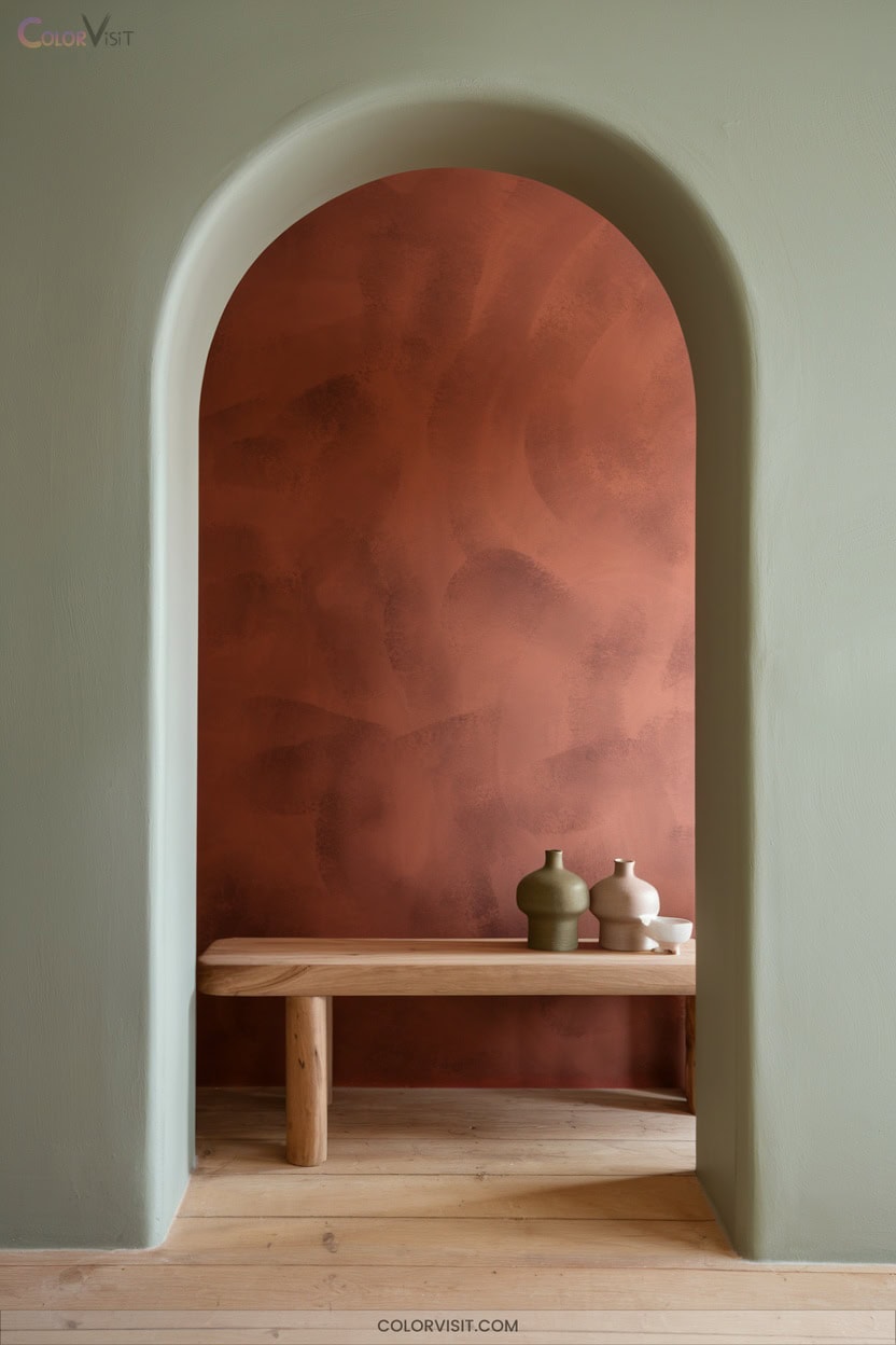
Think sun-baked clay, lush moss, and golden sand—earthy nature-inspired tones bring an organic, calming aesthetic to your Instagram feed that instantly sets a grounded, authentic mood.
These hues, rooted in nature, offer both vibrant and muted options, letting you tailor your palette for maximum impact.
Pairing greens and browns with unexpected pastels or brights sparks visual interest without sacrificing harmony.
Earthy tones resonate emotionally, suggesting warmth and sustainability—key traits for brands seeking deeper audience connections.
Consistently using these tones boosts engagement, creates thematic coherence, and positions your content as trend-forward, innovative, and aligned with the growing demand for authenticity.
5. Minimalist Neutral Backgrounds

Shifting from earth-inspired tones to a more pared-back approach, minimalist neutral backgrounds command attention through their refined simplicity.
By embracing monochromatic schemes and leveraging empty space, you create an Instagram feed that’s visually striking yet never overwhelming.
Neutral palettes make your content pop, while subtle textures and soft gradients add innovative depth.
- Use clean typography and minimalist icons for a polished, modern look.
- Source neutral backgrounds from platforms like Canva or Rawpixel for quick customization.
- Incorporate softly filtered photography to maintain cohesion and sophistication.
This trend-forward approach elevates your brand’s perception, focusing followers’ attention where it matters most.
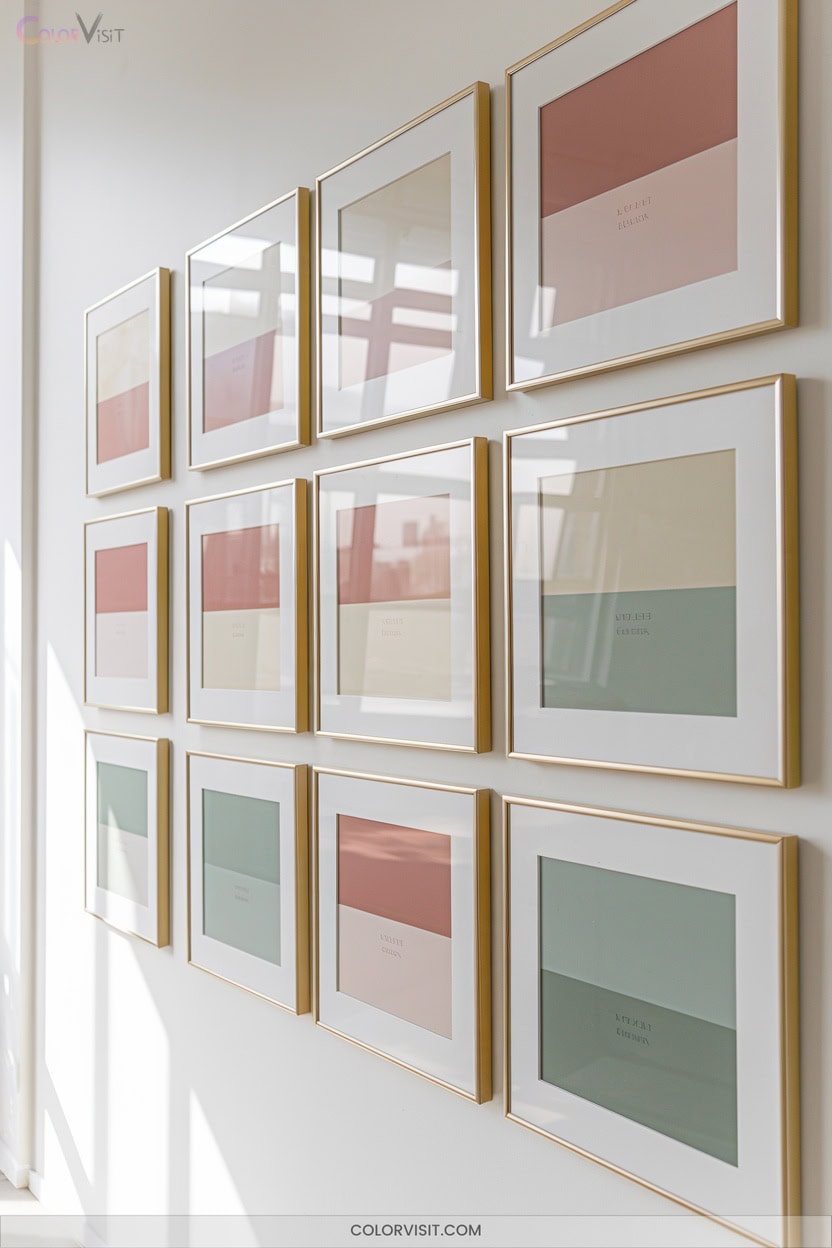
6. Branded Color Consistency
A cohesive color palette isn’t just an aesthetic choice—it’s a strategic tool that shapes how your brand is recognized and remembered on Instagram.
By anchoring your feed with a signature color scheme, you boost brand recognition, build trust, and differentiate yourself in a crowded space.
Consistent use of brand colors—through primary hues, custom backdrops, and curated props—creates visual cohesion and strengthens identity.
Lean on design tools and clear color guidelines to streamline this process, ensuring every post aligns with your vision.
Adapt seasonally or by campaign, but maintain underlying consistency.
This innovation-focused approach keeps your brand memorable and engaging.
7. Emotional Color Storytelling
Emotion drives connection—and on Instagram, color is your most powerful tool for shaping that emotional narrative.
Leverage color psychology to spark deep resonance: warm reds ignite passion, tranquil blues evoke trust, and vibrant greens signal growth.
Warm reds spark passion, tranquil blues build trust, and vibrant greens inspire growth—color shapes the emotional pulse of your Instagram feed.
By weaving intentional color choices into your feed, you’ll craft a visual story that’s instantly relatable and memorable.
Stay ahead of trends by considering cultural contexts and evolving audience expectations.
Analyze your palette for emotional impact, and let each hue serve your strategy.
- Use color to trigger emotional responses and guide engagement
- Align stories with color associations and brand identity
- Experiment with creative color grading for mood enhancement
8. High-Contrast Visuals

Ever wondered why some Instagram feeds immediately capture your attention? High-contrast visuals are the secret weapon.
By pairing bold, vibrant hues with muted backgrounds, you instantly boost readability and isolate your subject, creating a feed that pops.
Use color wheels to select opposites, leverage filters like Ludwig or Inkwell for dramatic effects, and adjust highlights for extra impact. Play with shadows and contrasting textures for depth and intrigue.
Consistency is key—stick to a brand palette while staying adaptable.
With high-contrast themes, your content becomes more recognizable, evokes emotion, and drives engagement, setting your Instagram apart in today’s dynamic visual landscape.
9. Seasonal Color Transitions
While Instagram trends shift with the seasons, mastering seasonal color changes keeps your feed visually cohesive and relevant year-round.
Seasonal color mastery transforms your Instagram feed into a visually cohesive, year-round showcase that evolves with every trend.
Use bridging palettes that blend warm autumn tones into cool winter hues for seamless continuity.
Neutral anchoring—drawing from 16-season color systems—bridges abrupt changes, ensuring your grid never feels jarring.
Employ gradient storytelling in reels to visually narrate the season’s evolution.
- Integrate color-filter challenges to educate followers on seasonal appropriateness.
- Schedule shifts 2-3 weeks before official seasonal changes to maximize engagement.
- Anchor your feed with 2-3 signature bridging hues across all formats for algorithm-optimized consistency.
Innovate, captivate, and retain.
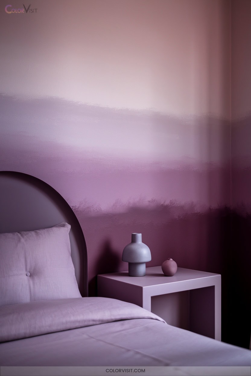
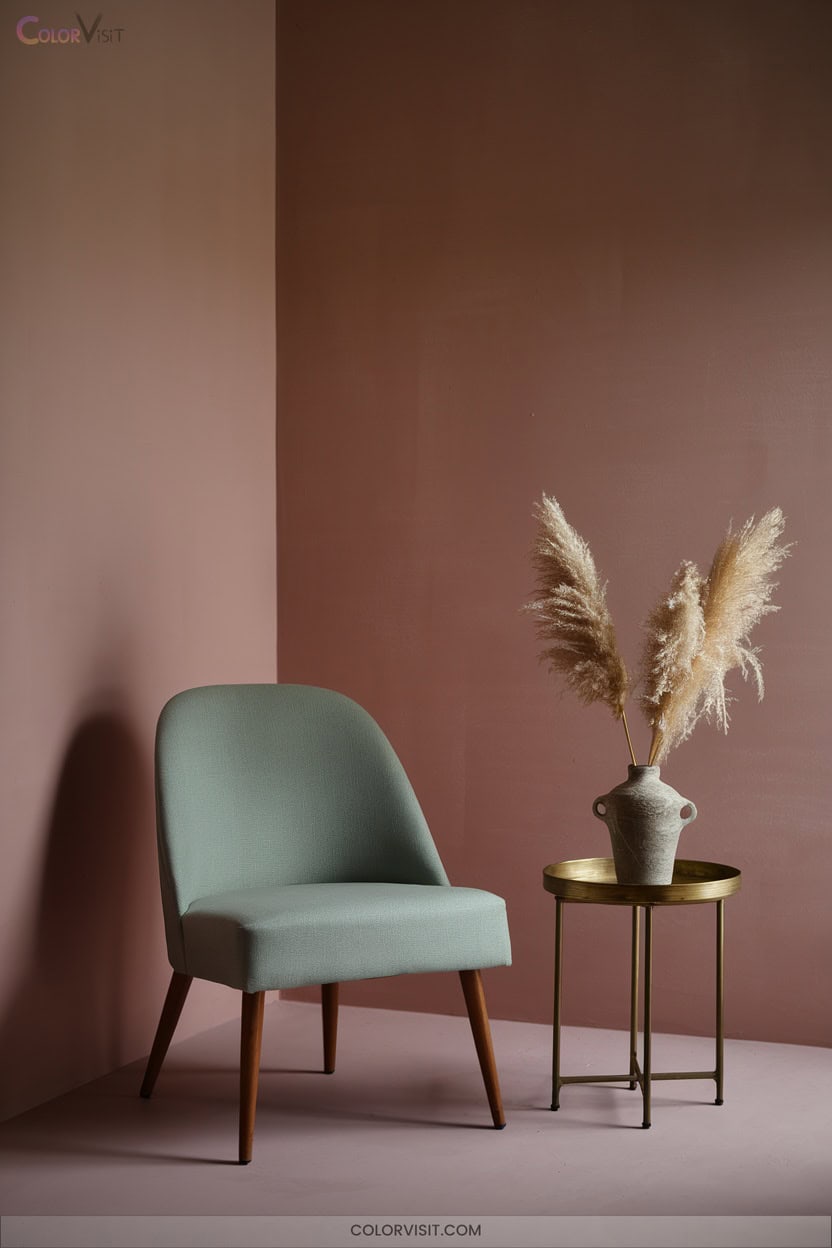
10. Dreamy Pastel Palette
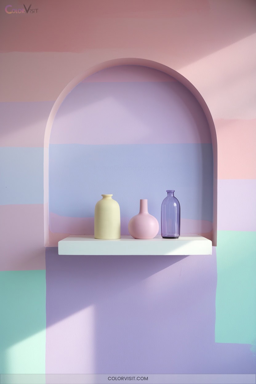
A dreamy pastel palette instantly elevates your Instagram grid, signaling both modern sophistication and an inviting softness that resonates with today’s aesthetic-driven audiences.
Leverage consistent gradients—lavender, mint, blush pink—to unify your feed, while matte overlays and soft lighting amplify the ethereal mood.
Use analogous color schemes for harmony, but anchor your brand with dominant pastels and strategic accents in ivory or dove gray.
Minimalist compositions with negative space keep your content fresh, and tonal accent posts inject movement.
Employ carousel posts to showcase color shifts, and tap into pastel-focused hashtags to expand your reach and attract niche, loyal followers.
11. Flat Design Color Blocks
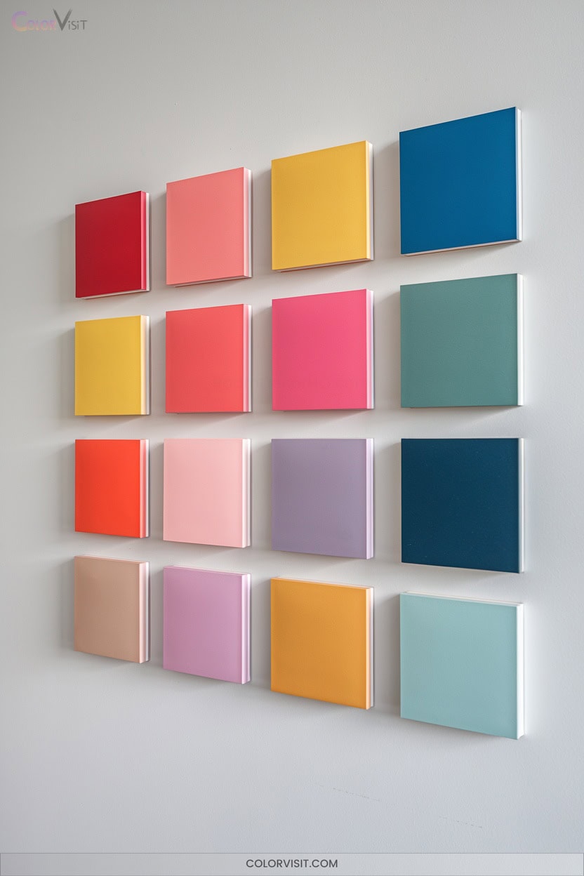
If you’re looking to move beyond the softness of pastels, flat design color blocks offer a bold, graphic alternative that instantly modernizes your Instagram feed.
By leveraging harmonious color palettes—typically three to five hues—you achieve visual contrast and organizational clarity.
This method elevates your brand identity and enhances engagement through strategic color storytelling.
Elevate your brand and captivate your audience by using color to tell a memorable, visually compelling story.
- Select harmonious or contrasting colors for high-impact visuals.
- Apply the 60-30-10 rule to balance main, secondary, and accent shades.
- Guide your audience’s attention with distinct, color-blocked sections.
Embrace color blocks to express creativity, boost professionalism, and attract innovation-driven followers who appreciate modern aesthetics.
12. Textured Color Layers
Textured color layers transform your Instagram feed into a tactile visual experience, merging organic materials and digital techniques for striking artistic depth.
By integrating elements like craquelé, sand, or coffee grounds, you spark visual intrigue and create narrative cohesion.
Rely on neutral bases—think browns or beiges—to anchor your palette, letting vibrant accents and selective pops of color command attention.
Repeat two or three signature textures throughout your posts to maintain a recognizable brand identity.
Show off your process with behind-the-scenes content and macro shots, cultivating authenticity.
This analog-digital hybrid approach sets your feed apart in a saturated, trend-driven landscape.
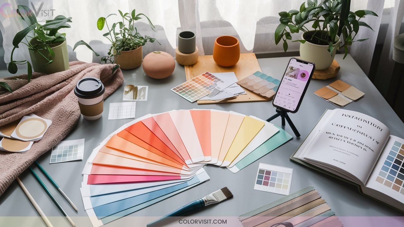
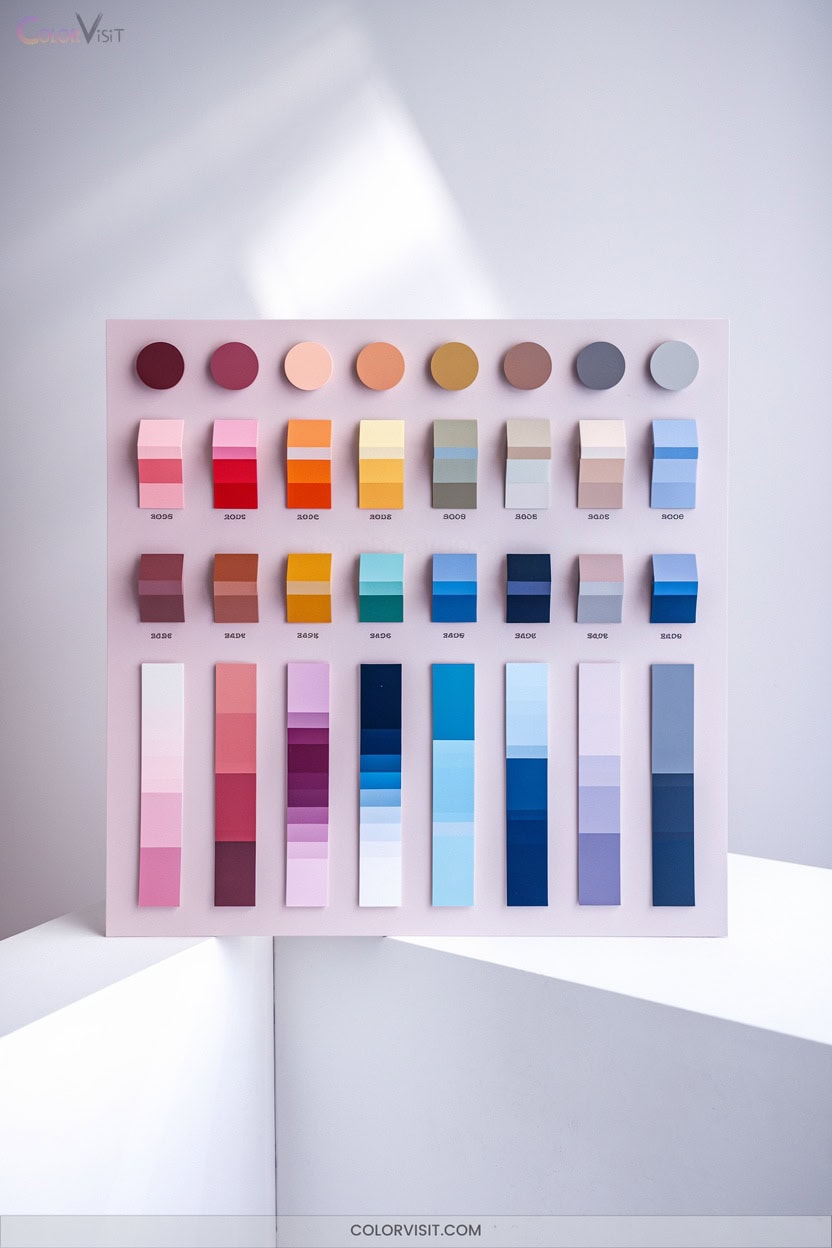
13. Photo-Based Palette Generation
Harnessing the hues from your own photos instantly elevates your Instagram feed, ensuring a palette that’s both authentic and visually unified.
By leveraging tools like Canva, Pantone Studio, and Coolors, you generate color schemes rooted in your unique imagery—sidestepping randomness for intentional design.
Use Canva, Pantone Studio, or Coolors to craft color schemes from your own photos, bringing intentional, personalized design to your feed.
Analyze dominant tones, integrate color theory, and adjust for emotion or contrast.
Streamline your workflow by extracting palettes from your most-used photo styles, then save and sync them with editing presets for consistency.
- Limit palettes to 3–5 dominant colors for clarity.
- Preview palettes in grid layouts before posting.
- Audit past posts to spot organic patterns.
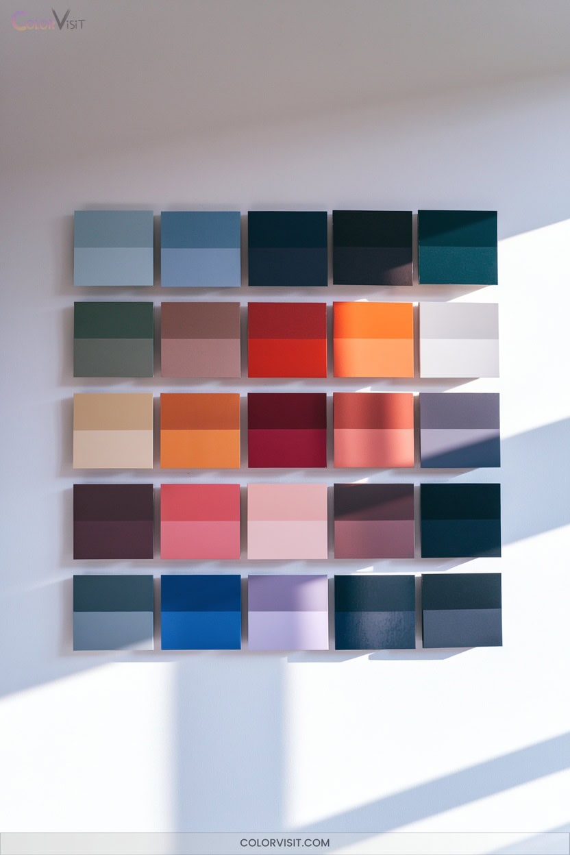
14. Trend-Driven Color Schemes
While crafting a palette from your photos creates authenticity, aligning your Instagram feed with trend-driven color schemes instantly signals that you’re ahead of the curve.
2025’s hottest hues—like cherry red, soft pastel yellow, and edgy lilac—aren’t just fleeting fads; they’re visual cues that tap into broader cultural movements and digital aesthetics.
Integrating tangy pickled green or cozy neutrals reflects innovation drawn from fashion, interiors, and technology.
When you use these colors consistently, you not only boost engagement but also reinforce your brand’s relevance.
Stay agile—experiment with seasonal updates and mix fresh greens or candy pastels to keep your feed dynamic and current.
15. Influencer-Inspired Feeds
Ever wonder why some Instagram feeds immediately capture your attention and feel unmistakably on-trend?
Influencer-inspired feeds harness deliberate design choices, unifying content for maximum impact.
You can emulate their strategy by focusing on aesthetic discipline and visual storytelling. Analyze these approaches:
- Minimalist feeds use white space, clean lines, and a limited palette—perfect for elegance and calm.
- Vintage feeds apply muted filters and nostalgic imagery, weaving a narrative that’s both emotional and timeless.
- Checkerboard feeds alternate contrasting posts, creating a striking, organized grid that’s instantly recognizable.
Choose a style that matches your message and watch engagement soar.
16. Sunset Gradient Themes
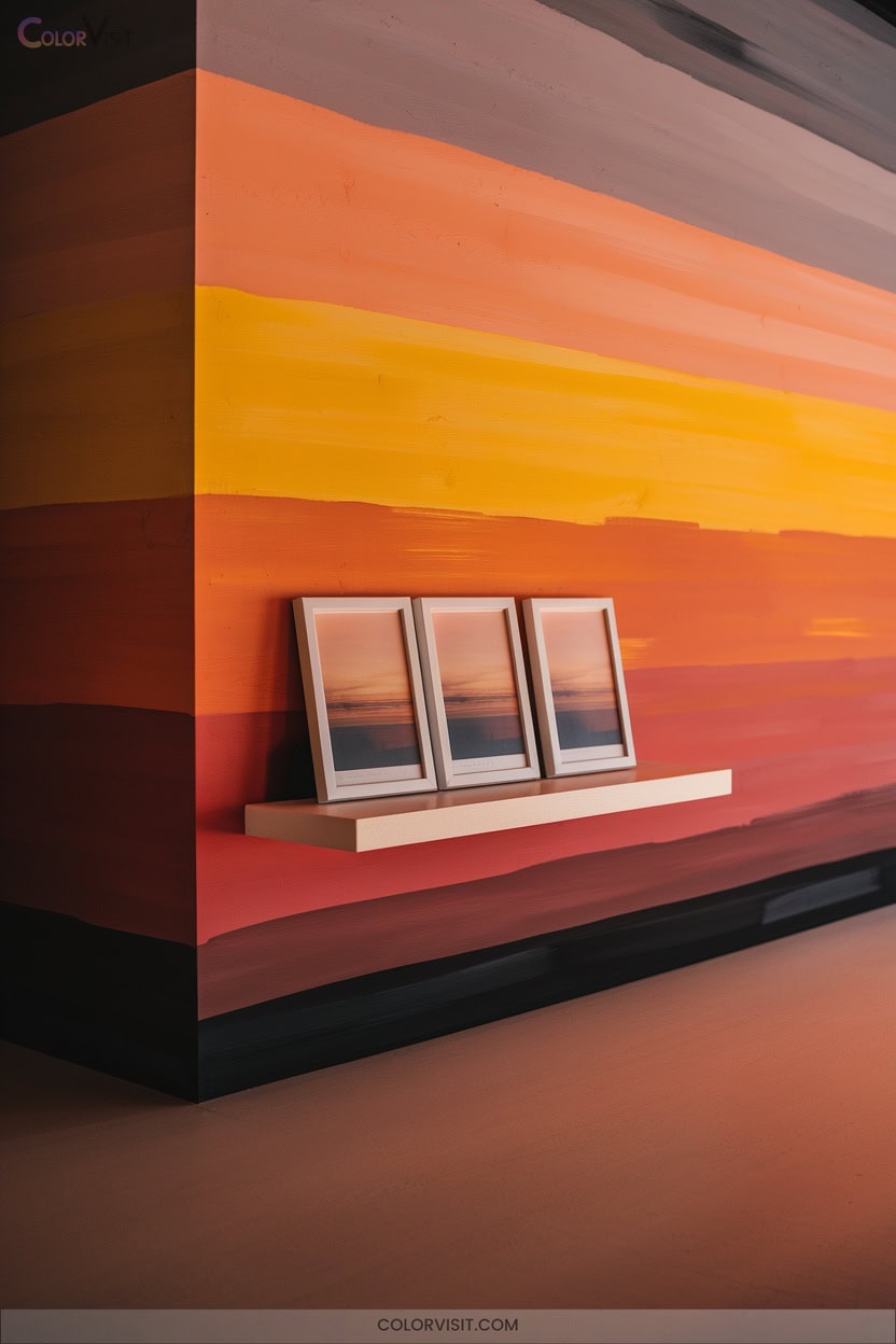
A sunset gradient theme instantly elevates your Instagram feed with a vibrant, on-trend aesthetic that’s both eye-catching and memorable.
A sunset gradient theme brings vibrant, on-trend energy to your Instagram feed, making your profile instantly more eye-catching and memorable.
By blending warm oranges, pinks, and purples, you create a cohesive color palette that stands out in a saturated digital space.
Tools like Canva and Photoshop make it simple to customize templates, while platforms like Freepik and PosterMyWall provide ready-made inspiration.
Consistent use across posts, stories, and brand elements not only reinforces brand recognition but also attracts higher engagement.
Sunset gradients evoke warmth and tranquility, forging emotional connections that drive loyalty and set your profile apart from competitors in the visual landscape.
17. Playful Pop Color Accents

Why settle for a bland feed when playful pop color accents can instantly energize your Instagram presence?
By harnessing bold primaries against neutral backdrops, you create dynamic contrast that stands out in crowded feeds.
Saturated reds and yellows even boost engagement through dopamine-triggering visuals.
Keep your brand innovative and cohesive by intentionally rotating a limited palette across all content formats.
- Showcase flat lays with painted backdrops in your signature hues for consistency.
- Use graphic, Warhol-inspired motifs for post-to-post variation without losing cohesion.
- Integrate vibrant accessories or accent chairs to anchor compositions and spark visual intrigue.
Stay trend-aware—color is your strategic edge.
18. Muted Vintage Tones
Nostalgia drives engagement, and muted vintage tones let you tap into that emotional resonance with precision.
By curating earthy browns, moss greens, and sky blues, you craft an aesthetic that feels both authentic and innovative. Balance these muted shades with richer hues for contrast that maintains visual intrigue.
Curate earthy browns, moss greens, and sky blues to shape an authentic, innovative aesthetic—balanced with richer hues for lasting visual intrigue.
Consistent filters, classic fonts, and retro-inspired textures set a mood that’s calm yet enchanting.
Incorporate vintage florals or subtle patterns from past decades to add depth.
Use these tones across your branding—logos, posts, and stories—to foster consistency, spark memories, and encourage community interaction.
This approach transforms followers into loyal brand advocates.
19. Black and White Classics
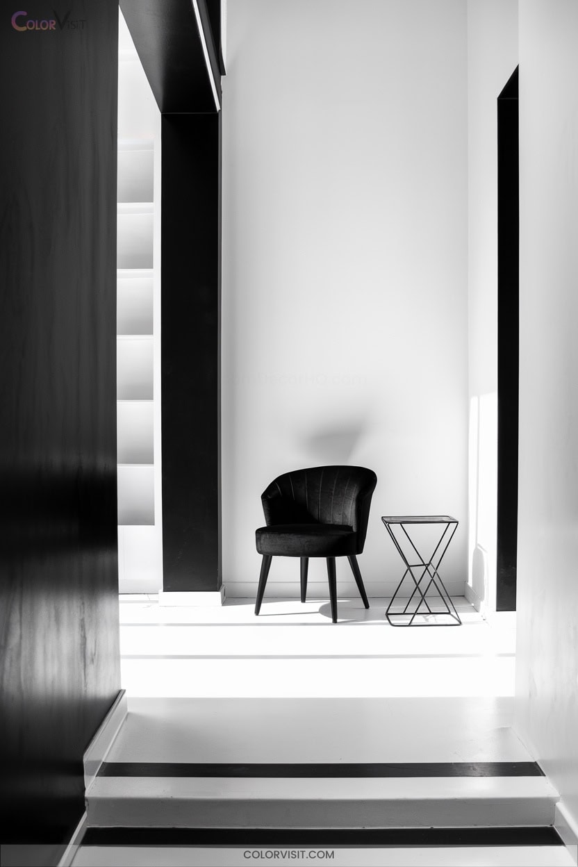
Timeless sophistication defines the black and white Instagram theme, instantly elevating your feed with a universally recognized aesthetic.
You’ll amplify detail and structure, especially in architecture, fashion, or portrait content—removing color distractions means your followers focus on composition and emotion.
By standardizing black-and-white presets or monochrome filters, you’ll guarantee grid consistency that appeals to design-savvy viewers.
- Use white or black borders to unify diverse visuals and establish brand distinction.
- Plan checkerboard patterns or row-based layouts for dynamic visual flow.
- Leverage VSCO, Snapseed, or Lightroom for advanced tonal control and textural emphasis.
This approach secures lasting relevance and audience growth.
20. Experimental Color Combos
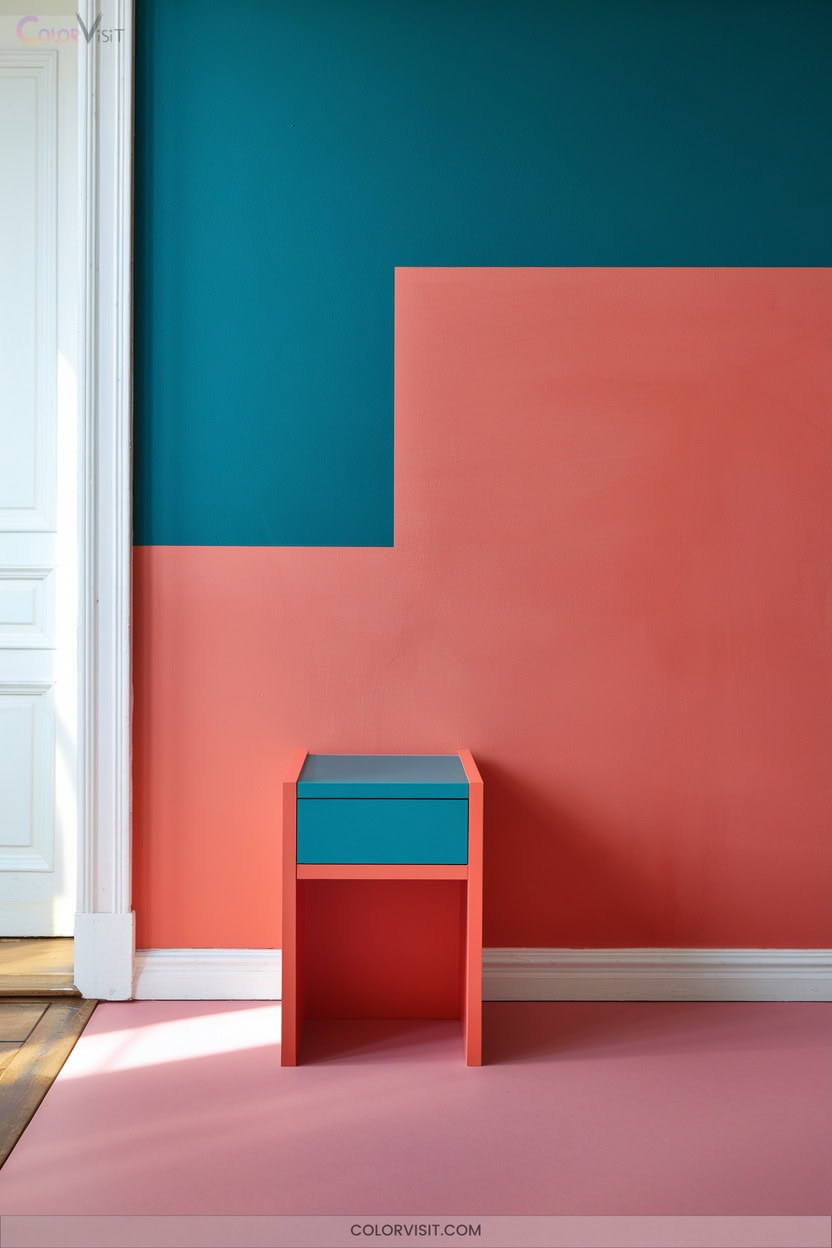
Curious how to make your Instagram feed stand out in a sea of sameness?
Experimental color combos are your ticket to instant visual impact.
Lean into triadic palettes—like teal, coral, and mustard—for bold, harmonious energy.
Prioritize one dominant hue, using accents to avoid chaos.
Unexpected duos, such as emerald green with burnt orange or sky blue with mustard yellow, break conventions and boost intrigue.
Test opacity adjustments to soften intensity for a minimalist edge.
Leverage seasonal or event-driven schemes—think turquoise and tangerine for summer, or neon fuchsia and eggplant for tech vibes—to keep your feed ahead of the curve.
Frequently Asked Questions
How Do I Choose Colors That Match My Brand Personality?
Start by defining your brand’s dominant personality trait, then research color psychology to identify hues that amplify that trait. Prioritize consistency and context, ensuring your chosen palette resonates emotionally and feels fresh, modern, and unmistakably authentic.
What Tools Help Preview Instagram Grid Color Layouts Before Posting?
If you want to stay ahead of the curve, use tools like Hopper HQ, Pallyy, or Preview App. They let you preview, rearrange, and perfect your Instagram grid’s color layout—ensuring your feed looks polished and on-trend.
How Often Should I Update My Instagram Color Palette?
You should refresh your Instagram color palette every 3–4 months to stay ahead of trends and audience tastes. Gradually introduce new hues, analyze engagement metrics, and experiment with mini-palettes to keep your feed innovative yet cohesive.
Can I Use Different Palettes for Instagram Stories and Main Feed?
You can absolutely dance between palettes for Stories and your feed—it’s a modern spin that sparks interest and shows flexibility. Just make sure the shades whisper to each other, maintaining a rhythm that feels intentional and on-trend.
How Do I Measure if a New Color Scheme Increases Engagement?
You measure a new color scheme’s impact by tracking likes, comments, shares, click-through rates, and follower growth. Don’t forget to analyze sentiment and brand mentions. Let data guide you—adapt quickly to stay ahead of engagement trends.
Conclusion
Ready to dial up your Insta game to 88 MPH? With these trend-focused color schemes, you’re not just snapping photos—you’re curating an experience that keeps followers hooked.
Analyze what resonates with your audience, experiment boldly, and let your feed tell a cohesive story. In the fast-moving world of Instagram, a striking theme is your flux capacitor to growth. Don’t just follow trends—set them, and watch your digital presence surge into the future.