25 Stunning Living Room Wall Color Ideas for a Stylish Makeover
Transform your living room with wall colors that define modern style—think Dover White for effortless brightness, greige for on-trend versatility, and off-white for timeless harmony. Play up drama with raccoon fur gray, champion cobalt, and burgundy, or introduce moody blue-grays with forged steel accents for depth.
Soften the mood using serene sage or deep browns, or go bold with black-and-white contrasts and accent wall strategies. Explore curated combinations that capture both sophistication and statement-making energy just ahead.

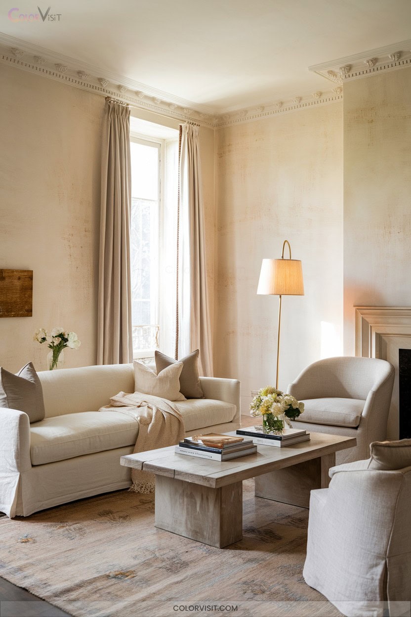
Dover White for Effortless Brightness
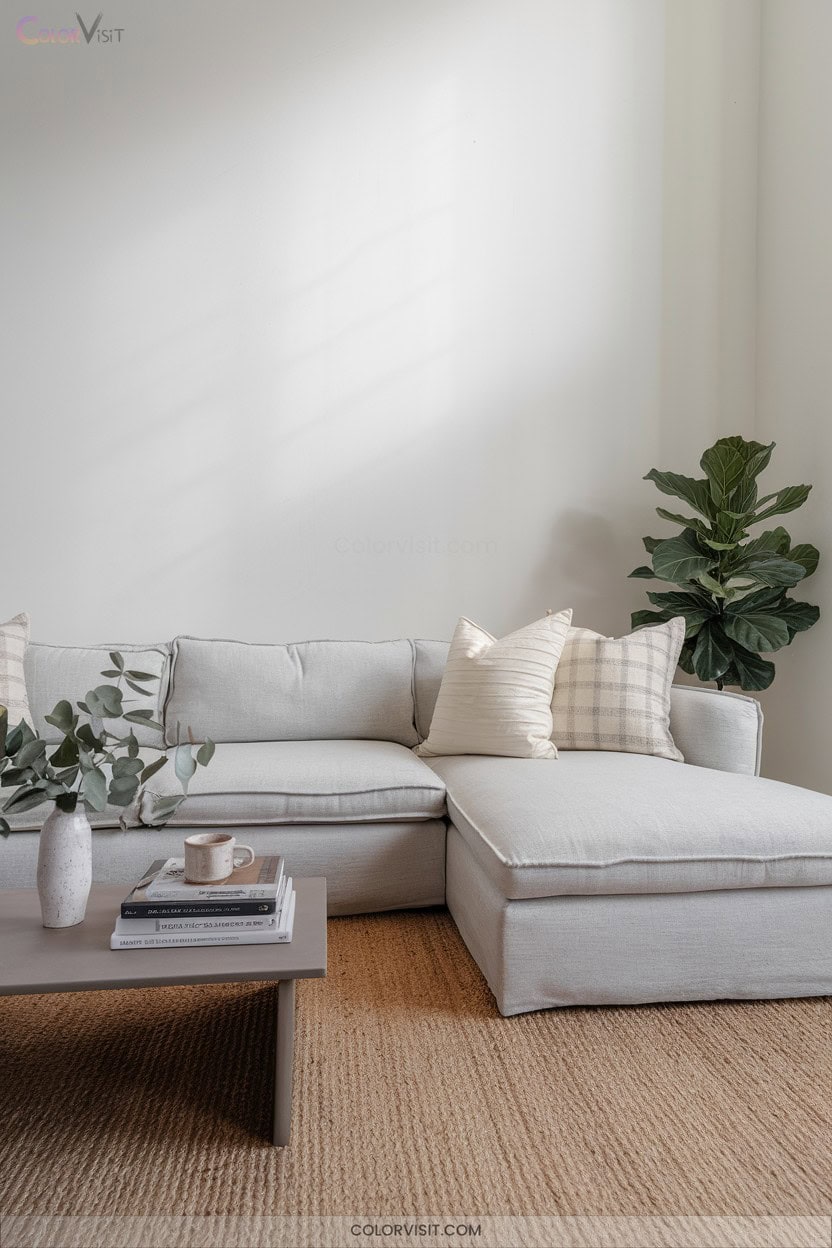
Dover White delivers a sophisticated, soft backdrop that expertly balances warmth and brightness—perfect for living rooms craving a welcoming yet refined atmosphere.
With an LRV of 83, this warm off-white channels subtle yellow and cream undertones, standing apart from stark or clinical whites.
It thrives in north-facing rooms, counteracting cool daylight, and complements organic textures—think linen, jute, and earthy wood tones.
Pair it with saturated accents or muted brass for visual depth.
In open-concept spaces or on cabinetry, Dover White provides a continuous, calming aesthetic.
Test under varying light; avoid competing warm neutrals to maintain its curated, innovative appeal.
Greige: The Versatile 2025 Neutral
Why does greige continue to dominate living room palettes in 2025?
This hybrid of grey and beige achieves a rare equilibrium—balancing warm and cool undertones to create a sophisticated, adaptable foundation.
You’ll notice designers gravitate toward iconic shades like Revere Pewter or Balboa Mist for their chameleon-like versatility.
Greige’s understated neutrality pairs seamlessly with oak trim, sleek furnishings, or organic textures, making it the ultimate backdrop for innovation.
Layer textiles, introduce bold art, or experiment with vibrant accents—greige sustains visual harmony.
It’s your launchpad for trend-driven updates, reflecting natural light and elevating any space with quiet confidence.
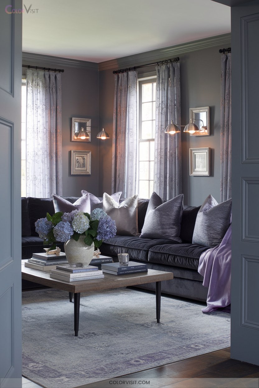
Dramatic Blackened-Gray With Raccoon Fur
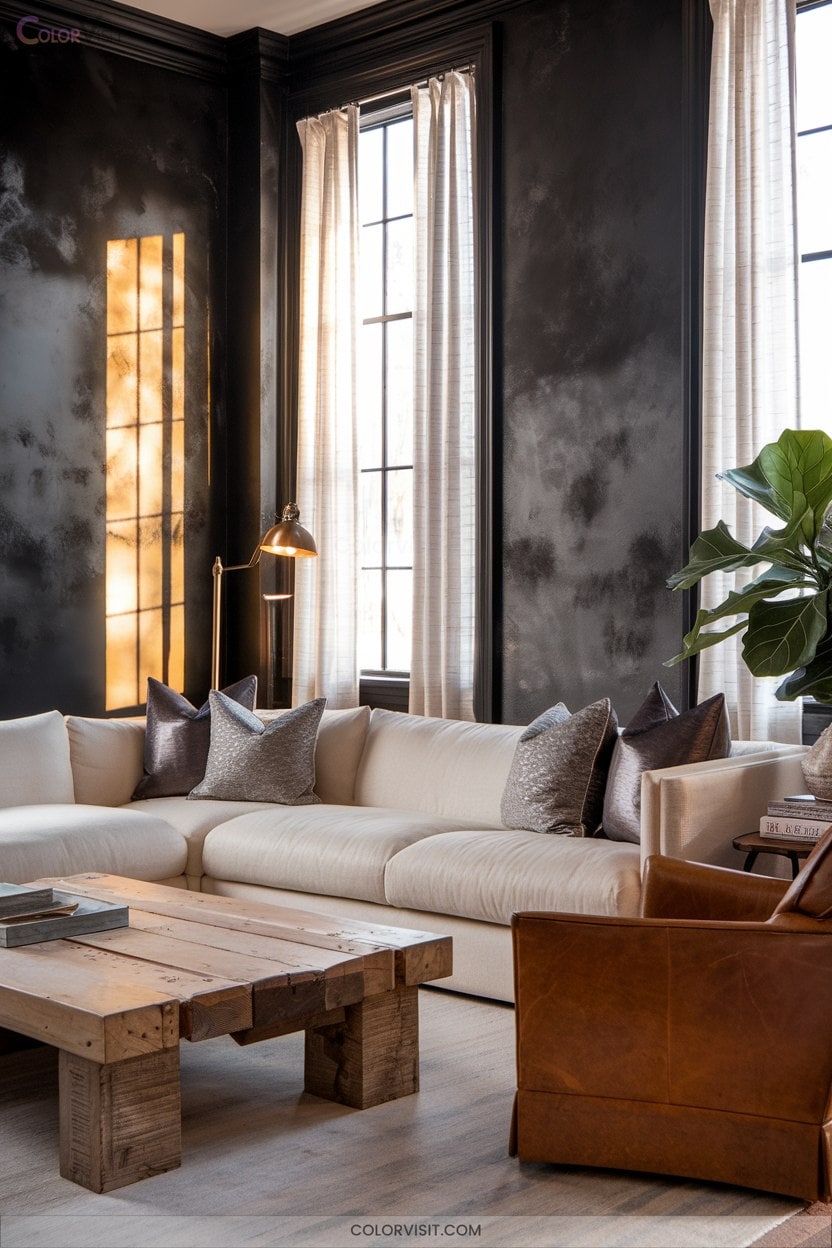
Midnight allure defines living rooms painted in Benjamin Moore’s Raccoon Fur 2126-20—a blackened-gray with subtle blue undertones that instantly commands attention.
With an LRV of 8.28, this hue delivers enveloping depth and a sophisticated, gallery-inspired backdrop.
Elevate your space with luxe contrast and architectural definition by leveraging its dramatic impact.
- Create a bold accent wall: Pair Raccoon Fur with crisp White Dove OC-17 for high-impact contrast.
- Enhance textures and finishes: Amplify wood, metal, or linen for tactile richness.
- Showcase art: Use as a moody canvas for vibrant artwork or metallic décor.
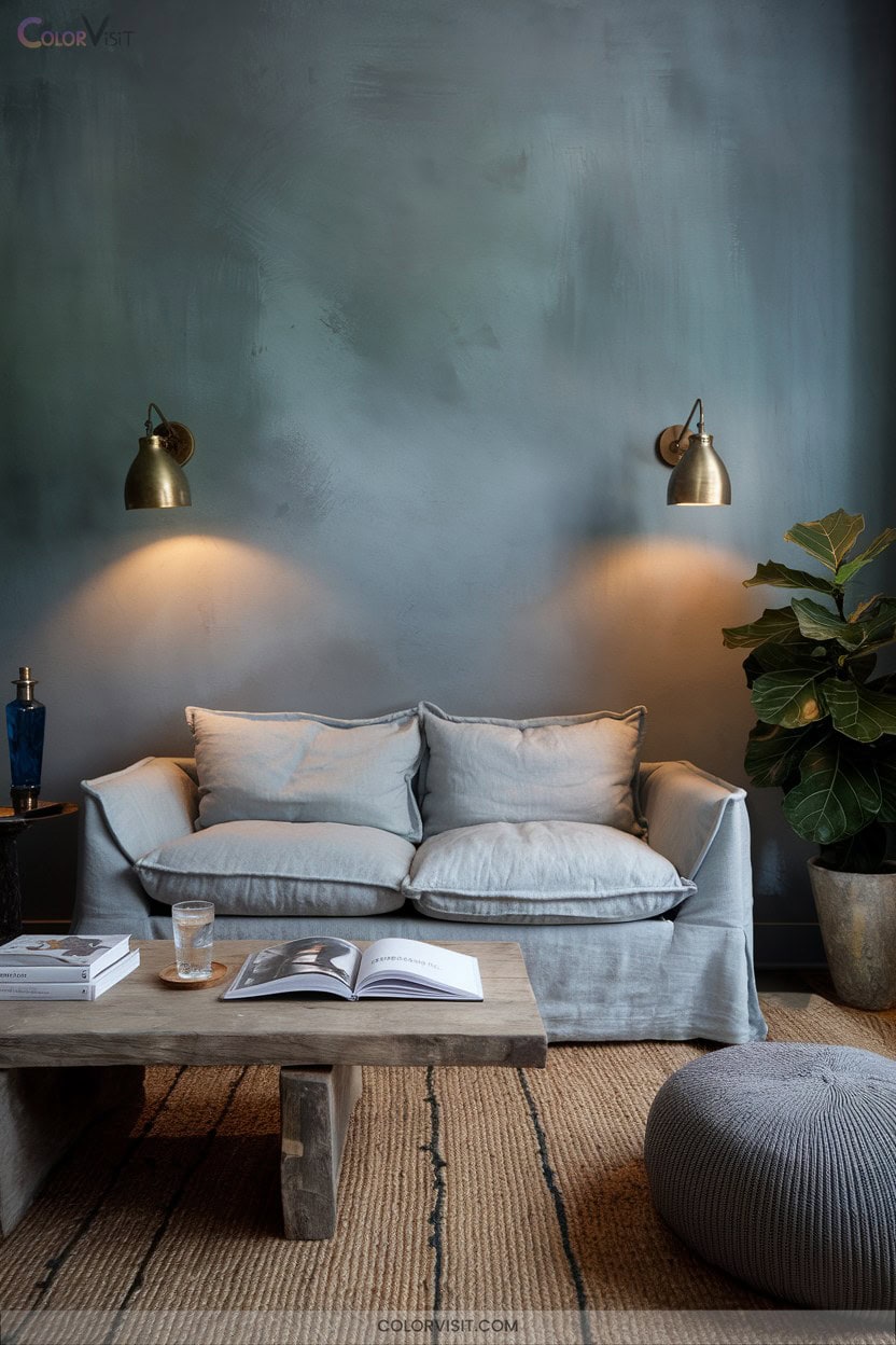
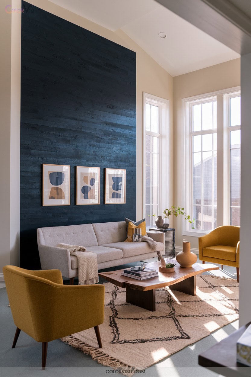
Moody Blue-Gray With Forged Steel
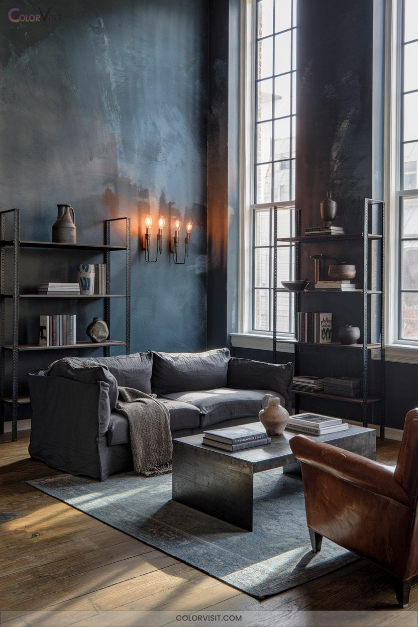
While blackened-grays like Raccoon Fur embrace drama and depth, moody blue-gray walls invite a sophisticated interplay of color, texture, and light.
Moody blue-gray walls create a refined backdrop, playing with light and texture for an atmosphere rich in sophistication and depth.
Choose Sherwin-Williams Moody Blue or Farrow & Ball De Nimes for nuanced undertones that shift with every hour.
Pair matte finishes with forged steel accents—think sculptural lighting or art frames—to inject an industrial edge.
Use creamy whites on trim for crisp contrast, while textured fabrics in taupe and oak elements add softness and warmth.
Stick to solid textiles, layering lighting to balance intensity.
Sample swatches in varied light; let forged steel transform moody blue-gray into cutting-edge style.
Off-White Tones for Timeless Appeal
A curated palette of off-white tones transforms a living room into a luminous, timeless retreat.
You’ll find that the versatility of high Light Reflectance Value (LRV) shades like Alabaster or Chantilly Lace delivers both sophistication and adaptability.
With subtle undertones, off-whites harmonize with evolving décor trends, elevating both modern and traditional spaces.
For a visually stunning effect, consider these innovative approaches:
- Pair off-white walls with crisp white trim for architectural clarity.
- Style dark wood furnishings to accentuate neutral nuances.
- Layer tactile textiles to add depth and warmth without overshadowing the serene palette.
Twilight Blue Paired With Velvet Textures
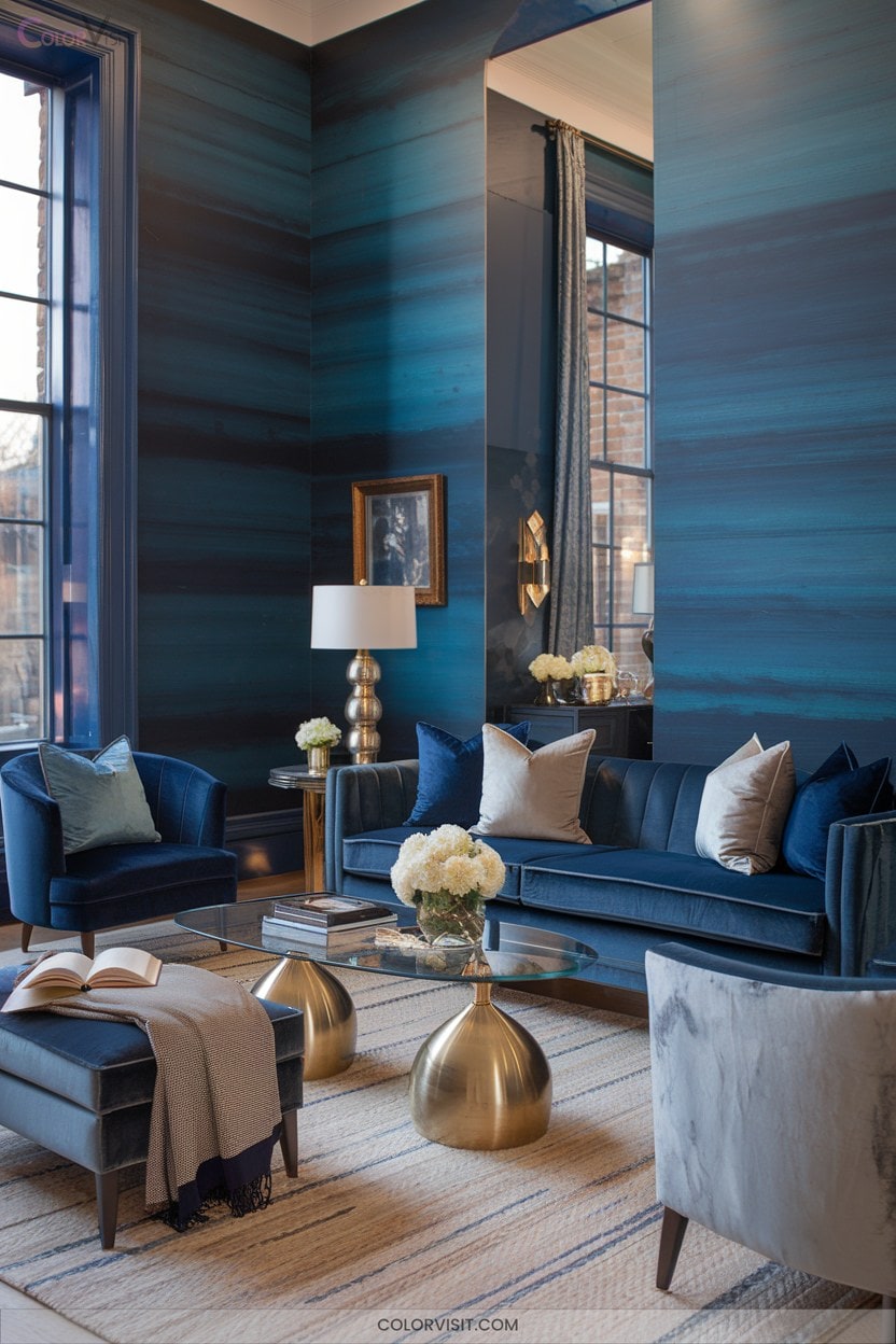
Twilight Blue injects an unmistakable sense of depth and sophistication into living room walls, especially when balanced with the tactile richness of velvet textures.
This midtone, periwinkle-infused hue, reminiscent of the evening sky, thrives as an accent wall—its LRV of 12.14 guarantees moody allure.
Pair it with velvet sofas or armchairs in soft neutrals like beige or cool gray to temper boldness, while metallic accents in gold or silver offer a luxe edge.
Layer with velvet throw pillows and blankets for chromatic intrigue.
Strategic, dimmable lighting will highlight both color and texture, achieving a romantic, contemporary ambiance effortlessly.
Champion Cobalt for Retro Flair

Shifting from the subtle romance of twilight blues, Champion Cobalt commands attention with its deep, saturated presence and unmistakable retro energy.
This Benjamin Moore hue (2061-20) delivers intense drama to your living room, especially when you pair it with mid-century silhouettes or vintage-inspired accents.
Champion Cobalt’s low LRV of 7.76 creates a moody, immersive backdrop—perfect for innovators seeking standout visual impact.
For a space that’s both nostalgic and current, focus on these essentials:
- Pair with metallic accents for sophisticated flair.
- Integrate natural wood for warmth.
- Use bold vintage décor to amplify retro vibes.
Bold Black Accents Against Crisp Whites
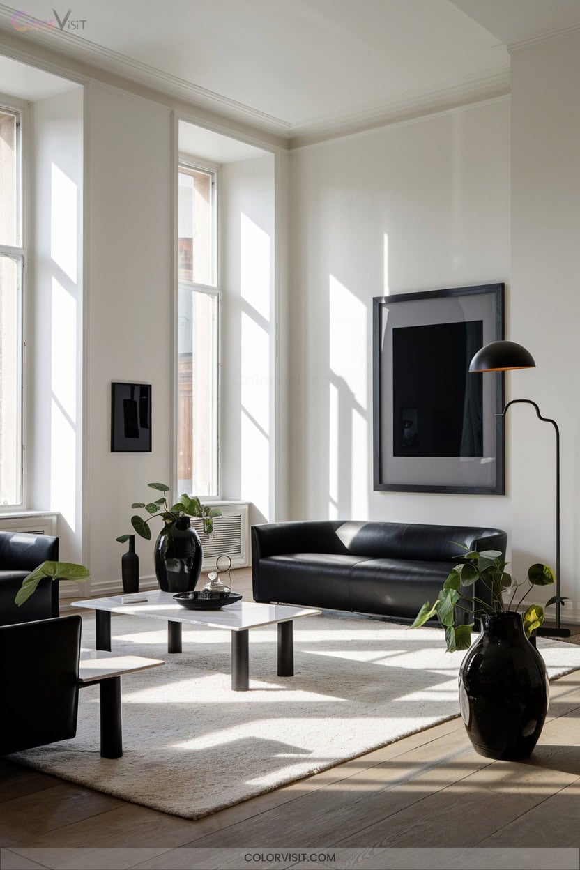
When you juxtapose bold black accents against crisp white walls, the result is a living room that channels modern sophistication and graphic impact.
This high-contrast palette leverages visual dynamism—black infuses warmth and drama, while white amplifies brightness and spatial perception.
To maintain equilibrium, layer lighting and integrate metallics for dimensionality and luminosity.
Employ clean-lined furnishings and rounded-edge textiles to soften the aesthetic, ensuring it feels inviting rather than clinical.
Curate black-framed photo galleries or striking monochrome art for focal points.
Add subtle neutrals or pops of color for balance.
This approach epitomizes cutting-edge, gallery-inspired living room design.
Burgundy Walls for Rich Sophistication
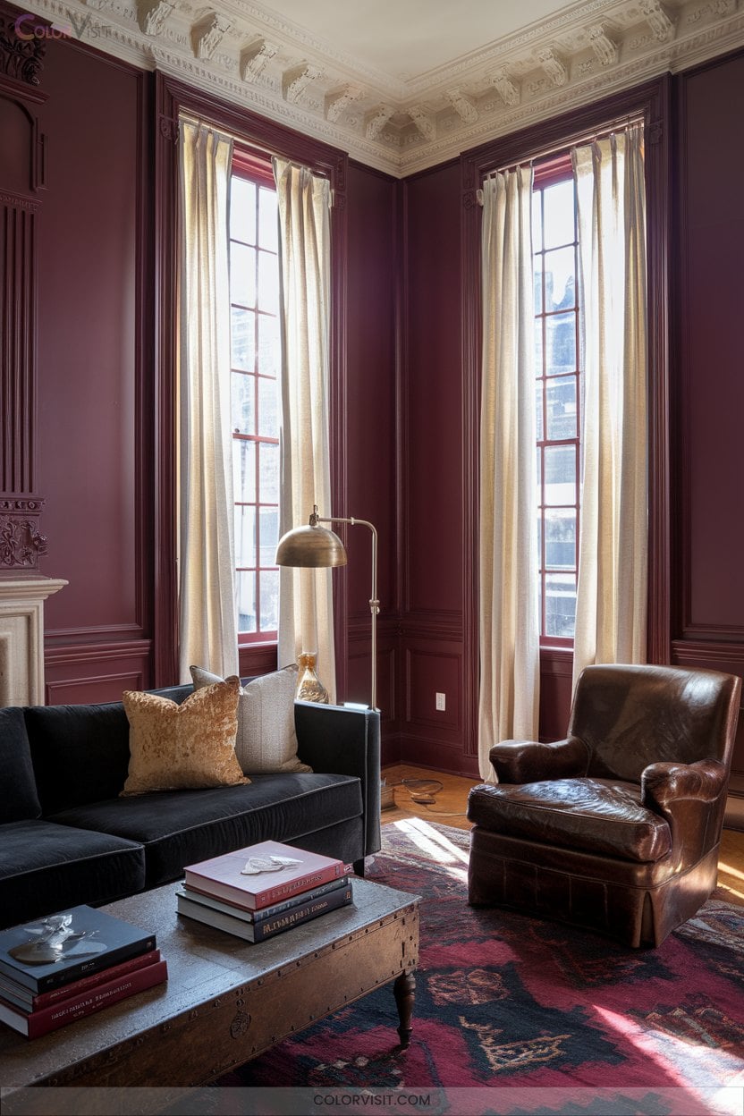
Opulence defines burgundy walls—this deep, wine-hued shade instantly envelops your living room in rich sophistication and visual drama.
Elevate the effect with expert pairings and lighting strategy to maximize depth without sacrificing brightness.
Complementary neutrals—think soft cream or pale grey—balance the intensity, while metallic finishes like brass inject warmth and modernity.
For a forward-thinking approach, consider:
- Layered lighting: Use warm LEDs and statement fixtures to accentuate texture.
- Feature or half-wall applications: Prevent overwhelm and keep the palette fresh.
- Material contrasts: Pair velvet upholstery, wooden accents, and sheer curtains for multidimensional, avant-garde appeal.
Charcoal Blue for Modern Navy Elegance
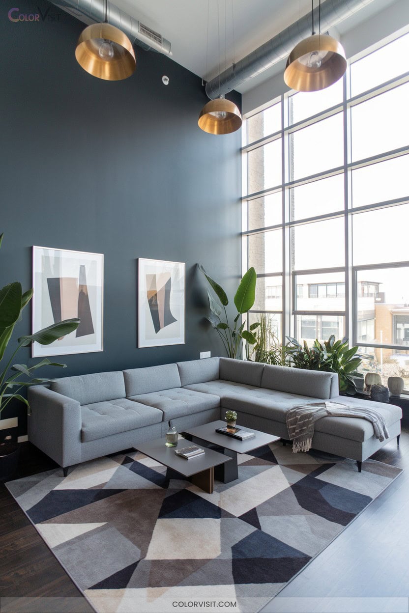
While burgundy envelops your space in warmth, charcoal blue introduces a refined, modern navy elegance that’s equal parts bold and serene.
This deep blue-gray hybrid offers a sophisticated edge—far more nuanced than classic navy or black—making it a contemporary designer favorite.
Leverage its versatility: use it for feature walls to anchor your living zone, or wrap the entire room for an enveloping, intimate feel.
Pair with crisp white trim, warm oak, and brushed brass for layered contrast.
Matte finishes amplify its depth, while geometric textiles inject modernity.
Always test physical swatches first—charcoal blue’s complexity demands real-world evaluation.
Sage Green for Serene Living Rooms
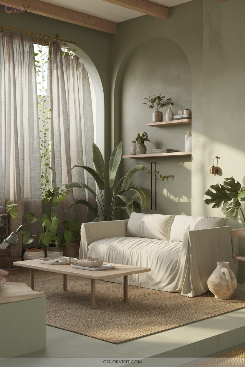
Serenity finds a natural home in sage green—a hue inspired by the tranquil beauty of lush herbs and soft landscapes.
This shade infuses your living room with a calming ambiance while maintaining design-forward appeal.
Sage green offers immense versatility, seamlessly adapting to both minimalist and ornate aesthetics.
To achieve a sophisticated, serene look, consider these expert strategies:
- Pair with metallic accents—gold or silver elevate sage green’s subtlety.
- Layer with textured textiles—think velvet throws or woven rugs for visual depth.
- Integrate natural elements—wood and greenery enhance the organic, timeless character of your space.
Pressed Flower for Monochromatic Pinks
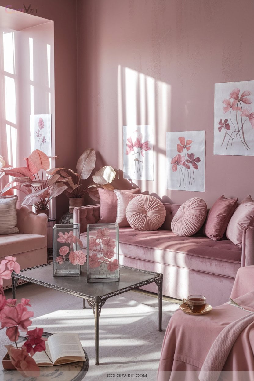
A monochromatic pink palette, elevated with pressed flower art, transforms your living room into a curated showcase of elegance and artistry.
A single-hue pink scheme paired with pressed floral art creates a living room brimming with curated elegance and artistic flair.
Select fresh blooms in varying pink shades, then expertly press and frame them against light backgrounds to highlight their ethereal beauty.
For a trend-forward impact, design a gallery wall or opt for a single bold statement piece, using UV-resistant materials to preserve vibrancy.
Complement the look with neutral-toned furniture and pink-accented textiles to unify the space.
Illuminate with gallery lighting to intensify subtle hues, and personalize with meaningful florals for a sophisticated, innovative aesthetic that radiates contemporary charm.
Earthy Palettes With Natural Wood Pairings
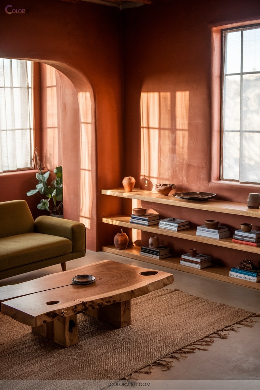
Earthy palettes anchor your living room in organic sophistication, seamlessly blending nature-inspired hues with the tactile richness of natural wood.
Pair warm ochre, sienna, or terracotta with walnut or oak for dramatic depth, or opt for greige and taupe alongside pine to maintain a light, contemporary vibe.
Layering tones and textures yields a multidimensional aesthetic, while reclaimed wood accents introduce artisanal character and sustainability—both on-trend and timeless.
- Combine navy and cognac walls with oak for a modern classic look.
- Use varying browns and textured wood finishes for monochromatic harmony.
- Integrate handmade ceramics or woven baskets for extra tactile appeal.
Olive and Moss Greens for a Biophilic Touch
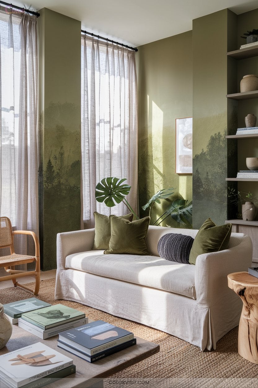
For those seeking a living room that feels both grounded and revitalizing, olive and moss greens offer a sophisticated biophilic palette that’s right on trend.
Olive’s rich, earthy undertones and moss’s vibrant golden flecks create a calming, full-bodied ambiance rooted in nature.
Use olive as a primary wall color for warmth and depth, then layer in moss green accents through textiles and artwork.
Balance these hues with creamy whites or deep charcoals for a crisp, modern edge.
Integrate natural materials and subtle metallics to elevate the organic aesthetic, amplifying tranquility while supporting innovative, sustainability-driven design sensibilities.
Terracotta Accents to Warm Up Neutrals
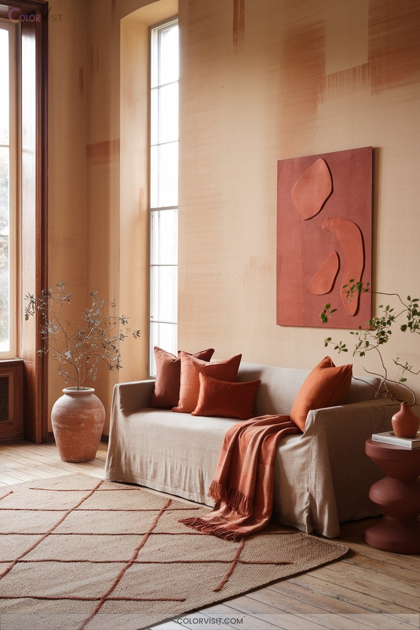
While neutral walls deliver timeless versatility, infusing terracotta accents instantly elevates the space with curated warmth and contemporary depth.
To stay ahead of design trends, leverage terracotta’s earthy palette to create layered visual intrigue and tactile richness against whites, beiges, or greiges.
Integrate innovative accents and materials that strike a balance between organic comfort and modern sophistication:
- Cluster sculptural terracotta vases with brass or matte black fixtures for a striking, curated vignette.
- Layer monochrome terracotta textiles—bouclé cushions, woven throws—for multidimensional coziness.
- Anchor seating with a terracotta-hued rug, offset by natural wood or rattan, for grounded, organic harmony.
Winter Gray for Soft Purple Undertones
One of the most refined ways to introduce subtle color complexity into your living room is by choosing Winter Gray—a sophisticated blend of gray and violet that delivers both tranquility and visual depth.
With its LRV of 61.69, Winter Gray reflects ample light, keeping your space luminous while its soft purple undertones infuse warmth and nuance.
This chameleon-like hue shifts subtly with lighting, ensuring versatile elegance.
Pair it with Paper White or White Heron for crisp contrast, or layer with Dreamy Cloud for a monochromatic effect.
Accentuate with brushed gold details for a contemporary, elevated finish that resonates with cutting-edge style.
Lilac Walls Complementing Tropical Murals
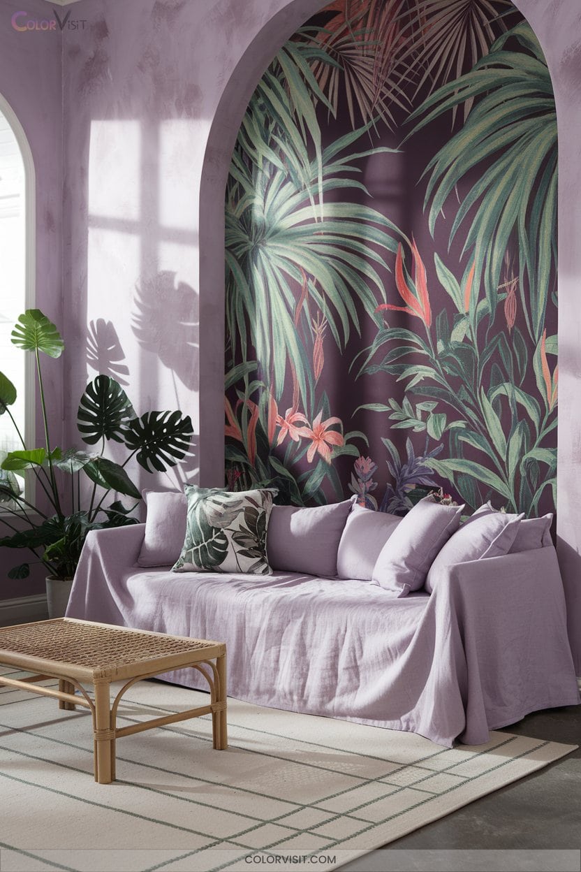
When you pair lilac walls with vibrant tropical murals, you achieve a striking balance between soft sophistication and dynamic visual impact—a look that’s at the forefront of contemporary interior trends.
Lilac’s pastel undertone forms a serene canvas, allowing lush greens and vivid blues from tropical scenes to truly pop.
Integrate layered hues for visual depth and select neutral furnishings to maintain equilibrium.
Embrace this forward-thinking fusion for a space that feels both innovative and harmonious.
- Accent with metallics or light wood for modern contrast.
- Opt for soft, diffused lighting to enhance color vibrancy.
- Mix botanical prints for layered complexity.
Sunshine Yellow for Vibrant Energy
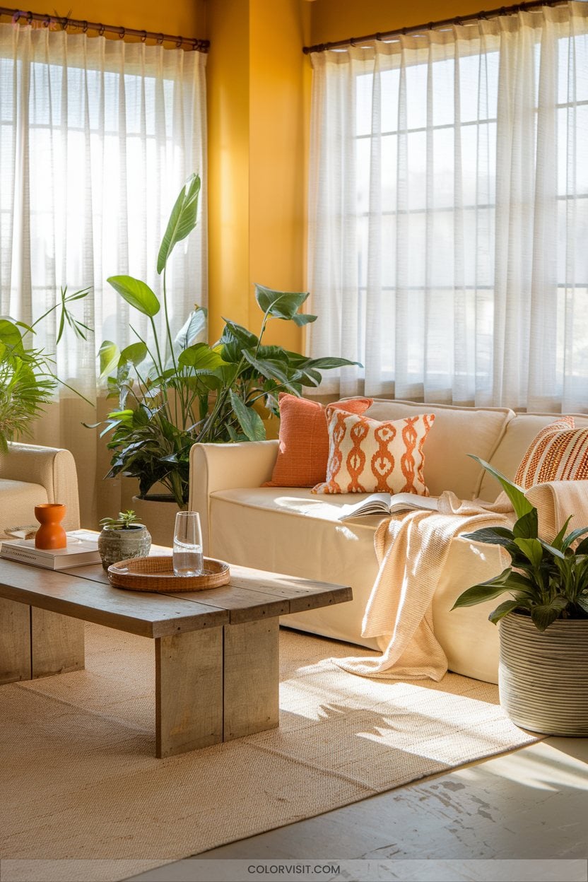
Sunshine yellow infuses living rooms with immediate vibrancy, capturing the essence of optimism and contemporary flair that’s dominating design trends.
Use bold feature walls to draw the eye or opt for buttery shades to mimic natural sunlight, amplifying brightness even in dim spaces.
Experiment with colour-drenching—enveloping walls, woodwork, and ceilings in yellow—for a cocooning, visually expansive effect.
Golden accents, like pillows or ceramics, layer in sophistication.
Pair yellow with neutrals for harmony or rich hues for bold contrast.
Whether your style is minimalist or maximalist, sunshine yellow energizes and transforms, delivering both emotional warmth and avant-garde visual impact.
Mod Retro Pastels as Statement Bases
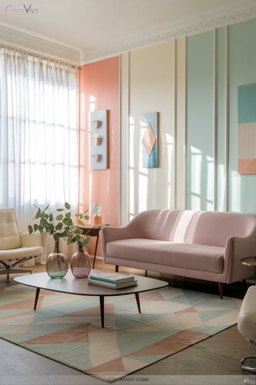
Pastel hues channel a mod retro vibe that’s both sophisticated and playful, making them a daring yet versatile choice for living room walls.
These statement bases offer design flexibility, seamlessly blending nostalgia with modernity.
Elevate your space by integrating:
- Retro color palettes—draw inspiration from mid-century shades like mint, blush, and powder blue for wall color.
- Monochrome accents—incorporate black or grey elements to ground the look and prevent saccharine overload.
- Layered textiles and patterns—use vintage-inspired fabrics in pastel tones for visual intrigue.
This innovative approach results in a curated, impactful living room that feels both fresh and timeless.
Egg-Yolk Yellow for Transitional Spaces
For a living room that radiates energy and warmth, egg-yolk yellow offers a bold alternative to the soft, mod-inspired pastels.
This vibrant hue infuses bridging spaces with optimism and visual dynamism, perfect for those craving innovative design.
Balance the intensity by pairing yellow walls with black or white decor, or introduce it as an accent through textiles and modern furniture.
Thoughtful lighting amplifies its sunny undertones, creating an uplifting atmosphere ideal for social interaction.
Egg-yolk yellow’s contemporary edge and versatility make it a trending favorite, seamlessly bridging modern and traditional elements while invigorating your living space with unmistakable style.
Oceanic Tranquility With Gray-Blue Hybrids
A sophisticated gray-blue hybrid transforms your living room into a serene retreat, blending the calming resonance of water-inspired hues with the refined edge of urban neutrals.
This versatile color family, defined by a gray base with blue undertones, offers a modern-classic duality that’s both timeless and trend-forward.
Harness its psychological benefits—stress reduction, spatial expansion, and sensory harmony—by optimizing application with expert strategies.
- Pair with stark white trim and brushed brass accents for elevated contrast.
- Test undertones in various lighting to reveal green or blue-green complexity.
- Layer textures—think grasscloth wallpaper or linen—for visual dimension.
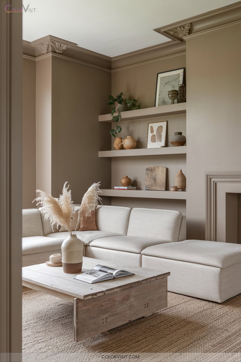
Deep Browns for a Grounded, Cozy Feel
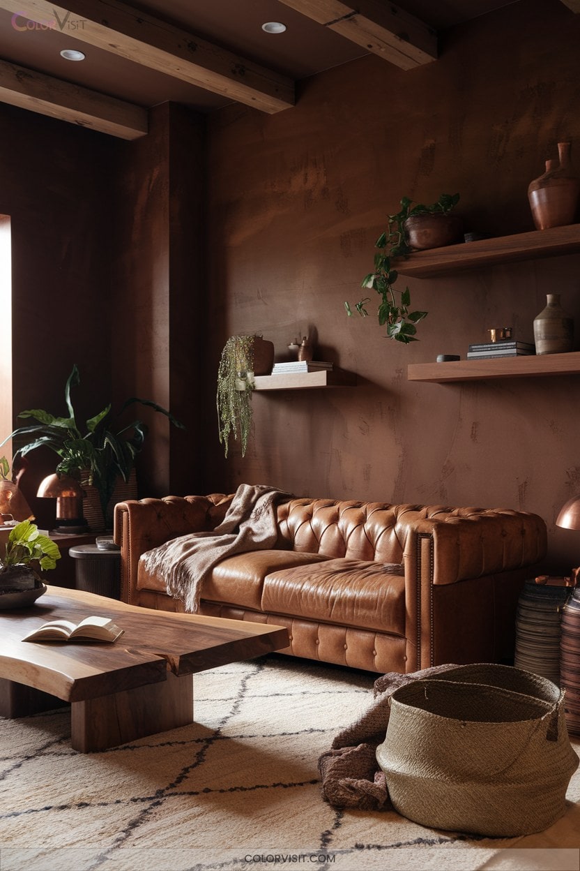
Richness defines deep brown walls, enveloping your living room in warmth, sophistication, and a palpable sense of calm.
Opt for Farrow & Ball’s Mouse’s Back or Benjamin Moore’s Whitall Brown for earthy refinement—ideal in open-plan, innovative spaces.
Crave drama? Sherwin-Williams Van Dyke Brown or Dark Clove delivers bold, grounding contrast, especially on accent walls.
Harness high natural light with Farrow & Ball Mahogany for heritage-inspired depth, or introduce Valspar Rue Bourbon for versatile modernity.
Balance these immersive hues with light upholstery and metallic finishes, leveraging undertones—red-browns with ochres, gray-browns with pastels—to create a visually dynamic, truly grounded retreat.
Warm Oranges Balancing Blue Accents
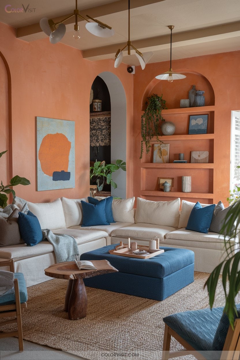
After exploring the enveloping depth of deep browns, infuse your living room with a burst of optimism by embracing warm orange walls balanced by blue accents.
Harness burnt orange or terra-cotta hues for statement walls, then introduce navy, teal, or denim blues to forge sophisticated contrast and dynamic harmony.
Layering these complementary tones taps into cutting-edge color blocking trends and elevates your design narrative.
- Pair Sherwin-Williams Obstinate Orange with slate blue velvet upholstery for tactile luxury.
- Integrate geometric blue-white rugs to break up orange expanses visually.
- Use brass hardware and warm white lighting for a cohesive, innovative atmosphere.
Soft Purples for Subtle Luxury
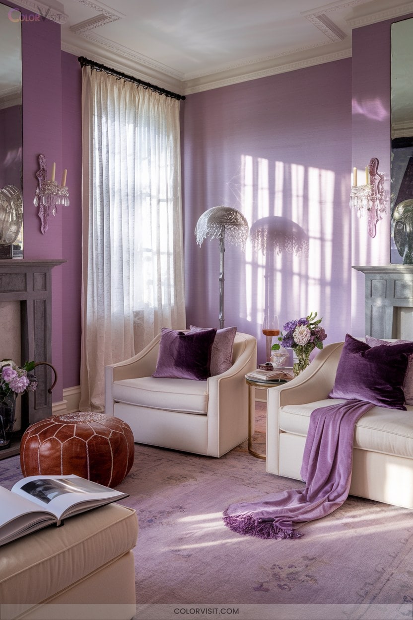
Soft purples instantly introduce understated sophistication to your living room, merging modern color sensibilities with timeless elegance. Lilac undertones evoke tranquility while maintaining a luxurious aura—perfect for innovative spaces seeking a refined edge.
Trending periwinkle hues infuse a playful, blue-dominant energy, while soft magenta and wine-inspired purples deliver warmth and unique charm. Pair these hues with off-white or gold accents for a chic, curated look.
Balance softness with neutral furnishings to keep the palette harmonious and visually fresh. With strategic lighting, soft purples radiate vibrancy, creating a serene yet imaginative backdrop that elevates your living room’s ambiance and style.
Accent Wall Strategies for Bold Impact
Accent walls deliver instant visual drama, transforming an ordinary living room into a curated showcase of color and texture.
To innovate, pair nature-inspired shades like sage or olive with modern wood finishes for biophilic flair.
Experiment with geometric murals or textured paint to introduce bold artistic elements.
For a trend-forward approach, integrate accent walls as focal points—behind a sofa or fireplace—to anchor the space.
- Contrast Creation: Select hues several shades apart for a striking juxtaposition.
- Whimsical Accent: Opt for playful pinks paired with matching decor.
- Material Fusion: Combine wallpaper, painted paneling, or reclaimed elements for tactile depth.
Frequently Asked Questions
How Do I Choose the Right Paint Finish for My Living Room Walls?
When choosing your living room paint finish, evaluate wall condition, traffic, and lighting. Opt for satin or eggshell—they balance durability with on-trend, subtle sheen. Don’t forget: test samples to visualize how light transforms color and texture.
What Colors Make a Small Living Room Appear Larger?
Imagine sunlight dancing across airy blues, creamy off-whites, and cool greiges—these sophisticated hues visually expand your space. Incorporate monochromatic bases, pearlescent finishes, and subtle vertical striping to redefine boundaries, crafting an innovative, trend-forward illusion of spaciousness.
Are There Wall Colors That Help Hide Dirt or Fingerprints?
You’ll want to choose warm neutrals, earthy tones, or muted blues and greens with a matte or eggshell finish—they expertly mask dirt and fingerprints. Innovative paints like Scuff-X and textured finishes elevate both style and durability.
How Often Should I Repaint My Living Room Walls for Best Results?
You should repaint your living room walls every 5–7 years for ideal vibrancy, but update every 3–5 years if you love trend-forward palettes or have high-traffic zones. Prioritize premium, washable finishes for cutting-edge durability and visual impact.
Can Lighting Affect How My Chosen Wall Color Looks in the Room?
They say, “seeing is believing”—and you’ll notice lighting dramatically shifts your wall color’s hue, saturation, and vibrancy. Embrace dynamic lighting solutions like tunable LEDs to curate a space where colors adapt, innovate, and visually pop throughout the day.
Conclusion
You’re standing in your living room, brush in hand—imagine that first swipe of Dover White, the drama of a blackened-gray accent, the warmth of deep browns wrapping around you. Which direction will you choose?
With 2025’s trend palette at your fingertips, every wall is a canvas, every color a chance to transform. Don’t just refresh your space—ignite it. The perfect shade is waiting, ready to redefine your living room’s story. Are you ready to begin?