14 Productive Office Color Ideas to Boost Workplace Efficiency
Elevate your workspace with smart color choices like blue for calm focus zones, green for harmony, and yellow or orange accents to boost creativity and collaboration. Pair soothing shades with versatile neutrals for clarity, while layering soft tones, wood, and biophilic elements keeps the look modern and healthy.
Avoid uninspired grays—opt for uplifting palettes customized by zone. Trendsetting companies use these strategies to energize teams and support well-being, with even more inspiring ideas just ahead.
1. Blue Accents for Enhanced Focus
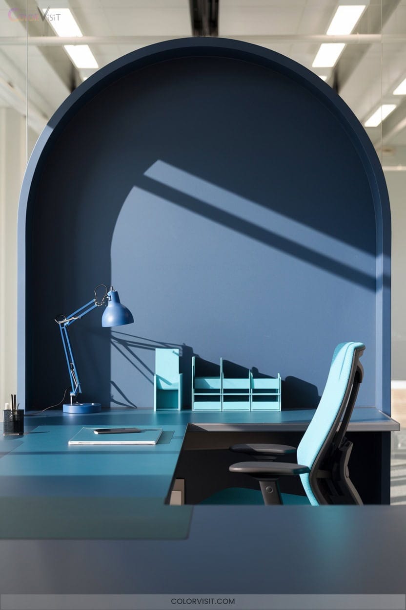
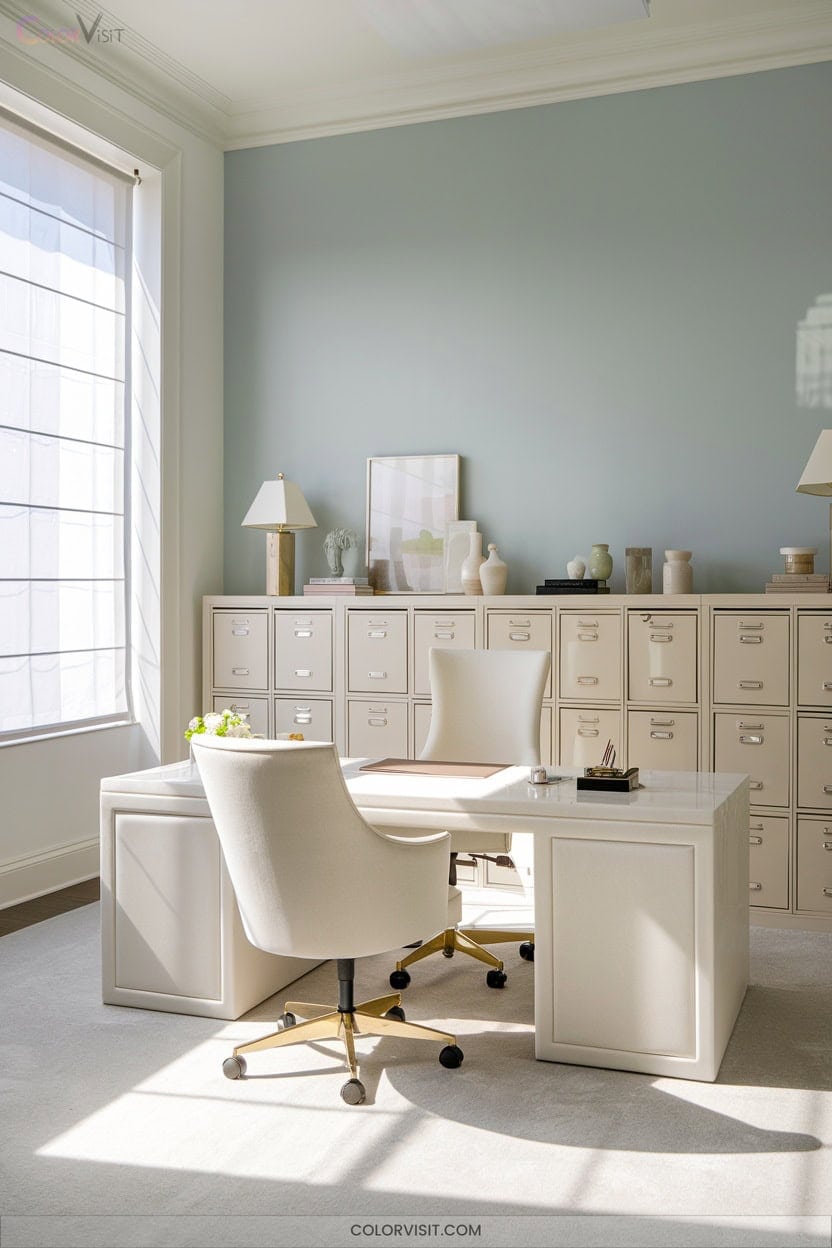
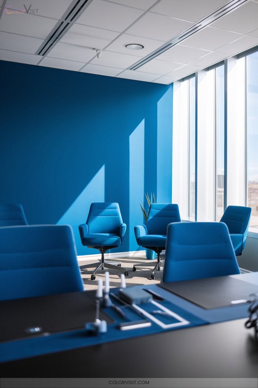
Blue accents transform an ordinary office into a haven for focus and calm.
When you integrate blue—through accent walls, sleek furniture, or curated accessories—you’re not just following a trend; you’re boosting productivity and reducing stress.
Blue accents in your workspace do more than look stylish—they actively encourage productivity and a sense of calm.
Pairing blue with neutrals keeps the design modern and visually balanced, while the right lighting, whether natural or artificial, amplifies blue’s tranquil effect.
If you want innovation, highlight zones needing concentration or creative bursts with blue—its psychological impact is proven.
Layer different blue tones for depth.
This approach creates not only a visually appealing environment but also a functional, high-performance workspace.
2. Calming Green Workspaces
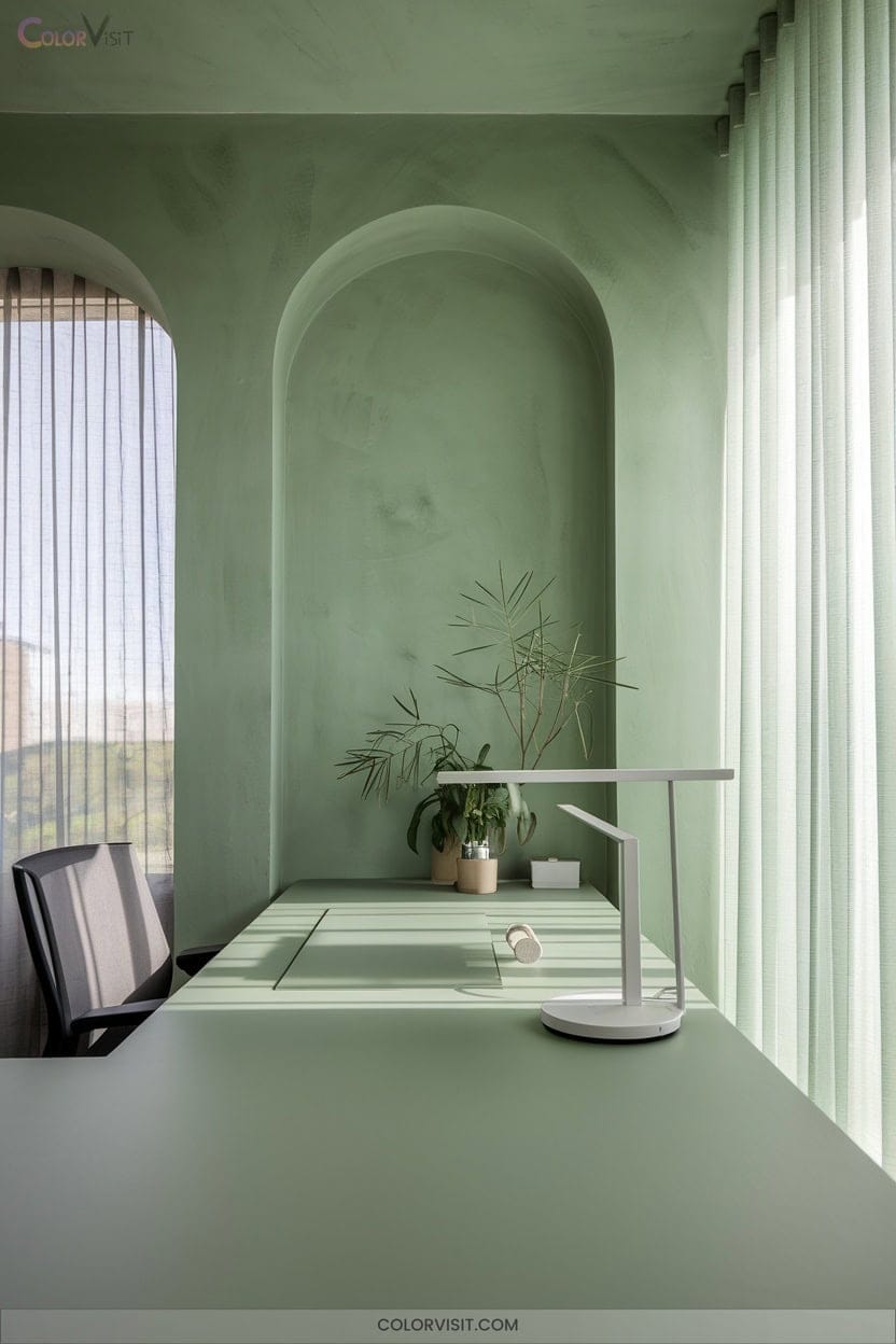
Verdant tones infuse your workspace with tranquility and clarity, setting the stage for a balanced and productive day.
Imagine sleek green accents, lush plant life, and biophilic design elements transforming your office into a serene haven.
This calming palette stabilizes emotions, reduces stress, and supports well-being while boosting creativity and sustained focus.
Integrating greenery improves air quality and aligns with sustainable design trends, creating a healthier, future-focused environment.
Strategic plant placement and nature-inspired materials like wood and stone enhance both style and function.
Embrace this innovative approach—your workspace becomes not only more beautiful, but fundamentally more productive.
3. Energizing Yellow Creative Zones
How can you infuse your workspace with instant energy and creative spark?
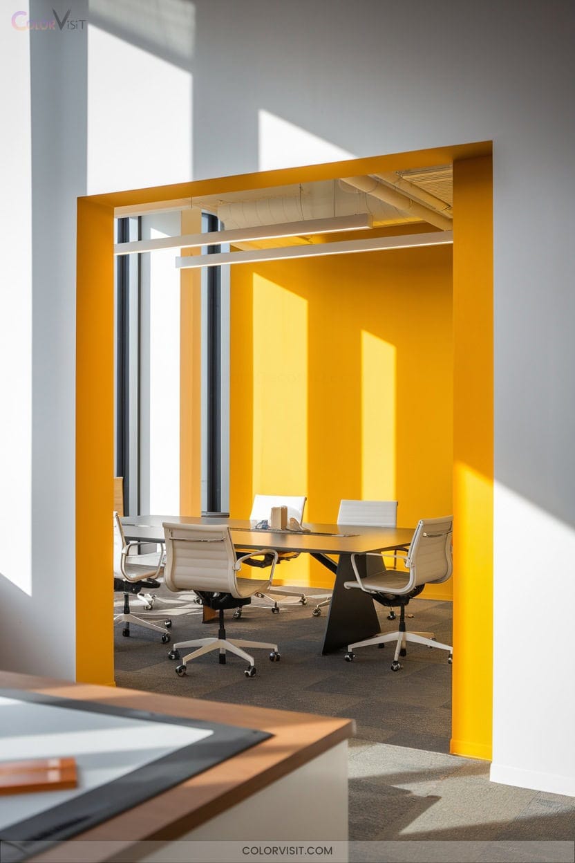
Yellow is your innovation ally—its vibrant tones radiate optimism, boost confidence, and elevate mood, making it perfect for creative zones.
Don’t let yellow overwhelm; instead, apply it as striking accents on walls, furniture, or décor.
Pairing yellow with neutrals balances brightness and keeps the atmosphere inviting rather than agitating.
In brainstorming rooms or focus areas, yellow stimulates fresh ideas and enhances collaboration.
Harness its connection to natural sunlight and emotional uplift to design spaces where creativity thrives and teams feel energized, confident, and ready to pioneer new solutions.
4. Dynamic Orange Collaboration Areas
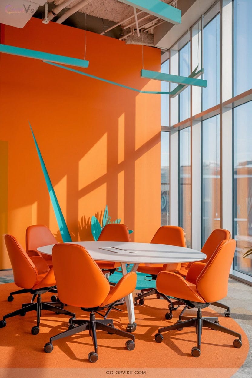
While yellow sparks creativity in idea zones, orange takes collaboration to the next level.
Introduce orange’s vibrant warmth into your teamwork areas and you’ll notice an immediate shift—energy rises, stress drops, and team conversations flow.
Orange stimulates open communication, fuels creativity, and helps groups brainstorm with ease.
Use orange on walls, modular furniture, or striking décor, but always balance with subtle neutrals to avoid overstimulation.
Layer in flexible seating and natural accents, and choose lighting that highlights orange’s inviting glow.
5. Balanced Color Combinations for Open Offices
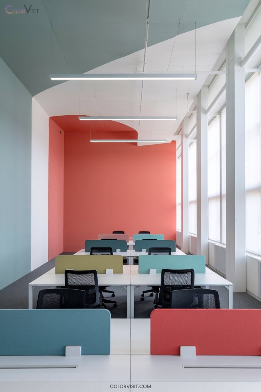
Step into a modern open office and you’ll notice that color does more than decorate—it shapes the entire work experience.
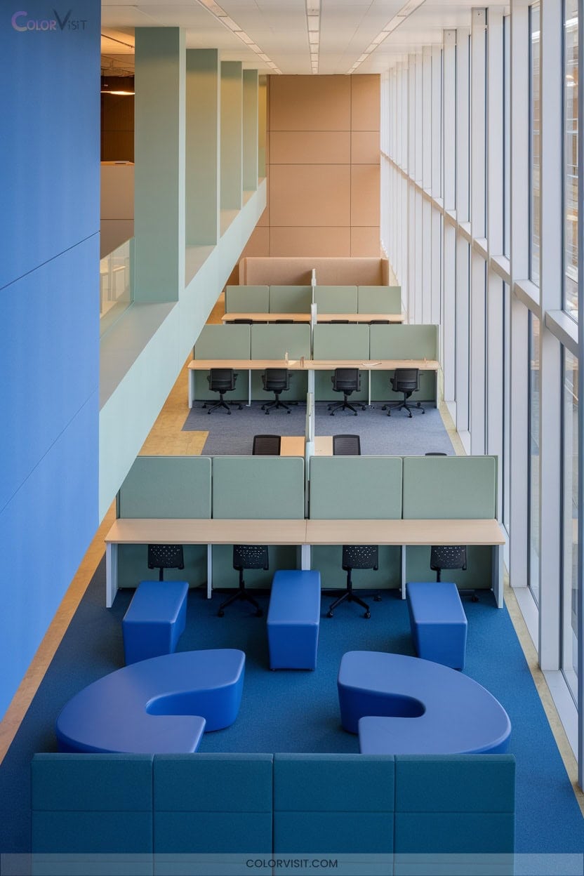
For peak efficiency, combine calming blue with crisp neutrals like white or beige for focus zones, crafting a clean, cohesive atmosphere that quiets distractions.
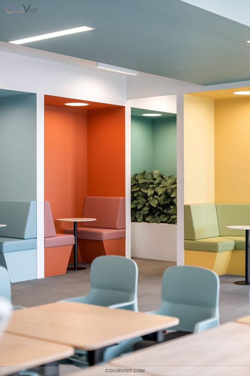
Integrate muted greens and warm wood accents in breakout areas to evoke tranquility while supporting relaxation and wellness.
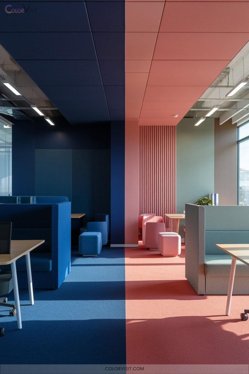
Embrace nature-inspired palettes—think sage, soft blue, and earthy browns—to create harmony and visual interest throughout.
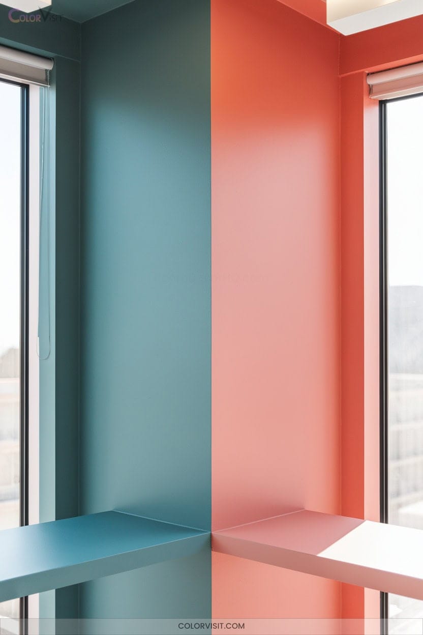
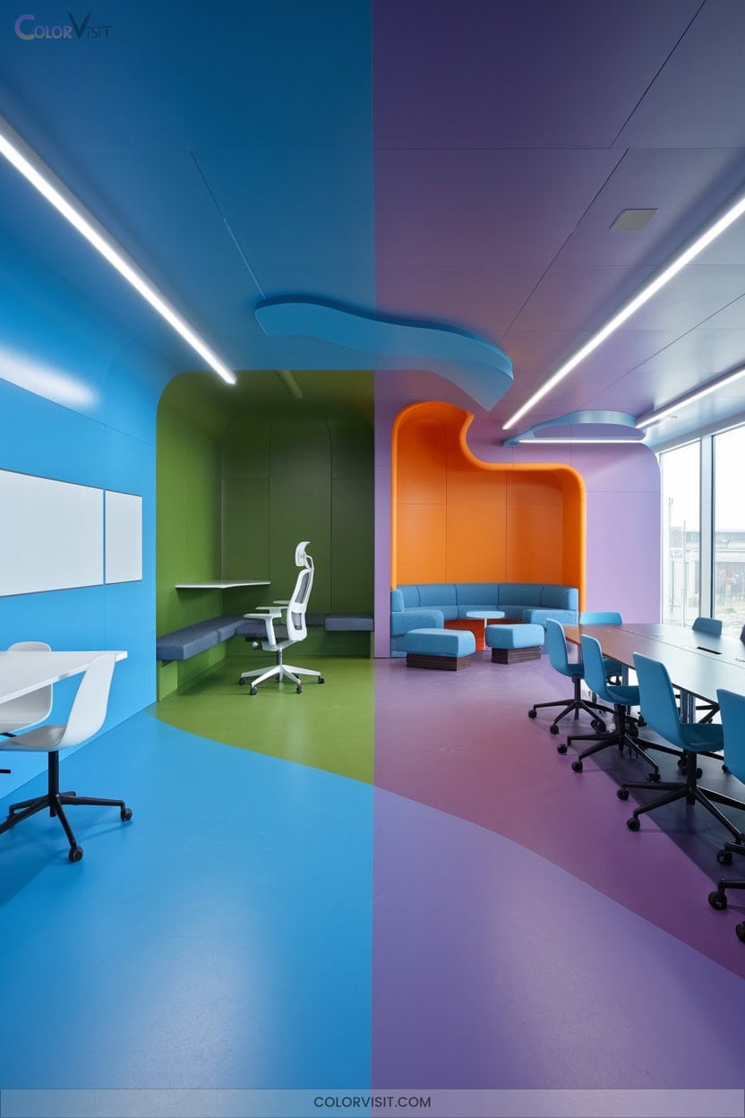
Strategic layering of cool and warm tones helps define zones, supporting both heads-down concentration and collaborative energy in one seamless, future-ready environment.
6. Light Shades to Prevent Overwhelm
Brightness sets the tone in any workspace, but too much intensity can quickly overwhelm.
To foster productivity and well-being, embrace light shades that balance function and aesthetics.
Leveraging advanced lighting design, you’ll create an environment that’s both innovative and attuned to human-centric needs.
Light shades prevent visual fatigue, supporting your team’s focus and mood throughout the day.
Consider these essentials:
- Integrate adjustable LED systems for tailored illumination
- Utilize soft, diffuse fixtures to minimize glare
- Select light shades that mimic natural daylight
- Calibrate color temperature for specific tasks
- Layer ambient, task, and accent lighting for adaptability
7. Avoiding Depressing Grays and Beiges
Ever wonder why some offices feel uninspired the moment you walk in? It’s often the dominance of dull grays and beiges. If you want an energetic, future-focused workspace, ditch these outdated neutrals.
Instead, opt for vibrant blues to promote calm focus or energizing yellows to spark collaboration and positivity. Greens—echoing nature—foster creativity and well-being, while diverse tones inspire innovation.
Strategic color placement elevates your office’s atmosphere, reflecting a culture that values both productivity and emotional wellness. By avoiding lifeless palettes, you’ll create a visually dynamic environment that motivates, reduces stress, and naturally enhances your team’s efficiency and creative drive.
8. Customizing Colors for Different Departments
Stepping beyond basic color choices, tailoring hues to each department transforms your office into a thoughtfully curated space that elevates both mood and performance.
By embracing departmental color customization, you infuse intention into every corner, blending aesthetics and productivity.
Aim for a palette that resonates with each team’s function and energy.
Consider these innovative combinations:
- Blue in administrative zones for enhanced focus and communication
- Green in finance and healthcare to balance stress and rejuvenate
- Yellow in creative spaces to spark innovation and optimism
- Red accents in sales for dynamic urgency
- Neutral tones throughout for cohesion and timeless versatility
9. Soothing Rest Zone Palettes
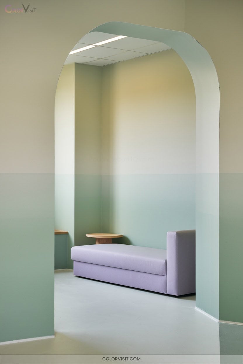
A thoughtfully curated rest zone palette transforms break areas into serene retreats that recharge both body and mind.
Choose soft blue hues and sky-inspired palettes to foster tranquility and sharpen focus.
Earthy neutrals like taupe and beige reduce sensory overload while keeping the space warm and inviting.
Muted greens, such as sage and olive, evoke nature’s calming influence, supporting stress relief.
Layer matte surfaces, soft textiles, and minimalist décor for depth and comfort.
Accentuate with natural wood and biophilic touches to reinforce organic warmth.
Distinct zoning through color guarantees your rest spaces remain visually restful, innovative, and functionally distinct within the office.
10. Incorporating Brand Colors Strategically
Beyond creating restful zones, you can amplify office impact by weaving brand colors thoughtfully throughout the workspace.
Strategic color choices align your environment with core brand values and foster both creativity and professionalism.
Thoughtful color selection shapes a workspace that reflects brand values while inspiring creativity and a professional atmosphere.
By blending primary and secondary palettes, you add depth without oversimplifying the visual identity.
Employ color wheel principles to achieve harmony or bold contrast, ensuring every hue serves a purpose.
Consider employee engagement and the psychological impact on work behavior as you design.
- Integrate feature walls in primary brand colors
- Use accent textiles and furnishings for secondary hues
- Apply department-specific color variations
- Balance bright and neutral tones thoughtfully
- Audit color consistency regularly
11. Adapting Color Choices to Gender Preferences
How can you tailor your office color scheme to genuinely resonate with everyone who walks through the door?
Start with blue—its authority and tranquility appeal broadly.
Blend in subtle turquoise and soft pink accents for a gentle, welcoming touch women often prefer.
For bold energy, introduce saturated blue or ruby red elements that men gravitate toward, but keep contrasts subtle to avoid visual fatigue, especially for women.
Embrace neutral backgrounds to ground the space and support clarity.
12. Using Color Psychology for Employee Well-being
Ever wonder why certain offices feel instantly energizing or calming?
It’s not by accident—it’s color psychology in action, shaping your emotional landscape and enhancing well-being.
By curating your workspace palette, you can reduce stress, nurture focus, and inspire creativity with just a strategic pop of color.
Consider these innovative choices:
- Blue: boosts calmness and concentration
- Green: fosters harmony and growth
- Yellow: sparks optimism and creativity
- Purple: ignites inspiration and luxury
- Neutrals: offer balance and clarity
Integrate these shades with intention to elevate both mood and productivity, transforming your office into a hub of well-being and efficiency.
13. Zoning With Distinct Color Schemes
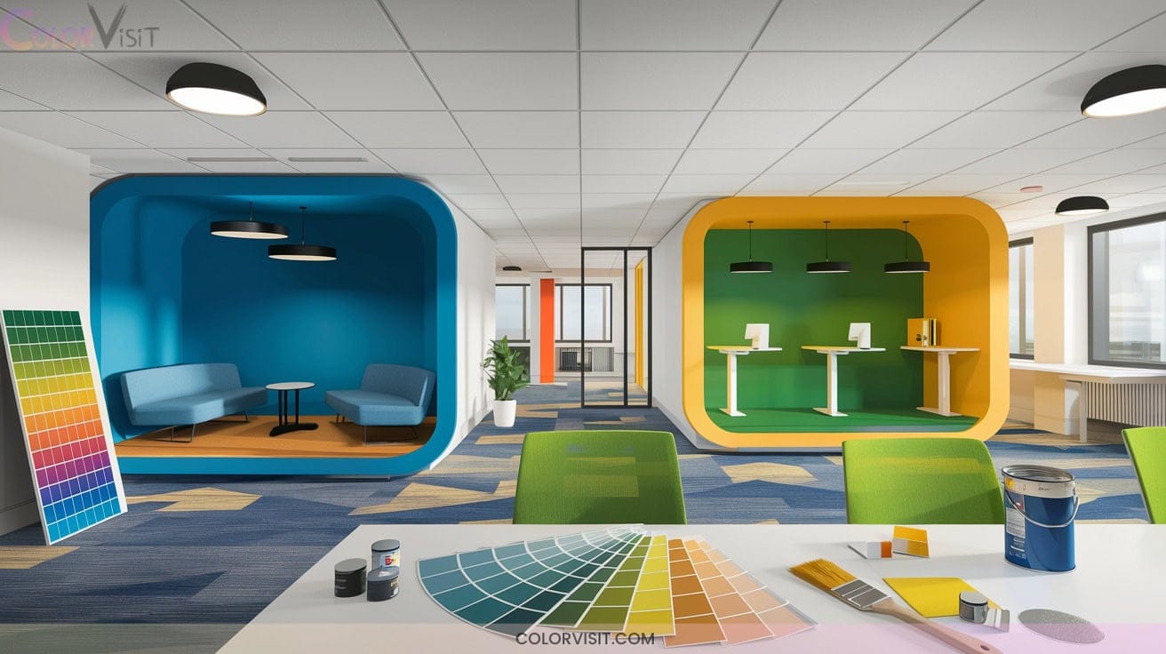
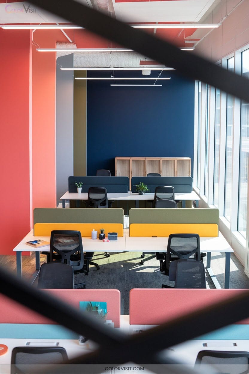
Color zoning transforms your office into a purpose-driven environment where every shade serves a function.
Assign blue to focus zones for calm productivity, and introduce green for steady concentration and eye comfort during long work hours.
Use neutral tones like white, beige, or taupe as versatile backdrops, letting accent walls pop with bold hues.
Spark creativity with yellow or orange in brainstorm corners, while vibrant teal inspires innovative thinking.
Warm colors in social spaces foster collaboration, balanced by neutral tones that reduce visual overload.
Harmonize your palette—choose colors strategically, ensuring each zone energizes, soothes, or stimulates exactly as your workflow demands.
14. Innovative Approaches From Leading Companies
Step inside today’s most inspiring offices and you’ll notice a deliberate use of color, where every hue serves both form and function.
Leading companies reimagine workspace color to enhance productivity and creativity.
You can harness their innovative strategies to elevate your own environment.
Consider how these trendsetters blend aesthetics with efficiency:
- Google energizes collaboration with vibrant yellow and orange accents.
- Microsoft integrates calming greens and natural tones for a serene, focused vibe.
- Apple’s minimalist neutrals keep distractions at bay, supporting deep work.
- Amazon empowers employees with personalized color choices.
- Facebook adapts flexible color schemes to suit diverse work styles and preferences.
Frequently Asked Questions
How Often Should Office Color Schemes Be Updated for Maximum Impact?
You should refresh your office color scheme every 5 to 7 years to stay visually inspiring and on-trend. Align updates with brand shifts or evolving work styles, and embrace accent walls for impactful, minimal-disruption transformations.
Can Lighting Affect How Productive Office Colors Appear?
You’ll quickly discover lighting radically transforms how productive office colors appear. It’s not just theory—adjusting temperature, brightness, and CRI lets you curate an aesthetic that enhances mood, sharpens focus, and aligns with today’s forward-thinking workplace trends.
Are There Eco-Friendly Paint Options for Office Color Makeovers?
You have plenty of eco-friendly paint options for your office makeover. Choose from innovative brands like ECOS, Clare, or Benjamin Moore Eco Spec. They deliver zero-VOC formulas, sophisticated color palettes, and sustainable packaging for a stylish, health-conscious workspace.
How Do Remote or Hybrid Work Environments Influence Color Choices?
Think of color as your workspace’s secret weapon. In remote or hybrid setups, you’ll want to blend calming tones with energizing accents, ensuring every shade fuels focus, creativity, and a seamless brand experience across both physical and virtual environments.
What Is the Cost-Benefit Analysis of Repainting an Entire Office?
When you invest in repainting your office, you’ll elevate aesthetics, enhance durability, and boost property value. Innovative finishes and robotic methods streamline costs, while refreshed spaces inspire productivity—delivering a tangible ROI that justifies your forward-thinking approach.
Conclusion
Embrace blue for focus, add green for calm, infuse yellow for energy, and spark creativity with orange accents. Mix and match thoughtfully, adapt to your team’s needs, and let color psychology guide your choices.
Zoning spaces with bold palettes isn’t just on trend—it’s functional and inspiring. Look to industry leaders, innovate, and watch your office transform. When you curate with intention, you don’t just color your workspace—you elevate productivity and style in every corner.
