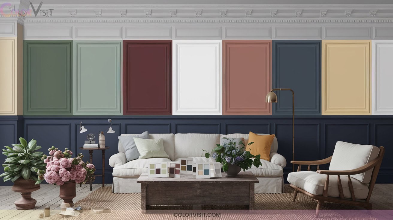
12 Classic Painted Wainscoting Ideas Color Schemes for Character
Transform blank walls with 12 classic painted wainscoting color schemes that bring instant character to your space. Mix white raised panels for crisp depth, gray or charcoal for upscale contrast, and navy blue with white for architectural drama.
Warm beige, taupe, or light wood with white trim gives subtle dimension, while sage, mint, or aqua add sophistication.
Try blush pink for a modern vibe or deep green for powerful visual grounding. Explore each scheme’s unique impact to truly elevate your interiors.

1. Timeless White Raised Panel Wainscoting
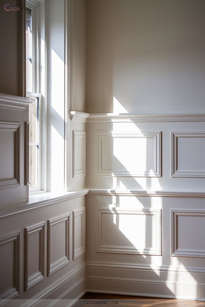
A timeless white raised panel wainscoting instantly elevates any space, introducing architectural depth and crisp definition along your walls.
White raised panel wainscoting brings instant elegance and dimension, adding striking architectural interest to any room.
You’ll appreciate how raised panels interplay with shadow and light, amplifying spatial perception and reflecting brightness throughout the room.
Select from classic woods or modern MDF to suit your budget and vision; incorporate intricate trim and molding for a custom, cohesive finish. Experiment with panel dimensions and coordinate ceiling details for design continuity.
White wainscoting’s versatility adapts to both traditional and avant-garde interiors, pairing flawlessly with neutral hues or elegant wallpapers for layered texture and contrast, transforming ordinary walls into statement surfaces.
2. Elegant Gray and Charcoal Painted Panels
Step into sophistication with gray and charcoal painted wainscoting, where nuanced tones and refined finishes reshape your room’s visual impact. Opt for deep charcoal with bright white trim to introduce high-contrast, modern elegance.
Choose slate grays to harmonize with cool-toned walls or muted gray-beige panels like Revere Pewter for seamless blending spaces.
Experiment with embossed composites for wood grain realism in humid areas or MDF raised panels with matte finishes for vintage texture.
Use vertical orientation to amplify ceiling height, and integrated LED strips to illuminate geometric profiles.
For durability, select scuff-resistant or moisture-resistant finishes—ensuring your space remains both innovative and practical.
3. Navy Blue Wainscoting With Crisp White Walls
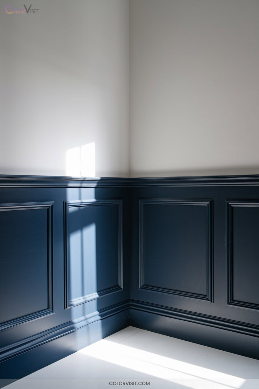
Contrast defines the impact of navy blue wainscoting paired with crisp white walls, creating instant architectural drama and elevating spatial depth.
Opt for Benjamin Moore’s Hale Navy in a semi-gloss finish to amplify the wainscot’s shadow lines, while Sherwin Williams Extra White delivers pristine upper walls and trim continuity.
Strong vertical paneling enhances perceived height, boosting the room’s graphic energy.
Brass hardware and moody accent furniture inject warmth and complexity, while natural fiber rugs and sheer drapery balance the bold palette.
This classic nautical pairing suits dining rooms, entryways, or offices, where sophistication, calm, and innovation intersect seamlessly in modern interiors.
4. Warm Beige and Taupe Combinations
Warm beige and taupe wainscoting instantly infuses interiors with refined warmth and subtle dimension, making them ideal for spaces where comfort meets sophistication.
Warm beige and taupe wainscoting brings refined warmth and dimension, perfect for interiors balancing comfort with sophisticated style.
Pair taupe panels with ivory walls to highlight architectural depth, or juxtapose warm beige with soft cream for an inviting, layered effect.
Integrate raised panels in dining rooms for classic elegance, or select flat taupe panels in living spaces for modern minimalism.
Enhance tactile intrigue with beaded or textured beige in hallways or bedrooms.
Always sample shades under your room’s lighting and coordinate with trim, wall color, and furnishings to guarantee seamless visual cohesion and contemporary flair.
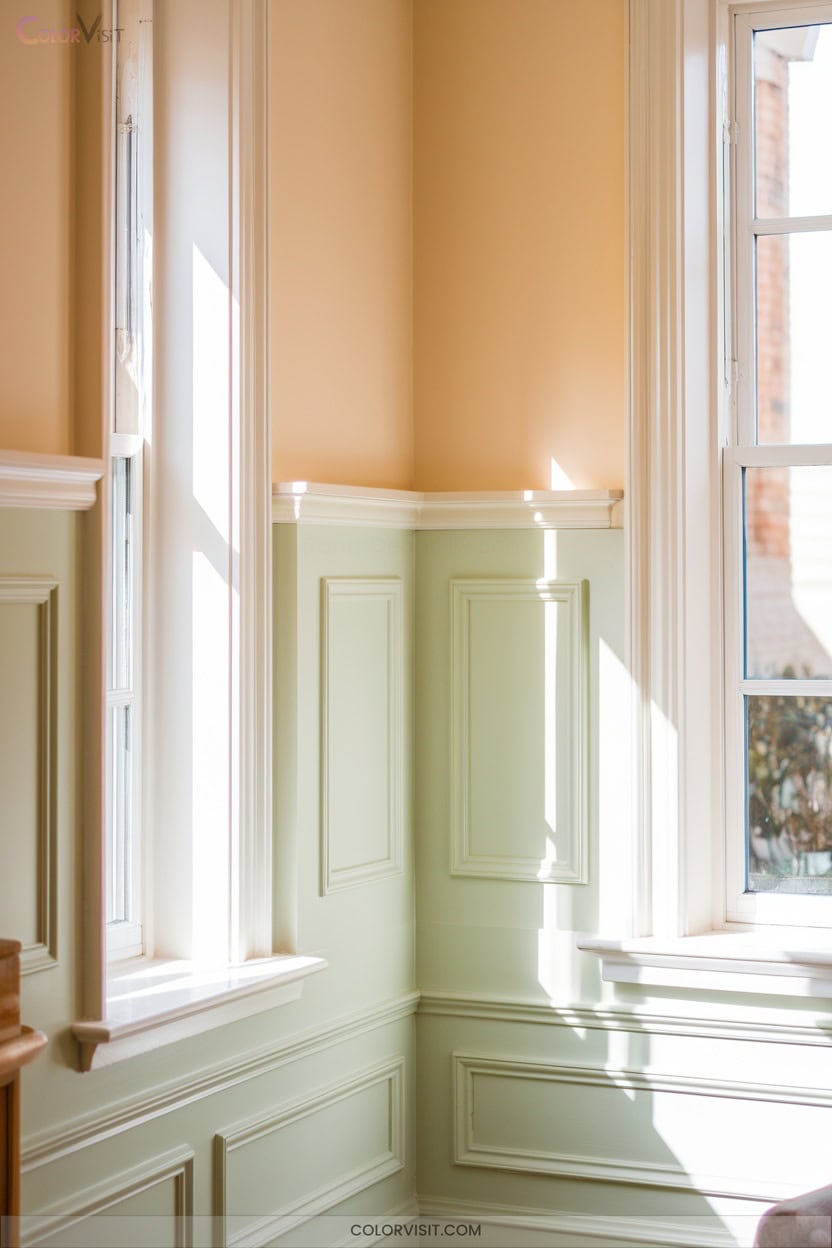
5. Soft Sage Green for Subtle Sophistication
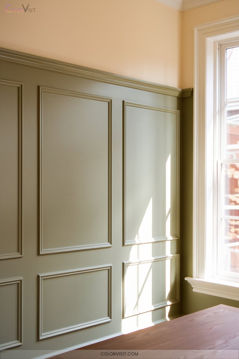
Soft sage green wainscoting introduces a whisper of color that transforms architectural features into focal points, blending silvery-green elegance with subtle gray undertones.
You’ll find sage’s muted spectrum—ranging from Oyster Bay’s blue-gray tint to deeper olive—delivers nuanced depth without overpowering the room.
Pair it with crisp whites or creams to sharpen corners and amplify spatial brightness, or layer with olive and pistachio for tonal complexity.
Semi-gloss finishes accentuate panel relief, while gold or brass hardware punctuates the restful palette.
Sage green’s adaptability bridges rustic and modern, grounding your interiors with sophistication and inviting innovation in both classic and contemporary settings.
6. Two-Tone Monochromatic Blue Scheme
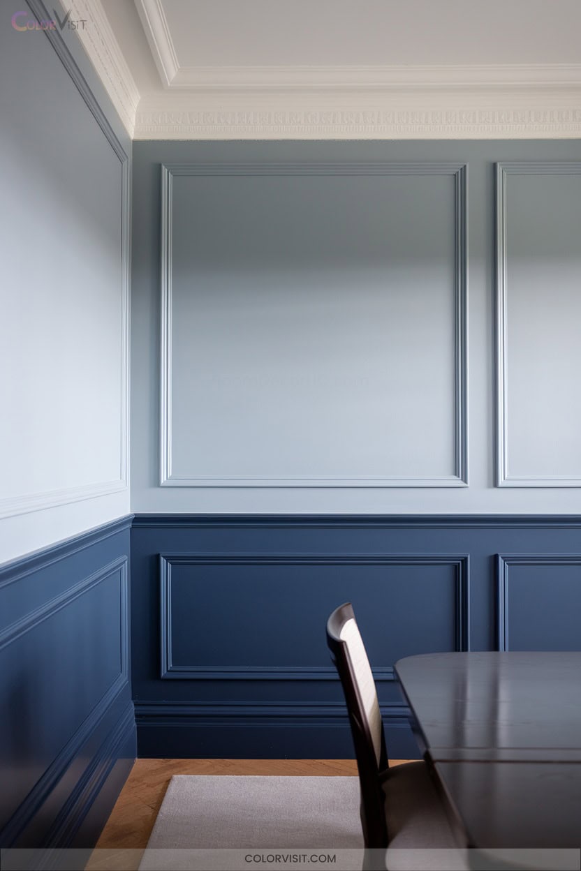
Few design approaches rival the visual harmony of a two-tone monochromatic blue scheme for wainscoting.
You can expertly layer depth by pairing a lighter blue wainscoting—think sky or pastel—with richer upper walls such as Hale Navy HC-154.
This gradient effect amplifies spatial definition and creates an immersive, sophisticated palette.
Textural enhancements like beadboard or shiplap introduce tactile contrast, while gold accents or crisp white trim sharpen the architectural boundaries.
Integrate nature-inspired textiles or wicker furniture for added dimension.
This scheme adapts seamlessly to bedrooms, offices, or coastal baths, offering a modern yet timeless canvas for innovative interiors.
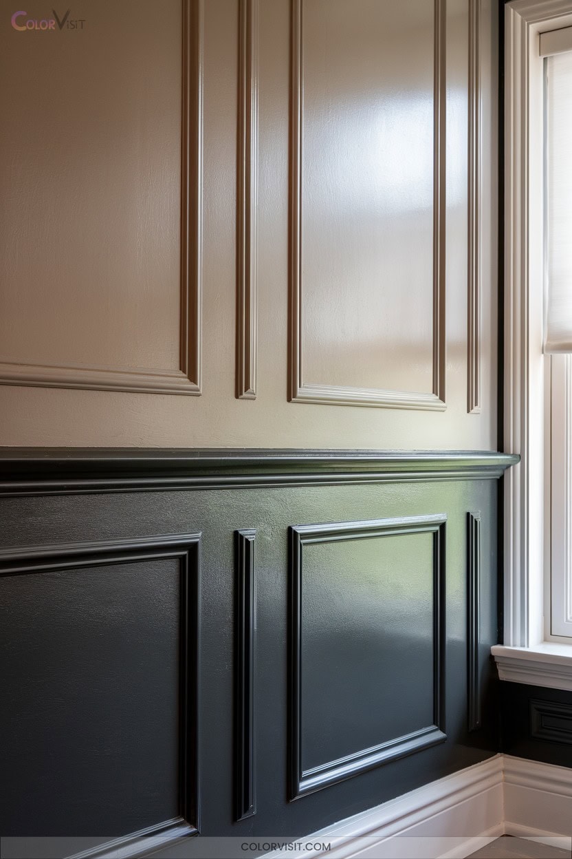
7. Classic Black Wainscoting for Bold Contrast
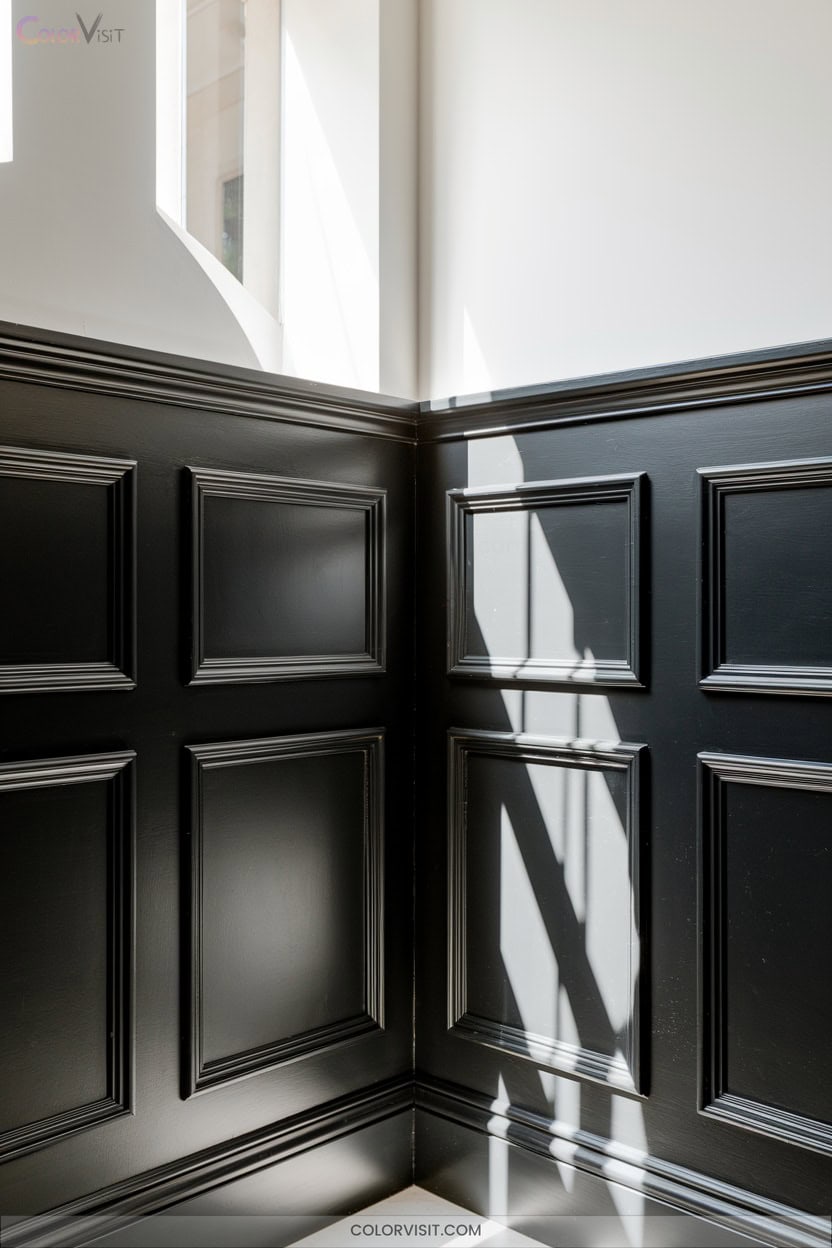
Moving from serene blues to deeper, more assertive hues, classic black wainscoting introduces instant drama and sophistication to any interior.
You’ll heighten visual depth by pairing matte or high-gloss black panels against white or pale upper walls—this interplay draws the eye upward, expanding spatial perception.
In bedrooms, anchor jewel-toned accents and gold fixtures with bold, Victorian-inspired panels.
For modern edge, use shiplap or sleek MDF with metallic hardware in entryways or bathrooms. Opt for 32″-42″ heights to maintain architectural balance; integrate sconces for layered light.
Black wainscoting, especially on a single accent wall, grounds contemporary interiors with unmistakable character.
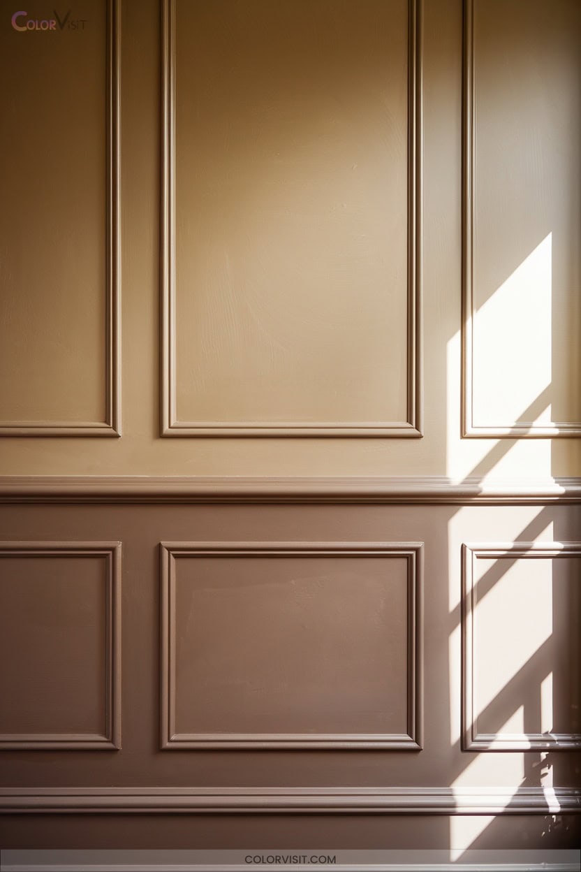
8. Earthy Brown Tones With Creamy Upper Walls
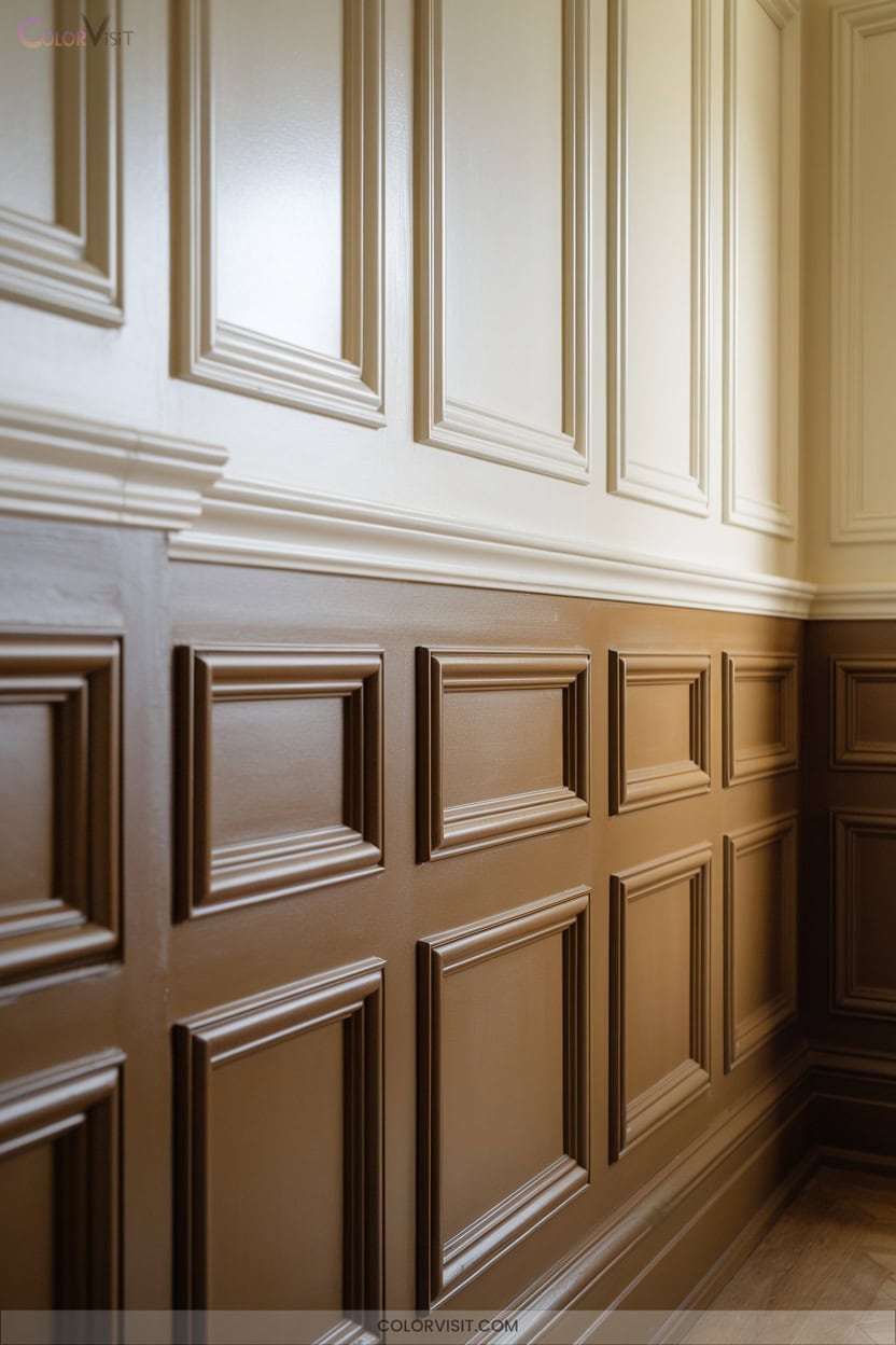
A foundation of earthy brown wainscoting paired with creamy upper walls anchors a room with warmth and timeless appeal.
Earthy brown wainscoting and creamy walls create a grounded, inviting atmosphere that endures with classic warmth and refined charm.
You achieve visual equilibrium by balancing rich, organic hues below with luminous, airy tones above, ensuring spatial harmony.
Opt for beadboard or raised panel profiles in wood or MDF for tactile depth and architectural distinction.
Highlight boundaries with complementary trim and accentuate the wainscoting’s depth using targeted lighting.
Integrate nature-inspired decor—textured textiles, greenery, or patterned rugs—for a cohesive, layered aesthetic.
Regular maintenance, such as sealing or revitalizing the finish, guarantees the wainscoting’s enduring elegance and adaptability within forward-thinking interiors.
9. Fresh Mint or Aqua Paired With Neutrals
Invigorating color meets modern restraint when you pair fresh mint or aqua wainscoting with neutrals.
Picture crisp white walls amplifying the mint’s clarity while light gray creates seamless blends.
Integrate sharp white trim for spatial definition and a touch of elegance. Soft gold accents or understated chrome hardware infuse the space with upscale detail.
For flooring, beige or cream grounds the palette, ensuring visual harmony.
Natural wood or sandy brown elements warm the atmosphere, while subtle patterns or pastel decor bring depth.
This approach transforms your wainscoting into a vibrant architectural statement—fresh, balanced, and distinctly innovative in character.
10. Blush Pink Wainscoting for Modern Charm
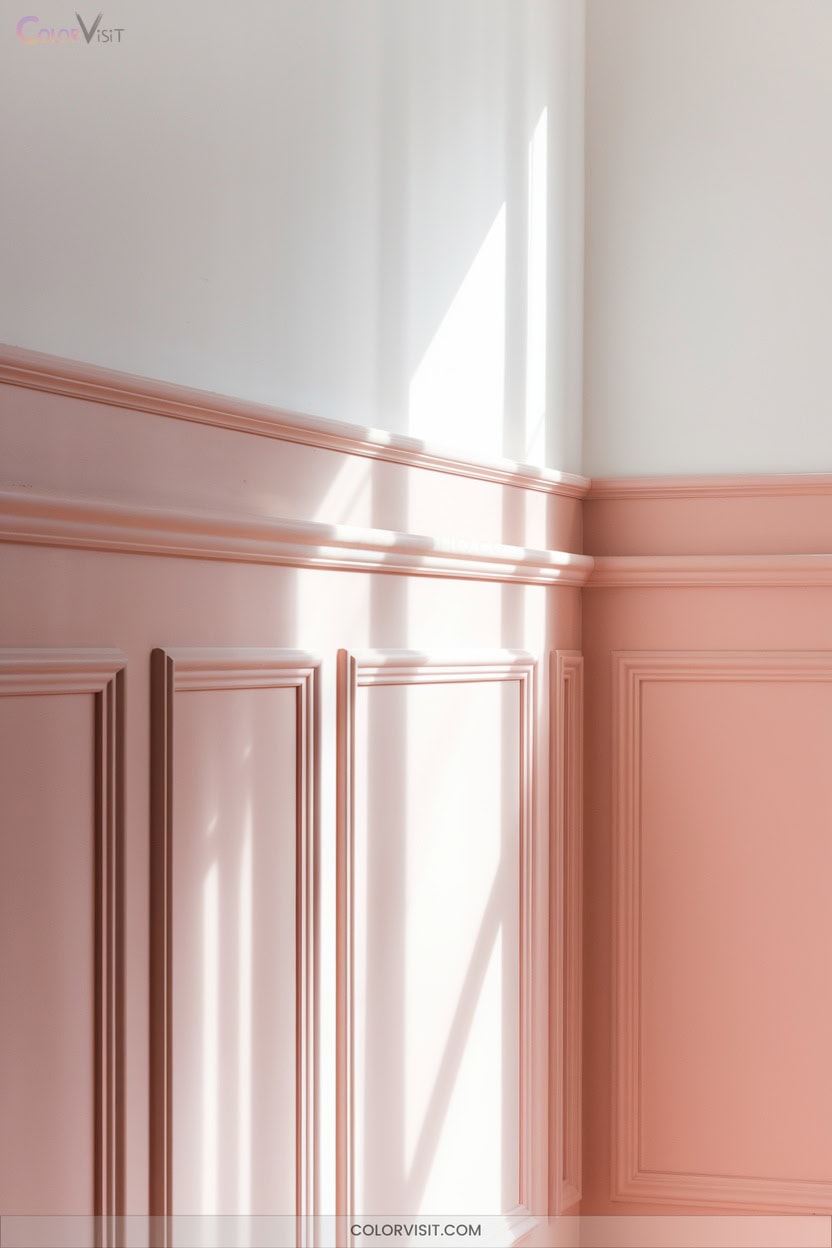
Blush pink wainscoting instantly introduces modern charm, softening architectural lines while anchoring the room in contemporary style.
Blush pink wainscoting brings modern charm, softens architectural edges, and grounds your space in a fresh, contemporary aesthetic.
You’ll appreciate how this hue’s subtle warmth interacts with natural wood elements, achieving a sophisticated yet inviting balance.
Elevate cohesion by pairing blush panels with muted neutrals or other soft pastels—ideal for spatial harmony. Consider integrating raised or recessed panel wainscoting to enhance depth and texture.
Accentuate with rattan lighting or metallic finishes for visual intrigue. Blue accent chairs or curated wall art can serve as dynamic focal points.
This approach transforms dining rooms, living areas, or bedrooms into innovative, character-rich environments.
11. Dramatic Deep Green With Light Accents
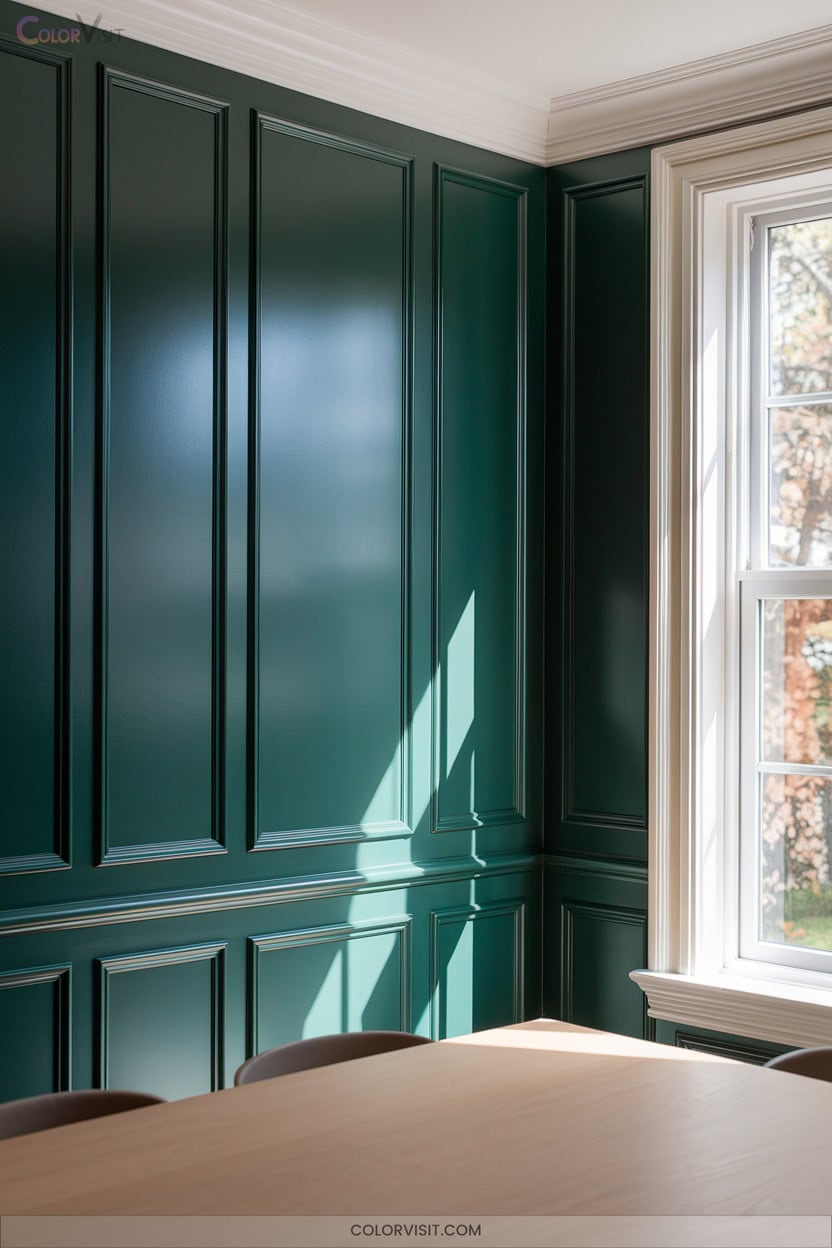
Emerald-toned wainscoting delivers a commanding presence, grounding your space with rich, saturated color while providing a sophisticated canvas for light accents.
Elevate architectural detail by pairing deep green panels with crisp cream or white trim, instantly amplifying dimensionality and contrast. Square or rectangular molding introduces visual structure; vertical elements draw the eye upward, enhancing spatial height.
Surround the bold green with neutral or patterned wallpapers for layered complexity. Integrate gold hardware or brass sconces to inject luxe highlights.
Strategically placed moody lighting sculpts ambiance, intensifying depth and shadow. This approach seamlessly balances historic charm with contemporary innovation, redefining classic wainscoting character.
12. Light Wood Tones Enhanced With White Trim
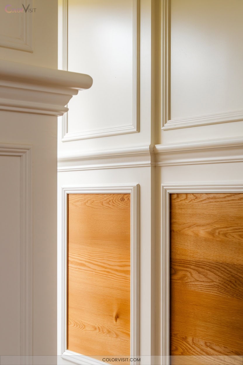
A palette of light wood wainscoting accented with crisp white trim delivers a refined yet approachable foundation for any interior.
Select oak, maple, or birch panels in pale beige or honey, emphasizing subtle grain and organic knots for tactile dimension.
Frame these with white trim—choose high-reflectance paints like Chantilly Lace or White Dove—to delineate spatial boundaries and amplify architectural detail.
Integrate soft greiges or muted blues on adjacent walls for gentle chromatic contrast.
In living rooms, hallways, or bedrooms, this pairing fosters visual clarity and layered texture, accommodating both minimalism and eclectic accents while preserving a sense of brightness and cohesion.
Frequently Asked Questions
How Do I Maintain Painted Wainscoting to Prevent Chipping and Wear?
You’ll maintain painted wainscoting by routinely dusting, inspecting for flaws, and applying touch-up paint. Seal joints with caulk, control humidity, and use acrylic sealers on MDF for resilience. Strategically place felt pads and mats to minimize impact.
Can Wainscoting Be Installed in Bathrooms or High-Moisture Areas?
You can absolutely install wainscoting in bathrooms or high-moisture areas—just opt for moisture-resistant MDF, acrylic, or PVC panels. Prioritize seamless joints, superior ventilation, and professional-grade seals to achieve a visually seamless, innovative, and enduring installation.
What Is the Typical Height for Wainscoting in Different Sized Rooms?
Imagine you’re aligning your wainscoting with a window sill—coincidentally, that’s often around one-third wall height. You’ll typically install at 32-33 inches for 8-foot ceilings, but in expansive rooms, try two-thirds for dramatic, spatially dynamic impact.
Are There Eco-Friendly Paint Options for Wainscoting Panels?
You’ll find eco-friendly paints for wainscoting—think zero-VOC formulas, natural pigments, and certified sustainable blends. Select vibrant hues, assess finish against panel texture, and verify Green Seal or GREENGUARD certification for innovative, health-conscious, visually striking wall treatments.
How Do I Transition Wainscoting Around Corners or Doorways?
To adapt wainscoting around corners or doorways, you’ll integrate bullnose corner blocks, full stile returns, or decorative pilasters. Maintain cap rail alignment, synchronize reveals, and use laser layout for crisp, seamless visual flow at every architectural intersection.
Conclusion
So, after all these spectacular painted wainscoting ideas, you’ll obviously just stick with plain white walls, right? Of course not!
With palettes spanning from charcoal drama to blush whimsy, your vertical surfaces are practically begging for a little chromatic flair. Go ahead—embrace shadow play, architectural relief, and color blocking.
Your walls deserve a story, not just another coat of off-white. Besides, who wouldn’t want their room’s lower third to outshine the rest? It’s only logical.