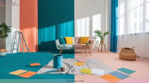
14 Soothing Pastel Wall Color Ideas for a Soft, Elegant Home
Transform your home into a haven of soft elegance with nuanced pastels like powder blue for tranquil walls, lemon yellow to energize, and lilac with grey undertones for subtle romance. Blend peach pit or candyfloss pink with pale wood accents for harmony, and layer in metallics for sophisticated flair.
Contrast pastels with jewel tones or use zoning in open-plan areas for visual depth. You’ll discover expert pairings and textural layering to perfect a truly refined space just ahead.

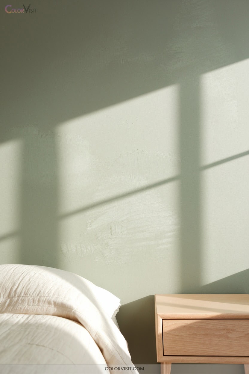
1. Powdered Blue for Modern Tranquility

Powder blue embodies modern tranquility, offering a refined yet soothing backdrop that instantly calms a space.
When you integrate this hue, you leverage its therapeutic potential—ideal for stress reduction and mood elevation.
Embracing powder blue invites tranquility, harnessing its calming effect to soothe stress and uplift your mood.
Pair powder blue with crisp white or muted beige to amplify its airy visual impact and create expansive, restful interiors.
Incorporate it through accent walls, cabinetry, or upholstery for a cohesive, contemporary look.
Enhance textural interest with layered textiles and curated artwork.
Powder blue’s versatility extends to minimalist settings, alcove details, and seasonal adaptability, ensuring your space remains innovative, serene, and tailored for sophisticated relaxation year-round.
2. Lemon Yellow to Energize and Brighten
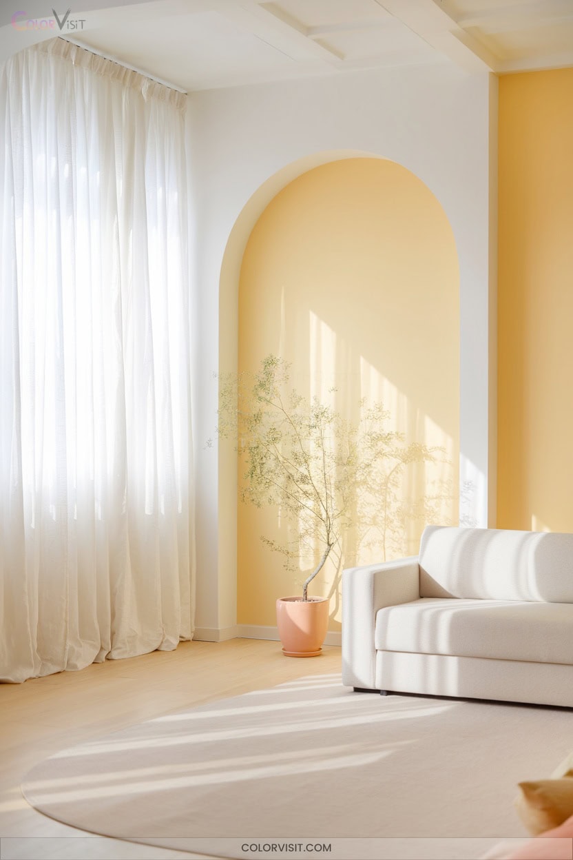
Illuminate your interiors with lemon yellow, a pastel that instantly energizes and brightens any space through its highly reflective qualities.
Leverage this tone in north-facing rooms to counteract cool shadows and infuse warmth.
Pair lemon yellow with crisp white trim or layer with pale neutrals like linen and oat to maintain radiance without glare.
Integrate glossy finishes and mirrors to maximize light diffusion, especially in compact or dim spaces.
Use lemon yellow on kitchen cabinetry or as a subtle accent against warm greys and navy for sophisticated contrast.
Always test undertones and scale intensity, ensuring a dynamic yet harmonious effect.
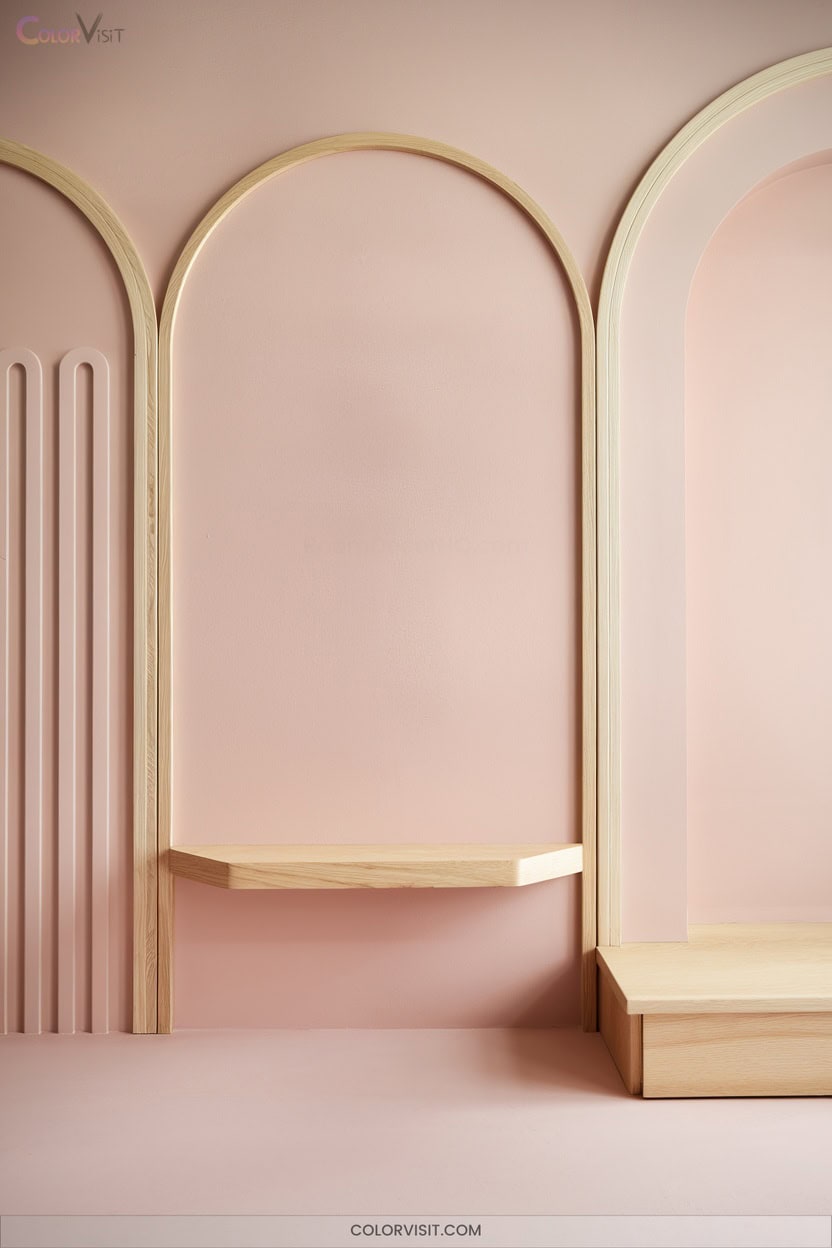
3. Peach Pit for Serene Living Spaces
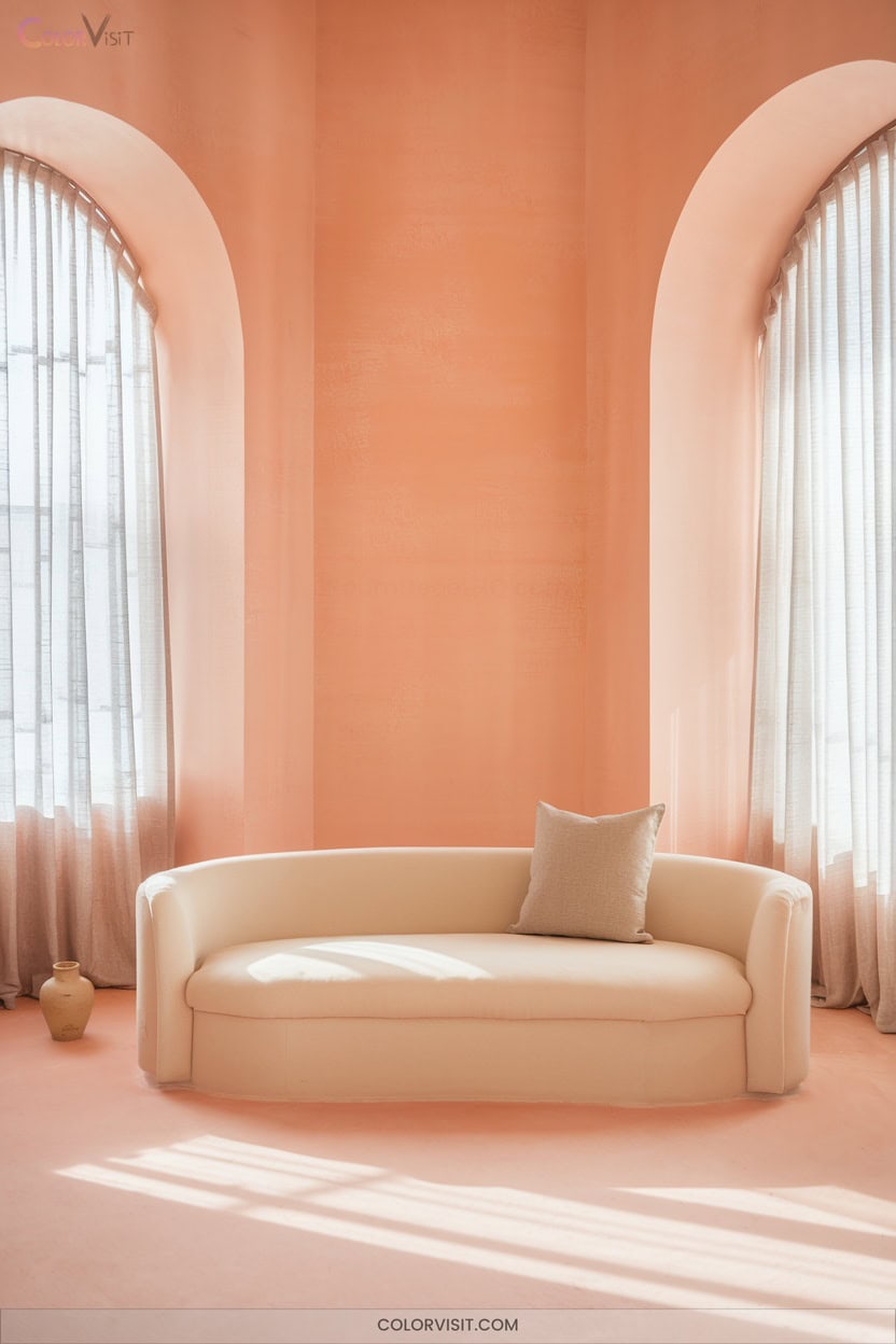
While lemon yellow infuses spaces with uplifting brightness, Peach Pit offers a softer, more tranquil approach to pastel interiors.
This nuanced hue blends pastel yellow and red, yielding a delicate balance ideal for serene living spaces.
A soft fusion of pastel yellow and red creates a gentle balance, perfect for cultivating calm and inviting interiors.
Leverage Peach Pit’s luminous matte finish to maximize light reflectance, enhancing openness in compact rooms.
Pair it with vintage or modern furnishings and highlight with bold pinks, earthy browns, or metallic gold accents for sophisticated contrast.
Coordinate textiles—linen, cotton, silk—for tactile harmony.
Under warm lighting, Peach Pit calms, boosts mood, and stimulates creativity, making it a versatile, innovative choice for contemporary interiors.
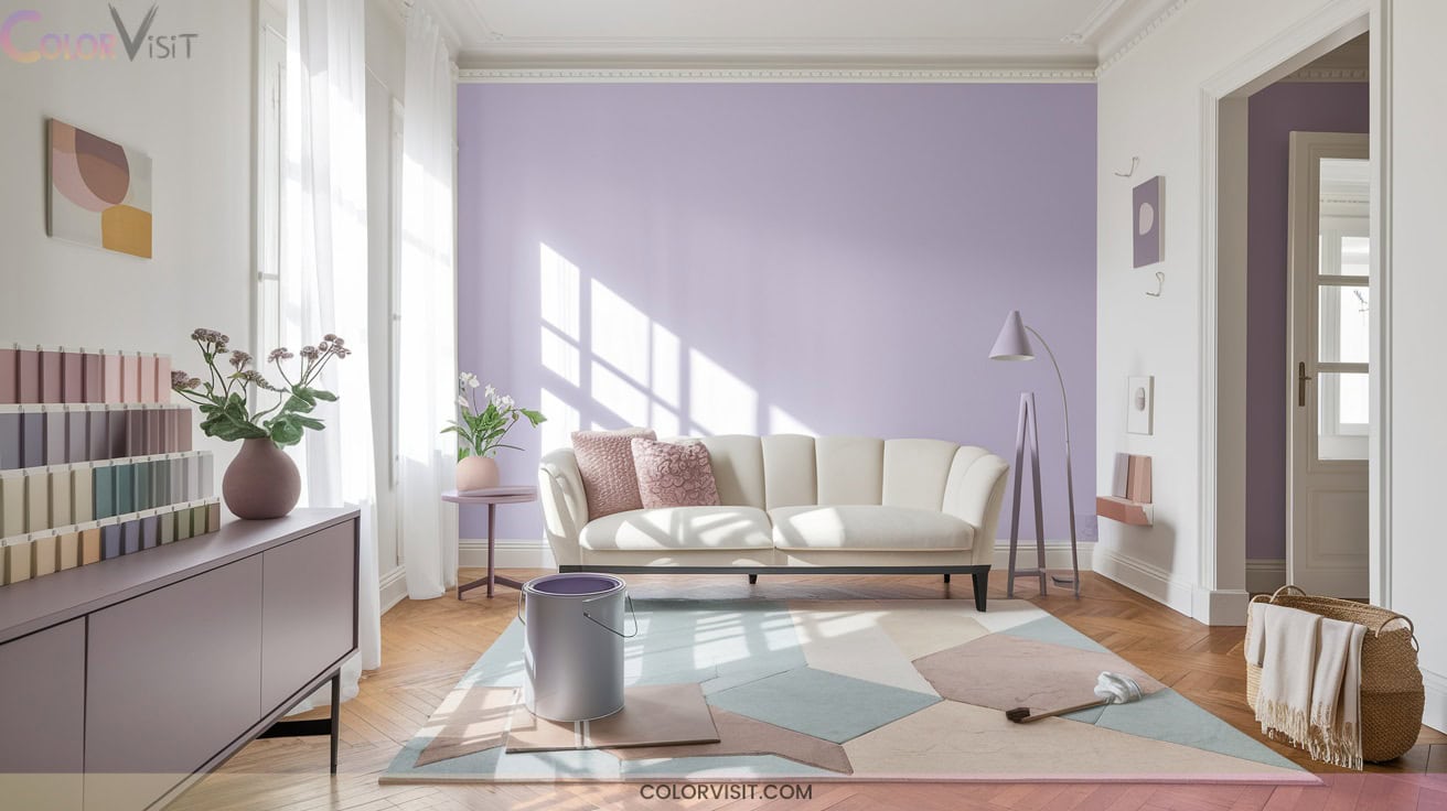
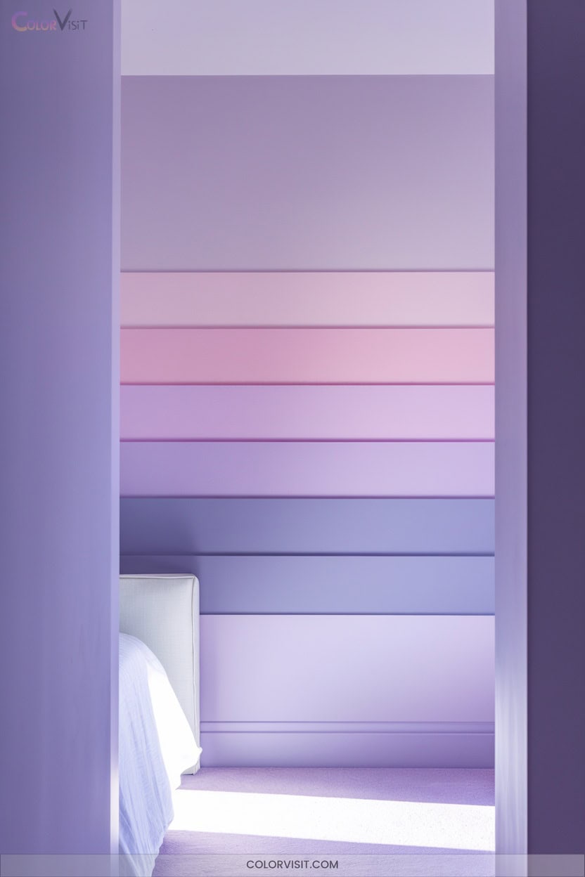
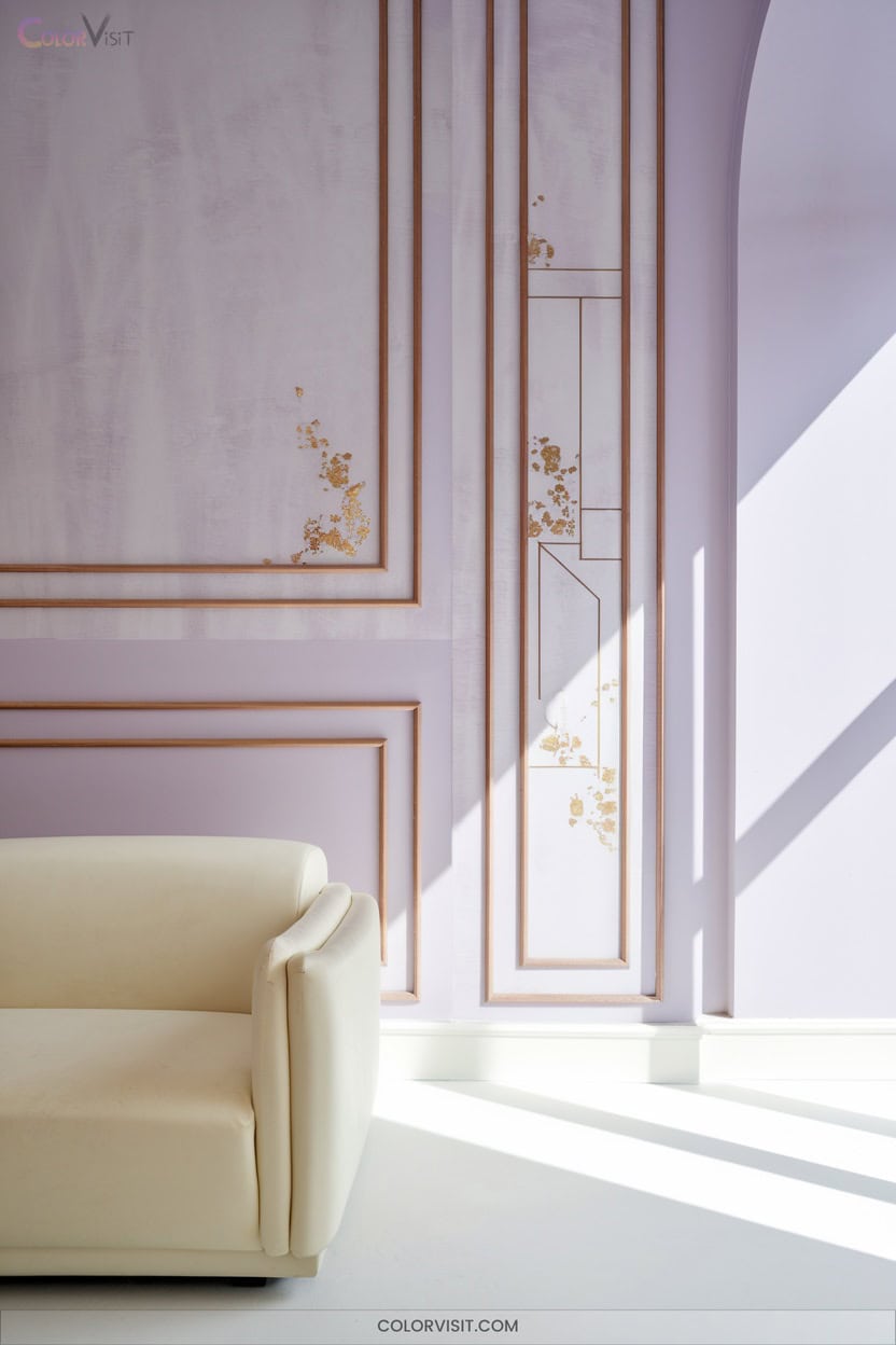
4. Lilac With Grey Undertones for Subtle Romance
Elegance defines lilac with grey undertones, delivering a refined blend of soft purple and grounded neutrals that instantly elevates any space.
You’ll appreciate the sophisticated impact of Jolie Paint’s Lilac Grey or Benjamin Moore’s Hazy Lilac for their icy, muted nuance.
Consider LRV when selecting the right shade—high LRV enhances light diffusion, while deeper variants create intimacy.
Pair lilac grey walls with warm metal accents like copper or brass, and introduce natural textures for tactile depth.
Complement with whites or soft pastels for cohesion, or add emerald and navy for contrast.
The result: romantic, versatile, and visually innovative interiors.
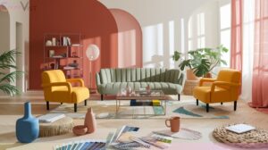
5. Candyfloss Pink for Contemporary Softness
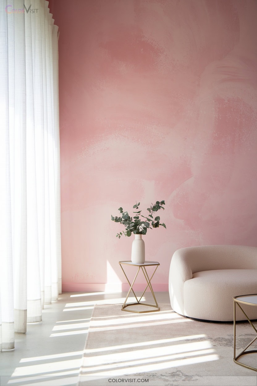
After exploring the muted sophistication of lilac with grey undertones, candyfloss pink introduces a distinctly contemporary softness to interiors.
Embrace this 2025 trend by incorporating geometric wallpapers or sleek candyfloss pink tiles for visual dynamism.
Balance sweetness with crisp white, charcoal grey, or bold black accents to avoid a saccharine effect.
For a refined palette, layer with peach, cream, or deep jade green.
Integrate brass fixtures for luxe contrast, and maximize natural light to amplify the pastel’s airy elegance.
Harness the playful, creative energy of Barbiecore and Bridgerton inspiration—candyfloss pink delivers versatility, modernity, and a calming, sophisticated atmosphere.
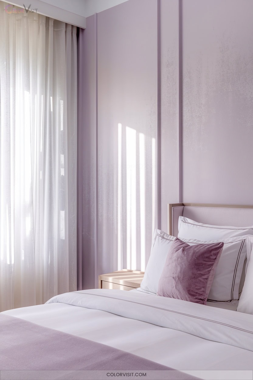
6. Lavender-Gray for Restful Bedrooms
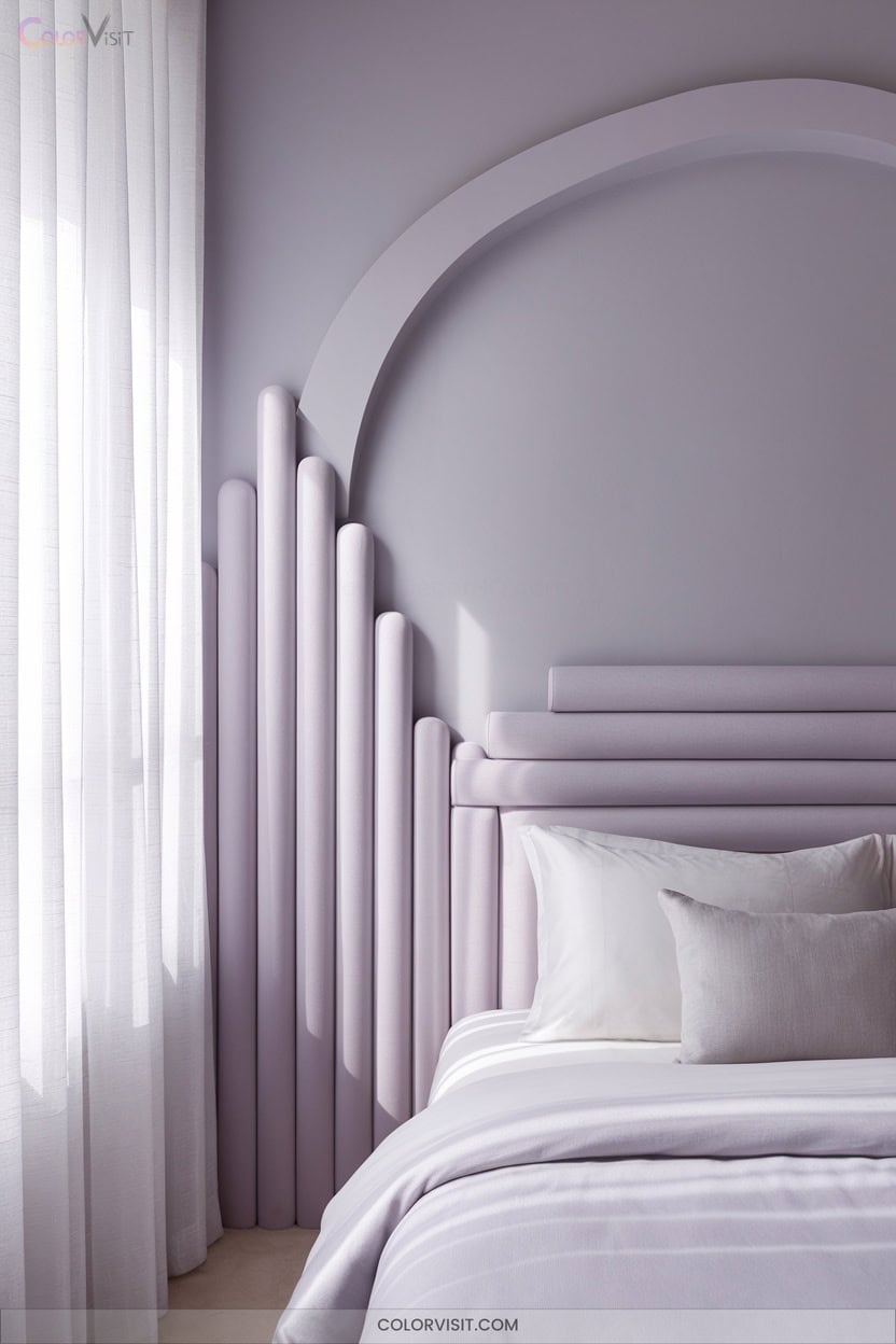
Anchoring your bedroom in lavender-gray establishes a tranquil foundation that expertly balances soothing blue undertones with muted purple hues.
Lavender-gray creates a serene bedroom haven, blending calming blue undertones with gentle hints of purple for restful elegance. This hue not only promotes relaxation but also pairs beautifully with natural materials like wood and soft textiles. For those looking to enhance this tranquil atmosphere, lavender-gray serves as an excellent backdrop for cozy sitting room color ideas, effortlessly complementing plush furniture and inviting decor. Accents of white or soft gold can further elevate the space, creating an inviting retreat that feels both luxurious and welcoming.
This nuanced shade reduces anxiety, simulating dusk-like calm and promoting restful sleep.
Pair it with ivory bedding and charcoal-gray velvet for elegant contrast and tactile sophistication.
Mercury glass or crystal accents reflect light, enhancing glamour without overwhelming the palette.
Choose matte finishes for contemporary subtlety and integrate natural wood to ground the scheme organically.
Layer linen and silk textiles for visual and sensory depth.
For ideal results, test swatches under varied lighting and maintain 30–40% white space for airy harmony.
7. Mint Green to Enhance Focus in Home Offices
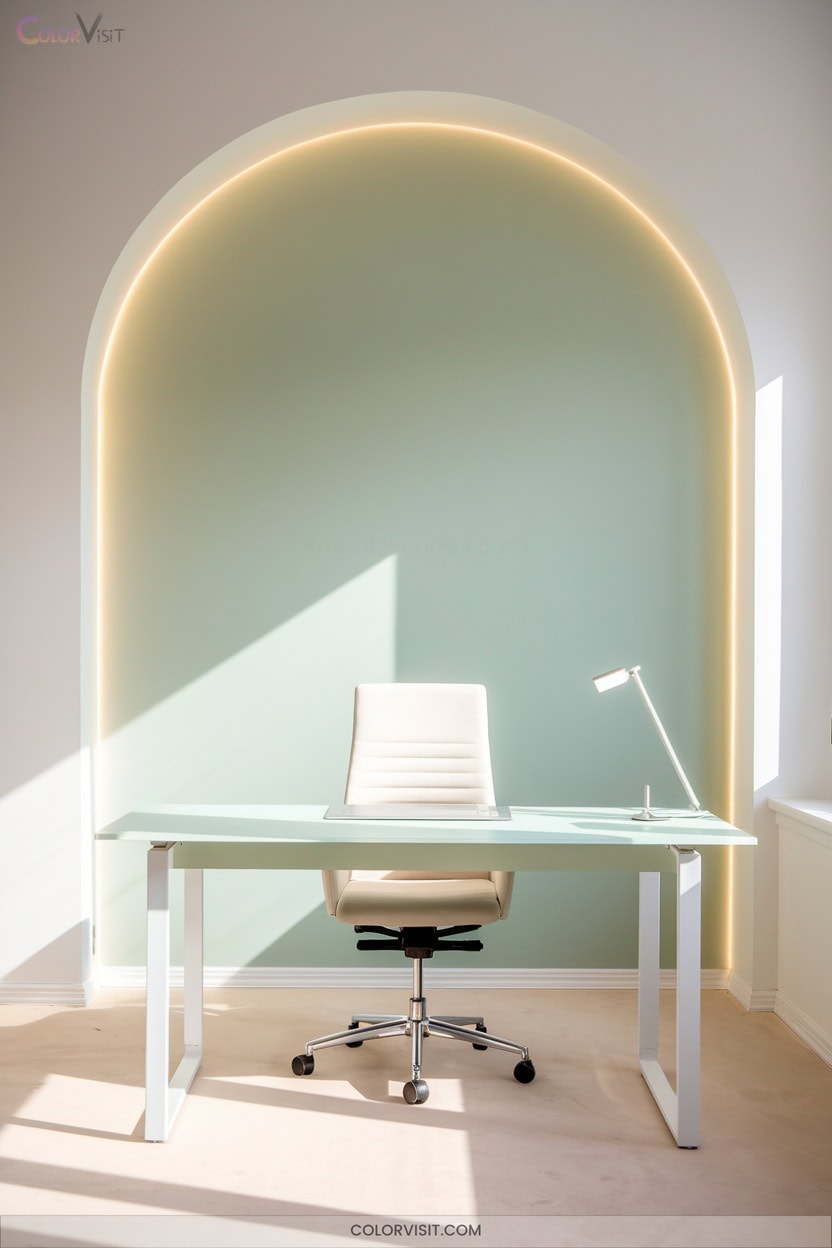
When you paint your home office in mint green, you cultivate an environment that sharpens focus and soothes the senses.
This hue’s tranquil undertone reduces eye strain and minimizes visual clutter, enhancing mental clarity for high-performance tasks.
Select a pale mint like Dulux Refresh Mind to amplify brightness in compact settings, or opt for sage-infused mints to deepen concentration.
Pair with charcoal accents and warm wood for a modern, grounded effect.
Elevate productivity by positioning mint behind your monitor and integrating ergonomic furniture, minimalist shelving, and task lighting.
Mint green’s subtle vibrancy transforms your workspace into a refined, innovative sanctuary.
8. Sky Blue for Airy, Inviting Bathrooms
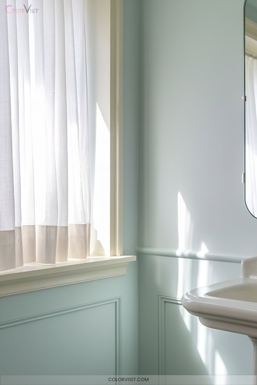
Tranquility defines a bathroom adorned in sky blue.
This innovative hue visually expands the space, harnessing reflective glass tiles and maximizing natural light for an ethereal, spa-like ambiance.
Pairing sky blue with crisp white fixtures, sleek brass accents, and warm wood tones creates a sophisticated, coastal-inspired retreat.
For a designer’s rhythm, consider:
- Mosaic glass tiles to amplify the room’s luminous quality
- A freestanding white tub to anchor the space with modern luxury
- Pendant lighting in brushed brass for contemporary elegance
Sky blue serves as a dynamic backdrop, transforming your bathroom into an airy, inviting haven that celebrates both innovation and relaxation.
9. Eucalyptus Green for a Nature-Inspired Retreat
Eucalyptus green instantly evokes the serenity of the outdoors, grounding interiors in cool, organic sophistication.
This nuanced pastel—with blue undertones and low to medium light reflectance—creates restful, spa-like retreats ideal for bedrooms and living spaces.
Choose Sherwin-Williams Fresh Eucalyptus or Benjamin Moore Eucalyptus for a refined, contemporary palette.
Pair this hue with natural textures like linen, rattan, or stone to amplify its botanical essence.
Opt for matte or flat finishes to conceal imperfections while preserving softness.
GREENGUARD Gold-certified options guarantee healthier air quality.
Integrate eucalyptus green with creams and beiges for a tailored, tranquil environment that exudes modern elegance.
10. Monochrome Pastel Layering for Added Depth
While eucalyptus green roots a space in organic calm, monochrome pastel layering adds depth and dimension through nuanced color play.
Harness tonal harmony by layering pale, mid, and deep variations of a single pastel hue—think powder blue, sky blue, and slate.
This approach elevates sophistication, steering clear of saccharine or juvenile undertones.
Use the 60-30-10 rule for ideal balance, and integrate tactile finishes for visual intrigue.
To innovate your monochromatic palette, consider:
- Layering velvet or matte textures for added depth
- Introducing black or metallic accents to ground the scheme
- Adjusting lighting to highlight each tonal shift
11. Pastel Walls With Light Wood Accents
A refined pastel wall paired with light wood accents creates a balanced, luminous backdrop that feels both fresh and timeless.
Select low-saturation hues—mint, blush, powder blue—and opt for matte or eggshell finishes to diffuse light without glare.
Integrate wide-plank oak or ash flooring for seamless continuity; reinforce architectural lines with pale wood baseboards or crown molding.
Install floating wood shelves or mid-century modern furniture in natural finishes for functional contrast.
Use adjustable track lighting or cove fixtures to emphasize grain and texture.
For innovative edge, juxtapose vertical wood slats beside pastel drywall or add pastel epoxy countertops atop wood cabinetry.
12. Bold Contrasts: Pastels Paired With Jewel Tones
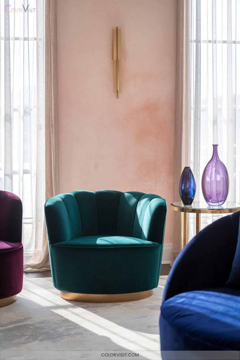
Moving beyond the serene interplay of pastels and light woods, pairing pastel walls with jewel-toned accents elevates a space with sophisticated contrast and energy.
You’ll find that the gentle, airy backdrop of mint, lavender, or pale blue becomes striking when punctuated by emerald, sapphire, or amethyst elements.
This dynamic approach avoids monotony, infusing vibrancy without harshness.
Achieve visual intrigue by layering color and texture, maintaining balance and focus.
- Opt for velvet sapphire cushions on a pale apricot sofa for tactile luxury
- Introduce ruby curtains against pale turquoise walls for opulent drama
- Highlight focal points with emerald or jade accessories on pastel backgrounds
13. Metallic Accents to Elevate Soft Tones
Luster transforms the ambiance of a pastel room, introducing metallic accents that elevate soft tones from simple to sophisticated.
Integrate gold for warmth and luxury against blush pinks or mint greens; use silver for a sleek, modern contrast with powder blues.
Copper delivers rustic warmth, while rose gold infuses feminine elegance—ideal for lilac or lavender.
Opt for metallic finishes in lighting, furniture trims, or decorative art frames to amplify light and expand visual space.
Employ restraint: minimal metallics preserve the softness of pastels.
For an innovative edge, mix metals or create a metallic accent wall, ensuring balanced, contemporary refinement.
14. Pastel Zoning for Defined Open-Plan Areas
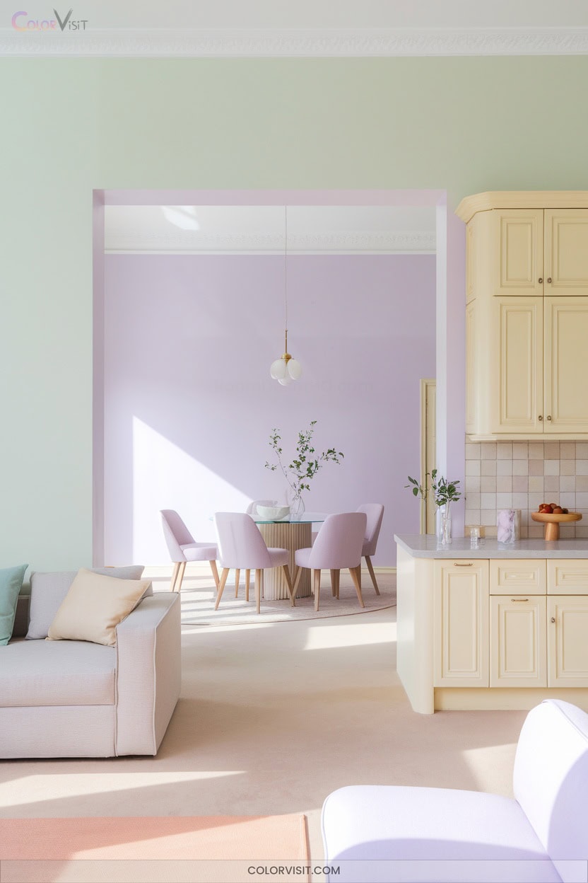
Transform open-plan living with pastel zoning—an approach that defines function without sacrificing the airiness these hues provide.
Pastel zoning in open-plan spaces defines function while preserving the light, breezy atmosphere these gentle hues naturally create.
Restrict your palette to one or two harmonized pastel shades for seamless zone blends, utilizing analogous hues like a mint-to-sage gradient to subtly differentiate dining from lounge.
Employ monochromatic layering—think powder blue walls with deeper steel blue textiles—for visual depth without visual fragmentation.
To anchor and unify:
- Use rugs and flooring contrasts (e.g., hexagonal tiles vs. light hardwood) to delineate activity areas.
- Layer ambient and task lighting for zone emphasis.
- Position modular furniture to form intuitive, movable boundaries between spaces.
Frequently Asked Questions
How Do Pastels Perform in Rooms With Minimal Natural Light?
In rooms with minimal natural light, you’ll notice pastels shift darker and lose vibrancy. Counteract this by layering textured surfaces, introducing reflective décor, and deploying innovative lighting strategies to amplify chromatic intensity and maintain visual sophistication.
Can Pastel Wall Colors Help Small Rooms Feel Larger?
You’d never guess, but pastel wall colors are spatial magicians. Embrace luminous pale blues or greens; they effortlessly bounce light, visually stretch boundaries, and create seamless blends. Pair with tonal ceilings for a chic, avant-garde illusion of grandeur.
Are Pastel Paints Available in Eco-Friendly or Low-Voc Formulas?
You’ll find innovative pastel paints in eco-friendly, VOC-free formulas—think mineral-based pigments, plant binders, and upcycled content. Opt for brands like Earthberry or ReColour for biodegradable packaging, modular palettes, and artisan-quality hues that elevate sustainable design.
How Do I Prevent Pastel Walls From Looking Washed Out?
Studies show 68% of designers use contrasting elements to prevent pastel walls from appearing washed out. You’ll want to layer deeper accents, implement warm lighting, and choose richer pastel tones for visual depth and sophisticated, innovative color harmony.
What’S the Best Way to Touch up Stains on Pastel Walls?
To touch up stains on pastel walls, meticulously match paint and finish, prime if necessary, and feather edges with minimal strokes. Use high-caliber tools for precision. Test on a hidden spot first—you’ll guarantee seamless, innovative visual harmony.
Conclusion
By choosing pastel wall colors, you’re embracing a proven path to serenity—studies show that 72% of people feel calmer in softly colored rooms. Don’t underestimate the transformative power of a powder blue accent or peach pit living space.
Layer in light woods, metallics, or bold contrasts to elevate your style. With these expert-approved palettes, you’ll create an elegant, visually restful environment that instantly welcomes and soothes—making your home a true sanctuary.