18 Transformative Room Wall Color Ideas for Every Space
Transform any space by choosing wall colors with purpose: opt for warm beige or soft greige to harmonize with daylight and earthy finishes, or try misty blue ceilings and sunny yellow for amplified light and height. Define zones with taupe, energize focal points with paradise green, and ground lounges with walnut brown or textured terracotta.
Experiment with gradients, ombré, artistic murals, and feature arches for heightened visual depth and sophistication. Each approach fine-tunes mood, flow, and functionality—discover which transformations best suit your space’s needs.

1. Warm Beige for Timeless Versatility

A warm beige wall instantly elevates any space by offering both timeless versatility and a sense of comfort.
You’ll notice its adaptable undertones—often with subtle green—that harmonize with earthy finishes and innovative design materials.
In rooms with abundant daylight, beige radiates a natural glow, while in dimmer spaces, it maintains cozy sophistication.
Select industry favorites like Manchester Tan or Wool Skein for a modern, balanced effect.
Pair beige with gold accents, layered lighting, and natural textures to enhance depth.
It’s an ideal foundation for displaying art, experimenting with textiles, or merging contemporary and vintage furnishings for a dynamic, future-focused interior.
2. Soft Greige for Balanced Sophistication
Moving from the warmth of beige, soft greige introduces a refined balance that anchors contemporary spaces with subtle sophistication.
This nuanced fusion of gray and beige adapts fluidly to changing light, revealing undertones from taupe to pink or red, depending on your space’s orientation and surrounding accents.
Soft greige shifts with the light, unveiling subtle undertones that transform with your room’s orientation and chosen accents.
Experiment with Sherwin Williams Worldly Gray or Benjamin Moore’s Edgecomb Gray to achieve timeless versatility.
Soft greige excels in living rooms and bedrooms, establishing tranquility without sterility.
Pair it with natural materials—wood, clay, muted greens—or energize it with bold jewel tones.
Always sample under various lighting to guarantee the ideal undertone emerges.
3. Misty Blue Ceilings to Enhance Airiness
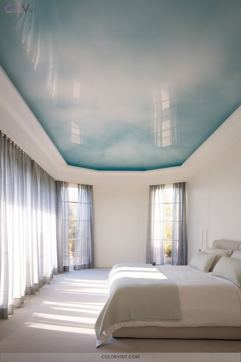
Elevate any room’s sense of space with misty blue ceilings—a strategic color choice that leverages high light reflectance (LRV 65.83) to visually raise low ceilings and diffuse daylight.
This icy blue, touched by lavender and tempered with gray, offers crisp airiness without the sterility of flat baby-blue.
Pair it with warm brass fixtures or natural wood for dynamic balance and avoid visual stops by extending color onto crown moldings.
Misty blue adapts to directional light, enhancing calm and spatial flow in both residential and commercial settings.
- Oxford White trim for sharp, modern contrast
- Satin finish amplifies brightness
- Greige furnishings bridge tones
- Layer with Beacon Gray for coastal vibes
4. Walnut Brown for Modern Richness
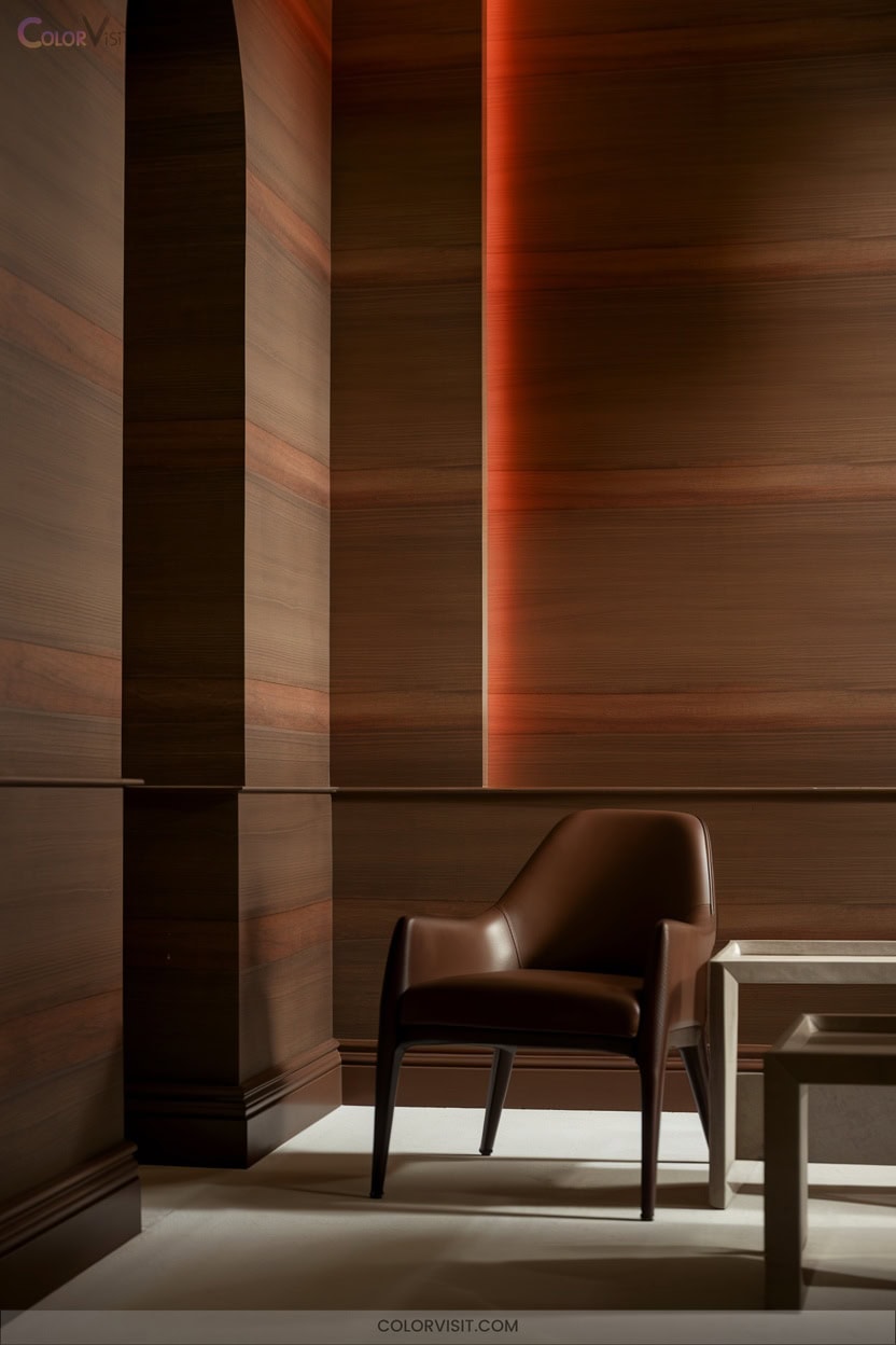
Depth and sophistication define rooms anchored by walnut brown—a hue that delivers modern richness through its organic warmth and versatile undertones.
Use neutral backdrops, such as crisp white or soft gray walls, to let walnut’s grain and luster command attention.
Integrate earth tones—terracotta or sienna—for an elevated, grounded palette.
Amplify vibrancy with bold plum or jewel-toned accents, and introduce metallic touches in bronze or gold for refined contrast.
Leverage walnut’s adaptability in modern minimalism, bohemian chic, or luxury interiors.
Prioritize natural light to reveal nuanced undertones and balance dark wood with lighter textiles, ensuring a visually dynamic, innovative space.
5. Taupe for Flexible Accent Pairings
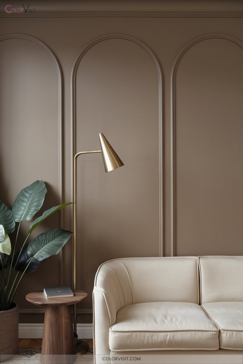
Versatility defines taupe, a sophisticated blend of brown and gray that adapts seamlessly to countless design visions.
You’ll find taupe’s chameleon-like quality indispensable for curating dynamic, innovative spaces.
It anchors minimalist, modern, or eclectic rooms, providing a neutral yet intriguing canvas.
Manipulate its undertones with lighting—warm bulbs accentuate coziness, while daylight amplifies subtle coolness.
Taupe transcends style boundaries, excelling as a backdrop for bold or muted accents and layered textures.
- Pair with velvet cushions and leather furniture for tactile luxury
- Combine with crisp whites or deep blues for visual contrast
- Integrate woven rugs for organic warmth
- Highlight with layered lighting
6. Paradise Green as a Vibrant Focal Point
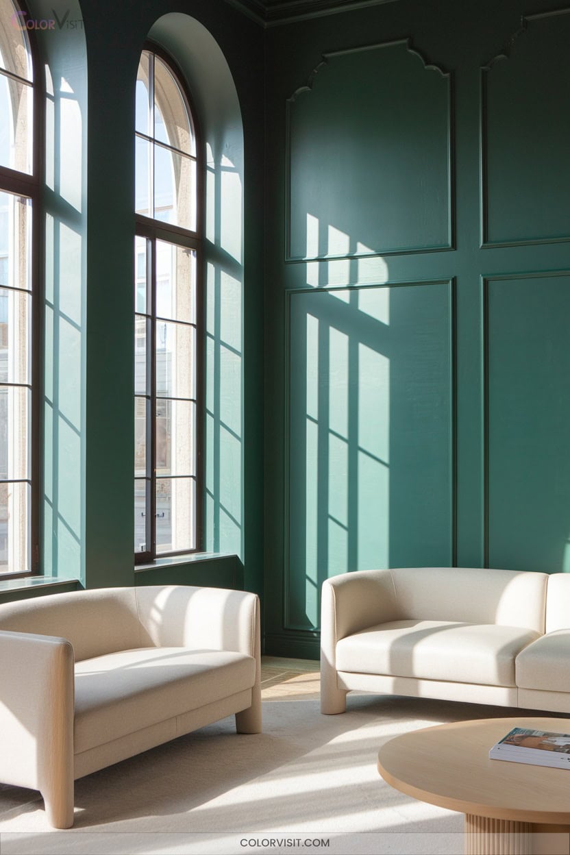
While taupe provides a reliable, adaptable base, Paradise Green commands attention with its vivid energy and tropical flair.
Paradise Green infuses interiors with bold energy and a lively, tropical spirit that instantly enlivens any neutral space.
Use this daring shade—akin to Benjamin Moore’s 2031-20—to establish a dynamic focal point, especially as a feature wall.
Its moderate LRV of 33.27 reflects just enough light to keep spaces lively without overwhelming.
Pair with Alpine White or Cliffside Gray for crisp contrast, or integrate natural textures like rattan for organic harmony.
Paradise Green’s invigorating presence infuses interiors with a sense of escapism and natural connection, ideal for innovative environments seeking a balance between serene ambiance and visual vibrancy.
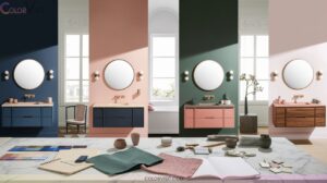
7. Peach Blossom Pink for Understated Glamour
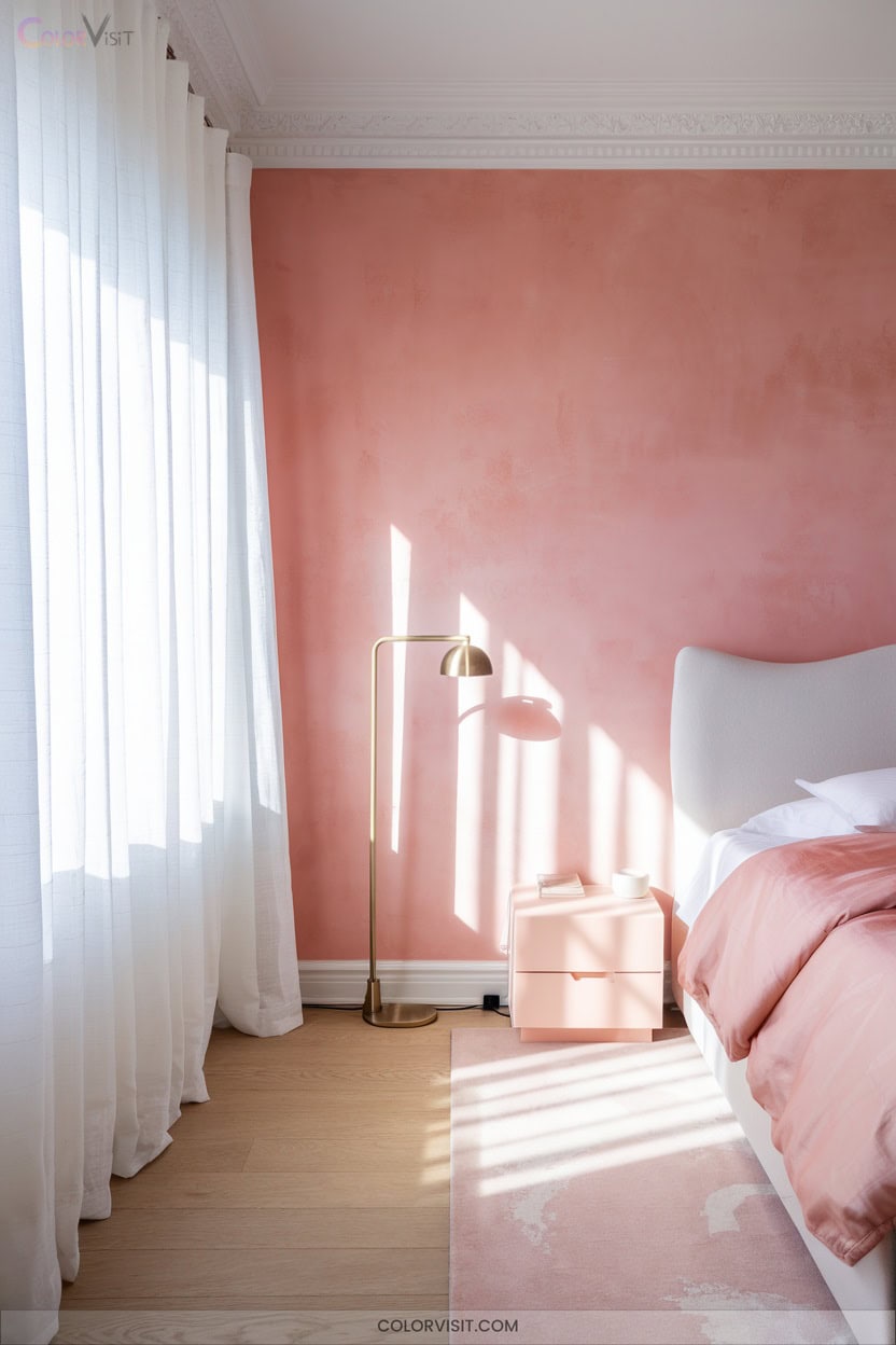
How can you achieve a refined yet inviting space without overwhelming the senses?
Peach Blossom Pink offers a nuanced approach to understated glamour, blending historical inspiration with innovative paint technology.
Its soft hue, available in limewash and absolute flat emulsion, enhances spatial light and airiness.
Choose VOC-free, mineral-based options for healthier interiors and surfaces that breathe.
Pair with grey teal for a sophisticated palette or use on vintage furniture for a modern heritage effect.
- Accent an entryway wall with a dusky pink limewash finish
- Refresh cabinetry using eggshell peach blossom
- Layer with pastel décor for visual harmony
- Illuminate dim corners with pale pink tones
8. Sunny Yellow to Brighten Any Room
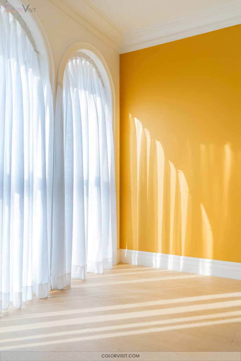
After exploring the soft elegance of Peach Blossom Pink, consider the invigorating effect of sunny yellow for your walls. This chromatic choice injects energy and optimism, amplifying natural light and visually expanding compact spaces.
For an innovative palette, juxtapose yellow with crisp white or dynamic teal. Select buttery tones to soften small rooms, or opt for bold accents to energize focal points like alcoves or reading nooks.
Balance undertones to avoid harshness—test samples in varying light. Sunny yellow harmonizes with earthy hues, enhances wall art, and infuses your environment with positivity and warmth, transforming any room into a luminous, contemporary retreat.
9. Navy Blue for Dramatic Contrast
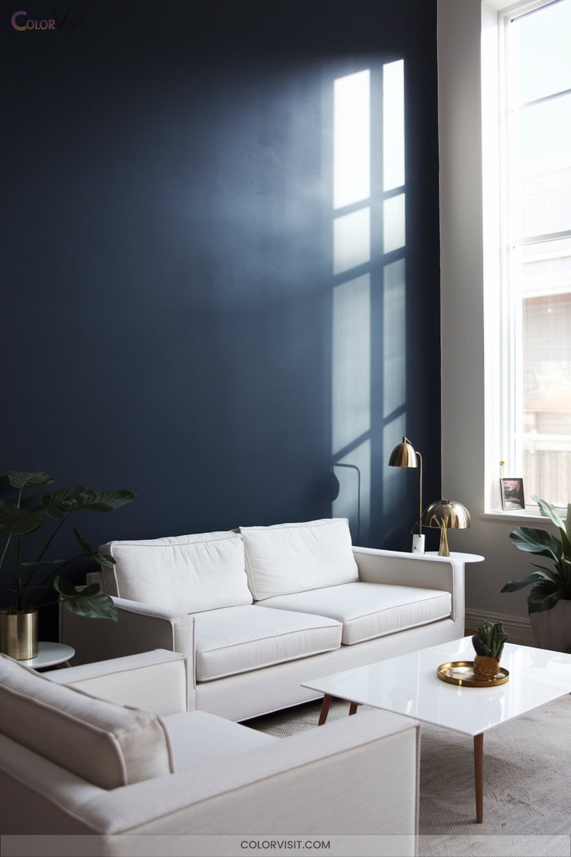
Depth defines navy blue, delivering a bold, sophisticated contrast that instantly transforms any space.
Navy blue’s depth creates a bold, refined contrast that elevates and reinvents any interior with instant sophistication.
You’ll find its moody undertones perfect for cultivating intimacy and drama, whether embracing a modern living room or a serene bedroom retreat.
Navy’s visual dynamism adapts under shifting light—deep and enveloping after dusk, crisp and invigorating by day.
Opt for this hue as a contemporary alternative to black, or let it anchor an accent wall for architectural precision.
- Benjamin Moore Polo Blue: classic, stately navy, ideal for formality
- Velvet drapes in darker navy: pairs with leather for tactile richness
- Botanical navy-white patterns: fresh, not nautical
- Gold and sienna accents: amplify luxury
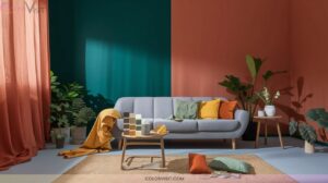
10. Terracotta for Earthy Warmth
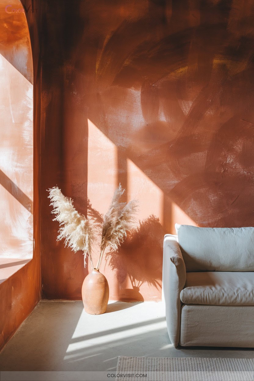
Infuse your space with the grounded allure of terracotta—a rich blend of red and orange pigments that radiates earthy warmth.
This trending hue for 2024 anchors interiors with a deep, ruddy brown reminiscent of sunbaked clay, evoking comfort and stability.
Pair terracotta walls with soft whites or pale grays to accentuate its vibrancy, or integrate cool tones like navy and seafoam for visual balance.
Use matte finishes for a tactile, organic effect, and layer with natural materials—think wood, linen, or leather.
Terracotta’s versatility adapts across design styles, making spaces feel both innovative and inviting without overwhelming the senses.
11. Diagonal Lines for Playful Zoning
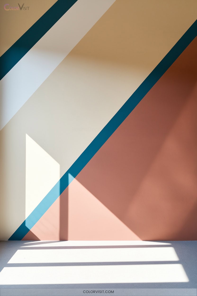
Why not invigorate your space with diagonal lines that energize and organize at once?
Diagonal wall designs introduce kinetic visual movement, amplifying depth and dissolving monotony in any room.
By layering contrasting or complementary hues, you can define zones—dining, work, or relaxation—without bulky dividers.
Precision is key: use angled brushes and sharp taping for immaculate edges, guaranteeing professionalism.
Diagonal lines not only echo sunlight’s natural entry but also harmonize open layouts with a sense of playful unity.
- Bold, angled stripes demarcate activity zones seamlessly
- Neutral gradients soften changes yet maintain clarity
- High-contrast color pairings energize spatial flow
- Clean tape lines guarantee crisp, architectural precision
12. Vertical Stripes to Elongate Walls
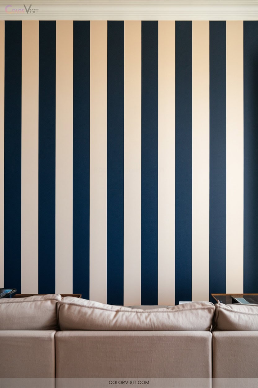
Vertical stripes instantly draw the eye upward, creating a heightened sense of space that transforms standard rooms into airy, expansive environments.
You’ll achieve maximum elongation by running crisp, uninterrupted lines floor-to-ceiling—utilize painter’s tape for precision.
Opt for 4–12″ widths, alternating satin and matte finishes of the same color for subtle sophistication, or introduce monochromatic schemes for visual continuity.
High-contrast pairings like black and white impart bold modernity, while earth tones offer understated dimension.
Extend stripes onto the ceiling for seamless amplification.
Reinforce verticality with tall bookcases, pendant lights, and sheer drapes, ensuring every element supports upward optical flow.
13. Horizontal Bands for Sectional Emphasis
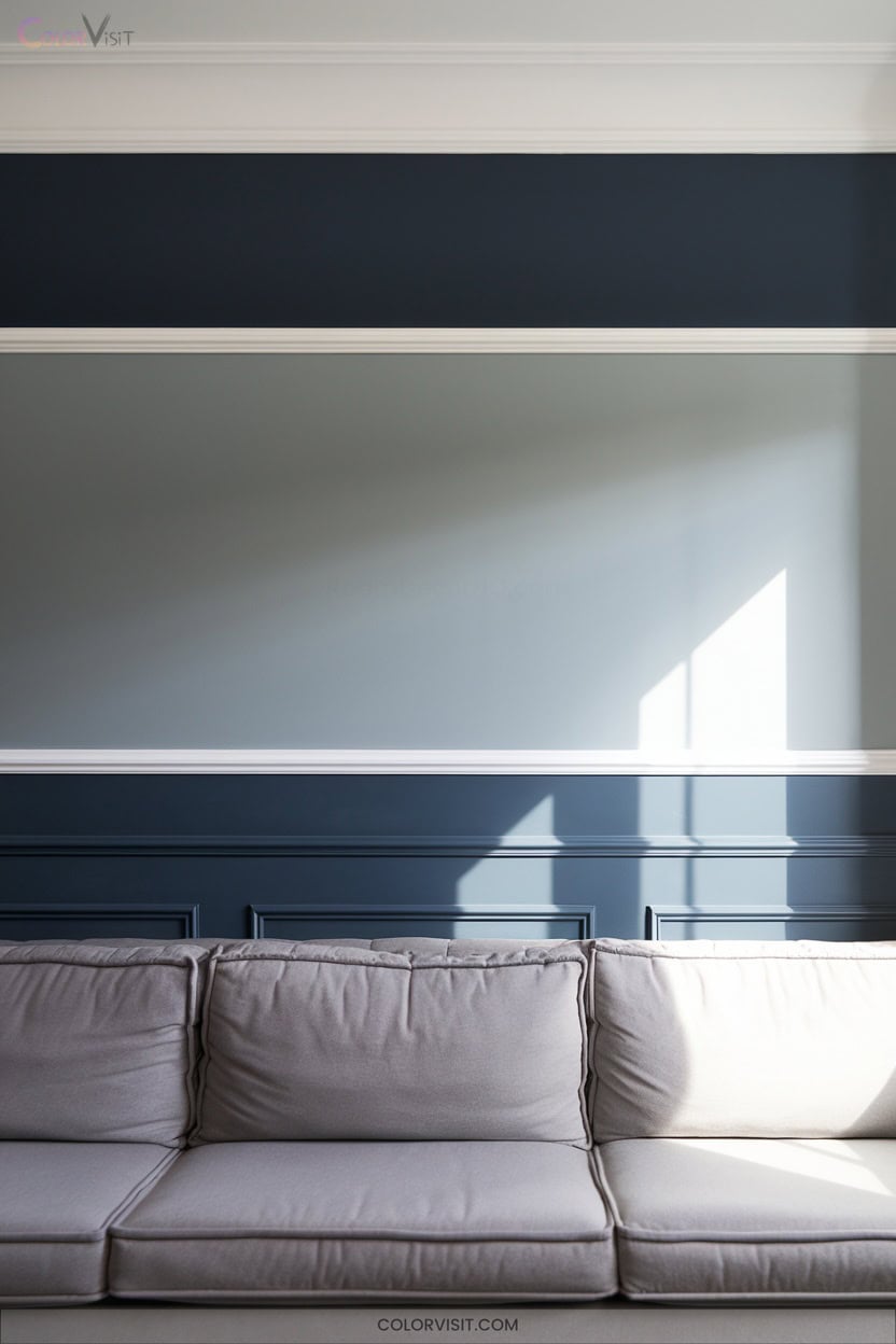
While vertical stripes draw attention upward, horizontal bands stretch your gaze across the room, amplifying width and establishing sectional emphasis.
Horizontal bands pull the eye across a space, visually widening rooms and accentuating distinct areas within your layout.
You can manipulate perception, making compact rooms feel expansive or demarcating zones within open layouts.
Experiment with color contrast and textured finishes for maximum impact.
Integrate patterns or gradients for dynamic visual flow and mood modulation.
Apply painter’s tape for crisp lines, and vary band width to disrupt monotony.
Strategic lighting can heighten the effect, turning bands into focal points or guiding pathways.
- Light bands atop dark bases elevate perceived ceiling height
- Contrasting colors create dynamic section delineation
- Integrated patterns boost visual complexity
- Wide bands expand small rooms
14. Arch Accents to Frame Architectural Features
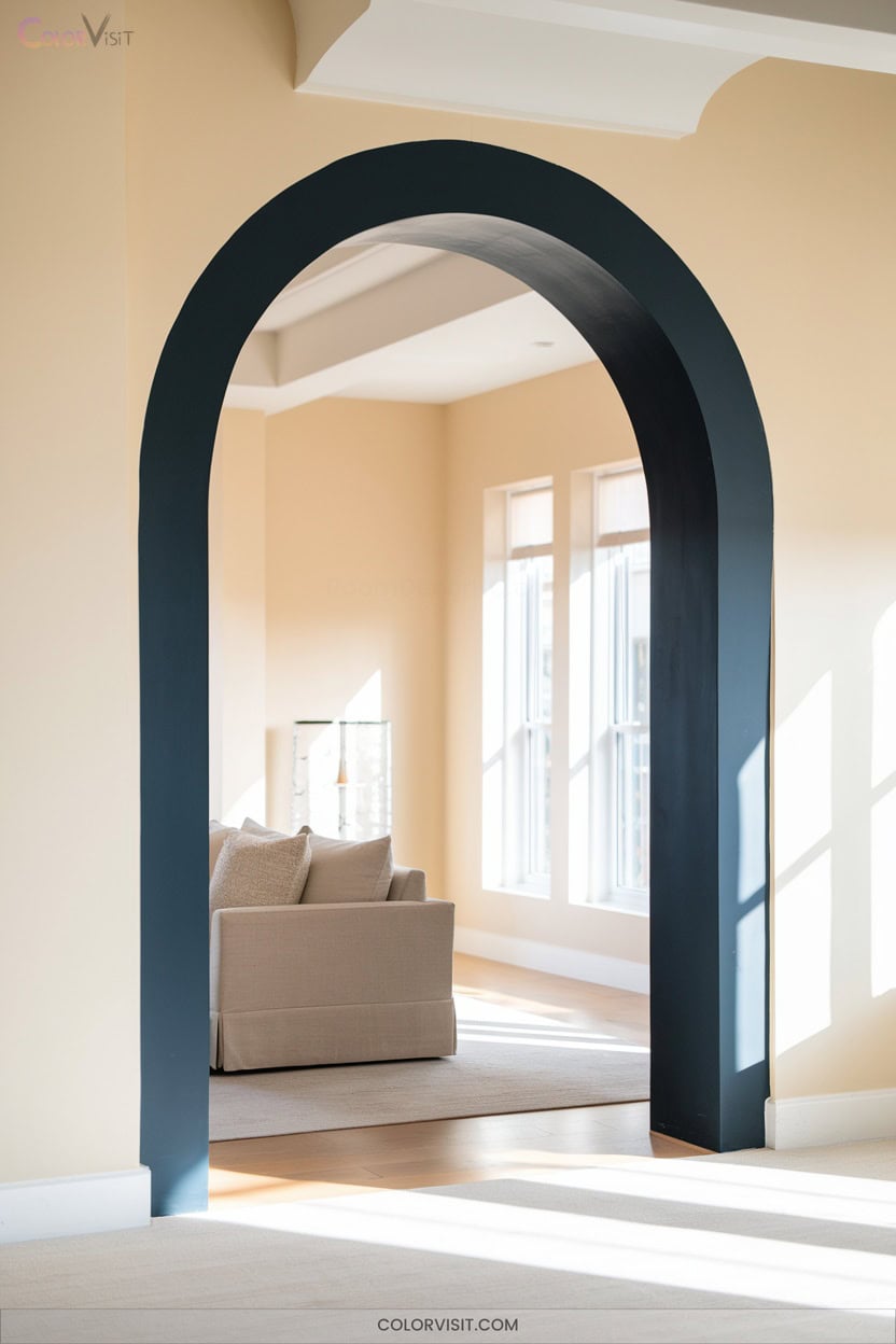
A well-placed arch accent transforms ordinary architectural features into striking focal points, using color, texture, and lighting to amplify their impact.
Leverage contrasting hues—think deep navy against crisp white—to define Tudor or Romanesque arches, or opt for monochromatic gradients to subtly enhance segmental curves.
Elevate keystones with metallic finishes like gold leaf, or mimic authentic materials with textured paints.
Employ recessed uplighting or flanking sconces to dramatize contours and decorative trim.
Integrate limewash, glossy lacquer, or Venetian plaster for material harmony.
Utilize vertical color blocking or arch-backed accent walls to visually elongate, widen, or deepen spatial perspectives.
15. Gradient Blends for Smooth Color Transitions
Once you’ve defined a room’s focal points with bold arch accents, you can introduce gradient blends to infuse walls with subtle movement and visual depth.
After highlighting focal points with bold arches, use gradient blends to bring gentle motion and depth to your walls.
Gradient shifts—whether ombré, horizontal, or radial—require precision in blending wet paints and using mid-tones for seamless flow.
Begin with a clean, primed surface and establish your lightest base layer.
Employ high-quality synthetic brushes or damp sponges to diffuse color boundaries, always blending while paint remains workable.
Use matte acrylics and glazing medium for ideal control and finish.
For a visionary result, imagine:
- Ethereal dawn-to-dusk walls
- Subtle oceanic fades
- Serene forest canopy gradients
- Warm sunset-inspired ombrés
16. Geometric Murals for Artistic Impact
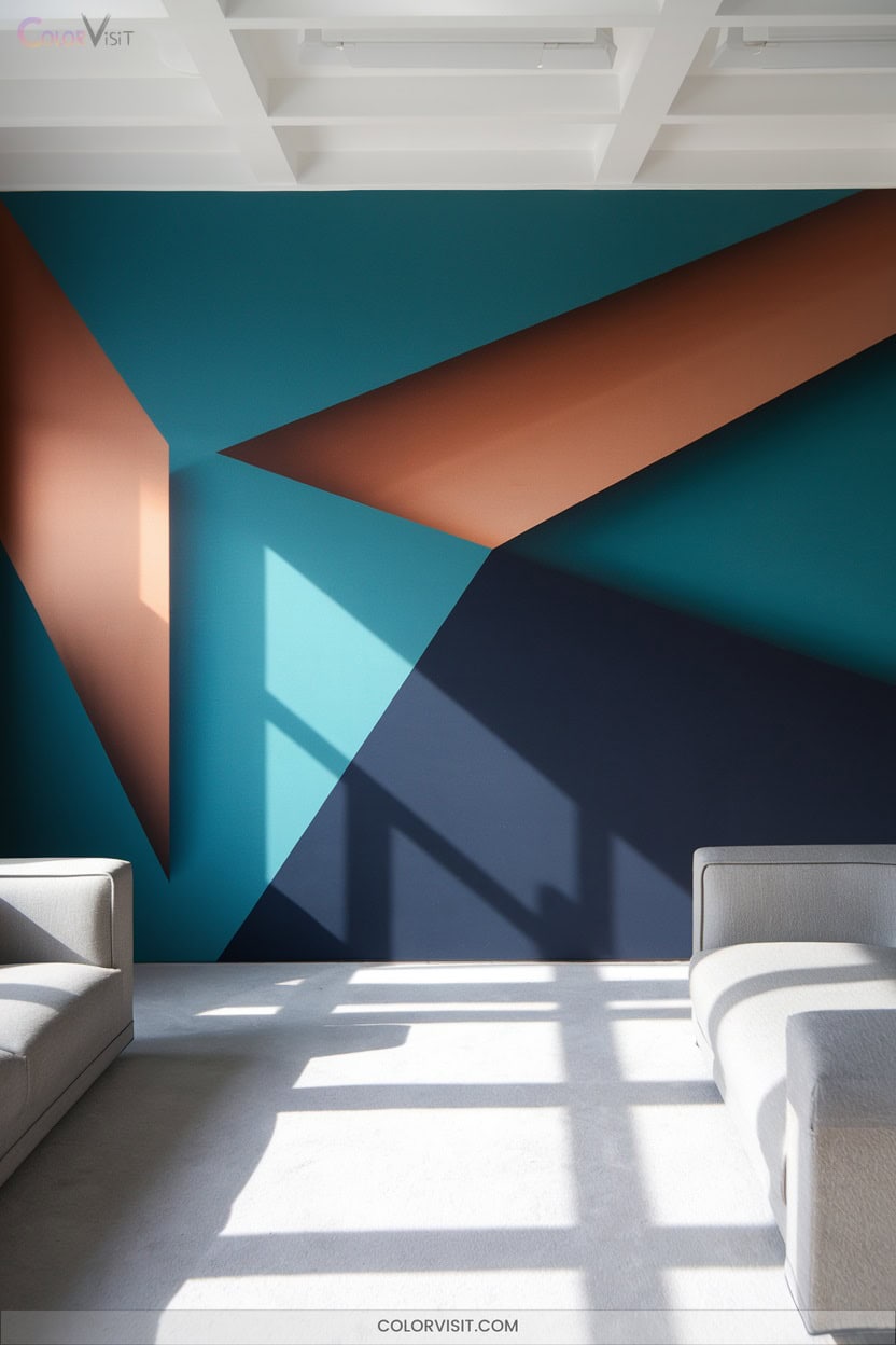
Geometry transforms your walls into bold statements of modern artistry.
Embrace geometric murals for a sophisticated, contemporary edge—think trellis, diamonds, or abstract 3D figures that deliver visual dynamism.
Black and white schemes channel timelessness, while vivid hues or muted neutrals align with any palette.
These murals adapt seamlessly to minimalist or eclectic themes, and their graphic nature creates compelling focal points in living rooms or bedrooms.
Inspired by Brancusi and global motifs, they fuse abstract art and cultural character.
Durable, affordable, and easy to install, geometric murals offer custom sizing and straightforward maintenance for innovators seeking high-impact, functional design.
17. Ombré Effects for Ethereal Aesthetics
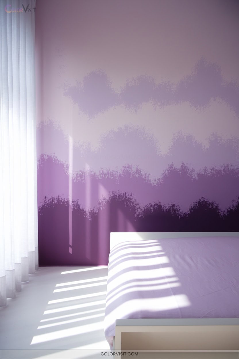
Ombré wall treatments infuse interiors with a sense of depth and movement that static color blocks can’t achieve.
You’ll create seamless gradients by selecting three tones from a single color family—ideal for beginners aiming for cohesion.
Employ latex paints in eggshell finish, using chip brushes and mini rollers for precision.
Prep meticulously: clean, sand, and base-coat your wall for ideal pigment flow.
Embrace wet-on-wet techniques for fluid blends, feathering edges for a soft finish.
- Stormy sky: gray fades into crisp white for drama
- Oceanic blues: teal to navy for spa tranquility
- Sunset blush: pinks melting into indigo
- Earthy terracotta gradients
18. Textured Finishes for Industrial-Chic Appeal
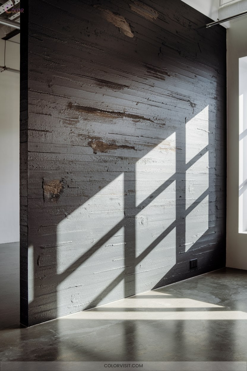
How do you craft a room that exudes both urban edge and tactile sophistication?
Start with exposed brick or concrete textures—these foundational elements provide raw authenticity.
Integrate distressed wood against sleek metal beams or stainless steel accents for striking contrast.
Industrial-themed wallpapers or DIY textured paint let you achieve depth without structural overhaul.
Augment with polished concrete floors, vintage metal decor, and sculptural lighting to reinforce industrial intent.
Layer rough-hewn stone, timber panels, or leather accents to balance warmth with grit.
Use metallic paints for a modern sheen.
Prioritize functional art—think metal sculptures or geometric abstracts—to energize your industrial-chic vision.
Frequently Asked Questions
How Do I Choose Paint Finishes for High-Traffic Areas?
When selecting paint finishes for high-traffic areas, prioritize satin, eggshell, or pearl. These finishes deliver modern resilience, washability, and visual depth. Assess traffic, lighting, and maintenance needs—innovate by exploring specialty finishes from leading brands for superior performance.
What Ceiling Colors Help Rooms Feel More Spacious?
Did you know 72% of designers recommend off-white ceilings for enhanced spaciousness? If you use pale tones or match ceiling and wall hues, you’ll blur boundaries, maximize light reflectance, and create a visually expansive, innovative interior environment.
Which Wall Colors Work Best With Low Natural Light?
You’ll maximize luminosity in low natural light by choosing high-LRV whites (over 65), soft pastels, and cool-toned grays. Emphasize reflective finishes and pair with crisp white trims to amplify brightness and create an innovative, airy ambiance.
How Can I Use Accent Trims to Highlight Architectural Details?
Studies show 62% of designers use accent trims to define space. You’ll strategically apply contrasting trims—think metallics or textured woods—along crown molding, wainscoting, or beams, leveraging reflective finishes to amplify architectural depth and visual intrigue.
Are Monochromatic Palettes Effective in Small Apartments?
You’ll find monochromatic palettes highly effective in small apartments. By leveraging tonal gradation and unified hues, you visually expand the space, minimize clutter, and foster seamless integration of textures—delivering spatial innovation without sacrificing sophistication or functionality.
Conclusion
Color isn’t just paint—it’s the silent architect of your space. With the right hue, you’ll amplify light, sculpt ambiance, and define function in every room. Whether you gravitate toward soft greige’s sophistication or the bold embrace of geometric murals, each choice sets a distinct visual rhythm.
So, wield your palette with intention: let your walls become both canvas and companion, shaping a home that’s as dynamic and versatile as you are.