15 Space-Enhancing Small Room Color Ideas for Cozy Comfort
Transform your small room by opting for pure white to maximize reflection or greige blends for soft warmth. Embrace pale grays with blue or green undertones to visually expand boundaries, and try eggshell or satin finishes for luminous, textured diffusion.
Monochromatic colors on walls and trim erase segmentation, while tonal layering and vertical stripes elongate proportions. High-gloss surfaces and metallic accents play with light for added spaciousness. Explore how strategic pairings further elevate cozy comfort and depth.

1. Pure White for Maximum Light Reflection
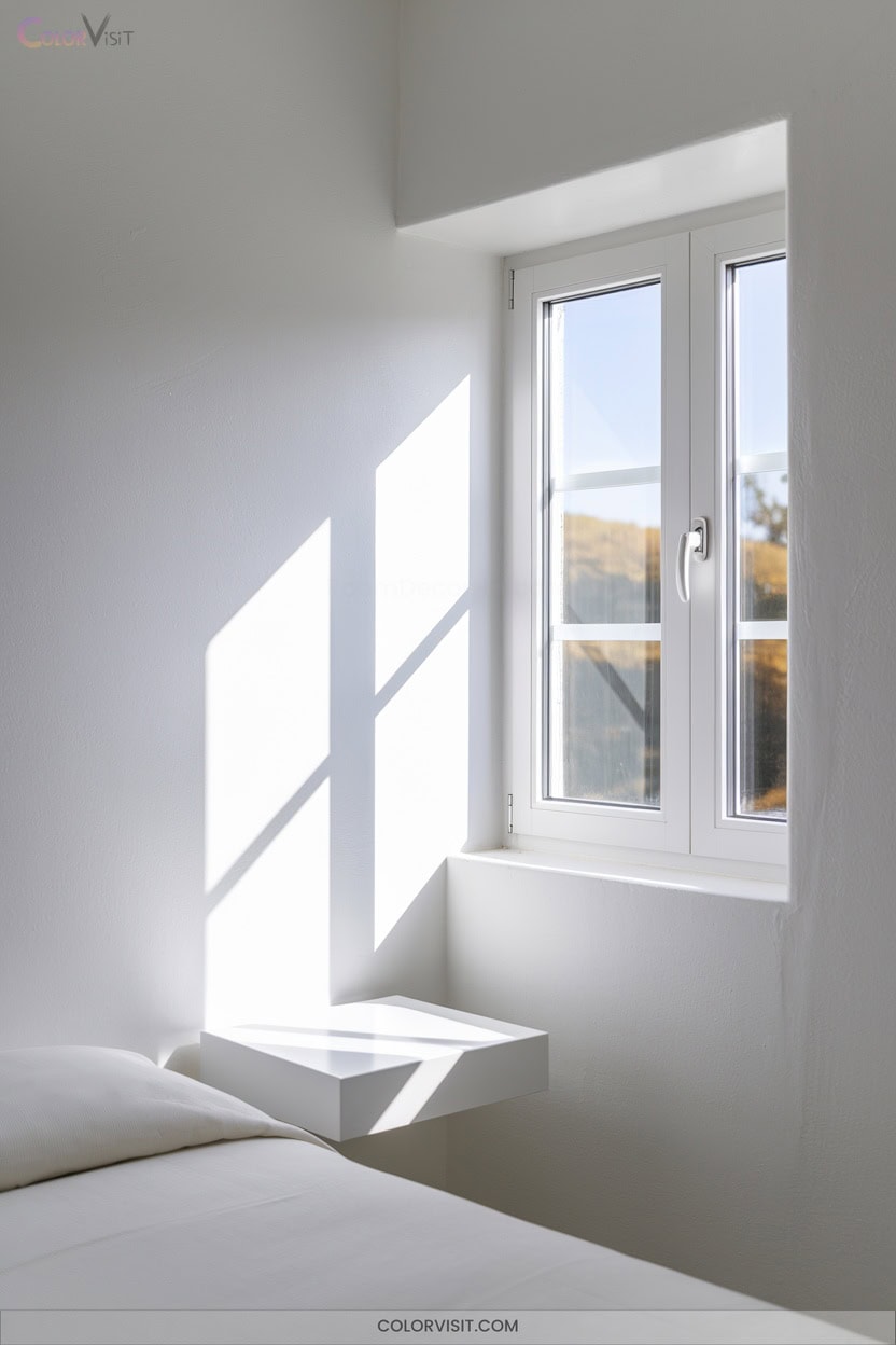
When you choose pure white for a small room, you’re leveraging its unparalleled ability to reflect nearly 100% of visible light—maximizing both natural and artificial illumination.
This chromatic neutrality amplifies spatial perception, diffusing light uniformly to eliminate visual clutter and expand perceived dimensions.
Chromatic neutrality diffuses light evenly, erasing visual clutter and making even the smallest spaces feel open and expansive.
Pure white acts as a seamless canvas, supporting bold accents and facilitating adaptive layouts without visual discord.
By reflecting LED lighting and preventing absorption, you maintain consistent brightness regardless of daylight variation.
Employ warm undertones and layered textures—think linen or marble—to avoid sterility while maintaining reflective integrity. Prioritize semi-gloss finishes to enhance durability and luminous impact.
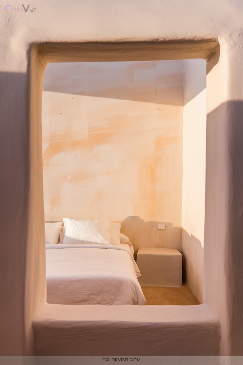
2. Greige Blends for Warmth and Brightness
Although small spaces often benefit from high reflectivity, greige blends offer a sophisticated alternative by balancing the coolness of gray with the inviting warmth of beige.
Use greige as your foundational hue to achieve a nuanced, serene backdrop that elevates both minimalism and multi-layered interiors.
Layer lighter and deeper greige tones—on walls, furnishings, and textiles—to create visual depth without overwhelming scale. Pair this neutral with natural textures like wood or woven fibers for tactile warmth.
Greige’s versatility allows you to introduce accent colors, ensuring cohesion across modern or blended styles.
This approach maximizes spatial comfort while maintaining a cutting-edge aesthetic.
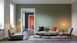
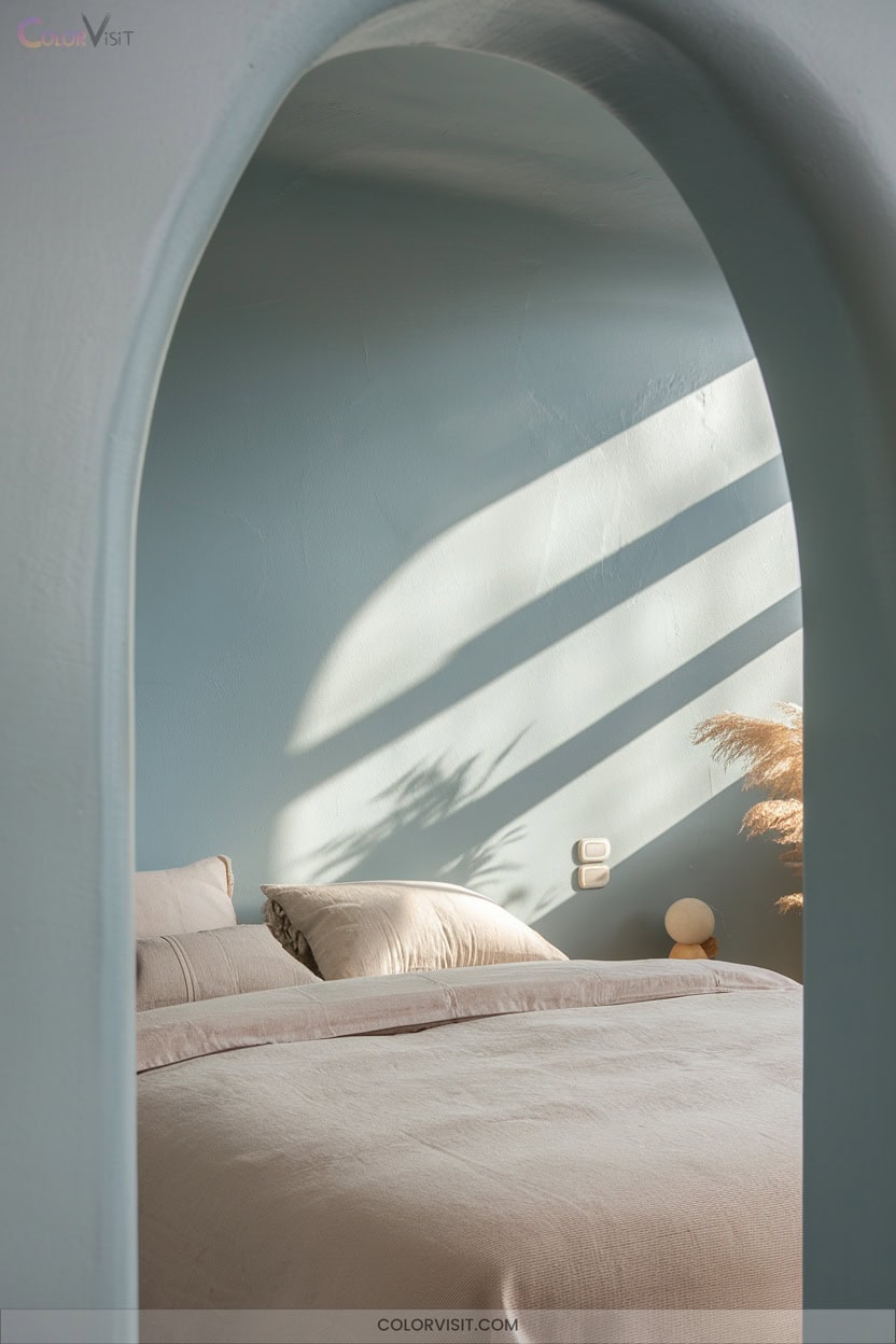
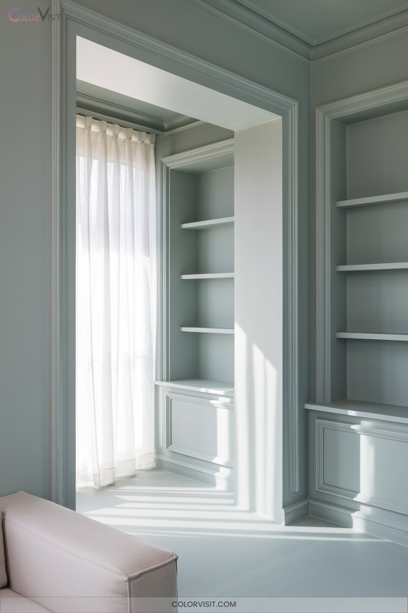
3. Pale Gray With Blue or Green Undertones
While greige blends deliver warmth and balance, pale gray with blue or green undertones offers a refined alternative for small rooms seeking both light and subtle color complexity.
Harness the visual expansion of these nuanced shades—blue undertones evoke tranquility, enhancing spatial perception, while green undertones introduce organic warmth and natural resonance.
Both palettes integrate seamlessly with biophilic elements and minimalist furnishings, maximizing space and comfort.
Optimize ambient lighting to accentuate undertones, preventing any visual flatness. Strategic use of accent colors—wood, gold, or warm neutrals—promotes harmony.
Select textiles and wall décor that reinforce serenity and innovation for elevated spatial design.
4. Soft White Variations for Light Adaptability
Soft white variations serve as strategic tools for optimizing both light adaptability and spatial perception in small rooms.
By leveraging undertones and reflectance, you can transform compact spaces into luminous, inviting environments.
Warm soft whites with yellow or beige infuse coziness, while high Light Reflectance Value (LRV) paints amplify daylight, reducing reliance on artificial sources.
Neutral whites with subtle pink or peach undertones prevent starkness, fostering tranquility. Integrate textural elements to counteract flatness and add dimension.
Employing soft whites as a backdrop, you’ll enable versatile accentuation and endless personalization.
- Maximize LRV for spatial amplification
- Warm undertones enhance coziness
- Pink/peach undertones for softness
- Layer textures for depth
- Use as adaptable canvas for accents
5. Eggshell and Satin Finishes for Enhanced Diffusion
When selecting paint finishes to optimize light diffusion in small rooms, eggshell and satin offer strategic advantages grounded in color theory and spatial manipulation.
Eggshell’s low-luster sheen subtly reflects light, adding dimensionality while concealing minor surface imperfections—ideal for bedrooms or cozy dining spaces.
Satin, with its elevated sheen and velvety texture, actively amplifies light reflection, visually expanding tight quarters.
Opt for satin in high-traffic zones like kitchens or hallways, leveraging its superior durability and cleanability.
Both finishes integrate seamlessly with diverse palettes, enabling you to manipulate ambience—choose eggshell for intimacy or satin for spatial enhancement and luminous vibrancy.
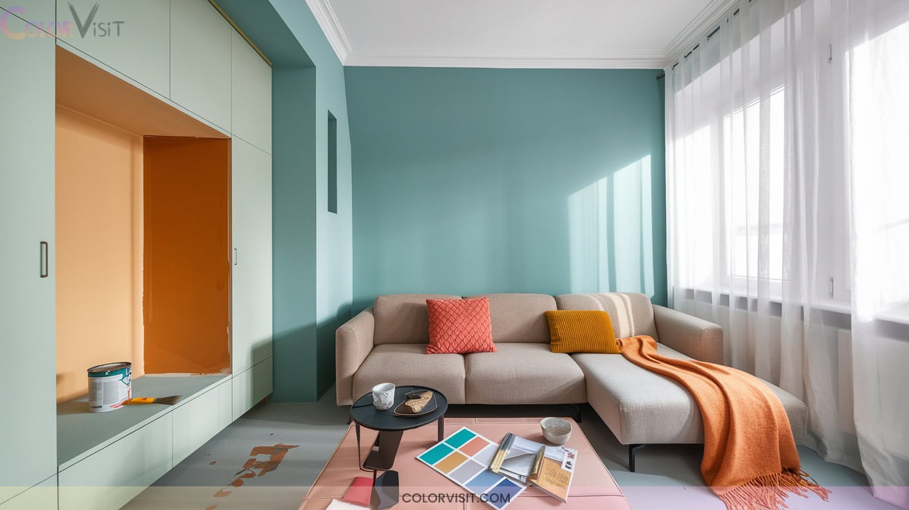
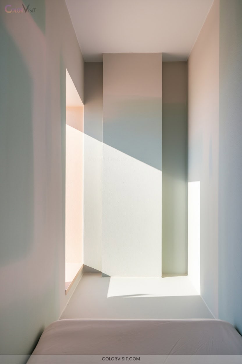
6. Blue-Green Walls for Expansive Ambiance
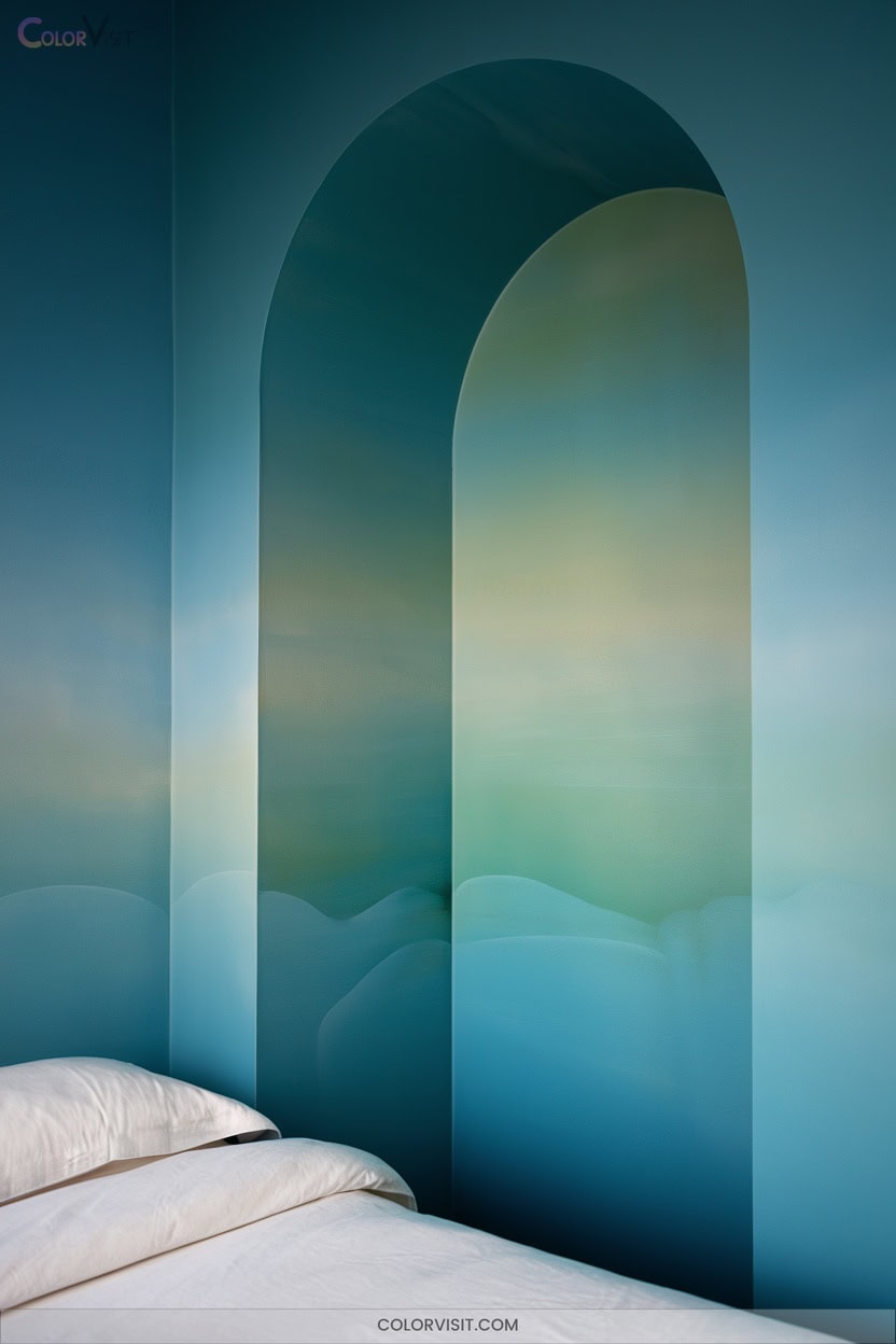
A blue-green palette infuses small rooms with an expansive, tranquil ambiance by harnessing the natural harmony found between sky and water.
You’ll utilize this chromatic duo to visually stretch boundaries and foster serenity—key for innovative, comfort-driven interiors.
Leverage color theory by selecting lighter tints to reflect light and amplify perceived volume.
Integrate texture and nature-inspired elements to maintain depth without visual clutter. For a progressive, spatially aware design, consider these techniques:
- Use glossy blue-green finishes to maximize light reflection
- Layer neutral accents for balance
- Introduce natural wood or plant elements
- Employ mirrors strategically
- Experiment with subtle color gradation
7. Grayed Lavender to Visually Recede Walls
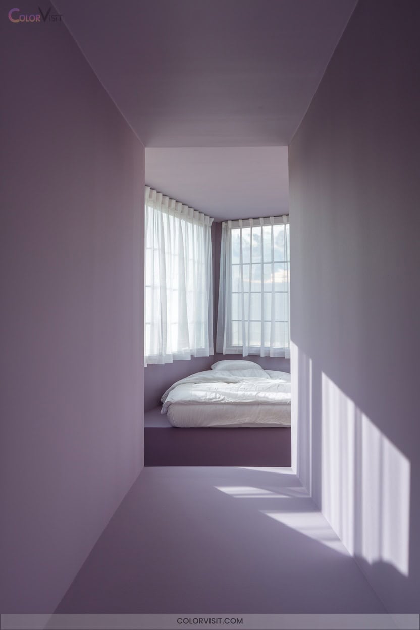
Grayed lavender offers an advanced solution for visually receding walls in compact spaces, leveraging both color theory and spatial psychology.
By blending the calming undertones of lavender with the neutrality of gray, you create a serene, balanced atmosphere that manages depth perception.
Lighter lavender shades reflect natural and artificial light, enhancing spatial expansion and airiness.
Lighter lavender tones amplify light and space, cultivating an open, airy ambiance ideal for small, enclosed rooms.
Integrate sheer lavender curtains to maintain illumination, while neutral furniture and light wood tones prevent visual clutter.
Employ geometric wallpaper or a single lavender accent wall for added dimension.
This versatile palette adapts to bedrooms or living rooms, delivering both sophistication and budget-conscious innovation.
8. Seafoam Green for Invigorating Lightness
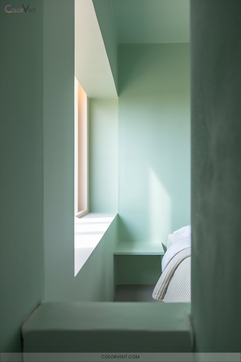
How can you amplify lightness and spaciousness in a compact room? Harness the reflective properties of seafoam green.
This nuanced shade leverages color theory by maximizing natural light, visually expanding boundaries, and fostering a tranquil environment.
Its vintage undertones introduce both freshness and nostalgic energy. Employing seafoam green with spatial intent transforms enclosed areas into innovative sanctuaries.
To optimize its effect, integrate these strategies:
- Pair with neutral or soft tones for seamless color harmony
- Use as an accent wall to create dynamic focal points
- Choose minimalist, light-toned furniture
- Layer textiles and patterns for depth
- Add metallic accents for sophisticated contrast
9. Misty Sage for Subtle Earthy Warmth
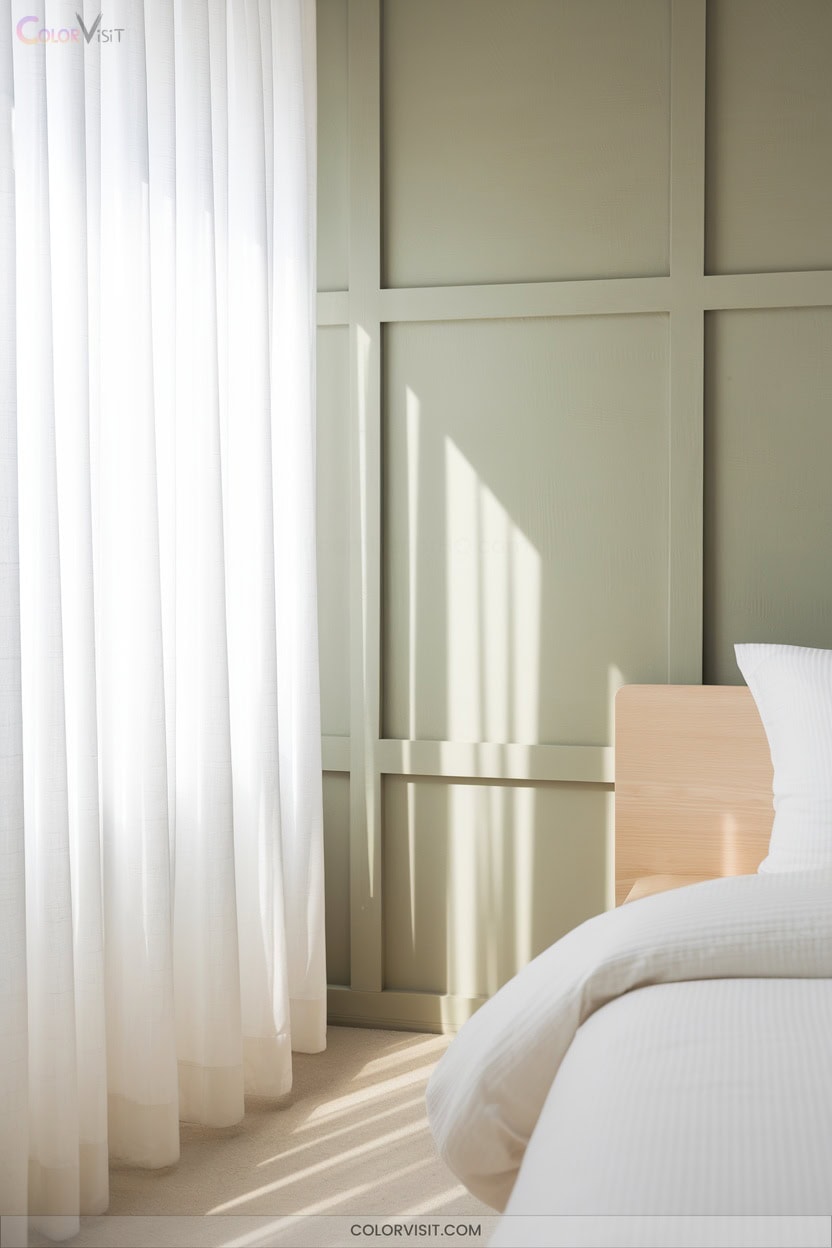
Misty sage infuses compact spaces with understated earthy warmth, expertly balancing muted green-yellow hues and soft gray undertones to evoke both serenity and sophistication.
This mid-tone, low-chroma shade minimizes visual weight, making small rooms feel open yet enveloping.
Its adaptable neutrality interacts dynamically with variable lighting, maintaining depth without appearing flat or garish.
Apply misty sage on accent walls for architectural emphasis, or use full coverage to achieve seamless immersion.
Pair with crisp white trims for sharp contrast, warm wood for organic resonance, and metallic details to amplify spatial luminosity. Layer natural textures to maximize tactile interest and foster innovative coziness.
10. Matte Charcoal for Seamless Depth
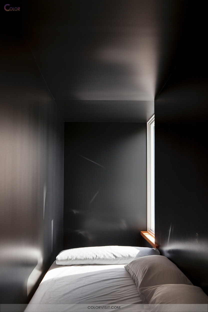
Matte charcoal delivers a sophisticated foundation for small spaces, enveloping the room in deep, velvety tones that absorb light and reduce visual clutter.
Matte charcoal creates a refined backdrop for small spaces, infusing the room with rich, light-absorbing depth and understated elegance.
This ultra-modern shade emphasizes seamless depth, offering a canvas that minimizes glare and enhances the perception of intimacy.
To maximize the effect, leverage color theory and spatial strategy:
- Pair with crisp neutrals like white or cream for contrast and balance
- Employ minimalist, sleek furnishings to maintain visual flow
- Integrate textured elements—think wood or boucle—for tactile dimension
- Use targeted lighting to avoid a cave-like atmosphere
- Select high-quality, low-LRV paint for consistent, dramatic impact
11. Midnight Blue Ceilings for Vaulted Illusion
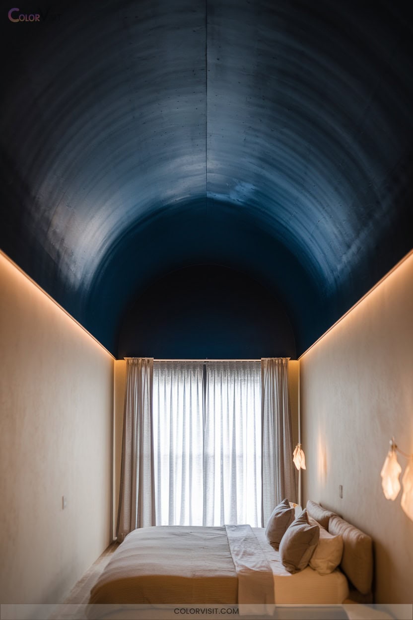
A midnight blue ceiling instantly redefines a small room’s spatial dynamics, leveraging color psychology and the science of visual boundaries to create a vaulted illusion.
When you apply deep blue overhead, you blur the ceiling’s edge, exploiting the cognitive spaciousness of cool hues to trick the eye into perceiving greater height.
Layering transparent glaze introduces faux-finish depth, echoing the night sky and amplifying dimensionality. Employ up lights or recessed accent lighting to draw focus upward, enhancing the effect.
Matte finishes reduce glare and visual clutter, while integrating metallic fixtures or contrasting warm walls accentuates verticality without sacrificing cohesion or comfort.
12. Monochromatic Walls and Trim for Seamless Flow
While midnight blue ceilings manipulate vertical perception, seamless monochromatic walls and trim harness color continuity to erase boundaries and visually expand compact interiors.
By eliminating abrupt color breaks, you create a receding plane that maximizes spatial perception and encourages architectural simplicity.
This unified approach softens angular changes and focuses attention on curated decor elements.
For ideal results, consider these strategies:
- Select a single hue for walls and trim to erase visual segmentation.
- Apply varied finishes (gloss on trim, matte on walls) for subtle depth.
- Opt for minimalistic trim profiles under 4” wide.
- Test paint samples in different lighting.
- Avoid complex molding details.
13. Tonal Layering for Sophisticated Gradients
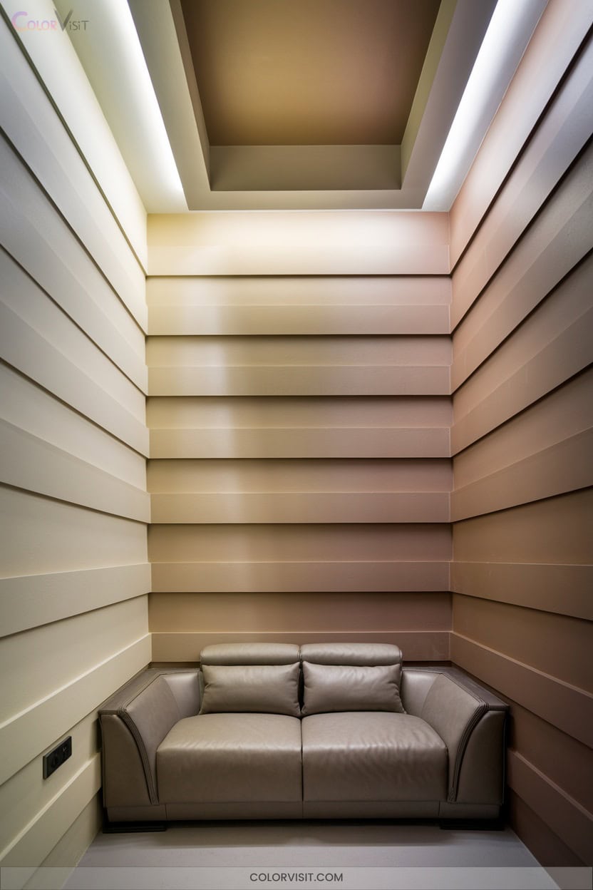
Tonal layering transforms small rooms by orchestrating a spectrum of saturations within a single color family, yielding sophisticated gradients that amplify depth and cohesion.
Tonal layering weaves gradients of a single hue, crafting depth and cohesion that visually expand even the smallest spaces.
Begin by selecting a dominant hue—whether tranquil blue, earthy terracotta, or daring crimson.
Deploy lighter tints on walls to visually expand boundaries, and punctuate the space with deeper tones in furnishings or art.
Integrate varied textures—matte, gloss, woven fabric—to prevent chromatic monotony and stimulate the eye.
Metallic or natural accents inject subtle contrast, while curated patterns reinforce visual intrigue.
This approach delivers warmth, adaptability, and refined balance, letting you sculpt intimate, innovative interiors with seamless unity.
14. Vertical Stripes to Elevate Ceiling Height
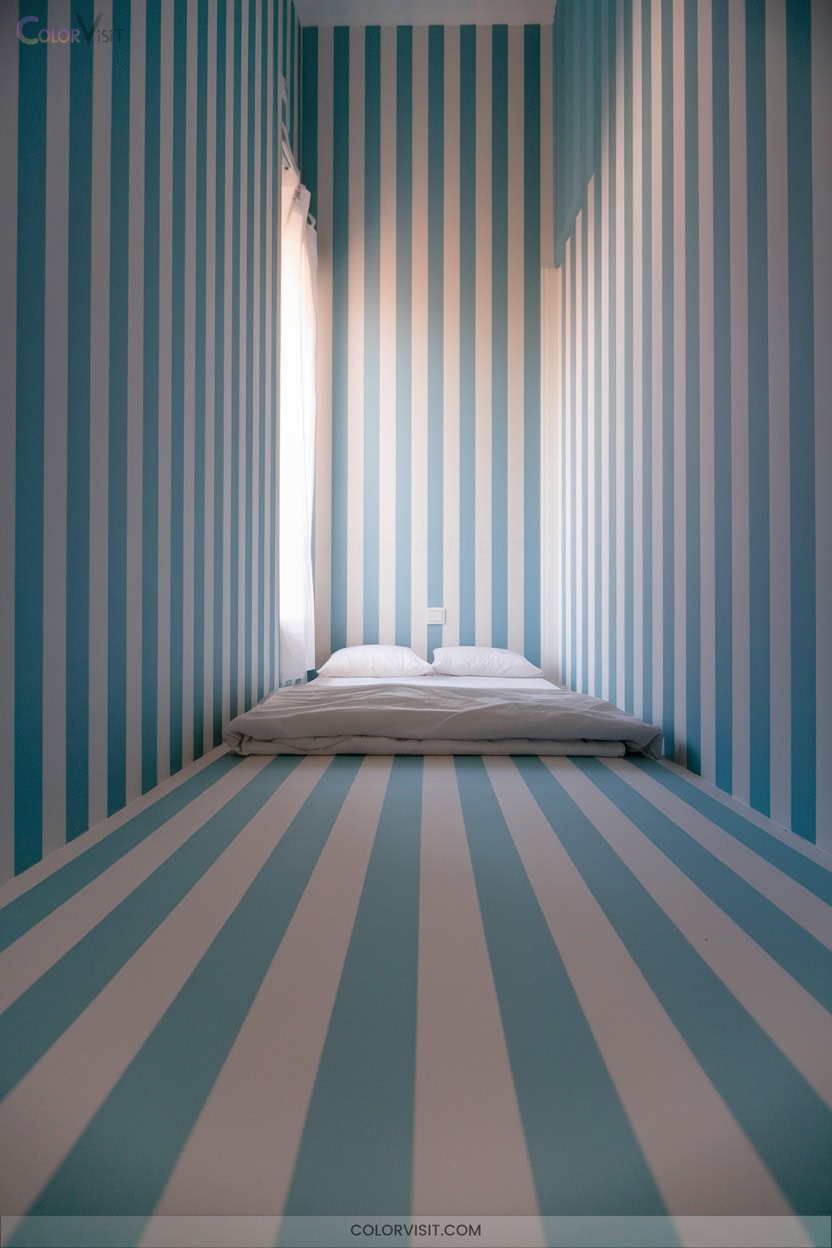
When you introduce vertical stripes into a small room, you leverage a time-tested optical strategy to elongate walls and elevate perceived ceiling height.
Select monochromatic or tonal palettes to unify the space, using subtle contrasts for understated sophistication or boldness for dramatic flair.
Integrate stripes through wallpaper, paneling, or textiles, always maintaining floor-to-ceiling continuity.
Reinforce verticality by aligning architectural and decorative elements for cohesive spatial rhythm.
- Choose matte-finish wallpapers to minimize glare and visual noise
- Align tall bookshelves or lighting with stripe orientation
- Opt for narrow stripes for elegance, wide for boldness
- Extend motifs to curtains and rugs
- Use minimal color contrasts for coherence
15. High-Gloss and Metallic Accents for Light Play
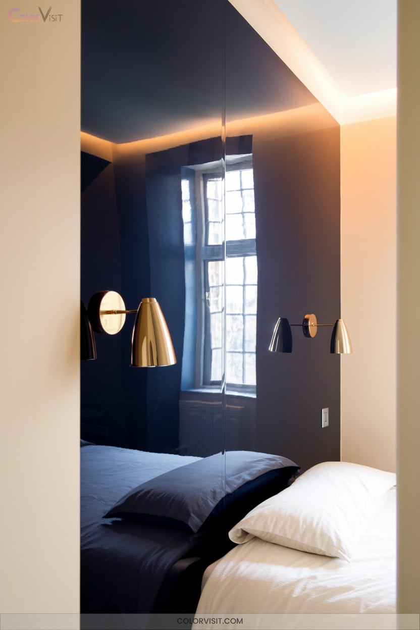
After harnessing vertical stripes to visually elevate your space, you can further manipulate perception by introducing high-gloss and metallic accents.
Employ high-gloss finishes on walls or cabinetry to reflect ambient and artificial light, amplifying spatial luminosity. Integrate metallics—think brushed gold handles or silver textiles—for sophisticated, multidimensional highlights.
High-gloss surfaces and metallic accents amplify light, creating a luminous, multidimensional effect that elevates even the smallest spaces.
Enhance this interplay with strategic mirror placement, boosting depth and brilliance. Maintain equilibrium: temper gloss and shimmer with matte surfaces and nature-inspired accents to avoid sensory overload. Opt for a restrained, cohesive palette; overuse can disrupt spatial harmony.
With precise application, you’ll transform compact rooms into innovative, light-filled environments with dynamic energy.
Frequently Asked Questions
How Do I Choose the Right Color for North-Facing Small Rooms?
You’ll want to counteract cool northern exposure by selecting warm, yellow-based hues or nuanced greens. Opt for cohesive wall-ceiling palettes, employ semi-gloss finishes, and layer lighting. Always sample shades at different times to gauge subtle shifts.
Will Dark Colors Make My Small Room Feel Claustrophobic?
You might think dark colors add drama, but beware—these hues absorb light, compress boundaries, and intensify enclosure. If you crave innovative spatial perception, leverage dark tones as accents, not dominant fields, to avoid overwhelming your room’s volume.
How Do I Coordinate Furniture Colors With Wall Paint in Small Spaces?
You’ll maximize spatial flow by selecting furniture within your wall’s undertone spectrum—think tonal layering or high-contrast anchoring. Integrate analogous hues for seamless cohesion or opt for deliberate color-blocking to delineate zones and highlight architectural interest.
Can Wallpaper Patterns Help a Small Room Feel Larger?
Yes, you can strategically use wallpaper patterns to amplify spatial perception in compact rooms. Opt for vertical stripes or subtle gradients to elongate walls, while medium-scale organic motifs and light-reflective accents maximize both visual depth and luminosity.
Are There Specific Color Tricks for Small Rooms With Little Natural Light?
You should leverage high light reflectance colors like soft whites or subtle pastels to maximize luminosity. Integrate layered lighting and reflective accents. For innovation, juxtapose warm undertones with cool mint or golden hues, amplifying depth and spatial perception.
Conclusion
With these color strategies, you can transform even the tiniest room into a sanctuary that feels as boundless as the sky. Harness the power of reflective finishes, tonal layering, and seamless chromatic blends to manipulate perception and amplify spatial depth.
Don’t underestimate the impact of undertones or the magic of vertical elements—they’re your secret weapons for visual expansion. So, pick up that brush, trust your eye for hue, and watch your small space grow exponentially.