12 Subtle Trim Paint Color Ideas to Frame Your Spaces Beautifully
Frame your rooms with subtle trim paint colors like light gray for a luminous touch, warm beige for cozy contrast, or greige for versatile sophistication. Modern taupe, dusty blue, and muted navy bring understated depth, while olive green and blackened browns ground your palette with earthy elegance.
Try creamy whites, pale sage, or even two-tone trims for a contemporary edge. Explore these refined shades to see how they’ll elevate each space with nuanced charm and tailored detail.

1. Light Gray Trim for Soft Contrast
A light gray trim instantly brings a subtle, sophisticated edge to any room, offering just enough contrast to highlight your walls without overwhelming the space.
You’ll notice how this neutral backdrop enhances everything—white walls feel crisp and modern, soft pastels become more serene, and deep hues gain dimension through gentle contrast.
Trend-forward shades like Sherwin-Williams Light French Gray or Benjamin Moore Classic Gray adapt seamlessly to diverse styles, from minimalist lofts to classic homes.
Light gray trim reflects natural light, making your space feel luminous and airy.
Pair it with metallic accents or natural textures to elevate and innovate your design.
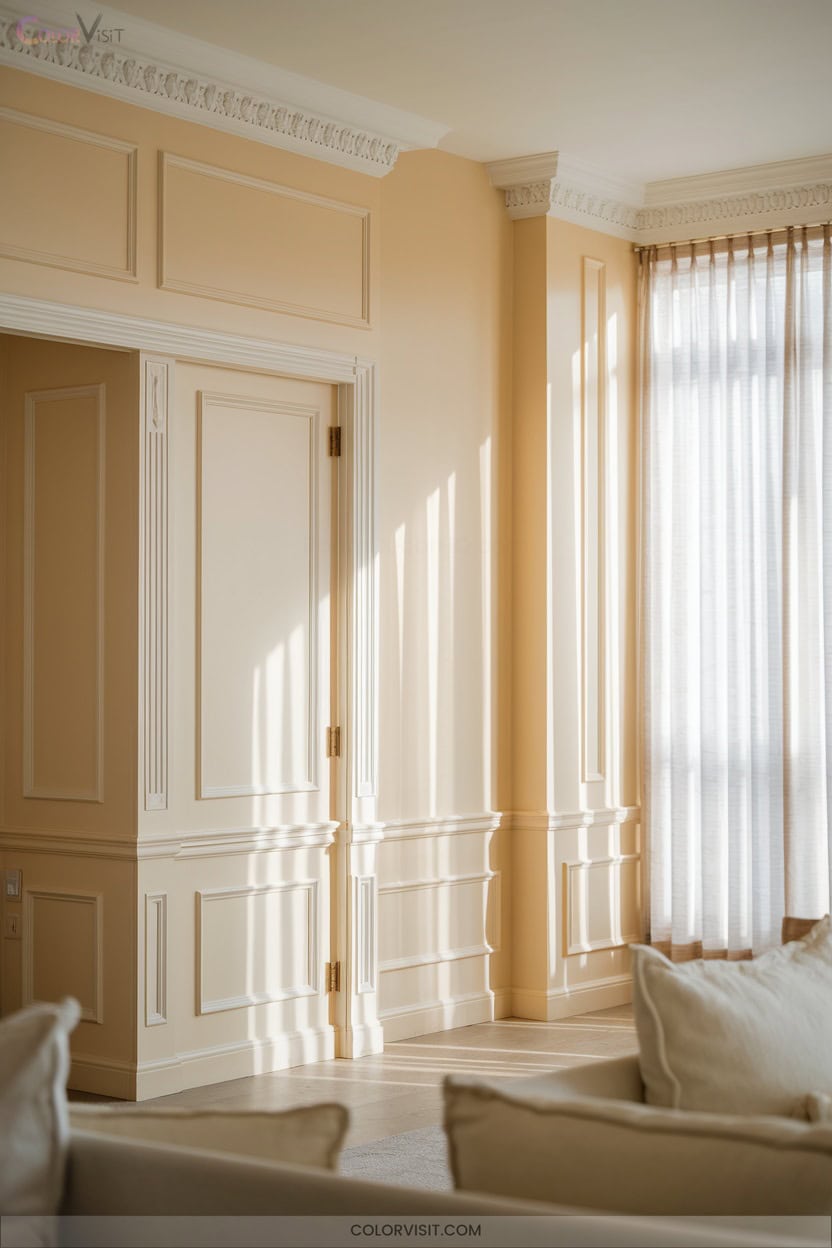
2. Warm Beige Trims for Inviting Spaces
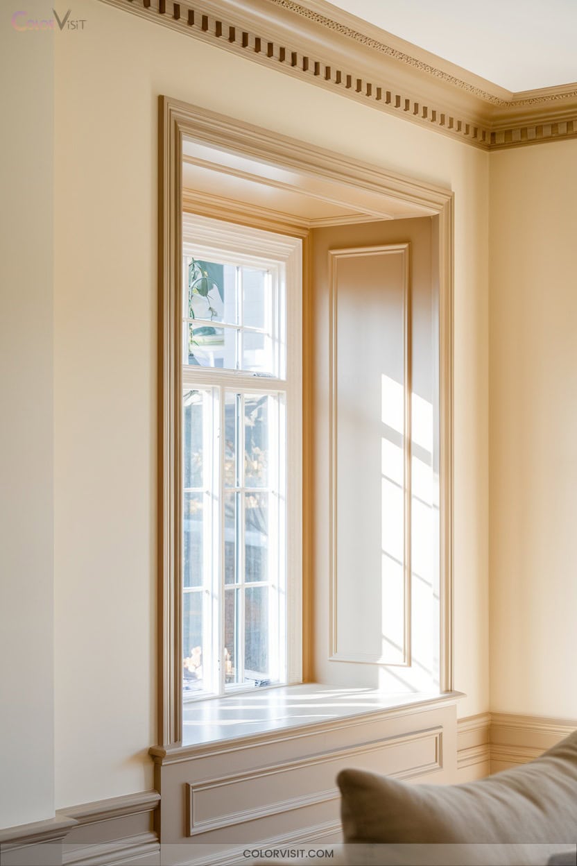
Step into a space trimmed in warm beige and you’ll immediately sense its inviting embrace.
This versatile shade—think Sherwin-Williams Warm Beige or Benjamin Moore Manchester Tan—delivers warmth while subtly reflecting light, brightening every corner.
Pairing beautifully with earthy stone or rich wood, warm beige trims ground bold wall colors and lend cozy sophistication to kitchens, bedrooms, and hallways alike.
Look for undertones—green hints in Manchester Tan, taupe whispers in Accessible Beige—to harmonize with your décor.
Opt for a satin finish to enhance the modern, tactile appeal.
With timeless flexibility, warm beige trims frame your spaces with effortless, innovative charm.
3. Modern Taupe Accents
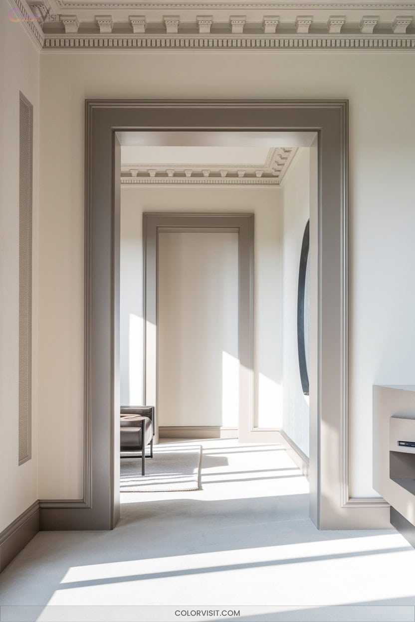
Curious how to infuse your space with understated elegance? Embrace modern taupe accents for trim that exudes warmth and sophistication.
Taupe, a blend of brown and gray, strikes just the right balance between cozy and contemporary.
Choose versatile shades like Benjamin Moore’s Pale Oak or Sherwin Williams’ Modern Gray to create subtle contrast against white walls.
Highlight architectural details, such as door frames and baseboards, for a designer finish.
Taupe trim’s adaptable tones and soft depth unify modern interiors, making spaces feel inviting yet innovative.
Test samples in different light, and pair with natural materials for a truly harmonious effect.
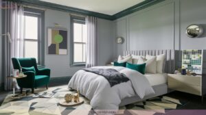
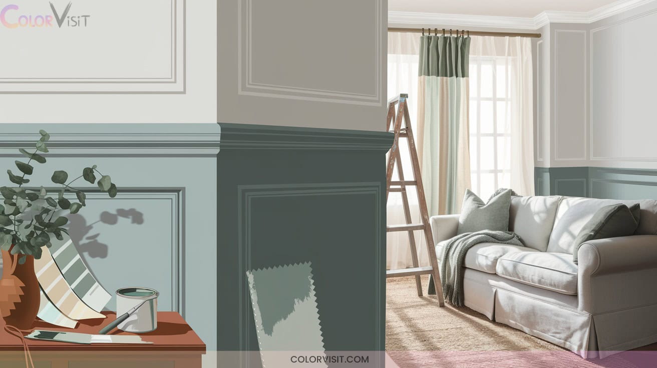
4. Dusty Blue Trim for a Calming Effect
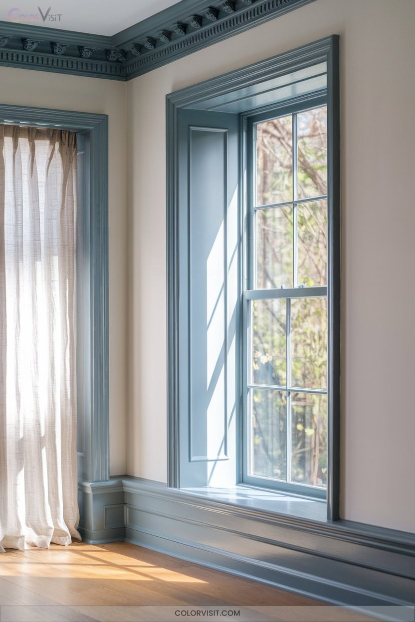
If you’re seeking a trim color that brings instant serenity, dusty blue offers a calming effect that’s both subtle and sophisticated.
This nuanced shade, with its blue-gray undertones, echoes tranquil skies and serene seas, making it perfect for modern bedrooms or restful living spaces.
Pair dusty blue with cool whites like Ice Cube or modern grays to create harmonious, contemporary palettes.
Try Sherwin-Williams Niebla Azul or Benjamin Moore Van Courtland Blue for a fresh, innovative take.
Highlight architectural details or contrast with velvet textures for added depth.
Maximize natural light to amplify its soothing presence and keep your space feeling effortlessly balanced.
5. Greige: The Ultimate Versatile Choice
Greige trim stands as a modern classic—effortlessly bridging the gap between cool grays and warm beiges for a look that’s both current and timeless.
Greige trim is the perfect blend of cool gray and warm beige, creating a timeless and effortlessly modern finish.
You’ll appreciate its chameleon-like adaptability, as it shifts with the light and complements everything from deep jewel-toned walls to organic textures.
With a moderate light reflectance value, greige trim never feels stark or muddy, making it ideal for innovative interiors.
- Test greige samples in different lighting to capture undertone shifts.
- Pair Mega Greige with earthy walls for sophisticated contrast.
- Use Revere Pewter for seamless modern farmhouse blends.
- Satin or semi-gloss finishes maximize durability and glow.
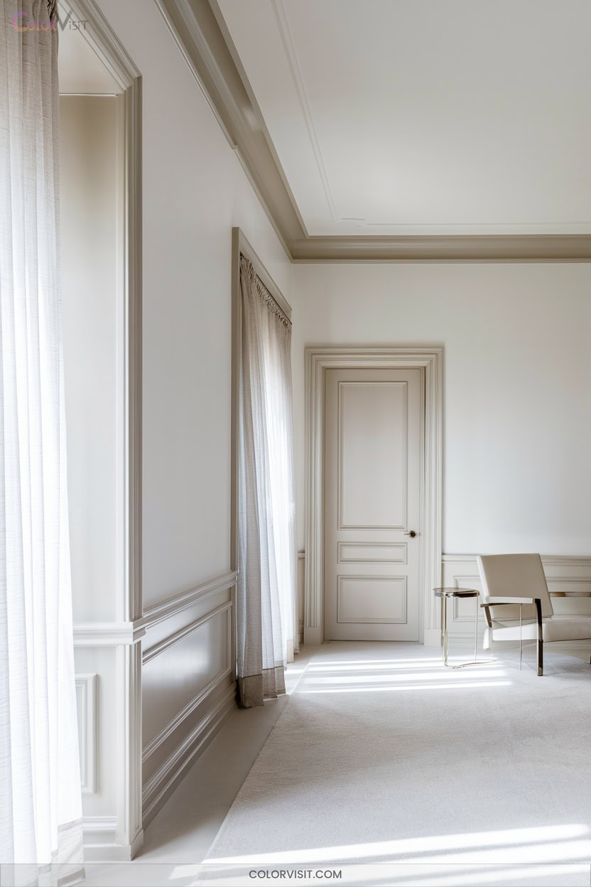
6. Creamy Whites for Gentle Contrast
Warmth radiates from creamy white trim, lending subtle contrast that softens and brightens your space without overpowering it.
You’ll notice the gentle yellow undertones—think Benjamin Moore Creamy White OC-7 or Sherwin-Williams Creamy SW 7012—enriching the room’s character while reflecting ample light thanks to high LRVs.
These shades pair effortlessly with warm wood floors, beige tiles, or soft greys, creating a seamless, elevated look.
Use creamy whites on trim, cabinets, or accents to bridge modern innovation and timeless comfort.
Their adaptability guarantees harmony across interior styles, especially in northern-facing rooms that need extra warmth and a welcoming ambiance.
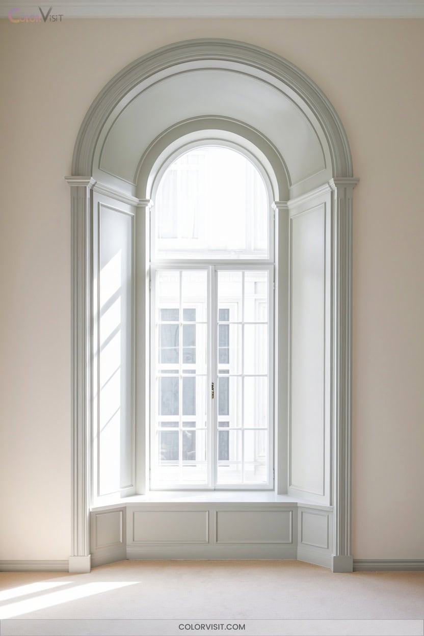
7. Pale Sage Trims to Enhance Natural Light
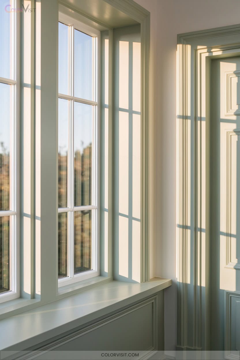
Pale sage trim brings a gentle infusion of nature into your home, softening edges and amplifying the available light.
This on-trend hue creates harmony with your interiors, seamlessly blending with neutral palettes or contrasting with vibrant accents for a modern twist.
In sunlit rooms, it reflects light, making spaces feel airy and expansive, while under evening lamps, it maintains warmth and comfort.
Consider these innovative pairings for a bespoke look:
- Pair with soft whites and beiges for calm, spacious vibes
- Contrast with coral or pink for energy
- Layer with natural wood for organic texture
- Accentuate with brass or gold for sophistication
8. Charcoal Trim for Sophisticated Depth
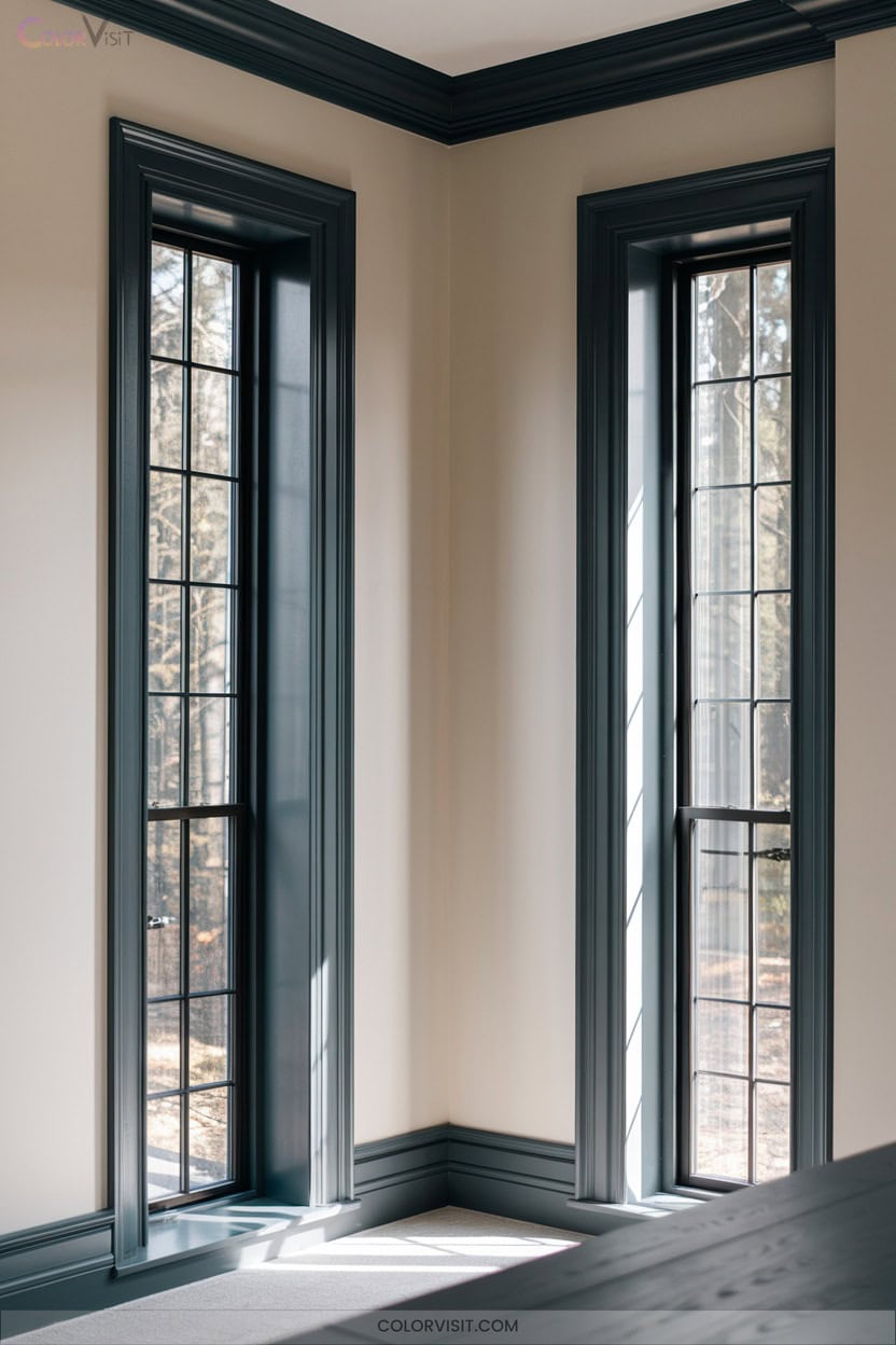
A deep charcoal trim instantly elevates a room, framing windows and doors with a dramatic yet understated edge.
Deep charcoal trim brings refined drama to any space, subtly outlining windows and doors with sophisticated, modern flair.
You’ll notice how this bold gray neutral infuses depth and refined sophistication—delivering visual interest without the starkness of black.
Charcoal’s varied undertones, showcased in favorites like Sherwin Williams Iron Ore and Farrow and Ball Railings, complement both warm and cool palettes.
Matte or satin finishes maintain subtle elegance and highlight architectural details.
Test large swatches to verify the right undertone, and pair charcoal with pale walls to maximize contrast.
In kitchens, entryways, or living spaces, charcoal trim grounds and unifies seamlessly.
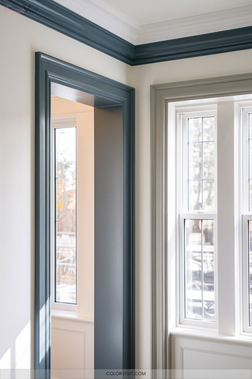
9. Muted Navy Accents in Transitional Spaces
Subdued navy trim brings moody sophistication to blended spaces, offering a crisp alternative to traditional black or charcoal.
Muted tones like Hale Navy or Newburyport Blue add depth without starkness, ideal for blended kitchens, entryways, or stairwells.
Their grayed-out undertones interact beautifully with mixed lighting and layered neutrals, grounding the room while letting textures shine.
For a balanced, innovative look, try:
- Pairing navy window trim with Swiss Coffee walls
- Framing built-ins in Newburyport Blue alongside brushed brass hardware
- Outlining wainscoting with matte navy against warm gray
- Highlighting stair railings for visual flow between floors
10. Olive Green Trim for an Earthy Touch
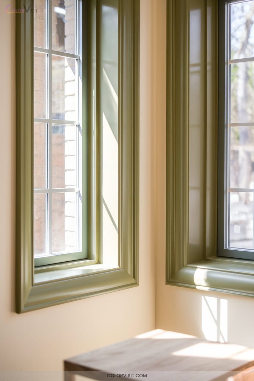
While muted navy delivers modern refinement, olive green trim introduces an earthy richness that instantly grounds a room.
Imagine this hue framing your living space, echoing the warmth of wood and the texture of stone.
Olive green brings sophisticated comfort, pairing effortlessly with neutrals, terracotta, or even bold turquoise.
Under natural light, it glows vibrantly, creating visual depth and serenity—perfect for cozy dens or inviting libraries.
Outside, olive trim harmonizes with brick or wood, weathering beautifully and adapting to both modern and classic facades.
Add brass or copper accents for a contemporary twist that keeps your space feeling vibrantly innovative.
11. Blackened Browns for Subtle Drama
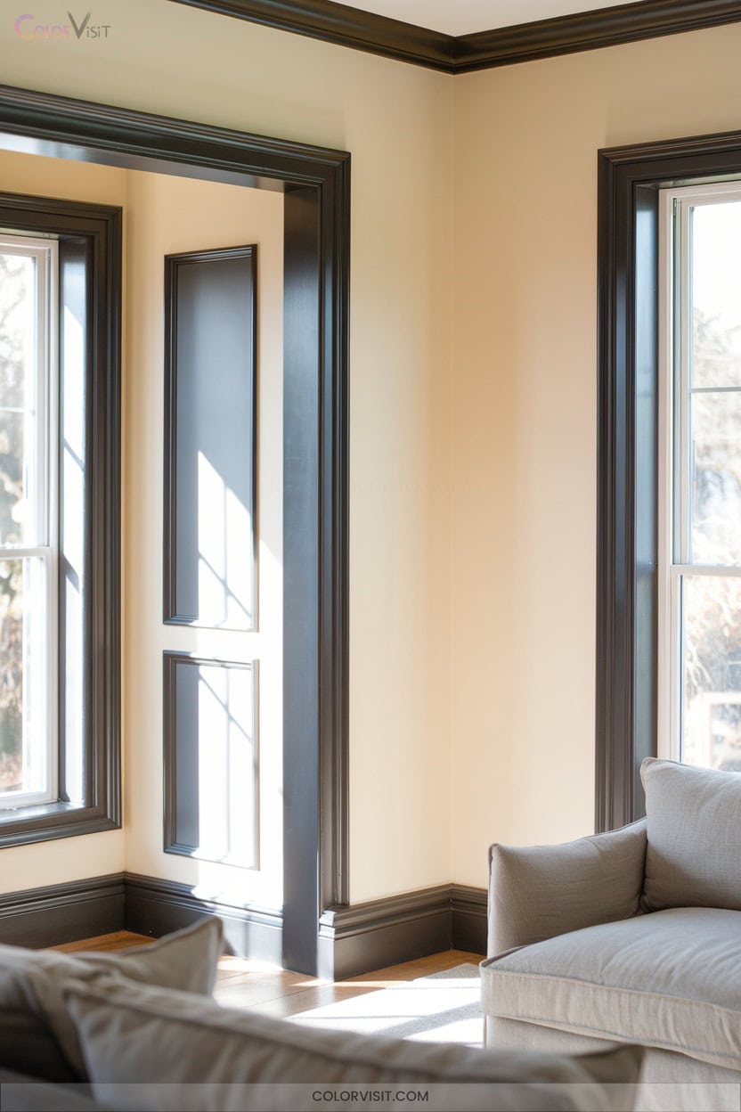
Even the smallest touch of blackened brown trim can transform a space, lending a sense of subtle drama without overwhelming the design.
These deep, ashy browns—anchored by cool gray or blue undertones—offer a sophisticated edge perfect for those who crave innovation.
Their low light reflectance absorbs brightness, sharpening architectural details and adding moody definition.
Use them to modernize Craftsman-style woodwork or ground minimalist interiors with quiet strength.
- Highlight vintage details with Weathered Brown or Willow for a muted effect
- Pair with olive greens or rustic reds for earthy harmony
- Test samples under your lighting for precision
- Embrace subtle complexity with violet-undertoned Branchport Brown
12. Two-Tone Trims for Layered Interest
A pair of carefully chosen trim colors can instantly elevate your space, drawing attention to architectural details and creating a sense of layered depth.
Two-tone trims—think crisp white paired with sleek grey or earthy sienna outlined in olive—offer innovation for design-forward homes.
You’ll want to balance sheen and finish: glossy architraves against matte walls amplify visual hierarchy and intrigue.
Use brighter hues to accentuate moldings or baseboards, letting neutral backgrounds support the palette.
Draw inspiration from curated design feeds and coordinate your trim shades with furniture or textiles for cohesion.
Experiment boldly, but guarantee your combinations enhance, not overpower, your space.
Frequently Asked Questions
How Do I Choose the Right Finish for Trim Paint?
When choosing your trim paint finish, weigh durability, shine, and maintenance. You’ll want semi-gloss for a crisp, modern edge and easy cleaning. If you prefer a softer, trend-forward look, opt for satin to subtly highlight architectural detail.
Should Trim Be Painted Before or After the Walls?
You should paint trim before the walls for crisp, seamless lines and a modern, gallery-inspired look. This method lets you control details, avoid taping, and easily achieve flawless, high-contrast edges that elevate any innovative space.
How Can I Prevent Brush Marks on Trim?
Like a sculptor smoothing marble, you’ll glide a high-quality brush in long, graceful strokes with the grain. Don’t overload; feather out edges, and thin paint slightly for a glassy finish that’s sharp and modern.
Can I Paint Over Previously Stained or Varnished Trim?
Yes, you can paint over previously stained or varnished trim. You’ll need to degloss, sand, clean, and prime with a high-adhesion primer. Embrace bold new colors—sleek matte blacks or soft modern taupes—for a transformative, contemporary edge.
What’S the Best Way to Clean Painted Trim?
You’ll achieve the cleanest, most modern look by dusting with a microfiber cloth, then wiping trim with a damp cloth dipped in mild soap solution. Target stains with a melamine sponge, then towel-dry for a flawless, sharp finish.
Conclusion
Think of your trim colors as the elegant frames around a gallery of artwork—each shade you choose is a curator, setting the mood and guiding the eye. Whether you lean into misty grays, earthy olives, or chic taupes, your home becomes a living canvas, whispering stories through subtle lines.
So, embrace these refined hues, and let your walls and trims dance together—always in step with today’s most stylish, yet timeless, design trends.