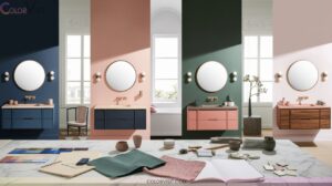
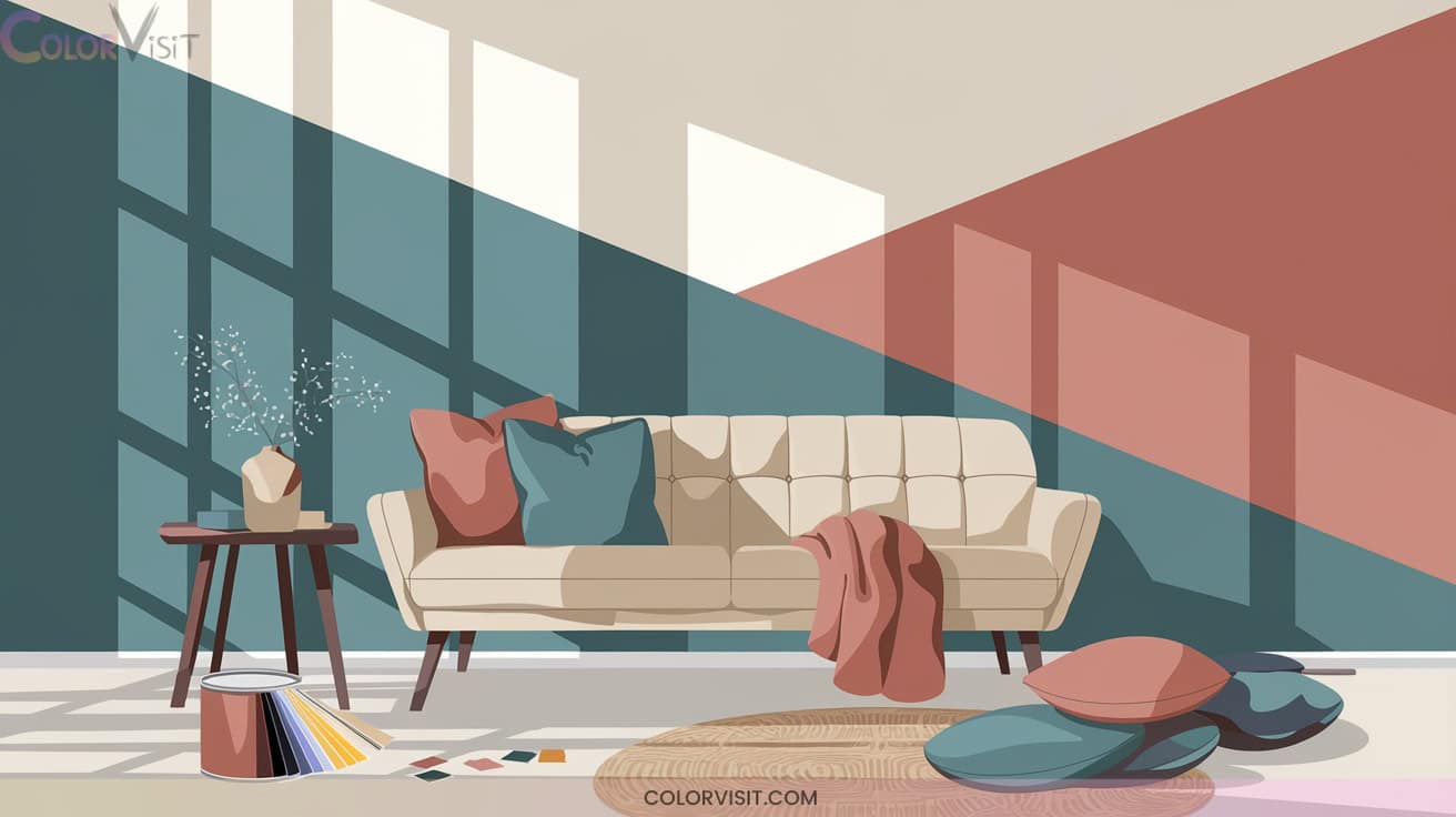
15 Dynamic Two Color Wall Ideas Paint Techniques for Dimension
Transform your space with dynamic two-color wall paint techniques like horizontal color blocking to widen rooms, vertical splits that enhance height, and ombre gradients for a seamless visual flow.
Try geometric panels, bold complementary pairings, or accentuated molding for striking architectural impact. Subtle blends and textured effects add tactile depth while crisp boundaries define zones and amplify drama.
Expertly chosen color combinations and finishes create unique rhythm and sophistication—discover innovative ways to enrich your rooms with dimension and style next.

1. Horizontal Color Block Walls
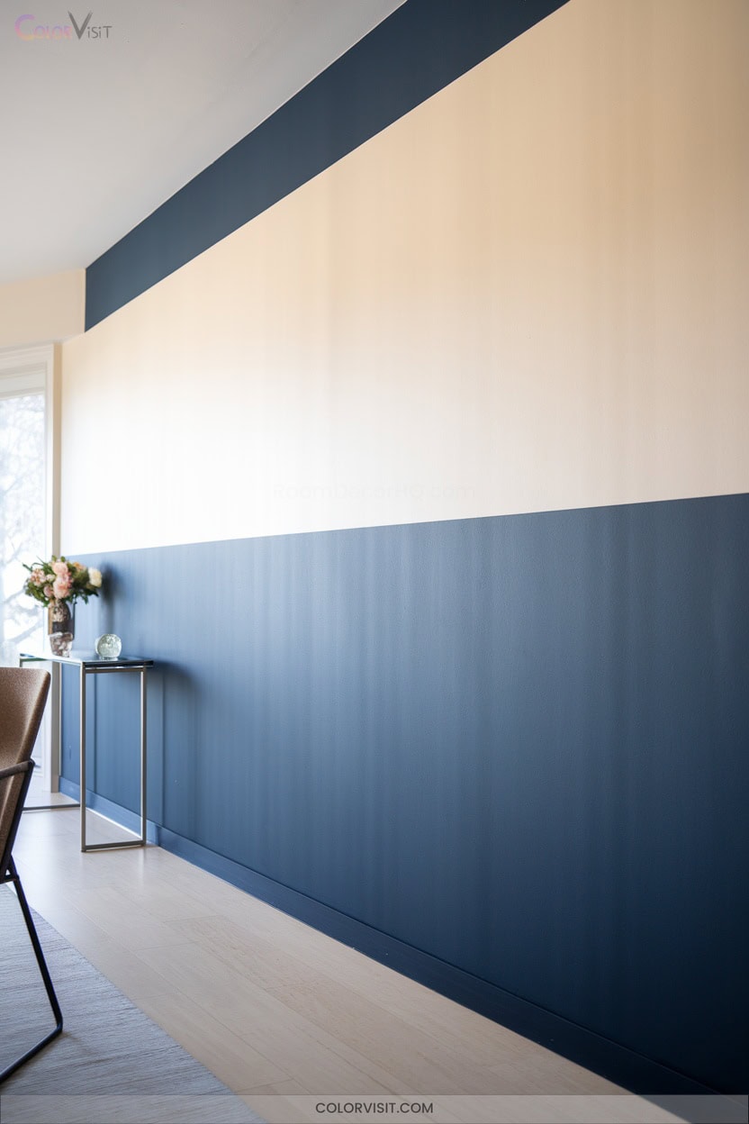
Horizontal color block walls instantly transform a space by visually expanding its width and introducing striking color contrast.
You’ll amplify spatial perception by choosing high-contrast hues or harmonious palettes that energize and unify your interior.
High-contrast or harmonious color palettes can instantly energize your space while visually expanding and unifying your interior design.
Start with meticulous surface preparation for crisp, flawless separation between shades—paint lighter tones first, then add bold or darker colors below for durability in busy areas.
Emphasize boundaries with brushstroke borders or geometric shifts for texture and artistic flair. Align blocks with furniture lines to craft cohesion and define zones.
Nature-inspired or monochromatic schemes can evoke warmth or sophistication, ensuring your innovative space feels both deliberate and dynamic.
2. Vertical Split Two-Tone Walls
A vertical split two-tone wall introduces a sophisticated way to divide a space visually, drawing the eye upward and enhancing the room’s perceived height.
By painting from ceiling to floor in two distinct colors, you create an immediate vertical delineation—ideal for defining zones within open-plan layouts.
Contrast a bold hue with a neutral for dynamic equilibrium, or select complementary colors for heightened visual intrigue.
This technique accentuates architectural features, establishes balance, and lets you customize each space’s function—whether separating living and dining areas or distinguishing workspaces.
Leverage lighting and symmetry to optimize impact and achieve a truly bespoke, innovative interior.
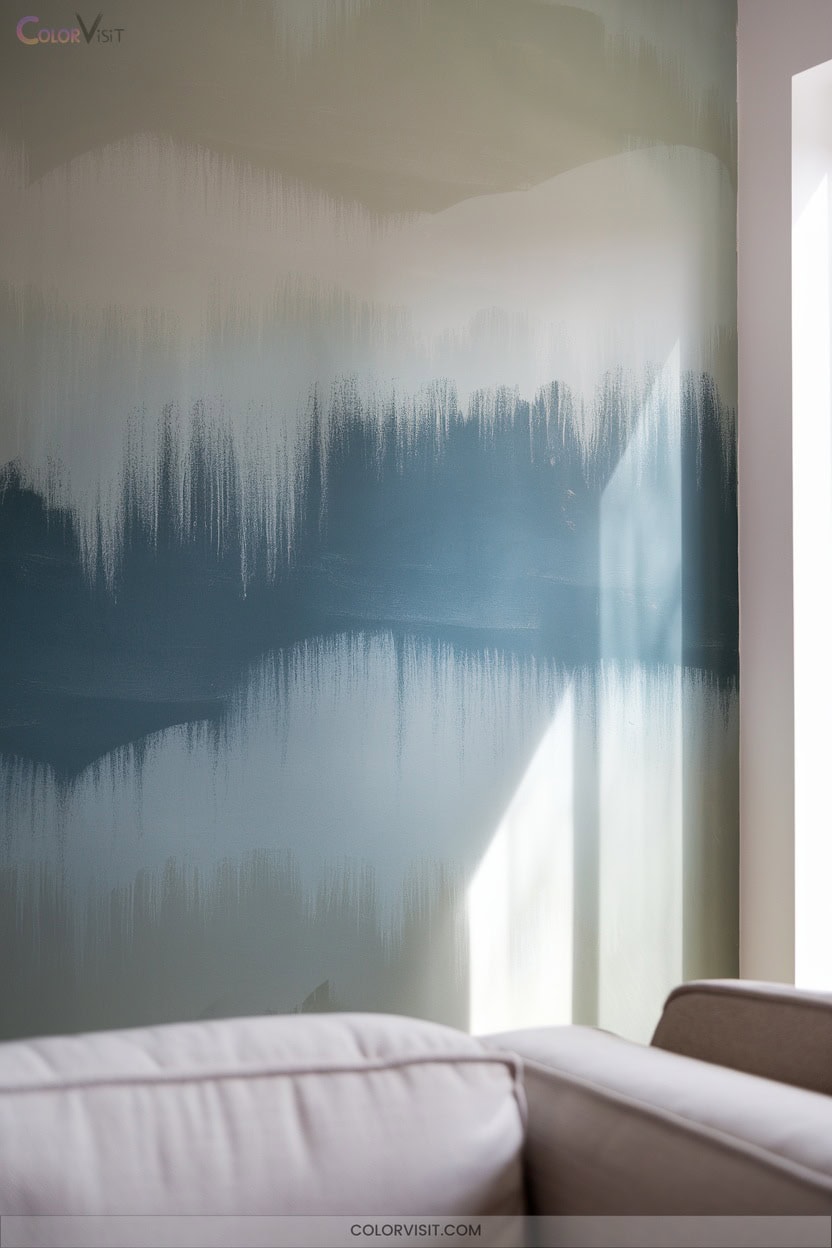
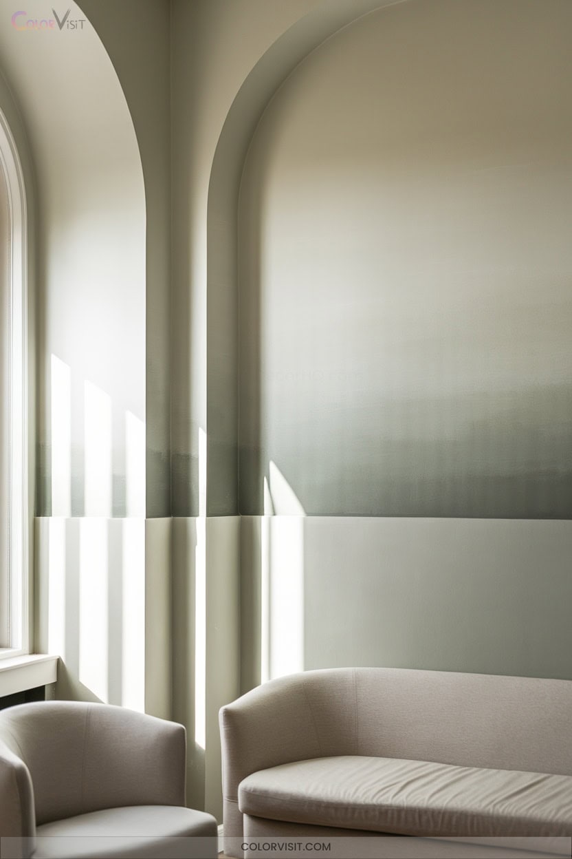
3. Ombre Gradient Wall Effects
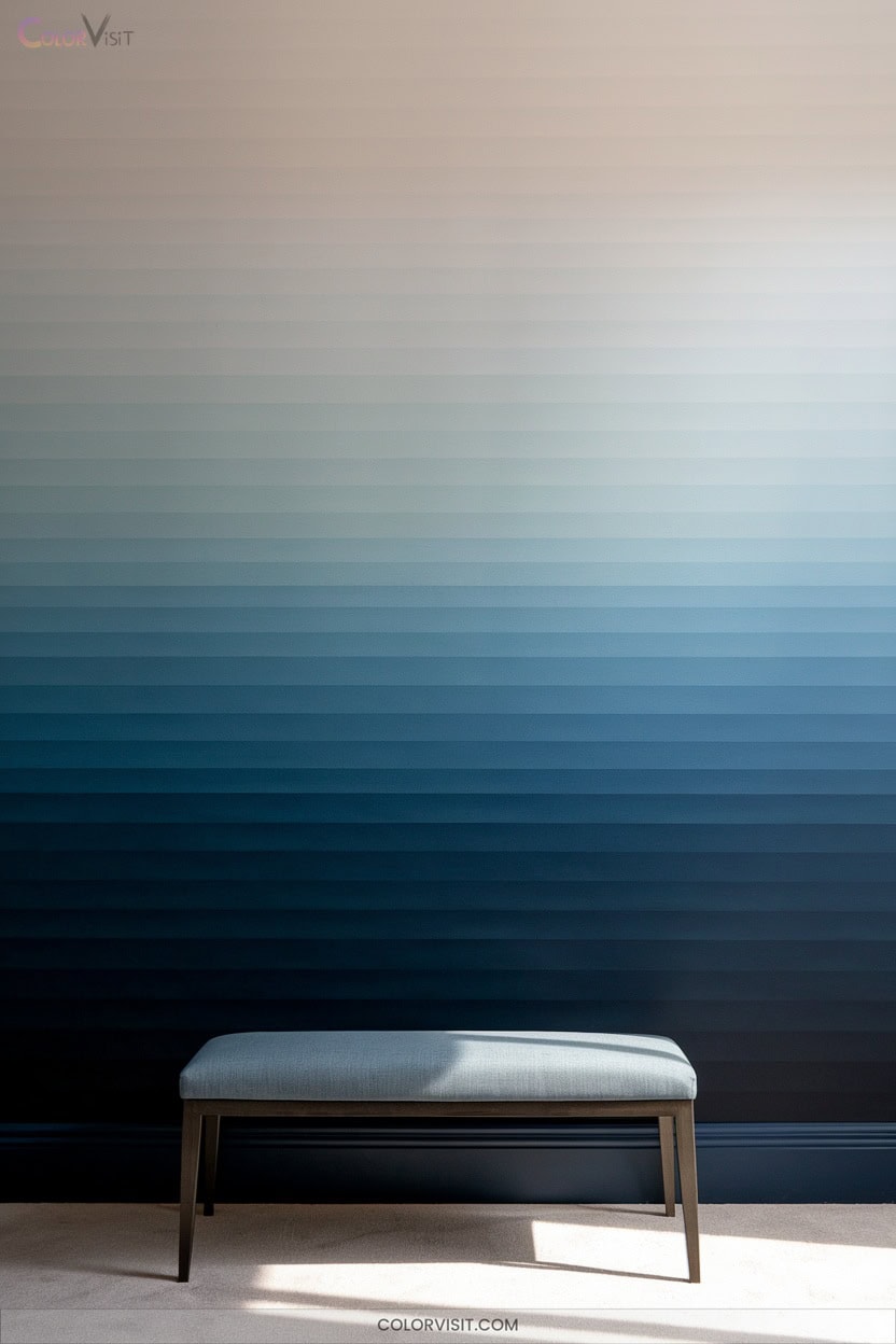
Immerse your space in subtle sophistication by embracing ombre gradient wall effects—a technique that layers color seamlessly from one shade to the next, transforming flat surfaces into mesmerizing visual statements.
Start by selecting colors from the same family or complementary hues with similar saturation for harmonious blending.
Plan the gradient—lightest at the top, darkest at the base, or vice versa—using swatches to visualize blends.
Employ high-quality paints, rollers, dry brushes, and sponges to feather edges and avoid harsh lines. Mix intermediate shades for smooth gradation.
With patience and careful layering, you’ll achieve a dimensional, innovative effect that energizes any modern interior.
4. Geometric Color Paneling
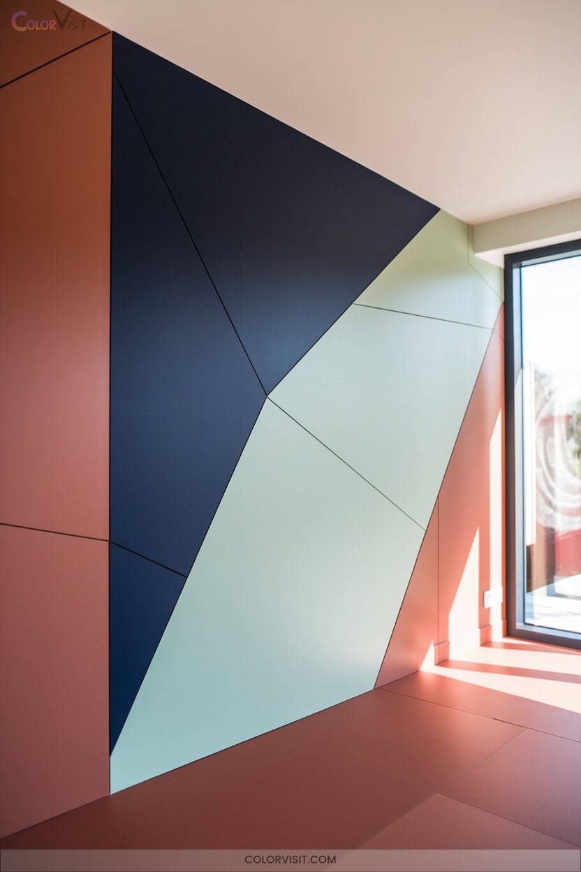
Step into a world of bold design with geometric color paneling—a technique that transforms ordinary walls into striking architectural features.
By combining crisp shapes and dynamic lines, you’ll introduce instant visual interest and depth.
Contrasting two-color palettes amplify the drama, making every geometric panel a focal point.
Materials like PVC, wood, or MDF allow for both flat and three-dimensional effects, letting you tailor texture and dimension.
Precision measuring tools and high-quality paint guarantee clean execution, while masking tape creates sharp boundaries.
Whether you opt for modern, curved, or wave-like patterns, geometric color paneling promises adaptable sophistication and innovative flair.
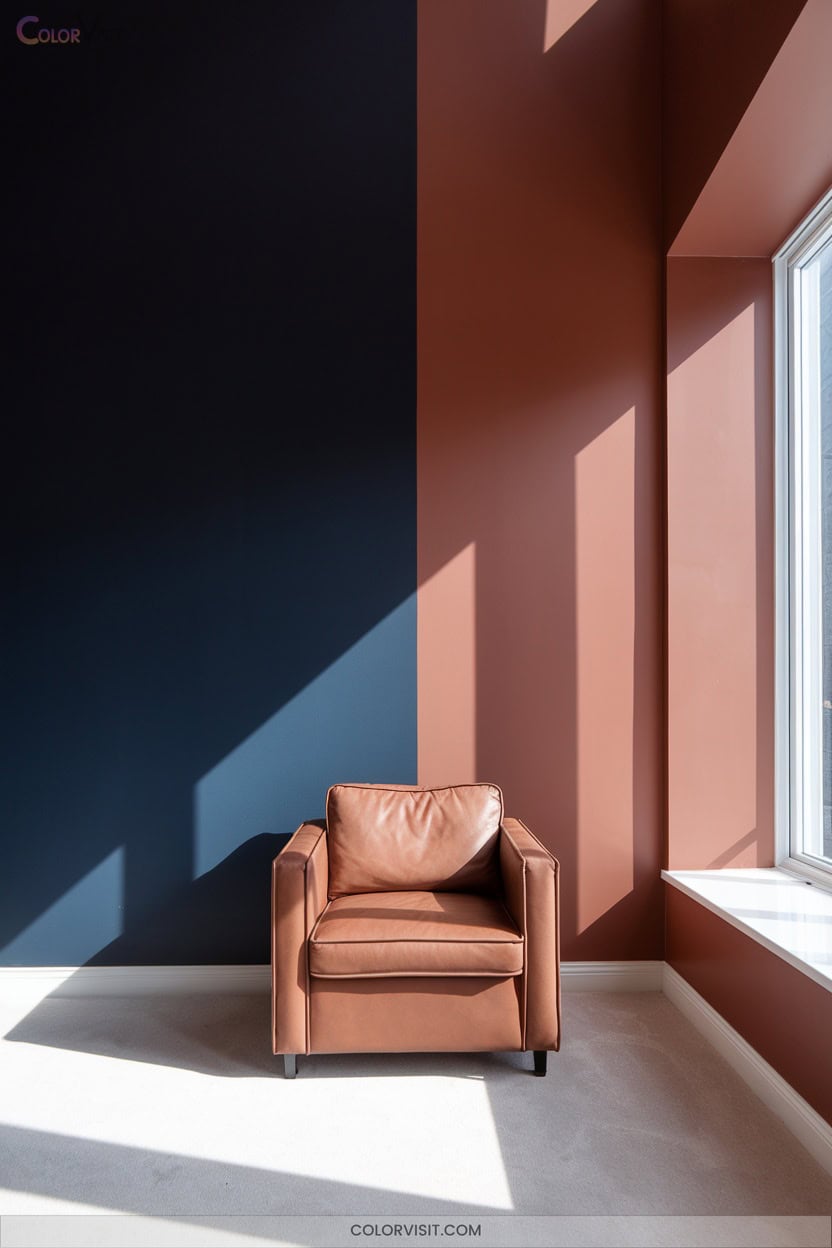
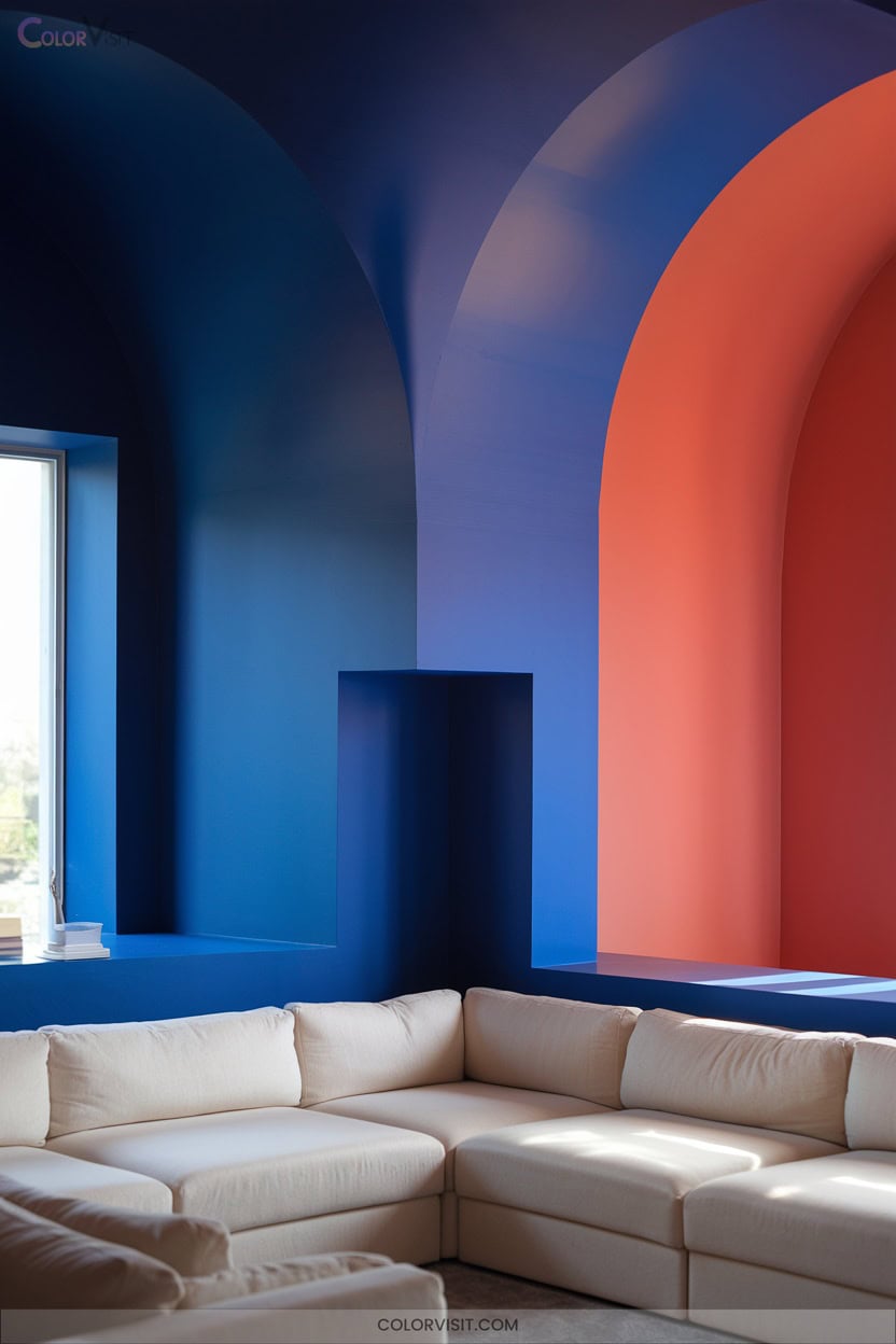
5. Diagonal Two-Color Accent Walls
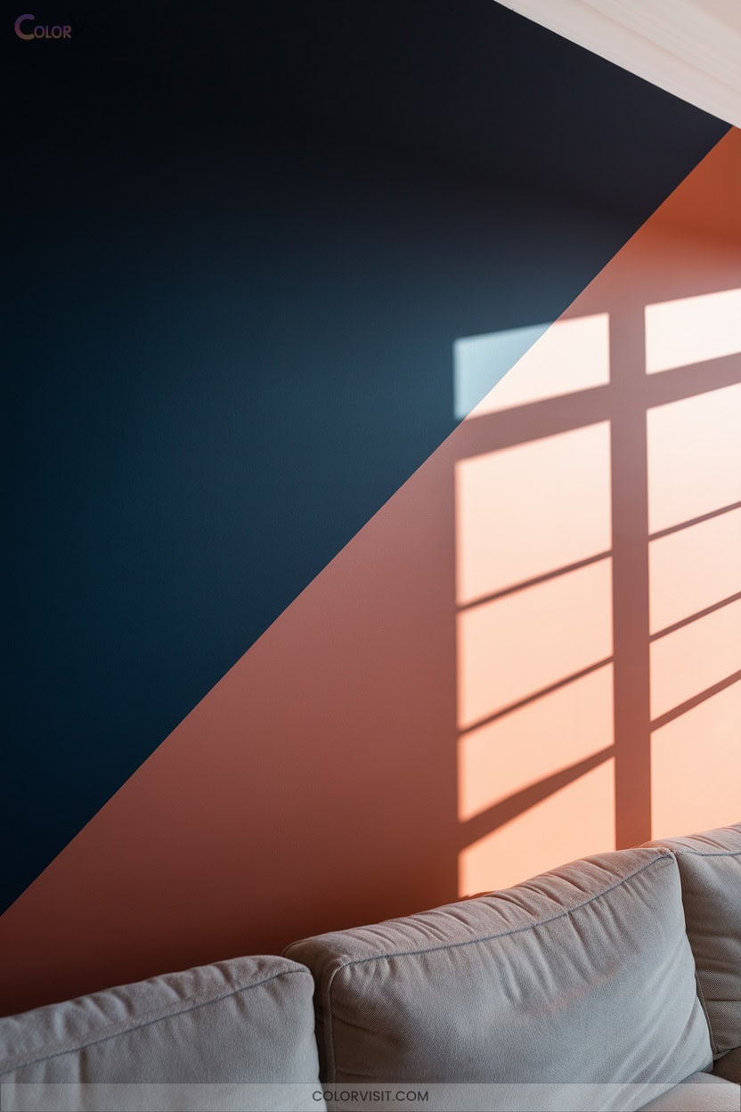
One of the most impactful ways to energize a space is with a diagonal two-color accent wall, where a single crisp line slices across the surface and sets a bold visual tone.
Select contrasting or harmoniously paired hues—perhaps a rich charcoal against a vibrant ochre, or a neutral beige with a lively teal.
Use high-quality painter’s tape to achieve razor-sharp lines, and angle-edged brushes for precision at edges.
Draw inspiration from your decor or artwork, and place the accent wall strategically to command attention.
For maximum depth, experiment with monochromatic variations or nature-inspired palettes, ensuring your statement wall feels intentional and dynamic.
6. Color Washed Layering Techniques
A color-washed wall adds tactile depth and atmospheric nuance, transforming flat surfaces into visually engaging canvases.
Color-washed walls infuse spaces with layered depth and moody ambiance, turning ordinary surfaces into captivating works of art.
To master this layered technique, start with a neutral or monochromatic base coat, then blend two harmonious shades from the same color family.
Apply glaze using a specialized tool like The Woolie, utilizing irregular, organic shapes for dimension and a natural, continental effect.
Mist the wall lightly to facilitate seamless blending, ensuring smooth blends between colors for a sophisticated finish.
- Select two shades from the same paint strip for harmony
- Use wet-on-wet blending for smooth color blends
- Apply in irregular patterns for organic depth
- Sand after drying for a refined surface
7. Bold Contrasting Ceiling Lines
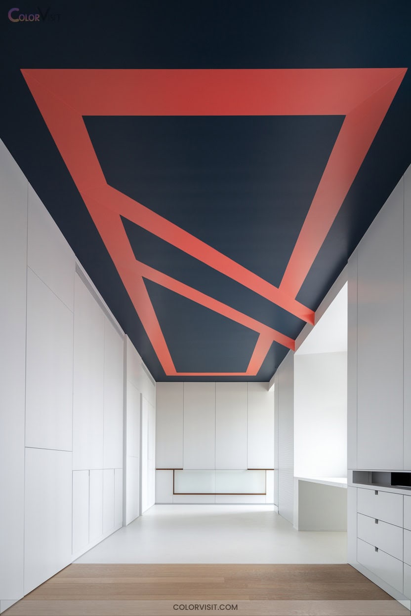
Bold ceiling lines introduce striking visual definition, instantly elevating a room’s architecture and setting a sophisticated tone.
When you opt for a deeper ceiling hue—think bold teal or sleek black—you create enthralling contrast, enhancing depth and intimacy.
Precise painter’s tape or pro edge tools guarantee crisp demarcation, while a bead of paintable caulk delivers seamless blends.
For additional dimension, explore textured or high-gloss finishes to reflect light and accentuate ceiling patterns. Layering shades along the ceiling edge further amplifies visual impact.
Bold ceiling lines let you showcase architectural features and transform ceiling planes into dynamic focal points within contemporary, innovation-driven interiors.
8. Monochromatic Shade Pairings
Monochromatic shade pairings deliver refined cohesion by layering variations of a single hue across your space.
Choose a dominant color as your foundation, then introduce depth by blending lighter tints and richer tones.
This technique eliminates color clashes, supporting both harmony and bold statements, depending on your base hue.
Elevate your design by integrating varied textures—think matte walls with high-gloss accents or plush textiles.
Maintain visual intrigue by balancing shade gradation and symmetry.
- Select a compelling base color for walls.
- Employ lighter and darker shades on furnishings and accents.
- Incorporate diverse textures for dimensionality.
- Use subtle patterns to amplify visual interest.
9. Nature-Inspired Earth Tone Duos
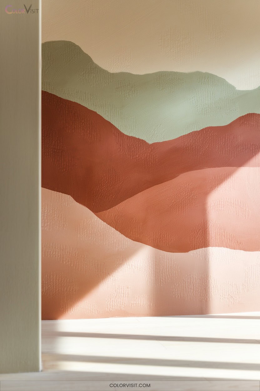
Drawing inspiration from the natural world, nature-inspired earth tone duos ground your interiors with a sense of warmth, tranquility, and enduring style.
Elevate your space by pairing deep blues with warm greys for a serene atmosphere, or combine evergreen and ochre for dynamic visual depth.
Pair deep blues with warm greys for serenity, or blend evergreen and ochre to create striking depth and visual intrigue.
Olive and brown offer timeless balance, while dusty pink and ochre introduce subtle warmth.
Integrate walnut or brass accents to infuse sophistication and dimension.
For a coastal twist, blend sandy beige with seafoam green or mocha and sea salt.
These innovative combinations deliver harmonious palettes, allowing you to craft interiors that feel both modern and naturally inviting.
10. Sponge Painted Textural Walls
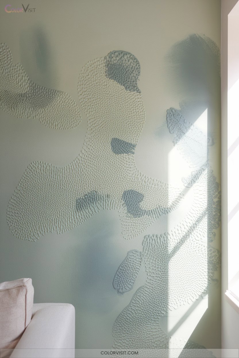
Sponge painted textural walls instantly transform a space by introducing depth, movement, and tactile intrigue.
By layering a dark satin base with lighter hues using a natural sea sponge, you’ll achieve organic dimension.
Thin your latex paint slightly for easier blending and practice on cardboard first to perfect your technique.
Alternate dabbing and dragging motions, rotating the sponge to avoid repetition while managing edges for seamless integration.
Divide your wall into arm’s-length segments for consistent results and reload your sponge frequently.
- Test lighting at various times to enhance texture visibility
- Employ glaze for translucent effects
- Integrate metallic mica powders for shimmer
- Use negative space creatively
11. Minimalist Subtle Color Splits
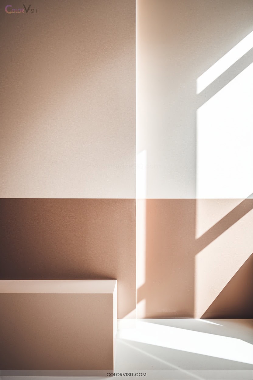
A minimalist two-tone wall instantly elevates a space by introducing subtle contrast and refined simplicity.
Opt for neutral hues—think light gray paired with crisp white or soft beige—to achieve understated depth and dimension without visual clutter. Place the lighter shade above to visually heighten the ceiling and expand the room’s sense of volume.
Maintain harmony with clean, horizontal or vertical divisions, ensuring symmetry and balance. Integrate minimalist geometric motifs or subtle texture contrasts to enhance visual interest.
For cohesion, echo wall colors in decor elements like rugs. Careful masking and precise paint lines guarantee a professional, sophisticated finish every time.
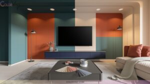
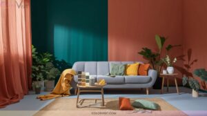
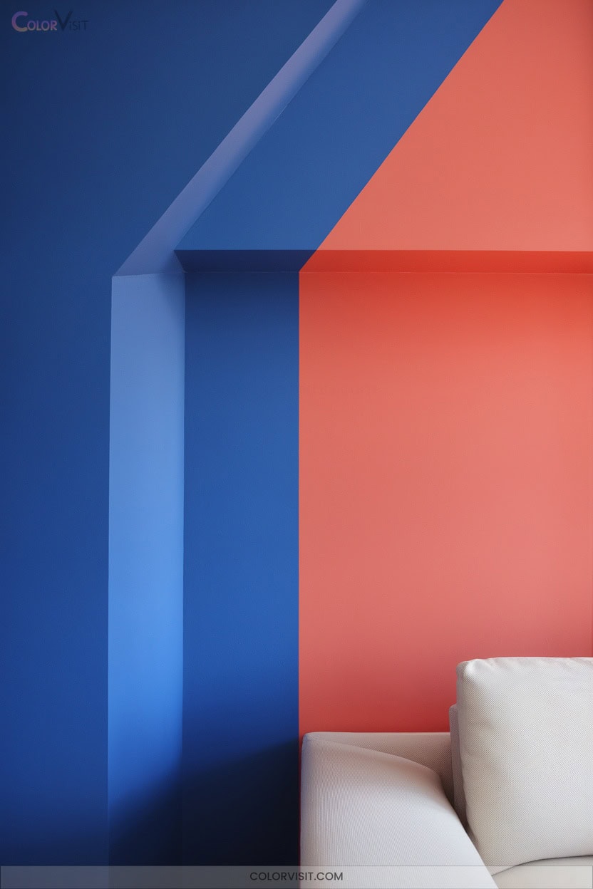
12. Complementary Color Pair Walls
Harness the dynamic energy of complementary color pairs to transform your walls into bold, balanced statements.
Select high-impact duos such as red and green for festive contrast, or orange and blue for modern vibrancy.
To prevent visual fatigue, harmonize undertones and adjust saturation—think dusty blue with terracotta for refined drama.
Geometric splits or accent walls maximize visual intrigue while controlling intensity. Integrate color with materials and lighting for cohesive sophistication.
- Use painter’s tape to achieve sharp, dimensional divides between complementary shades.
- Highlight architectural trim in a counterbalancing color.
- Pair wall colors with matching textiles for holistic rhythm.
- Optimize lighting to enhance contrasts.
13. Faux Finish Two-Color Blends
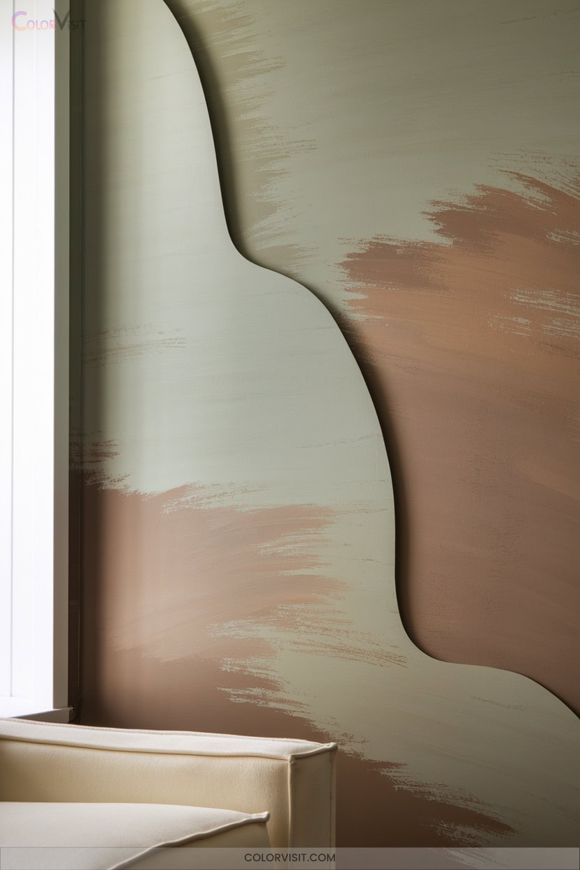
Two distinct hues, expertly blended through faux finish techniques, instantly elevate your space with visual depth and tactile illusion.
Master the art of faux finishes—blend two hues to create captivating depth and a luxurious, multidimensional look in any room.
Start by selecting two shades with a 3–5 step separation on a fan deck—this guarantees ideal contrast and dimensionality.
Use a dual split sheepskin roller and satin latex paints for seamless, single-coat application; edge-blend as you go for a unified look. Vary pressure and direction to customize texture, and extend blending for subtle gradients.
Experiment with unconventional color gaps for avant-garde statements. Always sample your scheme first—neglecting this step risks tonal discord.
Innovate further with pearl or metallic paint additives.
14. Bold and Bright Dynamic Pairings
Vivid color pairings transform ordinary walls into powerful design statements, injecting spaces with unmistakable energy and character.
You can leverage vibrant color theory to craft dynamic environments—think triadic or complementary schemes for maximum impact.
Experiment with bold hues like deep navy and electric green, or draw from art-inspired palettes for visually compelling interiors.
High-contrast duos such as fuchsia pink with electric blue, or yellow with black, capture attention and define contemporary style.
Use these pairings to renew any space with confidence.
- Navy and Wasabi green for striking contrast
- Fuchsia and electric blue for artistic flair
- Yellow and black for graphic impact
- Red and green for energetic harmony
15. Two-Tone Trim and Molding Highlights
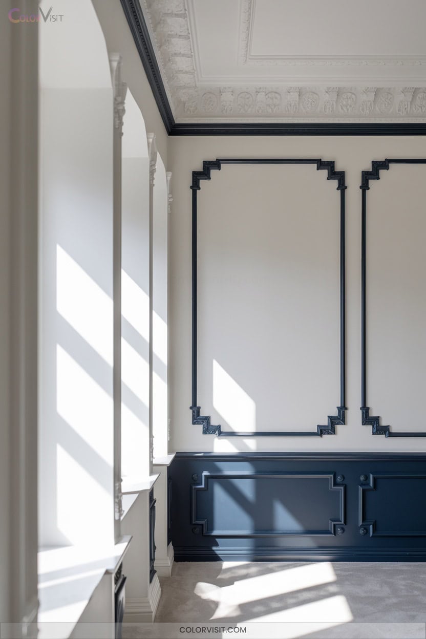
Trim and molding provide powerful opportunities to elevate your wall design with precision and style.
By embracing two-tone techniques, you can craft striking contrasts—think charcoal trim on crisp white walls—or choose harmonious matches that unify floor, furniture, and trim for a seamless effect.
Highlight architectural features by using tinted or clear glazes on molding, emphasizing texture and depth with brush or ragging techniques.
Consider color theory, lighting, and architectural style to guide your palette.
Whether you prefer bold, modern contrasts or retro-inspired hues, two-tone trim and molding allow you to infuse your space with innovation and personalized visual impact.
Frequently Asked Questions
How Do I Choose the Best Paint Finish for Two-Color Wall Designs?
You should assess your room’s lighting, wall texture, and functional needs. Pair matte with gloss or satin for striking contrast and dimension. Don’t hesitate to test samples—observe how finishes interact with colors under changing light conditions.
What Is the Easiest Technique for Beginners to Try Two-Color Walls?
You’ll achieve striking results by taping a straight line across your wall, painting one color on each side. Use painter’s tape for crisp separation, and don’t forget to seal the edge for a flawless, modern visual impact.
Can Two-Color Wall Techniques Work Well in Small Rooms?
Absolutely, you can use two-color wall techniques to visually expand small rooms. By strategically applying contrasting or harmonious hues, you’ll create spatial depth, emphasize focal points, and enhance architectural features—unlocking innovative, design-forward solutions for compact interiors.
How Do I Prevent Paint Colors From Bleeding at the Dividing Line?
Think of your dividing line as a runway—precision matters for takeoff. You’ll achieve crisp color separation by sealing tape edges with base color, using dense rollers, and removing tape before fully dry. That’s your ticket to flawless impact.
Are Two-Color Wall Styles Suitable for Rental Properties or Temporary Spaces?
You’ll find two-color wall styles can energize rental spaces, offering visual intrigue and design-forward appeal. However, always weigh maintenance, tenant agreements, and marketability. In temporary settings, removable decals or accent walls let you experiment without permanent commitment.
Conclusion
So, does the theory hold true? Absolutely—two-color wall techniques inject undeniable dimension and energy into any space. By playing with horizontal or vertical splits, ombre gradients, or bold geometric patterns, you’ll create visual interest that transforms plain walls into design statements.
Don’t be afraid to experiment with complementary hues or dynamic trim highlights. Trust the process: layering color strategically isn’t just a trend—it’s a proven way to elevate interiors and make every room feel distinctly yours.