22 Transformative Wall Paint Color Ideas for Every Home
Revamp your rooms using Benjamin Moore’s Simply White for luminous ceilings, Revere Pewter to warm up basements, and Tapestry Beige for fluid flows.
Try Mushroom Cap for subtle cozy vibes, set Irish Mint in gyms for calm, or mark spaces with bold feature nooks.
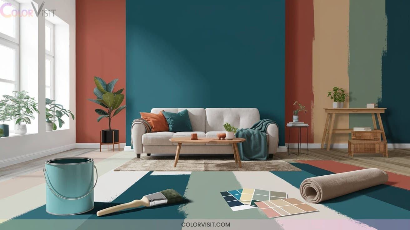
Mix gleaming stripes, mismatched trim, and mood-tuned palettes for architectural drama. Contemporary color blocking and precise accent lines deliver crisp, modern impact. Explore how these transformative ideas invite light and layered sophistication throughout your home.
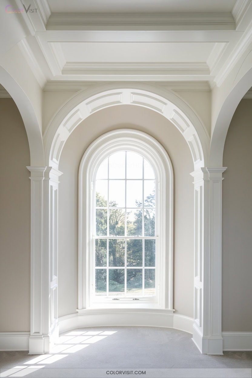
1. Benjamin Moore Simply White for Ceilings and Trim
Benjamin Moore Simply White (OC-117) remains a top choice for ceilings and trim thanks to its warm undertones, high light reflectance, and timeless character.
You’ll find its subtle yellow base delivers a crisp, luminous effect that maximizes brightness—especially in low-light or compact spaces.
Its gentle yellow undertone creates a luminous glow, amplifying light and enhancing spaciousness in even the smallest or dimmest rooms.
Innovators leverage its versatility, juxtaposing matte ceilings with semi-gloss trim for dimensional contrast.
Simply White’s adaptability guarantees seamless integration with contemporary palettes, from warm neutrals to bold charcoals.
Use it as a neutral framework to accentuate architectural details and metallic finishes.
With high-quality application, you’ll achieve enduring clarity and a visually expansive, modern environment.
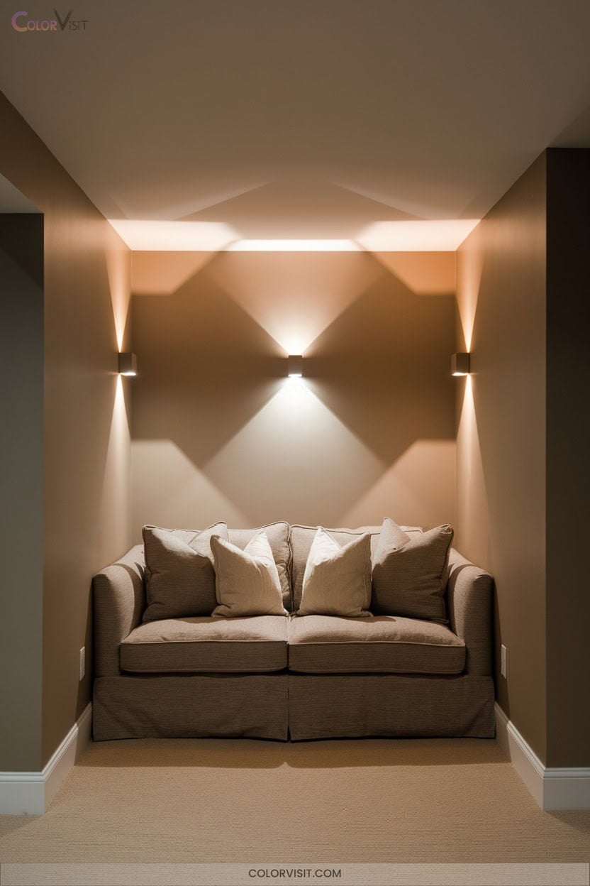
2. Revere Pewter HC-172 for Warm, Inviting Basements
While crisp whites like Simply White uplift ceilings and trim, achieving a truly welcoming basement calls for a shade that grounds and warms the space.
Revere Pewter HC-172 excels here, with its light gray profile and subtle green undertones delivering a harmonious balance of modern edge and traditional comfort.
In low-light basements, it reflects available light, compensating for natural deficits and preventing a gloomy feel. Pair it with warm white bulbs or earthy accents to amplify its inviting depth.
This adaptable hue transcends fleeting trends, offering a timeless, cohesive backdrop that energizes open layouts or cocoon-like entertainment zones with equal sophistication.
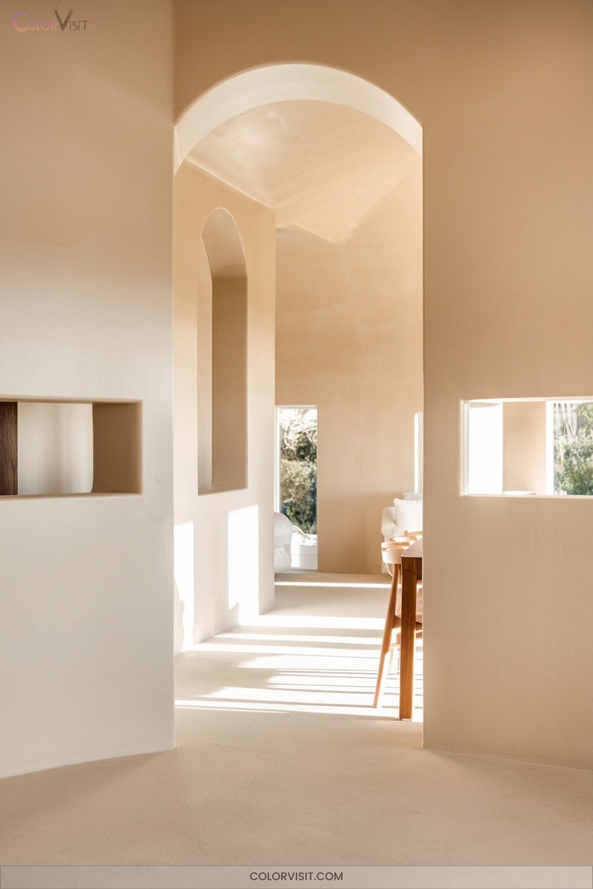
3. Tapestry Beige OC-32 for Seamless Room Transitions
Tapestry Beige OC-32 offers an expert solution for effortless visual flow between rooms, making changes feel seamless and sophisticated.
With an LRV of 66, this medium-light hue bridges warm and cool undertones, subtly leaning greige for contemporary versatility.
Its nuanced color profile adapts to diverse lighting, maintaining balance whether paired with Swiss Coffee for cohesion or offset by Storm Cloud Gray for contrast.
Tapestry Beige’s muted elegance sets the stage for bold textures and natural materials.
Use it across living spaces or home offices to unify your design narrative, ensuring changes that are both innovative and impeccably executed.
4. Mushroom Cap 177 for Subtle, Cozy Warmth
Soft luminosity defines Mushroom Cap 177, a warm, muted yellow that instantly infuses rooms with approachable sophistication.
Mushroom Cap 177 radiates gentle warmth, bringing effortless sophistication and inviting light into any space with its soft, muted yellow hue.
Its high LRV (73.13-74.53) effectively brightens interiors without harsh glare, making it a definitive choice for innovative, light-maximizing design.
Harness its versatility in contemporary and classic settings—pair with organic textures, sleek metals, or layered neutrals for curated depth.
Use Mushroom Cap 177 to elevate both spatial perception and tactile experience.
- Elevates mid-century modern and natural wood elements
- Enhances quartzite and travertine surfaces for earthy cohesion
- Pairs seamlessly with Simply White OC-117 trim
- Optimizes ambient light in north-facing rooms
- Supports trend-forward color blocking and monochrome layering
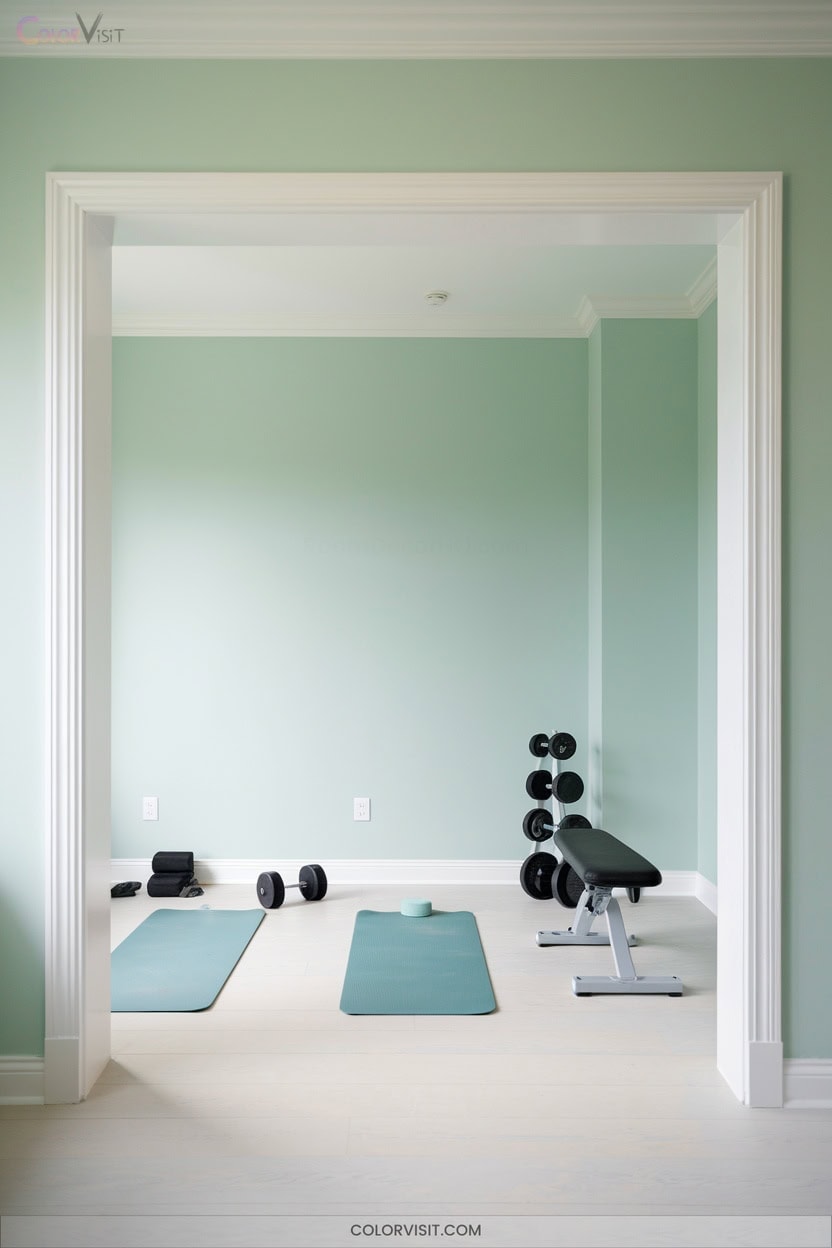
5. Irish Mint 2041-70 for a Serene Home Gym
After exploring the inviting warmth of Mushroom Cap 177, consider the revitalizing calm of Irish Mint 2041-70 for your home gym.
This pastel green shade channels biophilic design, promoting mental clarity and serenity—key components for restorative workouts.
The subtle hue expands space visually, while soft lighting amplifies its tranquil effect.
Integrate natural wood, greenery, and minimalistic decor for a holistic, on-trend ambiance.
Irish Mint’s versatility allows seamless pairing with neutrals, creating a balanced environment that reduces stress and enhances focus.
Prioritize this innovative palette to transform your gym into a therapeutic retreat, supporting both physical performance and well-being.
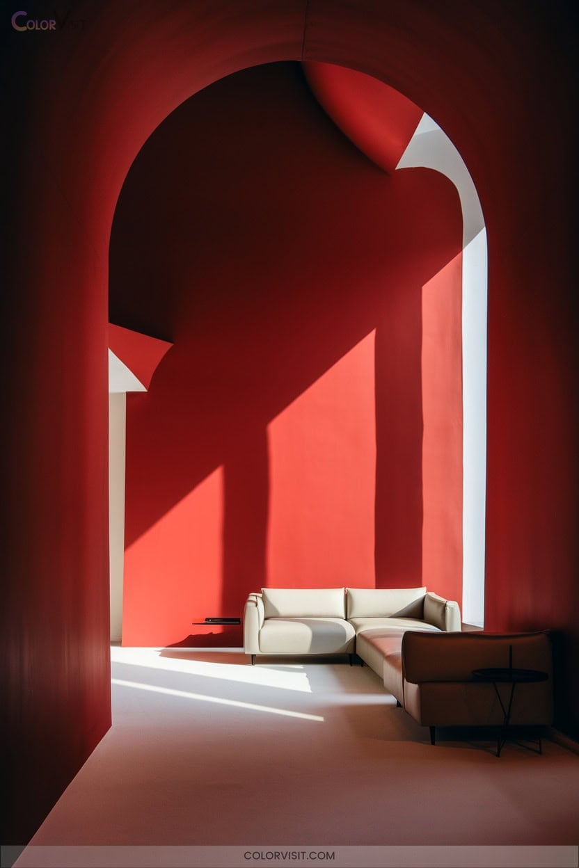
6. Fire Red Accent Walls for Energetic Spaces
Why not harness the undeniable energy of fire red to make a bold statement in your space?
Fire red accent walls instantly invigorate dining rooms, bedrooms, or entryways, infusing them with dynamism and warmth.
Fire red accent walls breathe energy and warmth into any room, transforming ordinary spaces into vibrant, inviting retreats.
Pair Rosy Apple 2006-30 with crisp white millwork for modern contrast, or layer in gold-leaf ceilings and black dressers for high-drama sophistication.
Leafy green accents balance red’s intensity, while red toile wallpaper on a neutral background keeps the look airy and fresh.
Integrate metallic finishes, tactile textiles, and strategic lighting for a multidimensional, trend-forward vibe.
- White trim for clarity
- Metallic gold fixtures
- Leafy green decor
- Textured red wallpaper
- Layered lighting
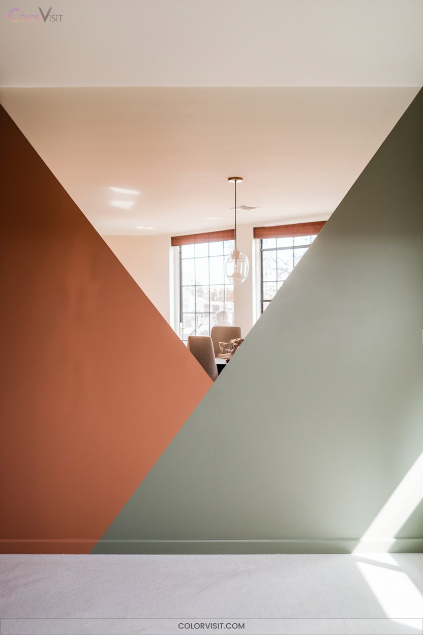
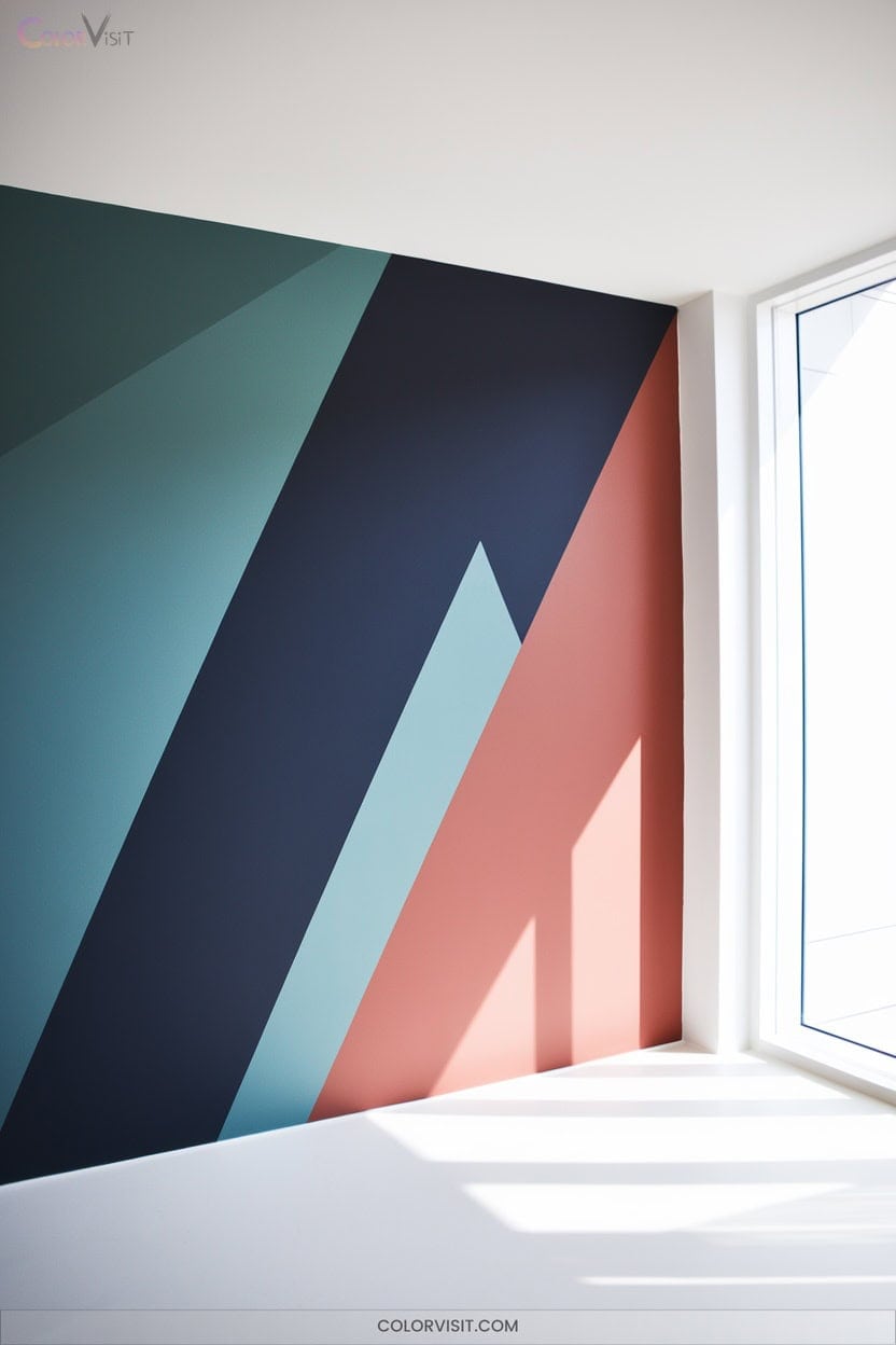
7. Diagonal-Line Color Blocking to Define Zones
Ever considered how diagonal-line color blocking can instantly energize your interiors and define functional zones with precision?
This technique leverages dynamic geometry to visually separate areas—perfect for open-plan layouts, creative studios, or children’s rooms craving playful sophistication.
Opt for timeless hues paired with neutral backgrounds to avoid fleeting trends, ensuring longevity and balance.
Integrate diagonal color blocks to accentuate architectural features or anchor furniture placements, transforming walls into bold art statements.
Execute with meticulous planning, taping, and priming for crisp, professional results.
While undeniably trendy, diagonal-line color blocking offers personal expression and flexibility, making it a frontrunner in innovative home design.
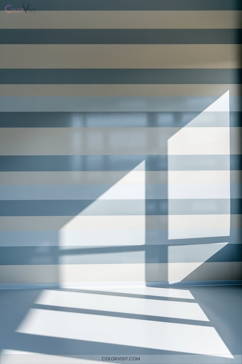
8. Tone-on-Tone Stripes for Subtle Dimension
Subtle-stripe wall treatments offer an elevated way to introduce visual interest without overpowering a room’s architecture.
By leveraging tone-on-tone hues and strategic use of sheen, you can craft a multidimensional effect that feels both sophisticated and current.
Start from a discreet corner, measuring stripe widths between 4″ and 12″ to achieve balanced rhythm.
Opt for latex paint in close shades, using safe-release tape and precise tools for crisp lines.
Consider room proportions when orienting stripes for enhanced spatial perception.
- Alternate matte and gloss finishes for depth
- Align stripes with furniture placement
- Use odd stripe counts for symmetry
- Seal tape with base color
- Prioritize paints with color retention
9. Abstract Arches for Dramatic Visual Interest
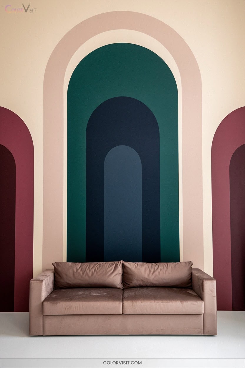
An abstract arch painted on your wall instantly commands attention, transforming flat surfaces into sculptural focal points.
A painted abstract arch brings instant impact, turning any plain wall into a striking, sculptural statement.
Harness this trend by mapping precise curves with the string-and-pencil method, then defining edges using painter’s tape for architectural clarity.
Opt for a single sophisticated hue to frame an area, or layer on-trend accent colors—think blush, ochre, or “New Penny”—for dynamic visual depth.
Strategic placement around artwork, doorways, or bedroom headboards draws the eye and creates intentional zones.
Integrate arches into corners for a seamless flow and heightened elegance.
Use multiple coats for an immaculate finish, ensuring your design remains bold and crisp.
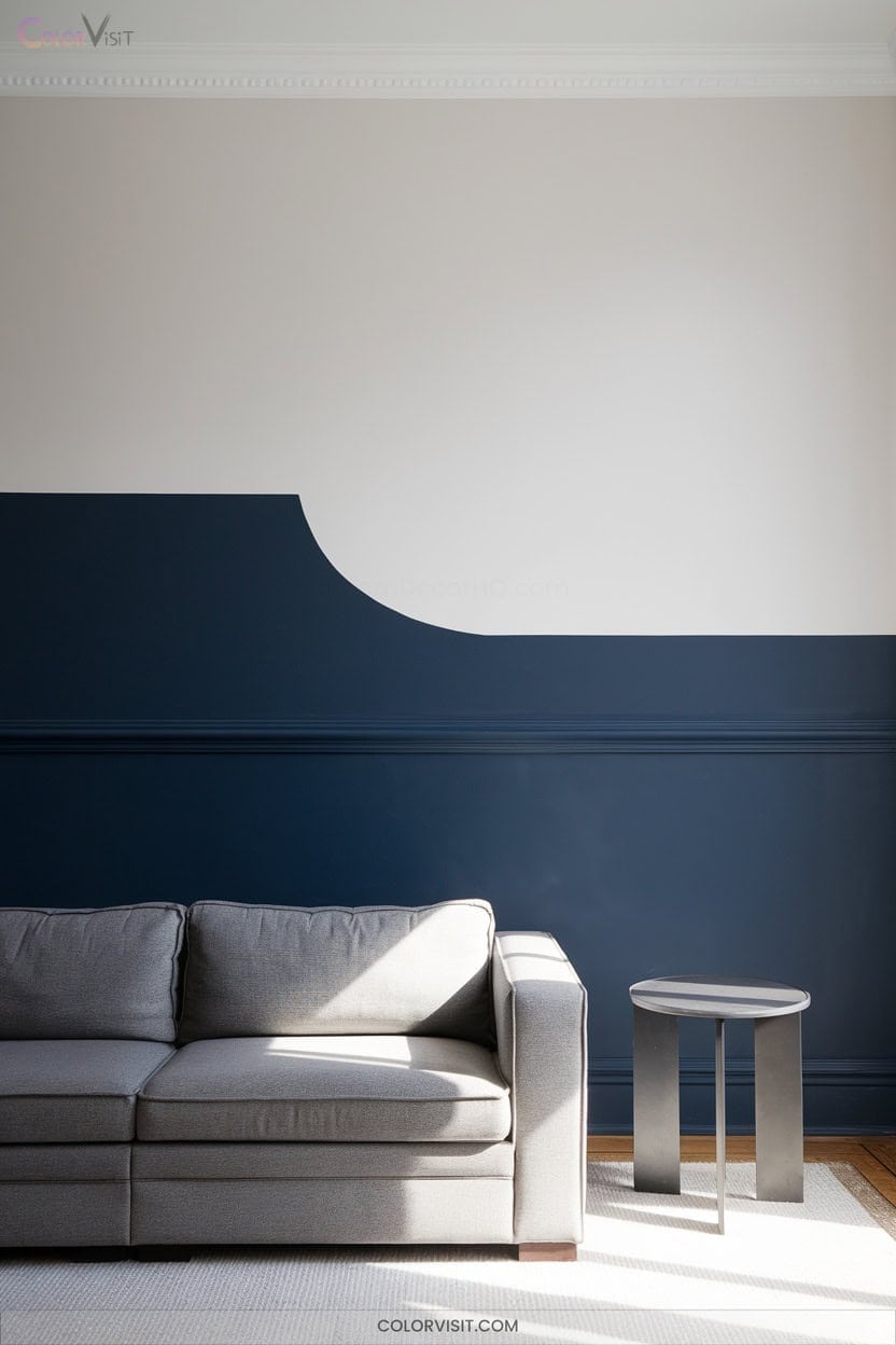
10. Two-Tone Vertical Wall Splits for Bold Contrast
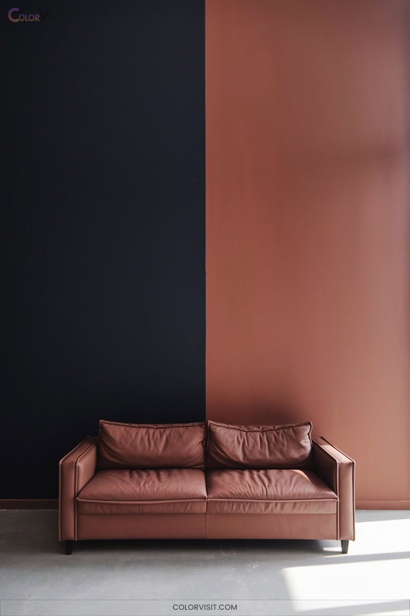
Dramatic impact defines the two-tone vertical wall split—a technique that instantly sharpens architectural lines and energizes any space.
Leverage high-contrast ratios like navy with white, or introduce metallics such as gold against midnight blue for a luxe, reflective edge. Ground your room visually by keeping darker colors below and lighter tones above, optimizing spatial perception.
Use laser-level precision and Frog Tape Edge Lock to achieve crisp, flawless boundaries. Experiment with sheen and texture to push the envelope—think satin-matte interplay or tactile sand-infused panels.
- Embrace rule-of-thirds for striking asymmetry
- Align splits with doorframes
- Use gloss accents for dimensional borders
- Try ombre blends
- Match paint to furniture proportions
11. Greige-to-Beige Gradients for Cohesive Flow
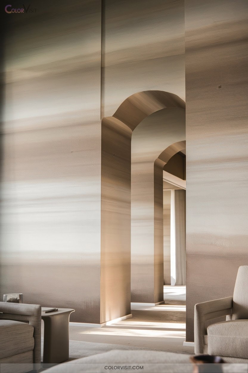
A greige-to-beige gradient offers a sophisticated approach to wall color, weaving together the tailored neutrality of gray with the welcoming warmth of beige for a seamless, modern flow.
By selecting nuanced greige paints—like Benjamin Moore’s Edgecomb Gray or Sherwin Williams Perfect Greige—and shifting subtly towards beige, you create spatial cohesion and visual depth.
Gradients, whether horizontal or vertical, leverage tonal progression to mask imperfections and enhance spatial perception.
Testing swatches in varied lighting reveals how undertones shift, optimizing cohesion.
Pair these gradients with mushroom cabinetry or neutral furnishings for a forward-thinking, harmonious palette that elevates open-plan living and supports evolving décor.
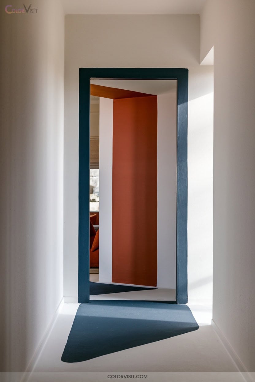
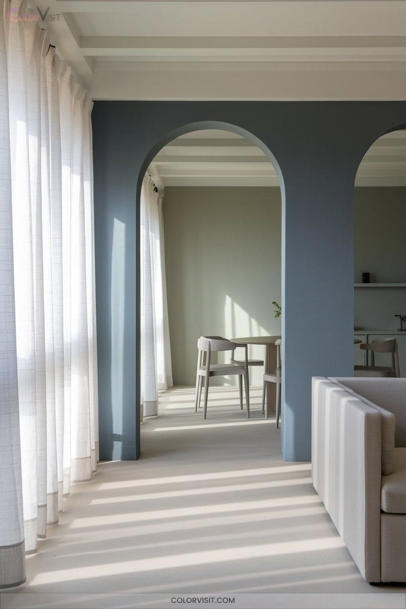
12. Painted Doorways as Transitional Buffers
Seamless flow between rooms isn’t limited to wall color gradients—painted doorways now serve as sophisticated visual buffers, reimagining how spaces relate within contemporary interiors.
Painted doorways redefine transitions, acting as elegant visual buffers that enhance the connection and flow between modern interior spaces.
By using targeted hues on door frames, you can delineate zones, soften abrupt changes, and guide movement, all while amplifying spatial drama.
Elevate your design with advanced color strategies and tactile finishes, ensuring every passage feels intentional and cohesive.
Embrace this innovation to define, connect, and enhance your home’s visual journey.
- Introduce muted or intermediary hues for subtle changes
- Highlight entries with bold, contrasting tones
- Opt for matte finishes to diffuse light elegantly
- Coordinate door color with architectural trim
- Experiment with dual-tone or color-blocked frames
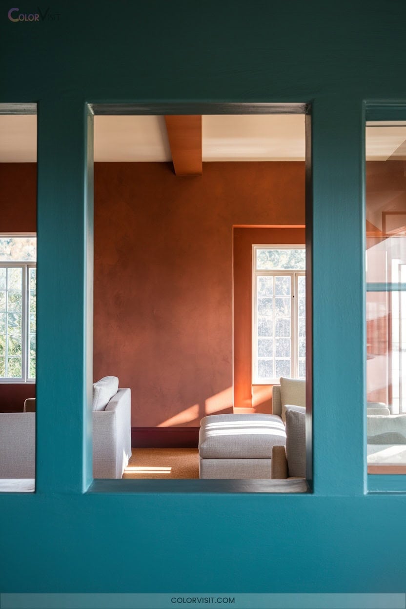
13. Complementary Saturation Across Connected Rooms
Harnessing complementary saturation across connected rooms elevates your interiors from merely coordinated to truly curated.
Use the color wheel to select pairs like sage and terracotta, calibrating mid-tone saturation for effortless flow.
Apply the 60-30-10 rule, and align undertones—warm burgundy and olive harmonize, while mismatched magenta and lime clash.
Progressively increase intensity across adjacent spaces, anchoring bold choices with deep wood floors or monochromatic trim.
Integrate layered textures: matte walls, glossy accents, and organic elements, such as jute, to soften changes.
Leverage lighting—3000K-3500K bulbs and high-CRI LEDs—to modulate and perfect your chosen complementary saturation symphony.
14. Repetition Technique With Accent Colors
The repetition technique with accent colors transforms ordinary walls into dynamic focal statements, leveraging rhythmic patterning to infuse modern energy.
Harness stencils or laser-cut templates for geometric precision—think harlequin diamonds or checkerboard contrasts.
Integrate color blocking in structured segments to emphasize architectural features and guide sightlines.
Combine matte bases with metallic or gloss accents for tactile interplay, and experiment with moire overlays or banded gradients for optical intrigue.
Precision tools like laser levels and high-quality tapes guarantee flawless alignment and crisp edges.
- Stencil rhythmic geometric forms for uniformity
- Alternate bold hues with light neutrals
- Use ombre gradation for subtle repetition
- Apply metallic finishes for accent impact
- Layer patterns for multidimensional depth
15. Threshold Alignment for Seamless Color Changes
Building on the impact of rhythmic accent repetition, you can further elevate your interior by mastering threshold alignment—where color shifts become intentional design statements rather than abrupt breaks.
Elevate your interior by turning threshold color shifts into intentional design statements, creating harmony instead of abrupt breaks.
Analyze your space’s architectural context, identifying shift points like doorways or arches to guide seamless color changes.
Opt for harmonious palettes, leveraging gradual shifts, accent walls, or subtle patterns for visual flow.
Test each hue under actual lighting conditions to avoid jarring contrasts.
Integrate textured elements or murals to blend boundaries, emphasizing continuity and balance.
Prioritize cohesive color psychology and guarantee furniture complements wall tones, pushing your home’s aesthetic into the domain of forward-thinking design.
16. Partial-Wall Painting for Budget Makeovers
Why settle for conventional full-wall color when partial-wall painting unlocks so much creative potential on a budget?
You’ll maximize design impact with minimal resources—think reduced paint consumption, time efficiency, and incredible aesthetic versatility.
Explore bold color blocking, ombre gradients, or half-height delights to create dynamic, on-trend interiors without committing to a full renovation.
Update spaces frequently and experiment with color palettes that reflect your innovative spirit.
It’s a strategic approach for the design-forward homeowner.
- Save on paint and materials with half-wall or color blocking.
- Refresh rooms quickly and easily.
- Experiment fearlessly with trending hues.
- Add depth and visual intrigue.
- Showcase creative expression affordably.
17. Geometric Masking With Tape or Stencils
Transform walls into striking canvases by leveraging geometric masking with tape or stencils—a technique that delivers high-impact visuals and sharp, modern lines.
Elevate your walls with geometric masking—use tape or stencils for bold, contemporary designs and crisp, eye-catching lines.
Start by prepping your surface: sand, clean, and fill imperfections.
Use 1″ FrogTape to outline flawless triangles, chevrons, or squares, ensuring crisp definition.
Opt for acrylic or latex paint in trending pastels, metallics, or bold contrasts.
Symmetry and balanced color pairings create cohesion, while stencils enable intricate, repeatable motifs.
Draw inspiration from geometric abstract art or TikTok for avant-garde patterns.
Peel tape immediately after painting for precision.
Final touch-ups guarantee a polished, innovative, and personalized statement wall.
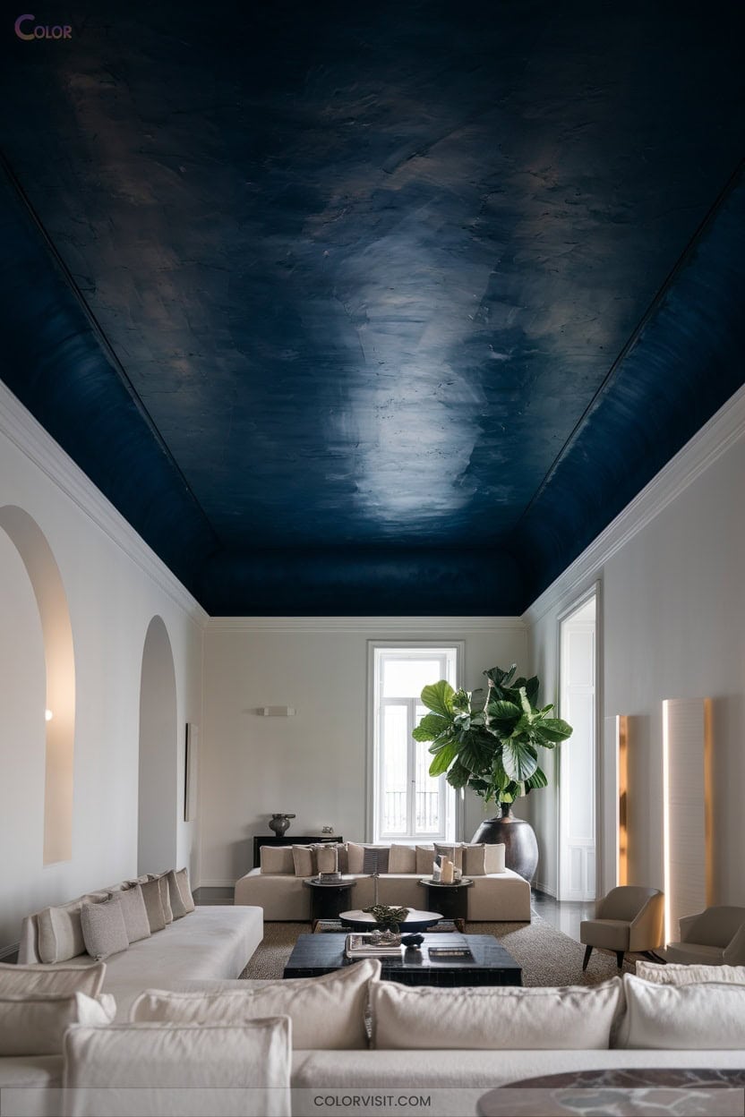
18. Ceiling Contrasts for Unexpected Drama
Ever considered the ceiling as your room’s secret weapon for dramatic impact?
Innovative ceiling contrasts are redefining modern interiors—no longer just an afterthought, but a canvas for creative expression.
Leverage expert strategies to visually expand space, amplify ambiance, or spotlight architectural elements.
Trendsetters are embracing bold ceiling hues, nuanced color gradations, and daring pairings for a transformative effect.
Move beyond basic white and let your ceiling command attention.
- Use complementary colors for maximum contrast and spatial illusion.
- Experiment with dark ceilings for cozy, immersive vibes.
- Highlight crown molding through color blocking.
- Integrate seamless monochromatic gradations.
- Energize rooms with vibrant, mood-enhancing ceilings.
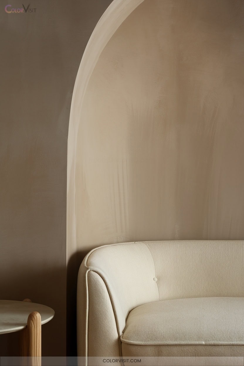
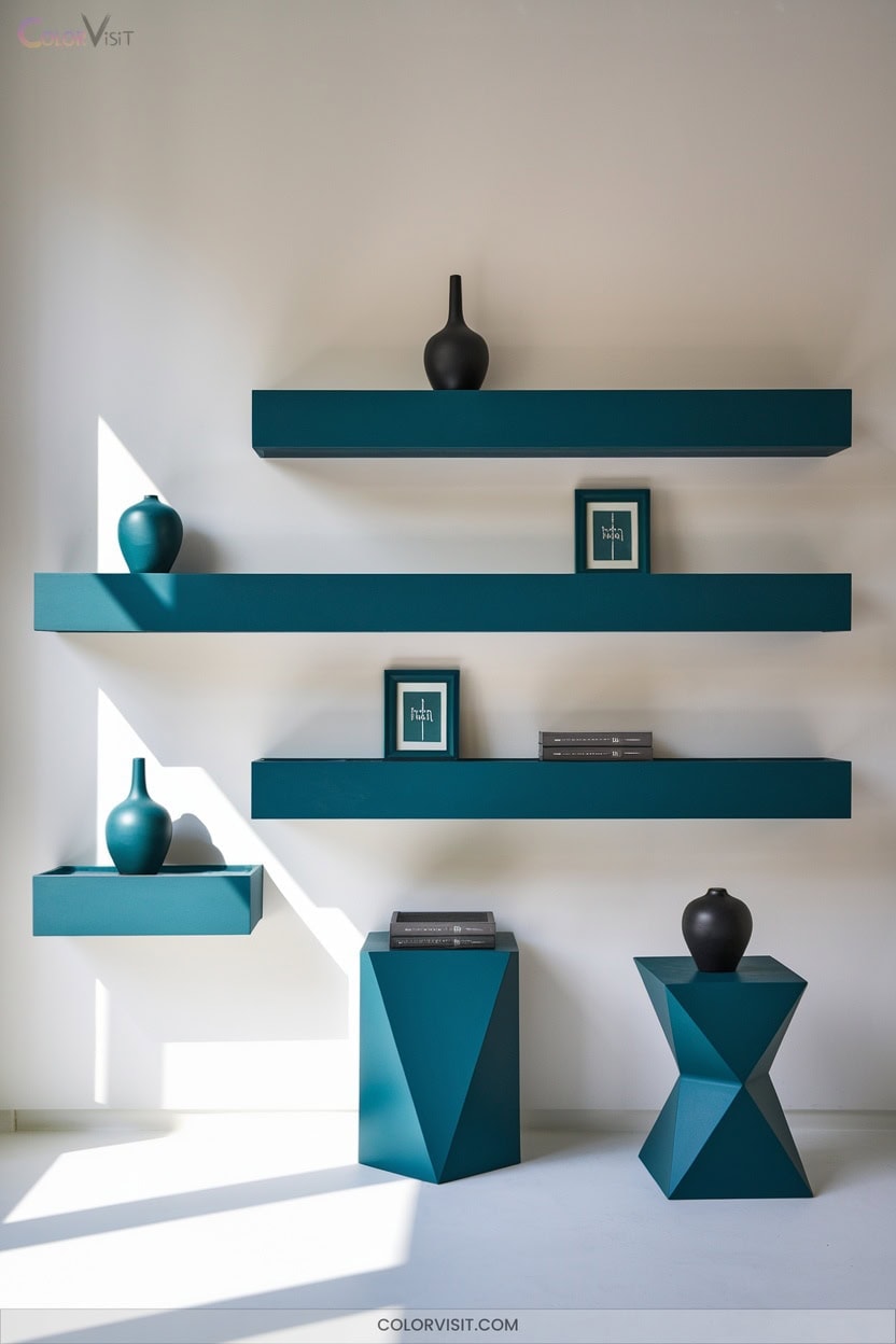
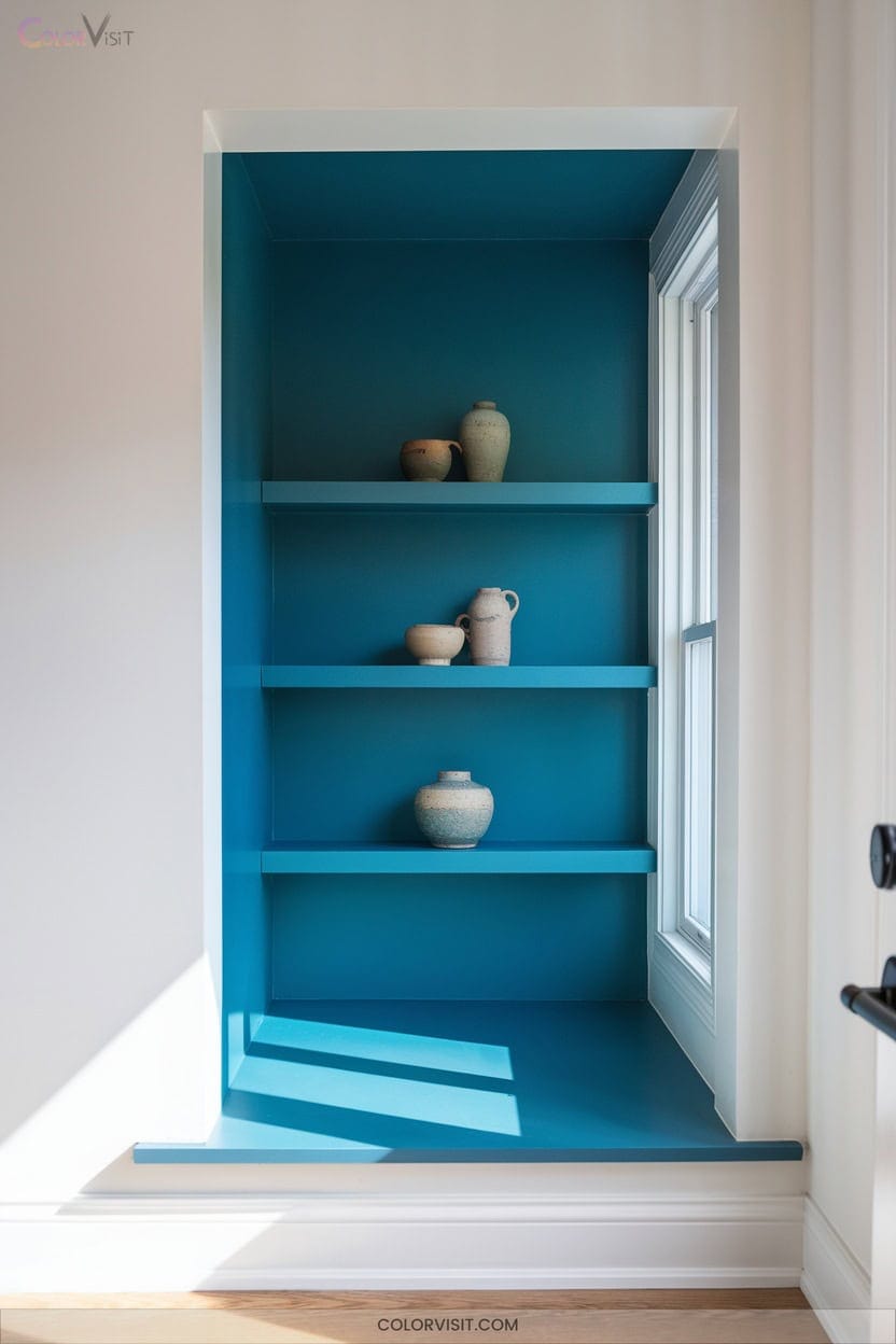
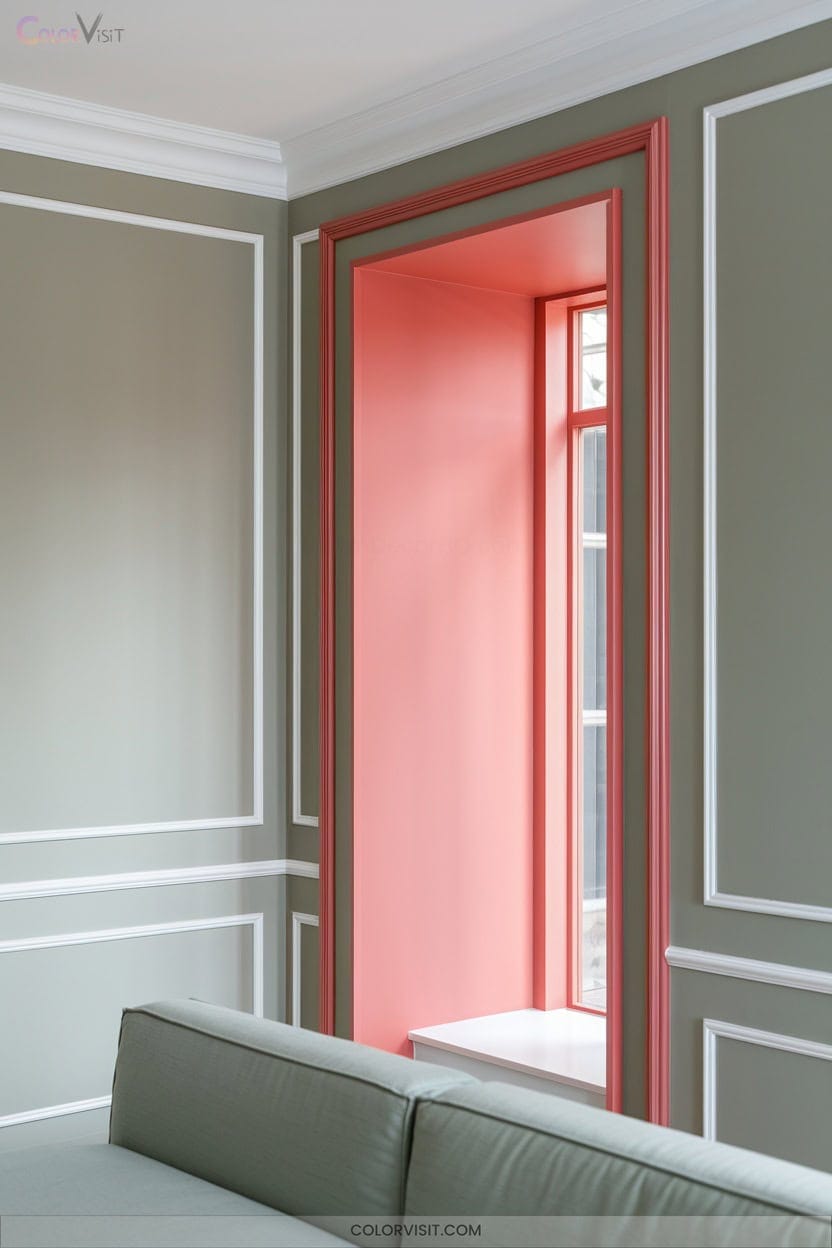
19. Painted Feature Nooks and Alcoves
Elevate your interiors by turning nooks and alcoves into painted feature zones that command attention.
Contrast bold hues against neutral backdrops to spotlight architectural recesses, or layer textured finishes for tactile intrigue.
Integrate strategic lighting to amplify color depth and foster dynamic visual interplay.
Paint built-in shelving or reading nooks for cohesion and highlight hidden storage with seamless color blends.
Dark shades create dramatic focal points, while lighter tones expand perceived space.
Use color to enhance decorative moldings, display areas, or even radiator cubbies.
These adaptive, cost-effective upgrades let you refresh unique features and infuse your home with contemporary edge.
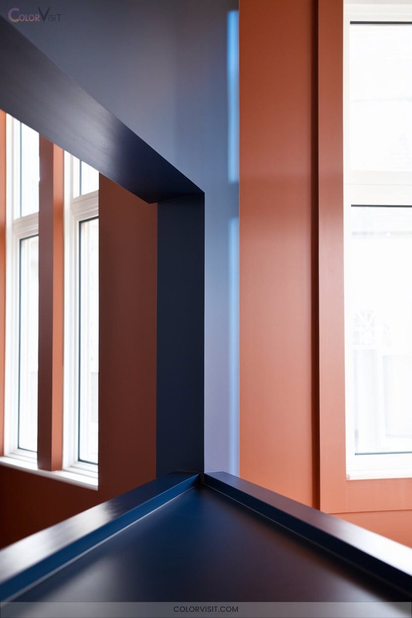
20. Mismatched Trim for a Modern Edge
While painted feature nooks draw the eye to architectural recesses, you can push your interiors further by experimenting with mismatched trim for a distinctly modern edge.
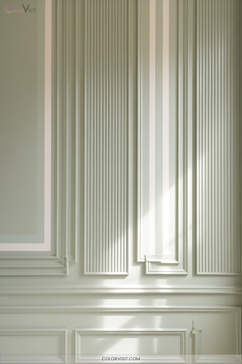
Elevate your palette by blending diverse trim profiles and finishes—think matte baseboards with semi-gloss door casings or pairing walnut-stained doors with oak trim unified by undertones. Mismatching doesn’t mean chaos; it’s about intentionality, proportion, and harmony.
True mismatching is curated, not chaotic—balancing intention and harmony to create spaces that feel both modern and thoughtfully composed.
Use color and material interplay to spotlight architectural lines and create visual depth, especially in open-concept homes.
- Pair modern baseboards with traditional crown molding
- Offset light walls with deep olive or navy trim
- Mix painted and natural wood trims
- Layer backband molding with simplified baseboards
- Introduce metal inlays for industrial flair
21. Light-Manipulation With Stripes and Gloss Finishes
Harness the transformative power of stripes and gloss finishes to manipulate light and reshape spatial perception in your interiors.
Vertical stripes—especially in narrow, monochromatic schemes—generate an elongating visual axis, making ceilings soar.
Intermingle matte and gloss stripes for rhythmic light diffusion, or introduce high-gloss accents to amplify reflection, maximizing luminosity and depth.
Employ semi-gloss on accent walls or architectural details to concentrate brilliance without overpowering glare.
Laser-level precision guarantees alignment, while painter’s tape and glaze prevent bleed.
Opt for cool-toned gloss stripes under LEDs or neutrals with high LRV for adaptive reflectivity, establishing innovative, light-responsive environments with striking visual impact.
22. Mood-Specific Palettes for Every Room
After exploring the interplay of stripes and gloss finishes to sculpt light, it’s time to address how color psychology can fine-tune the mood of every space in your home.
Harness chromatic innovation to evoke energy, serenity, or focus precisely where you need it.
Curate your palette with intention—each hue can be a catalyst for transformation. Choose forward-thinking combinations and let your walls become immersive experiences.
Consider these mood-specific palettes:
- Butter yellow or flamingo pink for vibrant, sociable living areas
- Sage green or soft lavender for tranquil bedrooms
- Energizing teal or coral for creative studios
- Warm neutrals for versatile, adaptive spaces
- Peach paired with mint for uplifting kitchens
Frequently Asked Questions
How Do I Test Paint Colors Before Committing to a Whole Room?
Start by leveraging virtual paint apps with augmented reality to visualize trending hues in your space. Next, use peel-and-stick or foam board samples, testing under varied lighting. Compare multiple shades and trust your evolving aesthetic instincts.
What’S the Best Way to Cover Dark Walls With Lighter Paint?
To cover dark walls with lighter paint, you’ll prep meticulously, use a high-hide, stain-blocking white primer, then layer premium, high-opacity paint. Embrace bold trends—try a tinted primer to boost vibrancy and minimize coats for a seamless, modern finish.
How Can I Prevent Streaks or Roller Marks When Painting?
To prevent streaks or roller marks, you’ll load your roller evenly, maintain a wet edge, and use premium, surface-specific rollers. Work swiftly in sections, sand between coats, and embrace trending application patterns like “W” or “M” strokes.
Are There Eco-Friendly or Low-Voc Paint Options for Sensitive Households?
Imagine you’re redesigning your allergen-free nursery—choose ECOS Paints for over 1,300 zero-VOC, latex-free shades. You’ll embrace trend-forward, transparent formulas, minimize indoor pollutants, and support innovative, sustainable living, all while achieving vibrant, long-lasting color retention.
How Do Temperature and Humidity Affect Paint Drying and Finish?
You’ll notice temperature and humidity dictate your paint’s drying speed, adhesion, and surface texture. If you want a flawless, on-trend finish, maintain a 50-85°F range and 40-50% humidity—think smooth, vibrant, gallery-worthy results.
Conclusion
Don’t worry if you think bold wall colors might overwhelm your space—expertly chosen hues like Revere Pewter or Irish Mint can actually amplify light and dimension, not shrink your rooms.
By layering finishes, experimenting with feature nooks, and embracing mismatched trim, you’ll create visual intrigue that rivals any design magazine.
Today’s paint trends empower you to tailor each room’s mood and function. So go ahead—let your walls become the canvas for your home’s next transformation.
