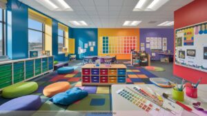
22 Inspiring Color Painting Ideas for Artists of All Levels
You can ignite your creativity with color by nesting bold geometric shapes, experimenting with harmonious or contrasting palettes, and layering colors for vibrant depth.
Play with dynamic light and shadow, mix custom hues, try impasto or glazing, and use both smooth and textured effects.
Explore negative space, abstract color layers, and cultural symbolism for emotional impact. Draw inspiration from famous colorists and nature’s diversity. If you’re curious to uncover even more inventive painting ideas, keep going!
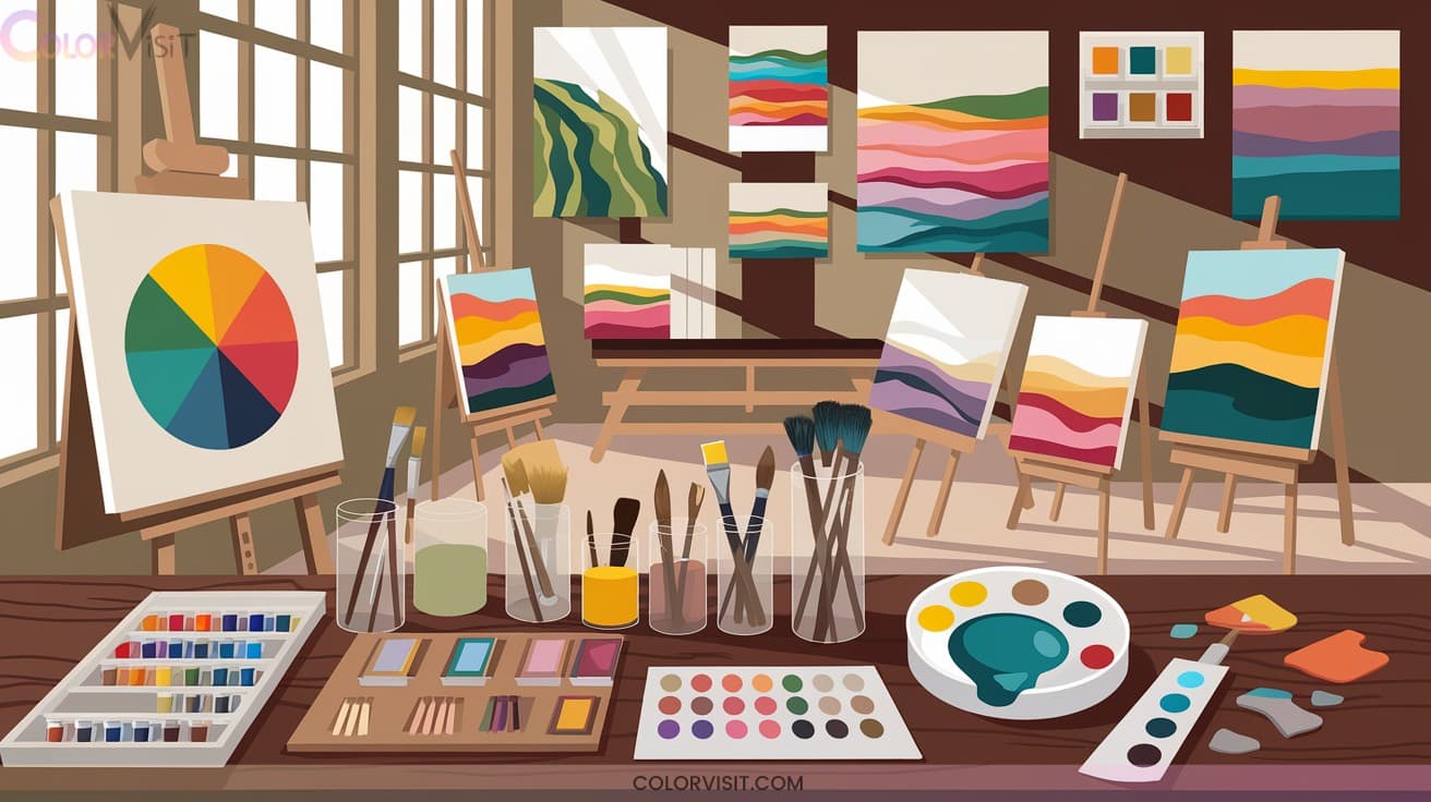

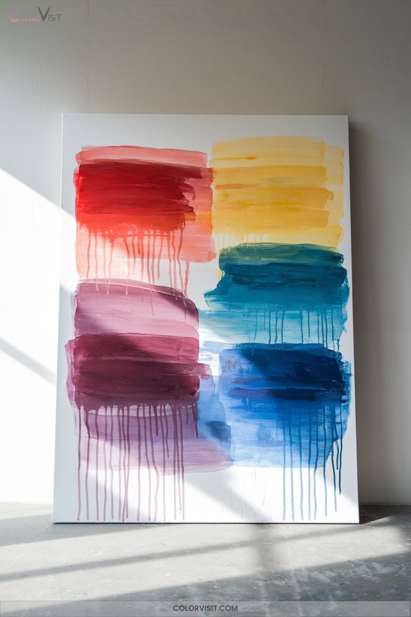
1. Exploring Nested Shapes for Color Harmony
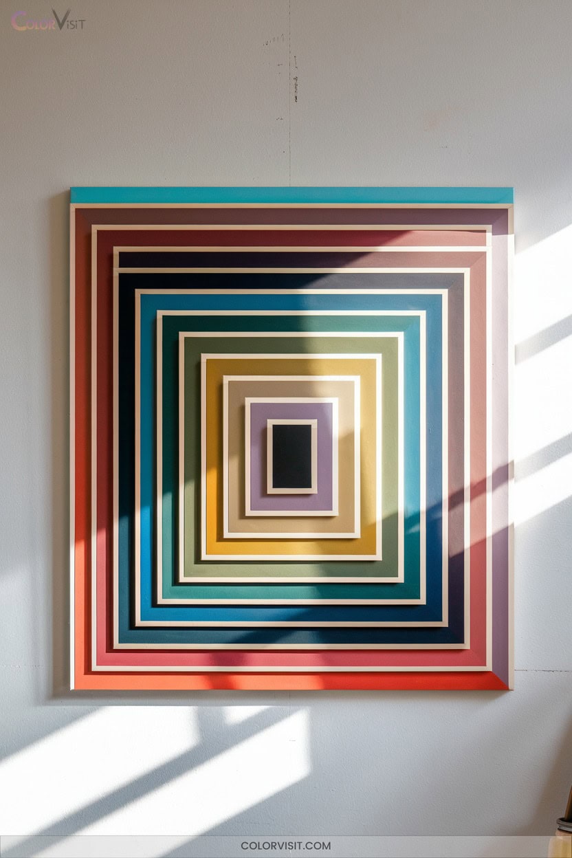
Have you ever wondered how simple shapes can transform your approach to color in painting?
Start by nesting geometric forms—squares, circles, or triangles—to create visually striking compositions.
This technique lets you focus on pure color interactions, free from distractions, making harmony or tension between hues unmistakable.
Take inspiration from Josef Albers’ “Homage to the Square” series, where over 1,000 paintings explore these relationships.
As you balance colors within layered shapes, you’ll notice increased visual harmony and a powerful sense of unity.
Use nested shapes as a springboard for innovation, adapting the concept to any medium or style you choose.
2. Creating Dynamic Light and Dark Contrasts
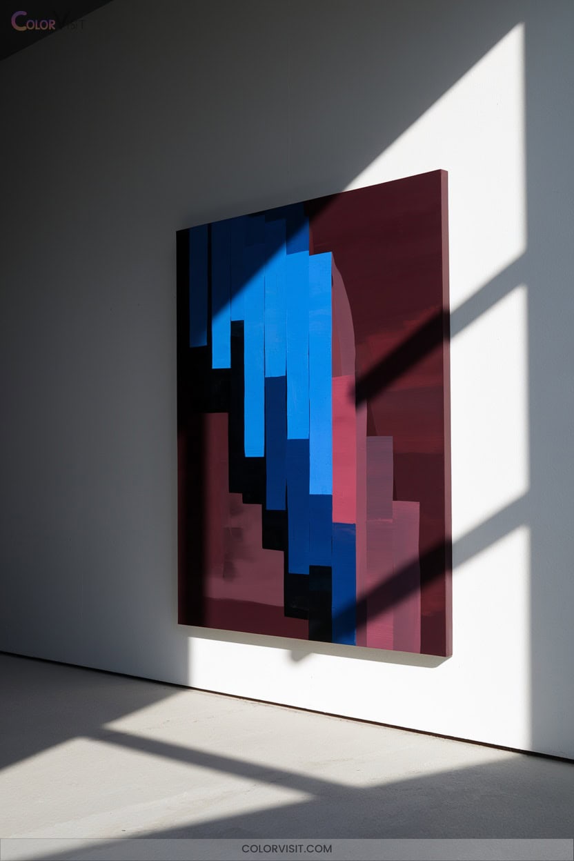
Unlock the expressive power of your artwork by mastering dynamic contrasts between light and dark.
Start with a solid value scale to map out your composition, then experiment with bold lighting—whether natural or artificial—to create visual drama and guide the viewer’s gaze.
Use dark values as a foundation, letting lighter colors emerge for stunning depth.
Analyze color temperature to evoke mood and emotion, and always place highlights strategically for maximum effect.
Innovation thrives when you embrace contrast purposefully.
- Map value scales early
- Emphasize focal points with lighting
- Layer from dark to light
- Balance warm and cool hues
- Place highlights intentionally
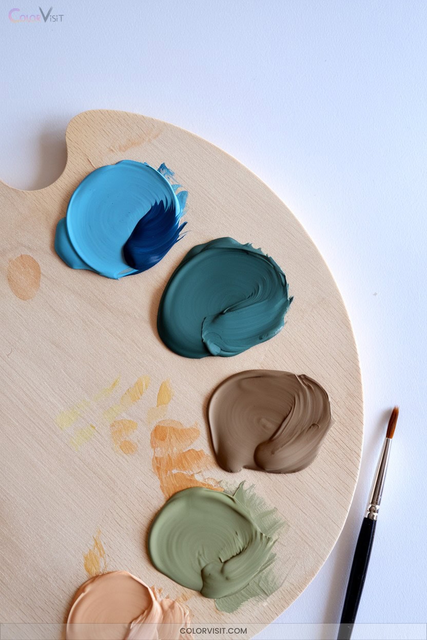
3. Custom Color Mixing Beyond the Tube
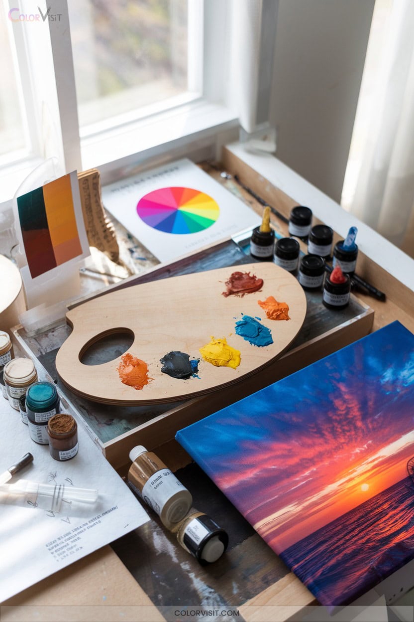
A thoughtful approach to color mixing reveals a world of possibilities beyond what comes straight from the tube.
You can craft unique hues by mastering primary, secondary, and tertiary relationships, always considering pigment bias for warmth or coolness. Mix on your palette for precision or directly on your canvas for dynamic blends.
Use palette knives for both blending and textural effects. Experiment with limited palettes to develop cohesion and efficiency.
Avoid muddiness by understanding complements and mixing cleanly. Test small amounts first, and don’t hesitate to adjust with white, black, or mediums.
With practice, custom mixing becomes your signature innovation.
4. Layering Smooth vs. Textured Color Applications
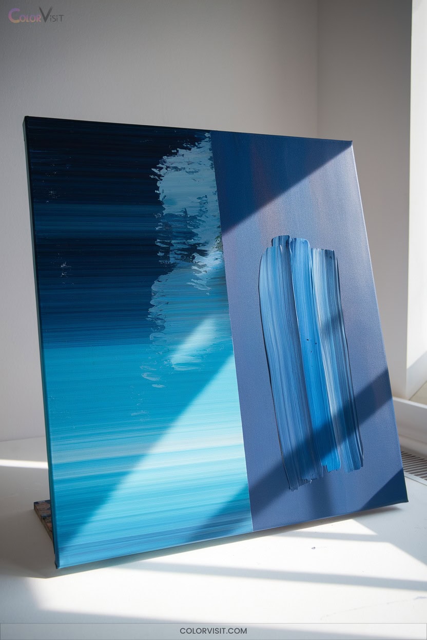
While mastering color mixing opens up new possibilities, your approach to layering—whether smooth or textured—can dramatically shape a painting’s visual impact.
Smooth layering, using transparent glazes and soft brushes, builds subtle gradations and luminous depths, ideal for realistic effects.
In contrast, textured applications—achieved with thick paint, sponges, or knives—invite energy and dimension, emphasizing surface and gesture.
Acrylics are especially versatile, letting you experiment with both methods rapidly. Always let each layer dry fully to avoid muddy results and preserve vibrancy.
Analyze your artistic goals, and try these innovative layering ideas:
- Experiment with impasto for tactile energy
- Use glazing for radiant depth
- Alternate smooth and textured passages
- Mix mark-making tools
- Play with underpaintings for unexpected effects
5. Negative Painting Techniques for Unique Shapes
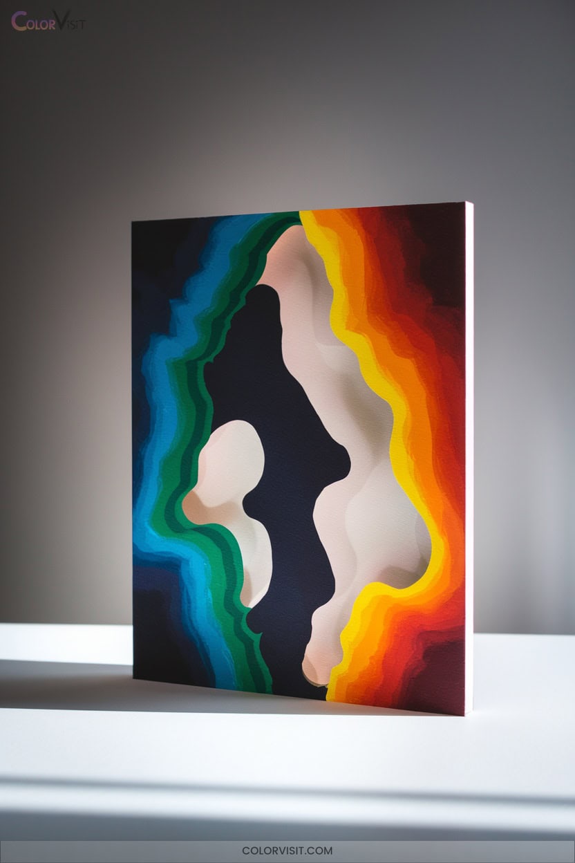
Negative painting offers a powerful way to shape your composition by focusing on the spaces around and between objects instead of the objects themselves.
To innovate, begin by observing negative spaces and consciously layering transparent watercolor or opaque gouache around your subject.
Let each layer dry, gradually building depth and visual interest.
Experiment with color temperature—cool hues recede, warm tones advance—while varying brush sizes for precision. Try gray paper or ink for striking contrasts. Don’t rush; negative painting rewards patience and observation.
6. Capturing Atmosphere With Watercolor Washes
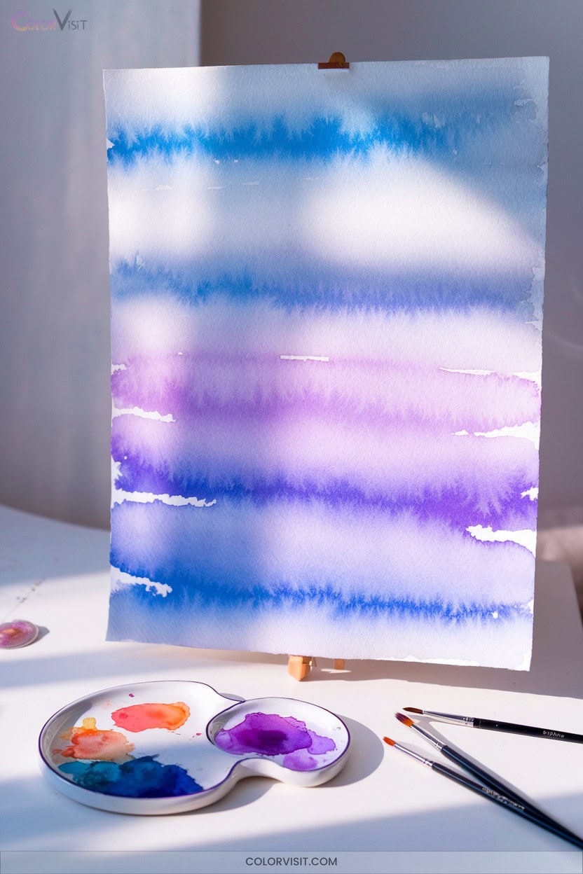
Immerse yourself in the expressive potential of watercolor washes to evoke atmosphere and mood in your paintings.
Begin by wetting your paper evenly—this primes the surface for seamless pigment diffusion.
Let your brush angles and pressure dictate edge softness, while lifting paint with a clean brush or tissue adds luminous haze.
Experiment with variegated washes: blend multiple hues for vibrant skies, tilt your board for gravity-guided blends, and preserve dry spaces for crisp subjects. Layer transparent “ghost washes” for depth without muddiness.
For adventurous texture, integrate salt, alcohol, or plastic wrap into wet washes to innovate atmospheric effects.
- Wet-on-wet for organic blending
- Lift pigment for highlights or haze
- Variegated washes for gradient color
- Glaze transparent layers for depth
- Add salt or alcohol for textural atmosphere
7. Fast and Bold Color With Acrylic Paints
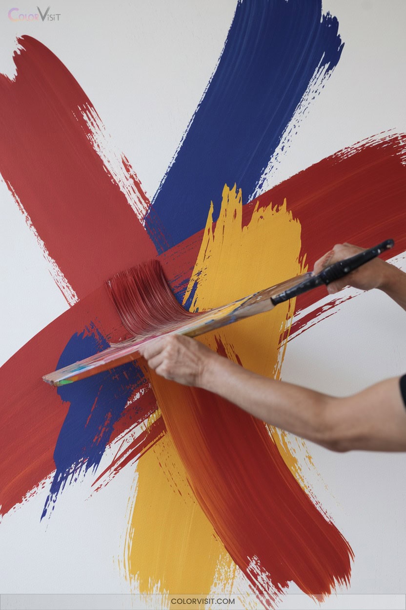
Release the energetic potential of acrylic paints by embracing fast, bold color techniques that transform your canvas with immediacy and vibrancy.
Use large, flat brushes for broad, expressive strokes and work quickly before the paint dries to capture spontaneous energy.
Select a high-chroma palette and mix colors minimally—avoid overmixing to keep hues intense and fresh.
Experiment with dry brushing and palette knives for dynamic texture and layered depth. Maintain a thicker paint consistency and minimize water to maximize richness.
Don’t shy away from bold choices or imperfections; regular practice and confident experimentation are keys to developing your unique, innovative style.
8. Opaque Blocks and Soft Finishes With Gouache
After exploring the vibrant immediacy of acrylics, you’ll find gouache offers a distinct approach to color with its signature opacity and matte finish.
To achieve bold, flat color blocks, use less water, mix with white, and choose smooth, hot press paper.
For soft blends, act quickly—gouache dries fast, so prepare gradients in advance. Flat brushes and careful layering prevent unwanted texture and bleeding.
Gouache’s versatility encourages experimentation, whether you’re refining edges or blending for subtle gradations.
- Mix colors with white for maximum opacity
- Use flat brushes for solid, graphic shapes
- Work on smooth, hot press paper
- Blend rapidly for soft gradients
- Layer thinly to avoid color bleed
9. Rich Texture and Depth Using Oil Paints
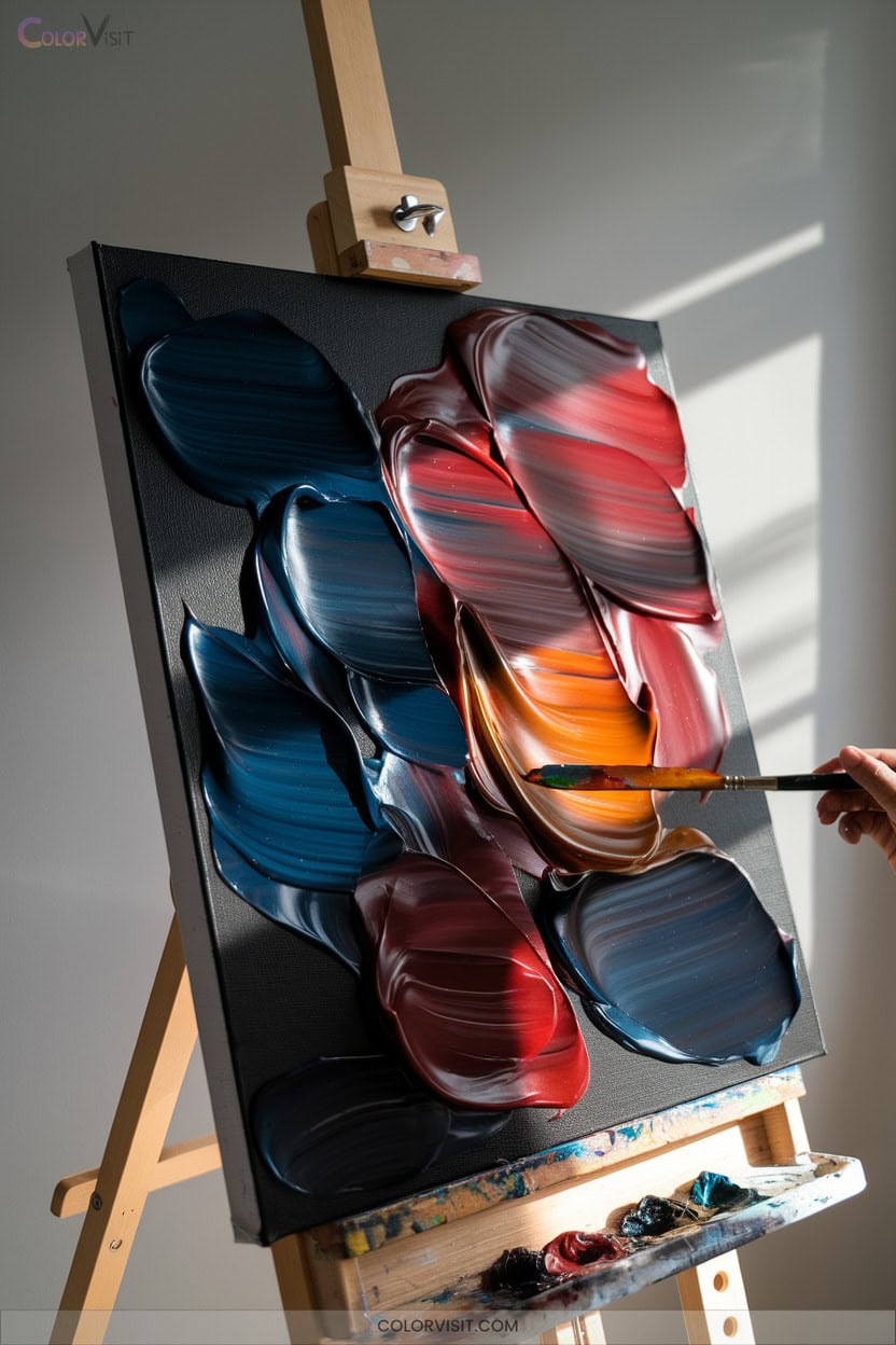
With oil paints, you can achieve remarkable texture and depth by exploring both bold and subtle techniques.
Try the impasto method—apply thick layers to canvas and let brushstrokes stand proud, catching light and creating dimensional intrigue.
Adjust ratios of linseed oil and turpentine for desired consistency, or mix in impasto medium for a tactile surface.
For nuanced effects, use scumbling or dry brushing to softly layer semi-dry paint, evoking mist or atmosphere. Experiment with foam brushes, sponges, or toothbrushes to expand your textural vocabulary.
Glazing with thin, translucent layers enhances luminosity, uniting lively surfaces with rich depth.
10. Blending Across Media for Experimental Effects
Curious about pushing your color work further? Blending across media opens a world of experimental effects that elevate your art.
Try layering gouache with colored pencils for crisp details atop rich bases, or combine watercolors and watercolor pencils for dynamic textures.
Alternate wet and dry techniques—smudge, burnish, or use palette knives to reveal intriguing layers.
Always test combinations to understand their interactions, and work in stages to maintain clarity.
Innovation thrives when you embrace unconventional tools and methods.
- Layer light washes for depth
- Blend oil markers into acrylic backgrounds
- Scrape or scratch to reveal underlayers
- Seal layers with fixative
- Mix collage with paint for texture
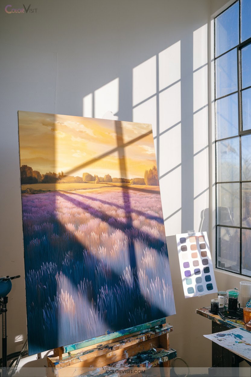
11. Drawing Inspiration From Natural Landscapes
Why not look to nature’s landscapes for fresh color inspiration?
Observe vibrant skies—mix ultramarine blue with titanium white for airiness, then layer in warm oranges and reds for a dynamic sunset.
Mix ultramarine blue with titanium white for airy skies, then layer warm oranges and reds to evoke a dynamic, glowing sunset.
Experiment with cloud forms, using wet-on-wet for soft blends or darker accents for striking contrast.
For lush greens, blend yellow and blue, or combine Cadmium Green Light with Permanent Green, adding red for depth. Impasto and palette knives add texture to foliage and rocks.
Capture water by sketching reflections with burnt sienna; use opaque and transparent colors for realism.
Layer and texture to build an innovative, atmospheric scene.
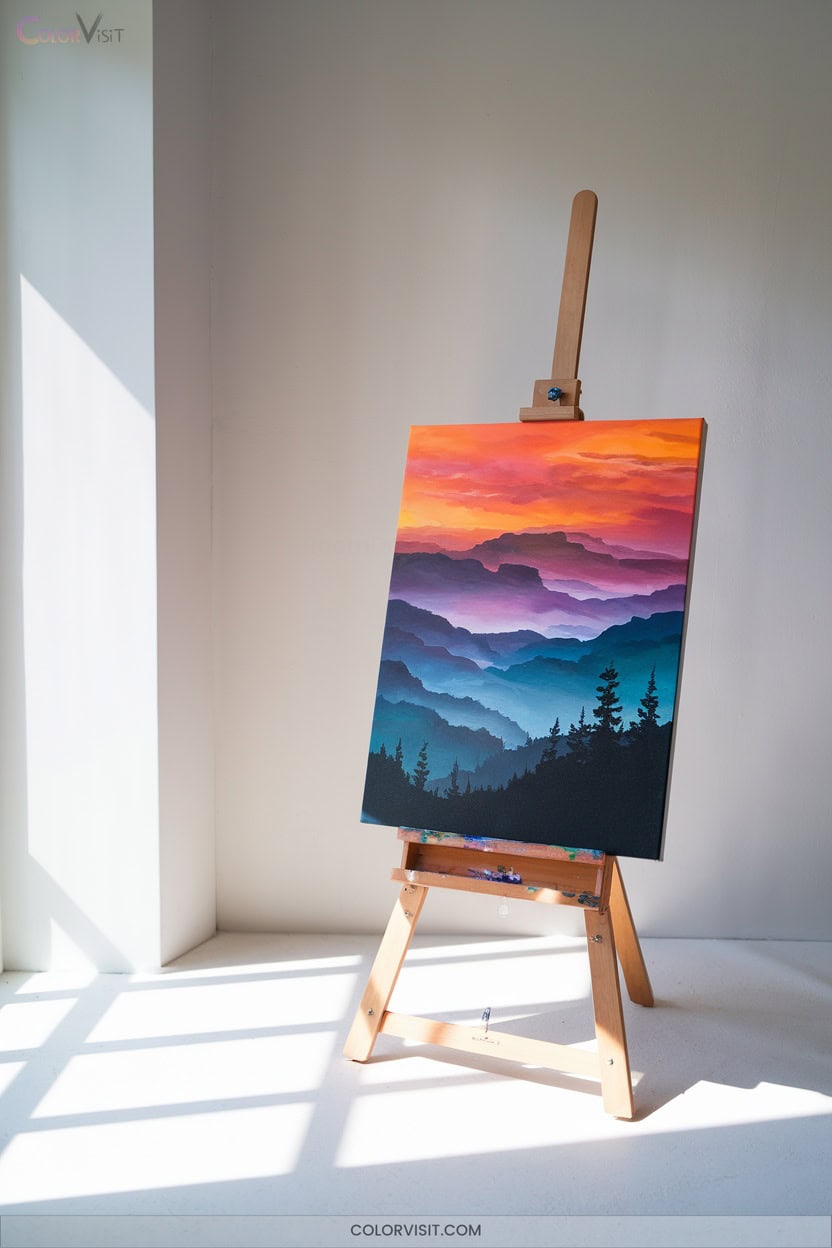
12. Representing Sunlight and Shadows With Color
Although painting sunlight and shadows might seem challenging, you can achieve striking realism by understanding how color temperature shapes perception.
Harness warm hues to depict sunlight and let cool tones enrich your shadows—this interplay instantly boosts depth.
Don’t rely on black for shadows; instead, observe subtle color shifts and reflect environmental influences.
Layer colors and blend edges for natural effects. Adjust your palette based on light source and surface reflections.
Innovate by studying dynamic daylight changes and practicing with reference images. You’ll discover endless possibilities for expressive, lifelike scenes.
- Observe warm sunlight and cool shadows
- Layer colors for depth
- Blend edges for realism
- Adjust palette to light source
- Use reference images frequently
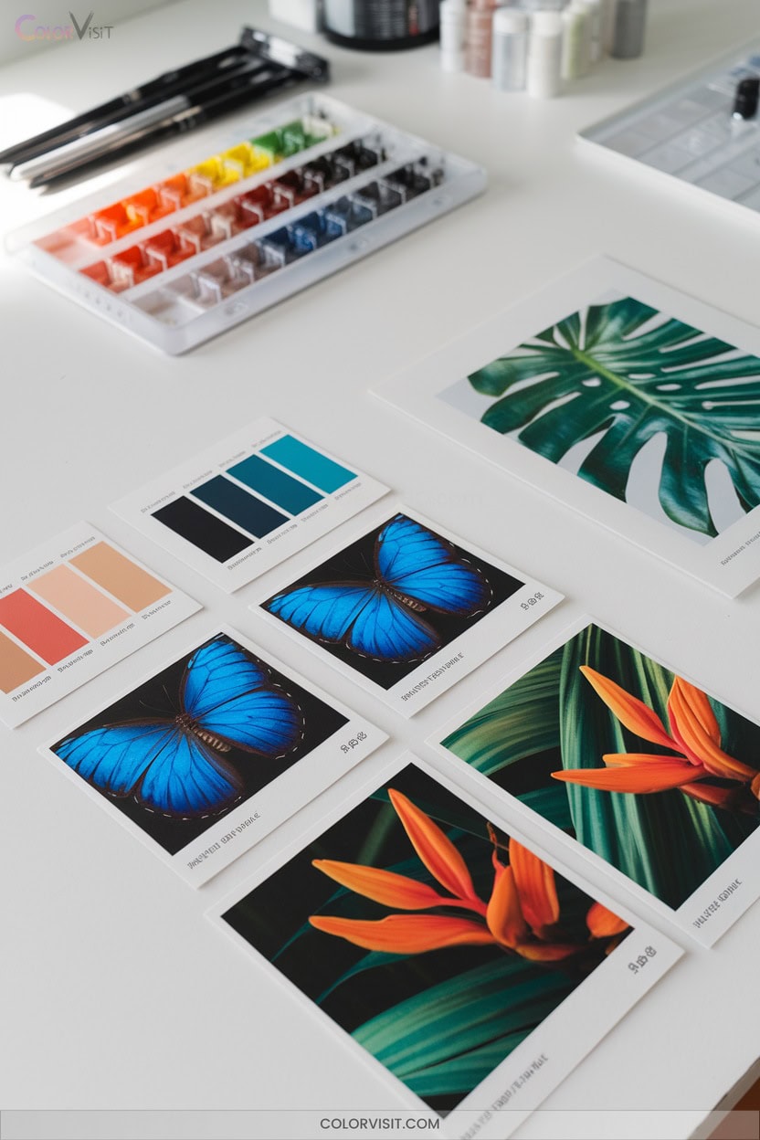
13. Building Palettes From Flora and Fauna Observations
Once you’ve explored how sunlight and shadows transform color, start looking to nature itself for authentic palette inspiration.
Observe plant pigments—chlorophyll’s vibrant greens form an energetic base, while floral hues offer bold or subtle accents. Notice how leaf texture and soil tones enrich greens with earthy depth.
Turn to fauna for dynamic contrasts; animal patterns and iridescence spark inventive color pairings and rhythm. Analyze seasonal shifts and ecosystem diversity for ever-changing chromatic possibilities.
Build your palette by layering flora’s greens with floral highlights, integrating animal-inspired contrasts, and anchoring with earth tones.
Let each observation guide innovative, fresh color choices.
14. Outdoor Painting to Experience True Color
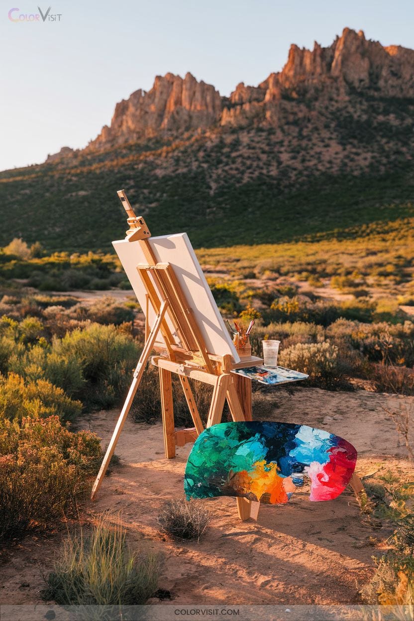
How can you truly capture the intensity and nuance of color if you haven’t painted outdoors?
Outdoor painting challenges you to observe shifting light, authentic hues, and dynamic landscapes. You’ll need to adapt as the sun moves and shadows evolve.
Use layering and blending to mimic vibrant light, and choose lightweight surfaces like canvas panels for ease. Analyze how weather impacts your palette; experiment with brushwork for texture and depth.
This immersive approach trains your eye to recognize real color relationships and encourages innovative technique.
- Observe how natural light transforms color
- Layer and blend to capture luminosity
- Use portable, stable equipment
- Adapt to weather and changing light
- Highlight details for impact
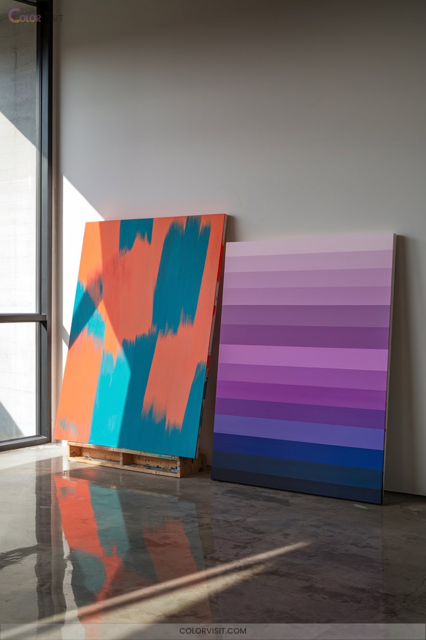
15. Curating Limited Color Palettes for Cohesion
A limited color palette can instantly bring cohesion and harmony to your artwork.
When you cap your selections to three to five hues, you simplify decisions and foster creative problem-solving.
You’ll notice how value contrast, temperature shifts, and saturation tweaks become key tools for visual interest.
Test swatches and mixing charts reveal each color’s potential, letting you master chroma and consistency.
If you fear monotony, experiment with glazing or texture to invigorate your surfaces.
Restricting your palette isn’t a limitation—it’s a catalyst for innovation, encouraging you to see the endless combinations and nuanced harmony within a focused, thoughtful selection.
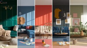
16. Playing With Complementary and Analogous Colors
After exploring the power of limited color palettes, you can amplify your paintings by thoughtfully playing with complementary and analogous colors.
Complementary colors, found opposite each other on the color wheel, create energy and vivid contrast, making highlights pop.
Analogous colors, sitting side by side, blend smoothly for harmony and cohesion. By balancing these approaches, you’ll craft dynamic yet unified artworks.
Analyze the emotional impact and experiment with ratios to innovate your style.
- Identify a bold base color and its complement for contrast.
- Select adjacent hues for smooth blends.
- Balance complementary and analogous use.
- Adjust intensity for depth.
- Experiment and observe results.
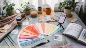
17. Designing With Online Palette Resources
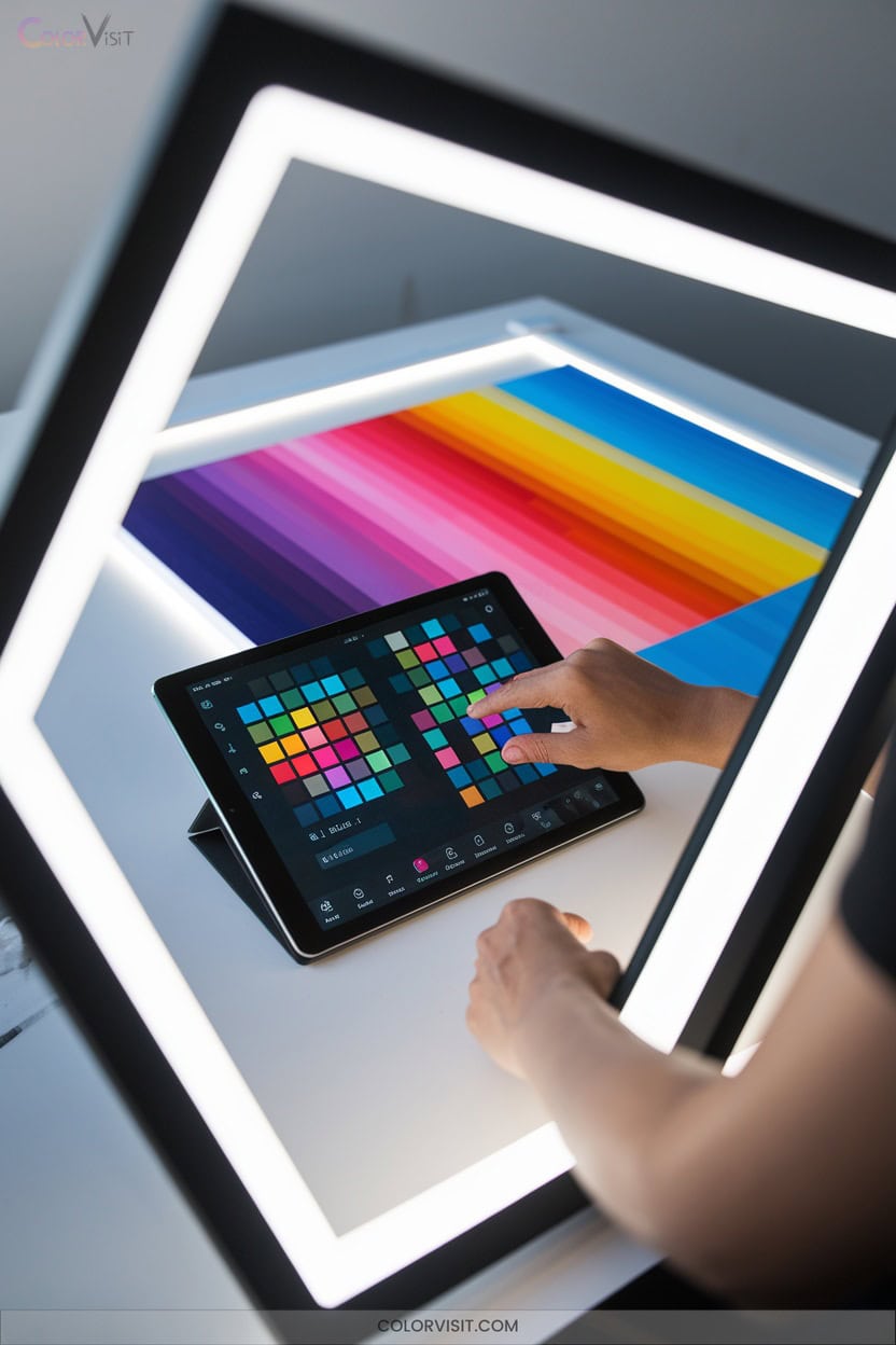
Online palette resources have revolutionized the way you select and organize colors for your artwork, streamlining the process and opening doors to fresh inspiration.
With tools like Coolors.co, you can instantly generate harmonious palettes or browse curated color schemes to match your vision.
Platforms such as Paletton.com offer interactive previews, letting you fine-tune hues and see real-time results.
Upload photos to Canva’s generator for automatic extraction of unique color combinations. Personalize further by adjusting saturation, brightness, or locking favorite tones.
Export your chosen palettes directly into your preferred design software, ensuring consistency and innovation throughout your creative workflow.
18. Developing Style Through Consistent Color Choices
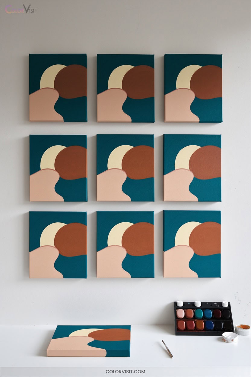
Consistency in color choices shapes the foundation of your artistic style, making your work instantly recognizable and cohesive.
Consistent color choices are the cornerstone of a signature style, ensuring your artwork remains both cohesive and unmistakable.
Start by mastering color theory—learn both the RYB and RGB color wheels to select palettes aligned with your vision. Choose a main ambient color and build a harmonious scheme with accents for unity.
Don’t fear subtle evolution; consistency lets you explore new ideas within a familiar framework, just as Monet did.
Reflect on your preferences and allow themes to emerge organically.
- Explore color harmony principles (complementary, analogous, triadic)
- Use monochromatic schemes for depth
- Observe nature’s palettes
- Define thematic consistency
- Balance creativity with consistency
19. Expressing Emotion With Abstract Color Layers
Why do certain abstract paintings instantly stir your emotions?
It all starts with the deliberate layering of color.
When you choose colors with purpose—using color theory to balance harmony and contrast—you amplify your artwork’s emotional impact.
Experiment by washing on thin, transparent layers to reveal subtle shifts, or glaze to add depth and luminosity. Integrate textures or mixed media for added dimension.
Build layers gradually, shifting from light serenity to intense darkness for nuanced expression.
Let intuition and spontaneous gestures guide your process, embracing accidental discoveries.
Through thoughtful layering, you’ll transform raw emotion into a complex, visually fascinating abstract narrative.
20. Psychedelic and Dreamlike Color Experiments
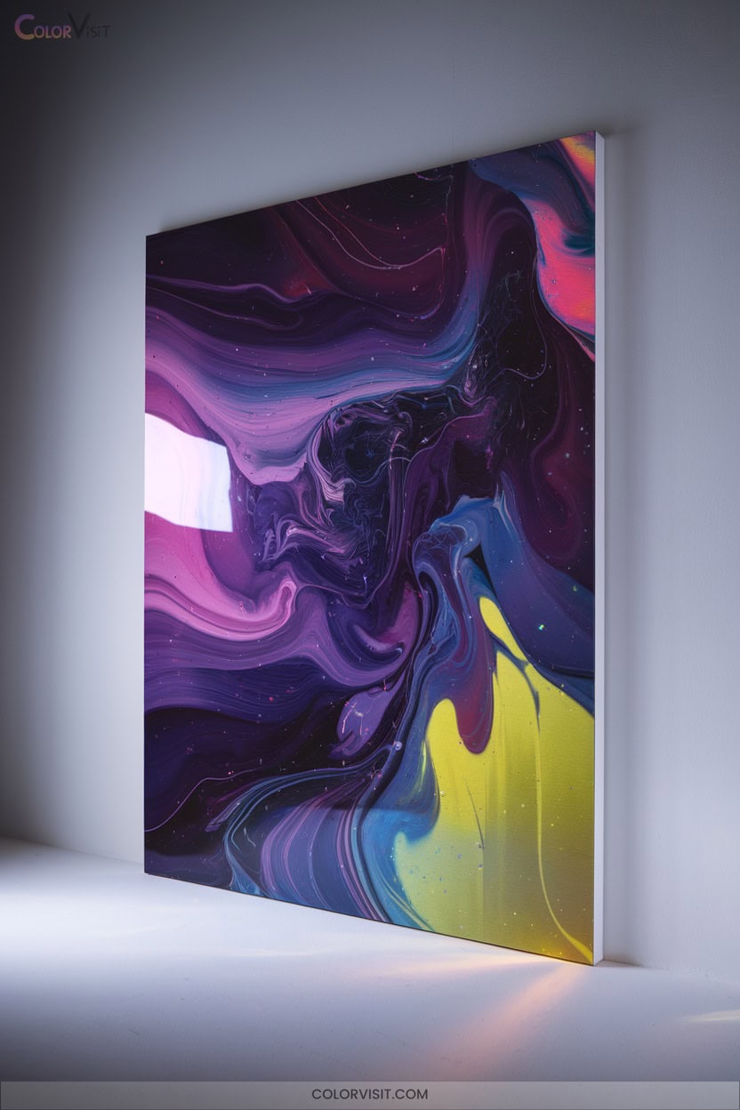
Ever wondered how to push your color palette into worlds that feel otherworldly and electric? Delve into psychedelic and dreamlike color experiments by embracing vibrant, neon hues and surreal imagery.
Choose bold, contrasting color schemes—think complementary and fluorescent effects—to amplify intensity. Explore abstract patterns, optical illusions, and cosmic motifs for mesmerizing depth.
Use airbrushing, digital tools, and fluid painting for seamless, unpredictable results. Analyze the impact of multidisciplinary styles and technology as you innovate. Try these techniques to energize your creative process:
- Layer neon, fluorescent paints for glowing effects
- Create fractals or mandala patterns
- Experiment with fluid acrylic pouring
- Incorporate surreal, nature-inspired elements
- Combine digital symmetry with organic forms
21. Symbolism and Cultural Meaning in Color Use
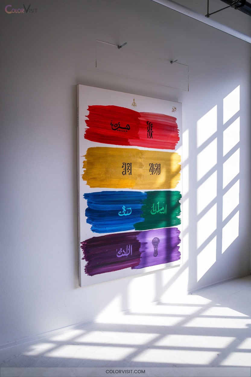
As you experiment with bold, expressive palettes, it’s just as important to reflect on the deeper meanings your colors communicate.
Color isn’t just visual—it’s symbolic, deeply shaped by culture and psychology.
Color speaks beyond sight, carrying rich layers of meaning shaped by cultural traditions and human psychology.
Red might ignite passion in one painting or signify luck in another, depending on context. White could evoke purity or mourning.
When you pair colors—like vibrant red and green or dramatic black and white—you’re creating layered narratives.
Think about how warm hues energize, while cool tones soothe. Explore gold for divinity, greens for renewal, or blues for tranquility.
Let your choices resonate with intention, innovation, and cross-cultural awareness.
22. Learning From Historical and Contemporary Color Masters
A closer look at the techniques and palettes of color masters can transform the way you approach your own work.
Study how historical artists like Leonardo and Caravaggio layered transparent glazes for depth, prepared luminous grounds, and chose pigments for specific effects.
Contemporary innovators blend these methods with digital and mixed media, pushing boundaries in color expression. Don’t just admire—analyze, replicate, and experiment.
By learning from both eras, you’ll discover endless ways to enrich your palette and technique.
- Analyze layering and glazing in classic works
- Try sfumato for soft blends
- Experiment with earth pigment backgrounds
- Blend traditional with digital tools
- Observe color harmony and contrasts
Frequently Asked Questions
How Do I Store and Maintain My Paints for Longevity?
Store your paints in a cool, dry, ventilated place. Always seal cans tightly, label them, and use original containers. Innovate by wrapping lids and inverting cans—these steps maximize longevity, empowering you to create without limits.
What Are Affordable Starter Kits for Beginner Color Painters?
Jump in headfirst—affordable starter kits like Winsor & Newton’s Pocket Box, Grabie’s 100 Paint Set, or Liquitex Basics let you experiment boldly. Compare portability, color range, and included tools to spark your innovative journey.
How Can I Prevent Common Mistakes Like Muddy Colors?
To prevent muddy colors, limit your palette, pre-test mixes, and let layers dry fully. Use high-quality paints, deliberate brushwork, and fresh palette areas. Embrace color temperature zones and value contrast—these strategies keep your paintings lively and innovative.
What Brushes Are Best for Different Paint Mediums?
Choose soft sable or synthetic brushes for watercolor, slightly stiffer natural or synthetic brushes for gouache, and durable synthetic or hog’s hair brushes for acrylic or oils. Experiment—your innovative style thrives when you match tools to techniques.
How Do I Safely Clean up After Painting Sessions?
Don’t let your cleanup become a Herculean task—wipe excess paint, rinse brushes with warm, soapy water, use proper solvents for oils, and dry tools well. Innovate by storing brushes upright and always follow safe, eco-friendly disposal methods.
Conclusion
As you stand before your canvas, let vibrant dreams and thoughtful analysis collide. Don’t just mimic the old masters—mix wild, personal colors and layer them with care. Pair chaos with control, soft glazes beside bold textures.
Explore both cultural symbolism and your own story. Every brushstroke can be methodical or impulsive—try both. Embrace the dance between planning and spontaneity. That’s where your most inspiring color paintings will emerge, unique to your vision and skill.