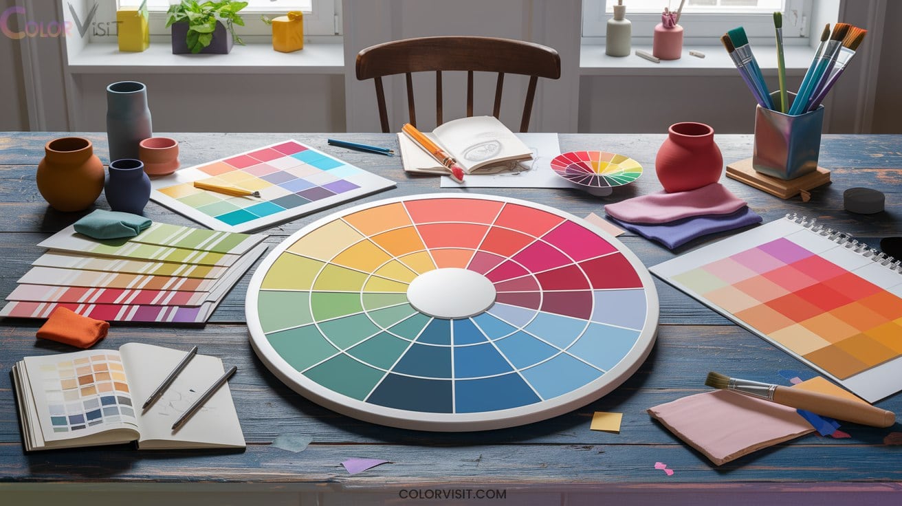
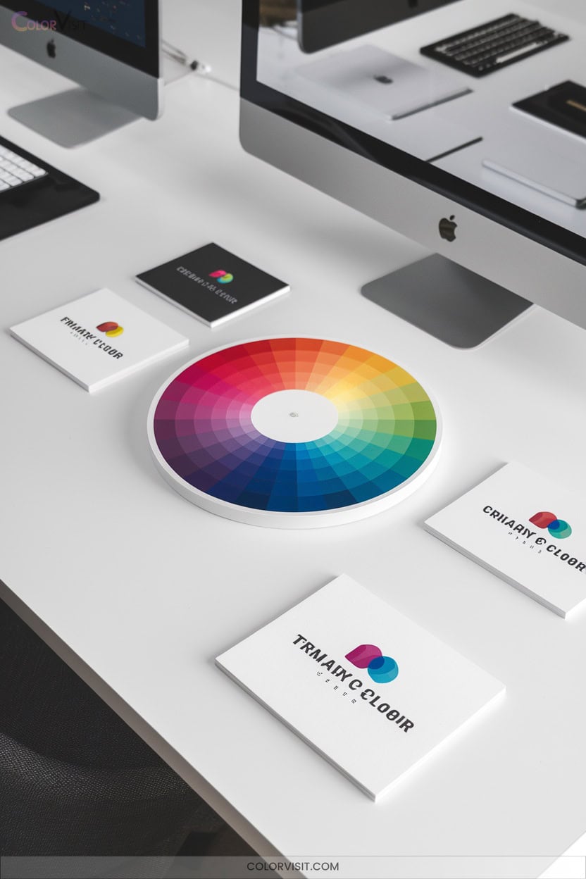
15 Practical Color Wheel Ideas for Designers and Artists
You can energize your design with complementary pairs like blue–orange or craft unity through analogous palettes. Leverage triadic schemes for dynamic tension, or use bold contrasts to draw focus and enhance legibility. Adjust mood by balancing warm and cool hues, or select seasonal tints for trend alignment.
Experiment with shades, tones, and tints to achieve depth or cohesion. Optimize color contrast for accessibility, and utilize digital tools like Figma or Paletton for palette precision. Explore further for advanced color mastery.

1. Mastering Complementary Color Schemes
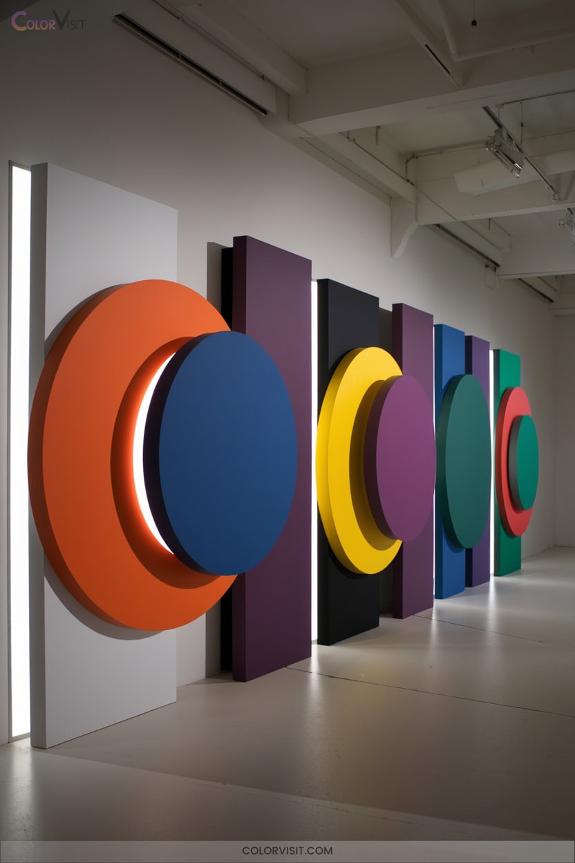
Curious about how to make your designs instantly pop? Leverage the power of complementary color schemes—pairs like red and green or blue and orange, positioned diametrically on the color wheel.
These combinations utilize the law of simultaneous contrast, intensifying visual impact and enhancing chromatic vibrancy.
Harnessing the law of simultaneous contrast amplifies visual energy and brings out striking color intensity in your designs.
By juxtaposing warm and cool tones, you achieve equilibrium and dynamic harmony, ensuring focal points command attention.
Integrate these pairs in logos, interfaces, or interiors for heightened brand recognition and emotional resonance.
Use digital tools like Figma or Paletton to experiment, optimize palette balance, and manage contrast for professional, innovation-driven visuals that captivate.
2. Exploring Analogous Color Palettes
While complementary color schemes energize compositions with their striking contrasts, analogous color palettes offer a subtler approach rooted in visual cohesion.
You’ll select three or more adjacent hues—often one dominant, flanked by supporting accents.
The shared chromatic component delivers intrinsic harmony, evoking natural gradients seen in autumn leaves or impressionist paintings.
Analogous palettes excel at generating serene, unified atmospheres—ideal for branding, interiors, or fashion ensembles.
To innovate, manipulate saturation and brightness, leveraging high-key tints for shimmer or deeper tones for drama.
Avoid monotony by assigning hierarchy and integrating neutrals.
Analogous schemes reward careful orchestration, yielding sophisticated, seamless color gradations.
3. Creating Triadic Harmony in Designs
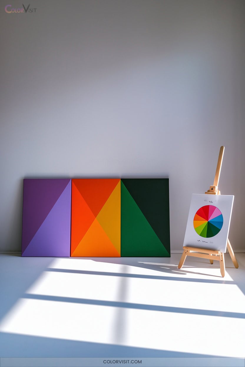
Triadic harmony harnesses the power of three equidistant hues on the color wheel, offering designers a dynamic yet controlled palette that balances visual energy with compositional stability.
Select a dominant hue to anchor hierarchy, then strategically deploy its supporting pair for tension—never chaos.
Employ the 30-60-10 rule to modulate prominence, and balance color temperature for nuanced expression.
Use white space as a buffer, preventing chromatic overload, and enrich depth with gradients or patterns.
Always evaluate accessibility by checking value contrast.
Digital tools like Figma streamline triad generation, while HSB adjustments and overlay modes help you iterate vibrant, innovative combinations.
4. Using Contrasting Colors for Visual Impact
Building on the structured vibrancy of triadic harmony, employing contrasting colors reveals a new dimension of visual impact in design.
Leverage complementary pairs—blue and orange, red and green—at peak saturation to generate striking focal points and optical tension.
Modulate saturation by integrating muted tones to temper intensity and cultivate compositional depth.
Manipulate brightness contrast—juxtaposing light and dark values—to intensify legibility and reinforce hierarchy.
Mastering these contrast strategies lets you direct user attention, clarify visual structure, and maximize memorability.
Exercise restraint; precision in contrast deployment guarantees clarity without chaos, empowering you to deliver compelling, innovative outcomes with unmistakable visual authority.
5. Evoking Emotions With Warm and Cool Hues
How do you tap into the psychological power of color to shape emotion and perception in your designs?
Harness warm hues—reds, oranges, yellows—to stimulate energy, direct attention, and cultivate inviting atmospheres.
Warm reds, oranges, and yellows ignite energy, draw the eye, and foster welcoming, vibrant spaces in your designs.
Each chromatic intensity elicits nuanced affect, from joyous exuberance to dynamic tension.
In contrast, leverage cool colors like blues and greens to evoke tranquility, mental stability, and a meditative quality.
Strategically juxtapose warm and cool spectrums to engineer visual complexity and emotional equilibrium.
This interplay creates compelling focal points, narrative depth, and aesthetic harmony, allowing you to orchestrate immersive emotional experiences through innovative, psychologically informed color manipulation.
6. Building Brand Recognition With Consistent Colors
While manipulating warm and cool hues can shape emotional resonance, the strategic deployment of consistent color palettes anchors a brand’s visual identity in the minds of consumers.
You’ll find that a meticulously maintained chromatic scheme elevates immediate brand recall—up to 80% of recognition hinges on color alone.
From color trademarks like Qualitex’s green-gold to the psychological primacy of blue in global logos, consistent hues unify touchpoints and reinforce legal differentiation.
Cohesive color application across packaging, advertising, and digital interfaces not only amplifies memorability and trust but also catalyzes revenue growth and long-term brand equity through repeat exposure and consumer loyalty.
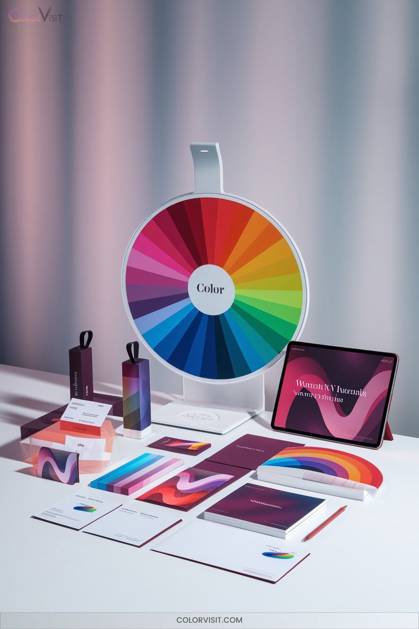
7. Leveraging Adobe Color for Palette Creation
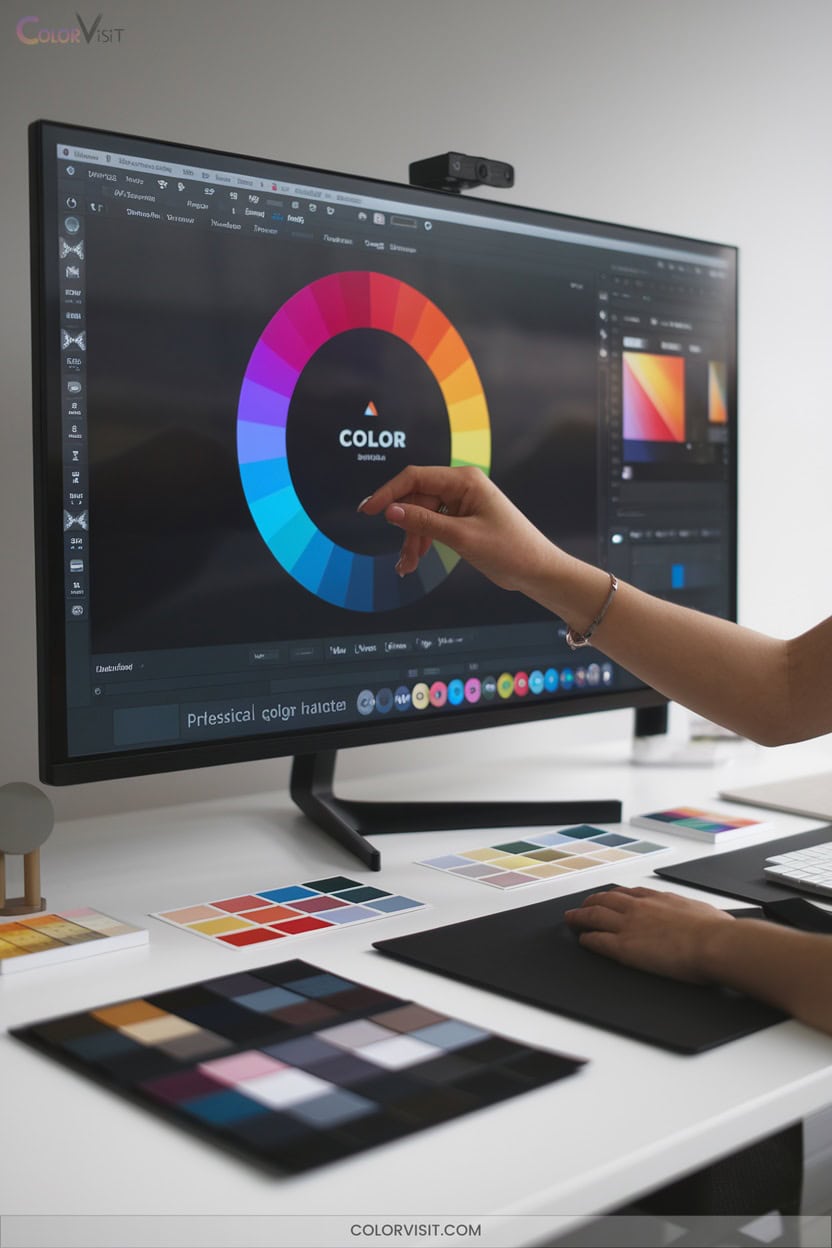
A robust tool in the modern designer’s arsenal, Adobe Color empowers you to generate, refine, and deploy sophisticated color palettes grounded in rigorous color theory.
Harness color wheel harmonies—analogous, complementary, and split complementary—to architect nuanced chromatic relationships.
Extract multi-stop gradients or palettes directly from images, then customize them to align with your project’s conceptual intent.
Leverage community-generated color schemes, searching by mood or keyword for instant inspiration.
Seamless Adobe integration lets you synchronize palettes across Illustrator, Express, and Behance, ensuring workflow efficiency and visual coherence.
With Adobe Color, inventive palette creation and precise control are always at your fingertips.
8. Selecting Precise Shades With Color Pickers

Once you’ve crafted dynamic palettes using tools like Adobe Color, honing in on exact hues becomes a matter of precision.
Modern color pickers empower you to extract, refine, and store shades directly from any digital environment.
Tools such as ColorPick Eyedropper, ColorSnapper 2, and ColorSlurp deliver magnified, pixel-level sampling, while Webflow’s color picker integrates seamlessly into your workflow for robust palette management.
These solutions streamline your process, facilitate inspiration, and guarantee accuracy in design execution.
- Magnifying tools for pixel-level accuracy
- Versatile format support (HEX, RGBA, HSL)
- Integrated global swatch management
- Automatic copying and storage
- Instant palette inspiration
9. Ensuring Consistency With Hex Codes

Across digital design environments, hex codes deliver unmatched consistency and precision when specifying color values.
You’ll find that these six-character alphanumeric representations are universally recognized across design platforms and browsers, streamlining cross-platform workflows.
Hex codes condense color data for efficient coding, while allowing seamless conversion to and from RGB values.
By standardizing your palette with specific hex codes, you guarantee brand integrity and cohesive user experiences.
Document your hex codes and leverage tools that support them for efficient palette management.
10. Designing Bold Logos Using Distinctive Colors
Color selection stands as a cornerstone in crafting bold, memorable logos that cut through visual noise and anchor brand identity.
To design with impact, you’ll leverage chromatic psychology, cultural semiotics, and trend forecasting.
Distinctive palettes—like red, orange, and black—infuse energy and immediacy, while blue and gold signal trust and authority.
The Pantone system and online color pickers streamline your process, ensuring precision and relevance.
Strategic choices amplify emotional resonance and sector alignment, driving innovation in visual communication.
- Harness emotional impact with vibrant hues
- Integrate market-specific color trends
- Apply contrasting color harmonies
- Leverage global color symbolism
- Utilize color psychology resources
11. Achieving Readability Through Effective Contrast
How do you guarantee that your design communicates clearly to every viewer?
You must harness effective contrast—specifically, the luminance differential between text and background.
Adhering to the WCAG’s minimum contrast ratios (4.5:1 for normal text, 3:1 for large text) guarantees digital accessibility and user engagement.
Meeting WCAG’s contrast ratios ensures your digital content remains accessible and engaging for every user, regardless of ability.
Use tools like WebAIM’s Contrast Checker and Section508.gov to calibrate compliance.
Prioritize dark text on lighter backgrounds and avoid low-contrast pairings, especially for users with visual impairments or dyslexia.
Remember, ideal readability often emerges from moderate, not maximal, contrast.
Test your color choices across devices and lighting scenarios to maintain robust legibility.
12. Enhancing Mood in Interiors With Strategic Color Choices

While contrast guarantees textual clarity, the strategic deployment of color within interiors shapes the emotional tenor of a space just as decisively.
Harness color psychology to calibrate mood, boost productivity, and foster relaxation.
Red infuses energy and sociability into communal zones, while blues and greens cultivate tranquility in bedrooms or restorative environments.
Employ the color wheel to engineer harmonious schemes—monochromatic for cohesion, analogous for subtle unity, or complementary for dynamic contrast.
Achieve equilibrium by balancing warm and cool hues.
- Energize with red in social spaces
- Soothe with blue and green for relaxation
- Balance color temperature
- Apply harmonious color schemes
- Align color with room function
13. Aligning Fashion Collections With Seasonal Trends
A successful fashion collection demands acute sensitivity to seasonal color trends, which are orchestrated by a complex interplay of cultural, technological, and economic factors.
You’ll need to decode Pantone forecasts, runway palettes, and zeitgeist shifts—each dictating chromatic direction.
Spring’s pastels and summer’s saturated hues evoke nature’s cycles, while autumn’s earth tones and winter’s jewel shades reflect environmental cues and consumer psychology.
Integrate digital printing advancements and sustainable dyeing to expand your palette responsibly.
Analyze Fashion Week outputs and influencer collaborations to anticipate crossover appeal.
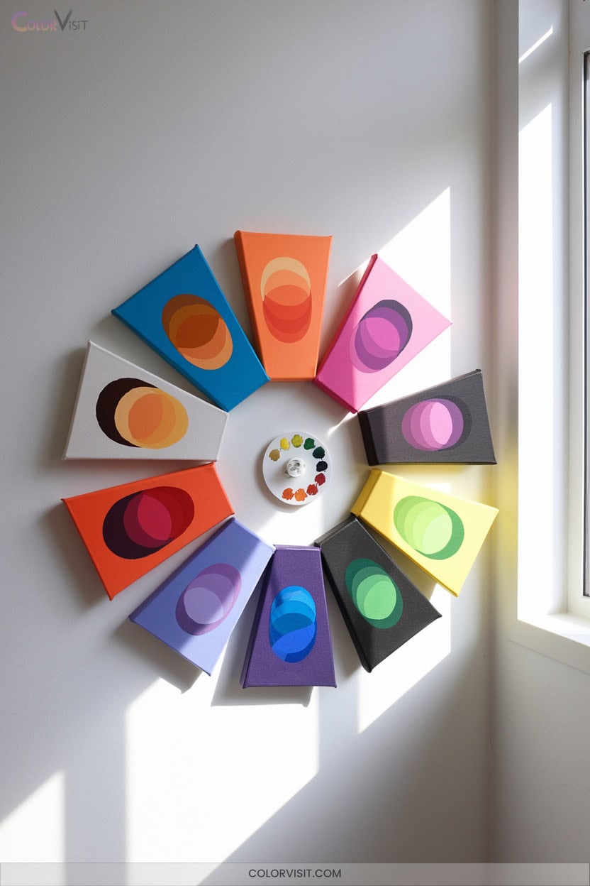
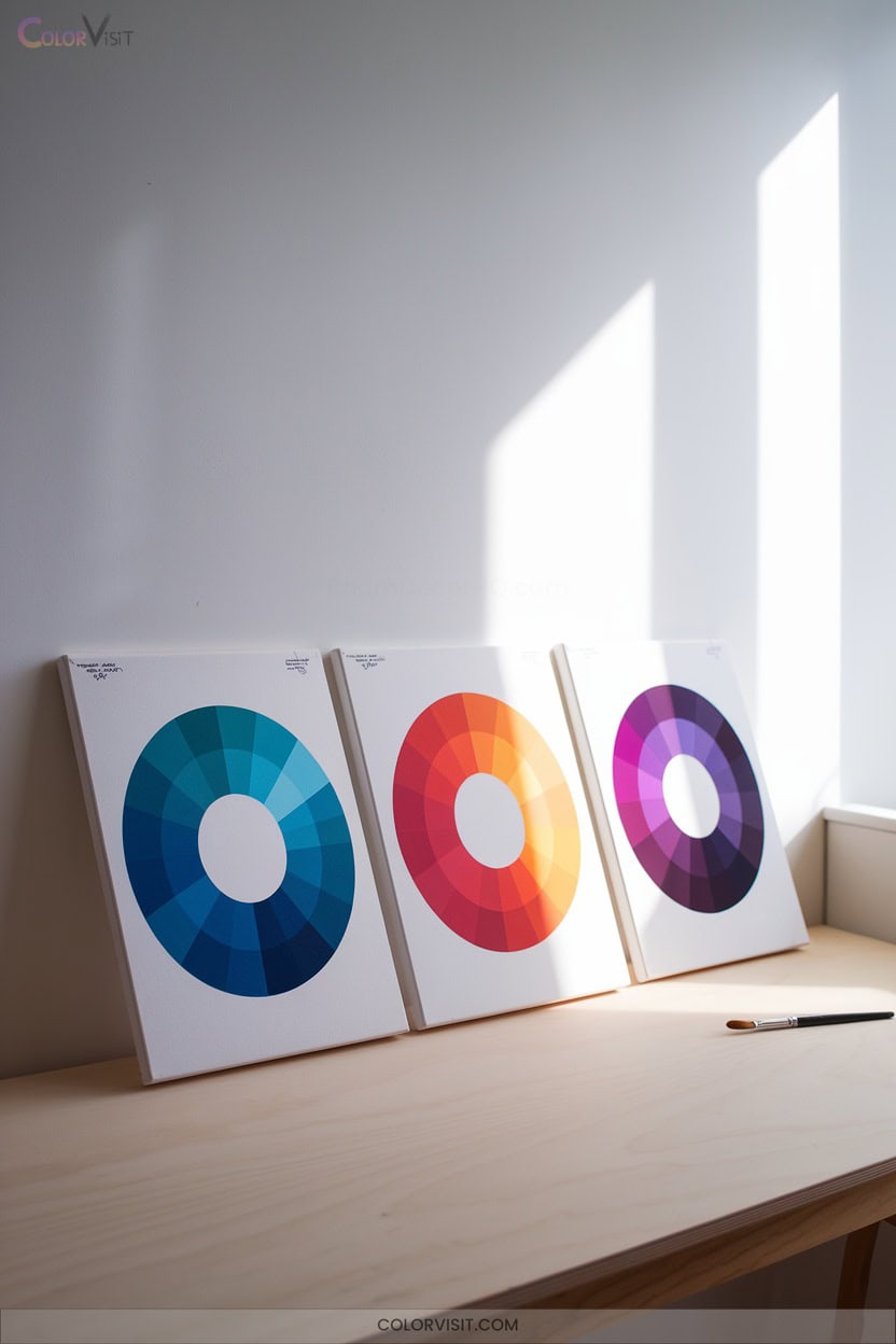
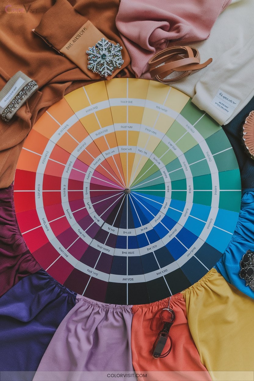
14. Experimenting With Shades, Tints, and Tones

Delving into shades, tints, and tones empowers you to manipulate color with nuanced control, expanding your palette beyond basic hues.
By infusing black, white, or gray into your base hue, you generate an array of chromatic variations that enhance depth, hierarchy, and emotional resonance.
This advanced modulation enables you to construct visually sophisticated compositions, balance contrast, and articulate intention with technical finesse.
Mastering color modulation unlocks sophisticated compositions, allowing you to balance contrast and convey creative intent with refined precision.
- Experiment with shades for dramatic, grounded accents.
- Apply tints to achieve ethereal, calming backgrounds.
- Use tones to smooth blends and unify schemes.
- Combine variations for monochromatic or complex harmony.
- Leverage digital tools for precision adjustments.
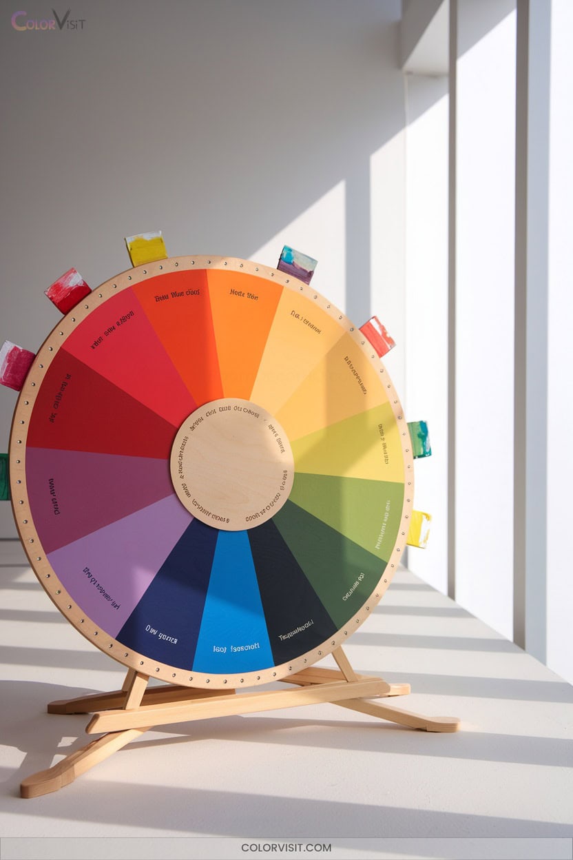
15. Drawing Inspiration From Color Wheel Tools
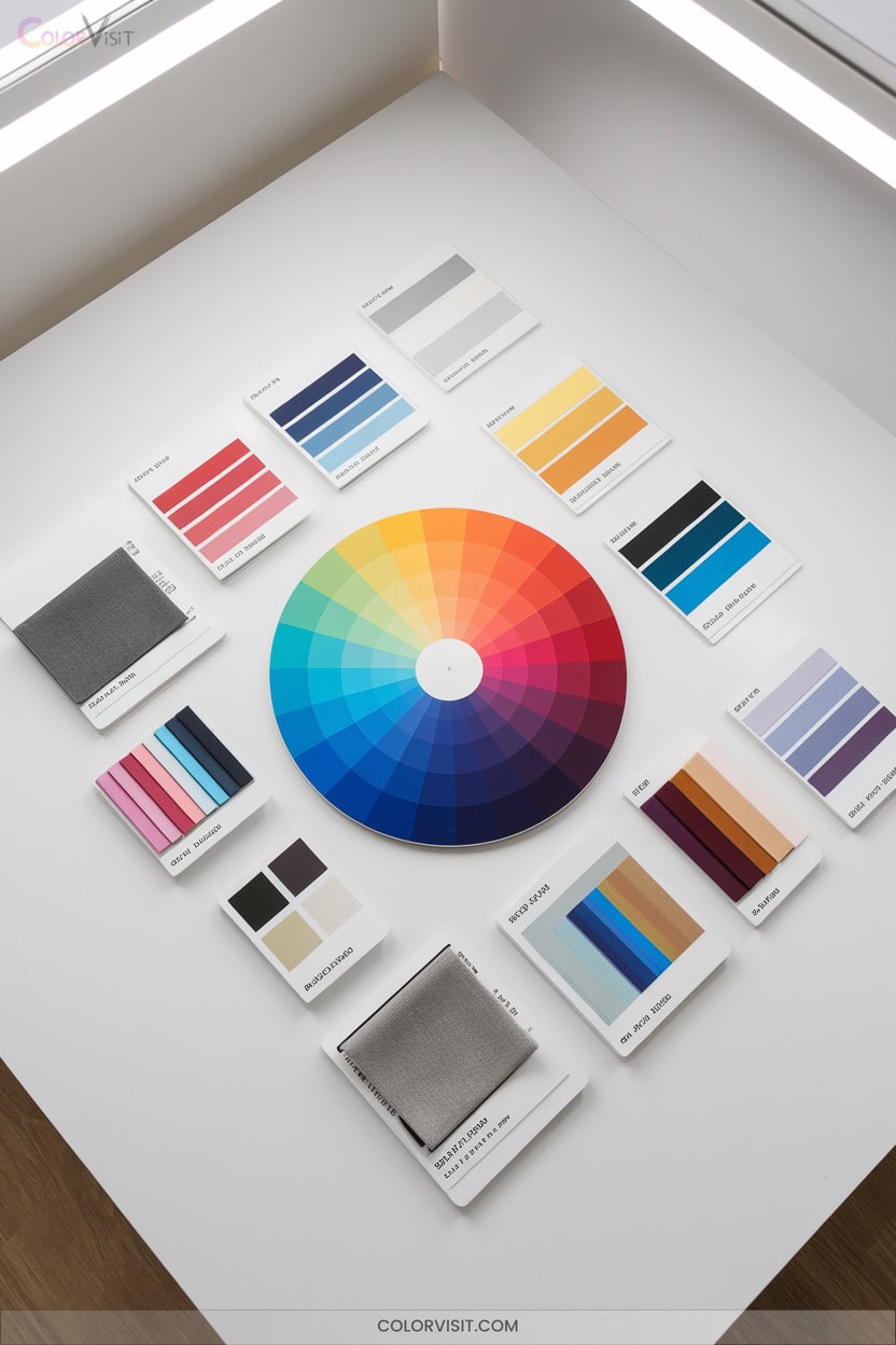
How do you unlock the full potential of your palette?
Leverage modern color wheel tools to innovate beyond tradition.
Digital platforms like Adobe Color, Canva, and Paletton allow you to visualize complementary, analogous, triadic, split-complementary, and tetradic harmonies with algorithmic precision.
Toggle between RYB for pigment-based work and RGB for screen-based design, ensuring chromatic accuracy.
Extract expressive color schemes, generate gradients, and refine palettes collaboratively in Figma.
Study historical context—Newton’s revolutionary color wheel—while utilizing up-to-date educational resources and community-driven palettes from ColorHive.
These tools empower you to infuse cohesion, emotional resonance, and brand identity into every composition.
Frequently Asked Questions
How Can Color Theory Help Resolve Client Disagreements on Color Choices?
You can leverage color theory’s frameworks—like harmony principles, psychological associations, and empirical A/B testing—to mediate client disagreements, grounding decisions in industry-standard logic rather than subjective preference, ensuring solutions are innovative, data-driven, and emotionally resonant.
What Are Common Pitfalls When Mixing Digital and Print Color Palettes?
You’ll encounter “creative surprises” when mixing digital and print palettes—expect gamut clipping, RGB-to-CMYK conversion artifacts, metameric mismatches, substrate-dependent chromatic shifts, and profile mismanagement. You must calibrate workflows and anticipate out-of-gamut hues to maintain color fidelity.
How Does Color Blindness Affect Design Decisions and Color Wheel Use?
When you design, color blindness compels you to prioritize perceptual accessibility, avoid problematic color pairings, and leverage tools like simulators. You’ll integrate redundancy—icons, textures, labels—ensuring color-coded information remains legible for users with diverse color vision deficiencies.
Can Cultural Differences Influence the Effectiveness of Color Combinations?
You navigate perception, you shape emotion, you define meaning—cultural differences directly modulate your palette’s efficacy. Incorporate chromatic semiotics, cross-cultural palettes, and contextual harmonization to optimize resonance and mitigate misinterpretation, ensuring your color combinations achieve global communicative impact.
What Role Does Lighting Play in Perceiving Colors Accurately in Designs?
You’ll find lighting fundamentally alters color perception by shifting chromatic accuracy, saturation, and hue fidelity. Variables like color rendering index, correlated color temperature, luminance intensity, and diffusion directly impact how you experience, evaluate, and innovate with color-driven designs.
Conclusion
You might think color wheels are too basic for advanced design, but their systematic structure anchors even the most sophisticated palettes. By leveraging principles like complementary contrast, triadic balance, and analogous harmony, you’ll engineer compositions that resonate both visually and emotionally.
Don’t underestimate the power of strategic hue selection, value modulation, and chromatic relationships—they’re the foundation of compelling, professional-grade work. Harness the color wheel’s full potential, and watch your creative output achieve new levels of depth and cohesion. Experimenting with various color combinations can lead to unexpected visual harmony that elevates your art. Additionally, seeking out creative color wheel inspirations for artists can fuel your imagination and encourage innovative thinking. By embracing these strategies, you can transform your approach and create artwork that not only captivates but also resonates with viewers on a deeper level.