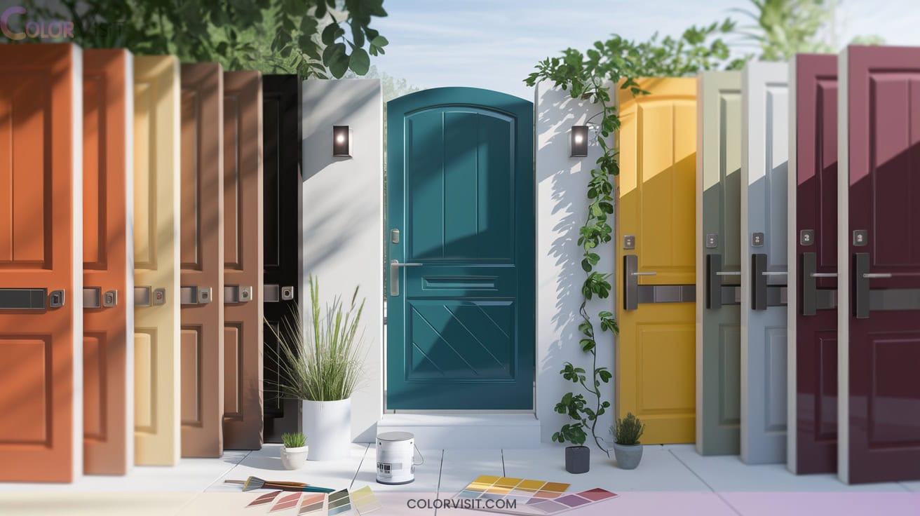
12 Welcoming Gate Color Ideas Entrance Designers Recommend
Make your entrance memorable with designer-recommended gate colors that highlight your plants and create instant charm. Try coral or bright yellow for a welcoming boost, teal and aqua blue to echo surrounding greenery, or cobalt and royal blue for a coastal or Mediterranean vibe.
Pair bold tones with lush foliage or natural wood for harmony, and let burgundy or terra-cotta enrich stone paths. Discover how these color choices can transform your entryway’s mood and spotlight your unique plantings ahead.

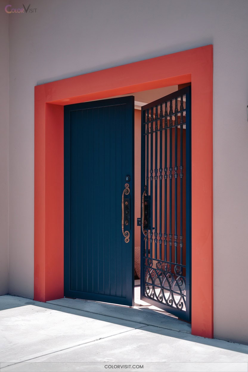
1. Coral Warmth for Inviting Entrances
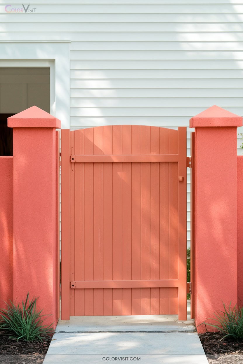
Infuse your entrance with a burst of energy by choosing coral for your gate—a color that radiates warmth and instantly signals hospitality.
Pairing coral with lush greenery or vertical planters creates a vibrant connecting zone, drawing the eye and making your home feel alive.
Gray hardscapes or white exterior walls amplify coral’s vibrancy, while terracotta pots and striped outdoor mats evoke a curated, modern feel.
Coral thrives alongside drought-tolerant grasses or coastal succulents, giving your entrance a dynamic, site-specific edge.
With weather-resistant paint, your coral gate remains striking, bold, and effortlessly welcoming, season after season, for innovative curb appeal.
2. Teal Tones That Stand Out
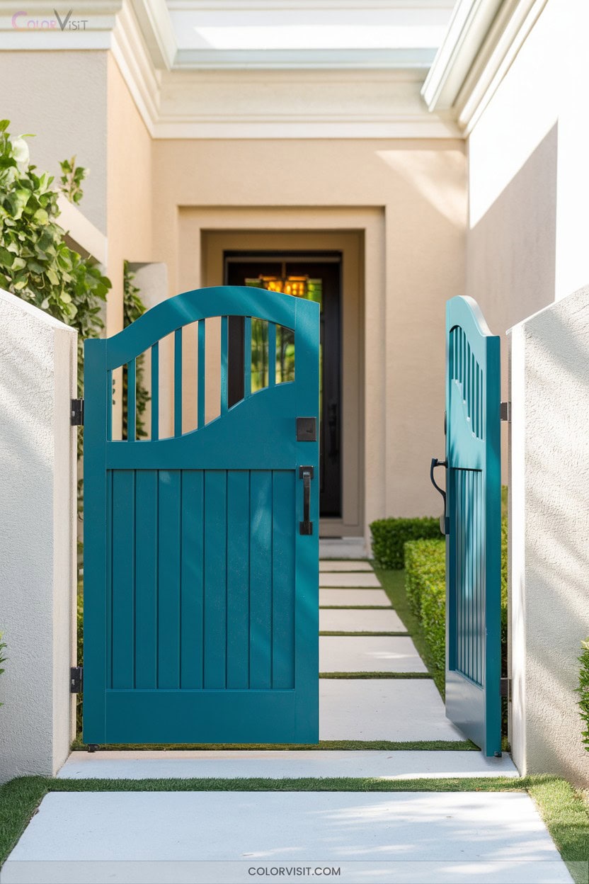
Choose teal for your gate and instantly anchor your entrance in nature’s palette—think tranquil lagoons and vibrant peacock feathers.
This blue-green hue radiates balance, clarity, and renewal.
Embrace medium or deep teal to create a sophisticated contrast against stone, beige stucco, or leafy plantings.
Brighter teals, inspired by succulents or agaves, add a distinctive touch that’s bold yet calming.
Pair teal gates with terracotta pots, golden grasses, or natural wood for a seamless, site-specific look.
Teal’s psychological resonance—trust, calm, approachability—welcomes guests and sets a progressive tone.
With proper care, your entrance will remain vibrant and inviting year-round.
3. Aqua Blue for a Fresh, Modern Look
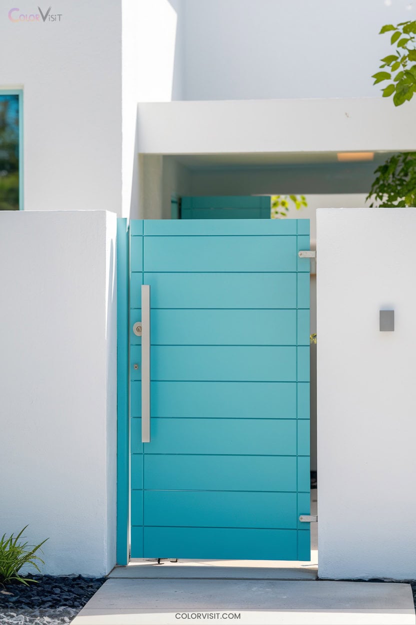
Aqua blue instantly refreshes your entrance, echoing the clarity of tropical waters and the openness of a clear sky.
Pair Benjamin Moore’s Soft Sky 807 or Behr Urban Raincoat N440-2 for a luminous, plant-forward welcome—think flagstone paths bordered by boxwood hedges, terracotta planters bursting with Mediterranean herbs, and white-trimmed frames for architectural pop.
Soft Sky or Urban Raincoat sets a radiant stage for lush hedges, fragrant herbs, and crisp white-trimmed entryways.
High-gloss finishes amplify color and resist weather.
Even partial door painting or DIY aqua accents can modernize a traditional setting, especially when you contrast with polished brass hardware.
Aqua’s cheerful mood and versatility invite innovation, transforming your entry into a vibrant, site-specific sanctuary year-round.
4. Striking Royal Blue Statements
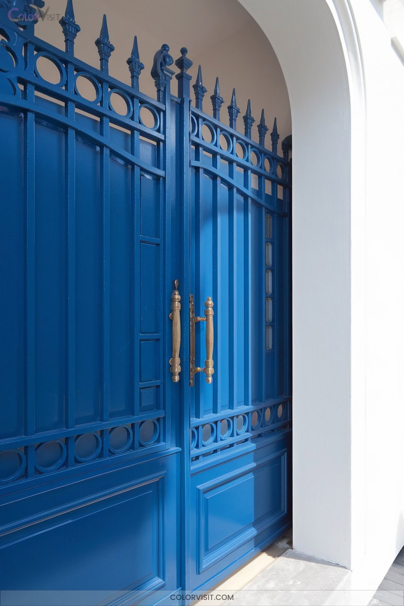
Command attention at your entryway with a royal blue gate that instantly anchors the landscape.
Picture bold cobalt against neutral-stone walls, flanked by boxwoods or white hydrangeas in symmetrical planters—it’s a visual statement that’s both classic and modern.
Choose marine-grade paint for wood or powder-coated steel for durability; matte finishes keep the color grounded and elegant.
Pair the blue with pathway lighting and sleek hardware for a cohesive look.
Royal blue’s calming effect transforms high-traffic zones into serene thresholds, all while signaling trust and stability.
This color resonates with Mediterranean heritage and offers year-round versatility for inspired, site-specific design.
5. Bright Yellow for Eye-Catching Curb Appeal
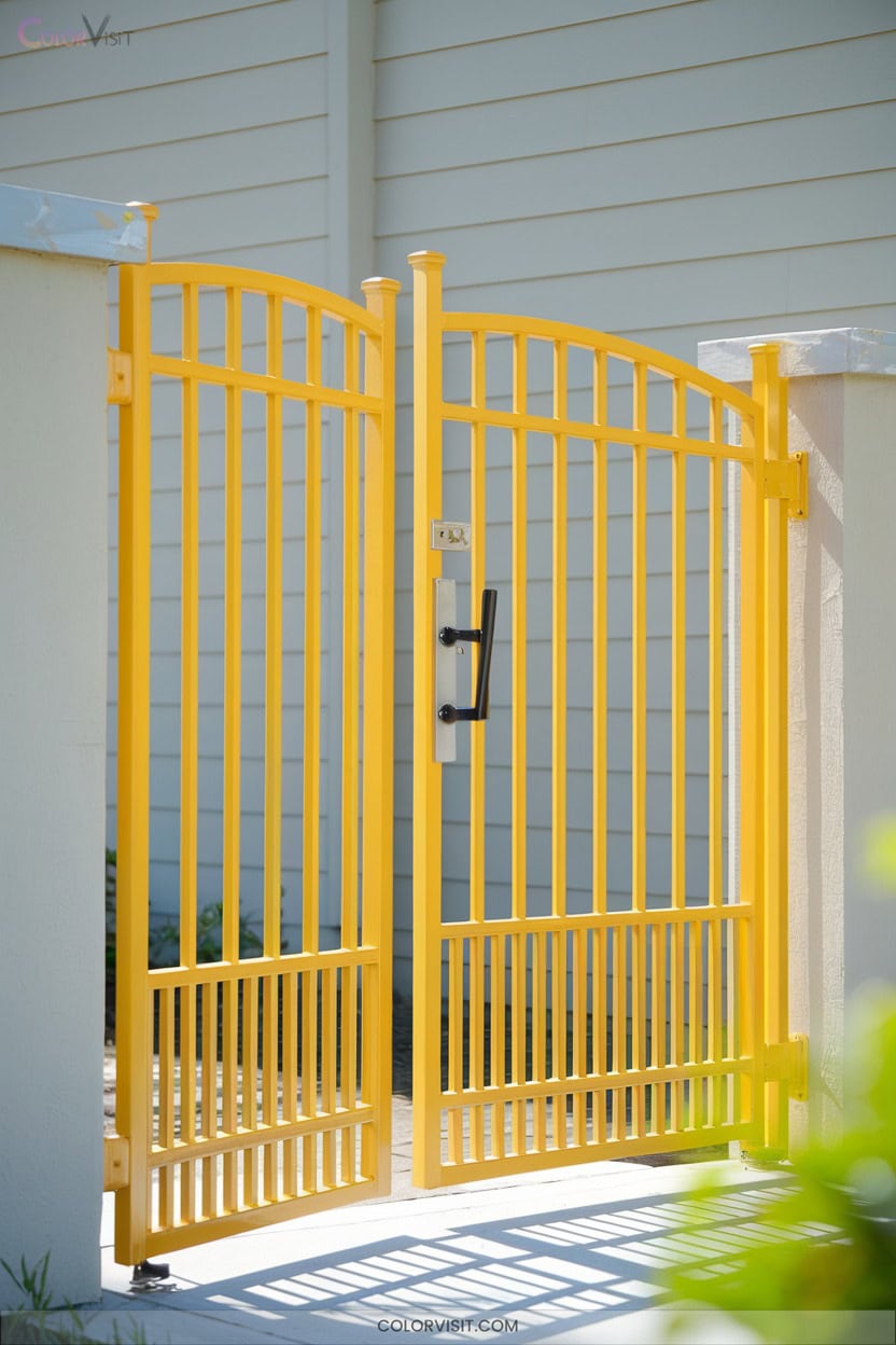
Why not let your entryway radiate pure optimism with a bright yellow gate, instantly warming the landscape and creating a beacon for visitors?
A vibrant yellow gate welcomes guests with warmth and optimism, turning your entryway into a cheerful beacon in the landscape.
Pair neon yellow with glass-paned doors to amplify natural light, or choose butter yellow against cocoa brown siding for a gentle, garden-inspired welcome.
Frame your gate with lush potted greenery or vibrant flower beds to echo yellow’s energy, weaving plant life into your design.
Use black hardware for striking contrast, and guarantee longevity with powder-coated finishes and UV-resistant pigments.
Complement with symmetrical hedges or pathway lights for balance, creating a visually compelling, mood-lifting entrance that’s truly unforgettable.
6. Classic Red for Timeless Hospitality
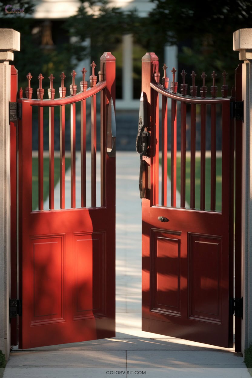
For a sense of enduring warmth, classic red gates invite guests with a timeless hospitality that never fades.
Place a red gate against lush greenery or trailing jasmine, and you’ll amplify its welcoming energy.
Red’s vibrancy draws the eye, whether your entrance is framed by brick, stone, or a tapestry of ferns and ornamental grasses.
Use a red-finished wood for natural texture, or opt for a sleek red metal gate for modern resilience.
This color isn’t just bold—it’s versatile, pairing with both traditional and contemporary landscapes.
Let climbing roses or vivid annuals echo the gate’s hue for a cohesive, innovative entrance.
7. Rich Burgundy for Elegant Contrast
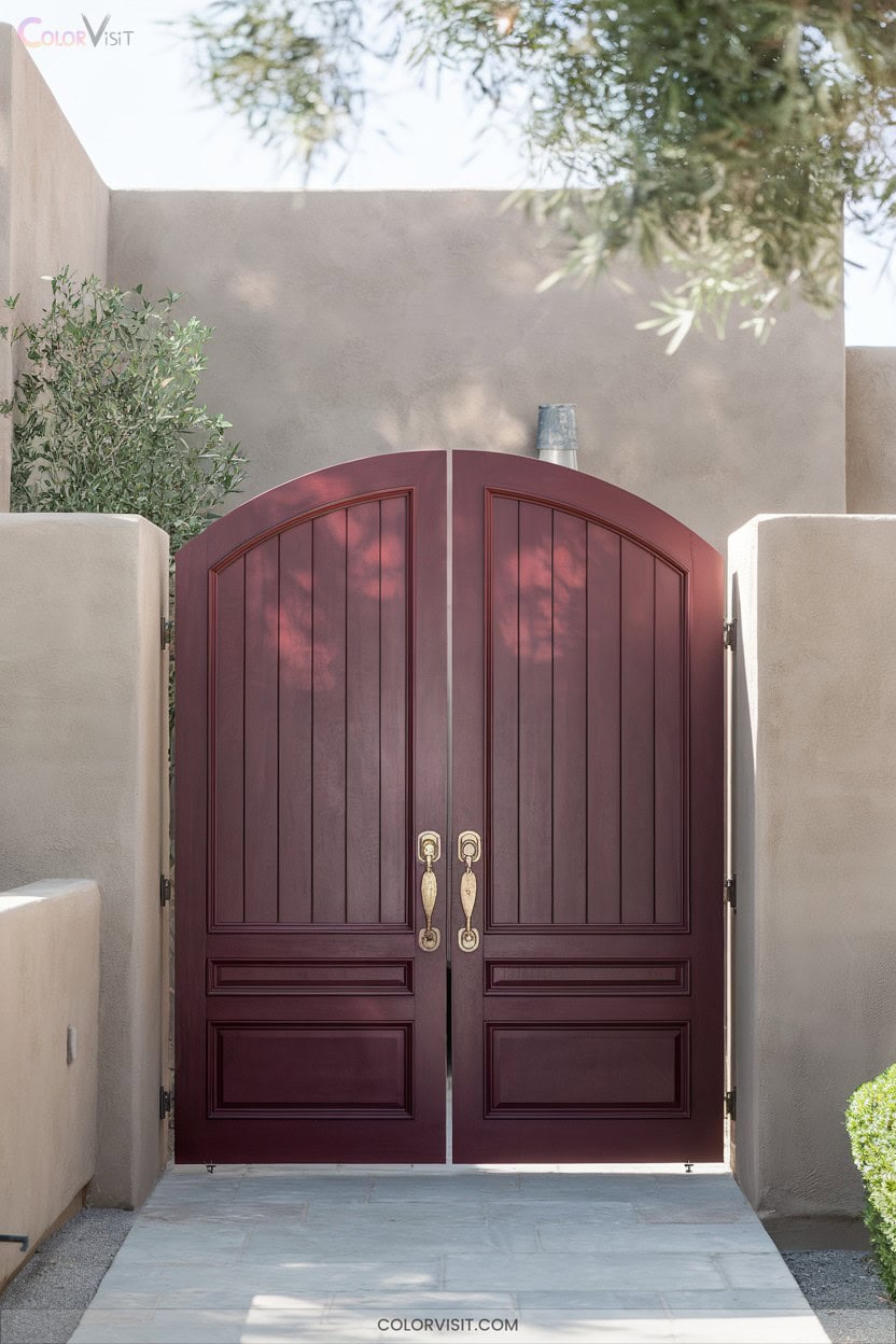
A rich burgundy gate instantly elevates your entryway, offering an elegant contrast against soft stone walkways and flourishing garden beds.
Pairing burgundy with lush greenery creates an immersive, botanical experience that feels both sophisticated and welcoming.
This hue, symbolic of creativity and luxury, stands out beautifully against brick facades or pale borders.
Opt for wooden gates with metallic accents—think copper or gold—for extra depth and a contemporary twist.
Integrate lantern-style lighting to highlight the rich tones, especially at dusk.
Burgundy’s boldness guarantees your entrance feels unique year-round, exuding warmth and drama without sacrificing harmony with your landscape’s natural elements.
8. Sophisticated Navy Blue Enhancements
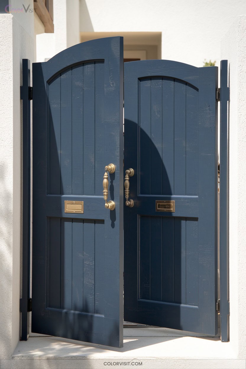
Navy blue gateways establish an inviting focal point, instantly elevating your home’s curb appeal while blending seamlessly with surrounding greenery.
A navy blue gateway welcomes guests with style, creating a striking focal point that harmonizes beautifully with lush green surroundings.
Position potted ferns or climbing jasmine on either side to amplify the lush, welcoming vibe.
Pair the navy with brass hardware for a touch of sophistication, and consider Benjamin Moore’s Hale Navy for its rich, deep tone.
Accentuate with yellow trim for vibrant contrast, or opt for lighter blue planters to create monochromatic harmony.
Vintage-inspired sconces and simple, modern welcome mats complete the look.
Seasonal wreaths—think eucalyptus or spring florals—keep your entrance fresh, innovative, and visually stunning year-round.
9. Terra-Cotta Orange for Southwestern Charm
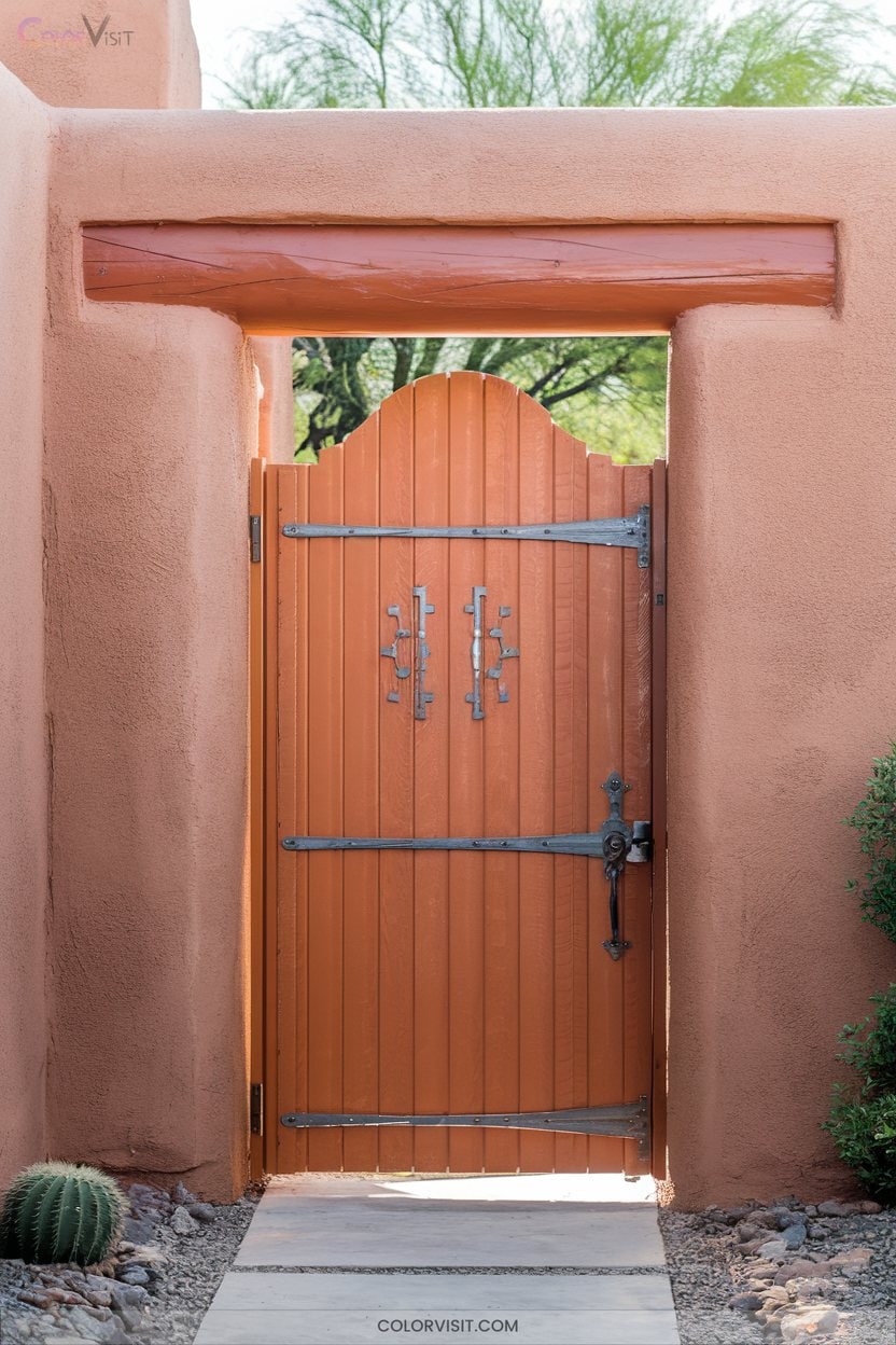
Sunbaked clay hues infuse your entryway with the unmistakable warmth of the Southwest, instantly echoing desert landscapes and rugged beauty.
Select terra-cotta orange for your gate to bridge native plants like agave, sage, and cacti with organic architecture—think adobe walls or textured stucco.
Opt for matte, weather-resistant finishes to echo handmade clay, and pair the vibrant tone with turquoise or deep green accents for botanical contrast.
Integrate bronze hardware and stone pathways to reinforce the regional vibe.
This earthy, plant-attuned palette honors Indigenous and Spanish Colonial roots while delivering an authentically innovative, welcoming entrance for your modern home.
10. Warm Maple Wood Stains for Natural Beauty
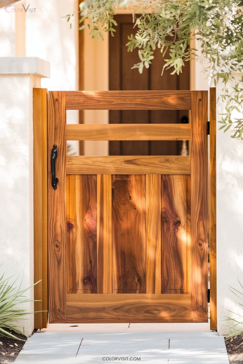
Why not let the natural beauty of warm maple wood stains set the tone for your gate, especially if your entry is shaded by leafy canopies or framed by lush perennial beds?
Maple’s dense hardwood, when treated with glowing amber stains, creates a luminous backdrop that amplifies green foliage and seasonal blooms.
Opt for high-solids formulas from Minwax or Old Masters to preserve subtle grain and achieve a modern yet vintage effect.
Pair with matte black hardware or olive planters for contrast.
Seal with UV-resistant topcoats, and inspect annually—your entry will radiate a “welcome home” glow year-round, thriving alongside your landscape.
11. Cobalt Blue for a Coastal Connection
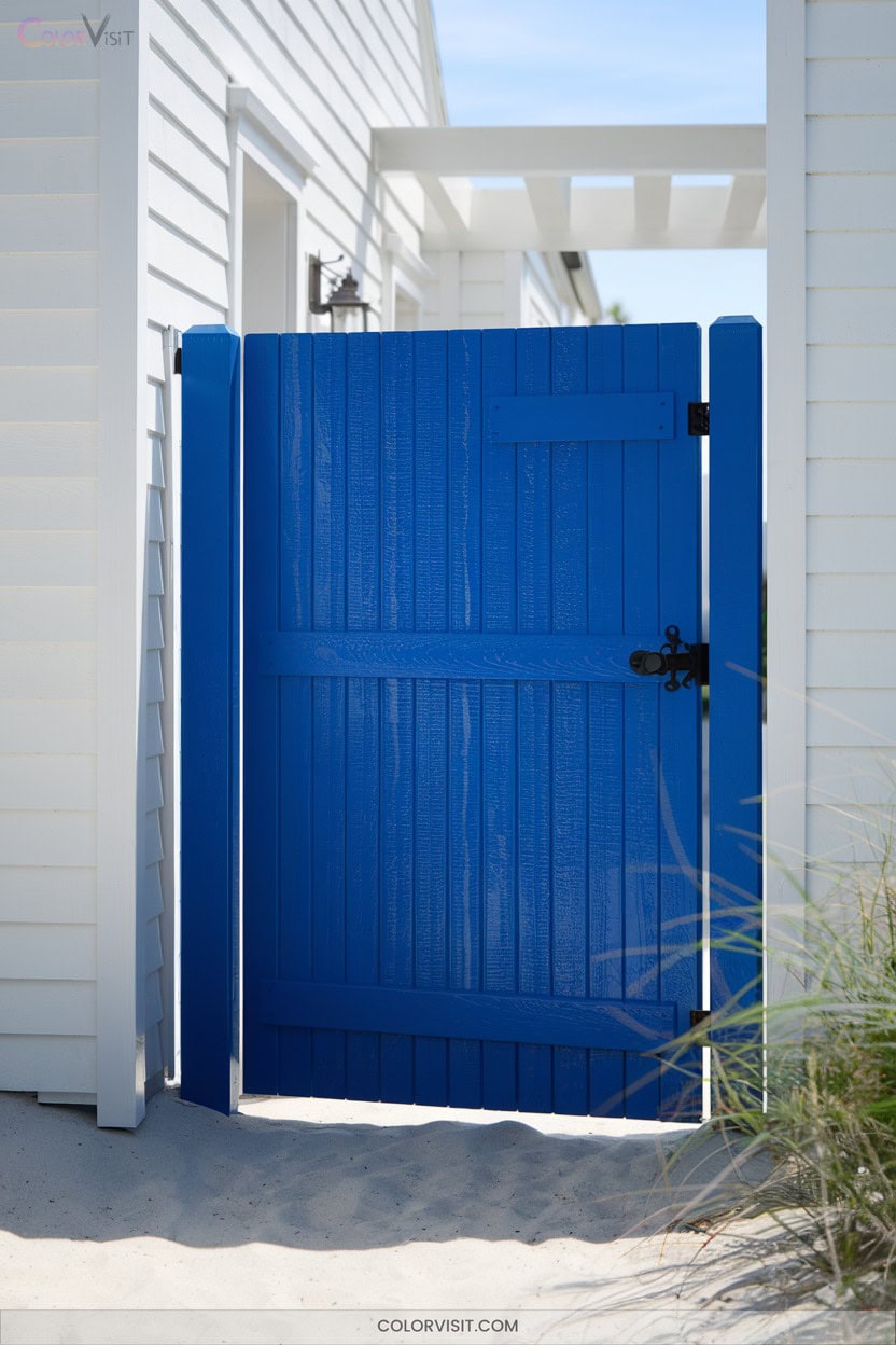
Cobalt blue radiates coastal energy, instantly evoking the crisp clarity of ocean waters beside lush seaside plantings.
When you choose this vibrant hue for your entrance gate, you infuse the space with optimism and a sense of innovative style.
A cobalt blue entrance gate welcomes with vibrant optimism and sets the tone for a home defined by creative style.
Cobalt blue works beautifully against neutral façades—think white stucco, sandy stone, or soft gray—while drawing out the greens and silvers of surrounding foliage.
Use it to highlight:
- Architectural features like arches or columns for striking visual rhythm
- Modern planters filled with succulents or lavender
- House numbers and signage for cohesive, site-specific flair
Let your entrance celebrate coastal-inspired creativity.
12. Bold Color Contrasts to Elevate Style
While coastal tones like cobalt blue invite a sense of seaside serenity, bold color contrasts take your entrance to a new level of dynamic style.
Imagine deep teal gates framed by lush ferns, or vibrant coral doors set against textured ivy-clad walls.
Pair a rich charcoal backdrop with neon planters for an instant urban garden statement.
Dutch blue or navy gates, accented by yellow blooms and metallic hardware, create a modern botanical welcome.
Don’t shy away from geometric mosaic tiles or red accents; they’ll highlight your plantings and architecture.
Let your entrance thrive—bold color meets organic beauty, right at your gate.
Frequently Asked Questions
How Do I Maintain Painted Gates to Prevent Fading and Chipping?
You’ll keep your painted gates vibrant by trimming plants back, washing gently, and applying UV-resistant sealant yearly. Touch up chips fast, use weather-smart paint, and always paint during mild, dry spells to preserve your gate’s bold, innovative appeal.
Are Certain Gate Colors Better for Resale Value?
You’ll boost resale value if you choose gate colors like black, slate blue, or charcoal gray—they ground your landscape and frame plantings beautifully. Avoid saturated blues, olive greens, or pale pinks; these hues deter innovative, design-conscious buyers.
What Gate Colors Work Best With Metal Materials?
Don’t worry about metal feeling cold—choose matte black for a sleek look, or copper for warmth that evolves with weather. If your site’s lush and green, deep charcoal or bronze creates striking contrast and botanical harmony.
Can Weather Affect the Longevity of Vibrant Gate Colors?
Yes, weather dramatically impacts vibrant gate colors. You’ll notice plant-filled sites with lush foliage shield gates from UV, but without UV-blocking finishes and moisture-resistant coatings, your gate’s aesthetics fade—innovation thrives when you blend climate-wise protection with striking hues.
How Do I Choose Gate Hardware That Complements Bold Colors?
Focus on how your bold gate color interacts with surrounding greenery, sunlight, and architectural lines. Choose hardware in matte brass or sleek black to create striking contrasts, while textured finishes echo natural elements, making your entry uniquely vibrant and innovative.
Conclusion
Let your gate be the blooming welcome at your garden’s edge—a vibrant first impression rooted in thoughtful color. Whether you choose the sunlit cheer of yellow, the grounding calm of teal, or the warmth of terra-cotta, each hue can help your entrance flourish.
Pair your shade with climbing jasmine or lush ferns to create a living frame, and watch your curb appeal grow. With the right palette, your gate becomes a living invitation to linger and explore.