20 Harmonious Living Room Color Palette Ideas for 2025
Transform your living room in 2025 with palettes that blend crisp whites, soft grays, timeless camels, and grounding beiges for a foundation of tranquil sophistication. Layer textured neutrals, organic stucco, and sandy clays for rich depth, then punctuate with earthy terracottas, ochres, and Mediterranean-inspired metallics.
Accent with airy blues, convivial yellows, and retro goldenrod for visual intrigue. Pair sleek black and light wood hues to refine your aesthetic—explore more to discover all 20 on-trend combinations.


1. Crisp Whites and Soft Grays for Serene Spaces
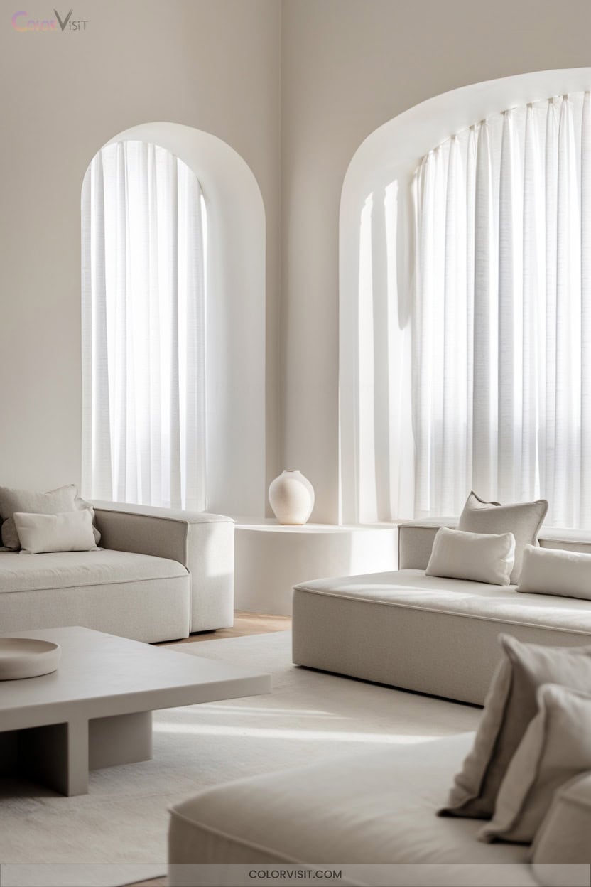
A refined palette of crisp whites and soft grays instantly elevates your living room, striking a balance between tranquility and sophistication.
Crisp whites and soft grays bring effortless elegance to your living room, creating a tranquil yet sophisticated atmosphere.
Opt for Benjamin Moore White Dove—its subtle gray undertone offers warmth that adapts to shifting daylight.
Layer chalky bone whites with linen textiles for tactile richness, and pair soft gray walls with crisp white trim for dimensional contrast.
Integrate brass or black hardware as contemporary focal points, while mirrors and matte finishes maximize light diffusion without glare.
Test paint undertones in your space to prevent flatness.
Biophilic accents and geometric wallpapers guarantee your serene gray-white foundation stays visually dynamic.
2. Timeless Camel and Beige Foundations
While crisp whites and soft grays set a foundation of serene sophistication, camel and beige introduce an inviting warmth that embodies 2025’s most enduring color trends.
You’ll find these nature-inspired neutrals deliver both timeless versatility and tactile comfort, making them the quintessential choice for innovative living room palettes.
Pair camel and beige with earthy terracotta or modern taupe for depth, or incorporate bold sapphire accents for visual intrigue.
Designers and trend forecasters agree: warm neutrals like camel are redefining the modern living room, balancing classic elegance with forward-thinking adaptability.
For a harmonious ambiance, embrace these understated yet transformative tones.
3. Layered Neutrals With Organic Stucco Accents
Texture transforms a neutral palette from simple to striking, and 2025’s interiors showcase this through layered neutrals paired with organic stucco accents.
In 2025, layered neutrals and organic stucco turn understated palettes into visually captivating, texture-rich interiors.
You’ll elevate your living room by combining warm whites, soft greiges, and taupes, then amplifying depth with tactile elements like organic stucco walls.
This sustainable, eco-forward finish introduces visual intrigue through subtle shadow play, especially alongside natural fibers—think linen upholstery, jute rugs, and woven light fixtures.
Pair these textures with plush, comfortable furniture and organic-shaped decor for a cohesive, modern aesthetic.
The interplay of muted nature-inspired hues and textural contrasts creates a space that feels both innovative and grounded.
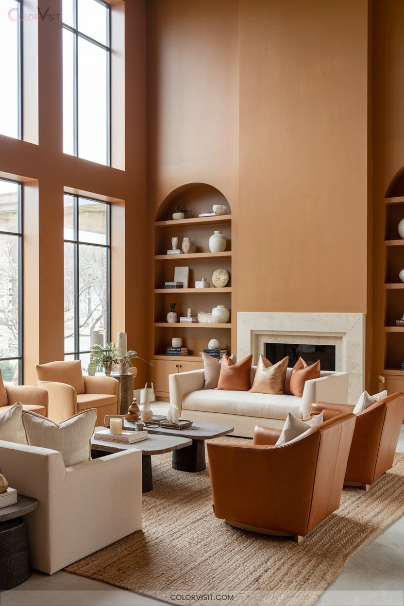
4. Earthy Terracotta and Ochre Pairings

Shifting from the serene world of layered neutrals, earthy terracotta and ochre introduce a sunbaked vibrancy that instantly energizes your living room.
These nature-inspired hues create a balanced, biophilic palette—terracotta’s grounded warmth harmonizes with ochre’s luminous undertones.
Integrate woven baskets, linen upholstery, and ceramics to amplify tactile interest.
For a trend-forward edge, juxtapose terracotta and ochre with green or yellow accents, or introduce metallics like brass for visual luminosity.
Use layered lighting—overhead, floor, and accent—to accentuate the palette’s dimensionality.
Embrace Moroccan or Mediterranean motifs and vintage accessories to infuse the space with authentic, global sophistication.
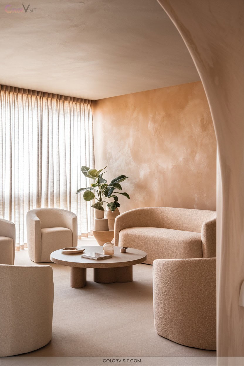
5. Grounded Clay and Sandy Tones
Grounded clay and sandy tones define the new era of neutrals, offering a sophisticated yet relaxed foundation for the modern living room.
Grounded clay and sandy tones usher in a fresh, sophisticated neutrality, creating a calm and inviting base for contemporary living rooms.
You’ll find warm taupe, soft clay, and creamy whites forming calming backdrops, perfectly suited for layering with tactile materials like raw wood, wool, and woven linens.
Matte finishes and terracotta accents enhance the organic narrative, while muted greens or brass details inject understated contrast.
This palette delivers both versatility and enduring comfort, promoting tranquility and balance ideal for social spaces.
Embrace sandy neutrals to achieve a timeless, welcoming atmosphere that elevates your living room’s sensory and visual experience.
6. Sunbaked Nomadic Desert Inspiration
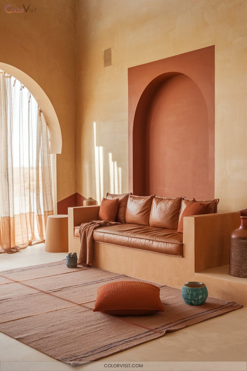
While sandy neutrals offer a timeless foundation, infusing your living room with sunbaked desert inspiration invites a more adventurous warmth.
Sherwin Williams Nomadic Desert (SW 6107), with its elegant red undertone, anchors the 2025 trend toward earthy palettes.
Replace cool grays with this sunset-infused hue to achieve depth and sophistication.
Pair Nomadic Desert with deep blue accents like Mount Etna for vibrant contrast, or layer monochromatic shades for seamless cohesion.
Integrate wood, stone, and textured textiles to amplify the natural aesthetic.
Complete the look with terracotta decor, golden lighting, and succulents, fostering a space that radiates contemporary, grounded energy.
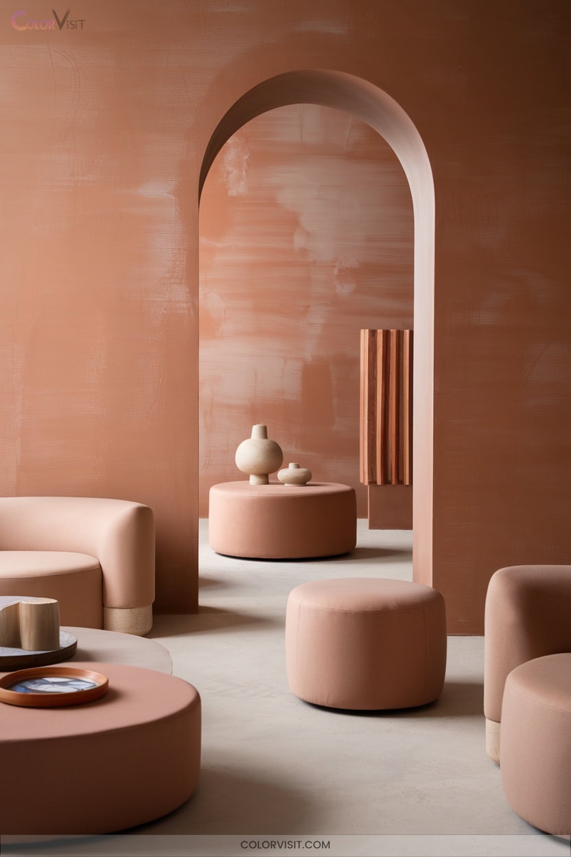
7. Warmth of Caramelized Plum-Brown
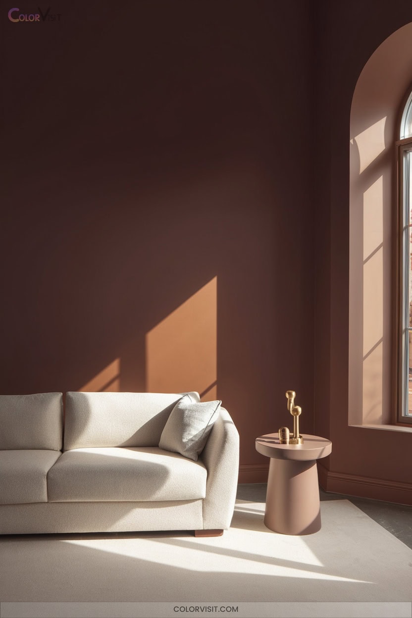
A palette anchored by caramelized plum-brown instantly elevates your living room with rich, inviting warmth that’s both on-trend and timeless.
You’ll find hues like Dunn-Edwards’ Caramelized and Benjamin Moore’s Cinnamon Slate blend sophisticated depth with versatility—perfect for modern-vintage fusion.
Pair these medium browns with off-white or cream for a light, airy balance, or introduce navy and charcoal for a moody, contemporary edge.
Integrate natural wood, tactile fabrics, or leather furniture to enhance tactile richness.
Metallic accents and jewel-toned blues amplify the dynamic visual impact.
This color story grounds your space while propelling it toward cutting-edge elegance for 2025.
8. Autumnal Spiced Cider Accents
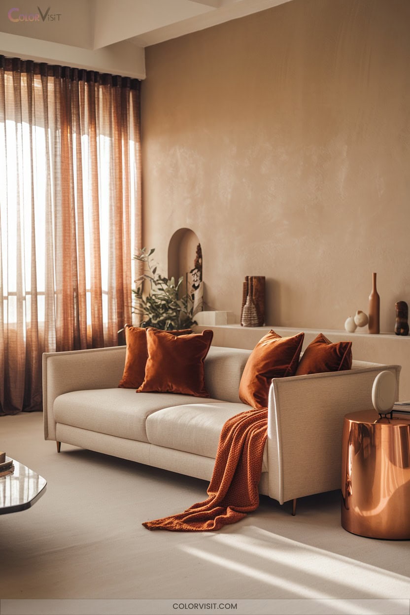
Spiced cider radiates autumnal sophistication, infusing your living room with deep, earthy vibrancy and a welcoming, on-trend ambiance.
Embrace Sherwin-Williams SW 7702 Spiced Cider for its warm red undertones—perfect for accent walls that anchor a space with modern, grounded energy.
Pair it with plush textures like velvet or wool and balance with creamy neutrals or bold navy for visual intrigue.
Integrate nature-inspired décor—think wood furniture, organic textiles, or cinnamon and nutmeg accents—to reinforce the autumnal palette.
Strategic use in select rooms guarantees cohesion, while layered lighting amplifies the inviting, innovative spirit of your space.
9. Calming Sage and Ochre Backdrops
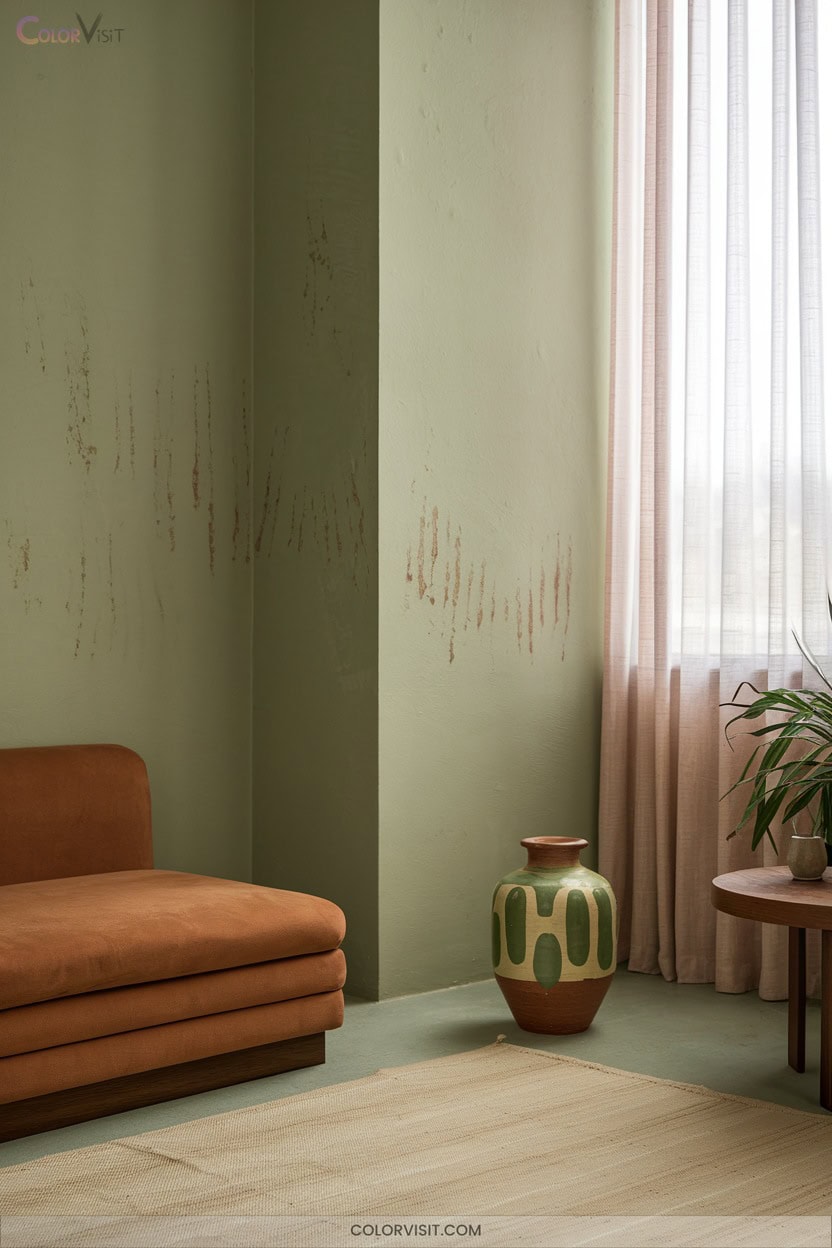
Serenity meets sophistication when you layer calming sage with ochre backdrops—a leading palette for 2025 that reflects a shift toward organic tranquility and sun-warmed earthiness.
You’ll notice how sage green, now the “new neutral,” grounds spaces without heaviness, while ochre and clay tones like Pantone’s Mocha Mousse radiate subtle, earthy warmth.
Integrate moss green textiles, reclaimed walnut furniture, and terracotta pottery for biophilic depth.
Pair sage cabinetry with ochre open shelving, or use muted sage wall paint for a restorative foundation.
Low-contrast pairings—sage and ivory, ochre and blush—promote visual calm and refined innovation in your living room.
10. Deep Jewel Tones for Dramatic Flair
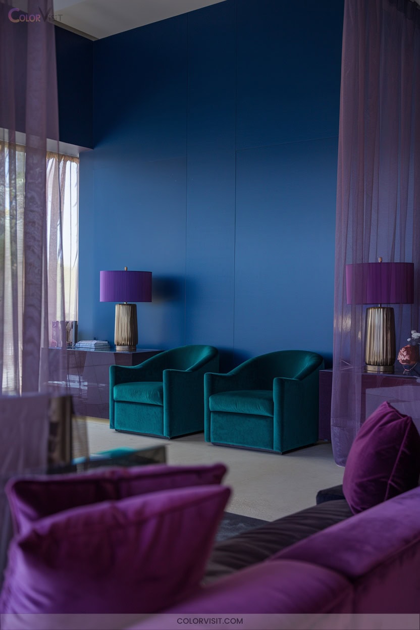
While soothing sage and ochre evoke natural calm, deep jewel tones deliver unmistakable drama and sophistication to modern living rooms.
Emerald green radiates luxury, sapphire blue deepens the atmosphere, and ruby red injects energetic flair—ideal for innovative palettes in 2025.
Layer these hues over neutral backdrops like soft grey or cream for visual equilibrium.
Accentuate with metallic golds, tactile velvets, and glass to amplify opulence.
Incorporate dramatic accent walls, jewel-toned furniture, or select artwork for instant impact.
Harness strategic lighting to intensify color saturation, ensuring every surface—from rugs to textiles—reflects the rich, trend-forward allure of jewel-inspired design.
11. Sophisticated Purple Basil Statements
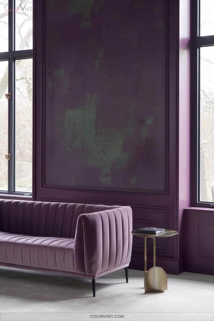
A striking evolution in living room color palettes, Purple Basil introduces a sophisticated dusty violet with mauve undertones that effortlessly balances warmth and coolness.
Embrace this hue’s contemporary resonance—it’s reshaping interiors with serene elegance and a maximalist spirit.
Use Purple Basil as an accent wall, statement chair, or through textured textiles to harness its depth and versatility.
Pair it with earthy terracotta, metallic gold, or soft pastels for dynamic contrast.
Lighting shifts reveal nuanced shades, keeping your space visually engaging.
As part of PPG’s “Kinetic” theme, Purple Basil signals a forward-thinking approach to color, ideal for cutting-edge design innovation.
12. Classic Delft Blue Elegance
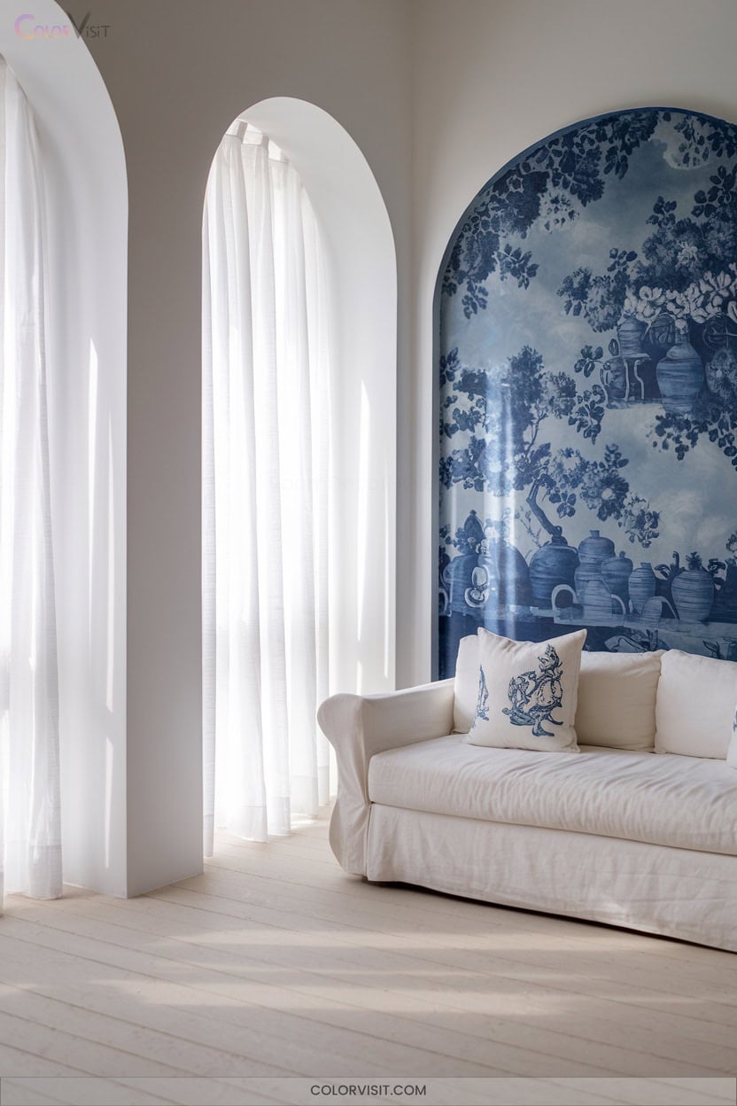
Step into timeless sophistication with Classic Delft Blue, a hue that channels centuries of artistry through its sea-blue vibrancy and subtle green undertones.
Elevate your living room by juxtaposing Delft Blue ceramics—think vases or contemporary 3D-printed accents—against soft white or creamy neutral backdrops.
Delft Blue ceramics shine against creamy neutrals, adding a touch of artful sophistication to any living space.
Integrate nature-inspired motifs on upholstery or drapery to evoke tranquility, while subtle gold or deep green elements like Rocky River layer in warmth and depth.
Embrace the historic allure of floral patterns or opt for cutting-edge computational designs, both enhancing collectibility and visual intrigue.
Delft Blue’s versatility bridges traditional elegance with forward-thinking interior trends for 2025.
13. Moody Navy and Charcoal Contrasts
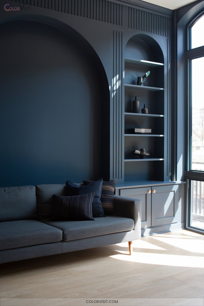
Immerse your living room in a sophisticated interplay of moody navy and charcoal, where dramatic tension and layered contrast define the space.
Opt for a 60/30/10 balance—navy as the dominant hue, charcoal secondary, and vibrant accents like burnt orange for warmth.
Integrate natural oak or walnut to ground the palette, while brushed brass or blackened steel introduce dimensionality.
Elevate tactile depth with velvet cushions, wool throws, and woven jute.
Employ layered lighting—recessed, sconces, LED strips—to counteract shadows and amplify spatial perception.
Float your furniture, use vertical stripes, and incorporate mirrored surfaces for a visually expansive, cutting-edge environment.
14. Frosted Jade for Meditative Retreats
While dramatic contrasts like navy and charcoal evoke bold sophistication, Frosted Jade introduces a quieter, restorative energy ideal for meditative retreats.
This green-grey shade (#C2D1C4) radiates serenity, with a 60.80 LRV that brightens without glare and low 14% saturation for visual tranquility.
Use it as a primary wall color to foster calm and clarity, pairing seamlessly with natural wood, stone, and soft textiles.
Accentuate with ivory, taupe, or brushed gold for layered harmony.
You’ll appreciate its stain-repellent, low-VOC qualities and one-coat coverage—innovative features aligning with wellness-focused, minimalist living room design for 2025.
15. Mineral-Inspired Rocky River Palettes
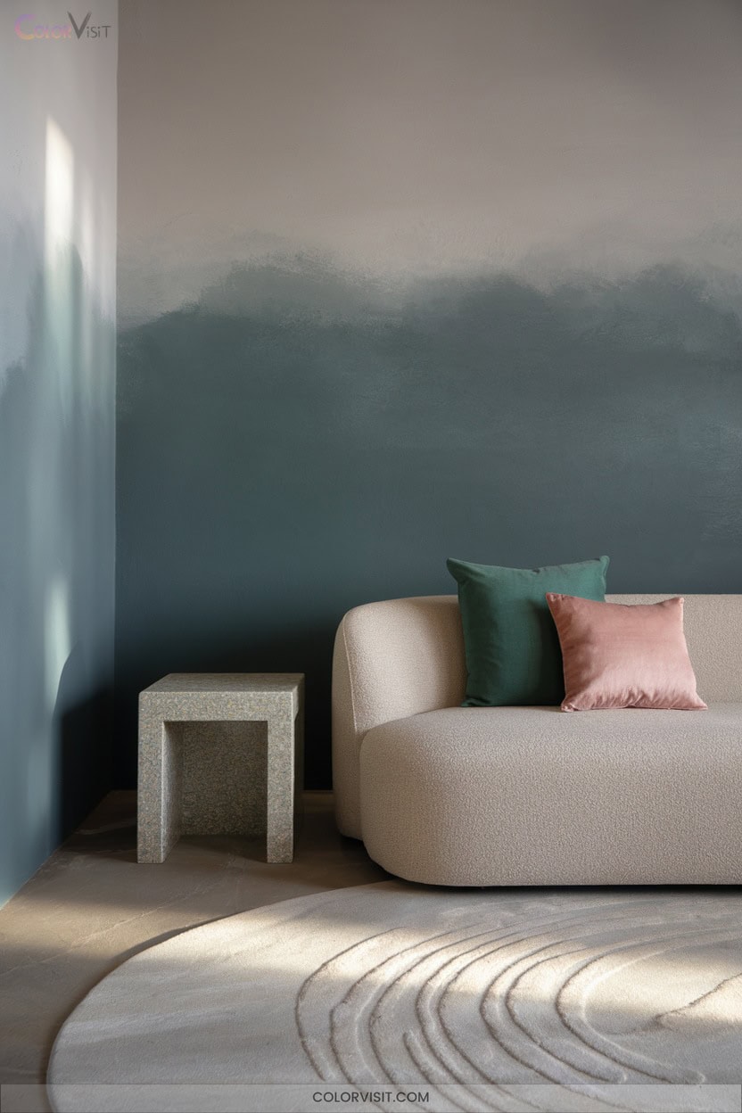
A mineral-inspired Rocky River palette channels the serene power of nature’s coastlines and riverbeds into your living room, harnessing blue-green undertones that feel both grounding and invigorating.
Embrace Rocky River as your core shade—its oceanic depth pairs effortlessly with Quietude for a balanced, mineral-driven harmony.
Integrate stucco textures, arched architecture, and natural materials like quartzite or walnut for sophisticated cohesion.
Offset coolness with warm terracotta or ochre accents, while brushed brass details introduce luminosity.
High-gloss Rocky River feature walls mimic water’s reflective quality.
Layer in navy, forest green, or emerald accessories for dimensionality, ensuring bold trend alignment for 2025.
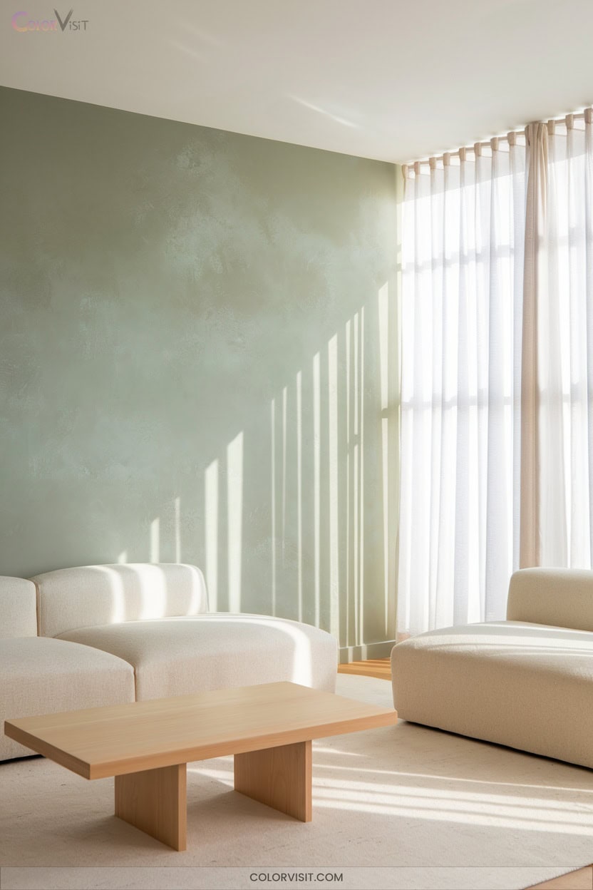
16. Biophilic Greens for Tranquility
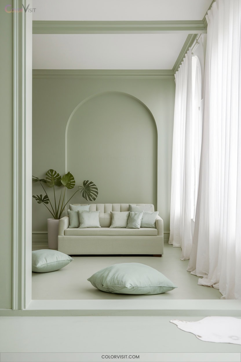
Infuse your living room with tranquility by leveraging biophilic greens, the cornerstone of nature-driven palettes for 2025.
Embrace deep, murky greens for a sophisticated base, layering with earthy and dark greens to amplify depth and evoke relaxation.
Pair these with warm browns, sandy neutrals, or mushroom grays for a harmonious, grounded scheme.
Integrate natural materials—think linen upholstery and wood accents—while embracing organic elements such as Raven ZZ or rubber plants for visual richness.
Optimize natural light to amplify biophilic qualities, and experiment with textured layers.
This nature-connected approach delivers sustainable innovation and a soothing, future-forward living space.
17. Airy Blues Reminiscent of Sky and Water
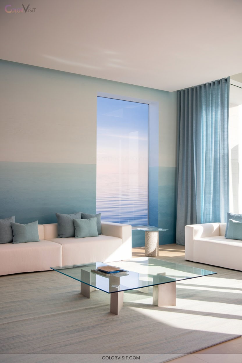
Serenity defines living rooms layered with airy blues, channeling the expansive calm of sky and water into contemporary interiors.
For 2025, embrace trending hues like Tradewind or Quietude by Sherwin-Williams, or Aegean Teal by Benjamin Moore—each infuses tranquility without sacrificing modernity.
In 2025, airy blues like Tradewind, Quietude, and Aegean Teal bring modern tranquility to contemporary living spaces.
Leverage these tones as wall colors to amplify openness or as accents through furniture and cabinetry for depth.
Pair airy blues with warm neutrals, crisp whites, and organic textures to maintain inviting balance.
Brass or gold details elevate the palette, while strategic lighting maximizes spaciousness.
This harmonious approach fosters clarity, relaxation, and a forward-thinking living environment.
18. Optimistic Convivial Yellow Pops
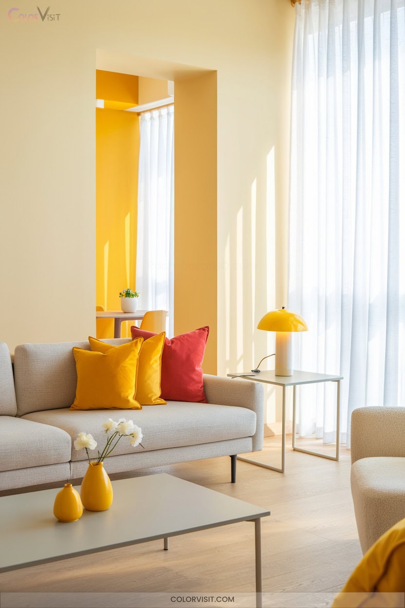
While tranquil blues establish a soothing foundation, introducing Convivial Yellow and similar hues like Yolk Yellow instantly elevates the living room with an unmistakable sense of optimism.
Harness these vibrant tones as accent walls, bold furnishings, or curated décor for a dynamic, light-reflective ambiance.
Balance yellow pops with neutral textiles—think gray area rugs or white linen curtains—to achieve visual harmony.
Integrate geometric patterns or primary color pairings for a trend-forward atmosphere that stimulates creativity.
Convivial Yellow’s energetic undertones not only enhance spatial perception but also foster lively, inviting social settings, aligning perfectly with 2025’s forecast for cheerful, innovative interiors.
19. Retro Goldenrod and Coral Highlights
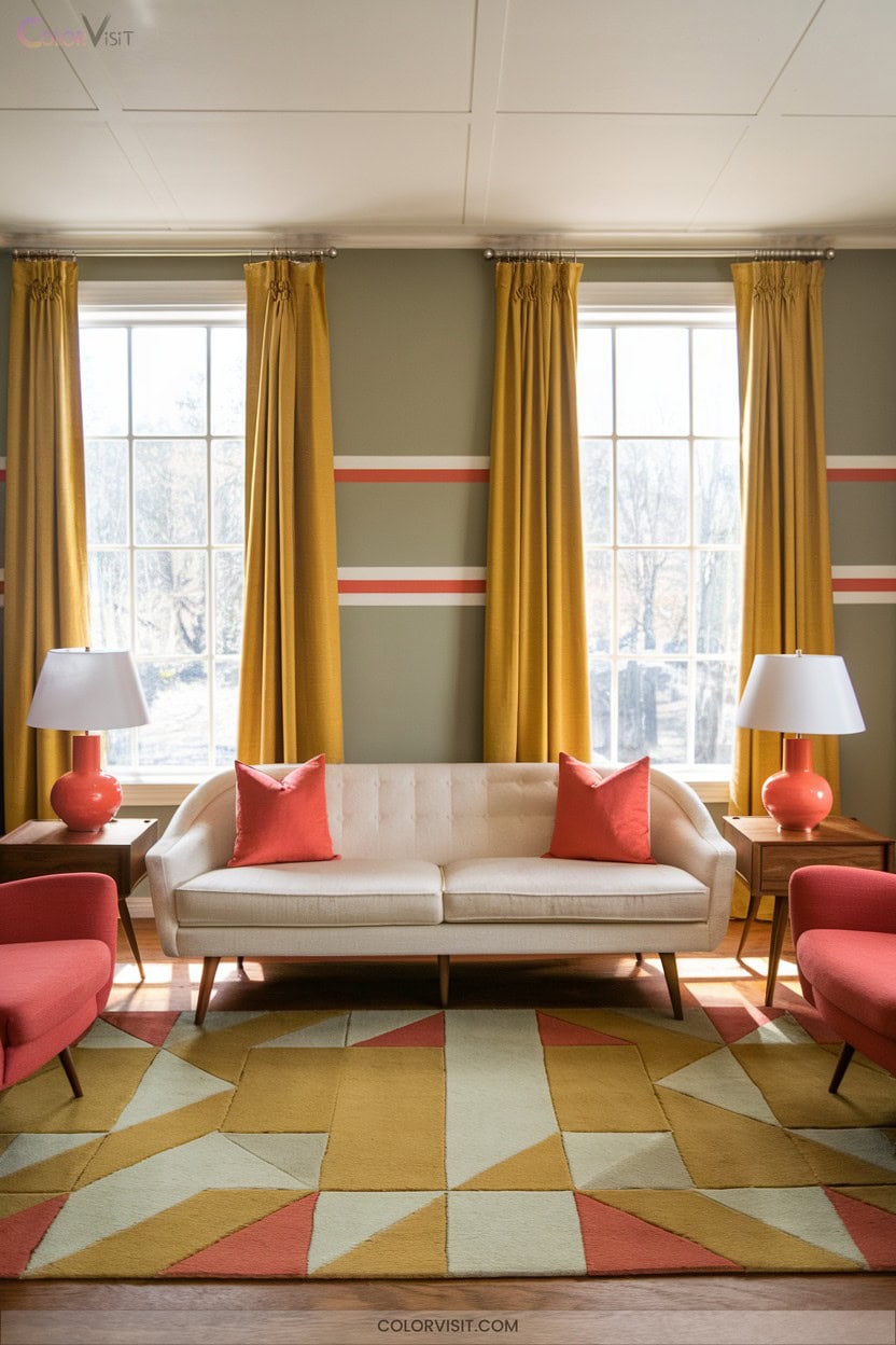
A retro-inspired living room gains instant character with the dynamic interplay of goldenrod and coral—two hues rooted in mid-century nostalgia yet thoroughly modern in their impact.
Harness goldenrod’s earthy optimism and coral’s energetic vibrancy for a curated, mood-enhancing palette.
Layer matte clay paints or glossy ceramics to evoke authentic period charm.
Pair goldenrod curtains with coral velvet ottomans and oatmeal walls for tactile, textural interest, or opt for deep emerald seating to amplify retro-modern contrast.
Use warm white lighting to elevate goldenrod’s richness, and integrate layered illumination with coral accents for dynamic ambiance—bold, adaptable, and on-trend for 2025.
20. Black, Metallic, and Light Wood Contrasts
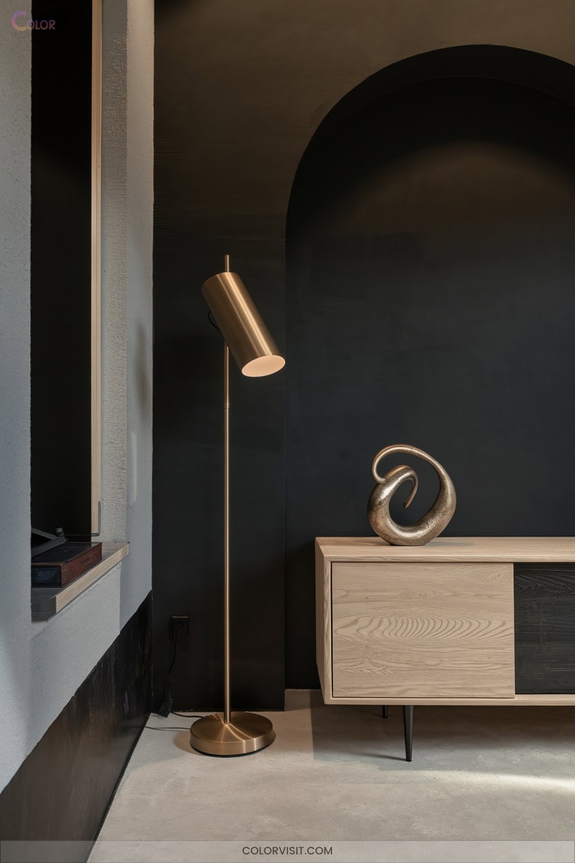
When you introduce black accents into your living room, you instantly ground the space with a bold, contemporary edge that feels distinctly 2025.
Employ raven black in furniture or fixtures to anchor your design, but use it strategically—highlight architectural lines or create dramatic focal points without overwhelming the palette.
Elevate contrast with warm metallics like bronze or gold, layering sophistication via lighting or hardware.
Integrate light wood flooring or furnishings to infuse organic warmth, balancing intensity and texture.
This trio—black, metallic, and light wood—delivers dynamic, harmonious contrast, supporting both minimalist and richly layered interiors that embrace innovation and visual intrigue.
Frequently Asked Questions
How Do I Choose the Right Paint Finish for My Living Room?
You’ll want to select a satin or pearl finish for your living room. These options offer a contemporary balance—satin provides subtle elegance and durability, while pearl introduces a trend-forward shimmer, enhancing color vibrancy and visual interest.
What Lighting Works Best to Enhance Color Palettes?
Did you know 85% of designers layer lighting for ideal color impact? You’ll want to combine ambient, task, and accent lighting, then leverage smart bulbs—dynamic color temperature instantly transforms your palette, amplifying vibrancy and visual intrigue.
How Can I Incorporate Color Trends on a Budget?
You can infuse trending hues by upcycling furniture, layering budget-friendly accents like jewel-toned pillows, and repainting with eco-conscious warm neutrals. Embrace maximalist contrasts, curate thrifted decor, and leverage natural materials for innovative, visually compelling, and cost-effective transformations.
Are These Color Palettes Suitable for Small Living Rooms?
Absolutely, you can confidently use these palettes in small living rooms. Light neutrals amplify space, warm earth tones provide grounding, and jewel or yellow accents inject energy—just balance saturation and scale for a visually innovative, trend-forward environment.
How Do I Coordinate Wall Colors With Existing Furniture?
Start by identifying your furniture’s dominant undertones, then select wall colors that create intentional contrast or seamless monochrome. Don’t forget to test swatches under multiple lighting scenarios—innovative palettes thrive when you amplify visual texture and dynamic interplay. Consider incorporating bold accent walls to enhance the overall aesthetic, drawing attention to key design elements in the room. Additionally, explore transformative wall color ideas that can breathe new life into your space, allowing you to express your personal style while harmonizing with your furniture. Experimenting with unexpected color pairings can also elevate the atmosphere, making each room feel distinct and engaging.
Conclusion
So, you thought picking a living room palette was just about grabbing a paint swatch? In 2025, it’s an art form—curating tactile neutrals, juxtaposing goldenrod with coral, or layering stucco and sandy hues for that “effortlessly curated” look. Ironically, harmony now demands a dash of boldness.
Embrace the paradox: your living room should whisper serenity and shout personality. With these palettes, you’re not just keeping up with trends—you’re setting them, one color story at a time.