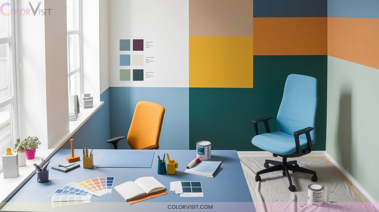
15 Productive Small Office Color Ideas Paint Choices for Focus
Boost focus in your small office with calming blue walls for mental clarity, stress-reducing greens, and sleek navy accents to reinforce professionalism.
Use energizing yellow highlights for creativity, while bold reds spark motivation. Ground your workspace with sophisticated neutrals—beige, taupe, or gray—to minimize distraction, and add earthy olive for balance.
Accent walls with contrasting tones create visual zones. Layer textures, incorporate natural materials, and strategically pair cool and warm hues for peak productivity through targeted color design. Discover advanced combinations next.

1. Calming Blue Walls for Enhanced Concentration
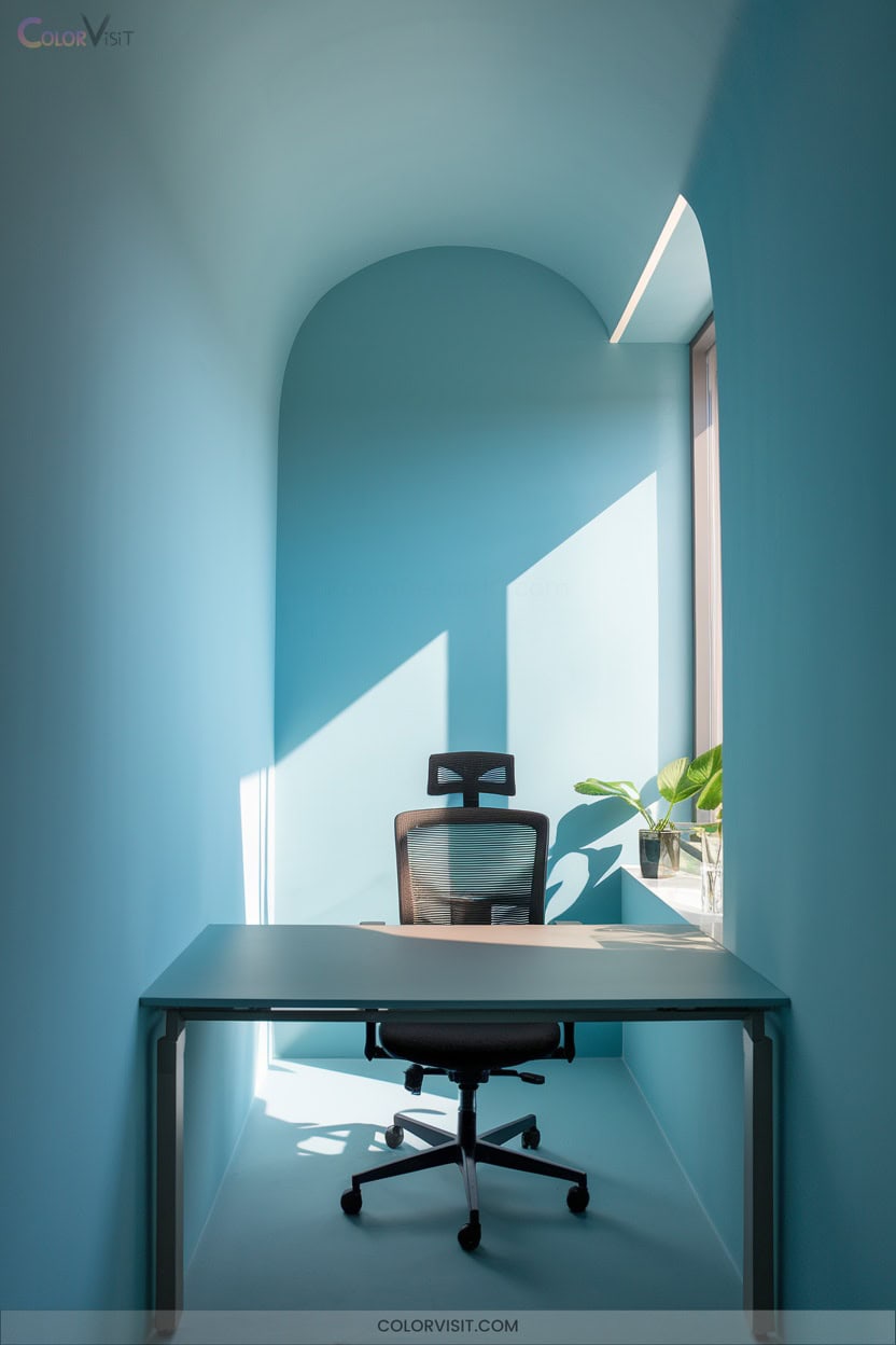
Transform your small office into a focused haven by choosing calming blue walls that enhance concentration and productivity.
Blue’s cognitive benefits—mental clarity, analytical precision, and stress reduction—make it ideal for high-performance workspaces.
Blue inspires sharper thinking, boosts focus, and eases stress—making it the perfect choice for a high-achieving workspace.
Opt for navy with natural wood accents for a modern, grounded look, or soft sky blue to minimize visual strain.
Matte finishes prevent glare, maintaining composure, while white trim amplifies light. Integrate blue ergonomic chairs or textiles for subtle reinforcement.
Combine blue with warm wood or yellow accents to balance the palette and prevent sterility. Prioritize natural light or daylight LEDs to optimize blue’s invigorating yet tranquil effect.
2. Refreshing Green Shades for Stress Reduction
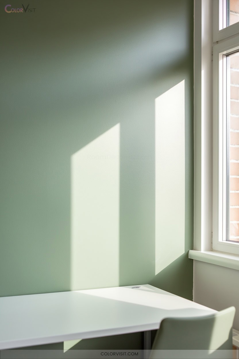
A well-chosen green palette instantly infuses your small office with serenity, grounding the space while reducing daily stress.
Opt for sophisticated emerald or dark green walls to cultivate calm confidence and sustained focus.
Lighter tones, such as mint or olive, deliver a invigorating, uplifting atmosphere that eases anxiety and balances mood.
Integrate botanical prints, potted plants, and green-accented furnishings to reinforce these psychological benefits and evoke natural tranquility.
By leveraging green’s restorative properties, you’ll foster emotional balance and improve productivity in your workspace.
Select shades and accents that align with your professional vision, transforming stress into innovation-driven efficiency.
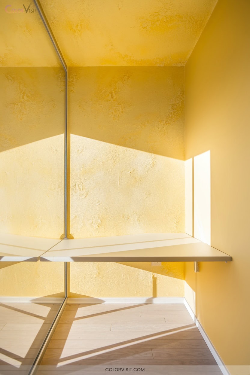
3. Energetic Yellow Accents to Spark Creativity
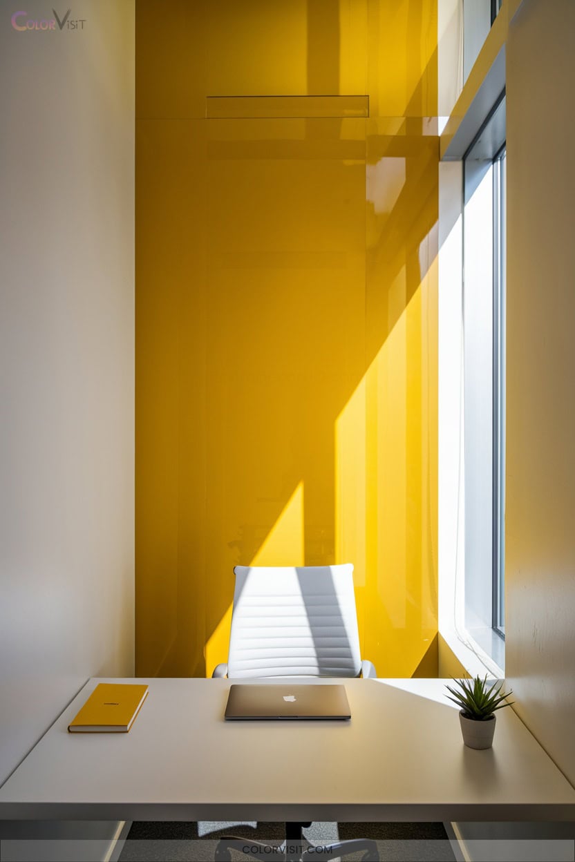
Why not infuse your small office with the invigorating energy of yellow accents?
Strategically placed yellow elements—such as pastel yellow walls, vibrant curtains, or even a yellow desk lamp—stimulate creativity, focus, and optimism.
Yellow naturally boosts productivity and encourages idea-sharing, making it ideal for collaborative or innovation-driven environments.
To avoid overstimulation, pair yellow with neutral backgrounds for visual balance.
Incorporate yellow in décor rather than overwhelming surfaces, ensuring the space feels both warm and professional.
This solution-oriented approach leverages yellow’s psychological benefits, creating a vibrant, energizing workspace that’s conducive to learning, retention, and inventive thinking.
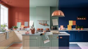
4. Bold Red Highlights for Motivational Energy
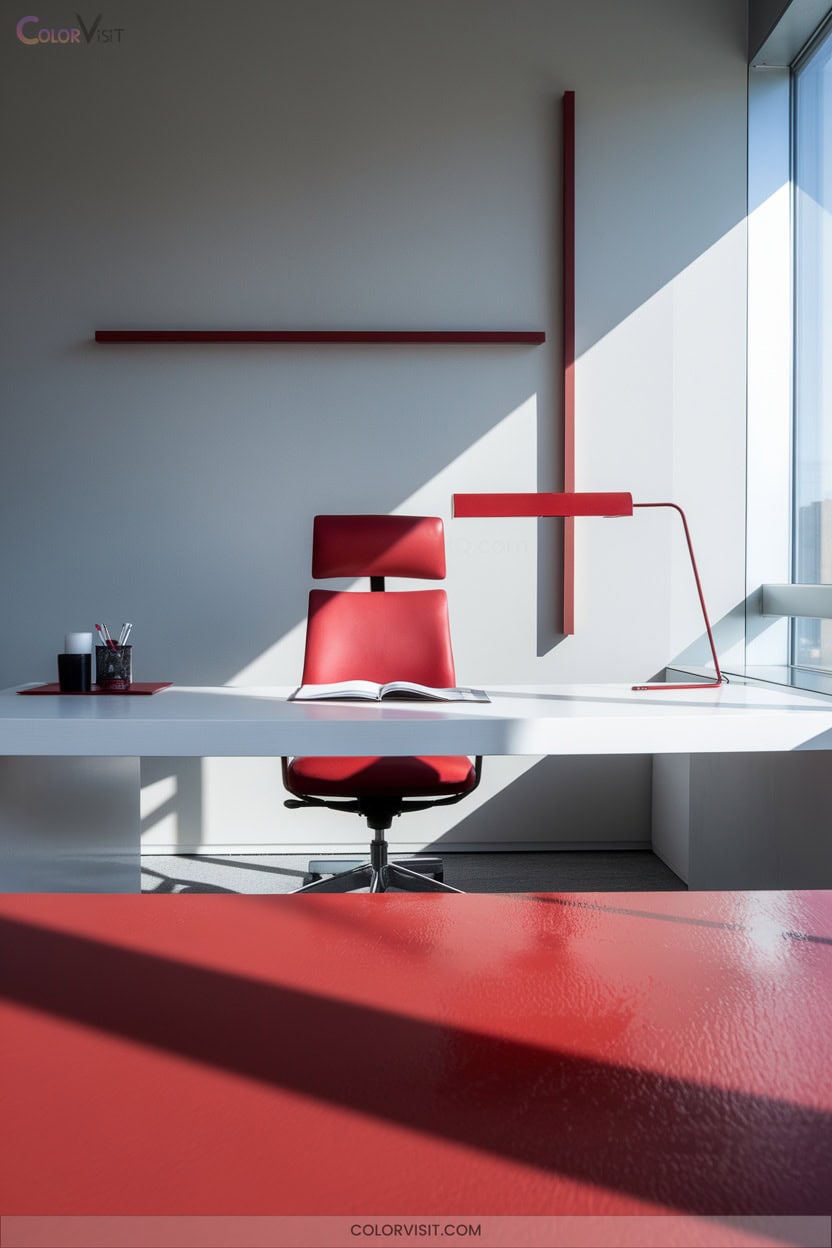
After harnessing the uplifting qualities of yellow, consider how bold red highlights can infuse your small office with motivational energy and dynamic focus.
Integrate red accents through ergonomic chairs, statement lamps, or textured cushions, instantly energizing your workspace.
Red’s psychological impact boosts attention to detail, recall, and confidence—ideal for high-intensity zones like meeting rooms or hallways.
Red invigorates focus and confidence, making it perfect for energizing meeting rooms and hallways in any office space.
Pair bold red with black for dramatic sophistication, then ground the palette with neutral walls to maintain balance.
For innovation-driven teams, red stimulates passion and engagement, transforming ordinary work areas into environments that foster bold ideas, productivity, and sustained motivation without overwhelming sensory input.
5. Sophisticated Neutral Color Palettes for Focus

Sophisticated neutral color palettes create a focused, distraction-free environment that elevates productivity in small offices.
By strategically blending warm, cool, and earthy neutrals, you foster clarity while encouraging visual interest through texture and subtle contrast. Prioritize innovative combinations that balance comfort, cohesion, and modern minimalism.
Consider these key strategies:
- Layer Accessible Beige and Natural Linen for a welcoming, stress-reducing foundation.
- Integrate Repose Gray or Gray Owl to achieve a crisp, task-oriented atmosphere.
- Anchor with chocolate brown or tan accents for grounded, tactile inspiration.
- Enhance depth using varied textures and paint sheens—woven rugs, satin walls, and matte trims.
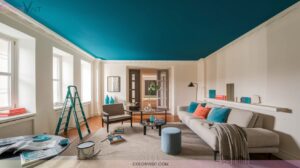
6. Light Blue Hues for Mental Clarity
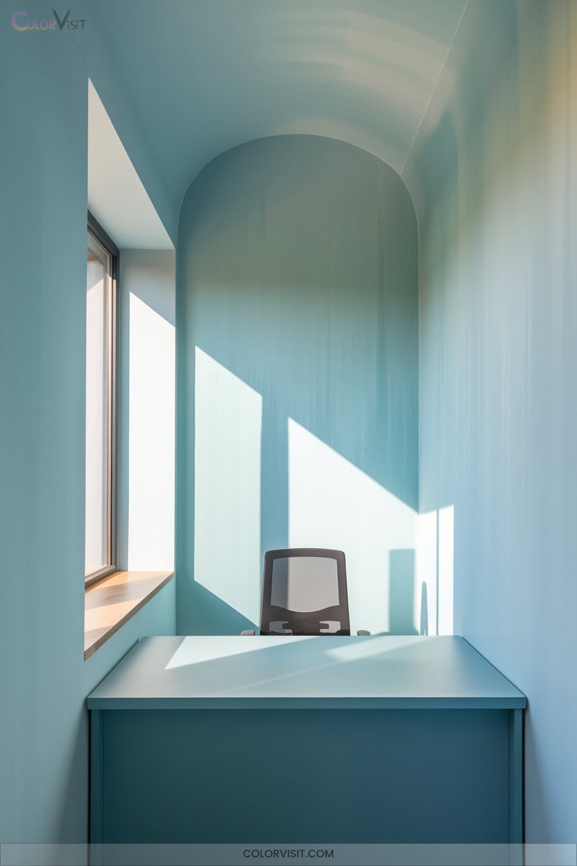
While neutral palettes foster focus and cohesion, light blue hues elevate small office environments by introducing a sense of calm and mental clarity.
You’ll find that light blue reduces stress, supports emotional stability, and enhances cognitive performance—ideal for high-focus work zones.
Light blue calms the mind, steadies emotions, and sharpens focus—making it perfect for productive, high-concentration workspaces.
Use it as a primary wall color to increase perceived space and reinforce a clean, open atmosphere. Pair with neutral accents to maximize tranquility without visual overload. Integrate blue through furniture or decor to motivate creativity and boost productivity.
Harness natural light alongside these hues to amplify openness and clarity, creating an innovative workspace that facilitates focus and efficiency.
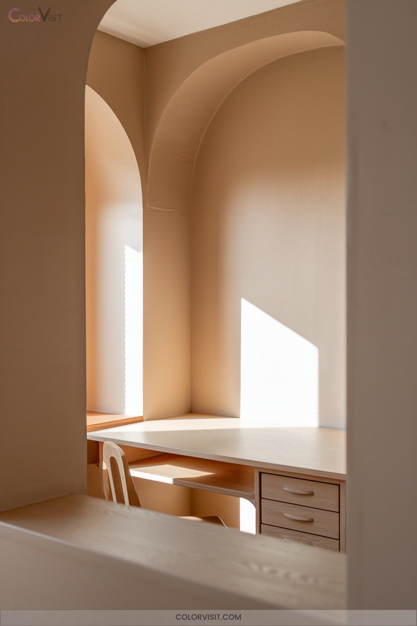
7. Earthy Taupes for a Grounded Workspace
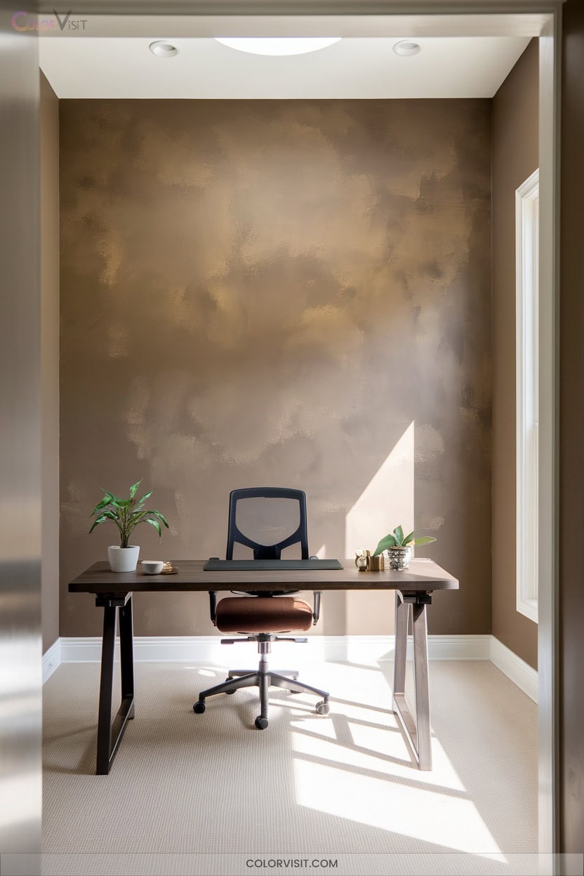
Versatility defines earthy taupes, making them a strategic choice for small office spaces seeking balance and subtle sophistication.
You’ll find that taupe’s blend of brown and gray delivers a neutral backdrop, enhancing both traditional and modern aesthetics without overwhelming your workspace.
To maximize innovation and focus, consider these strategies:
- Pair Benjamin Moore Stone Hearth with natural wood furnishings for a grounded vibe.
- Use Sherwin Williams Analytical Gray to support sleek, contemporary design.
- Integrate taupe-colored textiles for visual continuity and comfort.
- Offset taupe walls with vibrant artwork, maintaining a calm yet inspiring environment geared toward productivity and creative thinking.
8. Soft Sage Greens for Visual Comfort
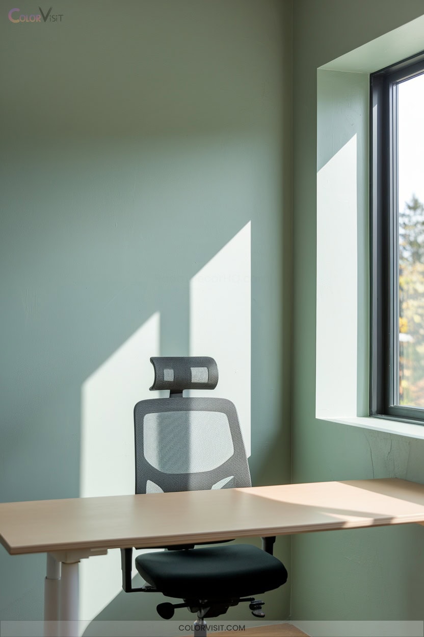
Soft sage greens deliver a strategic blend of tranquility and visual comfort, making them an ideal choice for small offices where productivity and focus matter most.
You’ll find that this nature-inspired tone minimizes visual strain, stabilizes your mood, and promotes sustained concentration throughout the workday.
Integrate soft sage greens on accent walls, cabinetry, or upholstery for cohesive design harmony.
Pair with neutral palettes, metallic accents, or wood tones to elevate sophistication and warmth.
Leading shades like Texas Sage or Soft Fern offer timeless appeal, ensuring your workspace remains fresh and innovative while supporting well-being, stress reduction, and long-term aesthetic satisfaction.
9. Crisp White Backdrops for a Spacious Feel
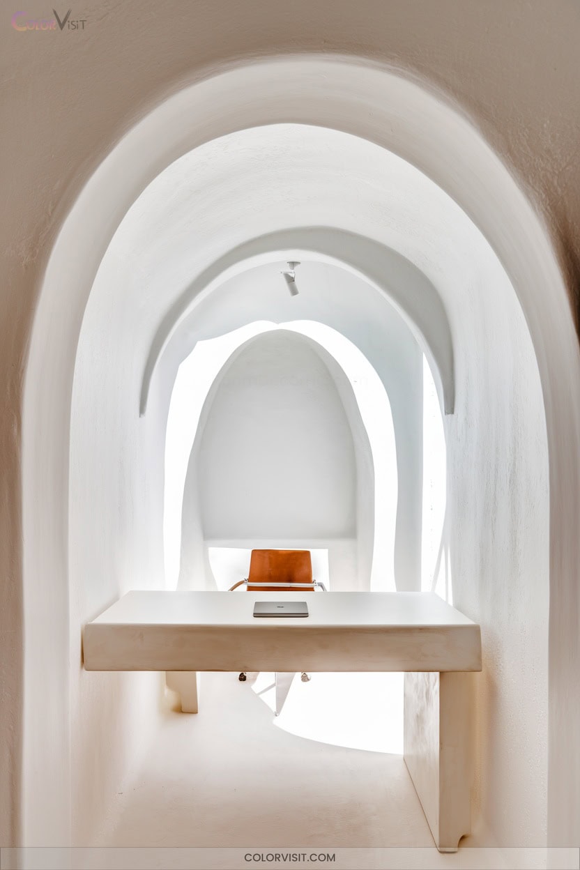
A crisp white backdrop instantly transforms a small office by amplifying light, expanding visual space, and establishing a clean, modern foundation for productivity.
A crisp white backdrop brightens a small office, making it feel larger and setting the stage for modern productivity.
You’ll notice how white surfaces reflect illumination, making your workspace feel open and bright.
White’s neutrality eliminates distractions and maintains a professional, organized image—ideal for digital meetings and video calls.
Its versatility supports any accent colors or design styles, granting you creative flexibility without sacrificing clarity or simplicity.
- Maximizes perceived space and brightness.
- Enhances focus with visual calmness and minimalism.
- Delivers a professional, distraction-free background.
- Provides cost-effective, sustainable, and easy maintenance solutions.
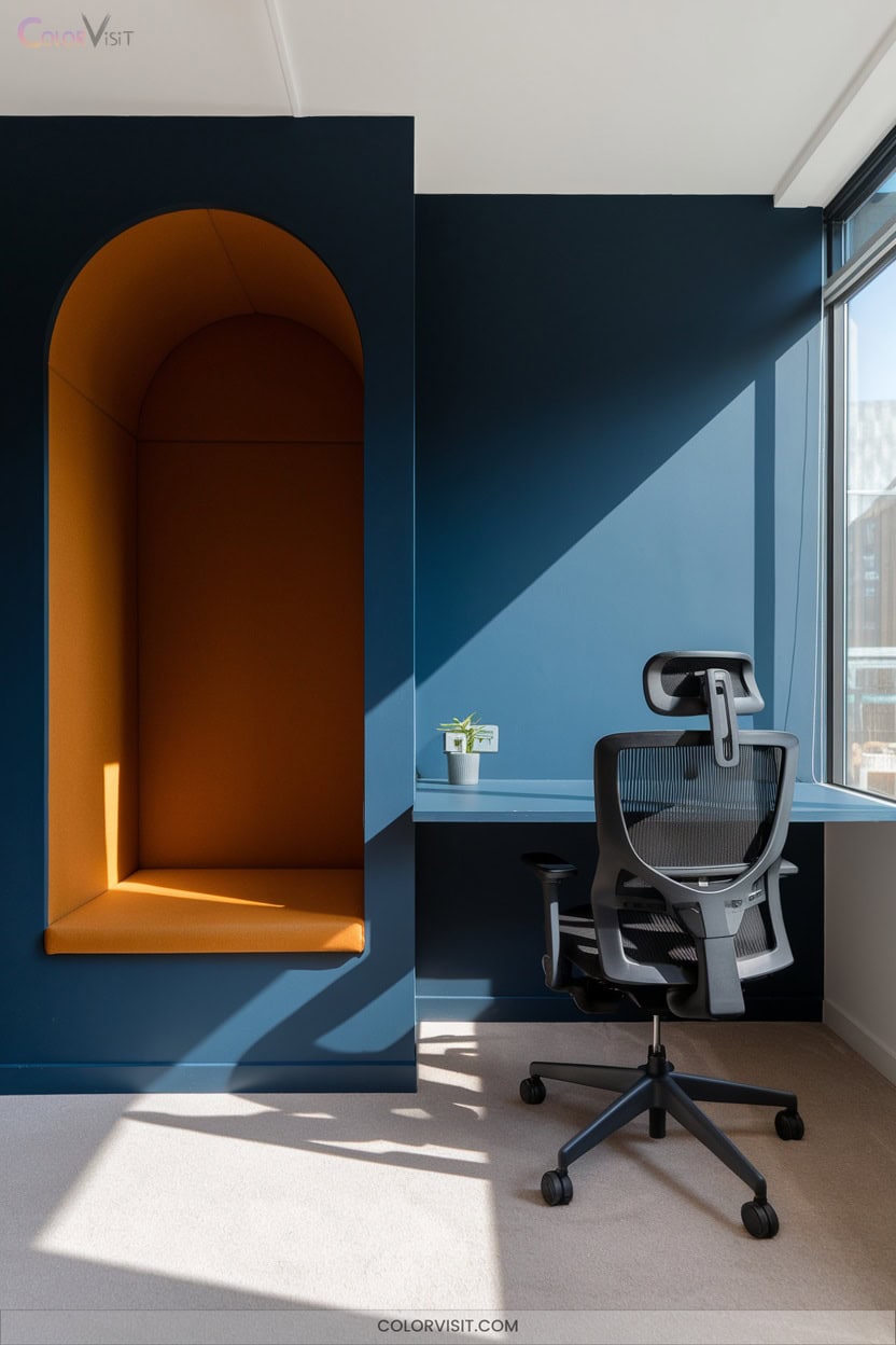
10. Navy Blue Details for Professionalism
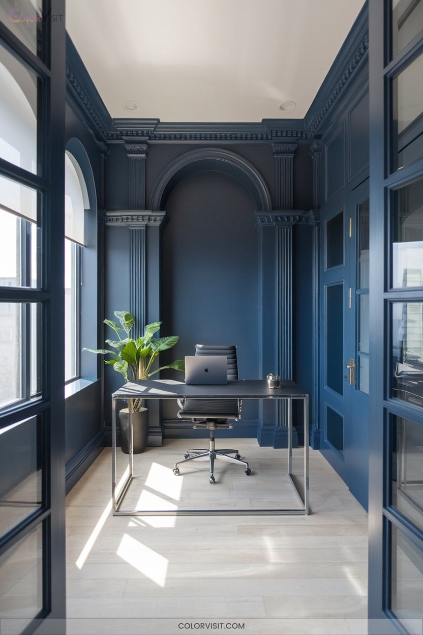
Navy blue injects instant professionalism into small office spaces, establishing an atmosphere of trust and stability that’s essential for focused work.
Choose dynamic shades like Benjamin Moore Hale Navy or Farrow & Ball Hague Blue to elevate your visual hierarchy.
Their neutral undertones adapt to various design schemes, ensuring versatility without overwhelming the space.
Use navy as an accent wall or on cabinetry to foster concentration and reduce visual noise. Pair it with crisp whites or metallic accents for a modern, innovative touch.
Navy’s calming effect supports productivity, while its sophistication signals credibility—crucial for contemporary, forward-thinking work environments.
11. Gentle Beige Walls to Minimize Distraction
While navy blue establishes professionalism and focus, gentle beige walls offer a different approach by minimizing visual distractions and fostering a calm, stable atmosphere. Beige’s neutrality supports mental clarity, making it an ideal backdrop for concentrated work.
To maximize its benefits and prevent monotony, incorporate strategic enhancements:
- Introduce natural elements—add plants or wood textures for biophilic design synergy.
- Optimize lighting—utilize natural light and soft artificial lighting to reduce eye strain and enhance beige’s warmth.
- Apply accent colors—integrate blue or green for subtle stimulation.
- Curate visual interest—use artwork or creative décor to maintain engagement.
12. Muted Olive Tones for Balanced Energy
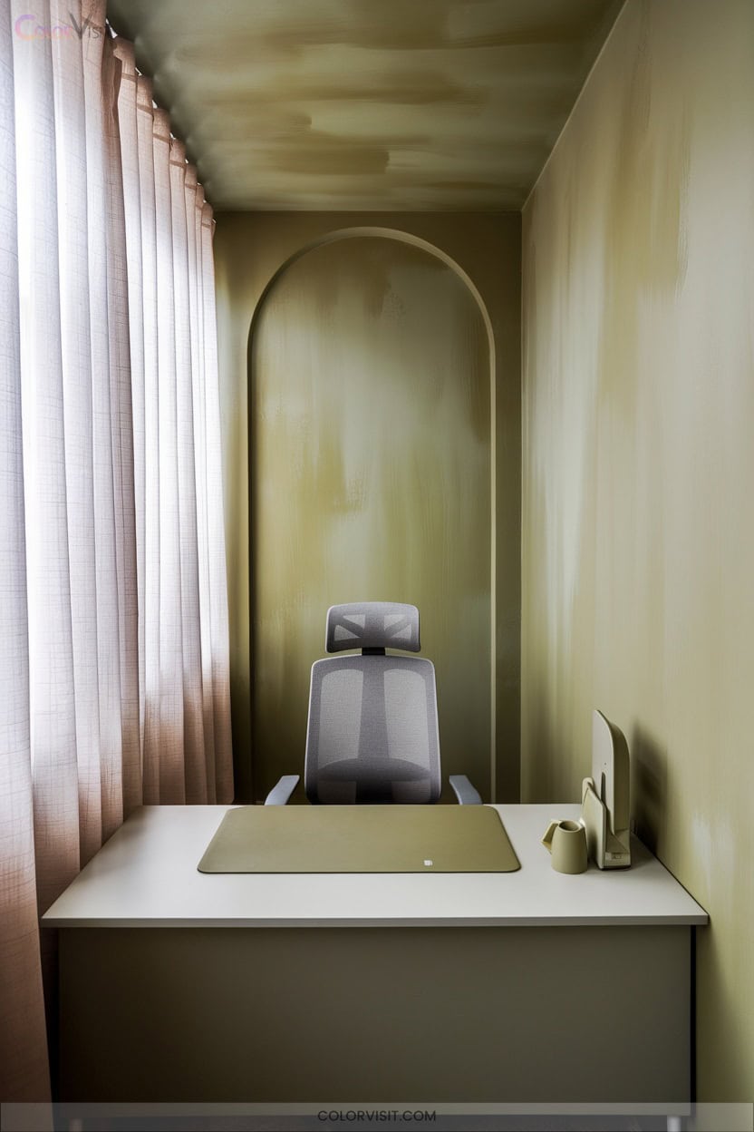
Muted olive tones anchor a workspace with calm sophistication, striking the perfect balance between natural energy and understated professionalism.
This earthy green (#556B2F) reduces visual fatigue, enhances focus, and promotes tranquility—ideal for high-performance environments.
Earthy green (#556B2F) soothes the senses, sharpens concentration, and fosters tranquility—perfect for high-performing, focused workspaces.
Integrate KRASO Silk Touch on walls for a seamless, eco-friendly finish that withstands daily wear.
Pair olive with rust, deep gray, or brass accents to create depth without distraction. Choose olive-upholstered seating against rattan or wood for textural innovation.
With its biophilic appeal and stress-reducing properties, muted olive guarantees your small office remains visually consistent, resilient, and inspiring—empowering you to achieve maximum productivity.
13. Warm Yellow Undertones for Positive Vibes
After establishing a foundation of calm with olive tones, infusing your small office with warm yellow undertones sparks instant positivity and creative momentum.
Yellow radiates optimism, enhances mood, and stimulates innovative thinking—perfect for spaces demanding high energy and creativity.
To optimize impact, pair yellow with neutral backgrounds and leverage natural light, ensuring visual balance and avoiding fatigue.
Integrate yellow subtly through textiles, furniture, or decor for dynamic yet harmonious results.
- Boost workplace morale with yellow’s mood-enhancing properties.
- Stimulate creativity and innovation in brainstorming zones.
- Amplify natural light using yellow undertones.
- Prevent overwhelm by balancing with neutral tones.
14. Accent Walls in Contrasting Colors for Zoning
Curious how to define distinct work zones in a compact office without sacrificing style? Leverage accent walls in contrasting colors to create clear spatial boundaries and enhance organizational flow.
Use shades a few steps lighter or darker than your primary walls, or integrate vibrant hues for a bold focal point—just maintain balance with neutral tones.
Contrasting walls can delineate collaboration spaces, frame presentation areas, and even reinforce your corporate branding by echoing logo colors. Opt for geometric patterns, metallic finishes, or textured surfaces to emphasize innovation.
This strategy maximizes visual impact, supports efficient zoning, and remains flexible for future updates.
15. Combining Cool and Warm Tones for Task-Specific Areas
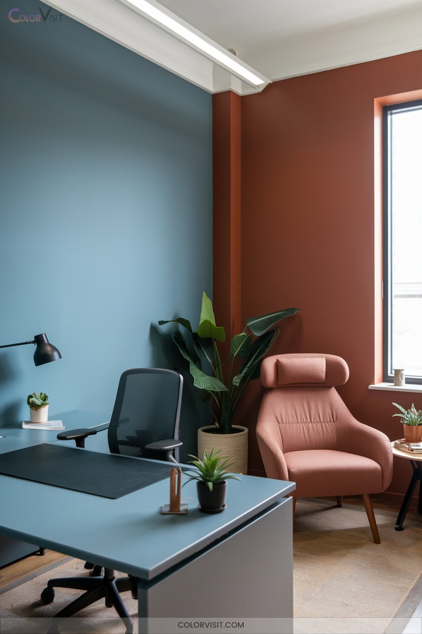
Color synergy transforms a small office into a high-functioning, visually engaging environment by purposefully mixing cool and warm tones for task-specific zones.
You’ll maximize productivity and comfort by strategically deploying color psychology and material contrasts.
Integrate the 80/20 ratio for tonal balance, and use targeted design elements to delineate and energize each workspace.
- Apply warm-neutral walls and cool-tone flooring to anchor the room while subtly energizing focus areas.
- Select key furniture—like cool gray desks or warm cognac chairs—to define individual versus collaborative zones.
- Layer lighting with mixed-temperature bulbs for ideal task illumination.
- Incorporate tactile accents for visual and sensory depth.
Frequently Asked Questions
How Does Office Lighting Affect the Perception of Paint Colors?
You’ll notice office lighting dramatically alters paint color perception—natural light shifts hues throughout the day, while LED or fluorescent types can enhance or distort tones. Optimize lighting temperature and CRI to achieve accurate, vibrant, and innovative color presentation.
Are Certain Paint Finishes Better for Small Office Maintenance?
It’s no coincidence that you’ll notice smoother upkeep when you choose satin or semi-gloss finishes—they resist stains and clean easily. Embrace these innovative solutions for streamlined maintenance, ensuring your office stays sharp and forward-focused with minimal effort.
Can Paint Color Impact Virtual Meeting Backgrounds?
Absolutely, your paint color directly influences virtual meeting backgrounds by enhancing visual clarity, minimizing distractions, and projecting professionalism. Choose rich navies, elegant creams, or cool grays to optimize on-camera presence, ensuring your background supports focus and innovative engagement.
How Often Should Office Walls Be Repainted for Optimal Effect?
Ever wonder why your office feels less inspiring lately? You should repaint interior walls every 3-5 years, prioritizing high-traffic zones for touch-ups. Proactive repainting sustains visual impact, boosts morale, and guarantees your workspace always drives innovation.
Do Eco-Friendly Paints Offer the Same Color Vibrancy as Traditional Ones?
You’ll find that today’s eco-friendly paints deliver exceptional color vibrancy using advanced zero-VOC and mineral pigments. Brands like ECOS and Clare match traditional paints in intensity, so you won’t sacrifice visual impact while prioritizing innovation and sustainability.
Conclusion
When you choose the right office colors, you’re painting the path for productivity and focus. Picture each shade as a strategic tool in your workspace toolkit—guiding, invigorating, or calming your mind as needed.
Don’t let your office walls be silent; let them speak in hues that support your goals. By leveraging these color strategies, you’re not just decorating—you’re engineering an environment where focus flourishes and creativity takes center stage, every single workday.