9 Best Pantone Color Guides for 2026 (Designers’ Top Picks)
You need the Pantone Color Bridge Guide Coated (GG6103B) and GG6104B for spot-to-CMYK precision across media. Grab GP1601B and GP1601 for exact ink matching on coated and uncoated stock.
Use GP5101C for extended gamut CMYK workflows. Pick up GG1504C for vibrant neons and soft pastels.
Choose GP6102B or GP6102A for portable, cross-format accuracy. Rely on FHIP110C for fashion and interiors consistency.
Trust these nine guides to keep your color game flawless—there’s more where that came from.


Quick Overview
- Pantone Formula Guide Coated & Uncoated (GP1601B) is essential for spot color accuracy with ink formulas and dual-finish swatches.
- Pantone Color Bridge Coated (GG6103B) delivers reliable CMYK, RGB, and HTML values for seamless print-to-digital color matching.
- PANTONE Pastels & Neons Guide (GG1504C) offers 210 specialty hues, ideal for designs requiring soft tones or fluorescent vibrancy.
- FHI Guide Set (FHIP110C) supports fashion and interior designers with 2,801 curated colors and cross-material FHI TPG consistency.
- CMYK Guide Set (GP5101C) provides G7-calibrated process colors for extended gamut printing, optimized for modern press workflows.
| Pantone Color Bridge Guide Coated (GG6103B) | 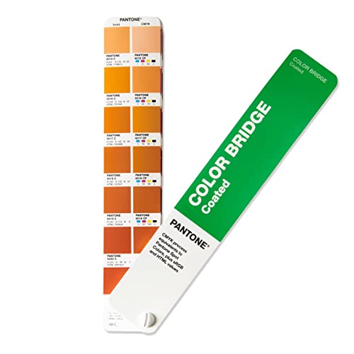 | Best Color Conversion | Format: Handheld fan deck | Color Type: Spot + Process (CMYK, RGB, HTML) | Substrate: Coated | VIEW LATEST PRICE | Read Our Analysis |
| Pantone Formula Guide Coated & Uncoated (GP1601B) |  | Essential Standard | Format: Handheld fan deck | Color Type: Spot (Pantone Solid) | Substrate: Coated & Uncoated | VIEW LATEST PRICE | Read Our Analysis |
| Pantone Formula Guide for Coated & Uncoated |  | Most Comprehensive | Format: Compact fan deck | Color Type: Spot (Pantone Solid) | Substrate: Coated & Uncoated | VIEW LATEST PRICE | Read Our Analysis |
| Pantone CMYK Guide Set (GP5101C) |  | Process Printing Pro | Format: Two guides (Coated + Uncoated) | Color Type: Process (CMYK only) | Substrate: Coated & Uncoated | VIEW LATEST PRICE | Read Our Analysis |
| PANTONE Pastels & Neons Guide (GG1504C) |  | Specialty Colors Pick | Format: Compact fan deck | Color Type: Specialty (Pastels & Neons) | Substrate: Coated & Uncoated | VIEW LATEST PRICE | Read Our Analysis |
| Pantone FHIP110C Fashion Home Color Guide Set |  | Cross-Industry Essential | Format: Two-volume fan deck set | Color Type: FHI TPG (Textile & Hard Goods) | Substrate: Paper (lacquer stripe) | VIEW LATEST PRICE | Read Our Analysis |
| Pantone GG6104B Color Bridge Guide Uncoated Multi-colour |  | Ultimate Portable Reference | Format: Chip card / fan deck | Color Type: Spot + Process (CMYK, RGB, HTML) | Substrate: Uncoated | VIEW LATEST PRICE | Read Our Analysis |
| Pantone Color Bridge Guide Set (GP6102B) |  | Top Conversion Set | Format: Handheld fan decks | Color Type: Spot + Process (CMYK, RGB, HTML) | Substrate: Coated & Uncoated | VIEW LATEST PRICE | Read Our Analysis |
| Pantone Color Bridge Set GP6102A | 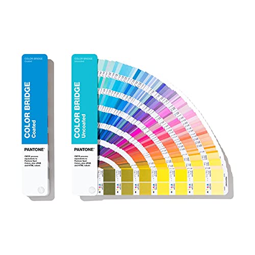 | Designer’s Digital Bridge | Format: Two compact fan decks | Color Type: Spot + Process (CMYK, RGB, HTML) | Substrate: Coated & Uncoated | VIEW LATEST PRICE | Read Our Analysis |
More Details on Our Top Picks
Pantone Color Bridge Guide Coated (GG6103B)
If you’re a designer who needs accurate color conversion, the Pantone Color Bridge Guide Coated (GG6103B) is your go-to tool for matching Pantone Spot colors to CMYK, HTML, and RGB values with precision. You’ll use its 2,359 total colors—plus 224 new graphics shades—to align spot colors with process and digital outputs.
Held in a handy fan deck on 100 lb coated paper, it shows how closely standard CMYK printing replicates Pantone colors. You’ll rely on the Lighting Indicator page to evaluate hues under correct lighting.
Essential for brand, packaging, and digital design, this guide keeps your work consistent across media.- Format:Handheld fan deck
- Color Type:Spot + Process (CMYK, RGB, HTML)
- Substrate:Coated
- Total Colors:2,359
- Digital Values:CMYK, RGB, HTML
- Lighting Indicator:Yes
- Additional Feature:224 new trend colors
- Additional Feature:Side-by-side CMYK comparisons
- Additional Feature:Ideal for digital workflows
Pantone Formula Guide Coated & Uncoated (GP1601B)
Choosing the Pantone Formula Guide Coated & Uncoated (GP1601B) means you’re prioritizing spot-on color accuracy for every stage of your design workflow—from initial concept to final print. You’ll match colors confidently using fan decks printed on 100 lb coated and 80 lb uncoated stock, mimicking real-world results.
The portable design fits easily in your bag, so you can check hues on-site or at press checks. A built-in lighting indicator guarantees you’re viewing colors under proper conditions.
Whether for branding, packaging, or marketing, this guide is your go-to for consistent, reliable color communication across all projects.- Format:Handheld fan deck
- Color Type:Spot (Pantone Solid)
- Substrate:Coated & Uncoated
- Total Colors:2,139 (implied standard range)
- Digital Values:Not specified
- Lighting Indicator:Yes
- Additional Feature:Ink formulations for each color
- Additional Feature:Chromatic color arrangement
- Additional Feature:Essential for brand consistency
Pantone Formula Guide for Coated & Uncoated
The Pantone GP1601 Formula Guide for Solid Coated & Uncoated is your go-to resource if you’re a designer in graphics, fashion, or home and interiors seeking precision and relevance. It displays 2,161 market-driven spot colors, including 294 new graphics shades that reflect current trends.
You’ll find each color on both coated and uncoated stock, with two compact fan decks for easy handling and on-the-go use. Colors are arranged chromatically, helping you spot harmonies fast, and new pages are clearly marked at the corners.
Every shade comes with its number and ink formula, so you’re always printing with accuracy. This guide keeps your work consistent and professional across materials.- Format:Compact fan deck
- Color Type:Spot (Pantone Solid)
- Substrate:Coated & Uncoated
- Total Colors:2,161
- Digital Values:Ink formulation only
- Lighting Indicator:Not specified
- Additional Feature:294 new graphics colors
- Additional Feature:New colors marked at corners
- Additional Feature:Compact dual fan deck set
Pantone CMYK Guide Set (GP5101C)
Boost your 4-color process printing precision with the Pantone CMYK Guide Set (GP5101C)—your go-to resource for designers and printers who demand accurate, G7-calibrated colour matching in coated and uncoated finishes. You’ll find over 1,879 coated and 1,653 uncoated extended gamut CMYK colours, each lacking close Pantone Spot equivalents (≥ 2.0 ΔE 2000).
These aren’t spot colours—you’re using them strictly for 4-color process printing. The guides meet G7-calibrated CRPC standards, so what you see is what prints.
Plus, you can seamlessly integrate them into your digital workflow with Pantone Connect—pick, save, and share colour data across your design tools with confidence.- Format:Two guides (Coated + Uncoated)
- Color Type:Process (CMYK only)
- Substrate:Coated & Uncoated
- Total Colors:1,879+ Coated; 1,653+ Uncoated
- Digital Values:CMYK only
- Lighting Indicator:Not specified
- Additional Feature:G7-calibrated for press accuracy
- Additional Feature:Extended gamut process colors
- Additional Feature:Pantone Connect compatible
PANTONE Pastels & Neons Guide (GG1504C)
You’re getting 210 standout specialty colors—154 soft pastels and 56 electrifying neons—in a sleek, portable fan deck designed for creatives who demand versatility and precision. You’ll flip through coated swatches first, then uncoated, all in chromatic order for smooth selection.
Each shade includes its number and ink formula, so you can match exactly what you need. The back index lets you find any color fast.
You’re using this guide for branding, packaging, and print—where soft or bold makes all the difference. It works alongside your Formula Guide and syncs with design software, so you stay in control from sketch to final output.- Format:Compact fan deck
- Color Type:Specialty (Pastels & Neons)
- Substrate:Coated & Uncoated
- Total Colors:Over 200
- Digital Values:Available in software
- Lighting Indicator:Not specified
- Additional Feature:154 pastels, 56 neons
- Additional Feature:Index for quick lookup
- Additional Feature:Complements main color guides
Pantone FHIP110C Fashion Home Color Guide Set
Choosing Pantone’s FHIP110C Fashion, Home + Interiors Colour Guide Set puts 2,801 meticulously curated colours at your fingertips, making it the go-to resource for designers and product developers working across textiles, hard home products, and fashion accessories. You’ll love the two compact fan decks with chromatic arrangement, offering seven easy-to-compare shades per page.
Each lacquer-coated paper swatch measures 1.6” x 0.8” and includes a number and name. The set adds 175 new hues from the Dualities collection, and FHI TPG colours guarantee consistency across materials.
You can confidently match textiles to ceramics, paint, leather, or cosmetics.- Format:Two-volume fan deck set
- Color Type:FHI TPG (Textile & Hard Goods)
- Substrate:Paper (lacquer stripe)
- Total Colors:2,801
- Digital Values:Not specified
- Lighting Indicator:Not specified
- Additional Feature:2,801 FHI colors included
- Additional Feature:Matches textile and hard goods
- Additional Feature:Color names with numbers
Pantone GG6104B Color Bridge Guide Uncoated Multi-colour
If you work across print and digital design, the Pantone GG6104B Color Bridge Guide Uncoated is your go-to tool for matching Pantone Spot Colors to CMYK, RGB, and HTML values with accuracy. You’ll love its side-by-side comparisons of 2,359 spot colors and their closest CMYK matches on 80 lb uncoated paper.
With 224 new market-relevant hues up front and chromatic organization, finding the right shade is fast. The lighting indicator guarantees proper evaluation, while RGB, HTML, and CMYK values help you manage color seamlessly across media.
Compact and portable, it’s perfect for on-the-go designers who demand precision.- Format:Chip card / fan deck
- Color Type:Spot + Process (CMYK, RGB, HTML)
- Substrate:Uncoated
- Total Colors:2,359
- Digital Values:CMYK, RGB, HTML
- Lighting Indicator:Yes
- Additional Feature:Full cure time specified
- Additional Feature:UPC/ASIN listed per color
- Additional Feature:Amazon return guarantee
Pantone Color Bridge Guide Set (GP6102B)
Get exact color conversions on the go with the Pantone Color Bridge Guide Set (GP6102B), the only tool that delivers CMYK, HTML, and RGB values for every Pantone Spot color—making it ideal for designers who need accurate digital and print matching. You’ll find 224 new, trend-forward graphics colors for fresh inspiration.
It includes coated and uncoated fan decks, printed on 100# and 80# paper stock for realistic evaluation. The built-in lighting indicator shows when conditions are right for precise color decisions.
With its compact, handheld design, you can confidently match and present colors anywhere, ensuring consistency from sketch to screen to print.- Format:Handheld fan decks
- Color Type:Spot + Process (CMYK, RGB, HTML)
- Substrate:Coated & Uncoated
- Total Colors:2,359 (implied)
- Digital Values:CMYK, RGB, HTML
- Lighting Indicator:Yes
- Additional Feature:Coated and uncoated versions
- Additional Feature:224 new trend colors
- Additional Feature:Industry-standard conversion tool
Pantone Color Bridge Set GP6102A
When you need a reliable, portable solution for matching Pantone Spot colors to CMYK equivalents, the Pantone Color Bridge Set GP6102A is your go-to choice—especially if you’re a designer working across print and digital media. You’ll compare 2,139 Spot colors with their closest CMYK matches, plus get RGB, HTML, and CMYK values for accurate digital use.
With 294 new trend colors and coated/uncoated swatches, you’re equipped for print, web, video, or animation. The compact fan decks make color selection quick and portable, ideal for remote work.
You’ll stay consistent across platforms and communicate color clearly—because accuracy shouldn’t depend on where you work.- Format:Two compact fan decks
- Color Type:Spot + Process (CMYK, RGB, HTML)
- Substrate:Coated & Uncoated
- Total Colors:2,139
- Digital Values:CMYK, RGB, HTML
- Lighting Indicator:Not specified
- Additional Feature:294 new trend colors
- Additional Feature:Work-from-home friendly design
- Additional Feature:Latest edition release
Factors to Consider When Choosing Pantone Color Guides
You’ll want to match your Pantone guide to your project’s purpose—print, fashion, or digital work all need different options. Make sure the guide covers the right color range, paper stock, and includes digital values if you’re working across mediums.
Think about portability too, since format affects how easily you can use it on the go.
Purpose and Application
Though color choice may seem straightforward, picking the right Pantone guide hinges on your specific application. You need to identify whether you’re working in spot-color printing, CMYK process, digital/web design, or textiles—each requires different color data.
If you’re matching physical inks, go for spot formulation guides with exact ink recipes. For digital or cross-media work, use bridge guides with CMYK, RGB, and HTML values.
Match your guide to the substrate—coated, uncoated, fabric, or hard surfaces—affecting how color appears and is proofed. Consider your workflow: grab a portable fan deck for on-site decisions or a larger format for studio use.
Don’t overlook lighting—choose guides with indicators or viewing conditions to make certain accurate assessment. Your guide should fit how and where you work, not the other way around.
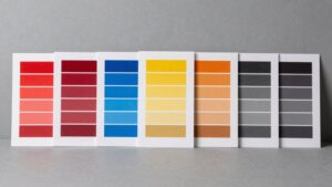
Color Range and Options
Picking the right Pantone guide means more than just matching ink to paper—it starts with understanding the full range of colors available and how they align with your design needs. You need to check how many spot and process colors the guide offers, since palettes can vary from hundreds to thousands.
Make sure it includes both coated and uncoated finishes to see how color shifts across surfaces. If your work spans print and digital, pick a guide that shows spot colors alongside CMYK, RGB, and hex values for consistency.
Look for specialty ranges like neons or pastels if your projects demand bold or soft hues outside the standard gamut. Finally, choose a guide with colors organized chromatically and indexed numerically so you can quickly find and compare shades.
A well-structured layout saves time and sharpens accuracy.
Paper Stock Type
Since the paper’s finish directly impacts how colors appear, you’ll want to match your Pantone guide to the actual stock you’re using. Coated paper, usually heavier at around 100 lb, gives a glossy, vibrant result with sharp detail because it absorbs less ink.
If you’re printing on uncoated stock—typically lighter, like 80 lb—colors look softer and flatter due to higher ink absorption. Choosing the correct paper type in your guide minimizes metamerism and guarantees accurate press matching.
Special finishes like matte, silk, or lacquer alter gloss and light reflection, changing how uniform and saturated colors seem, even with identical ink. Texture also plays a role—smooth vs.
rough surfaces affect perceived color consistency. Don’t forget lighting: coated sheets can glare under direct light, while uncoated ones diffuse it.
Always evaluate under the final viewing condition to avoid surprises.
Digital Value Availability
When translating your Pantone spot colors across mediums, make sure the guide includes digital values like CMYK, RGB, and hex for every swatch so you can maintain consistency from print to screen. Check that all key color models are covered—CMYK for print, RGB and hex for digital—to match your output needs.
Look for notes on conversion accuracy, like delta E values, so you know when a spot-to-process match is close or a compromise. Confirm whether digital values are calibrated to a standard profile or just starting points, as uncalibrated ones may need extra color adjustments.
Verify that the full range of swatches you’re using—especially neons, pastels, or extended-gamut colors—has reliable digital equivalents. Not all guides offer complete digital coverage, so pick one that supports your project’s scope without gaps.
Portability and Format
For quick color checks on location, go with a handheld fan deck that slips into your bag and stays handy. You’ll want a compact format that balances size and usability, especially when moving between jobs or meeting clients.
Choose lighter paper stock if you’re always on the go, but opt for heavier coated pages if durability matters more. If you work with both coated and uncoated finishes, grab a dual-guide set—it saves space and cuts down on clutter.
Flip through layouts to make sure colors are easy to view and compare fast, with clear chip spacing and readable labels. Guides with fewer swatches per page help you spot shades quickly.
And when lighting varies, use compact guides with built-in indicators so you can check color accuracy anywhere. Smart formatting means you’re never guessing when matching tones outside the studio.
New Color Additions
You’ve got your compact guide in hand, ready for on-the-go decisions, but don’t overlook what’s inside—especially the new colors. Check how many hues were added—dozens or hundreds—so you know if it truly expands your palette.
See if new shades target your field, like fashion, graphics, or interiors, ensuring relevance. Find out whether they’re woven into the main collection or grouped separately; integrated layouts make matching and comparing easier.
Confirm each new color includes full technical data—CMYK, RGB, and ink formulas—so you can apply them accurately across digital and print. Consider whether additions reflect fleeting seasonal trends or enduring staples; that’ll shape how long your guide stays current.
Don’t just grab the latest version—ask if the new colors you need are actually usable. A smart update doesn’t just add color—it adds value.
Lighting for Accuracy
While selecting Pantone color guides, don’t overlook lighting—it directly affects how colors appear. Use D50 lighting (5000K) or cool white light to evaluate prints, since different color temperatures alter hue and saturation.
Keep illumination uniform and set it to 2000–3000 lux for detailed checks, or 1000 lux for routine reviews to limit metamerism and eye strain. Always assess colors under the same light each time, and include a control sample or lighting indicator to guarantee consistency.
Avoid mixing light sources—like sunlight with fluorescent or LED—because blended spectra distort color and mask metameric issues. Let your lamps warm up for 15–30 minutes and let samples acclimate to the room before judging.
This prevents shifting appearances and guarantees reliable results. Proper lighting isn’t optional—it’s essential for accurate, repeatable color decisions in your 2026 workflow.
Frequently Asked Questions
Can I Use Pantone Guides for Digital Design Projects?
Yes, you can use Pantone guides for digital design—think of them as your color compass in a storm of pixels. You’re matching hues, not paint, but they keep your vision steady and true across screens.
Are Pantone Color Guides Recyclable After Use?
You can recycle Pantone color guides after use, but you’ll need to check local recycling rules first. They’re made of mixed materials, so not all facilities accept them—when in doubt, contact your recycler directly or look for special e-waste or print waste programs nearby.
Do Pantone Guides Include Metallic or Fluorescent Colors?
Yes, they do include metallic and fluorescent colors. You’ll find dedicated sections for them, so you can easily grab those standout shades when you need something bold or flashy in your designs.
They’re right there for you to use.
How Often Are Pantone Color Guides Updated?
You update Pantone guides yearly, yet some revisions surprise you mid-cycle. Old standards stay familiar, but new shades emerge fast—vibrant, urgent, unexpected.
You adapt quickly, flipping pages, matching trends, staying sharp in a world where color waits for no one.
Can I Mix Pantone Colors Without a Formula Guide?
you can mix pantone colors without a formula guide, but you won’t get accurate results. without the guide, you’re guessing, and consistency suffers.
for precise matches, always use the official guide. it saves time, reduces errors, and assures color accuracy every time you mix.
Conclusion
You’re the artist holding a prism to the light, each guide a facet reflecting your vision. These Pantone books aren’t just tools—they’re lanterns lighting the path from idea to impact.
Let them guide your hand, turn whispers of color into bold statements. In every swatch, a world waits.
Choose wisely, create fiercely, and let your palette speak louder than words. The future’s bright—paint it.