7 Best Pantone Formula Guides for 2026 (True Color Accuracy)
You need the Pantone Formula Guide Coated & Uncoated GP1601B for spot-on color matching on different stocks. Grab the Color Bridge GG6103B for CMYK, RGB, and HTML conversions.
Trust the G7-calibrated CMYK Guide Set GP5101C for process accuracy. Use the Solid Guide Set GP1605B when you need metallics, neons, and pastels.
The Formula Guide & Color Book GP1601A gives you new hues and precise ink formulas. Reach for the Pastels & Neons Guide GG1504C for soft or bright specialty colors.
The Essentials Set GPG301B bundles everything you’ll use most. Each guide supports true color with calibrated paper, lighting checks, and digital integration—knowing which one fits your workflow makes all the difference.

Quick Overview
- Pantone Formula Guide Coated & Uncoated GP1601B ensures true color accuracy with side-by-side coated and uncoated swatches on 100 lb and 80 lb paper.
- Lighting indicator pages in all guides help verify D50 viewing conditions to prevent metamerism and ensure consistent color evaluation.
- G7-calibrated CMYK Guide Set GP5101C delivers extended-gamut process color accuracy aligned with CRPC printing standards.
- Pantone Solid Guide Set GP1605B includes 2,390 solid colors with ink formulas, metallics, pastels, and neons for comprehensive spot color matching.
- Coated 100 lb and uncoated 80 lb paper stocks replicate real-world print results, enabling accurate substrate-based color decisions.
| Pantone Formula Guide Coated & Uncoated GP1601B |  | Best Overall | Format: Handheld fan deck | Color Type: Spot colors | Paper Stock: 100 lb coated, 80 lb uncoated | VIEW LATEST PRICE | Read Our Analysis |
| Pantone Color Bridge Guide Coated (GG6103B) | 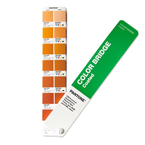 | Professional Grade | Format: Handheld fan deck | Color Type: Spot-to-CMYK equivalent | Paper Stock: 100 lb coated (148 gsm) | VIEW LATEST PRICE | Read Our Analysis |
| Pantone CMYK Guide Set (GP5101C) |  | Best for CMYK Workflows | Format: Two fan guides (coated & uncoated) | Color Type: CMYK process colors | Paper Stock: Coated & uncoated | VIEW LATEST PRICE | Read Our Analysis |
| Pantone Solid Guide Set (GP1605B) |  | Most Comprehensive | Format: Four fan decks | Color Type: Spot colors (including metallics, pastels, neons) | Paper Stock: 100 lb coated, 80 lb uncoated | VIEW LATEST PRICE | Read Our Analysis |
| Pantone Formula Guide & Color Book (GP1601A) |  | Top Seller Choice | Format: Two fan guides | Color Type: Spot colors | Paper Stock: Coated & uncoated | VIEW LATEST PRICE | Read Our Analysis |
| PANTONE Pastels & Neons Guide (GG1504C) |  | Specialty Colors Pick | Format: One fan deck | Color Type: Specialty spot colors (pastels & neons) | Paper Stock: Coated & uncoated | VIEW LATEST PRICE | Read Our Analysis |
| Pantone Essentials Guide Set (GPG301B) |  | Ultimate Bundle | Format: Six fan decks in case | Color Type: Spot, spot-to-CMYK, CMYK | Paper Stock: 100 lb coated, 80 lb uncoated | VIEW LATEST PRICE | Read Our Analysis |
More Details on Our Top Picks
Pantone Formula Guide Coated & Uncoated GP1601B
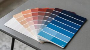
If you’re a designer or print pro who needs accurate color matching across materials, the Pantone Formula Guide Coated & Uncoated GP1601B is your go-to reference for 2026. You’ll use its coated and uncoated fan decks to match colors precisely for logos, branding, packaging, and marketing.
It’s portable, so you easily carry it from studio to press check. You’ll rely on 100 lb coated and 80 lb uncoated paper to preview real-world print results.
The lighting indicator page helps you assess proper viewing conditions. This guide guarantees consistent color reproduction across substrates, giving you confidence your designs look right everywhere.- Format:Handheld fan deck
- Color Type:Spot colors
- Paper Stock:100 lb coated, 80 lb uncoated
- Total Colors:2,161 spot colors
- Lighting Indicator:Included
- Digital Values:Not specified
- Additional Feature:End-to-end workflow use
- Additional Feature:Portable handheld format
- Additional Feature:Matches FHI colors
Pantone Color Bridge Guide Coated (GG6103B)
You’ll find the Pantone Color Bridge Guide Coated (GG6103B) ideal if you’re a graphic, brand, or packaging designer working with CMYK printing or digital formats. It gives you 2,359 colors, including 224 new trend-relevant shades, all on 100 lb coated stock for true visual accuracy.
You get precise CMYK equivalents for each Pantone Spot color, so you can judge print matches confidently. It’s the only guide offering CMYK, HTML, and RGB values together, making it perfect for both print and digital work.
Use the Lighting Indicator page to check colors under proper lighting. With its handheld fan format, you’ll have quick, reliable color reference anytime, anywhere.- Format:Handheld fan deck
- Color Type:Spot-to-CMYK equivalent
- Paper Stock:100 lb coated (148 gsm)
- Total Colors:2,359 colors
- Lighting Indicator:Included
- Digital Values:CMYK, HTML, RGB
- Additional Feature:Includes HTML/RGB values
- Additional Feature:CMYK match accuracy shown
- Additional Feature:224 new trend colors
Pantone CMYK Guide Set (GP5101C)
When creating designs that rely on precise CMYK reproduction, the Pantone CMYK Guide Set (GP5101C) is your best choice for achieving accurate, press-ready results. You get over 1,879 coated and 1,653 uncoated process colours, all engineered for extended-gamut printing.
These aren’t spot colours—each one’s built for 4-color process only and has no close Pantone Spot equivalent (ΔE2000 ≥ 2.0). The guides are G7-calibrated to CRPC standards, so what you see is what prints.
With separate coated and uncoated guides and full Pantone Connect compatibility, you can confidently pick, save, and share colour data across your entire design workflow.- Format:Two fan guides (coated & uncoated)
- Color Type:CMYK process colors
- Paper Stock:Coated & uncoated
- Total Colors:1,879 coated, 1,653 uncoated
- Lighting Indicator:Not specified
- Digital Values:Pantone Connect compatible
- Additional Feature:G7-calibrated CRPC standards
- Additional Feature:Extended-gamut process colors
- Additional Feature:Pantone Connect compatible
Pantone Solid Guide Set (GP1605B)
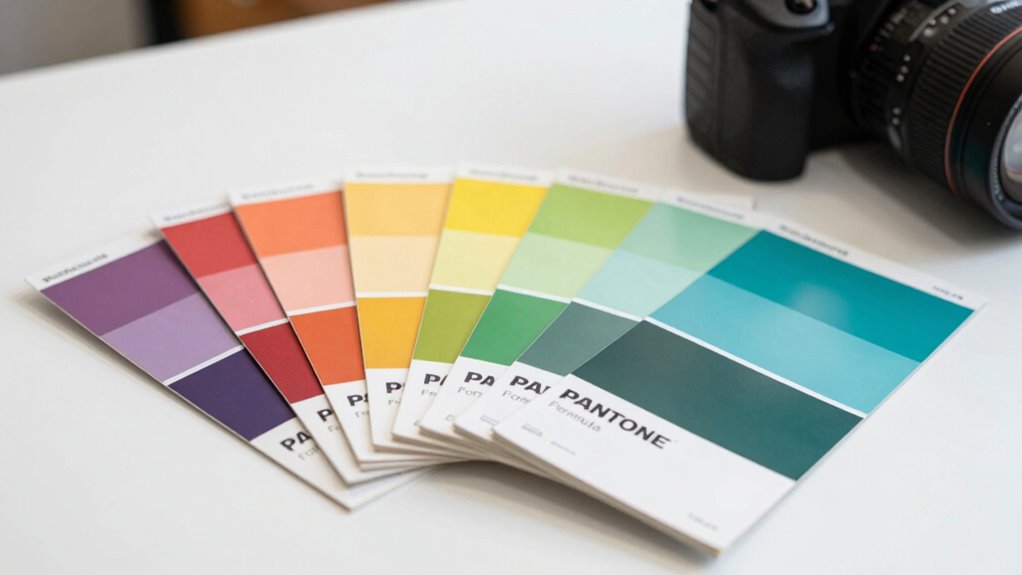
Since you’re working on high-precision graphics and print projects, the Pantone Solid Guide Set (GP1605B) delivers the most reliable, up-to-date selection of spot colors for 2026. You get four portable fan decks with 2,390 solid colors, 655 metallics, 154 pastels, and 56 neons—each with matching numbers and ink formulas.
Coated (100 lb) and uncoated (80 lb) papers ensure accurate real-world previews. Lighting indicator pages help you confirm proper viewing conditions, so you avoid color mismatches.
Designed for on-site use, this set fits seamlessly into your print workflow, giving you confidence in color specs every time. You’ll trust it for true-to-life color matching.- Format:Four fan decks
- Color Type:Spot colors (including metallics, pastels, neons)
- Paper Stock:100 lb coated, 80 lb uncoated
- Total Colors:3,255 total (spot + metallics + pastels + neons)
- Lighting Indicator:Included
- Digital Values:Not specified
- Additional Feature:Four-fan deck set
- Additional Feature:655 metallics included
- Additional Feature:Full gamut coverage
Pantone Formula Guide & Color Book (GP1601A)
The Pantone Formula Guide & Color Book (GP1601A) is tailor-made for graphic designers, brand managers, and printing professionals who demand unmatched accuracy in color selection and consistency across media. You get 2,161 spot colors, including 294 new trend-driven shades, with ink formulas for precise mixing.
The coated and uncoated fan guides let you compare finishes instantly, while chromatic layout and top-page tabs speed up color location. You’ll rely on the Lighting Indicator to check viewing conditions and the index to find colors fast.
Compact and portable, it’s ideal for branding, packaging, and print. Your colors stay consistent across digital and physical work, and with a 4.6-star rating, it’s a trusted standard since 1963.- Format:Two fan guides
- Color Type:Spot colors
- Paper Stock:Coated & uncoated
- Total Colors:2,161 spot colors
- Lighting Indicator:Included
- Digital Values:Available in digital design programs
- Additional Feature:294 new 2020 colors
- Additional Feature:Index for quick lookup
- Additional Feature:1-year limited warranty
PANTONE Pastels & Neons Guide (GG1504C)
You’ll get the most out of the Pantone Formula Guides for 2026 if you work with soft, subtle tones or bold, eye-catching brights—because the PANTONE Pastels & Neons Guide (GG1504C) gives you over 200 specialty spot colors in one compact fan deck, making it easy to carry and use across branding, packaging, and print graphics. You’ll find 154 delicate pastels followed by 56 vibrant neons, all arranged chromatically.
Each color shows coated and uncoated versions with its number and ink formula. You can quickly pick, match, and approve shades, and the back index helps you locate hues fast.
These colors integrate seamlessly into digital tools and production workflows, so you stay accurate and efficient from concept to print.- Format:One fan deck
- Color Type:Specialty spot colors (pastels & neons)
- Paper Stock:Coated & uncoated
- Total Colors:Over 200 specialty colors
- Lighting Indicator:Included
- Digital Values:Available in digital design software
- Additional Feature:154 pastels, 56 neons
- Additional Feature:Specialty colors in one deck
- Additional Feature:Chromatic order arrangement
Pantone Essentials Guide Set (GPG301B)
With 2,390 spot colors and 224 new trend-forward hues, the Pantone Essentials Guide Set (GPG301B) gives you the most all-inclusive color reference for graphics and print pros who demand accuracy and relevance. You get the Formula, Color Bridge, and CMYK Guides—each with colors in chromatic order and new shades up front.
Spot colors include ink formulas; comparisons to process colors make conversions simple. Printed on 100 lb coated and 80 lb uncoated stock, you see real-world results.
Lighting Indicator pages guarantee proper evaluation. Six portable fans and a carrying case let you take precision anywhere.
It’s versatility, value, and vision—all in one set.- Format:Six fan decks in case
- Color Type:Spot, spot-to-CMYK, CMYK
- Paper Stock:100 lb coated, 80 lb uncoated
- Total Colors:2,390 spot, 2,359 spot-to-CMYK, 2,868 CMYK
- Lighting Indicator:Included
- Digital Values:Not specified
- Additional Feature:Six-guide set with case
- Additional Feature:New colors at front
- Additional Feature:Common paper stock weights
Factors to Consider When Choosing Pantone Formula Guides
You need to match your guide to your color accuracy needs and the paper stock you’re using. Think about where you’ll work—portability and lighting conditions make a real difference.
Make sure the guide fits smoothly into your workflow so you’re not second-guessing results.
Color Accuracy Needs
Since accurate color matching is essential for brand consistency and print quality, you’ll need to define how tight your tolerance should be—aim for ΔE00 ≤ 1.0 when spot-on accuracy matters most, or allow up to ΔE00 ≤ 2.0 for less critical projects. You must decide whether you rely on spot-color formulations or process conversions—spot inks give exact matches, while CMYK simulations bring variance.
You’ll also want guides with measured colorimetric data like CIELAB or RGB so you can verify matches across digital and print. Always assess colors under standard lighting (D50) to prevent metamerism and guarantee visual consistency.
Don’t overlook that your choice of substrate affects perception, but we’ll cover paper type in the next section. Focus now on accuracy demands, your workflow’s color needs, and the data that helps you hit the right tone—every time.
Paper Stock Type
Choosing the right paper stock for your Pantone Formula Guide starts with understanding how surface and weight shape color appearance. You’ll see crisper, more vibrant colors on coated paper since its smooth, treated finish absorbs less ink and reflects more light.
Uncoated stock soaks in ink, giving softer, muted tones that can look flatter or warmer. Glossy surfaces boost brightness; matte or porous ones scatter light and tone colors down.
Weight matters too—heavier paper (~148–180 gsm) feels sturdier, resists curling, and handles better over time. Lighter sheets (~118 gsm) bend and dent easily.
For accurate matches, always compare swatches on the same paper type and weight as your final print run. Using consistent, high-quality stock guarantees reliable color communication and reduces variation between guides and across suppliers.
Portability Requirements
Keep your Pantone Formula Guide close at hand by picking one that balances size and durability for real-world use. Choose a compact, lightweight fan deck so it fits in your bag and slides easily into your workspace during on-site reviews or press checks.
If you’re always on the move between client meetings or production floors, go for a handheld format that delivers quick color comparisons without bulk. Make sure it includes both coated and uncoated swatches in one unit—no need to carry two separate guides.
Check that the binding lies flat and lets you flip pages smoothly with one hand during fast-paced consultations. Finally, pick a guide with thick, resilient paper that won’t warp or tear, even with daily handling and travel.
This way, your colors stay accurate and your tool lasts.
Lighting Conditions
You’ve got your compact Pantone Formula Guide in hand, ready for on-the-go color checks, but accurate decisions depend on more than portability—lighting makes or breaks color perception. You need standardized light, like D50 for print or D65 for daylight, to prevent metamerism and false matches.
Always use a light source with a CRI of 90+ so hues, saturation, and value stay true. Keep illumination consistent—about 500 lux for critical print work—and never mix light types, as that skews color.
Before approving anything, check a lighting indicator or follow a checklist to confirm color temperature and stability. If the final product will be seen under office fluorescents or retail LEDs, re-check your colors there too.
Doing evaluations under real-world lighting guarantees the color you pick is the color you get. Don’t guess—control your light, every time.
Workflow Integration
To get the most from your Pantone Formula Guide, align its color libraries—spot, CMYK, pastels, and neons—with the color types in your workflow so designers and printers speak the same color language. You’ll need conversion values like CMYK, RGB, and HTML if you’re moving between print and digital.
Make sure your guide plays well with color management tools, software plugins, and cloud services so you can save, share, and sync specs seamlessly. Don’t skip substrate and finish—pick a guide that matches your typical paper and printing process so press checks match final output.
Include training so everyone knows how to read formulations, use lighting indicators, and apply colors consistently. A well-integrated guide cuts errors, speeds approvals, and keeps your brand colors accurate from concept to print.
Color System Compatibility
While matching your Pantone Formula Guide to your workflow, make sure its color system aligns with your production needs—confirm it includes spot color ink formulations if you’re using spot printing, or CMYK and RGB values if you’re working across process printing and digital media. You’ll want conversion values like RGB and HTML for consistent cross-media color matching.
Check that the guide’s substrate—coated or uncoated—matches your final print material, since finish impacts how color appears. Make certain the gamut covers your project needs, including neons, pastels, metallics, or extended process colors, so you don’t run into specification gaps.
Also, look for built-in lighting guidance so you can assess colors under proper viewing conditions. This guarantees accurate comparisons and reduces metamerism risks.
Don’t assume all guides offer the same ranges or tools—verify specs match your output demands exactly.
Digital Tool Access
How do you make sure your spot colors translate seamlessly from print to pixel? You need reliable digital tool access.
Check that your Pantone guide includes accurate RGB and HEX values so web and screen designs match physical swatches. Make certain it works with your color management systems and design software, letting you save and share palettes across teams and devices.
A cloud-based library or app is essential—sync and update swatches remotely to keep workflows consistent. Look for guides that offer CMYK and device-specific conversion data so you can predict how colors shift across mediums.
Confirm support for standard export formats like ASE, CSS, or XML, so handoffs to developers and printers are smooth. Don’t overlook these tools—they’re key to maintaining color accuracy from concept to screen to final print.
Specialty Color Options
You’ve guaranteed your digital tools support accurate color translation from screen to print—now it’s time to think about the unique demands of specialty spot colors. You’ll need to determine if your project requires shades like pastels, neons, or metallics, since these demand specific ink mixes and won’t reproduce in CMYK.
Always check how they’ll look on coated versus uncoated stock—absorbency affects vibrancy and tone. Don’t overlook production limits: specialty inks often need extra press passes, custom blending, or varnishes, which drive up time and cost.
You also need to assess how lighting impacts appearance, as neons and soft pastels can shift due to metamerism. Finally, make sure each color has clear identification and formulation notes so your design and print teams stay aligned.
Accurate specs mean consistent, true-to-intent results—every time.
Frequently Asked Questions
How Often Should I Replace My Pantone Guide?
You should replace your Pantone guide every 12 to 18 months because colors fade over time. You’re working with outdated hues if you don’t, and your prints won’t match.
Keep it accurate—swap it out regularly for true color confidence.
Are Pantone Guides Waterproof or Stain-Resistant?
No, Pantone guides aren’t waterproof or stain-resistant. You’ll damage them easily if exposed to liquids or messy environments.
Keep them clean and dry, avoid spills, and handle with care to maintain accurate color references. Replace them regularly for best results.
Can I Use Pantone Guides Under Any Lighting?
you can’t use pantone guides under just any lighting—they need standard viewing conditions. natural daylight or d50 lighting gives accurate results.
avoid fluorescent or incandescent bulbs, they’ll distort colors. for true matches, always use proper light to see shades correctly.
Do Pantone Guides Include International Color Standards?
Yes, they do include international color standards. You’ll find cross-references to systems like ISO and DIC, so you can confidently match colors globally.
Just flip to the index or conversion charts—they’ve got you covered when aligning Pantone colors with worldwide specifications.
Are Pantone Guides Recyclable or Eco-Friendly?
Yes, you can recycle Pantone guides—most are made with recyclable materials. Pantone’s also pushing eco-friendly production, using soy-based inks and sustainable practices.
You’ll help the planet by recycling them properly and checking for updated green initiatives before disposal.
Conclusion
You flip through crisp pages, each swatch a beacon of color, lighting your creative path. The perfect hue waits—vivid, true, undeniable.
These guides aren’t just tools; they’re your silent partners in precision, turning visions into reality. In every studio glow and print run, trust blooms.
With the right Pantone guide in hand, your work doesn’t just speak—it sings in full, brilliant color.